Are you ready to see some of the weirdest websites the internet has in store for us?
Today, we’re about to get on a quirky journey through the digital scape as we uncover some of the internet’s most unusual and offbeat corners.
These aren’t your typical websites; instead, they’re the kind that defy convention and challenge the very essence of web design.
Are they pretty? I don’t think so!
Are they odd? I do think so!
I’m not sure what the purpose of some of these weird websites is – but that might be the whole point, to make us question.
And the others are some kind of interactive games – that are kinda cool. (Not really.)
Anyway, let’s go weird.
This post covers:
Best Weirdest Websites
Before we delve into our list of the weirdest websites, remember that these digital oddities may not boast beauty or a clear purpose.
Instead, they exist solely to leave you wondering why anyone would create such a website in the first place. But I’m sure many will put a big smile on your face.
So, brace yourself for an unforgettable journey!
1. That’s The Finger
When talking about the finger, everyone knows which finger we’re talking about. And That’s The Finger is all about the middle finger.
But to make it more exciting, the website is very interactive, showing you the middle finger when the mouse cursor is at the top of the site and the index finger when it’s at the bottom.
Another cool thing about the site is that the background also changes, making The Finger pop more.
Note: Make site background or elements react based on the cursor movement.
Why we chose it: That’s The Finger is a pretty straightforward website that might be weird, but it’s definitely impactful.
2. Cat Bounce
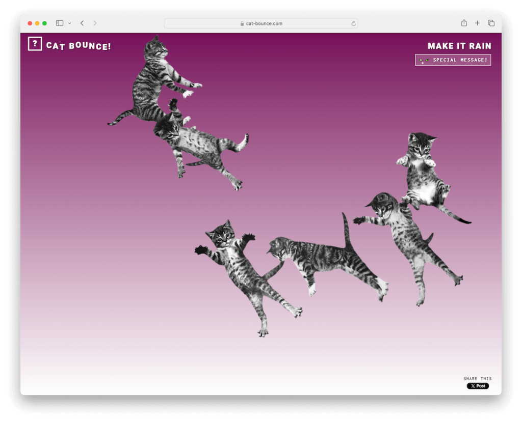
While initially, you think this is a silly website without a purpose – but it’s not quite so.
The Cat Bounce was created to raise funds, and according to the “special message,” it helped them surpass the fundraising goal.
The website is a bunch of kittens falling from the top and bouncing around. You can also “grab” each kitten and move it around or even “throw” it.
In addition to that, you’ll see a “Make It Rain” button in the top corner that, if you press it, makes it rain kittens and plays a sound.
Note: Interactivity in web design can significantly boost user experience.
Why we chose it: Cat Bounce may be a weird website at first glance, but there’s a deeper story behind it. Not all weird sites are useless.
3. Endless Horse
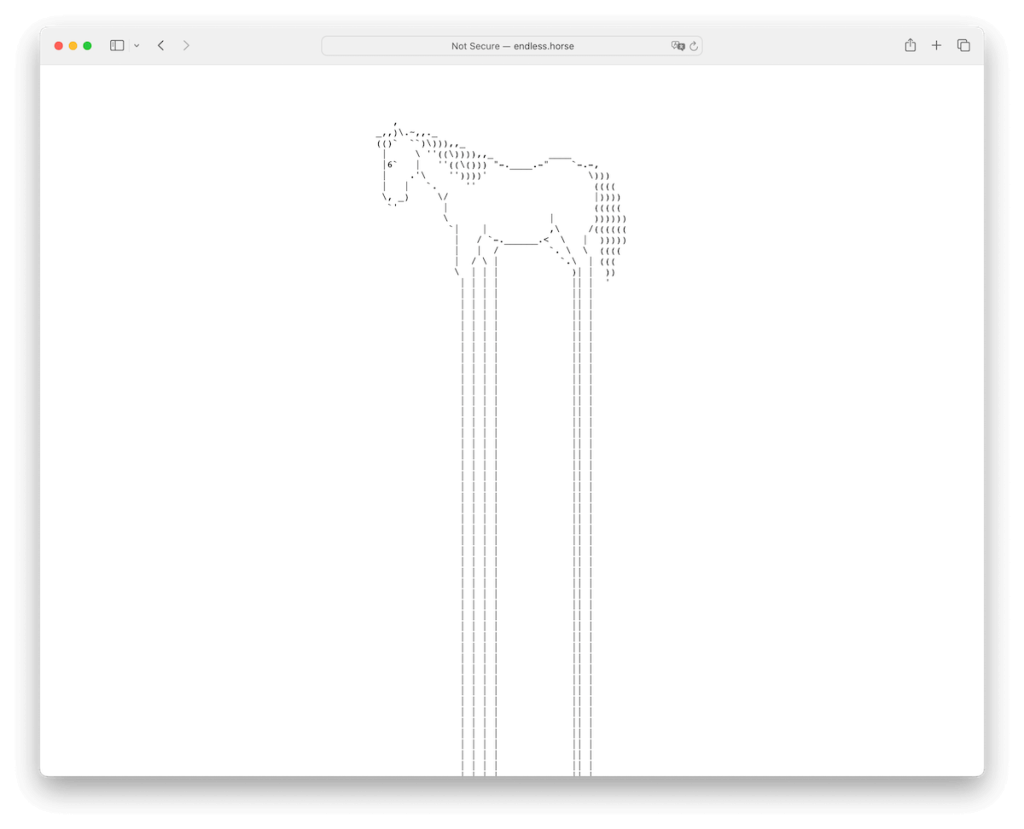
The Endless Horse website is pretty self-explanatory. It’s a horse whose legs never stop loading.
That’s it!
I tried getting to the hooves, but I gave up after god knows how many minutes of scrolling. Yup, they got me!
Note: You don’t need fancy designs and special effects – in fact, it’s better to keep it simple and minimal, enhancing focus on the “weird” element.
Why we chose it: Endless Horse is minimalist and straightforward, with a clever loop of infinite scrolling that some may use as a way of relaxation.
4. Electric Boogie Woogie
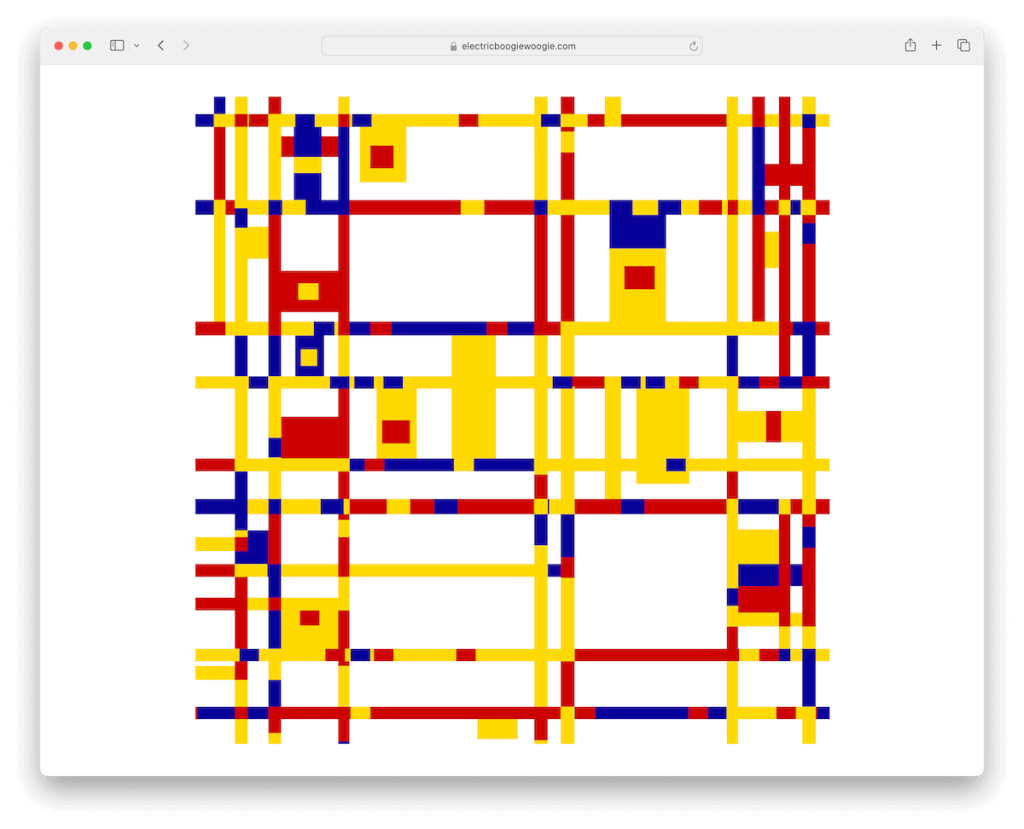
Have you seen the original Broadway Boogie Woogie painting yet? I did – just now.
And we could say that the Electric Boogie Woogie website is its online moving version. While weird, the detailing of the animations instantly captures the attention and has you hooked.
Note: Ensure the right combination of colors when making a weird site. But is there really a “right” in “weird?”
Why we chose it: Electric Boogie Woogie is a great example of how you can use a famous painting to inspire the creation of its “online electric” alternative.
5. Falling Falling
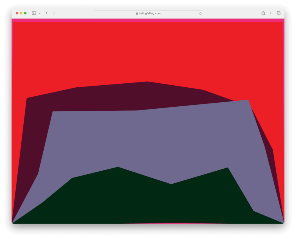
Falling Falling is an interesting website concept with falling/collapsible rectangles of different colors that change shapes. Each falling element also changes its shade when, well, falling to the bottom of the screen.
And to make it even more exciting, the website plays an odd sound if you click on it.
I’m not sure if staring at this website for too long is healthy for your eyes, but I must say, as strange as it may sound, it does feel good.
Note: If you include a sound or a song on your site, don’t make it play automatically – because it’s annoying. However, that might make it even more weird.
Why we chose it: Falling Falling is a great experiment of mixing weird shapes and sound(s) for your – hopefully – viewing pleasure.
6. Paper Toilet

I never thought unrolling a Paper Toilet would be so much fun. While this weird website has some similarities to the Endless Horse, the main difference is that Paper Toilet has an end.
The only sad part is that if you refresh the website or even clean the cache, the toilet paper is gone forever. Hint: You can still open it in incognito mode.
Note: The web allows you to do things you might never have and only dreamed about doing in real life, like unrolling the entire toilet paper in one go. Go out there and create your version of “Paper Toilet.”
Why we chose it: Paper Toilet shows how you can make elements pop more with a black background.
7. RGB
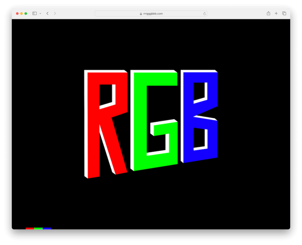
I’m sure you’re all familiar with the RGB color model. Well, Mr. Boonstra decided to dedicate an entire website to large RGB lettering in the middle, each letter matching the color, so “R” is for red.
But the fund doesn’t end here.
Once you hover over the letter, it turns black, but the background changes while a pretty loud robotic voice pronounces it.
Note: Implement hover effects into your website and level up the engagement.
Why we chose it: RGB might be weird, but it can also be educational at the same time – depending on which end you view it.
8. The Useless Web
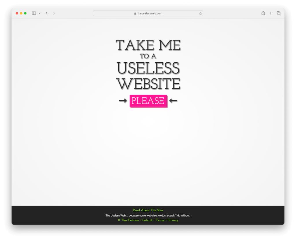
The Useless Web website isn’t actually as useless as it says it is. Once you click on the “Please” button, you’ll be instantly redirected to a website (it opens in a new tab) that you’ll have no clue what it’ll be about.
And the best part – it doesn’t repeat itself. So yes, you’ll get a new website each time you click the “Please” button.
Sure, some websites it recommends are weird and even bizarre, but some are fun games, so you get a little bit of everything.
Note: Create a website that’s a resource of some niche stuff you’re into and let visitors discover it with a simple click of a button.
Why we chose it: The Useless Web demonstrates how practicality and uselessness can work in perfect harmony.
9. Long Doge Challenge

More sites like the Endless Horse. Yup!
Here’s the Long Doge Challenge, another fun but weird website with infinite scrolling. Yes, it’s about that Doge, the popular meme we’ve all probably seen dozens if not hundreds of times.
Anyway, the Doge’s body accompanies you when you scroll along with plenty of “WOWs.”
There are two more cool things about this site: 1) you can actually print the doge and the number of pages depends on how deep you scrolled and 2) there’s a YouTube link to a video where Tim shares with us how he built the Long Doge Challenge.
But what’s the coolest is the statistic in the top left corner, showing you how long your doge is and how many WOWs you’ve collected.
Note: Infinite scrolling can have a relaxing and calming effect on the viewer. Long Doge Challenge is slightly more dynamic with all the WOWs along the way.
Why we chose it: Long Doge Challenge exposes playfulness with relaxation of the endless scrolling.
10. Staggering Beauty

Staggering Beauty doesn’t fool around. If you’re ready to get a dose of vigor, it’s time to vigorously shake the Staggering Beauty.
Attention: It gets extremely flashy!
You can start slowly, but as soon as you begin shaking the snail – or whatever that is – wildly, get ready to be flashed away.
Note: Offer visitors to easily get the embed code to include your creation into their website.
Why we chose it: Staggering Beauty might be the weirdest website in terms of flashy effects.
11. Weird Or Confusing
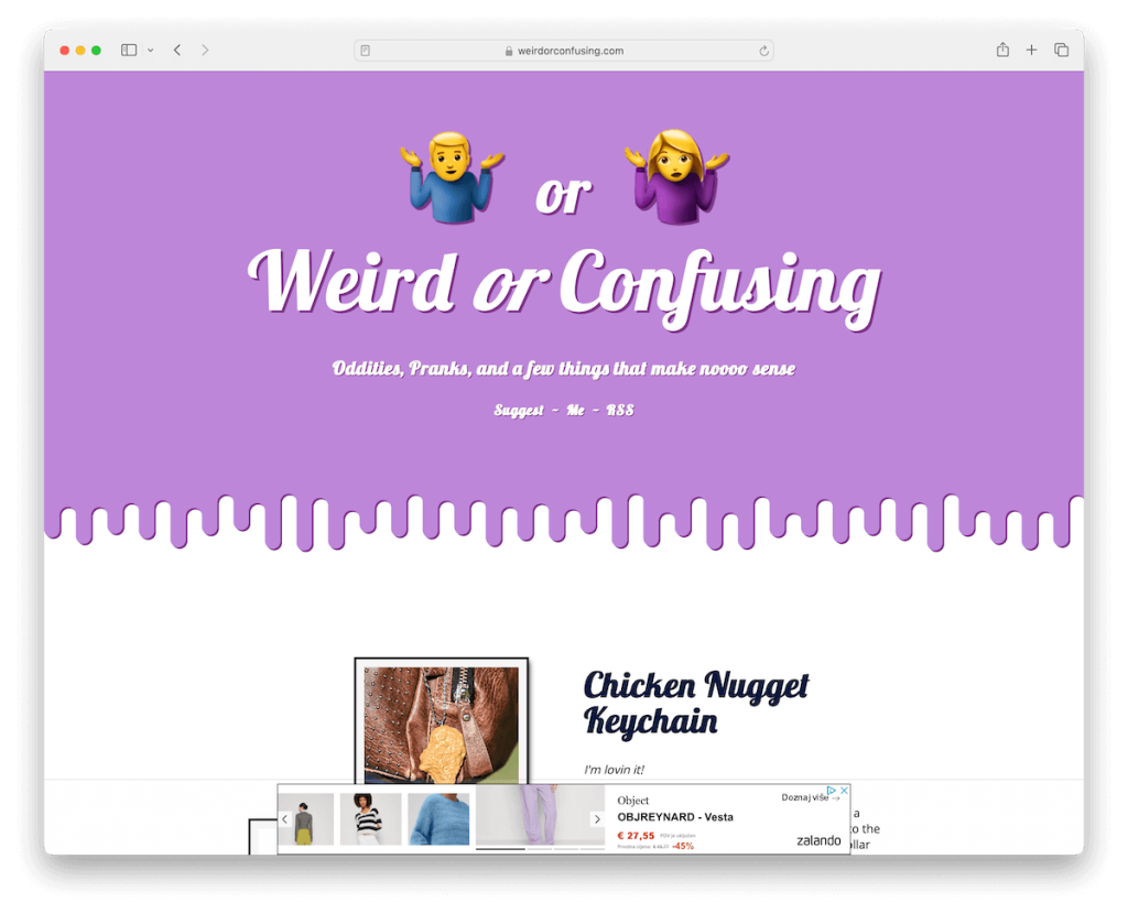
Weird Or Confusing website isn’t necessarily weird, but it does recommend some weird stuff from all around the web and promotes it via affiliate links.
The design is clean and simple with product description, additional images and Amazon buttons.
Note: A weird website doesn’t need to be weird from the design perspective, but it can showcase weird stuff.
Why we chose it: Weird Or Confusing benefits from the weirdness around the web and monetizes it smartly.
12. Chris McKenzie
Chris McKenzie website is weird. Period.
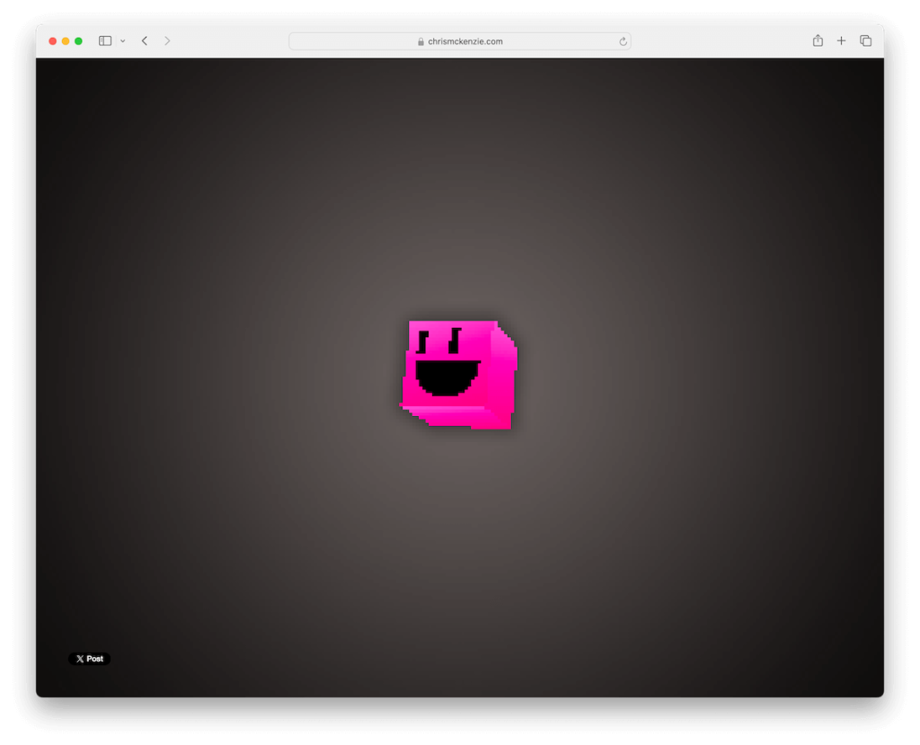
It features a pixelated pink cube that desperately looks around for the mouse cursor with a sad face.
However, as soon as you as you put the cursor on the browser screen, the face goes from sad to smiley. Not only that, but it follows the mouse cursor around so that you can have some fun with it.
Note: When it comes to weird sites, the quality of element – heck, even images and videos – doesn’t necessarily need to be high.
Why we chose it: Chris McKenzie’s animation is just too cool not to include it in this list.
13. Move Now, Think Later
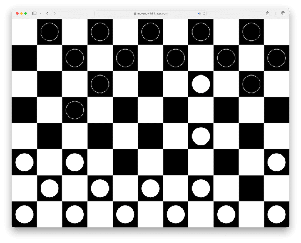
Move Now, Think Later is a weird website that lands you straight into a game of checkers with a black and white background.
Unfortunately, you cannot participate in the game; you can just watch the game being played in front of you. And if you click anywhere on the website, you turn on the game-playing sound.
Note: Experimentation with design and actual gameplay (even by a computer) can make people come and enjoy in a pleasant experience.
Why we chose it: Move Now, Think Later is an excellent example of how simplified game streaming can still work. (According to Similar Web, over 100k people visit the website.)
14. Eel Slap

Yes, you read that right, Eel Slap.
This goes to everyone who ever thought about slapping someone with an eel. But so you don’t have to, here’s the perfect weird website that resembles just that.
How?
By moving your mouse cursor from right to left. That’s it. In a bad, angry mood? Well, spend on the site as much time as you want – slapping and calming dawn.
Note: So it’s not all cartoonish and animated, use a real-time image and combine it with mouse cursor movement to bring in the fun.
Why we chose it: Eel Slap mixes real time imagery with you being in charge of the movement.
15. Is It Christmas
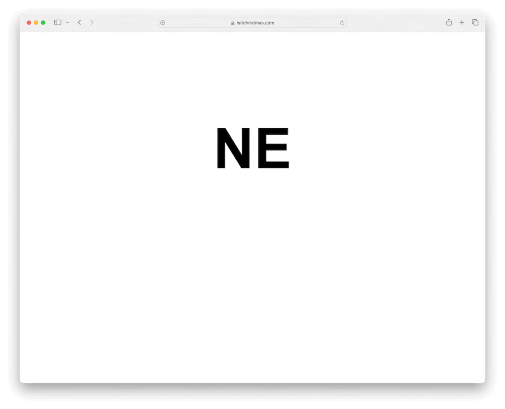
Is It Christmas today? If you’re one of those wondering, this is the website you need.
All this weird website does is simply display a yes or no (in your language) whether it’s Christmas today or not. It’s very simple and minimalist, changing the answer only once a year.
Note: One thing that you can learn from this website is its extreme simplicity.
Why we chose it: Is It Christmas is a neat example of how you can create a website with the purpose of answering one popular question. (Is It Christmas generates a pretty significant amount of traffic, especially during the holiday season.)
16. Corn Dog
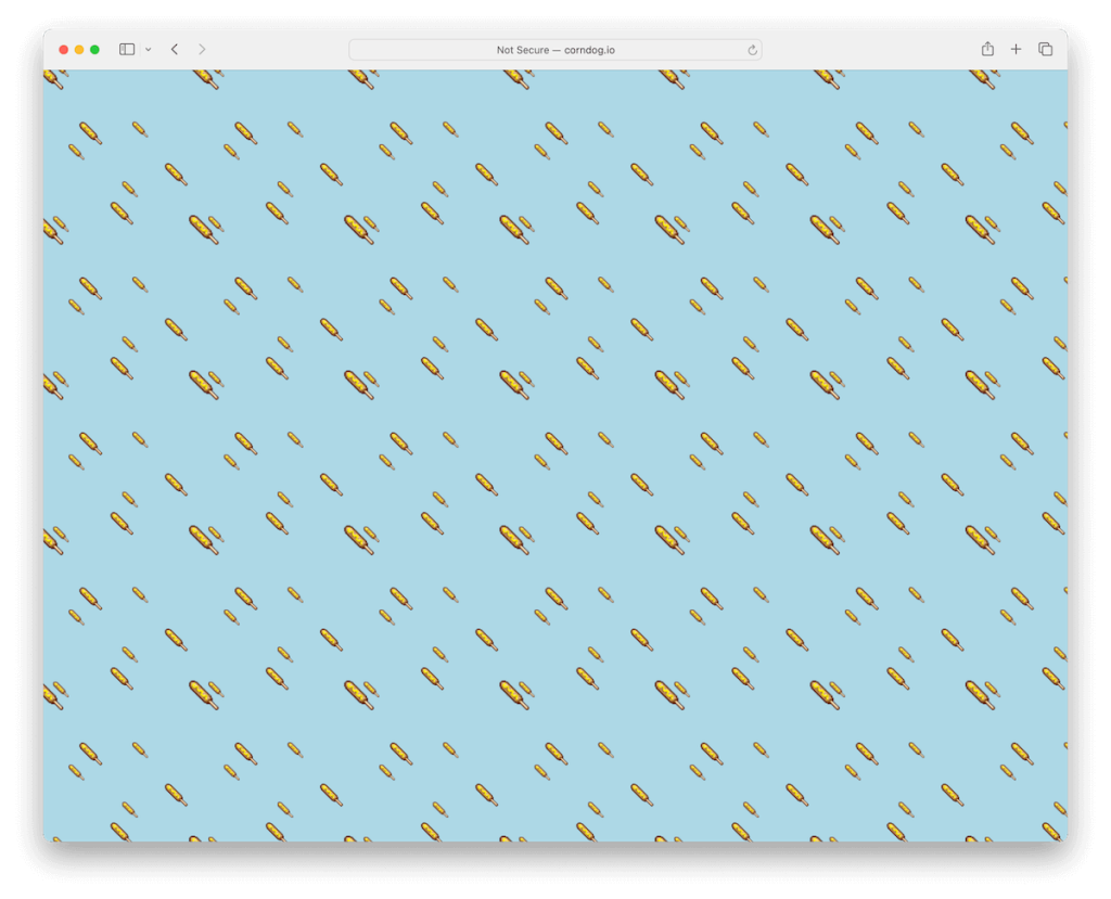
If you are a fan of corn dogs, then you’ll surely be a fan of this weird website. When conducting this collection, many websites made me question, “Why would you want to build and run this site?” – this one did, too.
However, while these funny flying corn dogs might not be your life’s goal, they can actually be a cool background for a (weird) website – or a corn dog stand site.
Note: You can minimize any object you want, multiply it by 100 (or more) and turn it into an animated wallpaper.
Why we chose it: You can use Corn Dog as an inspiration to create a fun website backdrop.
17. Every Day I’m

Every Day I’m is a pretty trippy website once you hover over the “Hustlin’” text.
Not only do the background colors change pretty fast and vividly, it also plays the famous “Everyday I’m hustlin’ hustling’” rhyme by Rick Ross.
But as soon as you remove the cursor from the text, it goes in default black and white mode without the song.
Note: Like Every Day I’m, you can also easily turn a popular rhyme or part of a song into a weird website – which might generate quite some traffic.
Why we chose it: Every Day I’m has a nice surprising effect with the changing background and audio on hover.
18. Trash Loop
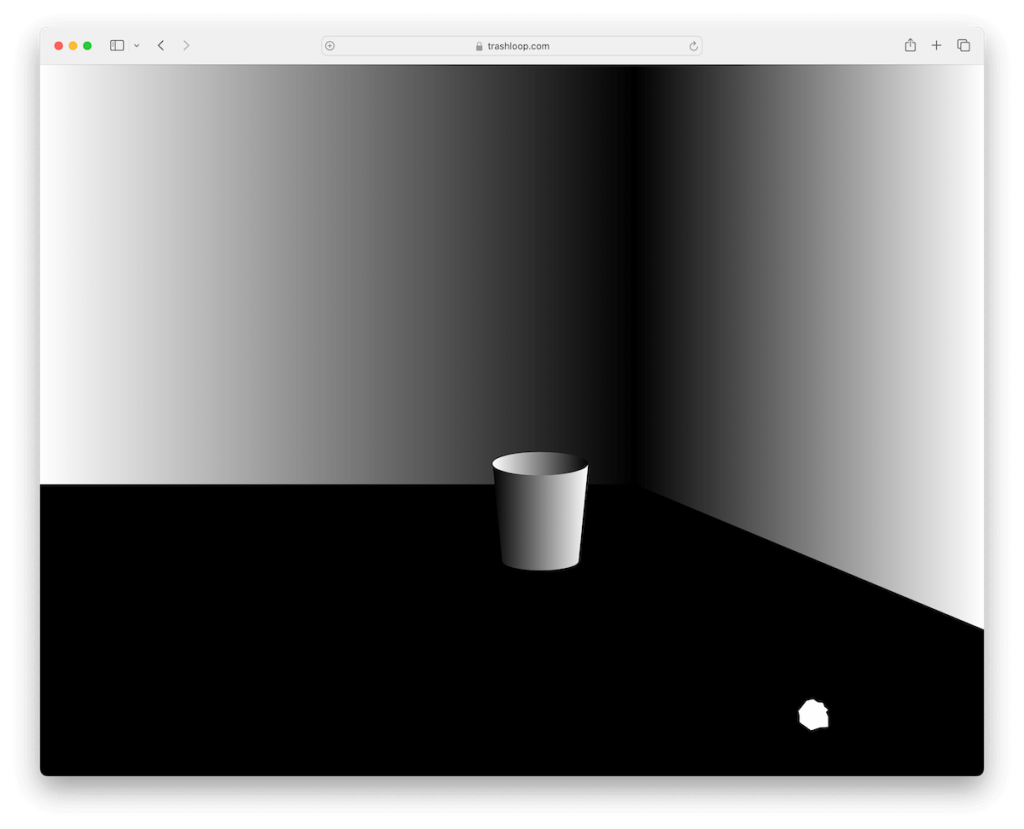
Trash Loop might be a weird and useless website, but as soon as you try it out, I’m sure you won’t think like that anymore.
It’s a game of throwing a ball into a trash can. You can throw it from various ranges and distances and enjoy some fun.
When you score, the site plays a sound just like it does when it throws the ball out of the can.
Note: You don’t always need a massive investment to create a game that 1,000s of people will end up playing.
Why we chose it: Trash Loop is an example of how a simple game can end up being a lot of fun.
19. Zoomquilt
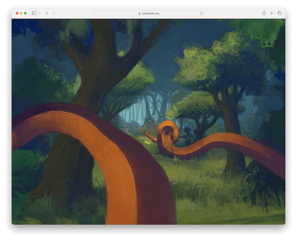
Zoomquilt is definitely my favorite among the weirdest websites. It has a continuous zooming effect, zooming into the center and revealing new fantasy scenes, keeping you glued to the screen and mesmerized.
What’s also cool is that you can use up and down to control the speed or go in reverse.
And if you click on the page, a sidebar will open with options to save the animation as a screensaver or wallpaper. (You’ll also find other similar projects in the sidebar, which are equally amazing.)
Note: When creating a functional weird website, you might just create a live wallpaper with the zooming effect.
Why we chose it: Zoomquilt is full of amazing detailing, creatures, and fantasy stuff that keep you in relaxation mode.
20. Make Everything OK
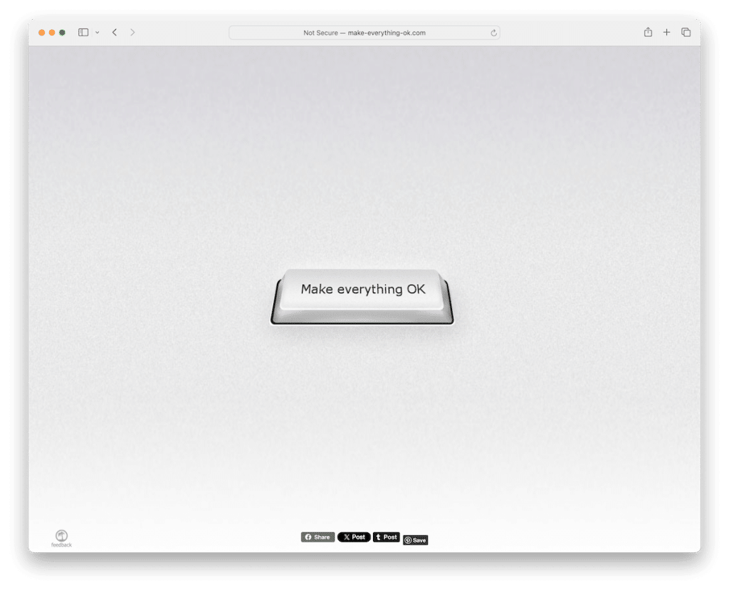
Not everyday might be your OK day, but this weird website will help you cheer up.
Make Everything OK is a greyish website with one main purpose – to help you check if everything is OK.
It has a keyboard-like button in the center that opens a progress bar, checking if everything is OK. I tried it a bunch of times, and everything’s always OK. Whatever happens in your life, refer to the Make Everything OK website, and you’ll see that everything will eventually be OK.
(My girlfriend even told me this is the button she needs on her keyboard.)
Note: Mimic buttons and other site elements with those we are familiar with. (No need to design completely new ones – hey, we’re talking about weird sites!)
Why we chose it: Make Everything OK fuses interactivity with anticipation, keeping you in the loop of OK hype.
21. Find The Invisible Cow
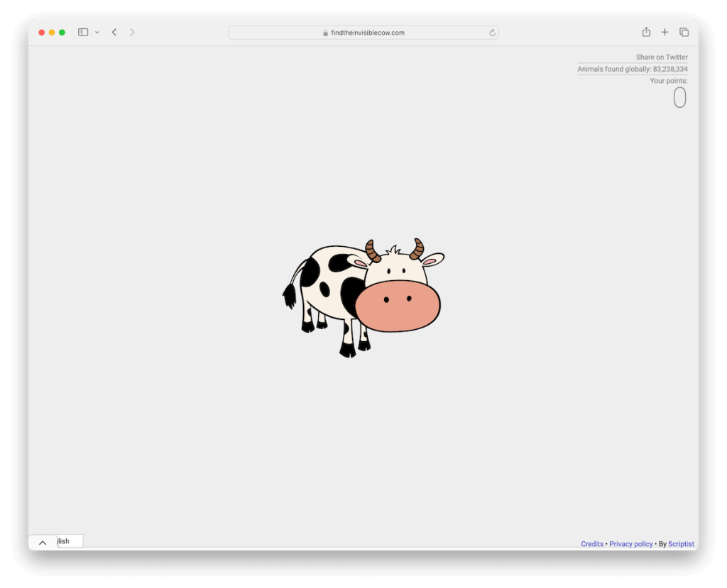
For the final one, I’ll share with you a pretty challenging game that’s, at the same time, superbly annoying.
Meet Find The Invisible Cow.
After you press the “Start Game” button, nothing is there, just the repeating “cow” sound that guides you to the cow. The louder it gets, the closer to the cow you are.
Once you find the first one, you can then also enter into the “Expert Mode,” which doesn’t change the cursor when you hover over the cow.
Note: Combine listening and attention skills through a fun little game.
Why we chose it: Find The Invisible Cow is actually lots of fun to play, just the “cow” sound can get in your ears, especially if your speakers are set to loud (I don’t recommend it). But the sound is necessary to find it, though.
Are There Any Benefits Of Having A Weird Website?
Having a weird website, while unconventional, can offer several benefits:
- Memorability: Weird websites tend to be memorable. Users are likelier to remember and share an eccentric or bizarre website, which can be advantageous if you aim for brand recognition.
- Stand out: A weird one stands out in a sea of similar-looking websites. This uniqueness can attract attention and make your site more distinctive.
- Creative expression: Creating a weird website allows designers and developers to push their creative boundaries without conforming to traditional design norms.
- Viral potential: Unconventional websites often go viral on social media due to their shock value or sheer oddity, potentially bringing in significant traffic.
- Niche audience: Some people actively seek out weird or obscure content online. You may find a dedicated and passionate user base by catering to this niche audience.
- Artistic and satirical expression: Weird websites can serve as a form of artistic or satirical expression, making a statement or challenging societal norms.
- Experimentation: Creating a weird website can be an experimental playground for designers and developers to test new technologies, designs, or ideas.
- Conversation starter: A truly weird website can be an excellent conversation starter, fostering user discussion and engagement.
- Low development costs: Depending on the level of weirdness, these websites may not require extensive development, making them cost-effective to maintain.
- Entertainment value: Above all, weird websites often provide entertainment and amusement for visitors who enjoy a good dose of the unusual and unexpected.
Pro tip: You can easily make a weird website with WordPress.
FAQs About Weird Websites
Why would someone create a weird website?
People create weird websites for various reasons, such as artistic expression, humor, or to challenge conventional design norms. It’s a way to stand out and evoke curiosity.
Do weird websites follow any design principles?
Not necessarily. While some may incorporate design principles, many weird websites intentionally defy them to create an unconventional user experience.
Are weird websites user-friendly?
User-friendliness can vary widely. Some weird websites prioritize creativity over usability, making them challenging to navigate, while others strike a balance for a more enjoyable user experience.
Can weird websites be effective for businesses or brands?
It depends on the brand and target audience. While unsuitable for all businesses, a weird website can be a memorable and attention-grabbing marketing tool if aligned with the brand’s values and objectives.
How can I design a weird website that works?
Start by clearly defining your purpose and audience. Then, embrace creativity, experiment with unconventional ideas, and test user reactions. Balancing weirdness with usability is key to success.
Was this article helpful?
YesNo
