Don’t miss these best startup websites if you’re building your own and need inspiration.
Everything from simple to minimal to animated and advanced pages is in the collection below.
We sometimes spend hours and hours on a single web design, trying to figure out why it works and fails.
Thus, we eliminated all the bad performers and brought you only those you can learn from.
We sure did!
Note: We also added the “Built with:” part to every awesome website, so you know what platform it uses.
Remember, you can also create your dream website with these startup WordPress themes.
Best Startup Websites & Design Inspiration
1. Consolto
Built with: Webflow
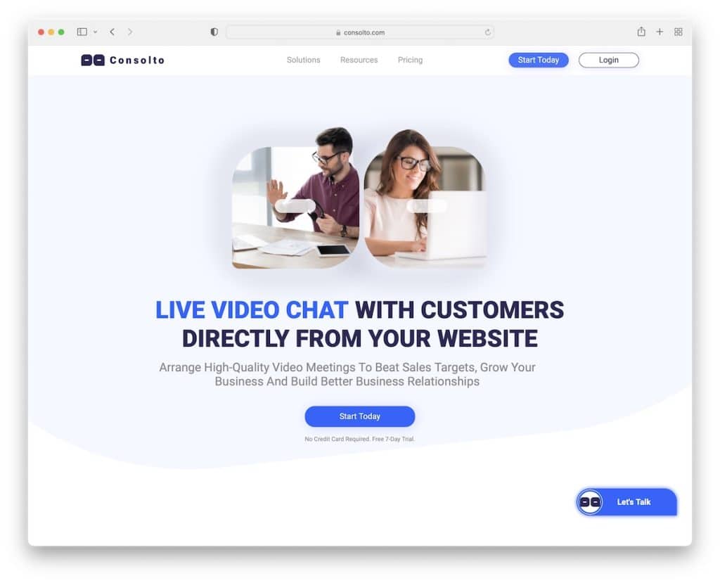
We like Consolto’s modern (mobile-style) design approach with cool effects that spice things up.
Scrolling is enriched with animations, hover effects and CTA buttons, so the potential user can take action without scrolling back to top/bottom.
The sticky navbar is also present (on the back scroll) to visit different pages, especially pricing.
Note: Consolto uses the quick preloader strategically, informing what their business is all about. (Include something more informational than a percentage bar if you use a preloader.)
2. AdYouNeed
Built with: Webflow

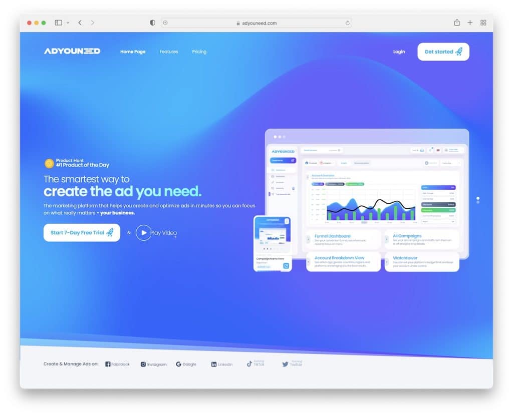
AdYouNeed has a nice flow of images, texts and animations to keep the visitors busy and excited to keep scrolling.
What’s also cool is that they offer three pricing plans but keep the most popular one in front of the other – highlighted. This is a great strategy to help users pick the right option if they’re unsure.
Note: Use AdYouNeed’s website as inspiration to present your software with just the right amount of animations and special effects.
3. Shadowmap
Built with: Craft CMS

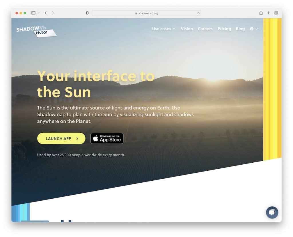
Let your website resemble what you have to offer, and Shadowmap does this extremely well. It allows you to visualize the app’s capabilities without even testing it.
But they also included CTA buttons, example use cases and features and benefits to get the gist of it quickly.
Note: Use your website as a brand ambassador, creating the best presentation to boost your potential and improve conversion rates.
4. Lightyear
Built with: Webflow

Lightyear’s full-screen video definitely grabs the attention, keeping you curious about what’s to come. The little text and a call-to-action button are excellent for taking quick, well, action.
But Lightyear’s browsing experience is also top-notch, engaging and VERY immersive. It feels advanced, but you can easily build it with Webflow.
Note: Keep the visitor engaged with a unique scrolling experience, as people over at Lightyear do it.
5. Apothékary
Built with: Shopify

Apothékary is a startup eCommerce website promoting pharmacy products in a catchy way. The full-width slider promotes some of their exclusives with CTAs for quick shopping.
We also really like the before-after image and testimonials that make you feel it’s a trustworthy product(s).
Note: Allow the visitor to get familiar with your products only by browsing your home page.
6. MikMak
Built with: HubSpot

MikMak’s website is modern and professional, guaranteeing a top user experience. They use a large background image with a text block and call-to-action above the fold for everyone who wants to learn more about the brand immediately.
Moreover, the brand logo slider makes this startup feel really PRO. It’s a website with a strong first impression necessary for your business’s success.
Note: Use brands you work(ed) with as a reference with a cool slider for everyone to see.
7. January
Built with: Netlify CMS

Instead of using an image, a video can be another great way of promoting your application. January does things strategically with a split-screen layout, using video on one side and opt-in form on the other (on desktop).
The content-revealing scrolling approach creates a great experience, making the visitor hungry to see what’s next.
Note: Using videos, screenshots of the app and customer testimonials are some of the key features of a great app website.
8. Practipago
Built with: Elementor

Practipago is a vibrant startup website example with a catchy design. Multiple moving elements (carousels and sliders) distribute useful information very cleverly (read distraction-free).
Also, the floating navigation only appears once you start scrolling back to the top, which you can use to jump from section to section.
Note: Practipago is a great example of a landing page with much information but done smartly to keep the user entertained.
Don’t forget to read our Elementor review if you’re interested in building a WordPress website.
9. VBOUT
Built with: Uncode

While VBOUT keeps every element static, the simple typewriter effect is a nice addition to capture visitors’ interest.
They keep the design simple with a lot of white space and a sticky live chat widget in the bottom right corner to quickly get in touch with them.
Note: Even in a boring industry, think outside the box and present yourself online engagingly.
10. YouEngage
Built with: Elementor

YouEngage’s home page lets you know what their tool is all about without scrolling. And everyone interested can take instant action by pressing the CTA button.
The rest of the page has a good deal of engagement-boosting elements to learn all about the tool.
Note: If you have something free to offer, make it clearly visible, preferably above the fold (especially in the case of a free trial).
11. Motivated Mornings
Built with: Squarespace

Motivated Mornings is an enjoyable startup website that wants you to watch its promotional video that’ll definitely keep you glued to the screen.
Another thing that they do a good job at is the text-rolling effect, which keeps asking you questions, which, of course, Motivated Mornings takes care of. (A smart way of presenting benefits.)
Note: Not everyone will sign up for your service or software on the first view. But they will likely fill out the form for a freebie. Motivated Mornings incorporates it at the bottom of the site (free guide), which increases the likelihood of getting a lead.
You may also be interested in more epic Squarespace website examples.
12. Upstate Laundromat
Built with: Squarespace

Upstate Laundromat is a small startup business with a landing page website that reveals everything in a few clicks or scrolls.
The floating navbar is great because it takes you to the section you want to see without scrolling. They also added contact details and integrated Google Maps to showcase the location.
Note: If you receive a lot of questions in your inbox, use your website to display frequently asked questions. (Accordions work really well for this because they keep the website cleaner.)
13. Minna
Built with: Squarespace

Minna is a fantastic example of an online store with a creative design that doesn’t feel too eCommerce.
The full-screen hero image tells more than 1,000 words, and the transparent menu makes it look spotless.
Minna also uses the parallax scrolling effect, which creates a more immersive experience.
Note: Like Minna, just a full-screen image, you can test no-text and no-CTA above the fold.
14. Dropps
Built with: Shopify

Unlike the simplicity that Minna site rocks, Dropps gives an instant impression of an eCommerce startup business.
A great slider with texts and CTAs welcomes every visitor to Dropps’ world of cleaning.
But there’s another fantastic slider mid-scrolling, showing you before/after images, demonstrating how great their product is.
Note: Apply the before/after image technique to your business and testimonials that together build trust.
15. Knapsack Creative
Built with: Squarespace

Knapsack Creative startup website shares a lot of modern vibes, promoting their services creatively and engagingly.
The background pattern creates an impression of a road that takes you through the path of what Knapsack Creative is all about when you scroll. Call it unique!
Note: Use your home page to take the visitor on a pleasant journey, learning more about you and warming them up for business.
16. TinySeed
Built with: Squarespace

TinySeed uses a video above the fold with text (brief explanation of what they’re about) and a call-to-action.
The overall responsive web design is very simple, broken down into different sections, giving you more insights. You’ll also find a newsletter subscription form in the footer, with a secondary menu and social media icons.
Note: Video form content is becoming increasingly popular, so it’s worth using it.
17. KeyNest
Built with: Squarespace

Because KeyNest’s (Airbnb partner) service revolves around finding a “keynest,” they feature a search bar with live results for quick action in the hero section.
But they also have a video button that opens a lightbox to watch the promotional video.
The home page feels like a landing page, with testimonials, another search bar, a contact form and a live chat box.
Note: If you’re a partner of some large corporation, ensure you make it clearly visible because it’ll raise your potential.
18. MonetaGo
Built with: Wix

MonetaGo is a strict business website with a professional design.
They feature three main sections on the home page, “Who are we?”, “How it works” and “Technology” which is a great way of showing the visitor what your business is all about.
Note: Regardless of how “serious” your business is, showcase your team with beautiful headshots and their roles. It instantly adds a more personal experience.
We also have a collection of the best websites built on Wix platform for you.
19. ebulletins
Built with: Elementor

ebulletins took the opportunity and used the above-the-fold section to share quite a lot of information about their business, accompanied by a catchy graphic.
With all the info, the user can go straight to clicking the CTA button without the need to learn more.
Note: Use a CTA button that lets visitors jump straight to the subscription form (no need to scroll).
20. AchieveMore
Built with: Elementor

AchieveMore startup website is simple and bold above the fold but has a lot of stuff going on further down.
However, they executed animations, effects and content distribution wisely for enjoyable scrolling.
Note: Instead of using a floating header, you can also add a floating bar at the bottom of the screen with CTAs.
21. Feastables
Built with: Shopify

If you want to make a website unlike any other, Feastables is an excellent example to study further. It’s super vibrant, with moving elements and animations.
We also really like how they included testimonials, which you don’t see daily. And there’s also a play button in the navbar that plays the Feastables song.
Note: There are no rules for web design, so dare to be different.
Was this article helpful?
YesNo
