Looking for inspiration? Here are the best restaurant website examples for Michelin-rated chefs.
Effectively generate more leads in your restaurant business with a professionally-built website. This way, you will not just earn a good reputation. Still, you will offer your customers the flexibility to make the reservation at their convenient time, even if it’s’ outside business hours. So, discover the best features to enhance from these restaurant website designs we’ve’ handpicked for your awesome inspiration.
Staying ahead of the competition is possible when you aim for a strong web presence. Building a website is never a waste of resources, regardless of your product or service. Studies reveal that more than any other business type, 90% of guests research a restaurant online before dining. With this fact, restaurateurs shouldn’t’ overlook this cheap yet powerful marketing scheme. Favorably, website creation isn’t’ as difficult as before. You can easily find fresh-looking, modern, professional restaurant themes ready to achieve your goals.
In this collection, you can find various designs that restaurateurs deliver content effectively. Some designs are creative enough to inspire fellow restaurant owners, while others look excellent in minimalist design. Hence, sparing time exploring these websites will help you acquire awesome ideas in crafting yours with finesse.
Best Restaurant Website Design Examples
1. Voellerei

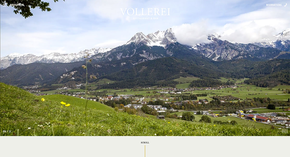
A unique and striking website can empower every business. Similarly, restaurant websites can help owners connect with customers efficiently. Voellerei has an awe-inspiring design that awesomely represents the business. Specifically, the restaurant and bar are located in the heart of Saalfelden, surrounded by mountains in an idyllic landscape. It is tailored with exceptional features ready to make the brand stand out. The website uses a nice off-canvas menu and a smooth slider to reveal every page – the homepage, restaurant, bar, and contact. Each of those pages integrates video content on the hero scene to introduce the brand beautifully. Moreover, subtle animations are also added to make the web components stunning.
2. Quay

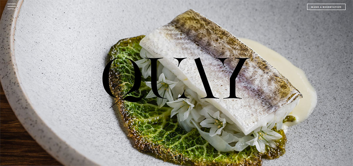
Accordingly, most people try a new restaurant after seeing its website. It would be great to build a visually appealing, stimulating, and modern restaurant website with this fact in mind. Here’s’ a collection of restaurant website designs that will help motivate other brands. Quay is one of Australia’s most celebrated restaurants. It’s’ an organic space reflective of Peter Gilmore’s’ nature-inspired cuisines. It exhibits a high-quality, fullwidth, attractive image on the hero scene with its logo. It also uses a sticky header with the logo, reservation button, and off-canvas menu. The next sections reveal similar split-screen layout – a great combination of imagery and a short description. Moreover, other useful contents are arrayed in grids, making them look interesting.
3. Koox

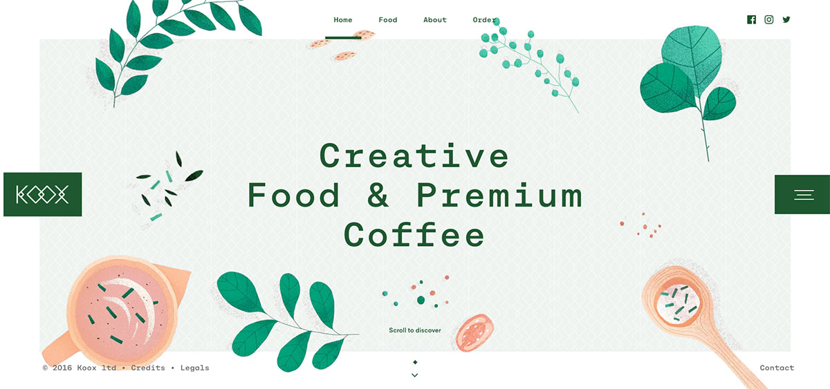
Boost your revenue stream when you choose a good website to promote your restaurant business. So, better check out these restaurant website designs that will give you ample ideas on refining yours. Koox is a new cafe created with star chefs, coffee roasters, and artisans to bring you good stuff without fuss. It’s’ one of the most creative restaurant website designs on the list ready to motivate restaurateurs. The homepage design is impressive and innovative, with cool and subtle animations. Having green as the primary color, the website looks fresh, invigorating and lovely. The site uses a sticky header with a logo, off-canvas menu, and social icons to provide user-friendly navigation.
4. Mamuka

Studies reveal that 52% of all worldwide online traffic comes from smartphones. Hence, it is best to create a fully responsive and mobile-friendly website. Mamuka is a large family restaurant of Georgian cuisine in the heart of Yaroslavl. The website appears attractive with hot pink as the primary color with nice and sleek sliders on the homepage. These restaurant website designs are worth checking if you lack inspiration for your upcoming project.
Moreover, the site uses a sticky menu on the side of the screen to provide quick access to the different branches and
5. Ammolite

Whether you offer online ordering or want an online presence for your restaurant business, it is necessary to build it exceptionally. Well, these numerous restaurant website designs are beneficial. Ammolite is a two-star Michelin restaurant located inside a lighthouse on the grounds of Europa Park. Aims to highlight its business in the highly competitive industry, its website is crafted with innovation and creativity in mind. The homepage design uses a full-screen layout with quality image, logo, off-canvas menu, reservation form, and social icons. On top of that, the design is impressive, too, with the integration of GSAP animation. Each page manifests creativity and subtle motion making the web elements look fantastic and readable.
6. Colibri

Picking the right theme for your restaurant business might be difficult if you don’t’ have the inspiration to look into it. Colibri Restaurant offers exquisite and delightful cuisines for its customers. Its stunning, neat, and professional-looking website is ever-ready to enhance its reputation. The homepage exhibits various features that make the website look modern and user-friendly. Moreover, it also implements the GSAP animation for cool and subtle animations that web components manifest. Specifically, it uses green as the site’s primary color, implying freshness and eco-friendly. The site also looks amazing with the sliders, sticky menu, and cool hover effects.
7. iL Buco

It’s’ undeniably clear that a strong web presence is a great and powerful marketing tool to enhance the restaurant business. Here’s’ a list of restaurant website designs ideally designed to improve credibility. iL Buco has a magnificent design that will inspire restaurateurs and web designers. Its fully responsive website design allows customers to easily reserve a table for any occasion on diverse devices. The homepage looks classic and sleek with the retro images added to it. Specifically, it uses an asymmetrical layout in displaying the contents. The hero header shows a grayscale photo with off-canvas menu, logo, and social links. It also has a simple menu and reservation form design that corresponds to this website’s color scheme.
8. Haberbueni

Indeed, designing a restaurant website is more than just adding exceptional, high-quality pictures. However, the outstanding imagery will surely make a big difference. If you need a lot of inspiration to explore for your project, you shouldn’t’ miss these restaurant website designs. Haberbueni is a unique and charismatic place where the customers can be spiked with culinary delights. Mainly, it exhibits a wonderful, clear, and attractive image on the hero header. Moreover, it also comes with the menu and CTA for reservation. To display the gallery with style, this site utilizes grid layout which can also be filtered by inside, outside, and all. That’s’ not all, the team section appears exceptional as they’re’ highlighted using sliders.
9. Inavoue

Spark your creativity as you explore these super creative and delightful restaurant website designs. It will not just empower your brand across the web but can unlock more opportunities too. Inavoue is a romantic and secret place in the heart of Paris and offers seasonal products and cuisines. It has a unique and creative homepage design with useful features for a restaurant website. The hero scene shines with its simple video background, logo, off-canvas menu, and reservation button. Moreover, the design appears grandeur as it implements the animation upon scrolling. That’s’ not all, the social media icons added on the off-canvas menu also do their parts in marketing the brand across social networks.
10. JB Restaurant

Express your creativity and passion as a restaurateur and boost your business by crafting a website that will help promote it 24/7. Here’s’ JB Restaurant, one of this remarkable collection’s finest restaurant website designs. It’s’ a real gourmet’s’ paradise with invaluable experience and makes it the World’s’ 50 Best Restaurants. It has a neat, clean homepage design with few web elements. The hero scene exhibits superb imagery with useful CTAs via a slider. Another section introduces the restaurant using a simple layout with white space. Thus, the web components ever look outstanding. Likewise, the menu section and reservation form also appear modern with this site’s simple layout.
11. Temper Restaurant

The benefits of having a web presence for your business is beyond measure. Regardless of your product or services, you’ll reap awesome benefits when you opt for a good website. Here’s’ many restaurant website designs that will inspire you to create yours with style. Temper Restaurant is a unique, vibrant animal barbecue restaurant with music, cocktails, an extensive wine list and an open kitchen. It has an out-of-the-box homepage design with black as the main color scheme of the site. Specifically, the lovely brush strokes on some elements add creativity to the overall design. Moreover, it also exhibits a unique book, a table, and gift card buttons.
12. Sass Cafe

Discover the finest inspiration from these restaurant website designs and get inspired in your next project. Sass Cafe welcomes guests from all around the world and all generations looking for authenticity and prestige. For 25 years, this has been a legendary venue that serves tasty, delicious cuisines. The homepage displays two options for the customers – dining and clubbing. It integrates the GSAP animation, awesome and performant animations are made possible. Furthermore, the website offers a cool virtual tour of its restaurant. In addition, this site implies elegance coupled with exceptional features as it uses black as the primary color.
13. The Smoke House

With the birth of online restaurants, efficient customer and order management is possible. That’s’ not all, it will also give you free and cheap yet powerful marketing. Here’s’ The Smoke House, a restaurant that offers delicious American barbecue food in South Wales. Its website is tailored with user-friendliness and modern design. Specifically, the hero scene welcomes customers with video as a business introduction and the logo, menu, and book online button. Having two different branches, this site lets customers check the pages of those branches. The next section reveals the restaurant’s different menu via slider to show the full menu and the reservation form.
14. Preto

Studies revealed that 86% of millennials prefer a restaurant after seeing it online. This is a great revelation for restaurateurs that building a website should be a priority. If you need the motivation to build it, Preto is here to help you out. It’s’ a restaurant that offers a dining experience like no other. The website delivers content nicely with bright and vivid colors to make it more attractive. The hero header displays the quality imagery via a slider with clear CTAs. Likewise, the header has a colorful menu, logo, and social icons. This website adds a little description of the site and restaurant image to introduce the brand well. Aside from that, the special offer and the reservation form also appear exceptional with nice typography.
15. Lawry’s Restaurant

Lawry’s’ Restaurant aims to grow and prosper by delighting its guests in providing a legendary dining experience at an exceptional value. It creates a website that exhibits the content professionally. The hero scene displays delicious, mouth-watering images as a background. With lots of branches to introduce, this site uses a seamless menu that shows up once the logos are hovered. If you’re’ a brand that seeks to maximize your impact on the web, you better check out these restaurant website designs.
16. Panini Bay

An attractive and informative website design should be apparent to build a strong web presence. Likewise, it must create a good impression so visitors will consider your products or services. Here’s’ a stunning collection of restaurant website designs that will surely motivate you. Panini Bay is an Italian cuisine that promises to offer breathtaking sunset over Barnegat Bay. It takes pride in its exceptional service, world-class culinary experience. One of the best websites in this list manifests a super clean, clutter-free, and modern design. The homepage is impressive, with not so many web elements added.
17. Gusto

Learn how to polish your designs and get the best features from these remarkable restaurant website designs. Gusto is another awe-inspiring site to explore for your restaurant website project. It offers a simple menu of grilled proteins and fresh and flavorful ingredients prepared daily. It cooks delicious meals and serves them quickly. The website design is pretty bright and vivid, with yellow as the website’s color scheme. The website uses a huge menu in the hero header, so it’s’ easier to access the catering, menu, and order pages. Meanwhile, the site also introduces the different locations of the restaurant in a clean and minimalist design with line icons. In addition, the call-to-action buttons are apparent on the different sections of the homepage so customers can easily respond to the invitations.
18. Nannina

Giovanni Di Tommaso is devoted to Italian cuisine and highlights his restaurant’s fresh, ambitious menu with a super elegant website. Its website uses sidebar navigation to provide access to other sections. Specifically, it utilizes gray and white as the website’s color scheme. The homepage is quite simple but conveys the message. Typically, most sections of the site embrace the modern and sleek slider. This way, highlighting the best features is quite quick and easy. In addition, testimonials are added to it to help boost the credibility of this brand. Meanwhile, the reservation button appears enticing as it manifests a subtle animation. Check out other features of this website today!
Was this article helpful?
YesNo