Handle events or conferences smoothly with an excellent website design that promotes them effectively. You shouldn’t miss this stunning collection if you need inspiration for your website development.
Conferences and trade shows are powerful ways to uncover new ways to grow your business. Its impact is essential for every brand to flourish in their respective industries. Typically, advertising upcoming conferences is quite difficult without a website that will spread awareness. But not in this modern era, conference websites are easier and quicker to build, thanks to the power of technology. Moreover, marketing and advertising such events are pretty much possible and effective. Hence, taking events to a higher level in all aspects is just the tip of one’s finger. Hiring an adept web designer to design a quality conference website is a great choice. But if you prefer a premade theme for your project, you can always find numerous themes at a fair price. A great collection of conference website designs will benefit you, whichever option you prefer.
How to create a conference website?
The fastest way to create a website is by using a conference WordPress theme. All of them come with drag-and-drop page builders that are beginner friendly.
You’ve just come to the right place if you need inspiration in crafting your conference website. In this set, you will find various styles of conference website design. They all have different ways to promote their conferences extraordinary, ranging from simple designs to creative, elegant, and sophisticated ones. So, check them out and grab the best features you’d love to replicate in your projects.
Best Conference Website Designs
1. Ayomide

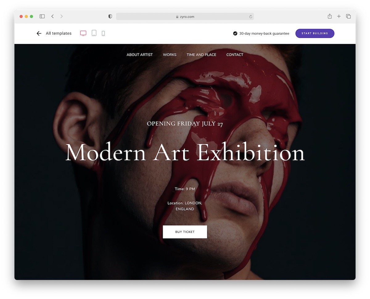
Ayomide’s versatility is endless, allowing you to build different art-related websites, including for conferences.
The ready-to-use template, internal pages and features are ready for you to mix and match. Build a website that’ll expand your business and bring more attendees to your exhibitions.
What I also like about Ayomide is its one-page layout. About, works, time, location and contact details are just a few scrolls away.
So quick. So awesome.
Make the most out of the web with Ayomide!
2. Demuxed

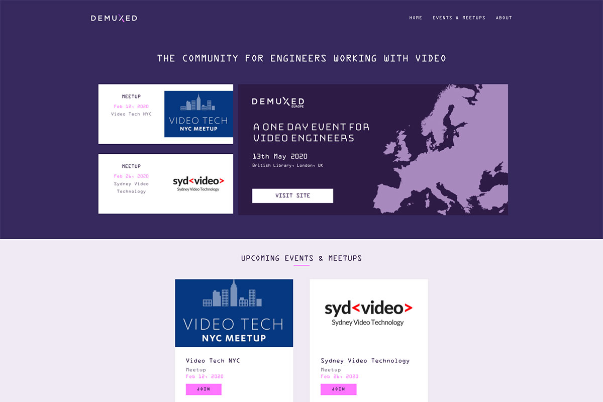
Hear about the latest research on conferences that can help boost your business. The conferences are a great tool to learn, share and innovate businesses. Here’s a cool, refreshing conference website design that inspires designers and event organizers. Demuxed is a conference website where engineers are talking all about video technology. It has a cool and creative design on the homepage with the necessary features it should contain. Having violet as the website’s primary color with ample white space, the overall design is ready to impress the audience. Aside from the awesome presentation of the speakers, this website also showcases a nice and attractive schedule of events. Also, the images look visually appealing with its asymmetrical layout.
3. VueJS

Conferences are essential for most businesses to help them grow and find more sophisticated solutions to various issues. If you’re a designer looking for inspiration to build similar websites, then this list of conference website designs is a must-see! VueJS is the World’s Most Special & Largest VueJS conference with 25+ Vue.js core members & experts. Its website has super clean, vibrant, and sleek, with cool animation. The homepage has awesome features ready to impress potential attendees, such as a beautiful hero header with a simple image background, descriptive CTA, and headline. Moreover, the simple presentation of the hosts behind this conference and the parallax effect add elegance to the design. It also utilizes a sticky header to keep the menu at hand.
4. Circle Conference

With the existence of the internet, digital marketing has become one of the most effective and popular ways to promote brands worldwide. In like manner, it also has become the greatest tool to host successful events in any niche. Here’s Circle Conference which has an exceptional conference website design. With the huge and bold typography this website utilizes, the homepage is awesome, impressive, and aesthetically pleasing. They are exceptional from big, quality images, asymmetrical layout, clean typography, consistency on web elements, and other essential components. Other notable features include social media icons, clear CTAs, an off-canvas menu, video integration, and more! It is a wonderful place to learn from world-changing thinkers and innovators for the creative community.
5. Aiga Design Conference

Whether you’re building a conference website from scratch or want to hire a designer to do the design for you, this handpicked collection is never a waste of time. Here’s Aiga Design Conference that you can take a look into. It’s the biggest event of the year for all creatives nationwide. The homepage has a nice design and looks elegant with a black background and red web elements. The hero header has an attractive design too – bold typography for the headline and clear CTA. Below the hero scene is a multiple displays of images highlighted using a smooth slider. In the same way, this website also utilizes a seamless slider for the speakers’ presentation. In addition, the social media icons on the footer never missed its role in the site’s success.
6. Loupe

High-quality conference websites can effectively boost the conference itself. That’s why it should be built with user-friendliness without compromising the design. Loupe is a conference from Framer in interactive design and creative coding. It is built to easily and effectively promote upcoming conferences to engage more attendees. While other websites have ample web elements on the homepage, Loupe uses less but engaging components. Specifically, it has a simple vertical menu and square boxes that display a beautiful spectrum. It also integrates a video recap on the previous conference and a recap page. The tickets page also has a simple but visually appealing design. Similarly, the about and FAQ page are even more interesting.
7. Phocuswright Conference

Conferences can provide a huge insight into various industries. If you’re looking for a great inspiration to finalize yours, this conference website design is not in vain. Here’s Phocuswright Conference that focuses not just on travel but also on technology and innovation. It’s a meet-up that connects attendees with the industry’s most significant leaders like Airbnb, Google, IBM, Kayak, Booking.com, and other biggest names in every travel sector. The homepage has a super vibrant and sleek design with amazing elements. The hero scene are the CTAs that are fully useful, a nice bright graphic design, and a cool menu. Since navigation plays a critical role in the overall design and usability, this website ensures that navigation is easy and quick with the sticky menu. Other pages include sponsors, speakers, news, venue, and more!
8. ECommerce Conference

Organize your conference with a website that will aid you in setting it up efficiently. You might find this helpful inspiration if you plan to build it soon. The eCommerce Conference is the first and only association aiming towards inclusive e-commerce. Its mission is to create a future for eCommerce growth, support e-commerce companies’ interests, and contribute to the knowledge and diffusion of e-commerce. As the homepage plays a vital role in the success of every website, the eCommerce Conference ensures the homepage is well-designed and fully organized. The hero header has a bold headline with CTA and a simple background. Moreover, the speakers and moderators section also looks superb, utilizing a clean layout and a cool hover effect.
9. Lines Conference

Advertise your conferences or events with ease as you opt for conference websites. If you need one for your upcoming project, here’s Lines Conference that you shouldn’t miss. This conference is for the wordsmiths, the content strategists, and the unique individuals who like to “communicate to the world in 140 characters”. This is also ideal for individuals who see social media as their platform and modern technology and their megaphone for their voices and ideas to be heard. This conference has a corresponding wonderful website to promote its goals worldwide. It has a simple but professional-looking homepage with awesome features. Check out other amazing components you can apply to your project soon.
10. We Cargo

Indeed, conference websites that offer a good user experience to the audience can greatly increase the engagement of possible attendees. So, it is necessary that before development, ample time should be spent in planning. Hence, you might be interested in checking this conference website design. We Cargo is an initiative of Liege Airport & Leansquare that focuses in the innovation of the air cargo industry. Its website is visually appealing with awesome features and elements ready to wow every audience. The homepage looks great with the super clean layout, good typography, simple layout coupled with the GSAP animation. Aside from the exceptional animation, it also has an elegant dropdown menu, fantastic hover effect, and more. See other notable features in this inspiration.
11. Digital Design Days

Sometimes, it needs a creative mind to effectively convey the message on your website. This way, potential attendees will have a good impression of the conferences. So, conference website designs will surely inspire creativity among designers and moderators who wish to build their websites. Digital Design Days comes with a creative and modern design perfect for inspiration. It’s a global meeting point of the digital design industry. It’s where thousands of the world’s best professionals with the brightest creative minds meet. Particularly, it has an attractive design of homepage to draw more users to the website. It has a nice animation on the hero scene with social media links, headlines and off-canvas menu.
12. Gramado Summit

Conferences bring new opportunities for entrepreneurs and businesses. That’s why many conferences are held everywhere. If you’re working with a conference website design, this Gramado Summit aims to transform the entrepreneurial reality and join innovation, communication, and technology pillars. The website has an exceptional design and looks more engaging with implementing GSAP animation. The homepage contains various web elements such as a ticker for the display of available tickets, attractive gradient web elements, seamless video compilation with cool hover effects. Moreover, it also implements the off-canvas menu, social media links, cool newsletter, awesome testimonials, and more. Additionally, the ticket page also has a nice and vibrant design.
13. SISO

Conferences are one of the effective tools to build and improve businesses. No wonder why numerous conferences are held in different places. Meanwhile, having a website is one of the best ways to spread awareness of such conferences. Here’s SISO CEO Summit which has a great conference website design. It’s the networking and information-sharing event for the global show organizers, both large and small. The hero scene is a beautiful display of content using a split-screen layout. The website uses blue as the primary color and has good typography. Moreover, the slider highlighting various content adds elegance to the design. Other awesome features include social media links, video integration, sticky header, and clear CTAs.
14. Coworking Europe

Scroll through these conference websites that will help moderators build an appealing website. Here’s Coworking Europe, an annual conference focusing on entrepreneurship, innovation and the future of the workplace. With more than fifty speakers and panelists ready to share their thoughts and best practices to 600+ attendees all around Europe, North America, and beyond. This website welcomes the audience with a descriptive CTA, headline, and engaging video background. To improve audience retention to the website, it utilizes a sticky menu so it’s much quicker to navigate to other pages. It also comes with a neat and clean pricing table and an awesome testimonials display using a smooth slider.
15. Meetings International

With the strategic objective of Meetings International, which is to communicate science and medical research between academia and industry, it has become one of the global leaders in producing high-quality conferences. Its website has a modern, sleek design, clean layout, and vibrant web elements. It’s the perfect portal for both moderators/hosts and attendees. Ready to build the connection for both parties, the audience can easily search for the conference visible on the hero header. Similarly, the upcoming meetings look professional and creative with the card design. The sticky social media icons on the sidebar provide easy access to the firm’s social media pages. Also, the sticky header is used to retain the audience.
16. Get Your Leach On (GYLO)

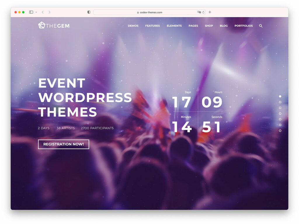
Create a great conference website to help you effectively promote and advertise goals and missions. If you need inspiration, this handpicked collection will be valuable. Here’s Get Your Leach On, that’s ready to inspire you. It’s one of this collection’s most vibrant and colorful website inspirations. Typically, the homepage creates the first impression on every website. Therefore, GYLO puts emphasis and dedication to making an excellent homepage. Specifically, the hero scene displays a countdown timer with a smooth slider as a background. It uses huge boxes with cool hover effects to present the firm’s expertise and capabilities. It also integrates the video to deliver the messages more clearly. Furthermore, the upcoming conferences look neat and innovative, with a gallery-style display using card design for each event.
17. The Next Web Conference

Don’t miss these conference websites that will take yours to the next level! The Next Web Conference is one of the most innovative and enticing in this list. The images look great and creative, utilizing an asymmetrical layout on the hero header. Of course, the CTA and headline are never boring, not to notice them. Aside from the sticky header, it uses for quick and easy access to other pages, the upcoming conferences even look gorgeous with the magazine layout it implements. Each speaker is represented by a small box with a grayscale photo for the speaker’s section. That’s not all since the newsletter subscription is one of the most practical and powerful tools to promote upcoming conferences, this website never misses adding it on the site stylishly. The testimonials and brands that trust this firm also look great and innovative.
Was this article helpful?
YesNo
