Do you know how powerful your website can be with the WordPress platform? Perhaps you’re wondering how other brands stood out in their highly competitive industries. If you plan to adopt WordPress to your website you shouldn’t miss these grandeur and exceptional WordPress websites as inspiration.
Undeniably, WordPress is the world’s most popular content management system. It started as a blogging tool but has become a powerful website builder that most established brands trust. Accordingly, it empowers 43% of all websites on the internet as it benefits various brands. If you haven’t learned how powerful and flexible this platform is, perhaps it is time to explore it for your website’s success. One of the essential reasons WordPress stands out is that search engine loves WordPress websites. This means that getting high ranks in search engines is much more possible and effective. Apart from that, extending the site’s functionality is possible, easier, and seamless with the numerous free WordPress plugins available for different websites. After all, that is the essence of having a web presence.

Looking to build a WordPress website?
Here are the best WordPress themes with drag-and-drop page builders, countless starter templates and much more. Building a website has never been easier!
Today, we’ve handpicked exceptional websites that are WordPress-driven to give you outstanding inspiration. No matter what type of business you’re into, exploring these websites won’t be a waste of time. So, check them out and get inspired!
Best WordPress Website Design Examples
1. 277 Fifth

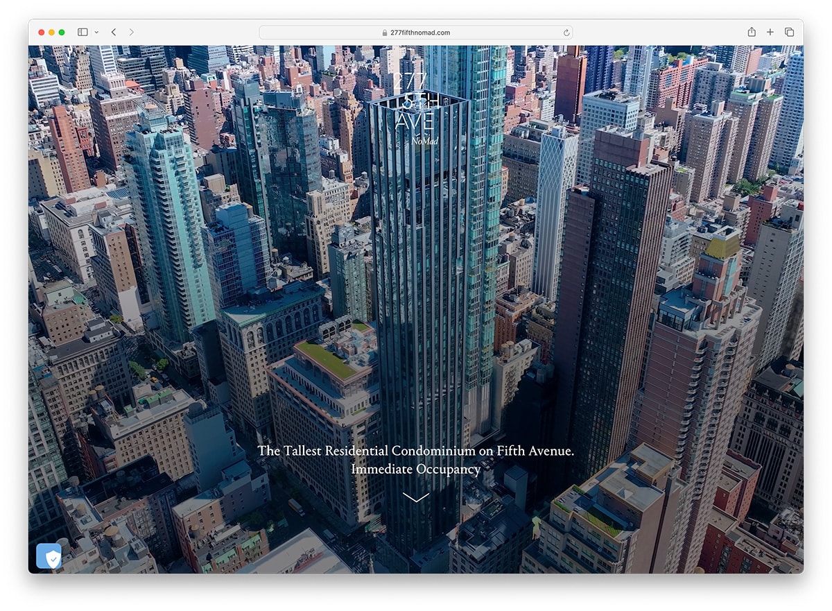
With the power of WordPress to provide a user-friendly user interface, it has become a seamless tool for designing, publishing, and updating websites. You will find excellent web design ideas in these WordPress websites list. 277 Fifth is a modern residential tower designed for an international audience by visionary architect Viñoly. Upon landing on the site, it displays the name of the brand with black background. Once the user scrolls down, the beautiful interior design image is warm and welcoming. It then introduces the brand with a little description and a quality image. In addition, it also integrates a video that features the architect for further introduction. The sticky header bears the menu for navigation so they’re always visible on different pages.
2. Suso Digital

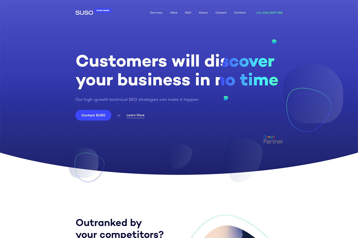
WordPress platform elevates functionality and flexibility to the next level. Here’s a collection of WordPress websites that’s worth checking. Suso Digital leverages the power of technical SEO to help clients grow their online revenue. The website design is clean, modern-looking, and has advanced features. The hero header is simple but elegant and sleek on blue background with white typography and descriptive CTAs. For the introductory section, video content with specific steps on managing their work is added. This brand also shows how they help clients get top ranks at Google. That’s not all. The presentation of their recent works looks superb with a short testimonial.
3. Lianz Surfaces

Do you know why WordPress has grown so much in popularity? Well, with the flexibility and the awesome functionality it offers to every website, it’s hard to resist its power. You might want to consider these WordPress websites in your next web design project. Lianz Surfaces is a brand that delivers beautiful & premier timber flooring to its clients. Its website has a unique look and feels to make it stand out. The homepage design is welcoming with the video background it integrates with the headline and call-to-action button. The presentation of the projects they’ve worked on looks great, too, with stunning images and bold typography. That’s not all. The product it offers appears attractive with a nice hover effect.
4. Yukon 1000

Integrating WordPress into your website will make your management quick and easy regardless of the services you offer to your customers. In this awesome collection, you will find various WordPress websites to help unleash your creativity. Yukon 1000 is the world’s longest paddle and the toughest survival and endurance race. It has a remarkable design with exceptional features that stand out. Through the GSAP integration, the animations look flawless and enticing. The hero header exhibits a big and bold headline, captivating CTA, and overlapping elements. Furthermore, the display of awesome images also appears attractive with the slider it uses.
5. Sarah Jenks

Here’s another gorgeous WordPress website that can motivate fellow professionals and entrepreneurs to create similar websites. Sarah Jenks is a life coach, emotional eating expert, and sacred space holder. She has not ignored this outstanding platform for her career and reaps awesome results. The website design implements the visual hierarchy to arrange the contents according to importance. The hero header exhibits her photo with her name on top and irresistible headlines. To entice more clients, she offers a useful freebie on her website. Moreover, she has added a special blog section with a stunning hover effect. That’s not all, the magazines that featured her expertise look great on grayscaled icons.
6. Bateaumon Paris

It may be hard for you to find the best inspiration with many WordPress websites. Bateaumon Paris offers professional or private events on boats and barges in Paris. The hero header exhibits a cool, retro style with simple typography and awesome hand-drawn arts. The presentation of the type of boats they offer to customers is as nice as its services. The user can click the designated passengers, and the clipart-style image of the boat displays. Aside from the visual hierarchy it applies, the overlapping of web elements is also remarkable. Other notable features include grid-style articles, sticky header, smooth slider, social icons, and more!
7. Kobu Foundry

If you’re looking for a content management system that promises to manage your business efficiently, you should consider WordPress. It’s a popular platform that helps you quickly and easily manage the content of your website. Here’s KOBU Foundry, a KOBU Agency project that focuses on developing customized fonts and best-suited typographic projects. This eCommerce site ensures that buying the best fonts is possible and speedy. The hero header has a playful flair that makes it look interesting. The slider highlights the featured ones smoothly to display more of its awesome fonts. The best sellers section also exhibits the fonts that capture the heart of most customers.
8. Dafi

Get inspired with these WordPress websites to help you achieve your web design goals. Check out Dafi, a brand studio that molds organic ideas into sleek creations. It features a fullscreen layout on the homepage with cool slider that showcases various products through video content. As the user hovers on the menu, the products are displayed as image background. The products page also appears grandeur with similar awesome animation it manifests. With the integration of GSAP, the animations on transitions add elegance to the look and feel of the site. Moreover, the animation upon scroll also makes the content shine.
9. Bersus Design

Bersus Design is a brand that helps new projects and startups with web design, mobile UI/UX, music, and even photography. It’s a portfolio of Den Sabrov, a designer, product manager, and team leader. The web design looks elegant with the perfect combination of white and black. The site also shows simple and subtle animation through the GSAP animation. The introduction of the designer is enticing with a nice animation it shows on web elements. Each of the service sections looks grandeur with the simple hover effect it implements. Apart from that, a slider highlights some of his recent works. Of course, social media links are necessary for further marketing hence this website includes them in the footer.
10. Pacvac Velo

Pacvac Velo is a product web design and a single-page WordPress website with scroll-based animations and parallax effect. The overall design is pretty impressive as it uses GSAP animation to introduce the awesome product. It features a simple design on the hero header – a quality image, enticing call-to-action, and a tagline. With this microsite, the user can examine the product specifications as the user scrolls the page. It even uses remarkable animations on every section of the website so users will never get bored; they’re all eye-catching. The user can easily book a demo, get a quote, and connect with social media accounts through this website.
11. Tour Partner Group

Tour Partner Group is expert in developing European tours for the travel business and creating authentic experiences and memories that last a lifetime. Their services to clients are clear and well arrayed as part of the introductory design. As WordPress drives it, it’s truly easier to manage content effectively. Specifically, a nice slider welcomes the audience, highlighting some magnificent images. The colorful icons are also added on the site to allow clients to browse for the best services they can avail themselves. Additionally, the slider is also utilized for the showcase of captivating images. If clients still need more details for certain service, brochures are available in the site too.
12. Brooklyn Brewery

The WordPress platform offers more wonderful opportunities for brands to shine in different industries. That’s why many brands have taken advantage of this platform. For Brooklyn Brewery, such platform shouldn’t be missed. So, it embraces WordPress to improve its web presence. It’s a leading global independent craft brewer and a pioneer of the American craft beer revolution. Like other awesome websites, it displays images that bear the brand’s logo through a slider. The website must inform the customers of the important details, ensuring that the holiday and shop hours are visible. Also, the video integration is added to the site and the animation upon scroll, social icons, and more.
13. Junction

The popularity of WordPress is great proof that it can offer flexibility, great functionality, and intuitive designs. You should look into this inspiration if you wish to have more ideas on creating an impressive site. Junction is a design agency that believes impactful solutions are made when creativity, media and technology meet. This brand likes to find, create, build and improve those solutions effectively. Looking neat, clean and modern, the hero header exhibits simple layout. The homepage design looks grandeur with quality images all over it. Meanwhile, the logo and the off-canvas menu are always visible on the header so clients can easily access the necessary pages of the site and branding.
14. Rino-Pelle

It’s no doubt that WordPress can empower one’s company website. Therefore, businesses should not ignore it as part of their strategy as much as possible. You will learn how awesome your website can be with WordPress in these WordPress websites. Rino-Pelle is a luxurious and contemporary fashion brand with an outstanding website. The hero header is simple but looks elegant with thin, sleek typography.
Additionally, the animation upon scroll adds charm to the design. The overlapping of images and the attractive CTA coupled with white space are indeed stunning for the latest collection. To ease browsing the collection, this site displays images upon hover.
15. de Staat van Creatie

Check out these adorable inspirations of WordPress websites and get more wonderful ideas for your brand to shine. de Staat van Creatie is a design agency passionate about creating unique websites and webshops focusing on user-friendly interfaces. The homepage features a smooth horizontal and vertical scroll. It welcomes the audience with a masonry layout where the content is placed in those grids. This website lets the visitor make an appointment easily, email, or use the contact number to connect with the brand.
16. Eu Travel Tech

Eu Travel Tech uses technological expertise and its position at the center of the treatment and tourism sector to contribute constructively to policymaking. Being part of these WordPress websites embraces a powerful website builder and content management system. This site uses a video background on the hero header to be more enticing. Notably, the homepage has amazing features and white space to make them look interesting and outstanding. To improve the brand’s credibility, the members or clients are arrayed in grids using grayscaled logos. It also uses a sticky off-canvas menu and search function.
Was this article helpful?
YesNo