Boost your creativity and improve your web design skills as you browse these retro websites collection. Whether you’re working with portfolios, photo studio websites, designers, eCommerce, or travel companies, retro designs can help you create stunning web designs.
The retro style of websites is gaining popularity among designers. By adding modern flair to the design, websites that embrace the retro or vintage style stimulate a good impression. Various websites that borrow the designs from the past look exemplary. Combining past and modern elements yields creative, beautiful, and memorable designs. Additionally, they even look modern and innovative with the functionality they implement. Of course, these retro themes are also timeless! If you plan to adopt it into your upcoming projects, you may want to check out these awesome, fun, and interactive retro websites we’ve handpicked. These websites are recognized by Awwwards associated with the best retro websites. Meanwhile, the digital marketplace has much more to offer your brand regarding retro web design.
Check out these creative, fun, vintage ones with a modern flair to help unleash your creativity. Your website should best represent you worldwide. Hence, you should always strive hard to make them stand out! So, if you’re looking for graphic design ideas, you shouldn’t miss these wonderful retro websites.
Best Retro Website Designs
1. Caava Design

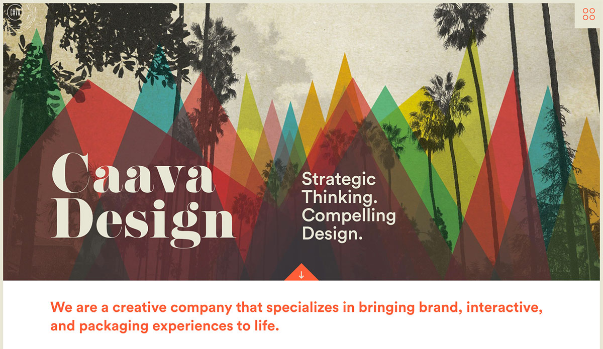
There’s no doubt about the effectiveness of digital marketing in the success of most brands. Likewise, retro-styled websites are still powerful schemes to boost one’s brand. Caava Design is a creative company in San Diego specializing in Beijing brand, interactive and packaging experiences to life. The web elements though retro or vintage-looking, have classy and professional designs. Moreover, this website also utilizes less saturated retro colors, thus creating an old vintage feel. Fantastic and notable features can help other brands shine, like parallax effect, cool off-canvas menu, slider, and more. The services section stands out in circles and has a nice hover effect. What’s more?
2. Virtual Gas Museum

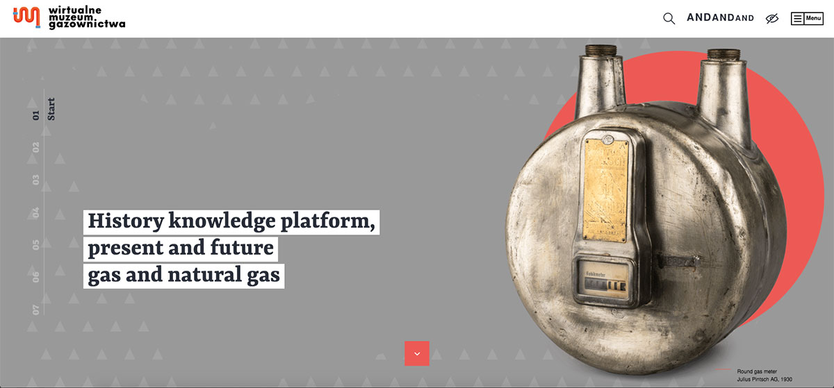
Effectively expand your market with a retro website that’s creative enough to represent your brand. Here’s a beautiful set of retro websites that’s motivating and awe-inspiring. Virtual Gas Museum is a website platform for knowledge about the history, present and future of gas and natural gas. It’s addressed to people interested in the gas industry, and enthusiasts of engineering or technology. The website manifests retro style not just on web elements but also on product images. The web design is stunning and excellent for the colors used in this website, the typography, and the simple transition effect. It also uses sliders, sticky header, off-canvas menu, and video integration.
3. Basement

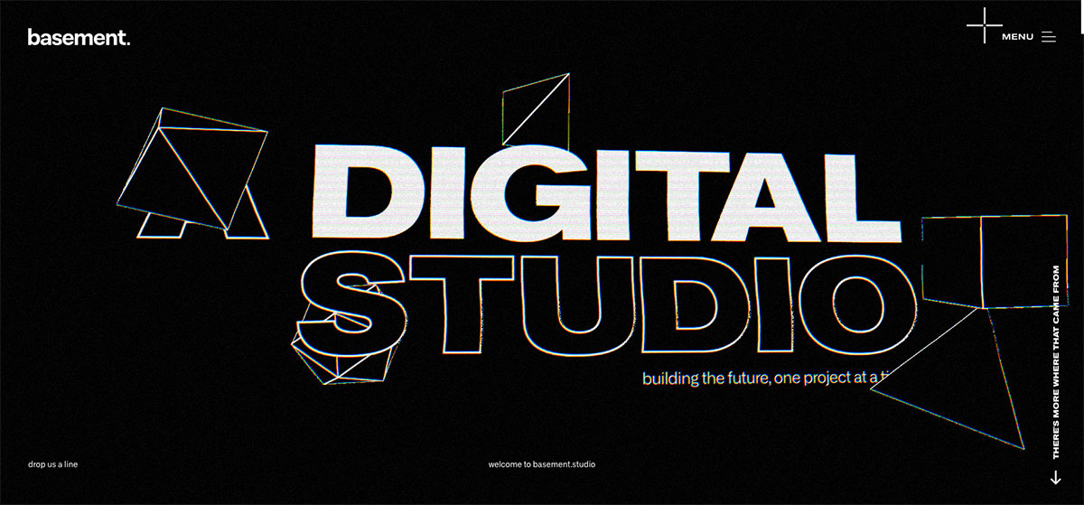
The retro-style never loses its popularity even in modern life. Here’s a list of retro websites providing abundant styles you can explore. Basement is a digital studio that builds the future, one project at a time. This retro website features a simple but comprehensive design on the homepage. It uses black and white on all the web elements and stands out with a simple design. Specifically, the hero header exhibits the brand’s name, what it does, and geometric shapes. The clients’ logos are arrayed well to improve the brand’s credibility, so they look attractive. Other cool features include an off-canvas menu, social media icons, a nice hover effect, and more.
4. Blast Galaxy Store

Retro websites are trendy and creative. That’s why it has become a popular web design idea among designers. In this collection, you’ll find awesome inspiration to influence your project. Blast Galaxy Store is a retro-styled site with a simple, beautiful, and unique design. The pixelated typography it uses is a complete replica of the old style. The hero header features the brand’s name, search, menu, and shopping cart. The products are showcased in grids with clear call-to-action buttons on this web page. Furthermore, those products have a simple but captivating design.
5. Resp

More and more brands have adopted the power of retro websites in spreading awareness. These websites will be valuable if you wish to consider it for your project. Resp is a smart cinema assistant and TV shows streaming tracker with retro style design. The homepage is amazing, from pixelated icons, logo, and typography. It utilizes fullscreen to exhibit the web components, including cute, tiny icons, clear CTA, search, nice hover effect, and more! The white typography also shines stunningly on a black background.
6. Harvard Film Archive

If you work with retro websites, it’s best to look into other brands that have seamlessly integrated it into their website. Here’s a creative list of retro websites for inspiration. Harvard Film Archive is a cinematheque and a film archive dedicated to the preservation and public exhibition of the film. Accordingly, the retro style coupled with modern web elements will make the website shine. This website manifests a vintage style on its images, typography, and layout but makes them look modern with the integration of the GSAP animation. The images have a grunge style highlighted using a smooth slider. To offer easy-to-use navigation, it uses a sticky sidebar menu.
7. Rooki

Despite the advanced and modern web technology, the retro style design has never lost its sense. So, considering it for your business isn’t a waste of time. Rooki is a young, independent designer and a director who embeds the awesomeness of retro or vintage design on its website. The site displays grunge-style textures and utilizes a retro background. The hero header shows the brand’s name, barcode, menu, and a grunge-textured image of the featured interview. Particularly, the other site pages have a similar design quality but are resourceful. It includes interviews, articles, resources, students, and more!
8. Three59

The web has a lot to offer regarding retro website inspiration. Retro colors are a great way to give your website a vintage feel. Here’s Three59, one of the great examples of this vintage or retro style list. It’s a full-fledged advertising and media services provider based in Dubai Production City, United Arab Emirates. The design of the homepage looks simple with a fullscreen layout. The slider beautifully showcases the products individually and even manifests smooth and sleek animation through GSAP. Aside from that, the audio enhances the design, the nice logo, and the off-canvas menu. It also integrates social media icons to boost the brand’s organic visibility.
9. Park West Event

Pick one retro style you want to embed in your design to invoke the brand nostalgia you prefer. Then, add a modern touch to your design to look magnificent. Here’s a cool list of retro websites worth spending time with. Park West is a concert venue located in Chicago, Illinois. This theatre opened in 1916 as a vaudeville and movie theatre by the Ascher brothers. Particularly, it can house up to 1000 guests. With the desire to incorporate a vintage feel into the site, colors, typography, and grunge textures are retro. Moreover, the nice hover effect also charm the design and the simple animations.
10. Getaway House

Retro design is fun, dynamic and awesome, especially if you add a touch of creativity and advanced features. With these retro websites, you will have ample web design ideas that will uniquely motivate you to craft your project. Getaway House is a hospitality brand that builds beautiful tiny cabins in the woods and encourages the world to disconnect from technology and reconnect with nature. This website has a whimsey design with comprehensive web design elements. It features various retro images on the hero scene via slider with clear CTAs, compelling taglines, and the reservation form. Furthermore, the vintage icons, typography, and images perfectly manifest awesome design. Other notable features include sticky header, accordion, Instagram feed and more.
11. Tens

Check out these wonderful retro websites that will serve as a marvelous inspiration. Tens is an independent subclass company that prides itself on seeing things differently. This eCommerce website has a simple but captivating design on the homepage. The hero header features a split-screen layout where the image, tagline, and CTAs are well organized. Aside from the vintage colors it applies, the images also appear retro-style. The featured products look outstanding while the customer reviews in a slider are visually appealing. Other wonderful features include sticky header, Instagram feed, line icons, video integration, and more.
12. Hypergiant

Here’s a selection of retro websites that can kindle the interests of brands that wish to integrate retro designs into their projects. Hypergiant is an AI provider for the Fortune 500. The website features playful colors and the retrofuturistic vibe alludes to when we felt the future was just around the corner. Particularly, the vintage background image and simple typography greatly resemble retro design. Additionally, the borders of web elements also add creativity to the overall design – from buttons, services, a list of abbreviated services, clients list, and more. In addition, the social media icons on the bottom, sticky header, and off-canvas menu are impressive.
13. Martens Brewery

This collection of retro websites manifests different retro styles, but they are magnificent. So, browse this list and get motivated. Martens Brewery is a proud and ambitious family business that has already been at the top of the Belgian brewing industry for eight generations. With the high-quality products they offer, its website reveals similar design quality. Embracing the GSAP animation, the web elements shows cool and subtle animations. The presentation of the products is seamless and intuitive using a slider. It also features a sticky sidebar, so the menu is always visible. Other beautiful features include Google Maps, a smooth transition effect, and more!
14. Global Welsh

Vintage styles are timeless and even look more gorgeous when added with modern flair. Have a glimpse of these retro websites that will inspire you in your next web project. Global Welsh is a growing global community of people with an affinity for Wales. It is committed to creating new connections, opportunities and ideas to benefit Wale’s future. The hero header features a great vintage-looking video compilation with a call-to-action button and headline. The logo represents the brand and social media icons in the header. Since it uses a sticky header, the menu is always at hand to easily navigate the site.
15. The Best Reason

This retro website is another awesome inspiration to cherish if you plan to utilize it for your business. The Best Reason is a surreal, vintage design that presents 8 different reasons to choose Domaine Glinavos. Notably, the homepage is a beautiful video integration in full screen layout with audio and CTA. Each of the 8 reasons in trusting the brand is presented professionally and has awesome pages that users can easily explore. The website’s vintage color looks superb and even manifests a cool transitional effect.
16. Our Stories In STEM

Here’s another vintage or retro website that has the potential to inspire other brands. Our Stories in STEM has a nice landing page that promotes the Kickstarter campaign for “Our Stories In a Stem”. It’s a book celebrating Canadian women changing STEM today to inspire STEM professionals of tomorrow. The hero header welcomes the audience with colorful vintage icons with the brand’s name, CTA and menu. Video integration is ready to provide a clear idea of what it does to fully introduce the brand.
What’s more? This eCommerce website uses a card design to display products nicely. It also uses a slider to showcase more of its amazing product.
Was this article helpful?
YesNo