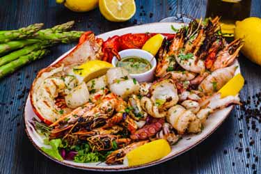
غذاهای دریایی مانند میگو و ماهی سالمون با داشتن آنتیاکسیدانی به نام «کاروتنوئید آستاگزانتین» دارای خواصی ضدالتهابی برای محافظت از غشاهای چربی در پوست ما هستند.
همچنین استفاده از مواد مغذی حاوی ویتامین سی، کلاژنسازی پوست را بالا میبرد و از پیری زودرس و تیرگی پوست جلوگیری میکند.
مرغ حاوی روی است که در برقراری تعادل بین هورمونها و سطح تستوسترون به بدن کمک کرده و در تولید کلاژن و از بین بردن لکههای پوستی بسیار مفید است.
بیوتین نوعی از ویتامین بی است که به نام ویتامین بی ۷ نیز شناخته میشود. تخممرغ از این ویتامین سرشار است و مصرف آن به جوانی و شادابی پوست بسیار کمک میکند.
آووکادو از انواع میوههاست که چربیهای سالم و ویتامین ای موجود در آن به رطوبت پوست کمک میکند.
مغزهای موجود در آجیل نظیر بادام و گردو، حاوی اسیدهای چرب ضروری امگا ۳ و امگا ۶ هستند که علاوه بر تاثیر در کاهش التهاب در روده و پوست، به تنظیم چربی و رطوبت پوست نیز کمک میکنند.
متخصصان همواره از اهمیت مصرف زیاد آب و نیاز بدن به این مایع حیاتی سخن گفتهاند. کمبود آب در بدن و پوست فاقد رطوبت، منجر به نمایان شدن خطوط ریز، چین و چروک، لکهدار شدن پوست و پوستهپوسته شدن آن میشود.
این مطلب از سایت ایتنا گردآوری شده است.
منبع: ایتنا