Do you want to check a bunch of Squarespace blog templates so you can start blogging like a pro ASAP?
It doesn’t matter what niche you want to enter (food, tech, DIY, golf, etc.); the right template can make your blog stand out and speak volumes.
In this article, I’ve rounded up the best Squarespace blog templates that are beautiful, user-friendly, and versatile.
Each is designed to help you showcase your stories, visual content, and ideas in the most captivating way possible.
And the best part?
You don’t need to have any coding or design skills to start a blog with Squarespace. Anyone can do it today!
You’re just a few clicks away from finding the perfect backdrop for your blog that feels as unique and inviting as the stories you’re eager to tell.
This post covers:
Best Squarespace Blog Templates
Below is a handpicked selection of gorgeous designs that promise functionality, aesthetics, and the perfect canvas for your blogging journey.
Are you ready?
Note: For inspiration, check out these great Squarespace blog examples.
1. Crosby
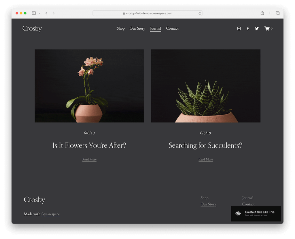
Crosby is a gorgeous, dark, minimalist blog template with catchy elements to spice things up, such as animated thumbnails.
The header disappears when you scroll down and reappears when you return to the top, ensuring a clean, clutter-free viewing experience. On the other hand, all the necessary links are always within reach.
Moreover, each blog post page has previous and next buttons at the bottom to keep investigating content without needing to go back.
2. Clove

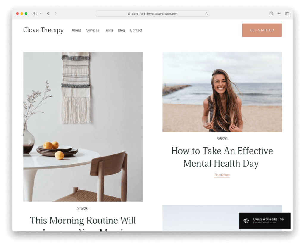
Clove is a fantastic Squarespace blog template with a clean, simple and modern design. The header, base and footer all have the same white background, creating a pleasant atmosphere.
The base features a boxed two-column grid layout with plenty of spacing to ensure images and titles pop nicely.
Avoid complication and fancy design elements with Clove and create and strong and lasting first impression.
3. Altaloma

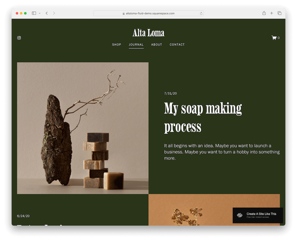
Altaloma has a smooth single-column blog post layout with content loading while you scroll.
It alternates between images, titles, and excerpts, making the scrolling more dynamic. The necessary white space is also present, guaranteeing improved readability and UX.
Blog post pages are neat and boxed without a left or right sidebar to ensure the focus is on what matters most – content.
In the footer, there is an IG link, menu, and newsletter subscription widget for taking action without needing to scroll back to the top.
4. Laurie

Laurie knows how to grab attention with great detailing in the form of red typography, icons and CTA buttons.
The three-column grid displays blog posts with “read more” buttons for easy access. Blog pages have featured images with the main content area and details section on the left. Handy!
The contrasting yellowish footer stands out nicely with essential links and a subscription form.
While black text on a white background is the most common, why not use a red one?
5. Comet

Comet is a Squarespace blog template ready to present all your amazing content ideas beautifully and user friendly.
The clean, light grayish background, combined with black typography, works fantastically well. Enhance the experience with stunning visuals, and everyone will be craving your content right from the get-go.
Moreover, the header with menu and login links and social icons stick to the top of the screen for convenience.
6. Cedar

Cedar is a gem for bloggers who love simplicity with a punch. The posts are neatly organized in a two-column layout, making browsing easy. The large titles grab your attention without screaming for it.
It’s minimalist, yeah, but each element, from the basic header to the hefty footer loaded with links, social media, and a subscription form, feels thoughtful.
Cedar is inviting, warm, and just the right vibe for storytelling.
7. Penny

Penny is a trendy yet well-organized Squarespace blog template where everything has its spot.
It kicks off with a large header that smartly houses your categories. There’s a cool twist with dedicated spots for both featured and popular posts, making your main attractions impossible to miss.
Love a bit of drama? The dark section for sponsored posts adds that perfect contrast.
Recent posts in a two-column layout keep the vibe fresh, while the dark footer with an email opt-in wraps it up neatly.
8. The Blog

The Blog template takes what you love about Penny and dials it up. Scrolling through the layout feels familiar but surprises you with unique sections that pop out, making your browsing journey way more engaging.
Content magically loads as you scroll, keeping you hooked without the wait. Furthermore, with handy previous and next links, jumping between posts is a breeze.
And it’s all framed by a header and footer that neatly combine simplicity and practicality. It’s like Penny’s cool, slightly edgier sibling.
9. Prism

Prism has a top bar notification that’s easily collapsible by clicking “x.” The header is simple with social icons, menu links and a CTA button, so those interested in working with you can send a query right away.
However, you can use that CTA for something else, too.
The layout is engaging, with colorful sections that keep you glued to the screen. There are also blog post carousels for quickly skimming through popular content or other content.
Prism also has an Instagram feed, a subscription form, and an online shop section to sell stuff online easily.
10. Fidelity

Fidelity is the Squarespace template that’s all about showcasing your content in the most stylish way possible.
It’s like walking into a gallery where each piece is perfectly placed.
The full-width slider is your spotlight, ready to highlight your star posts. Remember, you can change its location to where you think would fit best.
There’s also a featured posts section that acts like a curated exhibition of your best work. And for those who love to dig deeper, there’s a neat search option to explore recent posts by topics.
11. Perfectionist

What I really like about Perfectionist is that the hero section has a convenient search bar in the center with an option to browse by different topics. And yes, a search bar on a blog is a must, regardless of how well-structured your menu is.
The layout is then broken down into multiple sections with different backgrounds, so scrolling and finding content doesn’t get boring.
While the menu isn’t that big of a deal, the footer is packed with goodies, including an Instagram feed.
12. Stories

Stories is that Squarespace template that whispers elegance right from the start. It includes a unique above-the-fold section that draws you in with a drop-down menu to browse through topics.
It’s got an airy light header that feels like a breath of fresh air, contrasted by a grounded, dark footer.
Posts line up in a single column, with thumbnails on the left, while categories, titles, and “read more” invites glide on the right.
Stories is storytelling – redefined.
13. Indie Studio

Besides the main navigation in the header, Indie Studio also has a secondary for browsing blog categories.
This Squarespace blog template rocks a gorgeous, bold structure with large thumbnails, making each post even more inviting to read.
If you scroll all the way to the bottom, you’ll notice a large footer with menu links and a spot ready for the Instagram feed.
The single blog posts are simple and basic, ensuring content is easy to digest.
14. Rosée

Rosée is the chic, minimalist Squarespace template you can’t help but check. The blog hero section warmly introduces you to the blog, setting the tone for what’s to come.
What’s more, posts on the homepage are presented in a boxed layout, with large, captivating images that tell a story before you even click.
Scroll down, and you’re greeted by a dark, sophisticated footer, neatly organized with columns for about info, social icons, menu links, and more.
15. Lora

Lora has a minimalistic introduction above the fold through a short blog description followed by category links for quick finds.
Following is a large three-column blog post grid with decent spacing to easily skim through.
Single posts are without sidebars but feature links to previous and next posts. A pleasant reading experience? You bet!
16. Boho Social

Boho Social is a cool Squarespace blog template where every detail feels intentional yet relaxed.
Its bright design has a clean, white canvas stretching from the header down to the footer, making everything feel cohesive and airy.
Right above the fold, the main blog categories are introduced through images that invite exploration.
And the heart of it? A large, two-column blog post grid that displays your stories in a layout that’s as open and welcoming as a sunny day.
17. Identity

Identity ensures vibrancy through its vivid color scheme, but thanks to Squarespace’s easy customization, you can change it however you want.
The header is separated from the base with a black line that makes it pretty original, while the footer is black and bold.
While the demo blog posts don’t show much, you can easily and quickly decorate them with your creativity, custom content, and visuals.
18. Arch&Gold

Arch&Gold is a sleek, modern template with thoughtfully placed elements for your convenience.
The search bar is above the fold, waiting to take you exactly where you want to go. Below that, browsing by category feels like flipping through a designer’s portfolio, thanks to a secondary menu that organizes content with a touch of elegance.
The grid layout presents posts visually satisfyingly, while a newsletter subscription section and a dark footer round off the experience with a blend of functionality and style.
19. Lemongrass

Lemongrass has a light and feminine vibe, making every scroll feel like a gentle breeze.
Just below the fold, there’s a special section that spotlights top posts, like a curated collection of moments. (Use it however you want.)
What’s great about Lemongrass is the corner dedicated to the author, adding a personal touch.
Furthermore, posts flow in a graceful single column, leading to a newsletter subscription and a colorful footer that carefully wraps everything.
20. Good Vibes

Good Vibes is all about organization while still delivering an awesome browsing experience.
This Squarespace blog template has a lovely structure that immediately immerses you in the content.
You can easily find the categories and topics, but you can also use the search bar if you want something specific.
It as well includes call-to-actions and a peaceful footer with a logo in the center and links on the left and right.
How To Make A Blog With Squarespace
Creating a blog with Squarespace is exciting, simple and quick:
- Sign up for Squarespace: Go to Squarespace.com and create an account. Choose the plan that best suits your needs, and you can start with a trial to get a feel for the platform.
- Select a template: Squarespace offers a wide range of templates tailored for blogs. Ideally, pick the tested and proven one from the above list (Remember, you can customize it later.)
- Customize your template: You can customize your chosen template by clicking “Design” to edit layouts, fonts, and color schemes. You can also add your logo and images to make the site uniquely yours. Squarespace’s drag-and-drop editor makes this process intuitive.
- Add blog posts: Navigate to the “Pages” section, find your blog page, and add posts. You can include text, images, videos, and more to make your posts engaging. Remember to categorize and tag your posts for better organization and SEO. (And don’t forget to use a search bar.)
- Adjust settings and launch: Before going live, adjust your site’s settings under “Settings.” You can set up your domain, SEO options, social media integrations, and more here. Once everything is set, click “Launch” to publish your blog.
FAQs About Squarespace Blog Templates
Can I switch templates after creating my Squarespace blog?
Yes, you can switch templates anytime. Squarespace allows you to change your template without losing your content, though some manual adjustments may be needed to fit the new template’s design.
Are Squarespace blog templates mobile-friendly?
Yes. All Squarespace templates are designed to be responsive, ensuring your blog looks great and functions smoothly on devices of all sizes, from smartphones to desktop computers.
Can I customize my Squarespace blog template without coding?
Yes, you can. Squarespace provides a user-friendly interface with drag-and-drop elements, allowing you to customize your template without coding. Some knowledge of CSS and HTML might be helpful for more advanced customizations, but it is not required.
Do Squarespace templates support SEO for my blog?
Yes. Squarespace templates are built with SEO in mind. They feature clean HTML markup, automatic tagging, clean URLs, and mobile responsiveness, all of which are favorable for search engine ranking.
Can I add social media integrations to my Squarespace blog?
Yes, integrating social media into your Squarespace blog is straightforward. You can link your social media accounts, add sharing buttons to your posts, and even display your latest social media content directly on your site.
Is it possible to add eCommerce features to a Squarespace blog template?
Yes. Squarespace provides built-in eCommerce capabilities that can be added to any template, including those optimized for blogging. This allows you to sell products, accept donations, or offer subscriptions from your blog.
Was this article helpful?
YesNo
