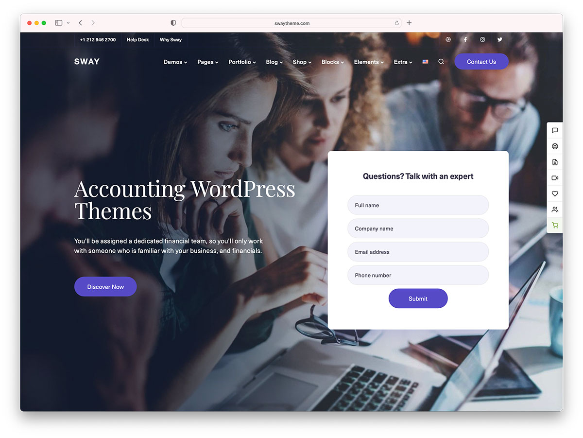
Are you an accounting firm offering a wide range of accounting services but not a highly professional website yet? If you are, you shouldn’t miss these accountants’ website designs we’ve handpicked for you.
Accountants are the financial backbone of businesses. Typically, they perform overviews of the financial operations to help the business run efficiently. Thus, organizations, companies, and even professional individuals can operate businesses efficiently. Like other professionals, accountants must have quality websites to increase prospects and unlock beautiful opportunities for career growth. As most people use the internet to search for products and services, it is ideal for every professional to build a web presence. An accountant’s website should mainly manifest competence, trust, and expertise. Such goals are possible when you plan, have the right tools, knowledge, and ample research. While hiring a website developer is a great choice and acquiring quick, easy-to-setup, ready-made, accountant WordPress themes is ideal, you might still need inspiration from accountants’ website design on the web.
Building an accounting website?
We have got your back! These amazing accounting WordPress themes will help you to get started today! Easy to use drag and drop page builders, hundreds of pre-made demo websites, and much more.
Since great websites can drive more potential clients to the business, we’ve collected these resourceful and modern website examples for you. These handpicked accounting websites have creative designs and cool features to inspire fellow accountants worldwide. Here, you can find simple but elegant designs, creative and stylish designs without compromising functionality. So, don’t miss this wonderful inspiration and acquire the best web design elements for your next accountant website design project.
Best Accountants Website Designs
1. Accounting Center “Tsifir”
A fully custom built website
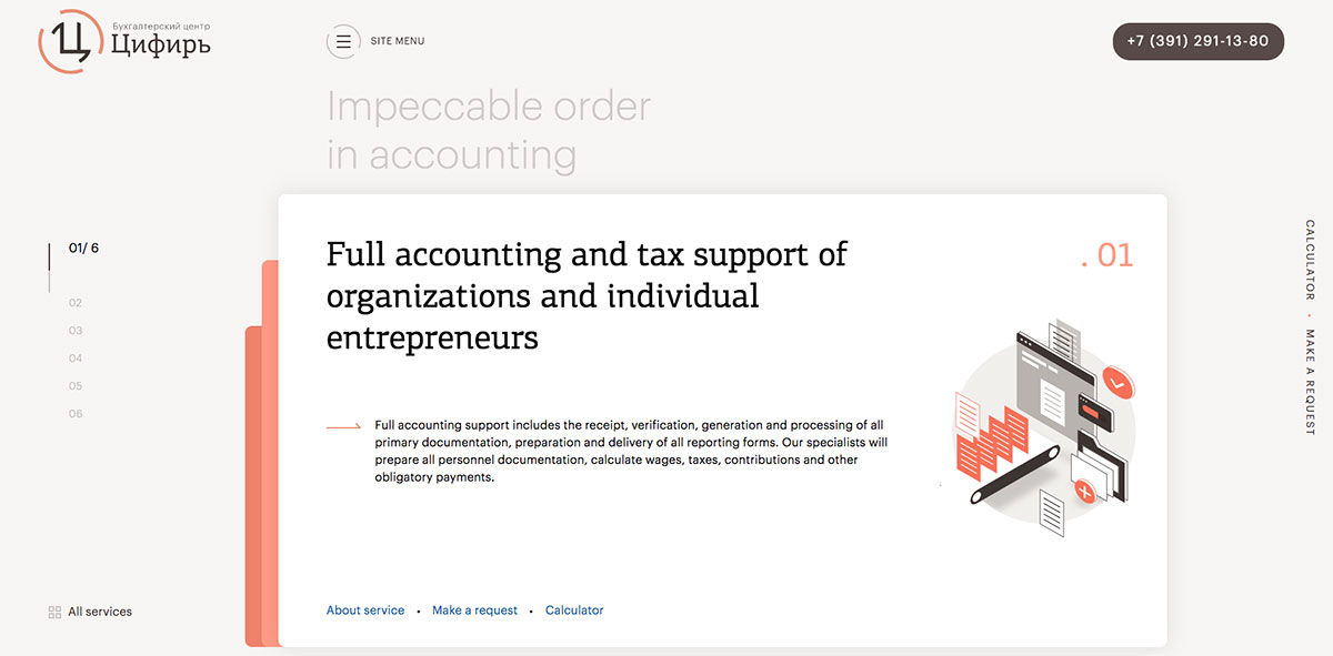
Make your accounting services prominent with a quality website representing your brand worldwide. If you haven’t finalized your website design yet, this accountant’s website design is a great inspiration to delve into. Accounting Center “Tsifir” has a creative and modern website design. It embraces the powerful and innovative GSAP animation on its website. Specifically, the homepage has a simple design but comes with useful elements. It also applies an excellent effect upon transitioning to the website’s other pages. It comes with ample options to showcase quality services. Whether the user can access the off-canvas menu, slide transition, or all services button, all of those options can be accessed effortlessly.
2. Accountant Online
A custom-built WordPress theme in combination with WooCommerce. Hosted with WPEngine
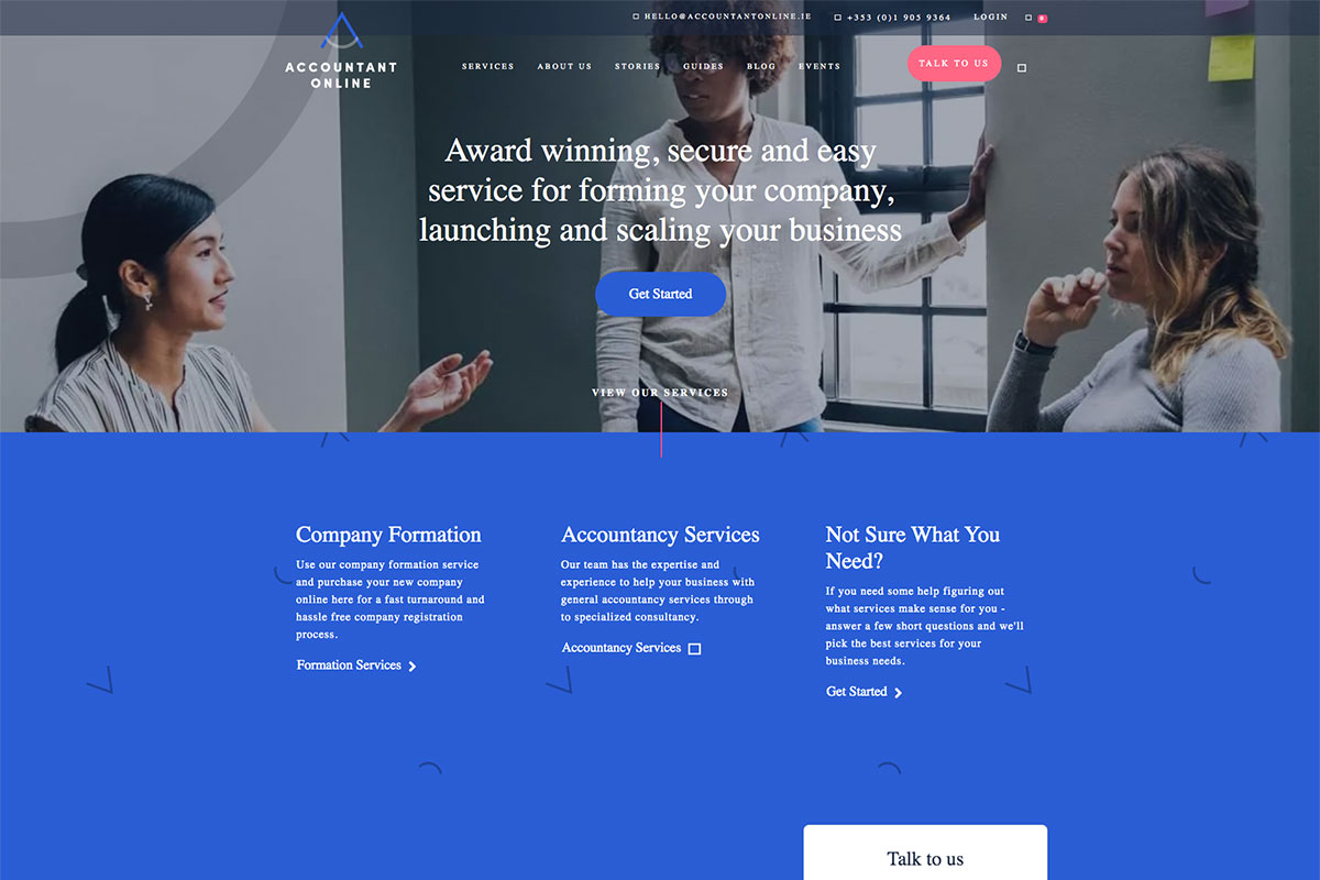
Accountants must have a website that engages visitors and offers relevant service information. Accountant Online is potential inspiration for fellow accountants all over the world. This accountants website design is a great manifestation of the clean, creative and elegant firm. The homepage displays the necessary elements and apparent visibility of visual hierarchy, good typography, obvious call-to-action buttons, consistency, and quality content. Each section of this website is meticulously tailored to convey the message. Other notable features include parallax effect, smooth slider, sticky header, and other amazing features.
3. RHN Chartered Professional Accountants
The website is built using Divi WordPress theme.
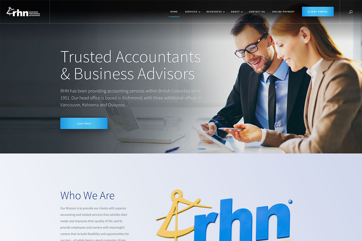
Generate more leads for your accounting or CPA firm with a quality website to present your accounting services distinctly. RHN is a beautiful inspiration for fellow accountants. It has a professionally-designed website with useful features ready to improve its credibility. It welcomes visitors with a slider highlighting the firm’s capabilities coupled with images, CTAs and headlines. Similarly, the floating effect of the buttons looks stylish too. Typically, honest words from the clients effectively help build trust in your business Hence, this website presents the testimonials section using another sleek slider. Moreover, it also comes with a clean and minimalist menu that adds to the great user experience concept.
4. Banyan Accounting
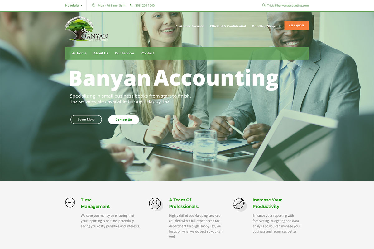
Although you can find numerous accountants’ website templates and themes everywhere, it’s still best to have inspiration in building your online presence. Here’s Banyan Accounting, ready to kindle the interest of accountant firms worldwide. It has a great design on the homepage and comes with a clean, minimalist layout. The hero header is a good combination of a background image, CTAs, headlines, and menu. Specifically, the services are presented in a professional manner using boxes. Other amazing features include the parallax effect, slider, sticky menu, and more.
5. Bromhead
Website made using Craft CMS. Hosted with DigitalOcean
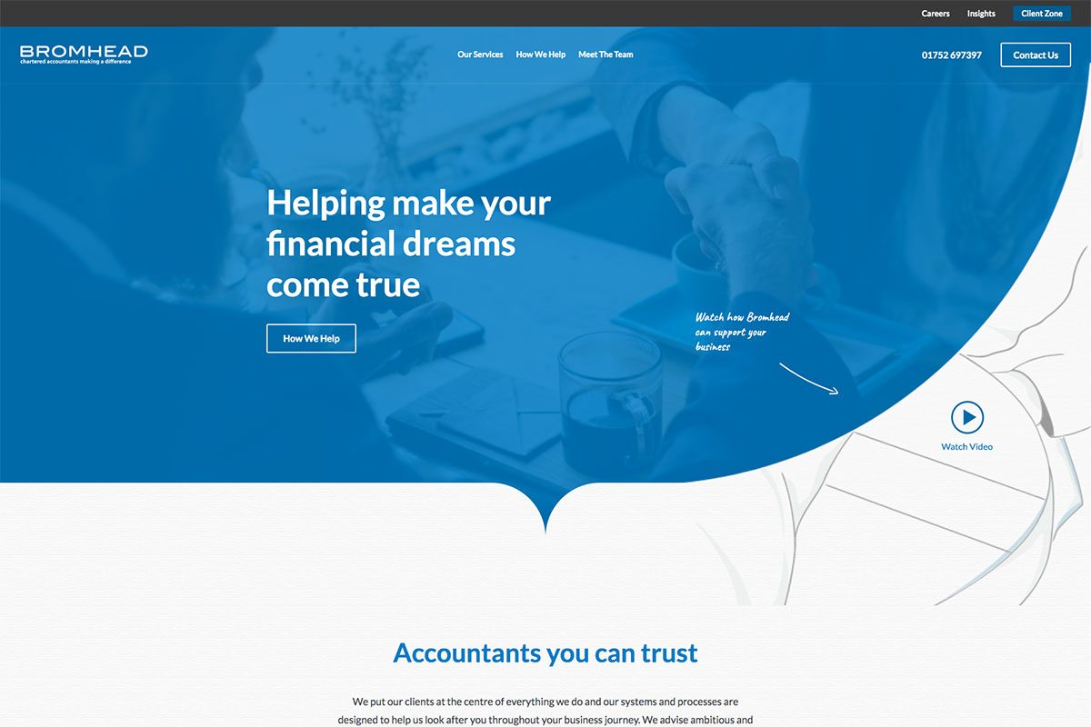
Are you a competent and professional accountant who wishes to build a website to open more career opportunities? You probably need to see these accountants’ website designs to plan your web presence well. Bromhead is a great motivation to delve into. It has a simple homepage design but features to impress potential clients. The hero header is a simple background image with CTA, headline, and video integration. To provide easy and quick access to the other necessary pages of the site, Bromhead uses a sticky header where the menu, contact, and brand name is visible. This website integrates newsletter subscriptions, LinkedIn, and Twitter social media icons.
6. Van Reybrouck
A custom-built website using ASP.NET
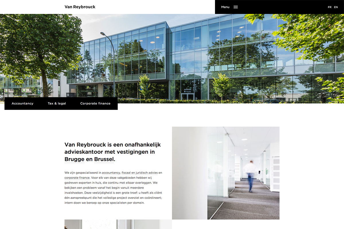
Clean and minimalist websites often stand out regardless of the products and services it offers. Van Reybrouck specializes in accountancy, tax and legal advice, and corporate finance with an excellent accountants website design. It has a unique menu that makes the site look interesting. It also implements a sticky header where the brand’s name is visible along with the off-canvas menu. Other website content looks clean and neat too with quality images and text arrayed in alternate positions. Moreover, this website also presents various options to connect with the firm, such as contact numbers, email addresses, office addresses, and google maps.
7. Swallow Accountancy
The website is made using Avada WordPress theme.
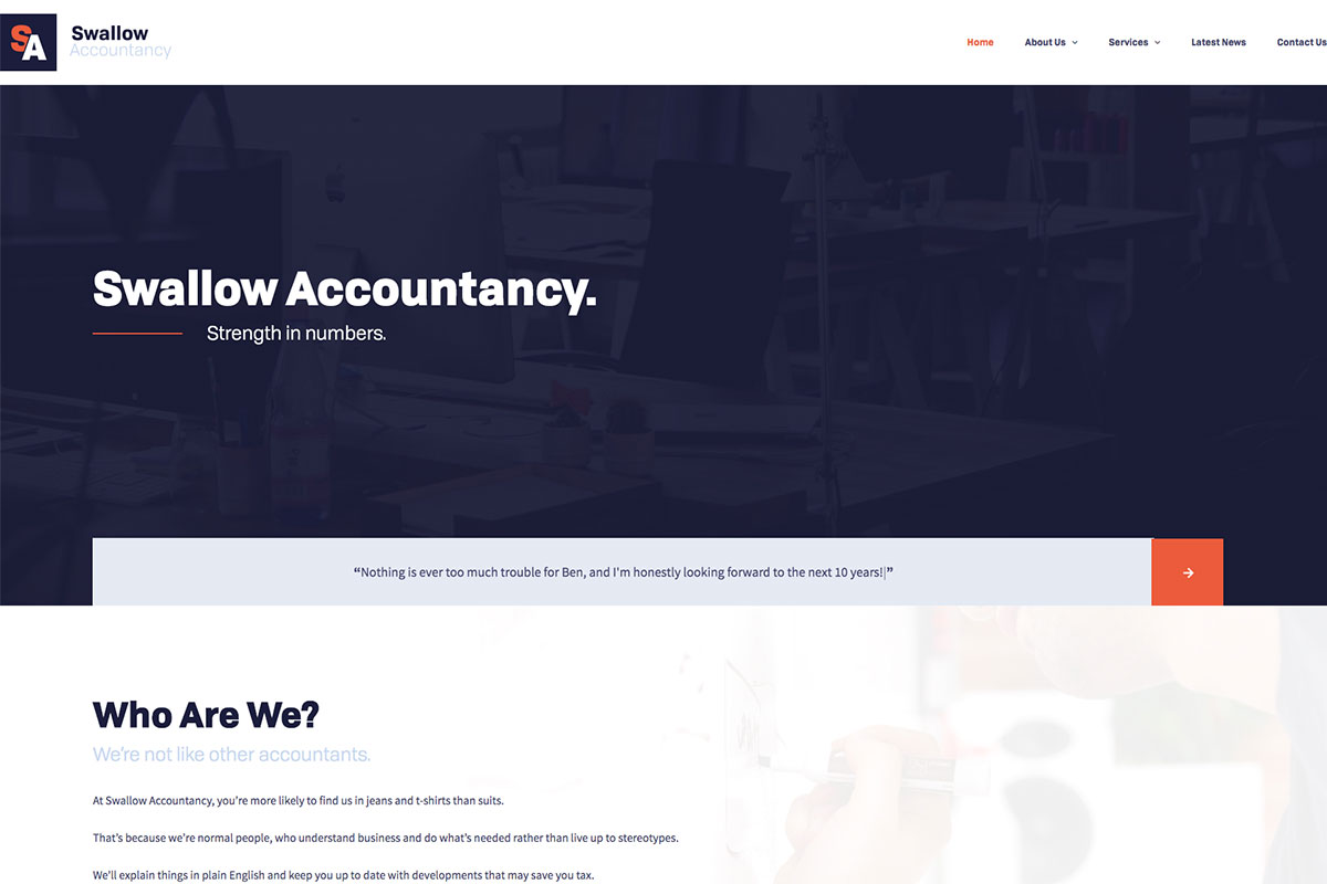
Most businesses today have taken advantage of digital advancements. If you’re an adept or experienced accountant who’d like to embrace web presence, these accountants website designs are awe-inspiring and a must-see! Swallow Accountancy is another sleek and minimalist website intended for accountants. The hero header has a cool background image with a monochrome combined with the parallax effect. It also impresses visitors with animated text testimonials randomly displayed in seconds. Additionally, this website applies consistency in their designs, elements, and typography. While those components are apparent, the services section also looks clean and superb.
8. Carrie Braswell
Website is built using Canopy accounting management platform
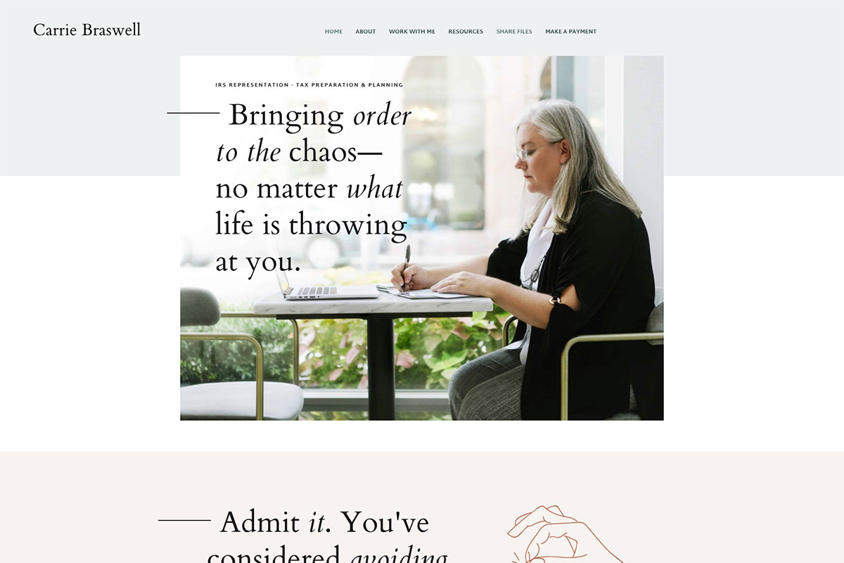
Clean and simple designs are unrivaled. Professionally-built websites coupled with functional elements are even more exceptional. Carrie Braswell is a passionate and federally-authorized tax practitioner who demonstrates competence in tax laws. Her website is a manifestation of simplicity and elegance. This website is ready to impress potential clients by emphasizing visual hierarchy and good typography. It also has a nice and captivating tagline that can stimulate visitor’s interest. Meanwhile, this website embraces the quick and easy navigation realized using a sticky header.
9. The Outsourced Accountant
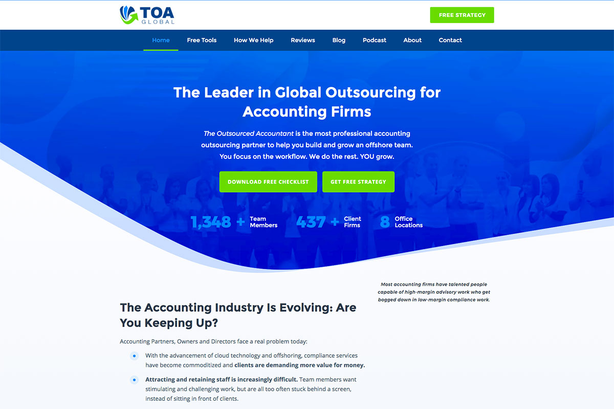
Accountants’ roles in business operations are beyond measure. Keeping track of the business’ financial transactions is effortless with the accounting services. The Outsourced Accountant has a clean and comprehensive approach of accountants website design. Jampacked with essential elements, this website is ever-ready to showcase its services innovatively and clearly. Specifically, the website implements the essence of visual hierarchy in its overall design. It integrates the descriptive CTAs ready to increase conversions, fixed social media icons, introduction video, and color consistency. Other necessary website pages also look seamless and have a logically designed layout.
10. TOA Global
The website is made using Elementor Pro.
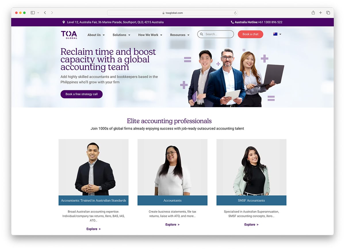
TOA Global is accounting software that offers small businesses easy, fast, and secure accounting services. Like the software, its website is a seamless and powerful accountant’s design. It has a great and captivating homepage design that suits you well to inspire. The hero header is stunning with a cool combination of CTAs, taglines, and quality images. Being featured in different established magazines is a great tool to improve the credibility of your product or service. With TOA Global’ presentation of the magazines that featured it, it’s easier to convert visitors into potential clients. Other notable features include a seamless slider, clear CTAs, cool dropdown menu and more.
11. Elder & Isaac
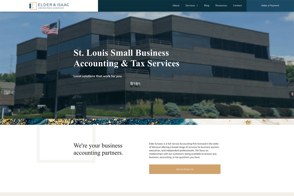
Elder & Isaac crafted a great website to improve its business by offering various services for business owners, executives, and independent professionals. It comes with a simple design on the homepage. Particularly, it presents its services in a simple but clear way. Moreover, it also added a potential button that links to the presentation of all its services. Additionally, this website embraces the power of testimonials in improving its brand using a sleek slider. It implements the sticky header with the menu and brand’s logo to provide easy access to other important pages.
12. The Wow Company

In this era of advanced technology, every brand must have a website to effectively showcase its products and services. Similarly, accountants must have an exceptional website with excellent design and functionality. If you need the inspiration to achieve your goal, The Wow Company has an outstanding accountants website design that will serve as a motivational tool. It has a professional-looking homepage and is creative as it implements animation upon scrolling. Each of the website sections manifests the necessary elements with a different layout. Moreover, it also comes with vibrant and attractive colors that make it look interesting. Additionally, it uses sticky navigation to provide ease in navigation too.
13. Avalon Accounting
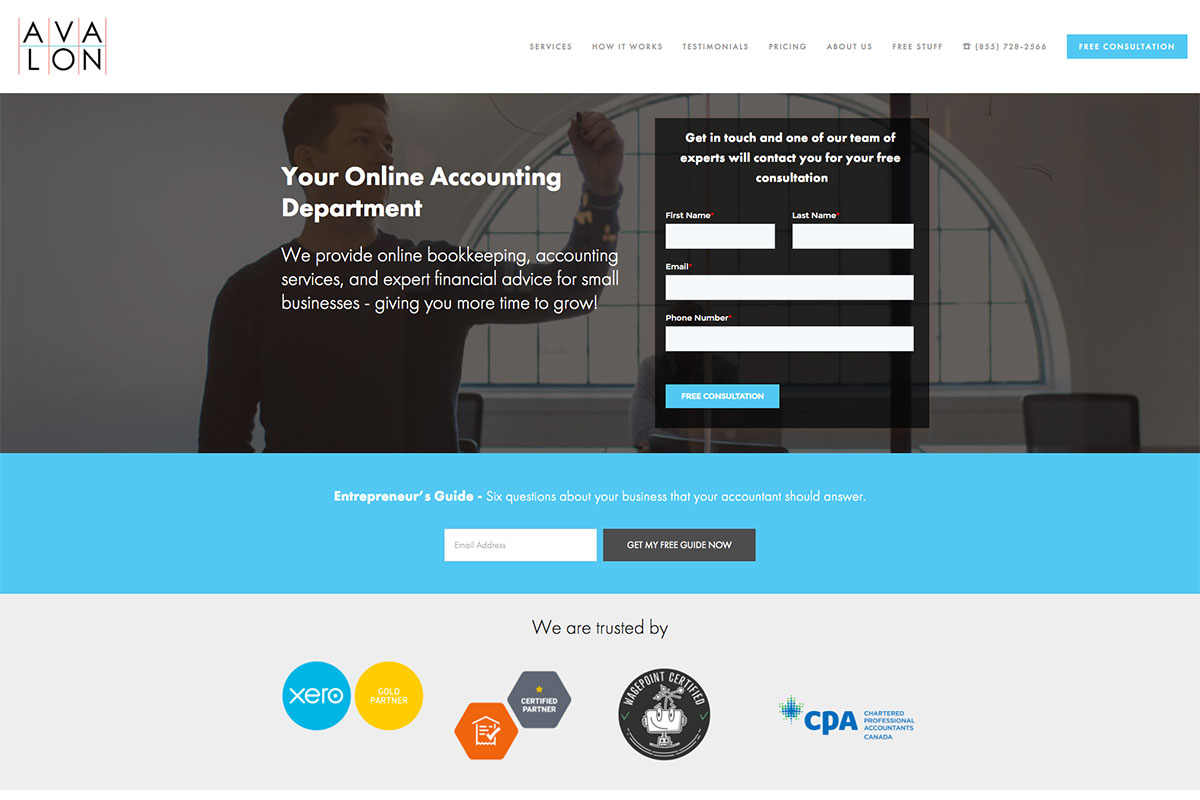
If you need inspiration to finalize your accountant’s website design concept, you can pick from these websites and craft as a seamless one for your brand. Avalon Accounting has a simple but elegant web design. Its homepage is ready to generate more leads quickly. Notably, it has a lead generation form in the hero header with a headline and image background. It also impresses website visitors by presenting brands that trust this firm.
Additionally, client testimonials are essential for improving business credibility. Therefore, this website presents testimonials nicely and engagingly using a simple slider. It also uses the sticky header to easily access the website’s different pages.
14. Bench
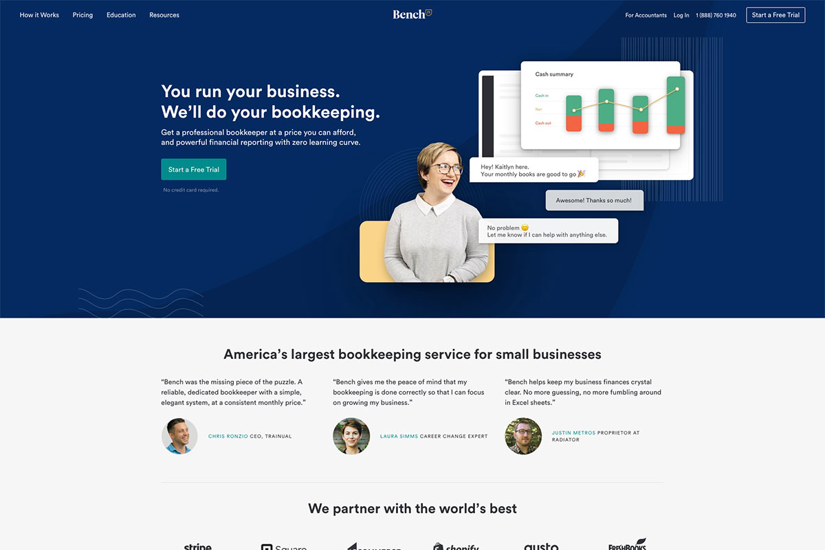
Make your first impression incredible with a seamless website design that will convey your brand well across the web. If you need website examples, these accountants website design are useful. Bench has a professional-looking design perfect for an accountant’s web presence. It has a clean and organized layout with the necessary elements and features ready to make the brand shine. Specifically, it has an engaging homepage that fully considers consistency, visual hierarchy, white space, and other necessary features. It also has a nice and attractive slider for the client’s testimonials. Additionally, clear CTAs are ready to persuade the audience to take action.
15. Grant Thornton
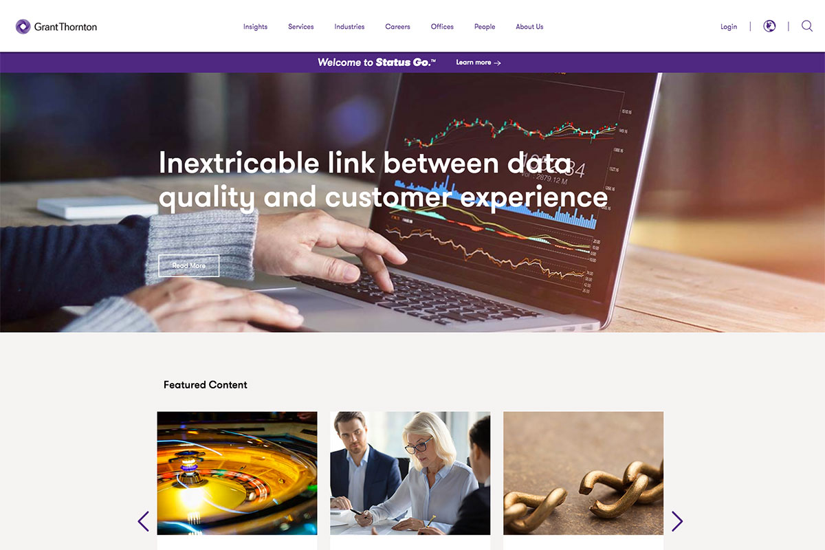
More often than not, an out-of-the-box design is pretty cool and outstanding. In like manner, unique and elegant web designs are excellent too. Grant Thornton is a beautiful and creative accountants website design. It has plenty of nice features and elements to exhibit its services worldwide. Consistency is a vital key principle of user experience. Therefore, this website implements consistency in its color, buttons, and hover effects. Aside from the clean typography, it also integrates high-quality images and a smooth slider in different sections.
Furthermore, this website also embraces white space that effectively improves readability and comprehension. What’s more? The social media icons on the footer never ignore the essence of social media marketing in its brand promotion.
16. Chartered Accountants New Zealand
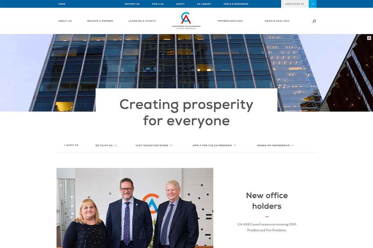
Another great and potential inspiration to examine is this Chartered Accountants New Zealand. It has a super neat and clean homepage with awesome and interesting features. Specifically, it integrates a clear video on the hero scene with a clear menu presentation. While the layout is well organized, the animation upon scrolling adds elegance and sophistication to the overall design. The homepage is ready to impress potential clients by emphasizing the elements using white space. For navigation, it utilizes an excellent dropdown menu. Hence, visitors can easily access the necessary pages of the website.
Having seen these clean and modern website designs, which inspiration do you love to recommend to fellow accountants? Let us know in the comments.
Was this article helpful?
YesNo
