Do you want to check an extensive collection of great spa websites and examples for design inspiration?
Your timing is perfect because we just finished reviewing 70 spa and salon pages.
However, these are the 21 that are too good not to see.
Each beautiful and awesome website has original and creative touches, making it unique.
Some are simpler, and some feature animations and effects, but all are a MUST-SEE.
Enjoy.
Remember, you may also want to check our list of the best spa and salon WordPress themes.
Best Spa Websites For Inspiration
1. Forever Young Spa
Built with: Squarespace
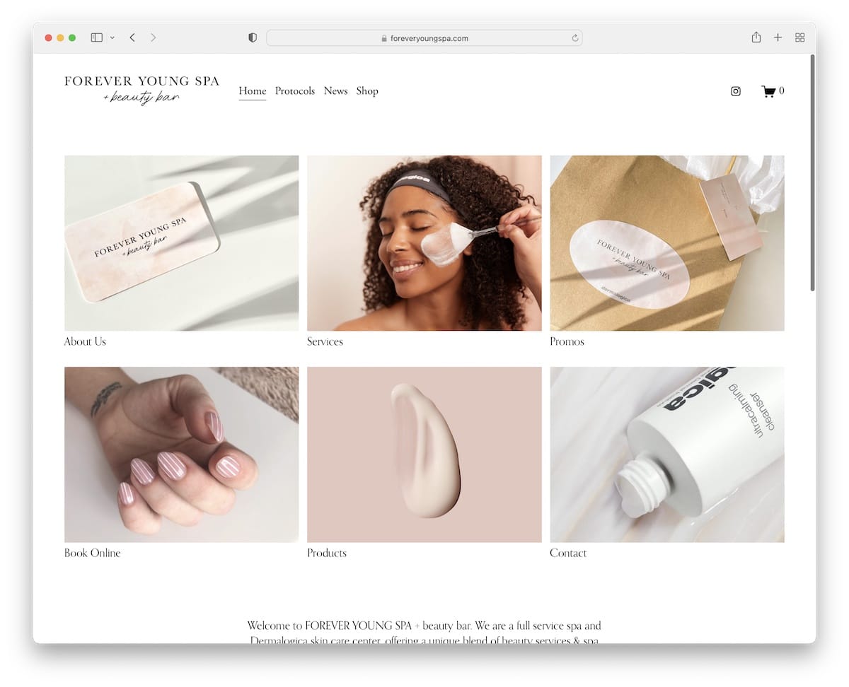
Forever Young Spa’s home page is very basic, including a simple grid that acts as a navigation to check their services and promos, make an online booking, and more.
You’ll also find an Instagram feed slider that opens each post in a new tab.
Note: A simple home page with links to your services, products, etc., can mean a better user experience.
2. SpaBelles
Built with: Squarespace

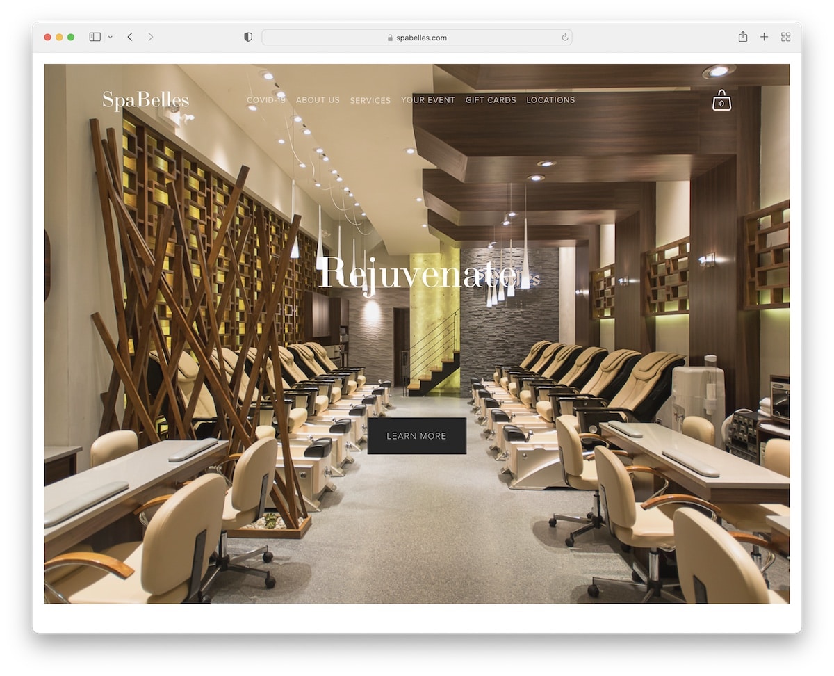
SpaBelles makes you feel like you’ve just arrived at the salon with the large parallax effect image background.
The transparent drop-down navigation bar gives users access to their services and all other useful information.
There’s also a cool grid with some of their more popular links and a subscription form.
Note: Parallax effect background gives depth that creates a more immersive atmosphere.
3. Pavitra Organic Day Spa
Built with: Squarespace

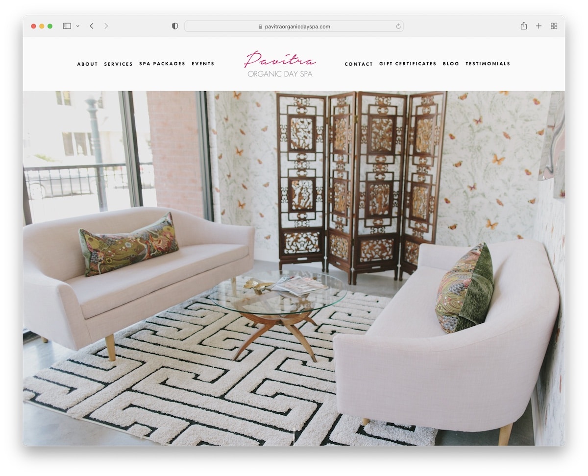
Header with a full-screen parallax image background is what welcomes you to the world of Pavitra Organic Day Spa.
You can check more information by either starting scrolling or clicking the scroll-down button.
The footer area and the base of the website are separated with a simple line, keeping the background intact for a more flawless feel.
Note: Feel free to test adding only a full-screen (parallax) image background in the hero section.
4. The Refuge Spa
Built with: Webflow

The Refuge Spa is a great example of a beautiful spa website with a creative hero section, hover effects, a small slider and an embedded video.
They also use a floating header with a transparent menu drop-down and a booking button with animation.
Note: Even if you plan to add multiple elements to your website, do it tastefully, like The Refuge Spa.
Don’t miss our main Webflow websites collection with many great designs that inspire you.
5. La Belle Studio
Built with: Squarespace

La Belle Studio is another spa website with a full-screen image above-the-fold that gives a quick glimpse at their studio.
You get hit with a ton of useful information, service presentation, and more as soon as you start scrolling.
But if you would like to use the menu again, just start going back to the top, and it’ll appear immediately.
Note: The navbar that reappears on the scroll removes the “distraction” of a sticky header/menu.
6. Aman
Built with: Drupal

Aman has a beautiful website to promote its spa services, starting with a title and a large image. They also have multiple sections with enough white space and more content to ensure visitors get everything they need.
What’s cool is the sticky booking bar at the bottom of the screen so that everyone can check availability when they want.
Note: Ensure your booking form/calendar is easily accessible – always.
7. The Berkeley
Built with: Optimizely

The Berkeley greets visitors with a slider consisting only of images (no text, no call-to-action (CTA) buttons).
But there’s a whole bunch of content that reveals while scrolling, giving you a better idea of what The Berkeley offers. This page also features a large footer with links, social icons, Google Maps and a newsletter subscription form.
Moreover, the sticky header includes a “Book” button that opens a full-screen overlay with more options.
Note: Use the footer area to add all the must-have business information.
8. Bare Flyt
Built with: Squarespace

A minimalist header and a simple slideshow go hand in hand, which you can see in full effect on Bare Flyt.
The website also includes a lightbox gallery to showcase their facility, opening hours in the footer area and CTA buttons to connect easily.
Note: A minimalist, responsive web design is always a good decision (why complicate it if you don’t have to?).
Do you want to see more Squarespace website examples? We have a whole list of them!
9. Blue Lagoon
Built with: Contentful

Blue Lagoon’s clean look speaks nothing but professionalism. Especially mixed with amazing photography and simple animations (great attention to detail).
But it all begins with a creative hero section with a transparent header for a spotless look.
The sticky live chat button is also always present for you to contact the staff and receive quick answers.
Note: Offer your (potential) customers the best support by including a live chat.
10. Gaia Retreat
Built with: Elementor

Gaia Retreat offers a warm welcome with a full-screen video presentation that you can mute/unmute.
One of the more unique features we’ve seen while picking the best spa websites is Gaia Retreat’s unique twist on the mega menu.
The menu floats on top of the screen when you scroll, giving you continued access to the clickable phone number and “Bookings” button.
Note: Use a video background (without text and CTAs) to let visitors experience your location first-hand.
11. Linaean
Built with: Craft CMS

Linaean has an immaculate look with images linking to their four main departments (using very little text). This gives it a luxurious feel, telling you they mean quality work of the highest degree.
Besides the sticky header, Linaean has a floating “Book online” button on the right side of the screen that opens a sidebar booking wizard.
Note: Give visitors a reason to book your services with luxurious web design.
12. Scarlet Spa
Built with: Craft CMS

With its clean and creative website design, Scarlet Spa gives a warm feeling that makes you want to scroll it.
The hero section is pretty unique and features a minimalist mega menu. There’s also a booking button in the floating navbar to check availability and make a reservation.
This spa website example also contains some animations so that the content display doesn’t feel too boring.
Note: Give a minimalist web design a few creative tweaks for a WOW experience.
13. SSBH
Built with: Underscores

SSBH has a transparent header with a clean mega menu and an auto-played video banner that promotes the location, experience, and more.
Below the video is an availability calendar form followed by a gorgeous presentation through images and text.
SSBH also features one of the simplest newsletter subscription forms meant to collect only quality leads.
Note: Using a video banner in your website’s hero section can keep visitors around for longer.
14. Willow Spa
Built with: Avada Theme

Willow Spa has a massive slideshow of images showing their spa location without text and CTA buttons. But they’re using images that tell more than 1,000 words.
Other features contain a sticky header, Instagram feed, live chat and opening hours (in the footer).
Note: Don’t go straight to selling your services; warm your visitors up with a large image slider.
You can also check these Avada theme examples to see its versatility!
15. Lilly Victoria Beauty
Built with: GoDaddy Builder

This spa website takes a slightly different approach with its design, using a sticky sidebar menu/header instead of the more traditional top version.
Lilly Victoria Beauty’s home page also keeps things simple with a large image, text and CTA button that guides you to their online bookings.
Note: Instead of doing it like everyone else, you can easily differentiate from the rest with simple design tweaks, like a sidebar menu.
16. The Little Owl Spa
Built with: Squarespace

The Little Owl Spa is a collection of multiple full-width parallax image sections with text and CTA buttons that showcase their services. This creates a unique browsing experience unlike any other on this list.
The footer section is minimalist, with a menu, phone number, location and a “Book now” button.
Note: While some say using too much parallax hurts web design, that’s not the case for The Little Owl Spa.
17. Santosha Wellness & Beauty
Built with: Weebly

Santosha Wellness & Beauty is a more basic spa website that’s a great example that simplicity works.
It includes a minimalist header with a drop-down menu, a section for services, a product carousel and an IG feed.
What adds a very personal touch is instead of using a “Book now” button, Santosha Wellness & Beauty uses a “Book with [practitioner’s name]” button, so the customer knows immediately who he/she’ll work with.
Note: Instead of using the classic booking CTA, copy Santosha Wellness & Beauty’s method.
18. Shevet
Built with: Webflow

The entire Shevet website is one large vertical slider promoting its services (very) engagingly.
The header section is always available with a menu button that opens a full-screen overlay. There’s also a sticky language switcher in the bottom left corner, which is a very non-traditional approach.
Note: Shevet’s immersive and engaging slider-style experience will make any website stand out.
19. Urban Nirvana
Built with: Avada Theme

While website sliders usually slide automatically, Urban Nirvana uses pause/play buttons so that you can control it.
Their floating header includes a booking CTA and a drop-down menu to find the right service, location, etc., quickly.
Moreover, regardless of how far you scroll, you can always jump back to the top of the page with a click of a button.
Note: A back-to-top button saves users time and increases your site’s UX.
20. Skincare Paris
Built with: Webflow

Skincare Paris’s home page means business and professionalism with a luxurious touch. Even though the website is kind of “long,” the awesome scrolling animations don’t make it feel like that.
They also use a secondary menu with an email subscription form in the footer section.
Note: Let your potential customers know what your business and services are all about – via your awesome spa website!
21. Ama
Built with: Cargo

Ama website is bold and impactful, with large images showing you the salon’s inside.
The header doesn’t feel like a header due to its simplicity and transparency. But it’s sticky with a hamburger menu icon that reveals navigation in the right sidebar.
However, the footer section is more classic but minimalist.
Note: Make a navbar always available with a transparent header that’s barely visible for a distraction-free experience.
Was this article helpful?
YesNo
