Developing a consistent brand starts with creating a brand style guide. These branding rule books help graphic designers, marketers, web developers, community managers, and even product packaging departments present a unified vision of the brand to the public.
The best brands stick in our brains because their presence is defined by the repetition of the same logo, fonts, colors, and images. Once we see them enough, they become instantly recognizable. All of this is possible when each member of your team adheres to a cohesive brand style guide.
![Free Download: How to Create a Style Guide [+ Free Templates]](https://cdn.iranwebsazan.org/iranwebsazan/2024/10/76520ae5-1a3b-4055-9e8e-95e150b90965.png)
So, what is a brand style guide? In this article, I’ll go over the elements of a style guide and share some amazing examples of them in action to help inspire your next branding project or website redesign.
Table of Contents
- What are brand guidelines?
- The Elements of a Brand Style Guide
- Style Guide Examples
- Branding Guidelines Tips
- Build a Memorable Style Guide of Your Own
Picture the most recognizable brands you can think of.
Chances are, you’ve learned to recognize them due to one of the following reasons:
- There’s a written or visual consistency across the messaging.
- The same brand colors are reflected across every asset.
- The language sounds familiar.
- It‘s all very organized, and while not rigid, it’s cohesive.
But before you sit down to create your branding guidelines, I’d recommend taking a step back and defining your brand’s mission statement and buyer personas. These strategic elements will help you dive into the tactical components of your brand style guide later.
Brand Guidelines Mission Statement
Your brand guidelines mission statement ensures that all your content is working toward the same goal and connecting with your audience. It can also guide your blog and paid content, ad copy, visual media, and slogan.
Brand Guidelines Buyer Persona
Your brand guidelines buyer persona guides your blog content, ad copy, and visual media, which can attract valuable leads and customers to your business. You can create one quickly with our free persona tool.
The Elements of a Brand Style Guide
A brand style guide encompasses much more than just a logo (although that’s important, too). It visually encompasses everything your brand is about — down to your business’ purpose.
Here are some key elements that I believe make or break a brand style guide, with links to in-depth articles if you need more guidance or info:
- Logo. Logos are a powerful way to determine how your brand is perceived. We’ve got a nine-step guide to walk you through it.
- Color palette. Your brand color palette affects every aspect of your design, especially visual impact and user experience. We’ve got 50 unforgettable palettes to inspire you.
- Typography. Typography plays a critical role on any website by ensuring we can comfortably read and process all its text-based content. If a website’s typography works, we won’t notice. If it fails, chances are we’ll bounce off the page.
- Imagery and iconography. Ensure the best possible user experience with these icon best practices.
- Brand voice. Build your best brand voice using our free brand-building guide.
1. City of Chicago
See the full City of Chicago brand guide.

Image Source
What I like: Chicago’s brand guidelines rest on the beauty and simplicity of the city’s flag, both in terms of color and design. Plus, the tone of the guide is fun and casual — like its acknowledgement of how popular Chicago stars are in tattoo designs.
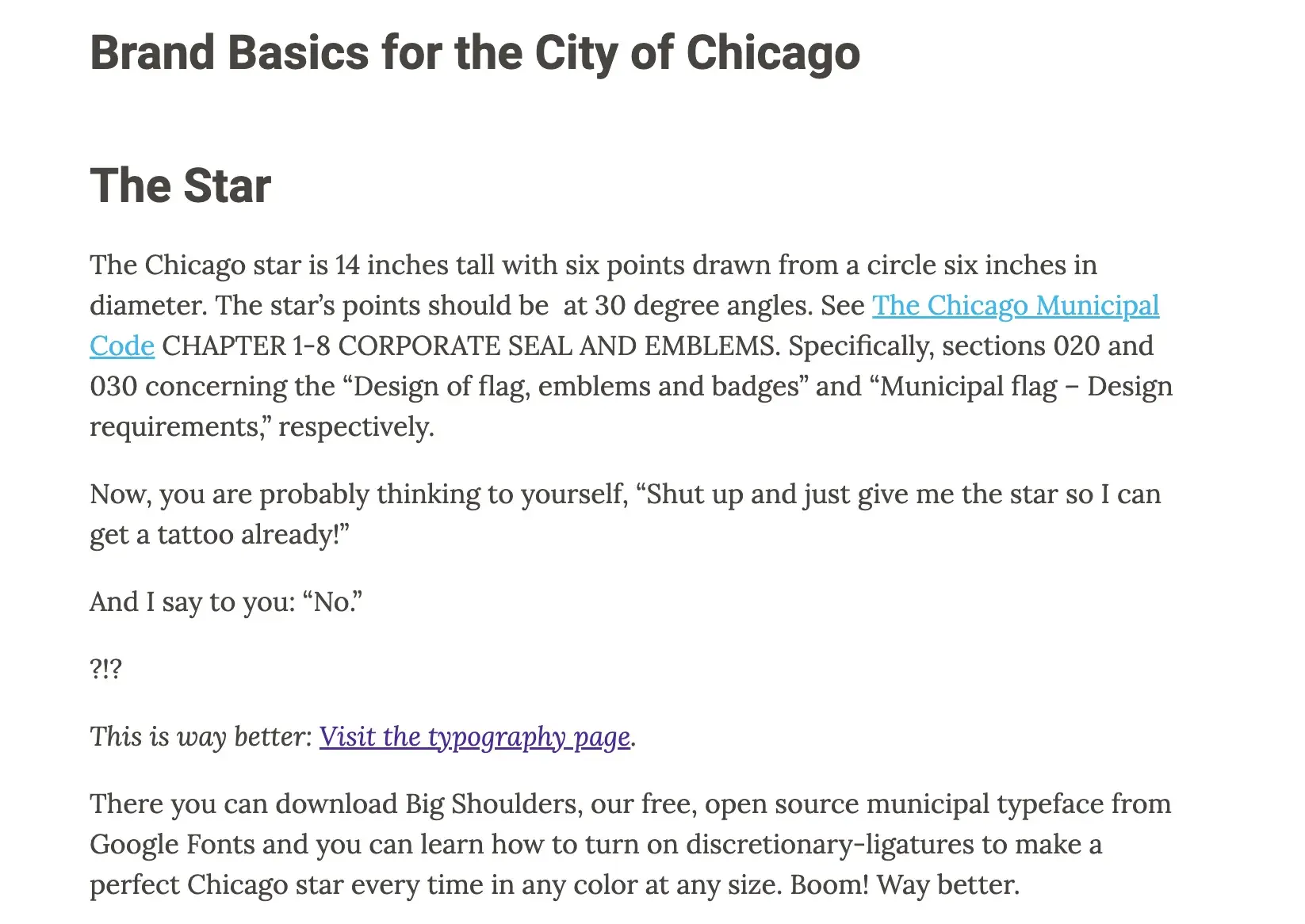
Image Source
A fun detail: The custom font, Big Shoulders, comes from the Carl Sandburg poem “Chicago,” which gave the city its nickname “City of Big Shoulders.”
2. Olympic Games
See the full Olympic Games brand guide.
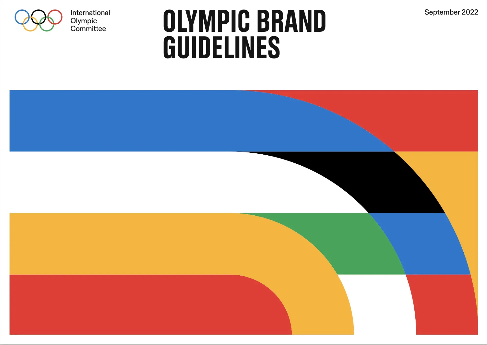
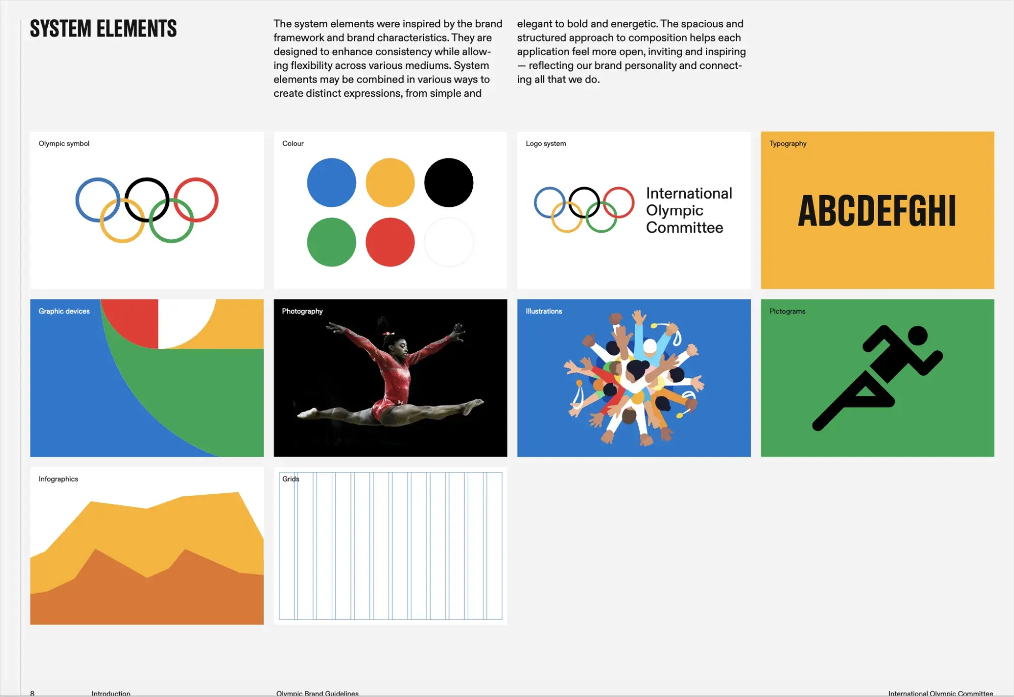
Image Source
What I like: The Olympic Games still use the logo and colors from 1913, but the brand was refreshed in 2022 by Ben Hulse (whose work shows up a few times in this list). The bold interpretation of the Olympic colors embody the brand characteristics: hopeful, universal, inclusive, vibrant, and progressive.
3. Amnesty International UK
See the full Amnesty International UK brand guide.
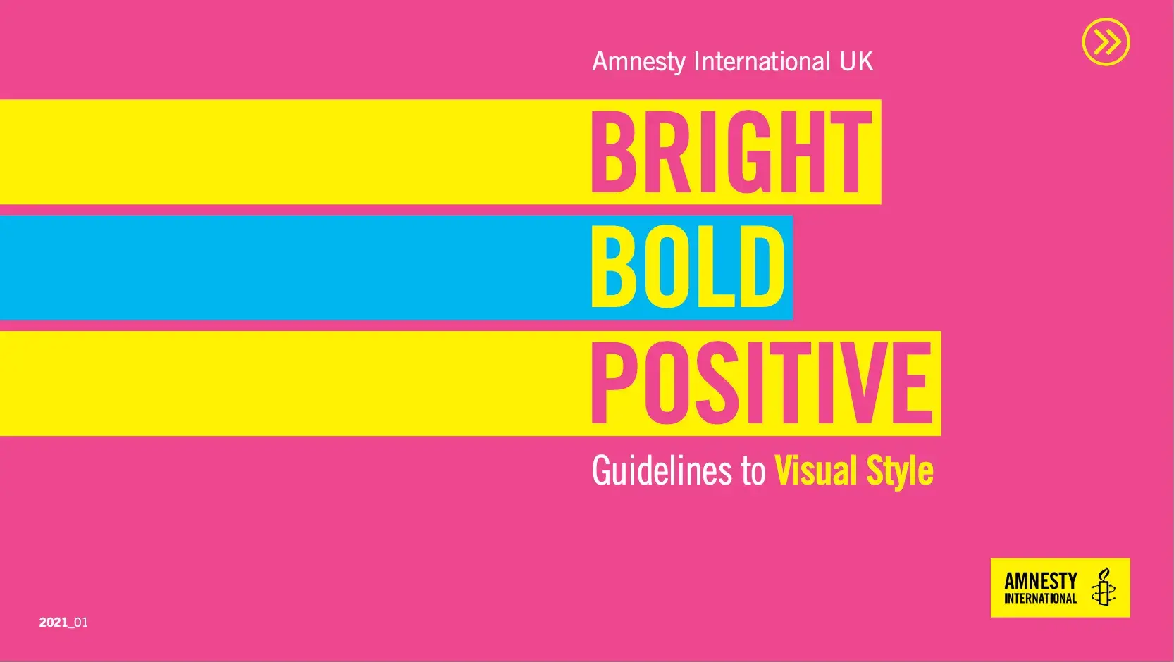
Image Source
What I like: Amnesty International UK spells it all out on the cover: bright, bold, and positive. The pink, yellow, and blue brand colors are cheerful, optimistic, and bold. This guide also does a particularly nice job of illustrating do’s, don’ts, and exceptions.
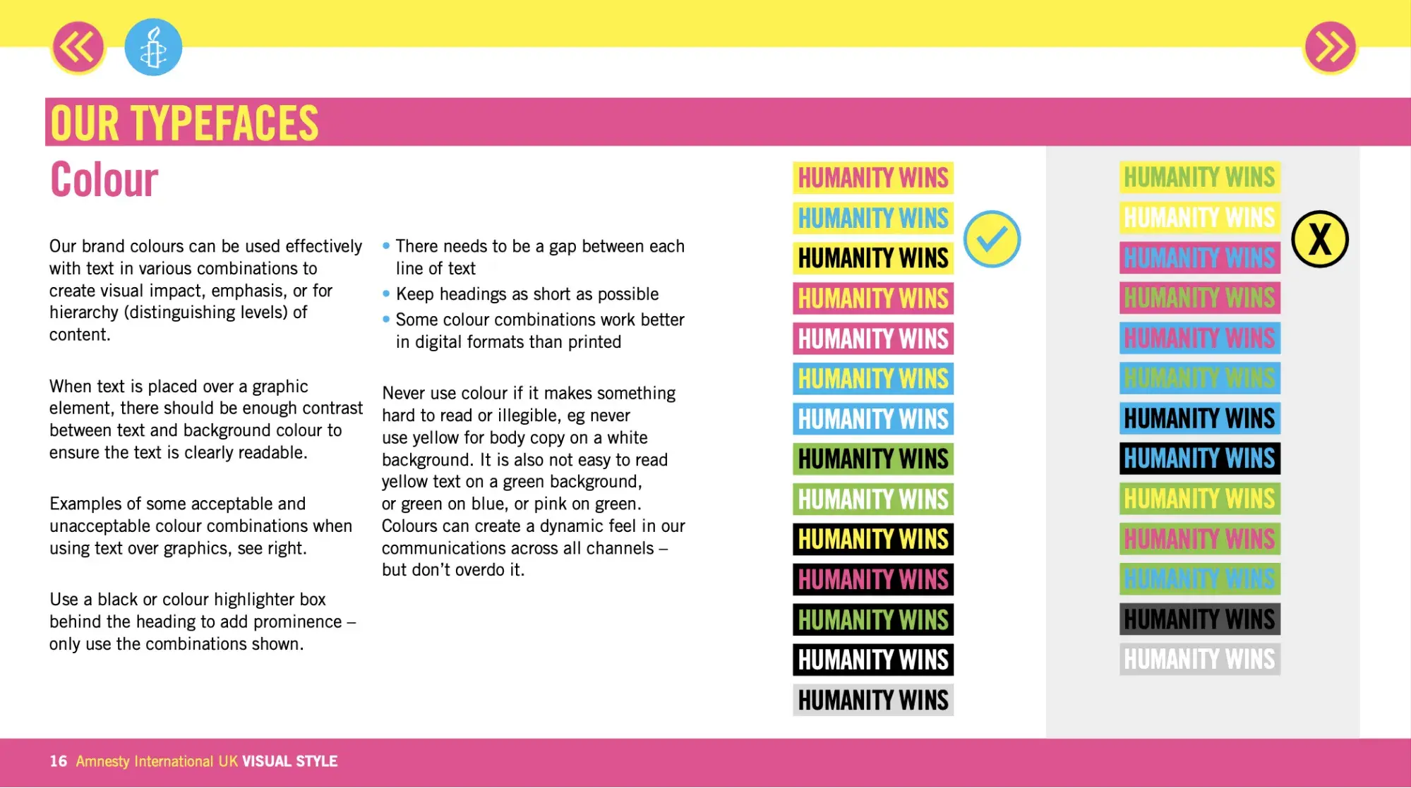
Image Source
4. Sonic the Hedgehog
See the full Sonic the Hedgehog brand guide.

Image Source
What I like: Even cartoons need a style guide. Sonic the Hedgehog’s include phrases for each character, which is a fun and novel way to ensure brand consistency.
5. Burger King
See the full Burger King brand guide.

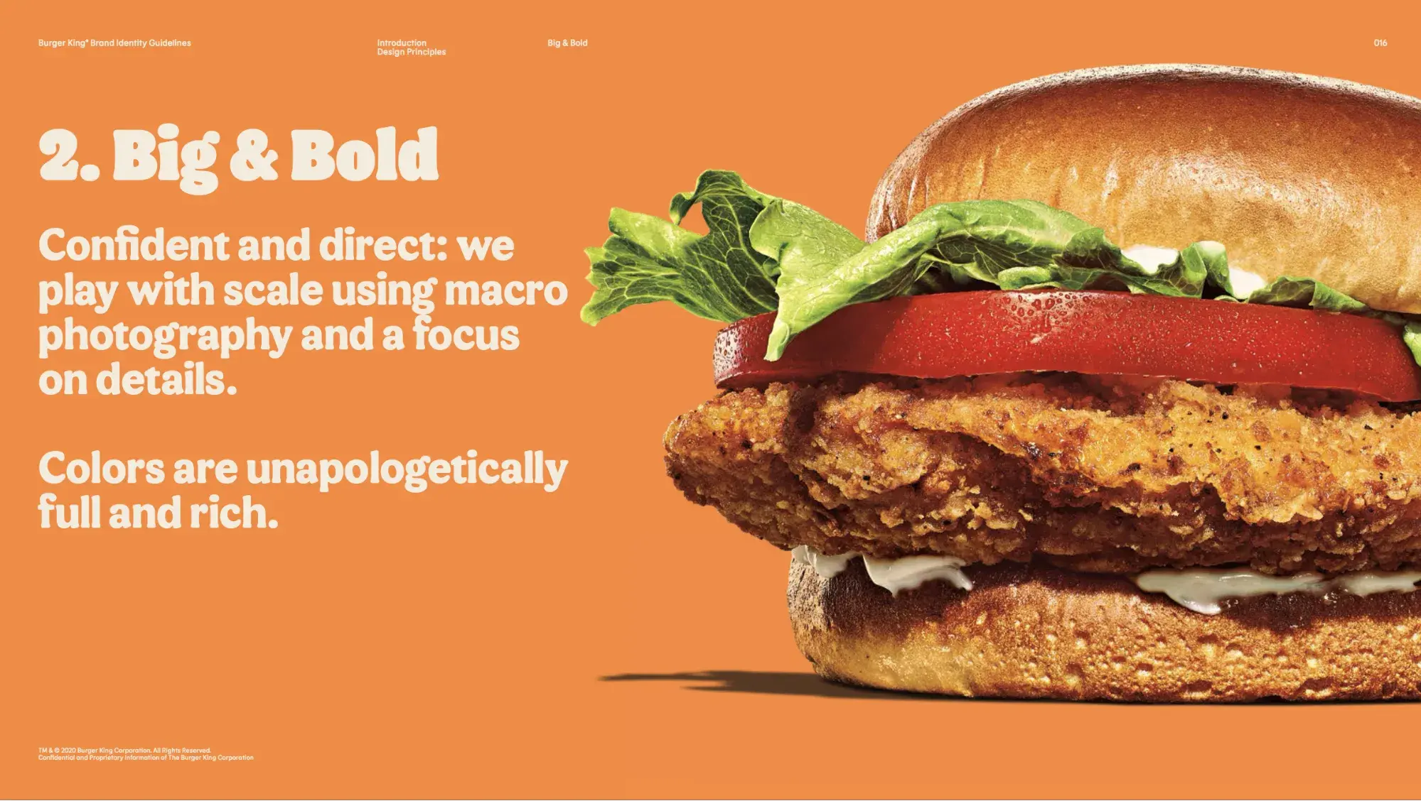
Image Source
What I like: Burger King says that everything it does should make the food “even more craveable” — including the shape of the font, which is custom-designed to evoke the shapes of food.
6. Eurovision Song Contest
See the full Eurovision Song Contest brand guide.
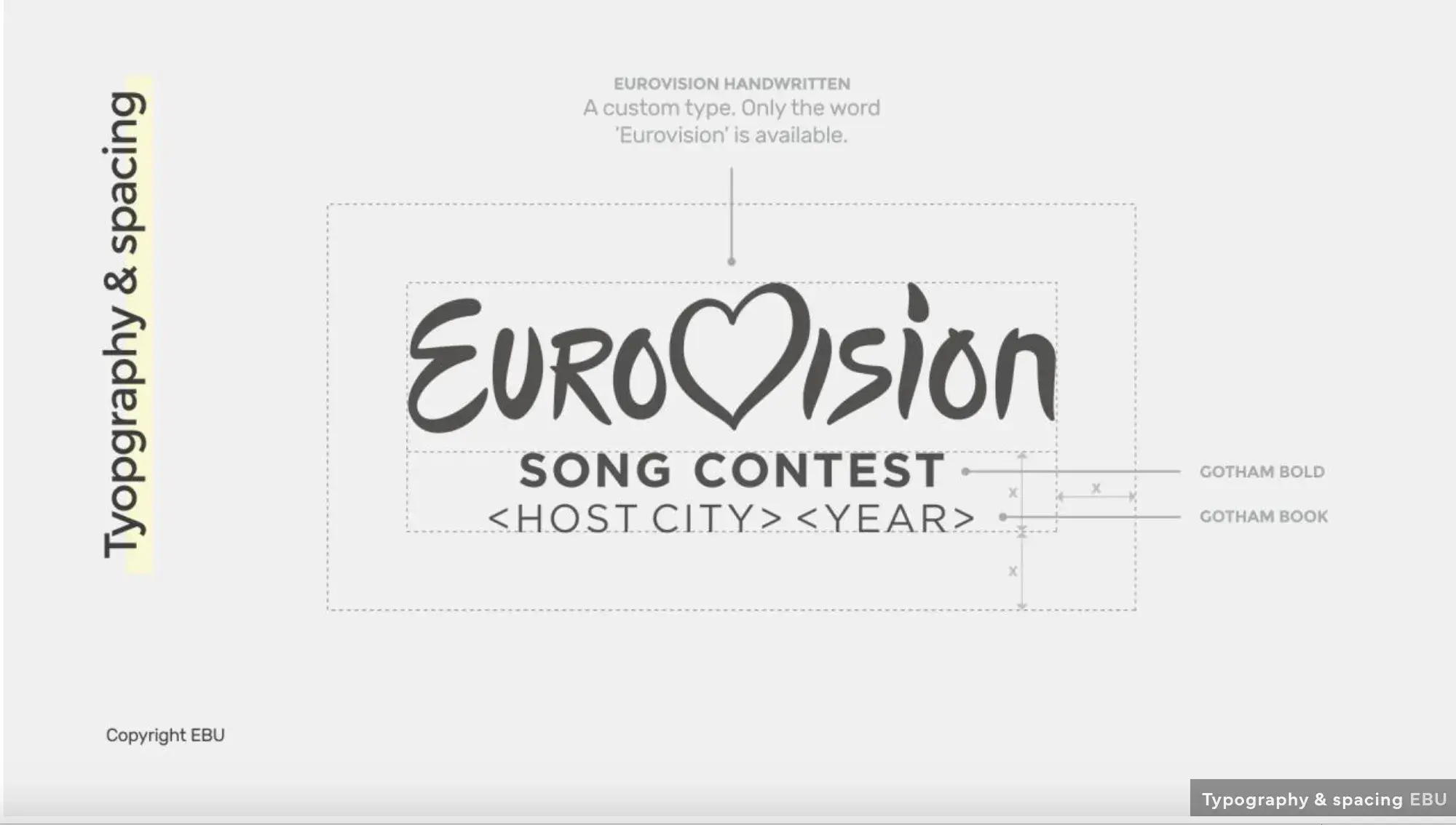
What I like: The font is so customized that no other characters exist other than the ones in the word “Eurovision.” That gives the brand an unmatched distinctiveness.
7. OpenAI
See the full OpenAI brand guide.
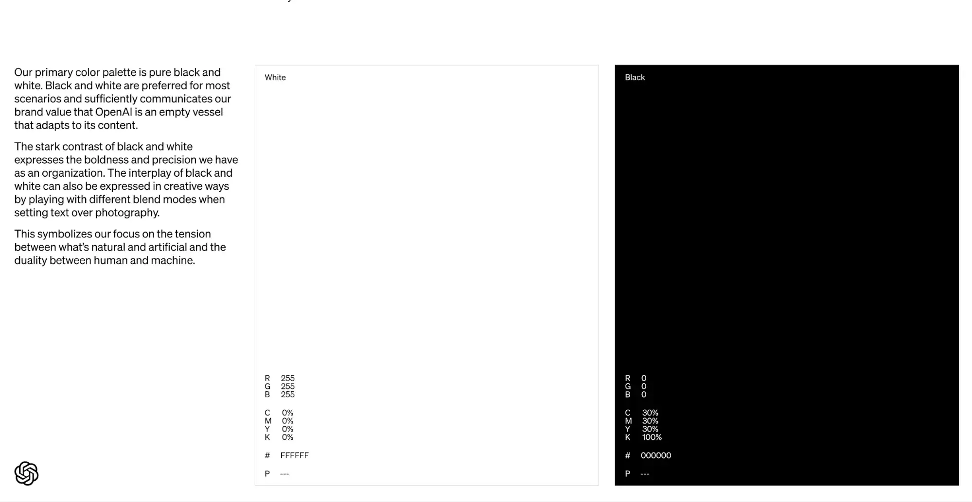
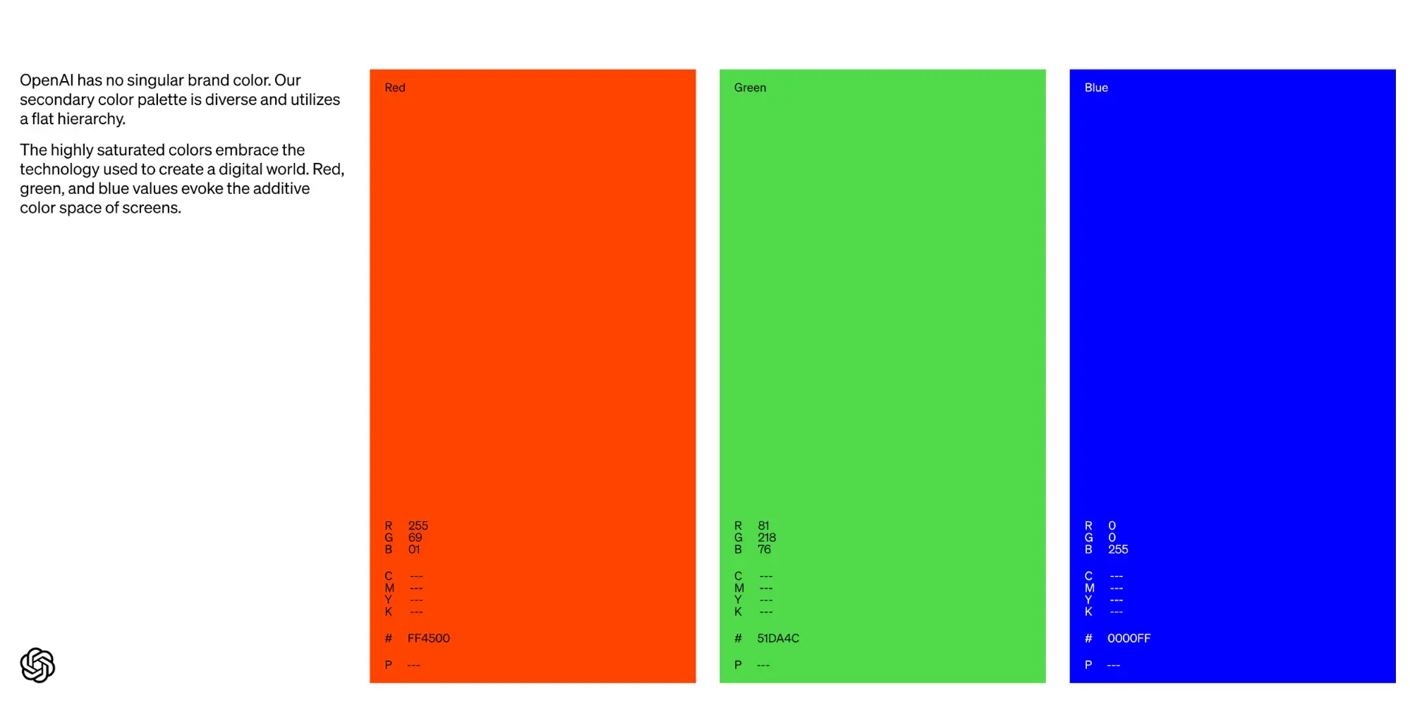
Image Source
What I like: OpenAI has put a lot of thought into the symbolism behind all its color choices. For instance, it uses a lot of black and white in its branding to signify that “OpenAI is an empty vessel that adapts to its content.”
8. DC Comics 1982
See excerpts from the DC Comics 1982 brand guide.
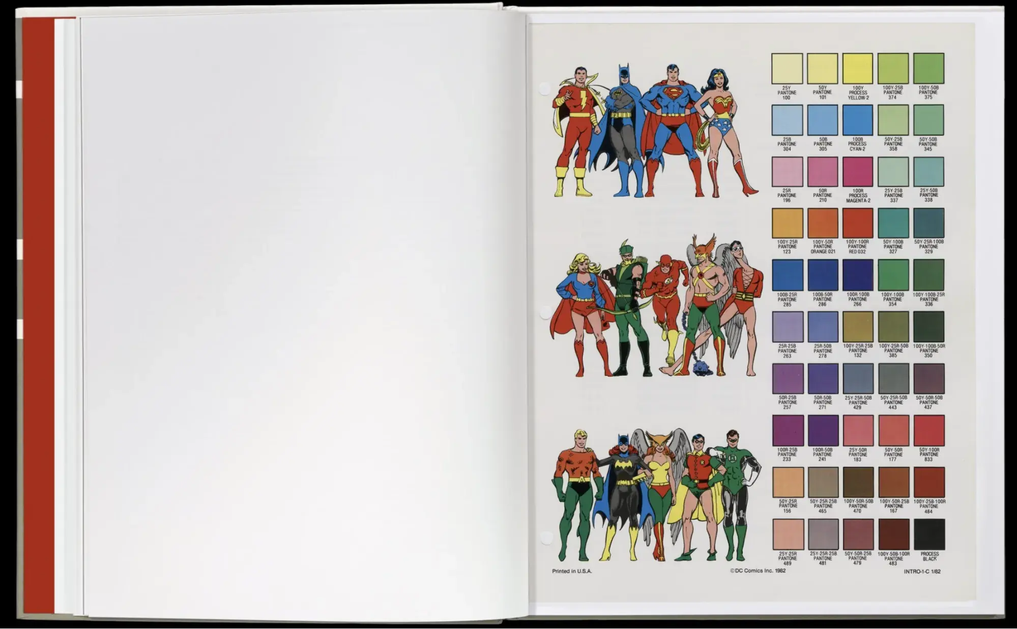
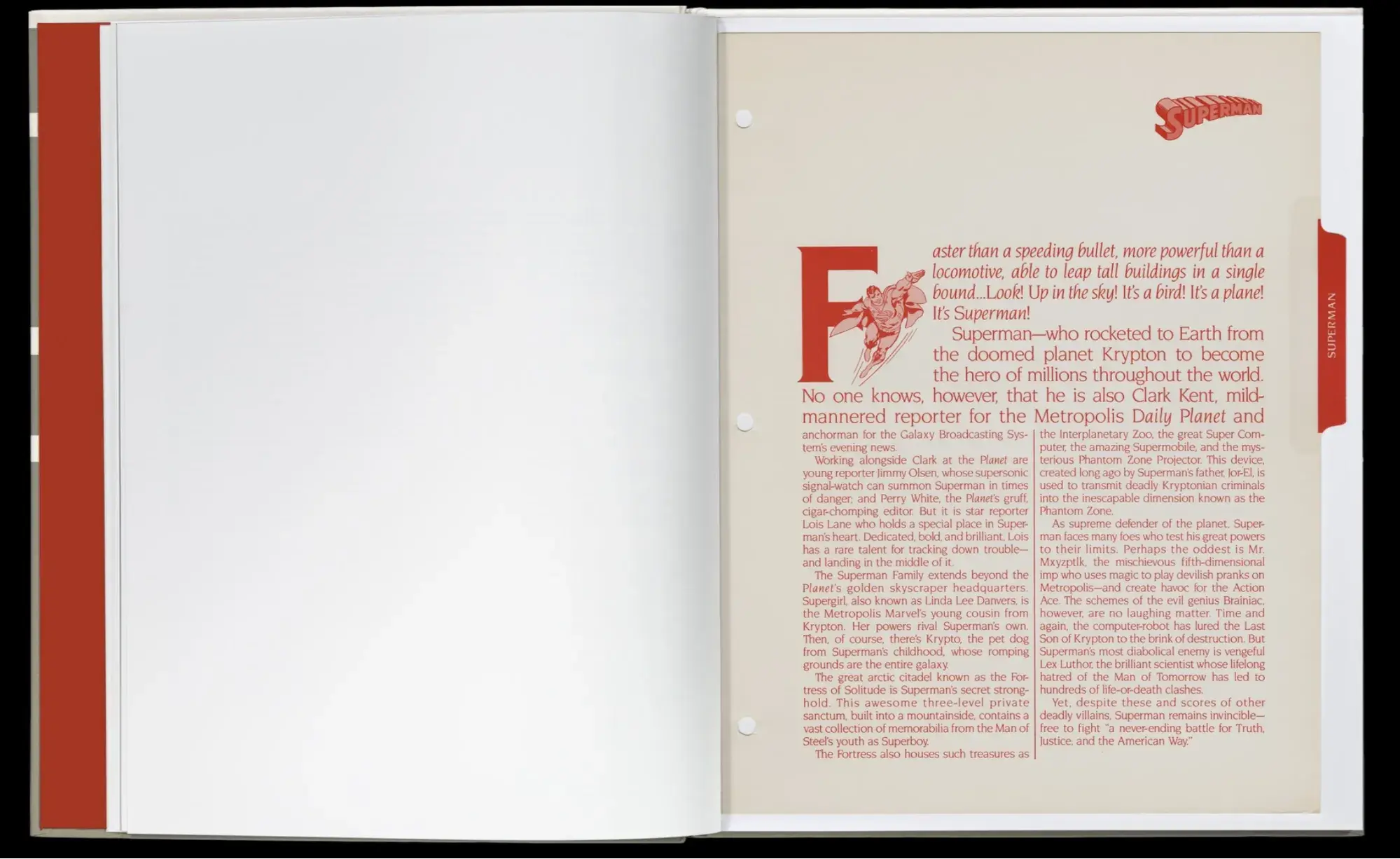
Image Source
What I like: What’s not to like? Even MCU apologists can appreciate the storytelling that went into DC Comics’ 1982 style guide. Superheroes are grouped by color palette, and each character includes a written introduction with catchphrases, mythology, and other details.
9. Reporters San Frontières
See the full Reporters San Frontières brand guide.
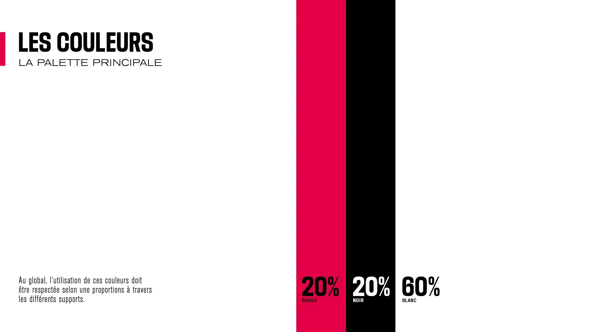
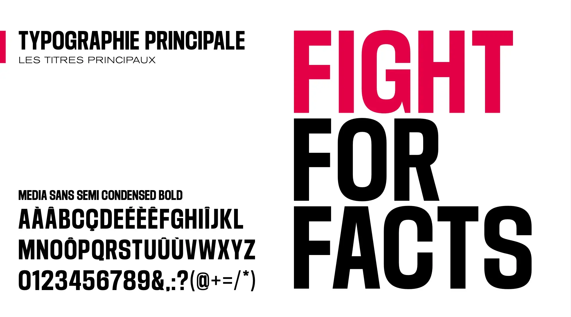
Image Source
What I like: One of RSF’s slogans, “Fight for facts,” is simple but powerful, which is reflected in RSF’s three colors: black, white, and a vibrant pinkish-red. The guide specifies how to use accent colors — red or black should only make up 20% of a design, with white using the other 80%. That reinforces RSF’s spare but muscular branding.
10. Major League Soccer
See the full Major League Soccer brand guide.
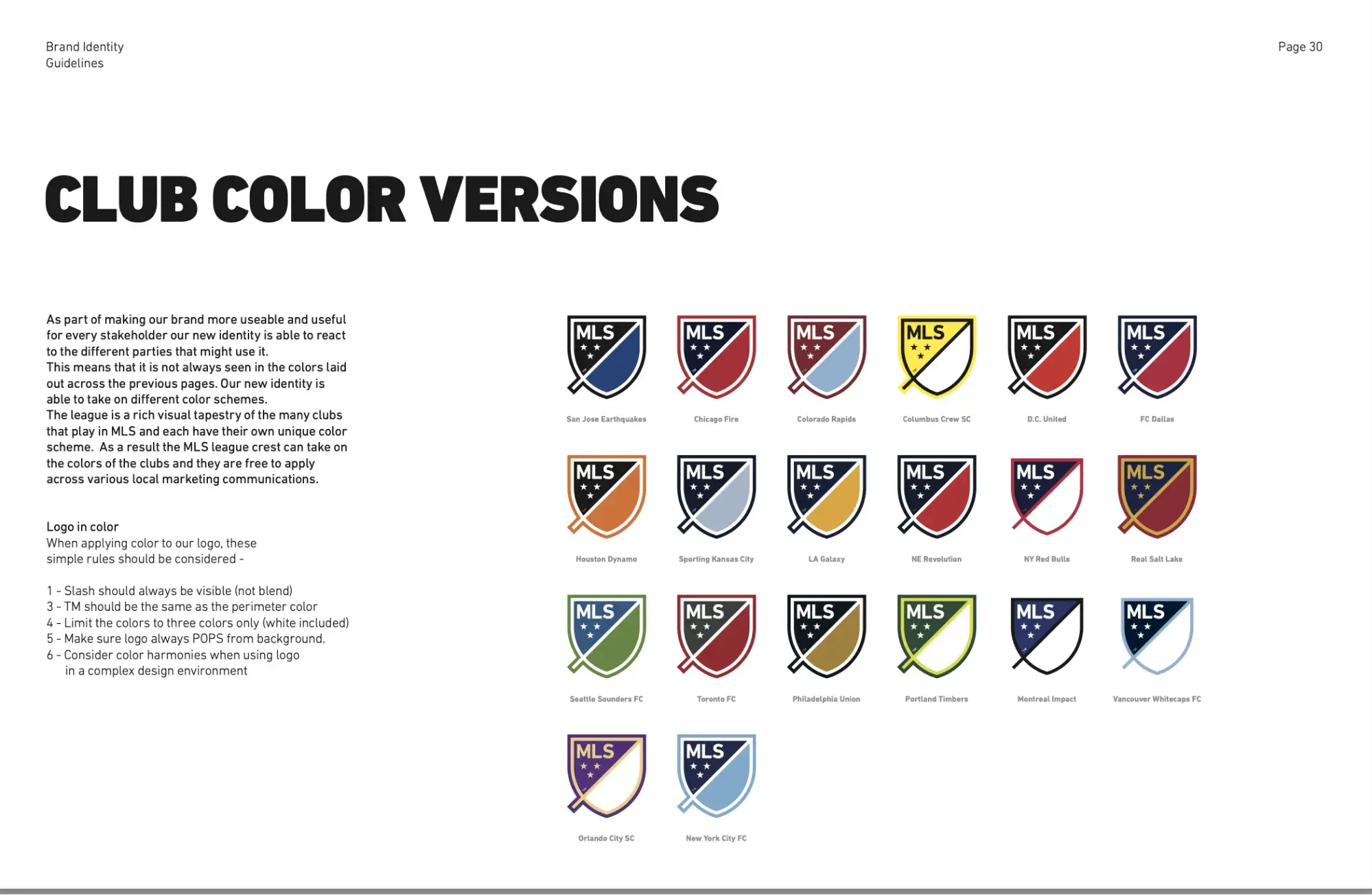
What I like: Major League Soccer’s style guide has to include color combinations for 20 teams. To ensure brand cohesiveness, MLS has a single logo mark, the crest, with no design variations. It also includes specific guidance on applying color layers to images.
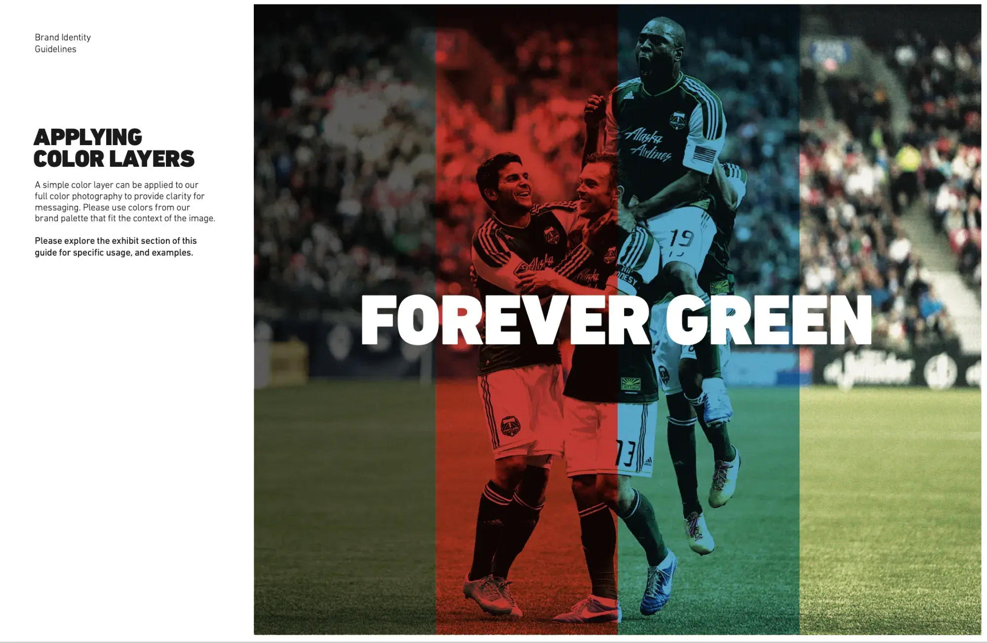
Image Source
11. Czech Railway
See the full Czech Railway brand guide.
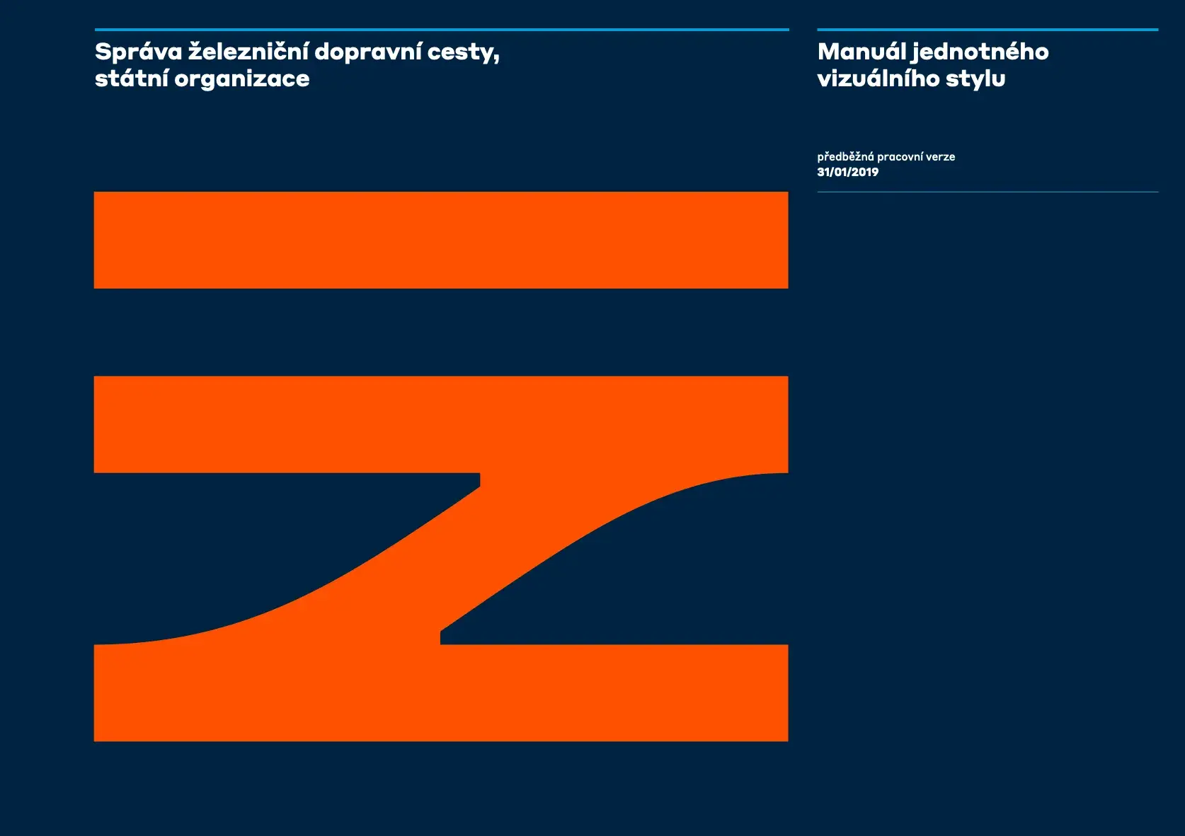
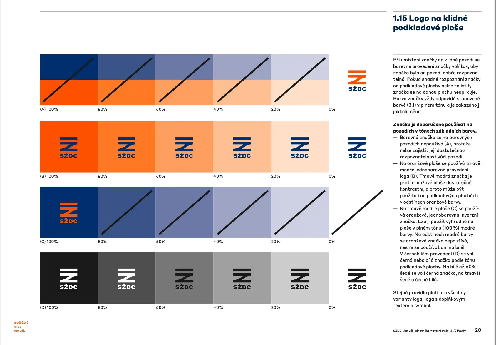
Image Source
What I like: The Czech Railway’s beautiful color palette is centered around a dark blue and deep orange, and the logo mark evokes railway tracks.
12. Coronation 2023
See the full Coronation 2023 brand guide.
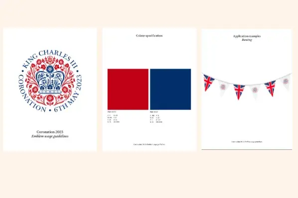
Image Source
What I like: This 23-page guide covers one thing and one thing only: The emblem used for the coronation of Great Britain’s King Charles in 2023. As such, it’s a fascinating case study in detail. The guide includes half a dozen examples of how to use the emblem on royal swag, and it’s exceedingly specific in its do’s and don’ts.
13. EPA (1977)
See excerpts from the EPA brand guide.
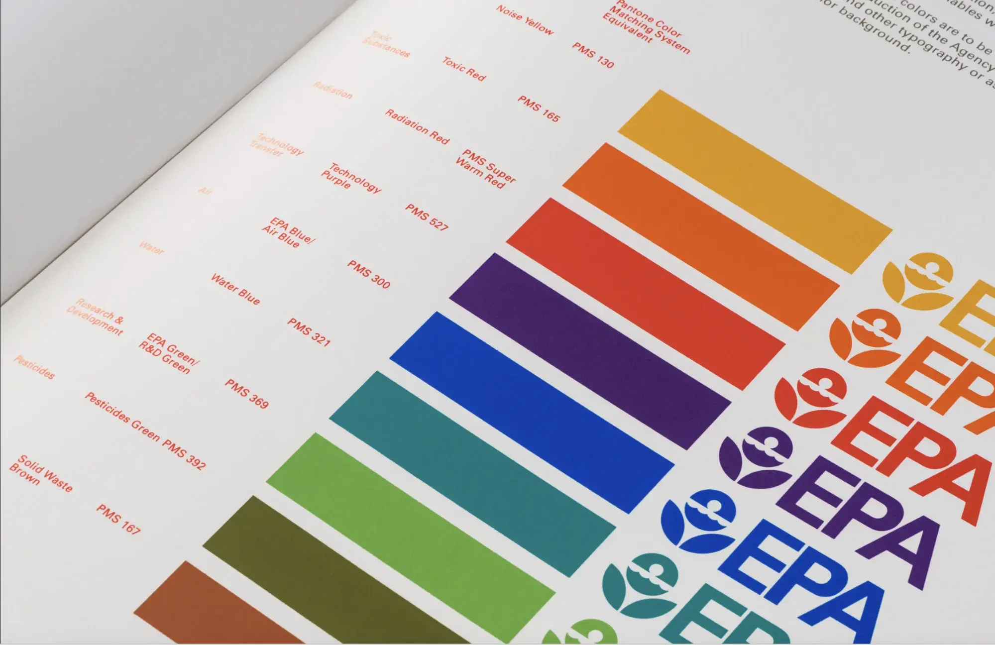

Image Source
What I like: The U.S. Environmental Protection Agency’s 1977 brand guide is a favorite of graphic designers for good reason. Check out the patterns designated as program identifiers, like “toxic substances,” “noise,” and “radiation.”
The EPA’s jewel-toned rainbow of brand colors includes a muddy green called “Pesticides Green” and a color called, ahem, “Solid Waste Brown.” The EPA must have been a fun place to work in the 1970s.
14. Docusign
See the full Docusign brand guide.
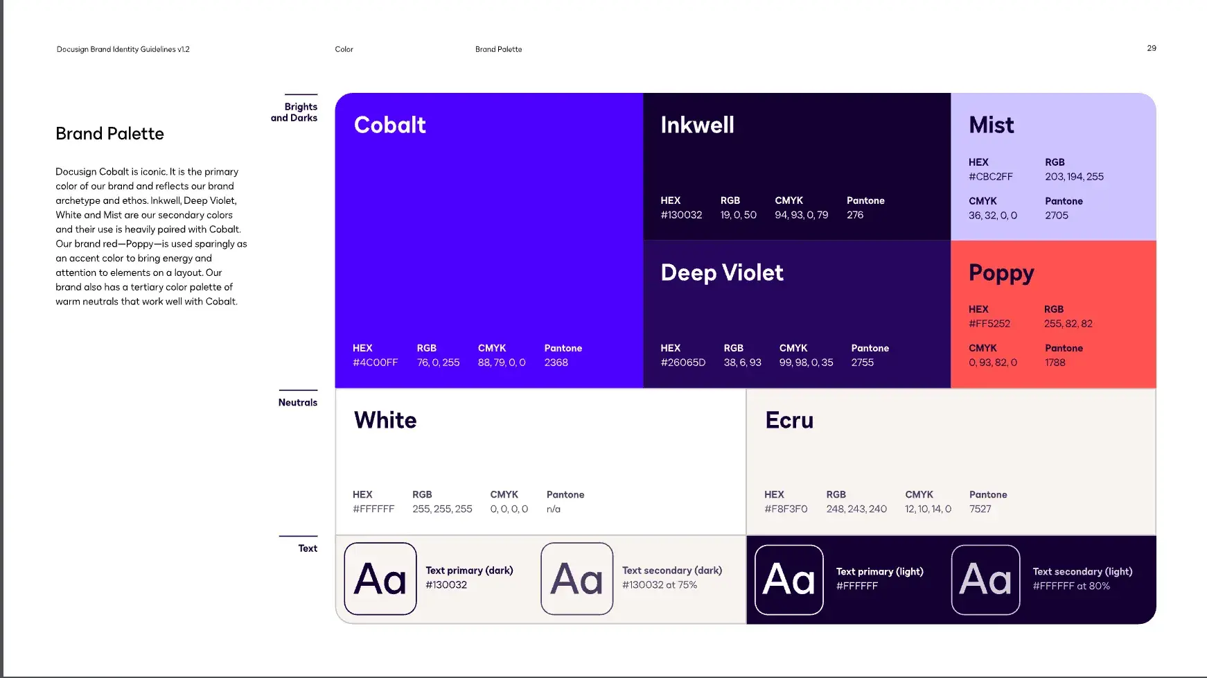
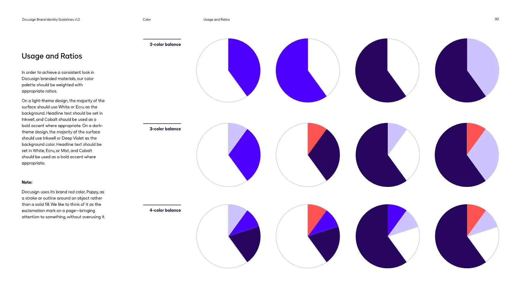
Image Source
What I like: Docusign includes a page of colored pie charts to demonstrate the correct color ratios. Docusign also stands out with a zinger of an accent color — a bright coral that beautifully contrasts with the purples in the brand palette.
15. Zagreb Airport
See the full Zagreb Airport brand guide.
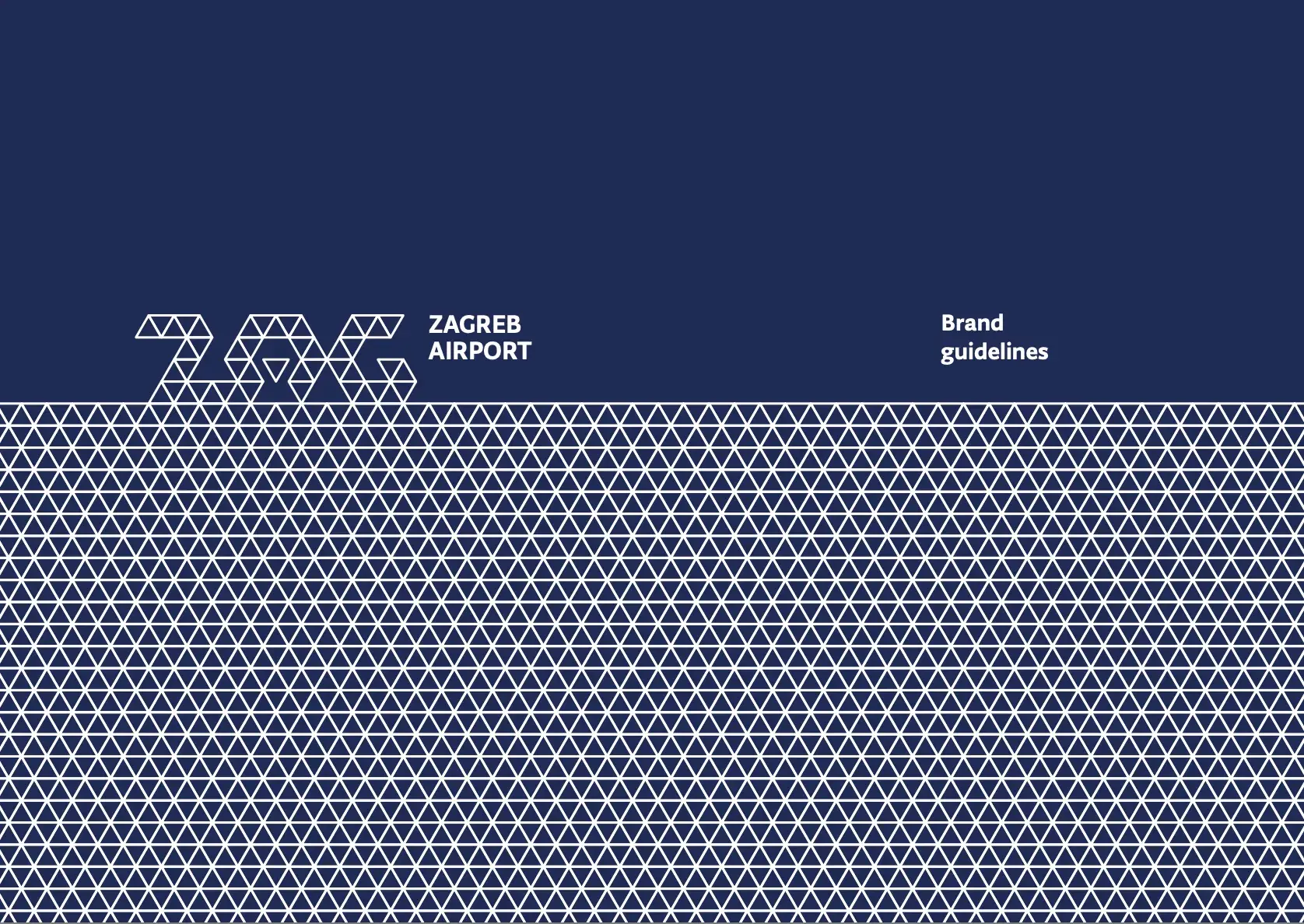
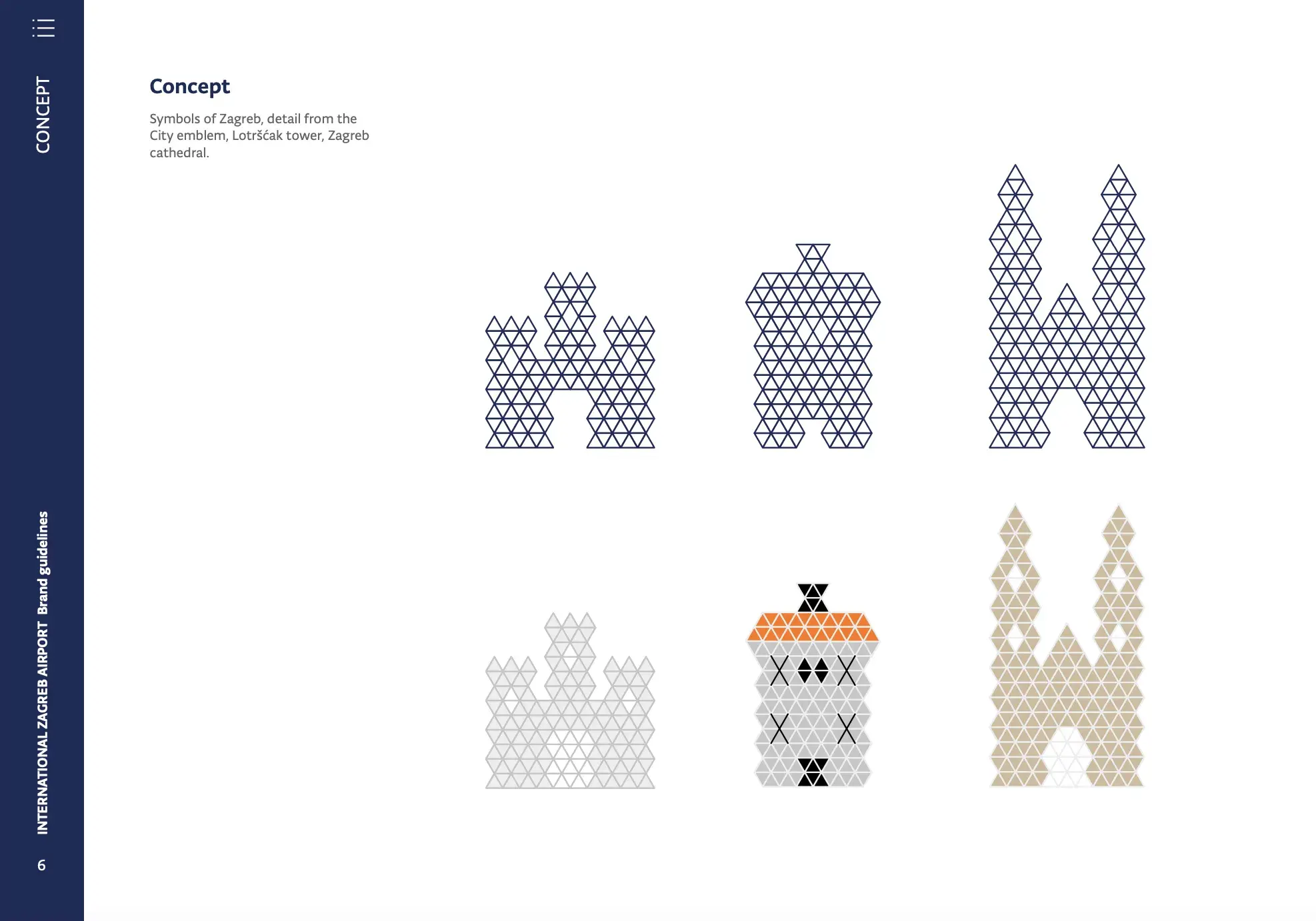
Image Source
What I like: Zagreb Airport in Croatia uses a simple triangle as a building block for complex iconography that references Croatian heritage and culture.
16. Oxford Student Union
See the full Oxford Student Union brand guide.
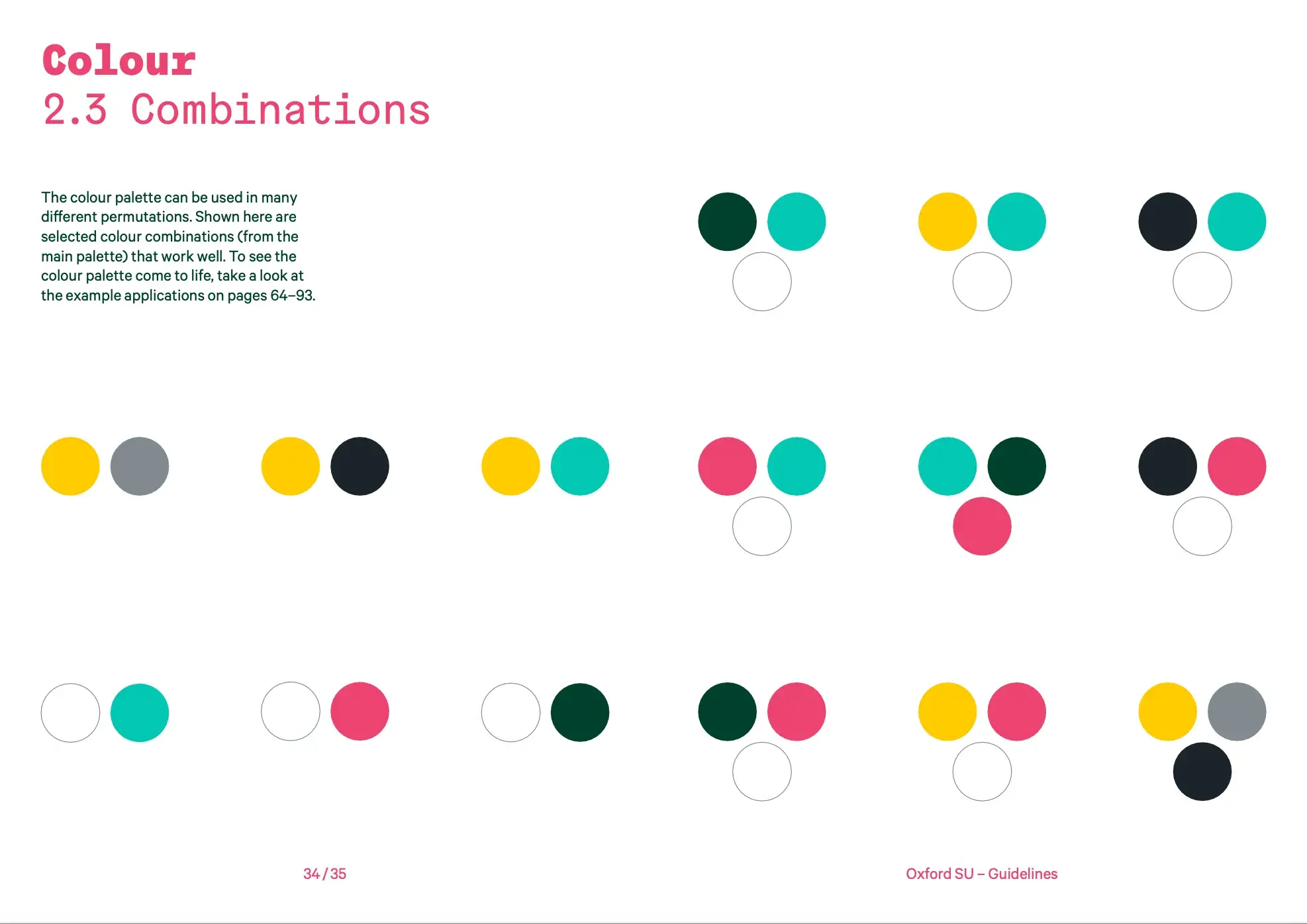
What I like: The addition of colo(u)r combinations is a nice touch here. I’m one of those people who can take a perfectly lovely color palette and make a muddy mess of it, so this is something I’d love to see in more style guides.
17. Fiat 2019
See the full Fiat 2019 brand guide.
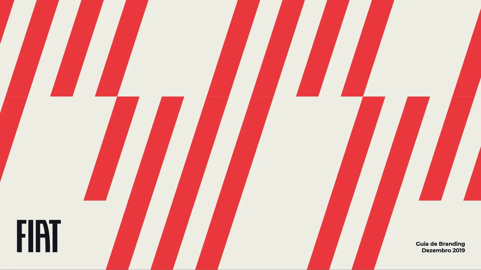
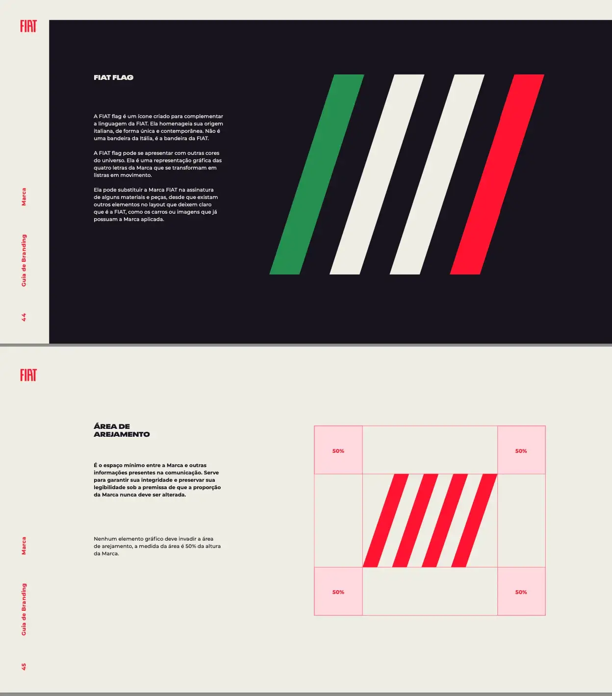
Image Source
What I like: The four diagonal lines in Fiat’s logo are mesmerizing. Fiat has incorporated those simple four lines across its branding in playful, creative ways, like changing the length of half the lines, as it’s done on the cover (above).
18. Team Canada
See excerpts from the Team Canada brand guide.
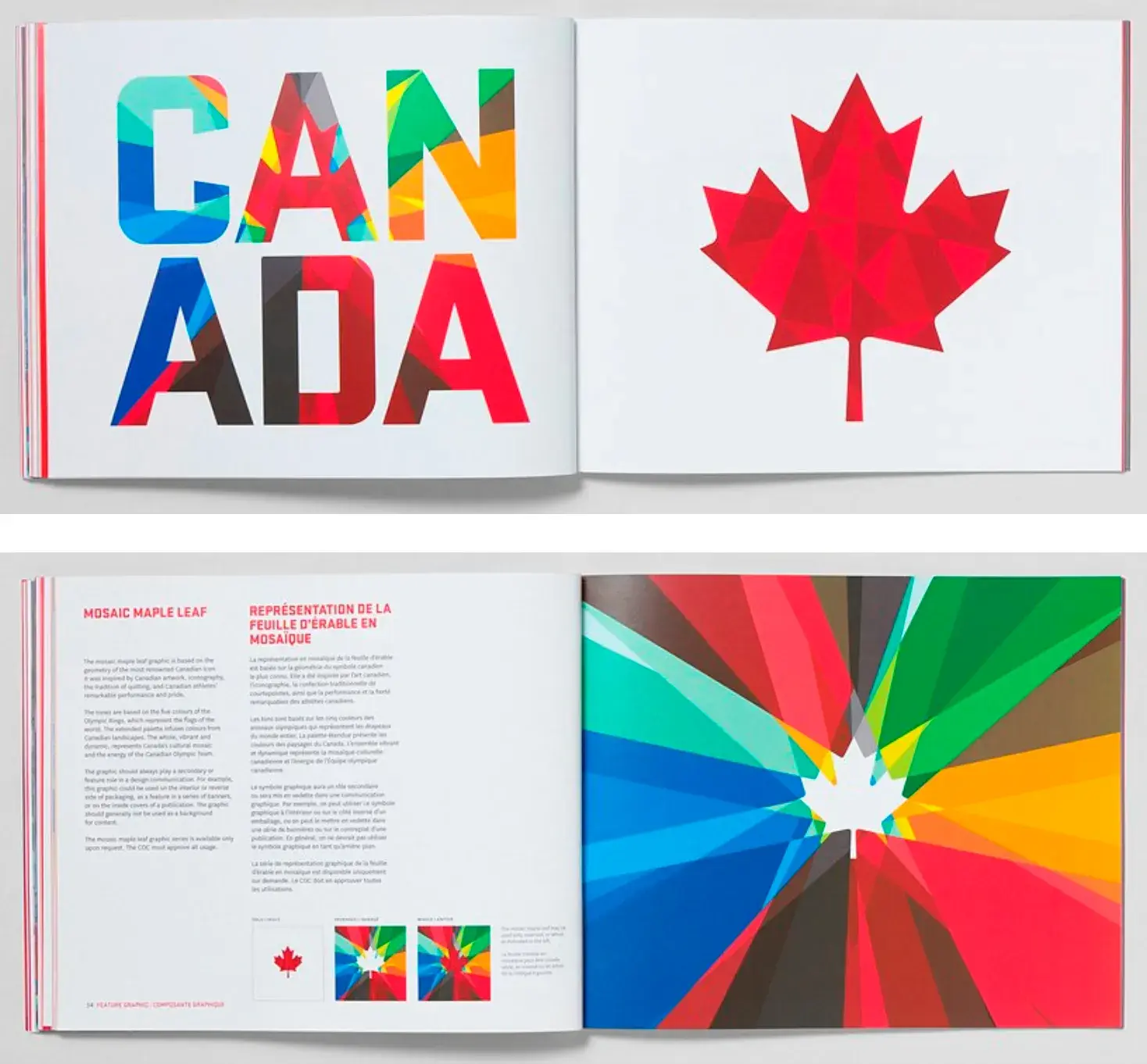
Image Source
What I like: Even though only a few excerpts are available from the full 88-page brand guide, I’m including this because it’s simply gorgeous. Canada’s red maple leaf could have been a tired symbol, but the designers reimagined it with complex geometric patterns and bold colors.
19. Hulu
See the full Hulu brand guide.

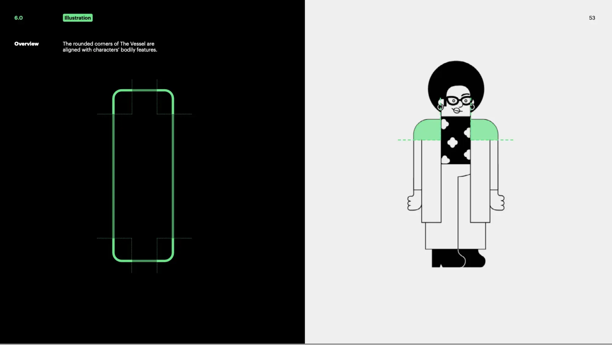
Image Source
What I like: Hulu does a lot with a relatively limited palette, mixing it up with bold typefaces and whimsical illustrations. I also like this shade of green — despite being a common color, Hulu has landed on a standout hue.
20. Brasil Governo Federal
See the full Brasil Governo Federal brand guide.
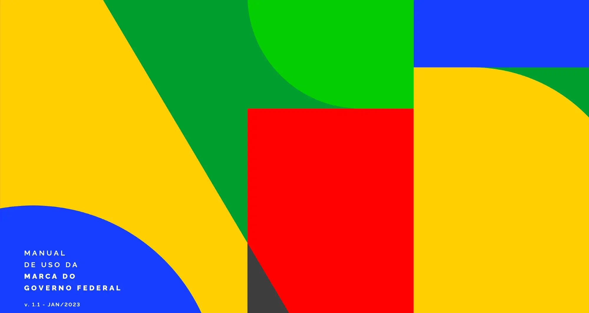
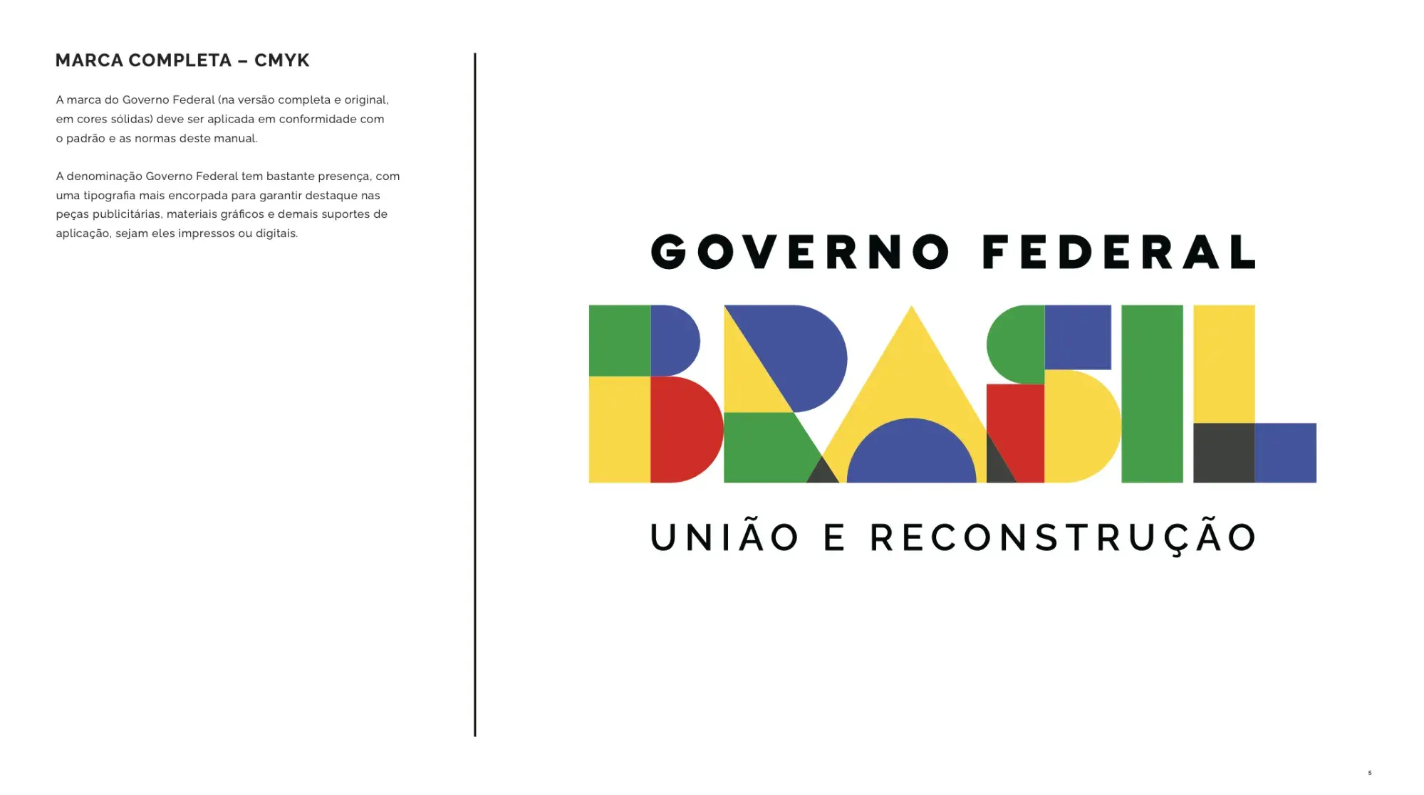
Image Source
What I like: Brasil Governo Federal’s bold style and brash colors are eye-catching, to say the least. The style guide includes information on how to use the logo in video, which in my experience is a brand question that often goes unanswered.
21. IBM
See the full IBM brand guide.
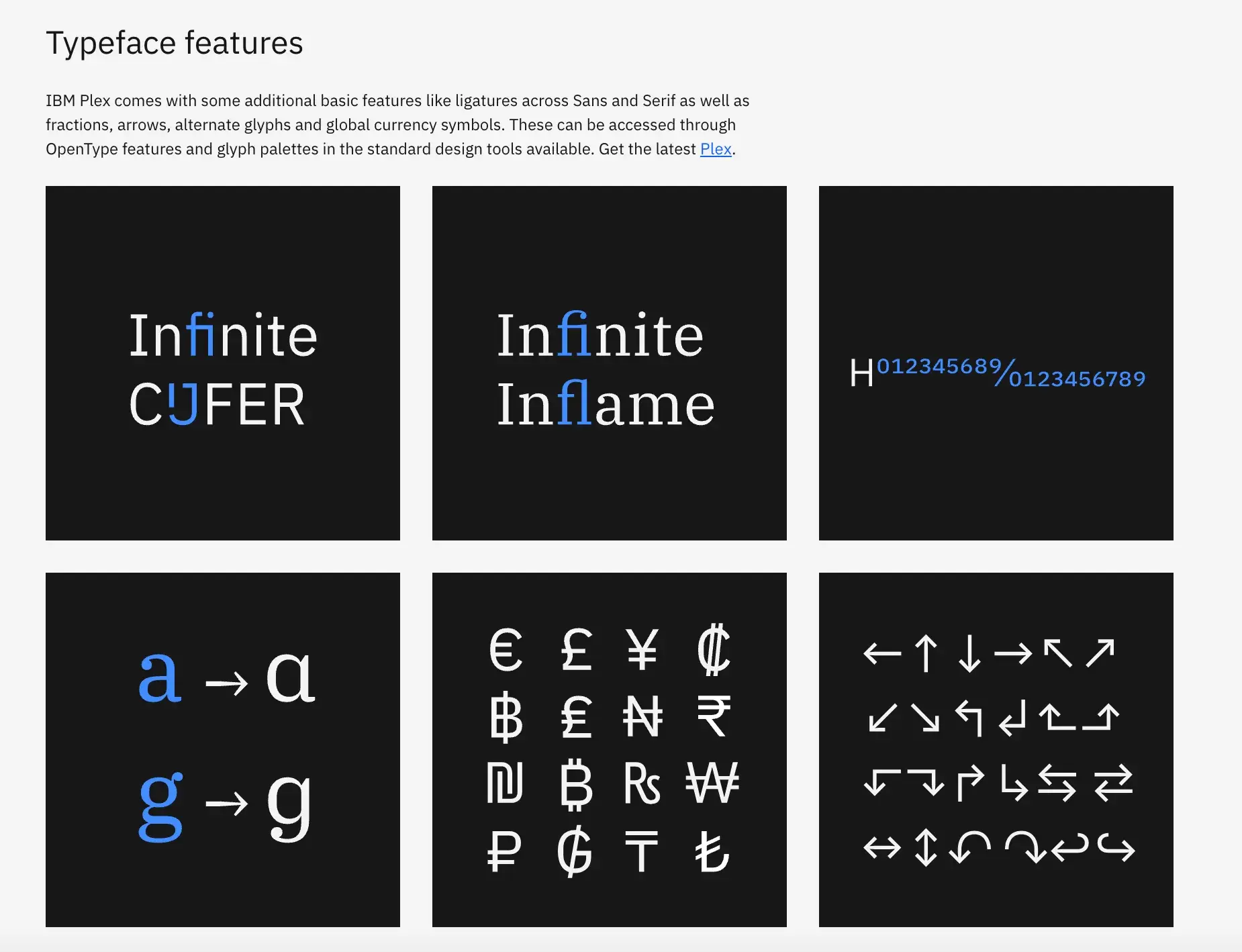
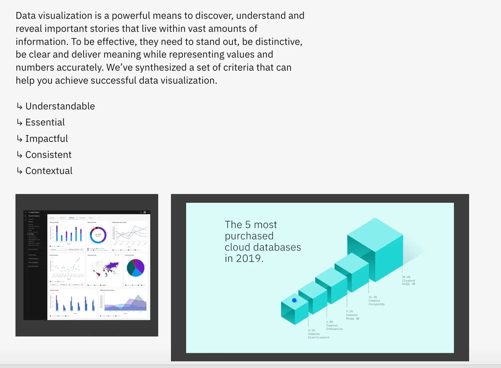
Image Source
What I like: IBM’s brand guide is an incredible interactive experience with videos and custom typeface previews. It’s also among the most comprehensive of this entire list, since it includes support for non-Latin scripts like Arabic and fonts that support alternate glyphs and even ligatures. There’s even an entire section dedicated to data visualization.
22. American Airlines
See the full American Airlines brand guide.

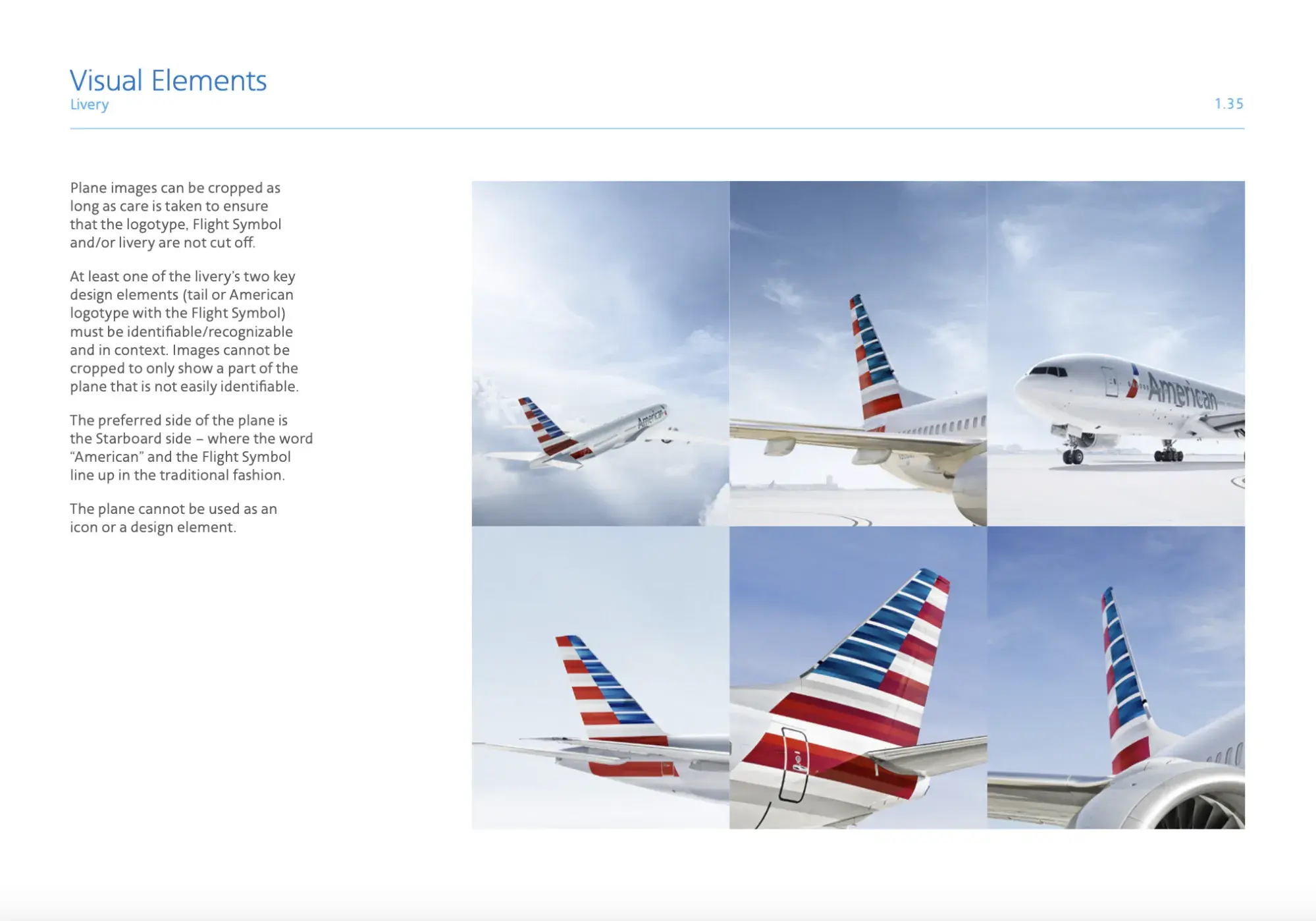
Image Source
What I like: American Airlines’ style guide has a ton of examples, including specifics like what part of the airplane can be shown in a photo. Considering how many different types of ads the airline runs, it’s useful to have so many specific details to help avoid human error and inconsistencies.
23. British Rail
See the full British Rail corporate identity manual.
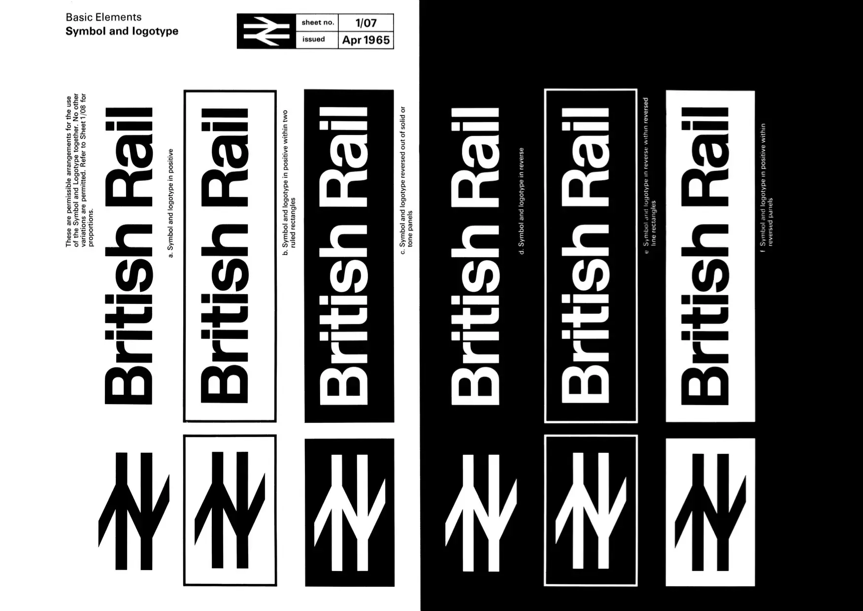
What I like: British Rail’s corporate identity manual collects several decades of brand changes — it’s worth a look just to trace the subtle differences over time.
24. Elizabeth Line, Transport for London
See the full Elizabeth Line brand guide.
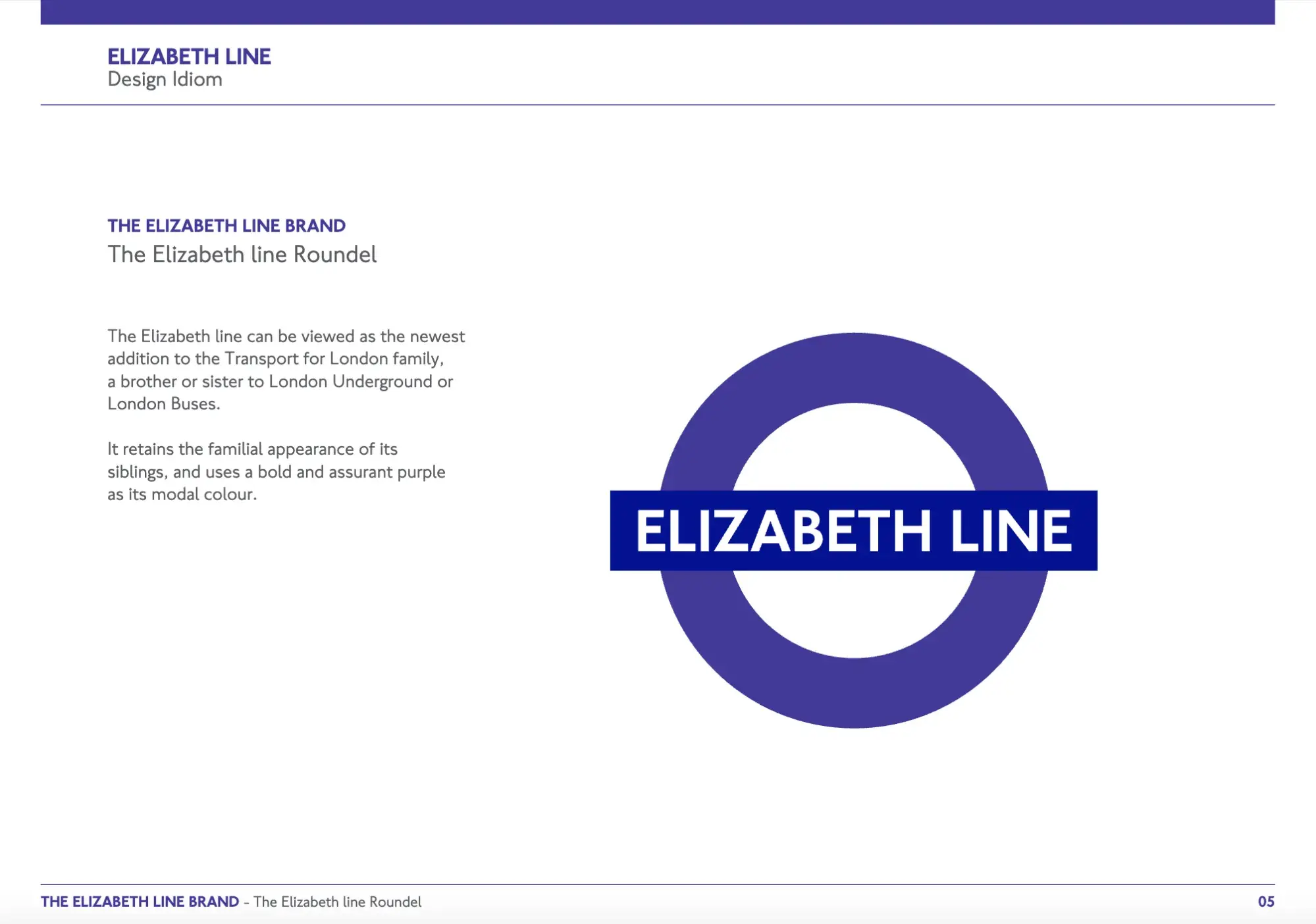
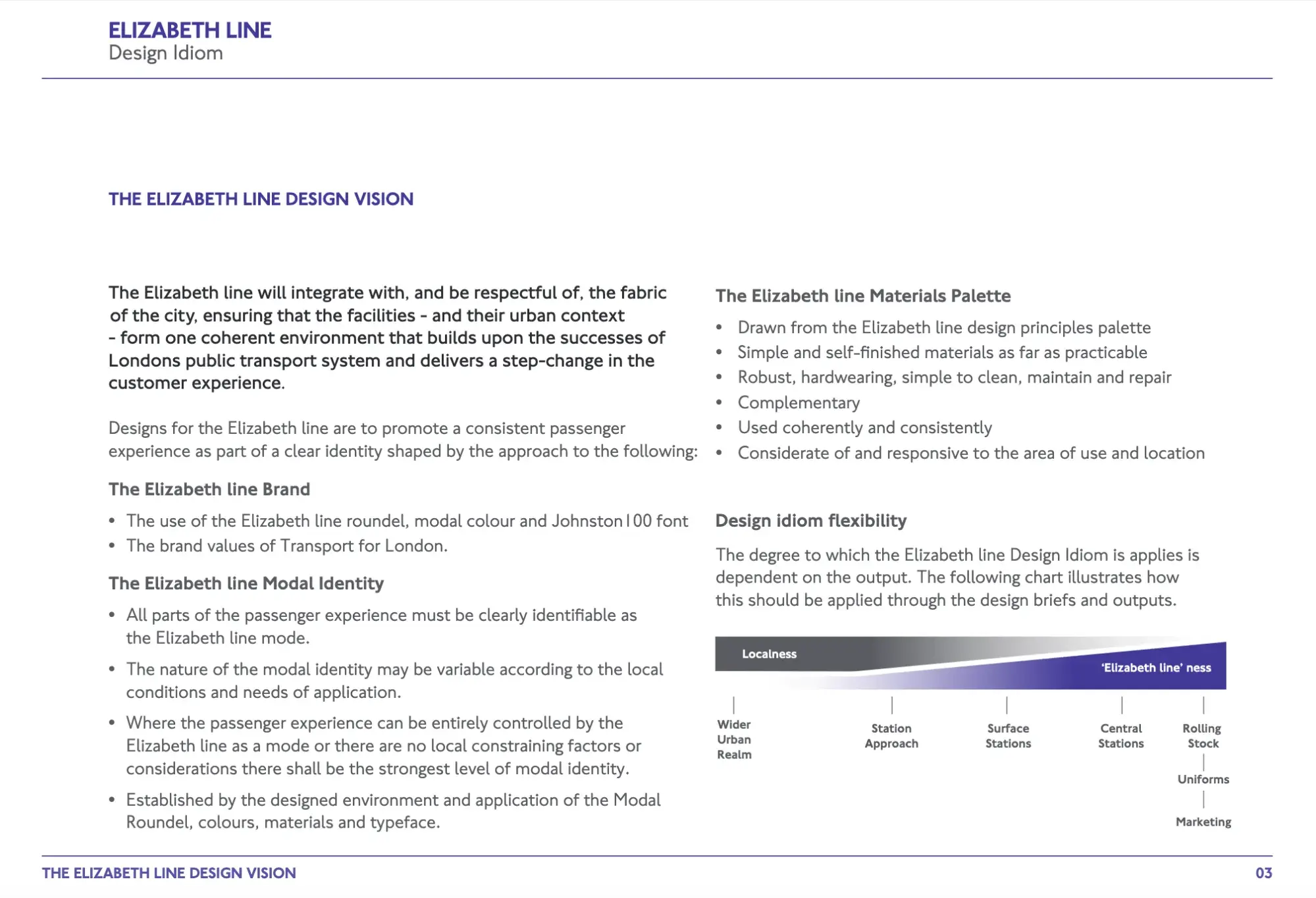
Image Source
What I like: TfL, London’s transport authority, created a brand guide for its newest addition, the Elizabeth line. It even includes a section on “design idiom flexibility,” which provides guidance on how much Elizabeth line branding to use on a scale of “localness” to “Elizabeth line-ness.”
25. Medium
See the full Medium brand guide.
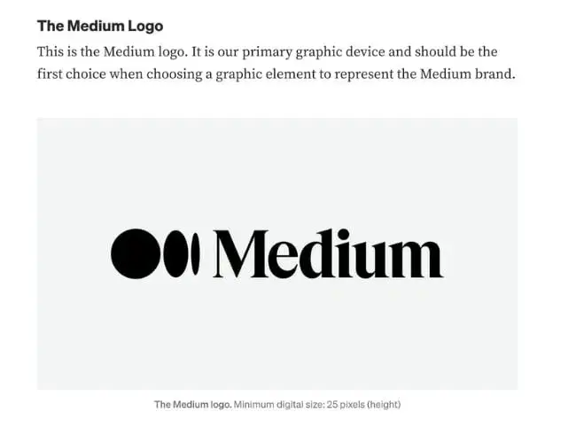
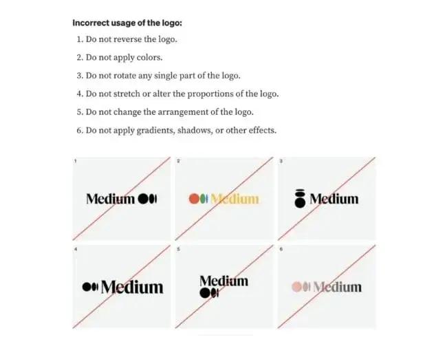
Image Source
What I like: Medium‘s simple brand style guide emphasizes usage of its logo, wordmark, and symbol. Medium’s logo is the brand’s primary graphic element and was created to feel “confident, premium, timeless, and modern.”
26. Walmart
See the full Walmart brand guide.
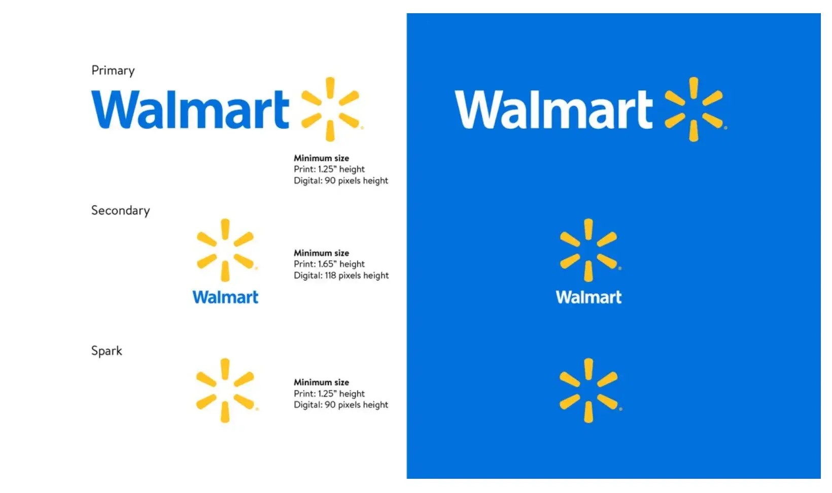
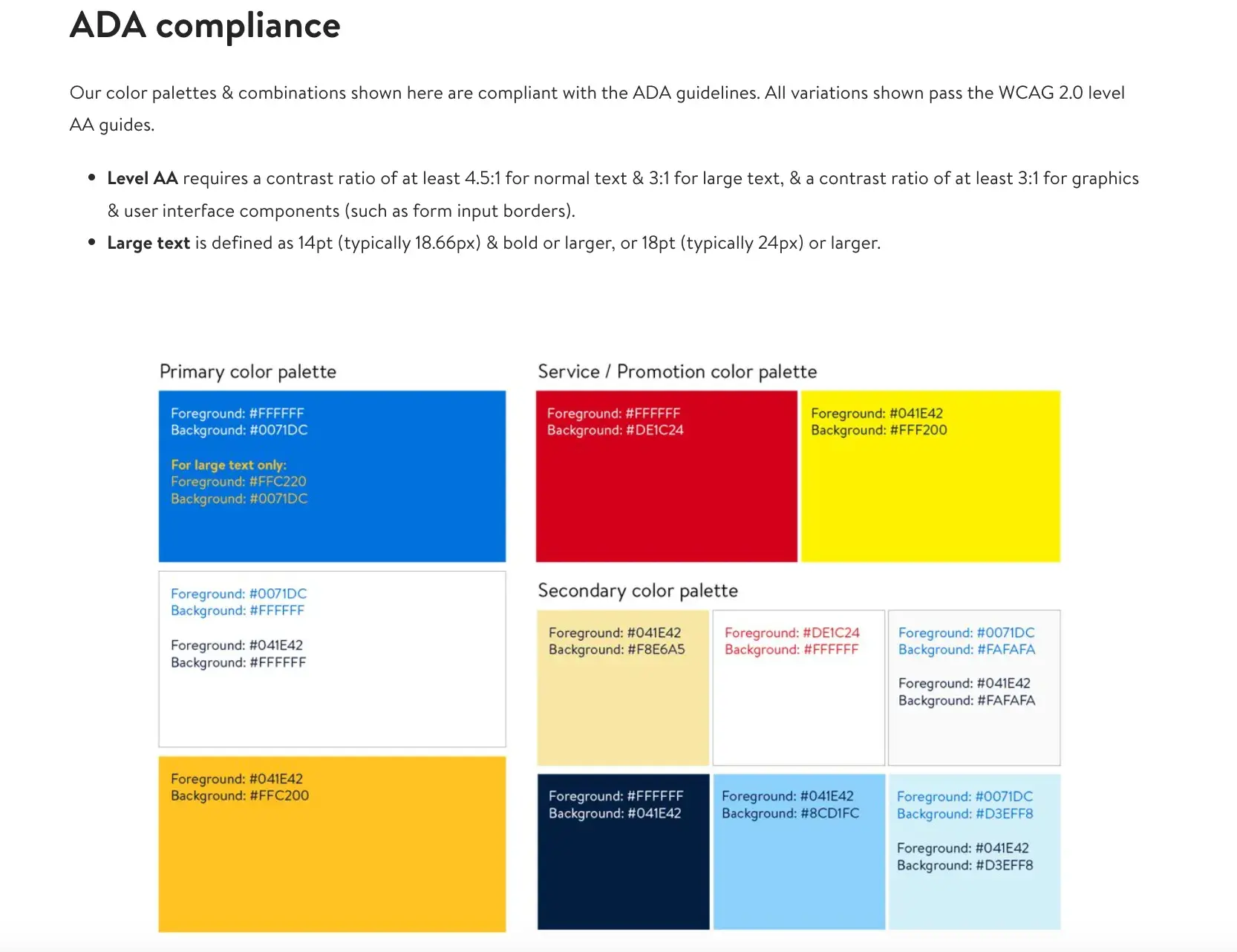
Image Source
What I like: The guide includes the brand‘s logo, photography, typography, illustrations, iconography, voice, editorial style, and more. Walmart’s color palette is so integral to its brand identity that its primary color is called “Walmart Blue.”
27. Asana
See the full Asana brand guide.
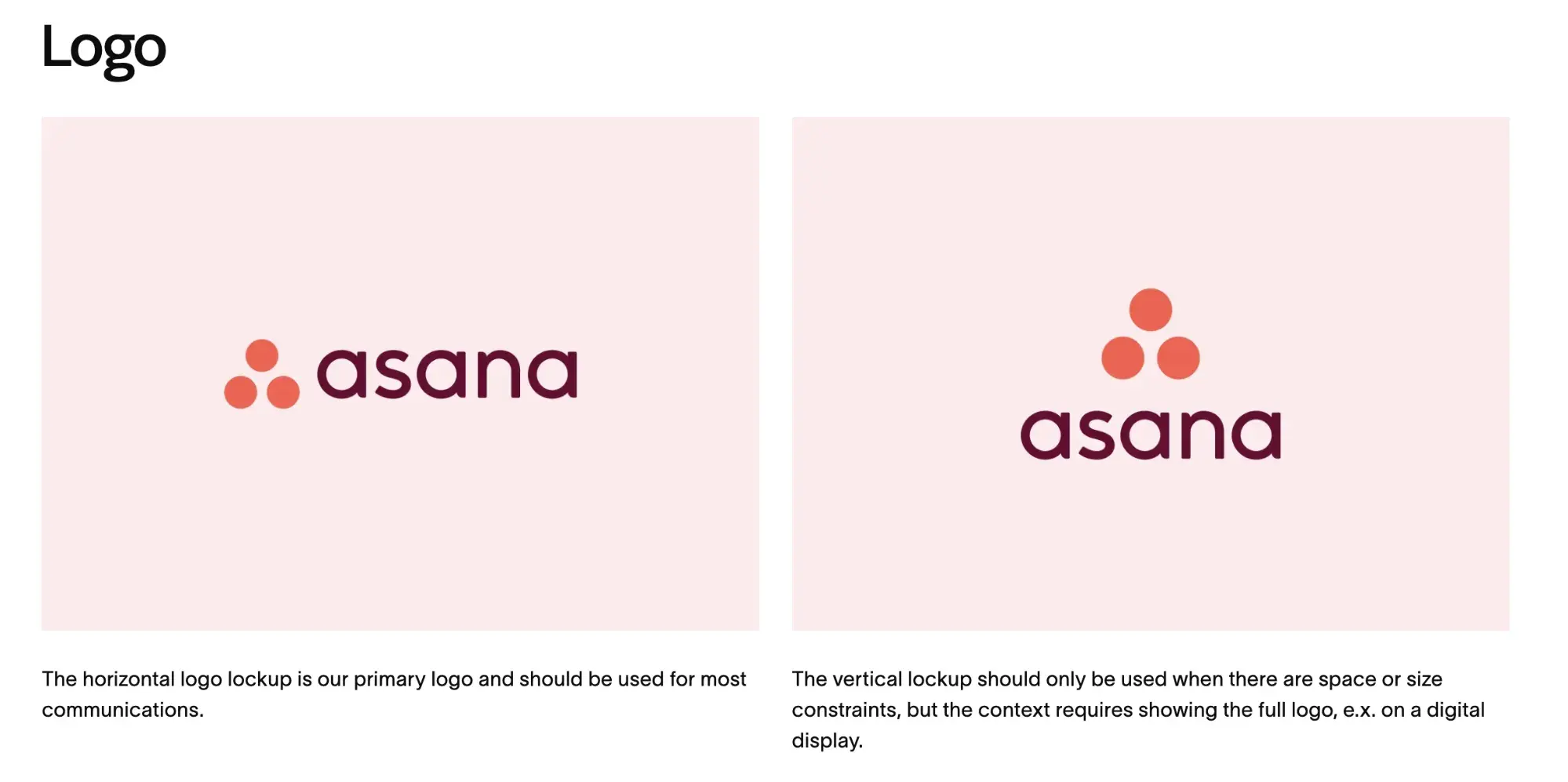
Image Source
What I like: Asana‘s simple style guide highlights its logo and color palette. It also explains how to properly use the brand’s assets.
28. Spotify
See the full Spotify brand guide.
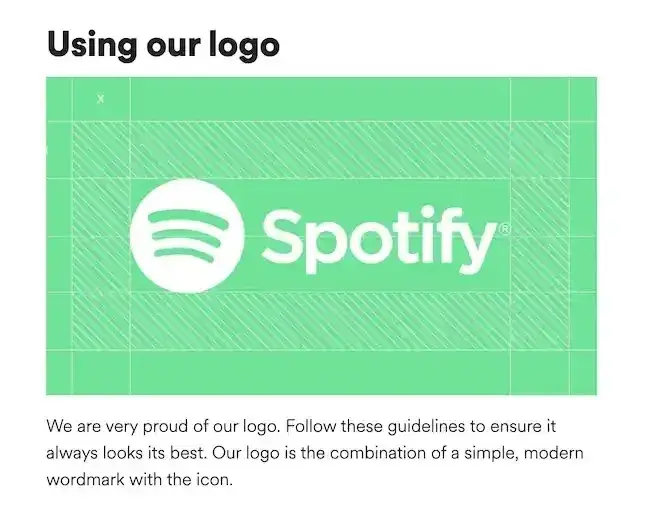
Image Source
What I like: Spotify‘s color palette includes three color codes, while the rest of the company’s branding guidelines focus on logo variation and album artwork. The style guide even allows you to download an icon version of its logo, making it easier to represent the company without manually recreating it.
29. Starbucks
See the full Starbucks brand guide.
What I like: Starbucks’ interactive brand style guide includes details about how to use its core elements such as the iconic Siren logo and green color palette. Plus, the guide features a visual spectrum of how their creative assets can be used across different channels.
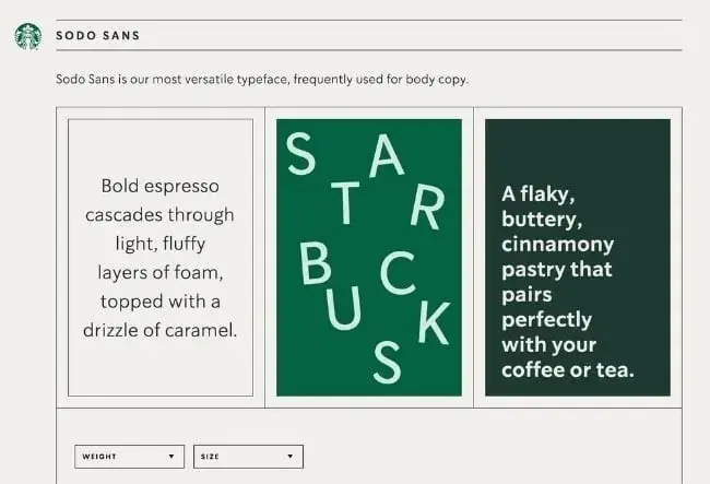
Image Source
30. Paris 2024
See the full Paris 2024 brand guide.
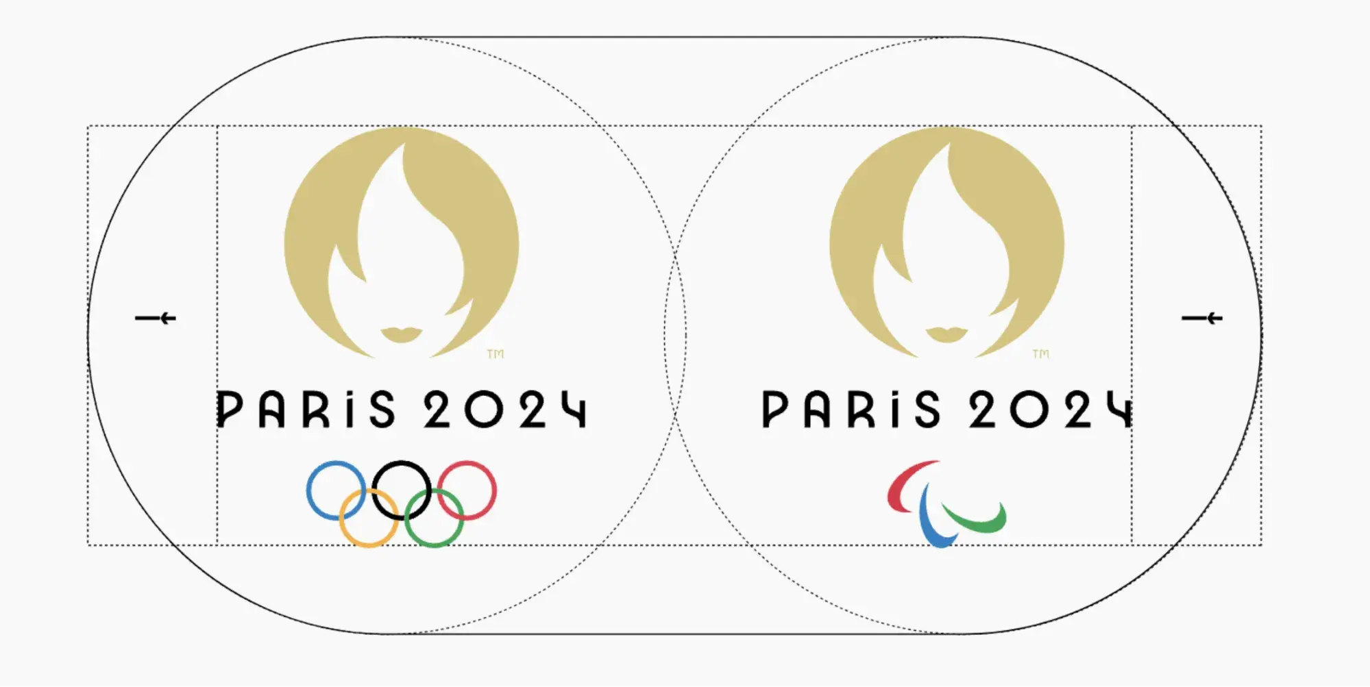
What I like: Paris 2024’s brand identity pays homage to the 1924 Olympic Games through Art Deco-inspired design. Best of all, designers applied eco-branding methods to reduce the amount of ink and paper needed for physical materials as well as limit the power and data consumption on digital elements.

Image Source
This brand guide also reinvents all 62 pictograms from the Olympic and Paralympic Games as “coat of arms that serve as rallying cries for sports fans.” Each pictogram is designed on an axis of symmetry that reinforces the coats of arms iconography. Go straight to the pictogram guidelines to take a look. The ones below represent surfing, swimming, table tennis, and taekwondo.
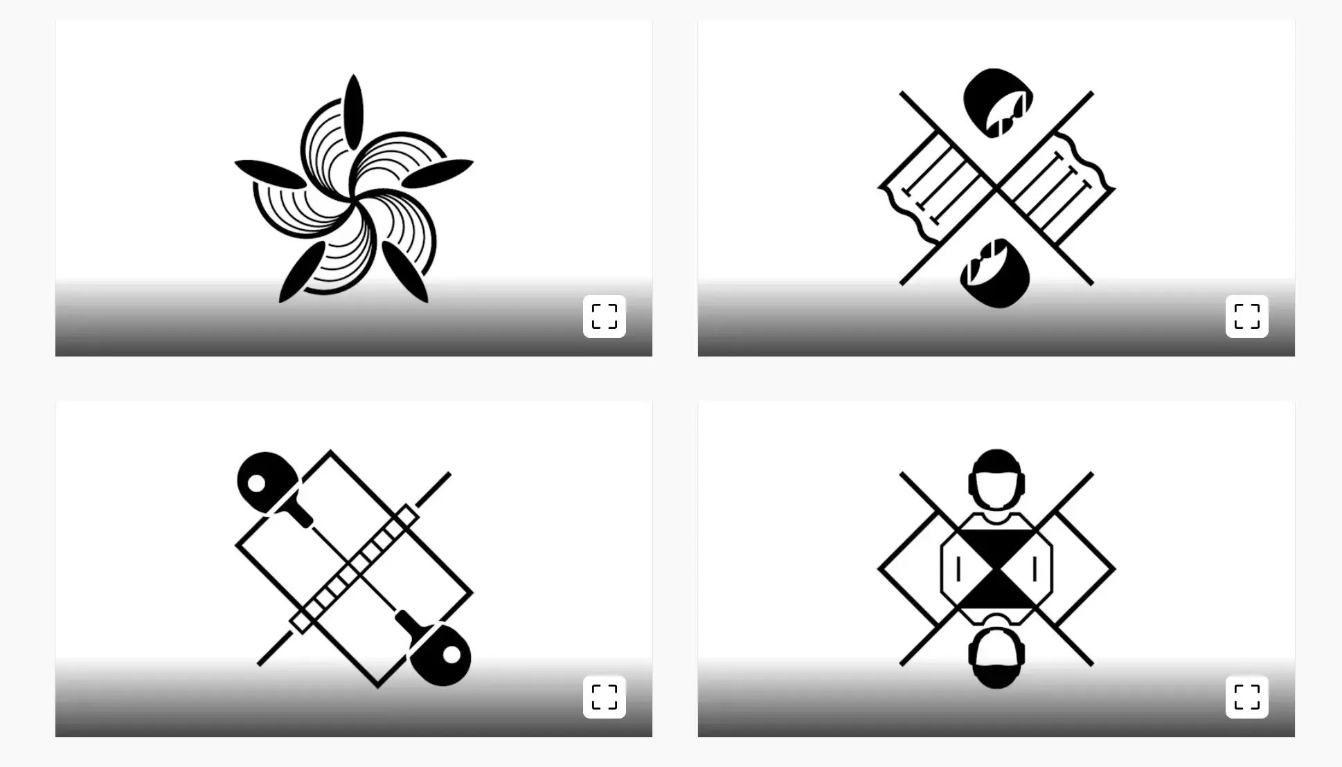
Image Source
31. Urban Outfitters
See the full Urban Outfitters brand guide.
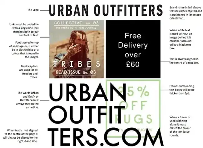
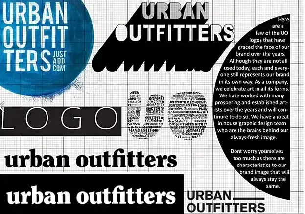
Image Source
What I like: Photography, color, and even tone of voice appear in Urban Outfitters‘ California-inspired brand guidelines. Plus, the company includes information about its ideal consumer and what the brand believes in.
32. Love to Ride
See the full Love to Ride brand guide.

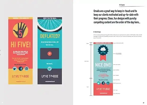
Image Source
What I like: Love to Ride, a cycling company, is all about color variety in its visually pleasing style guide. The company’s brand guidelines include nine color codes and tons of detail about its secondary logos and imagery.
33. Barbican
See the full Barbican brand guide.
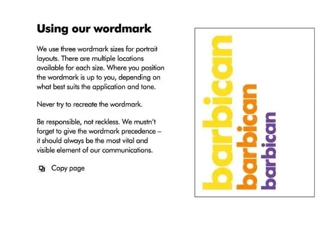
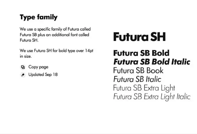
Image Source
What I like: Barbican, an art and learning center in the United Kingdom, sports a loud yet simple style guide focusing heavily on its logo and supporting typefaces.
34. I Love New York
See the full I Love New York brand guide.
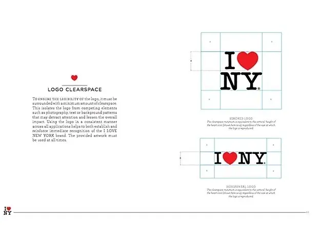
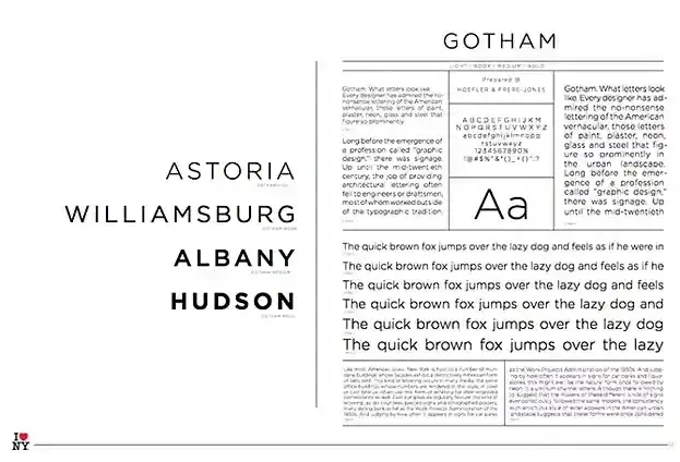
Image Source
What I like: Despite its famously simple T-shirts, I Love New York has a brand style guide. The company begins its guidelines with a thorough explanation of its mission, vision, story, target audience, and tone of voice. Only then does the style guide delve into its logo positioning on various merchandise.
35. TikTok
See the full TikTok brand guide.
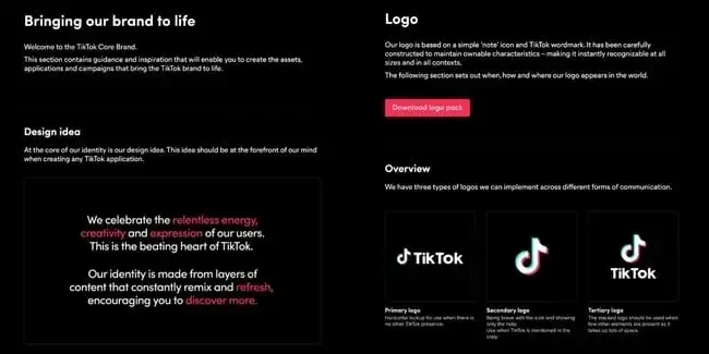
Image Source
What I like: TikTok‘s style guide isn’t just a guide — it’s an interactive brand book. First, it provides an in-depth look into how it brings its brand to life through design. Then, it gives an overview of its logo, co-branding, color, and typography.
36. University of the Arts Helsinki
See the full University of the Arts Helsinki brand guide.

What I like: The style guide of the University of the Arts Helsinki is more of a creative branding album than a traditional marketing guide. It shows you dozens of contexts in which you‘d see this school’s provocative logo, including animations.

Image Source
37. Western Athletic Conference
See the full Western Athletic Conference brand guide.
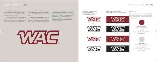
Image Source
What I like: The Western Athletic Conference’s brand style guide includes extensive information about its history, mission, and vision. It also highlights its member universities and athletic championships and awards it is involved with.
38. Discord
See the full Discord brand guide.
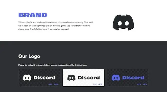
Image Source
What I like: Discord‘s brand guide is as colorful and playful as the communities it serves. The brand’s motion elements are based on the dot, which represents the Discord user interacting with others in the communities it belongs to.
39. Netflix
See the full Netflix brand guide.
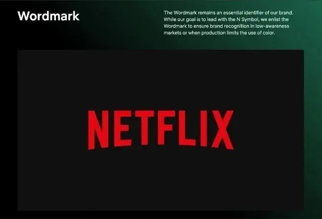
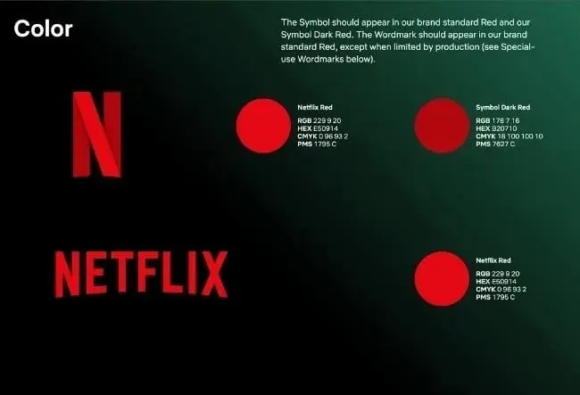
Image Source
What I like: As far as its public brand assets are concerned, Netflix is focused primarily on the treatment of its logo. The company offers a simple set of rules governing the size, spacing, and placement of its famous capitalized typeface.
40. NASA
See the full NASA brand guide.
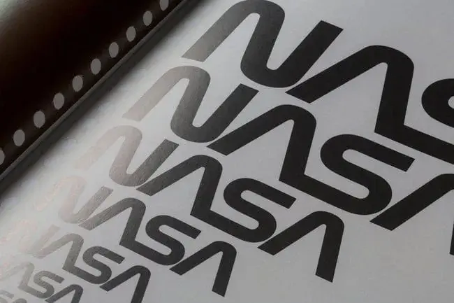
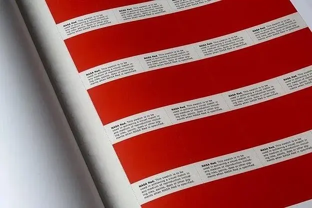
Image Source
What I like: NASA‘s “Graphics Standards Manual” is as official and complex as you think it is. At 220 pages, the guide describes countless logo placements, color uses, and supporting designs. And yes, NASA’s space shuttles have their own branding rules.
41. New York City Transit Authority
See the full New York City Transit Authority brand guide.
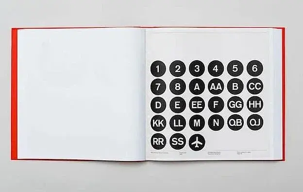

What I like: Like NASA, the NYCTA has its own Graphics Standards Manual, and it includes some fascinating typography rules for the numbers, arrows, and public transit symbols the average commuter takes for granted every day.
Branding Guidelines Tips
If you want to take your branding style guide to the next level, let HubSpot’s Brand Kit Generator do some of the heavy lifting for you.
I’d also recommend following the best practices below, which the HubSpot Creative team has used to disseminate branding information to the rest of the HubSpot Marketing team.
This has not only made my job as a blogger easier, but also makes our branding feel well thought-out and cohesive.
1. Make your guidelines a branded document.
Whether you’re publishing your branding guidelines online or creating an internal presentation, consider making the guidelines themselves a branded document.
Ensure the published document follows your established brand voice, uses the symbols and imagery you’ve created, and employs the colors and typography that makes your brand feel like you.
Insights from HubSpot’s Creative Team
When our Creative team rolled out a visual identity refresh for the HubSpot brand, we all received access to a branded playbook that summarized all the changes and described how we should represent HubSpot online moving forward.
Not only was I a huge fan of the refresh, but also of the way it was presented to our team in a branded document.
You can do the same, regardless of your budget. Our Creative team actually used a free tool, Google Slides — so it’s totally doable for a small or freelance brand!
2. Name your brand’s colors.
You’ve already chosen your color palette — why not go as far as naming the colors?
Giving your colors unique names (aside from “blue” or “orange”) can help you tie the tactical elements of your branding into an overall theme or ethos.
Not to mention that it’s awesome to be able to refer to company colors by a unique name. Imagine if we called Solaris, HubSpot’s primary brand color, “HubSpot Orange” — that simply doesn’t have the same ring.

Insights from HubSpot’s Creative Team
In our visual identity refresh, our Creative team brightened and intensified our color palette, then renamed the individual hues.
They wrote, “Every color, tint, and shade is based on central themes. […] Whether it’s a subway line in Paris, or a flower-lined street in Japan, the secondary color names are a veritable tour of important cultural and geographical touchstones from HubSpotters all over the world.”
Think about what makes your brand unique, and why you chose the colors that you did. For instance, if you work at a law firm that specializes in car accident cases, you might choose red as one of the brand colors and call it “Stop Light.”
3. Create easy-to-use branded templates.
Alongside your branding guidelines should be templates to empower your team to easily design branded assets, even if they’re not designers.
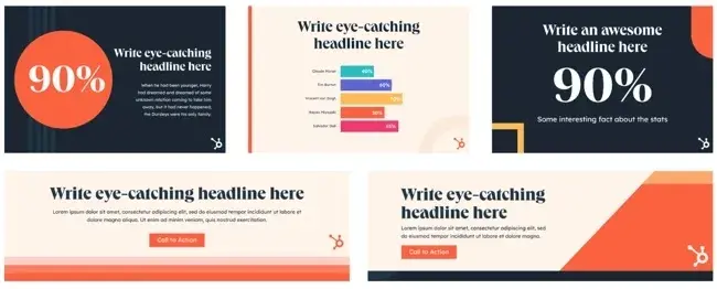
Insights from HubSpot’s Creative Team
At HubSpot, we keep all of our templates in our team’s Canva account. There, anyone (myself included) can edit pre-made designs for any number of use cases.
As a writer on the HubSpot blog, I have to create graphics to supplement the information I’m sharing.
The branded templates made by our Creative team have made my work a great deal easier, and I can imagine that it’s the same for our Social Media team.
Not everyone is a designer, but with templates, you can ensure your brand looks professional no matter who creates an asset.
4. Ensure your branding is optimized for all channels.
Your branding guidelines should include different specifications for different channels.
Or, alternatively, you should have assets and designs that can be adjusted for various channels and mediums. Not only for sizing purposes, but for accessibility purposes, too.
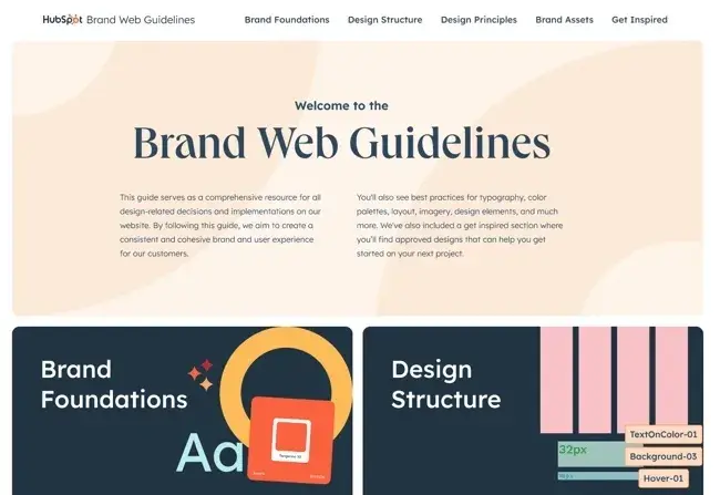
Image Source
For instance, if you primarily market your brand over Instagram and on your website, then your branding should have web accessible colors, as well as Instagram-friendly designs and sizes.
However, you don’t want to significantly change your branding from channel to channel. It should work relatively well no matter where you’re marketing your brand.
Build a Memorable Style Guide of Your Own
Once you build your unique brand style guide, customers will recognize your brand and associate it with all the visual cues you want them to.
I hope you were inspired by our list of amazing brand style guides and wish you luck in creating a timeless style of your own.
Editor’s note: This post was originally published in January 2017 and has been updated for comprehensiveness.
![]()
این خبر را در ایران وب سازان مرجع وب و فناوری دنبال کنید
جهت دانلود و یا توضیحات بیشتر اینجا را کلیک نمایید