Are you trying to discover what are the best and most impactful website design trends today?
Trends are constantly evolving to meet the demands of an ever-changing digital landscape. So it’s important to stay updated on what’s HOT right now.
And instead of doing the research yourself, we spent the last month and a half carefully investigating the most influential web design trends and curating them into this collection.
From simplicity and boldness to special effects, animations and many more in between, there’s something for everyone.
Whether you’re a designer seeking inspiration or a business owner looking to revamp your online presence, this article will provide invaluable insights into modern web design’s direction.
You’re welcome to apply any that sparks your interest and enjoy a refreshment.
Best Website Design Trends
1. White Space

The power of white space is that it brings all the content front and center – without distraction. It’s a tested and proven technique that works for any website, regardless of the niche.
This approach improves readability, creates a more pleasant navigation and highlights key elements for a much better user experience (UX).
In addition to that, when creating a website with an emphasis on white space, your online presence will automatically appear more professional and modern (and you don’t really have to do much to achieve a better result).
2. Micro-Interactions

This and the following website design trend are fantastic attention-grabbers. Micro-interactions enhance engagement and site interactivity, contributing to longer on-page times (because of how fun they are!) and memorable experiences.
These special effects guide the visitors to perform specific actions and guide them “to do” particular things.
Thus, you must place micro-interactions on your website strategically and intentionally and create a more focused UX. Otherwise, they may add unnecessary bloat and distract the visitors.
3. Micro-Animations

While micro-interactions contribute to a more focused and guided website encounter, micro-animations can add a layer of fun and entertainment.
However, they also work great in sparking emotions or expressing particular feelings and sensations that might be harder to evoke through text.
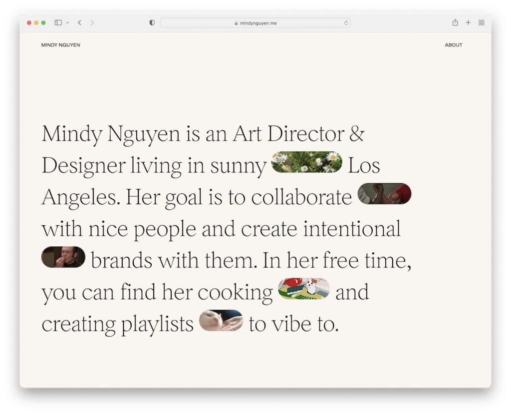
One micro-animation style that works fantastically well is GIFs, which Mindy is well aware of.
4. Parallax Scrolling

The parallax scrolling effect enhances visual appeal first and foremost. It adds depth and dimensions to the site, making it more engaging and memorable. Memorability comes from the unique and innovative browsing the visitors may find refreshing.
The parallax effect can also boost storytelling, keeping visitors’ attention and encouraging them to continue navigating through the website.
Add dimension for an immersive feel that elevates the overall design aesthetic.
Need inspiration? Check these great parallax scrolling websites.
5. Rounded Corners

Rounded corners became popular because of (mobile) applications but soon got adopted in website design, too. Why? Because they work.
Instead of rough corners, rounded corners reduce harshness, creating a better and more natural eye flow.
What this also does is it alleviates visual discomfort, which calls for a more gentle and comfortable visual experience. This is especially helpful if the visitors engage with the content for more extended periods.
But rounded corners also instantly make the site more modern and trendy, which your users might be used to.
6. Bold/Large Typography

One of the trends in website design is the use of bold and large typography. This works if you plan to add little text to your page (to avoid too much white space) or to make a statement and a strong first impression on your visitors.
Enhanced typography contributes to clarity and focus and guides the visitors’ attention through a better hierarchy.
And then there’s mobile – smaller screens and tiny fonts don’t work together too well. So you maintain fantastic readability and impactfulness by enlarging them.
In short, if you want to make something stand out – communicate it through bold and large fonts.
7. Dark Mode

Dark mode is a website design trend that’s been around for a while. It offers benefits such as reduced eye strain (during nighttime hours), improved readability (don’t use complicated typography), energy efficiency, visual focus (brighter elements stand out more), modern aesthetics and user personalization.
Remember, adding a toggle (usually located in one of the corners) is advantageous, even if you create a website with a dark look by default. Give the visitor the freedom to switch to light or day mode because not everyone fancies dark/night web design.
One way of creating such a website is by using a dark WordPress theme. (It’s easy and doesn’t require experience.)
8. Gradients And Color Transitions

Just like the parallax effect adds depth and stronger immersion, so do gradients and color transitions create “a new dimension.”
This creates smooth and seamless transitions between different website sections and elements, whether large chunks of text, white space or something else.
Gradients and transitions also allow designers to create custom colors to intensify branding and personalization.
Friendly tip: Include animations and effects with great care when using gradients and color transitions because you can easily overdo it (and create a mess).
9. Minimalism (It Always Works!)

Whenever in doubt about how to approach website design, go minimalist and save yourself plenty of time and effort.
Why? Two words: It. Works.
Strip away the unnecessary elements and create a more streamlined and purposeful design for a user-centered experience with little to no distractions.
Minimalism in website design provides a personalized experience through clean design, improved engagement, enhanced readability, faster loading times (no extra features and functions), focus on essential elements and a timeless aesthetic.
Finally, it’s a versatile web design trend that works for any business and any industry.
Ge a dose of minimalism through these epic minimalist website examples.
10. Illustrations And Custom Graphics

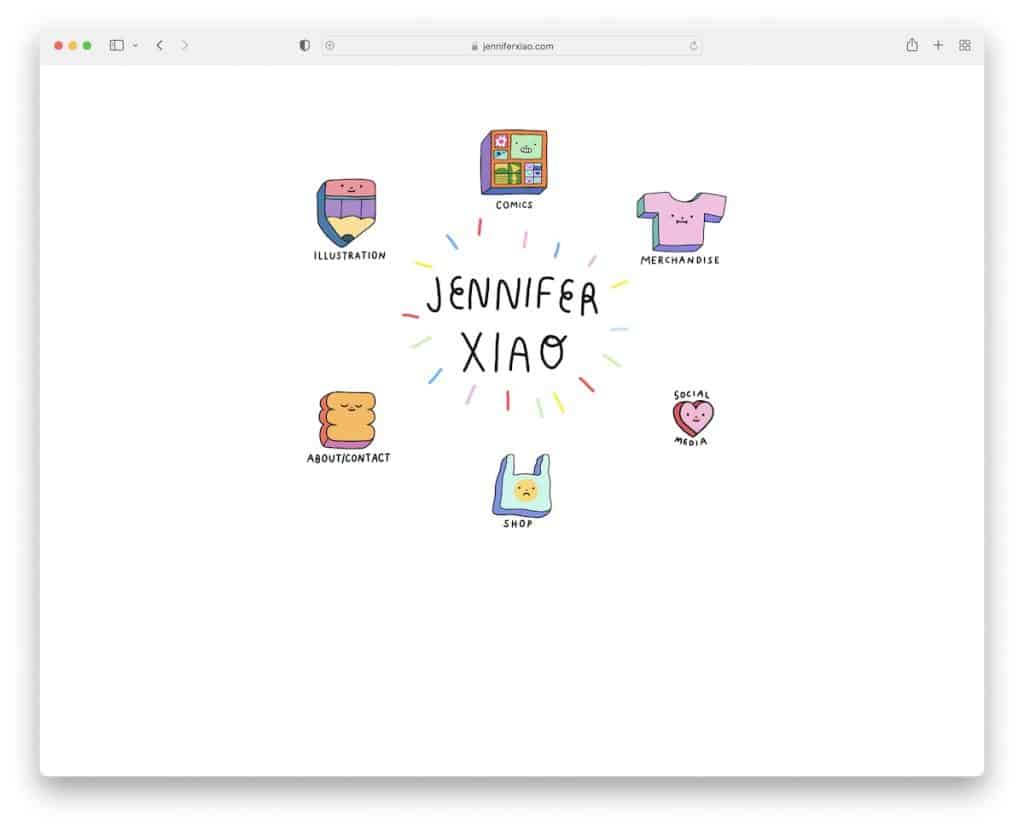
If you want to stand out from the crowd, add illustrations and custom graphics to your website. Simple.
By leveraging custom visuals effectively, you can create visually engaging, memorable and inclusive website experiences and effectively communicate (hint: simplify complex concepts, evoke emotions and create a narrative) with users.
Custom graphics allow designers to tailor the visuals to the brand’s identity and create a cohesive and distinct visual language.
11. Asymmetric Layouts

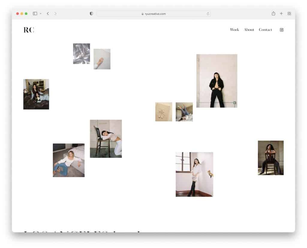
If everyone uses symmetrical shapes, go against the grain with asymmetrical ones. While this isn’t a website design trend you’d see many use, it’s starting to pop up more often than not.
What’s the deal behind creating asymmetrical layouts?
They give the website energy by creating visually interesting presentations that draw attention. That’s why using asymmetry can work great for highlighting specific site areas or elements (hint: products and services).
Make it more dynamic and differentiate from the rest.
12. Custom Cursors

One of the main reasons for using custom cursors on your website is an improved user experience. They can boost interaction and engagement, which may cause the visitor to stay on your website longer.
(Maybe it’s just me, but I always play with the custom cursor first for a few seconds before I even start browsing the page.)
Also, as a pizzeria, you can create a custom cursor in the shape of a pizza (yes, it exists, but I cannot find the website) as an extension of your branding.
Make your site visitors go: “That cursor is SOOO cool!”
13. Accessibility-Focused Design

An accessibility-focused approach in website design promotes inclusivity, expands reach and target audience, improves the user experience for all users, provides SEO benefits and future-proofs the website.
In plain English, if you want to make your website accessible to a wider audience, make it accessibility-friendly.
You can do this by integrating a simple accessibility menu/configurator so that the user can modify the website look according to their needs.
Demonstrate a commitment to equal access and usability, benefiting visitors with disabilities and the website’s and business’s overall success.
14. 3D Elements

Do you feel like flat design is boring and uninteresting? That’s okay because you can incorporate (satisfyingly!) 3D elements immediately to:
- Capture attention
- Increase customer engagement
- Add depth
- And draw visitors’ attention
Adopting 3D elements allows you to create an individualized website unlike any other. What’s best? You can use them regardless of how “boring” or how “fun” the industry you’re in is.
Captivate and fascinate.

A full-screen header or at least a very large header/hero section is for everyone who wants to create an impactful visual statement. This will lead to a visually striking first impression that makes visitors hungry for more.
Additionally, if you want to make it more dynamic, you can switch the static full-screen header with a slideshow to ensure multiple important pieces of information get easily noticed and absorbed.
The large header ensures the website maintains its visual impact and functionality across all devices, providing a consistent and seamless UX.
I particularly like Casa Mami’s slider, which consists only of beautiful images and doesn’t appear salesy at all.
16. Scroll-Triggered Animations

If there’s one thing that always makes me more alert when scrolling a website, it’s scroll-triggered animations.
These are usually little special effects that appear, move or react in some way while you scroll. They cause the website to be more dynamic and interesting.
However, designers don’t necessarily use them purely decoratively, but scroll-triggered animations can also steer the users’ attention to make particular sections and elements more actionable.
17. Split-Screen Layouts

Split-screen layouts aren’t new, but they aren’t going away anytime soon. In fact, there’s a large percentage of websites that use this structure and see fantastic results.
A split-screen design features two sections that together provide clarity and simplicity, ensuring a quick but effective skim through the website.
The visitors can spot the most important information more easily when sections are paired strategically (usually with visual content on one side and text on the other).
18. Chatbots And Virtual Assistants

Adding a chatbot or virtual assistant (have you seen our in-depth chatbot statistics?) to your business website has many benefits, contributing to more satisfied users and (potential) customers and sales.
While bots might not fall in the same category as the other website design trends on this list, I feel they must be mentioned.
When you use a smart chatbot, you can offer 24/7 support, automation, enjoy cost- and time-savings and increase interactions and conversions.
Deliver a better experience and add value to their buying journey through credibility and trust – yes, because of a friendly chatbot/virtual assistant.
Note: You may also be interested in our customer experience statistics because CX should not be taken lightly.
19. Geometric Shapes

For those of you who asymmetry isn’t how you roll, geometric shapes in web design can establish a complete opposite – balance and symmetry. But how you use these shapes is entirely up to you. One way is by creating a (changing) layered structure, like in Andrew’s case.
Whether the shapes and lines float, appear as part of each site section or you add them to the background, they can create points of interest and add flexibility and texture.
Also, shapes can collaborate and support each other when creating a pattern, establishing a catchy and focused website flow.
20. Overlapping, Layered Elements

By stacking layers one on top of the other, you create depth that calls for a more immersive and lively website appearance.
Overlapping or layered elements can also work great for guiding the users’ focus, highlighting key aspects you want them to discover easily and quickly.
In my opinion, the layers also contribute to better (contextual) storytelling, thanks to the dynamism the layers and stacked elements create.
Note: This trend is best used in combination with minimalism (but you can also spice it up with animations and parallax effect).
21. Brutalism

Although brutalism comes from architecture, it’s quite common in website design, too. While it focuses on a minimalist and simple look, it aims to bring vital web design elements front and center.
Brutalism is all about functionality and effectiveness but hypes the freedom of expression. In other words, brutalism encourages experimentation and pushes the boundaries of traditional design norms.
This artistic freedom can lead to innovative and thought-provoking website designs that captivate and engage users.
While the brutalist approach might not be for everyone, those seeking to break away from the traditional design can establish a visually impactful website experience.
22. Nostalgic And Retro Designs

The nostalgic and retro designs are all about establishing an emotional connection between the people and the brand. This connection can foster positive associations, resonate with users’ personal experiences and create a sense of comfort.
Using vintage-inspired elements, colors, typography, or imagery can create a visually captivating experience that sets the website apart from competitors.
Using nostalgic and retro designs is also an excellent approach for targeting specific audiences, building rapport and making the website more relatable and relevant.
But I like the (usually) playful and fun atmosphere nostalgic and retro sites carry, making them more enjoyable to browse.
23. Visible Borders

We’ve already gone through a few of the website design trends that work great in highlighting elements and sections, but I find visible corners one of the most awesome.
The simple lines separate one section from the other but ensure both get as much attention as they deserve. This creates a much more transparent appearance, so the visitors can easily scan the page to get the information they need fast.
Remember, you don’t have to use visible borders across your entire website layout. You can add borders just to the elements and sections you want to bring attention to. (Sometimes, webmasters create borders around advertisements so they stand out more or to separate the header and the footer.)
Friendly tip: Use borders in unison with a minimal and simple look. If your website is already packed with other “fancy” stuff, adding borders may ruin the experience (but you can still test it out, though).
24. Scroll/Progress Indicator

Rarely does anyone mention scroll or progress indicators in website design, but if you’re running a website with exceptionally long articles and posts, this simple addition may improve your site’s UX.
A scrolling indicator indicates how much content is left to explore, helping users navigate lengthy pages or scrollable sections more efficiently. It reduces confusion because the user knows their position within the content.
They also create a sort of “mind trick” on the visitors, encouraging them to scroll further, uncover more content and explore more of the page.
Do you want to empower website exploration? (Who does not?) Adding a scroll indicator can do the trick.
Was this article helpful?
YesNo