Are you looking for the ultimate recipe blogs? We are excited to share some fantastic examples that’ll water your mouth.
Food and recipe blogs are trendy, so it’s worth checking some great designs first before creating your own.
Some of the key characteristics of most-read recipe blogs are high-quality visual content, user-friendly navigation (and recipe index) and clean, readable design.
Luckily, you can cover all these and more by building yours with a WordPress food blog theme or a website builder for blogs.
Best Recipe & Food Blogs
Don’t forget also to check our comprehensive collection of the best blogs.
1. Martha Stewart
Built with: Drupal
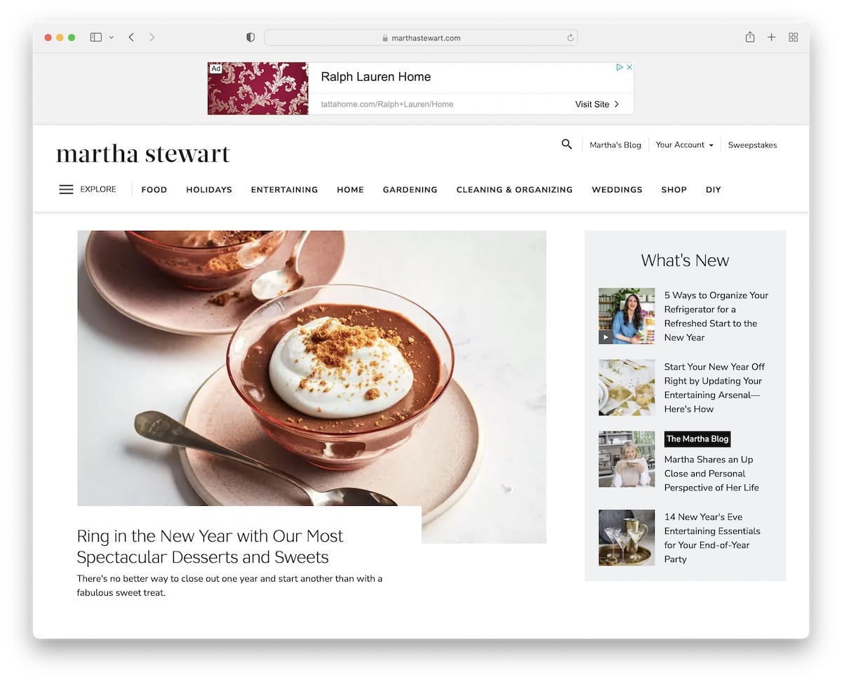
Martha Stewart is a magazine-style food and recipe website with a light design and one of the most unique navigations we’ve ever seen.
While the main quick links are in the header, an additional “explore” button opens up a pop, which almost feels like a website within a website.
Martha Stewart’s site also uses sticky elements for banner ads to increase click-through rates.
Note: Ensure an organized and extensive navigation through your website, especially if you have many categories and sub-categories.
2. Flourist Recipes
Built with: Shopify
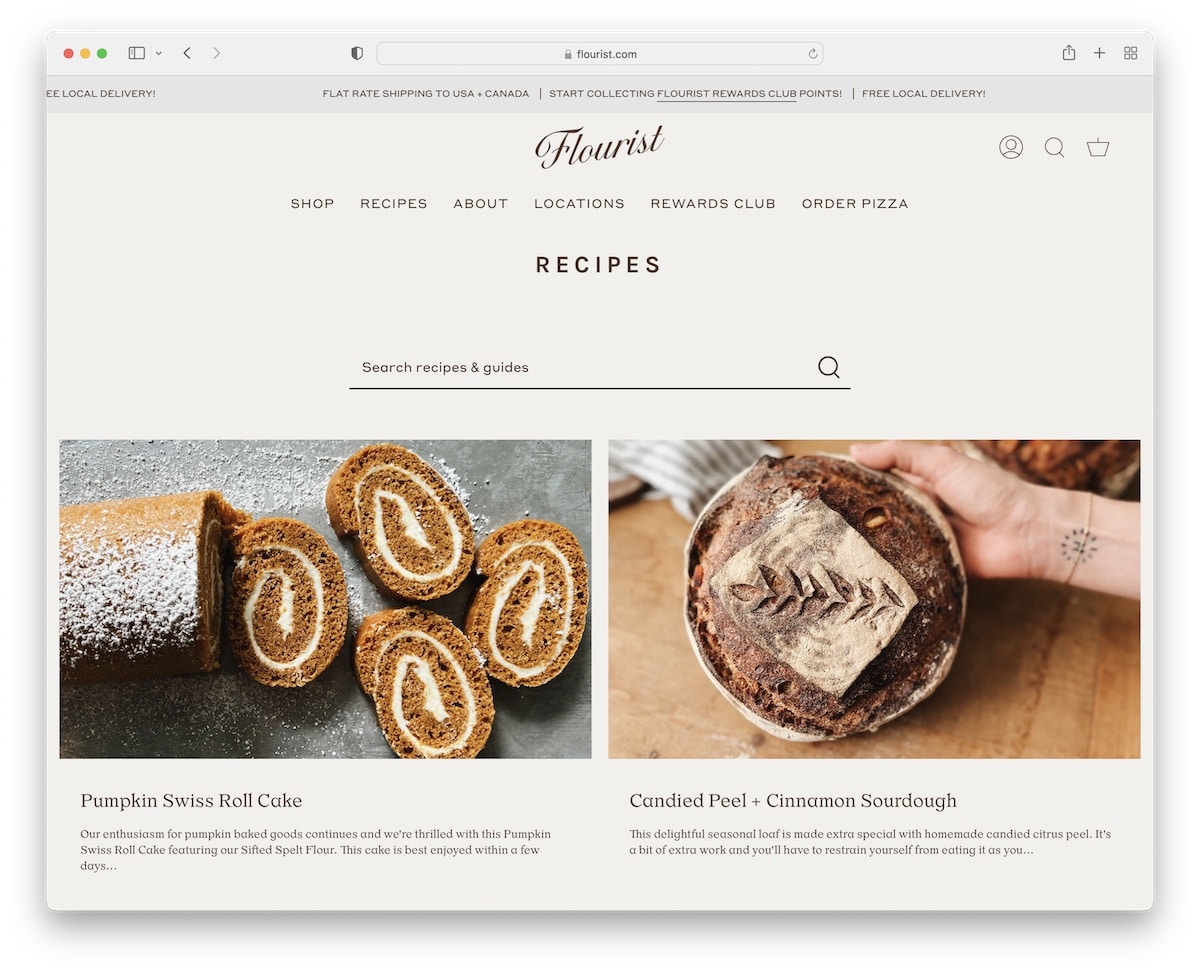
Flourist Recipes is an elegant recipe blog example with a grid layout. It features a top bar notification with sliding text and a floating header, so you don’t have to scroll back to the top to get to the menu links.
We also enjoy a visible search bar, contributing to a better user experience.
The site’s color scheme is also very crisp and goes well with all the delicious images of cooked and baked dishes.
Note: Create a top bar above the header for special deals, free shipping, etc.
3. Cookie And Kate
Built with: Magazine Pro Theme
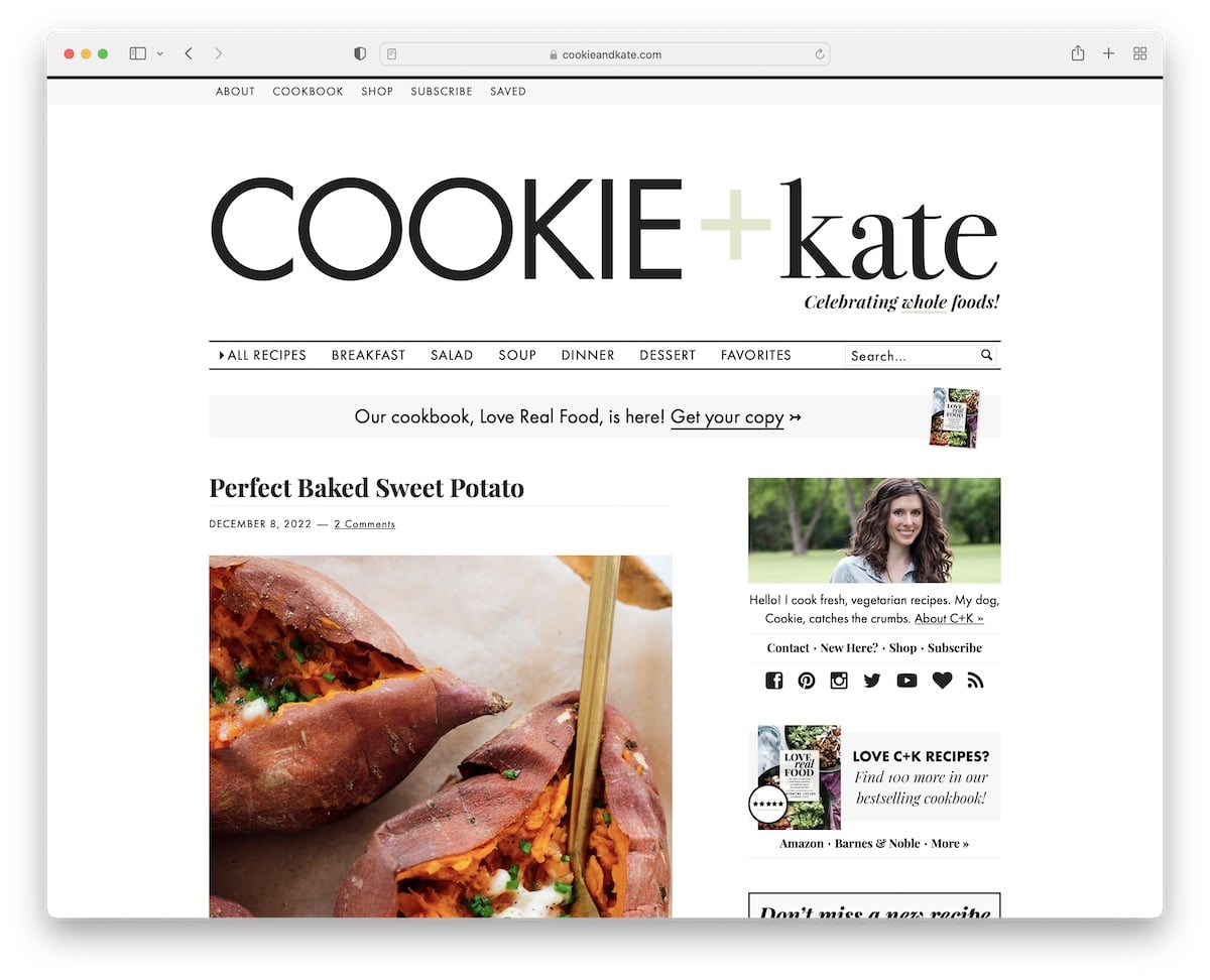
Cookie And Kate is an extremely popular recipe blog that uses a popup to collect emails in exchange for free recipes.
The header takes a large part of the website, with a massive logo, a top bar and a multi-level drop-down menu.
The blog has two sticky ad placements, one in the sidebar and one at the bottom of the screen.
Moreover, we also like the extended post excerpts that make you want to peek into them.
Note: Create a more organized navigation with a multi-level drop-down menu.
4. A Fork & A Pencil
Built with: Squarespace
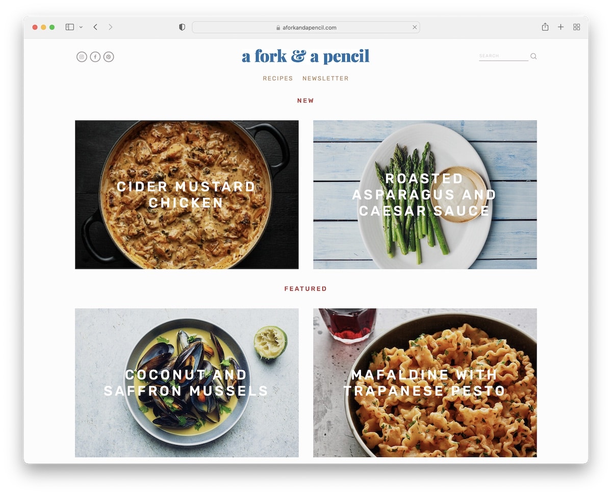
A Fork & A Pencil has a clean and modern responsive web design with a parallax effect and content loading while you scroll.
This recipe blog has a minimalist header with social icons, menu links and a search bar. Moreover, the footer contains additional quick links and a newsletter subscription form just above it.
A Fork & A Pencil also has an Instagram feed (with a “follow” button) where posts open in a new tab.
Note: Use your blog to promote your successful IG profile through a beautiful grid feed.
We also recommend reviewing these Squarespace website examples to see how powerful this website builder is.
5. 101 Cookbooks
Built with: Picostrap
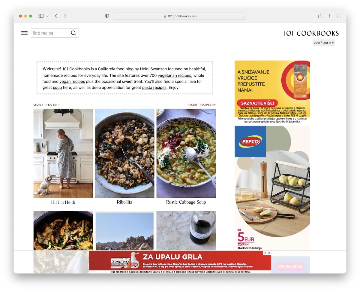
101 Cookbooks has a clean appearance that makes all the tasty content pop more. The blog uses a traditional right sidebar layout, which Heidi uses for banner advertisements.
101 Cookbooks also uses pretty original navigation that opens after clicking on the hamburger icon. Instead of displaying only menu links, you’ll find the welcome text and a section promoting the membership area. But you can always use the search bar to find the necessary recipes.
Note: A search bar is mandatory for any recipe blog, regardless of how well-executed the navigation is.
6. Green Kitchen Stories
Built with: Bateaux Theme
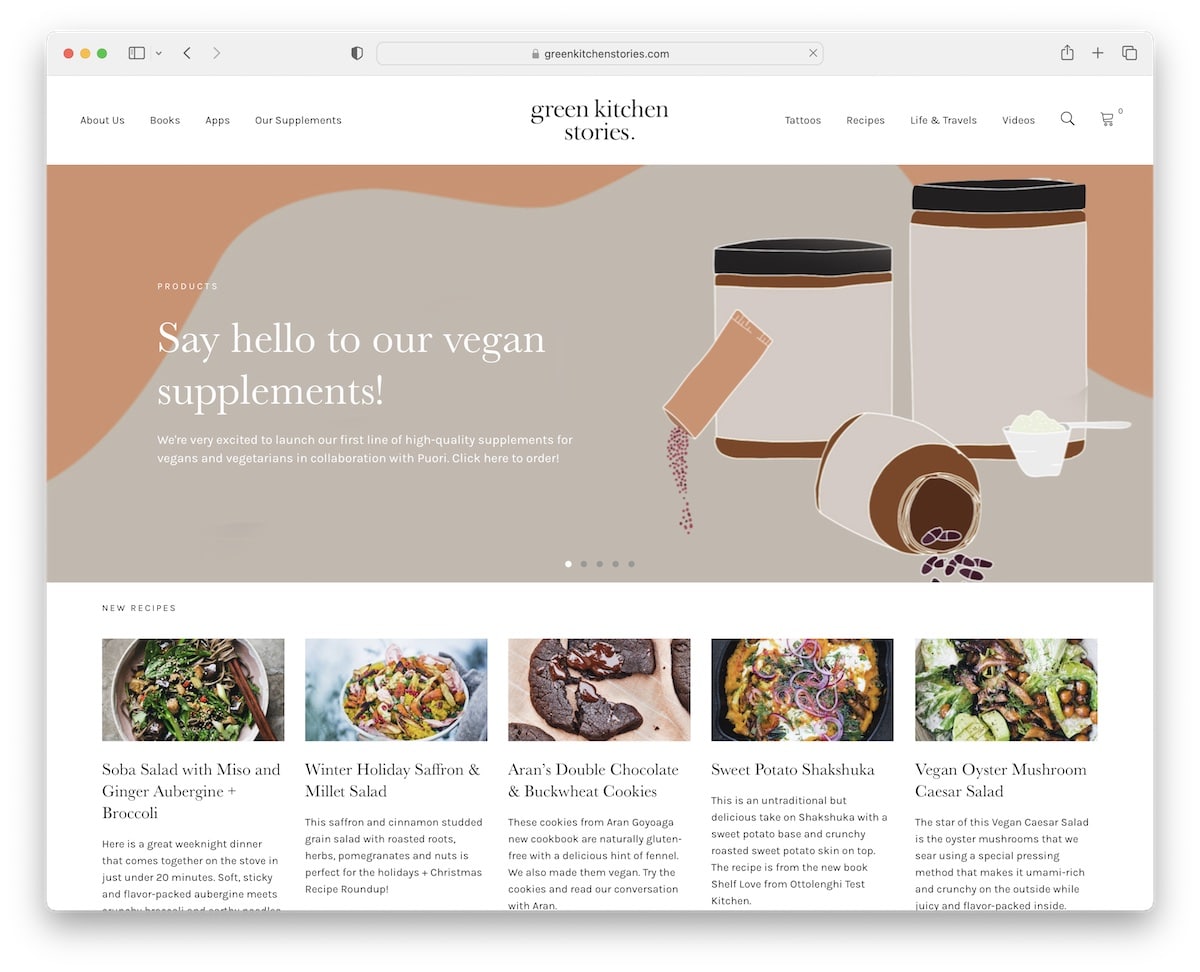
Green Kitchen Stories also uses a popup for collecting emails with a black background that makes it stand out even more.
This recipe blog has a full-width slider that advertises products, recipes, guides, and more. Besides a recipe grid and a section promoting a cookbook, you’ll also find multiple embedded YouTube videos.
Furthermore, because the header/menu doesn’t float, Green Kitchen Stories uses a back-to-top button to avoid scrolling.
Note: A simple addition of a back-to-top button can significantly improve your blog’s UX.
7. Sprouted Kitchen
Built with: Squarespace

The main thing that differentiates Sprouted Kitchen from the rest of the recipe blogs on this list is the sticky left sidebar header/menu.
Surprisingly, the blog displays entire posts without the “read more” button, which may be a bit overwhelming. However, you can always access the recipe index to search for something specific.
Finally, the minimalist site design calls for excellent readability and content viewing experience that’s oh so necessary when skimming through recipes.
Note: Instead of using a traditional header, move it to the sidebar.
8. Sailu’s Food
Built with: Understrap
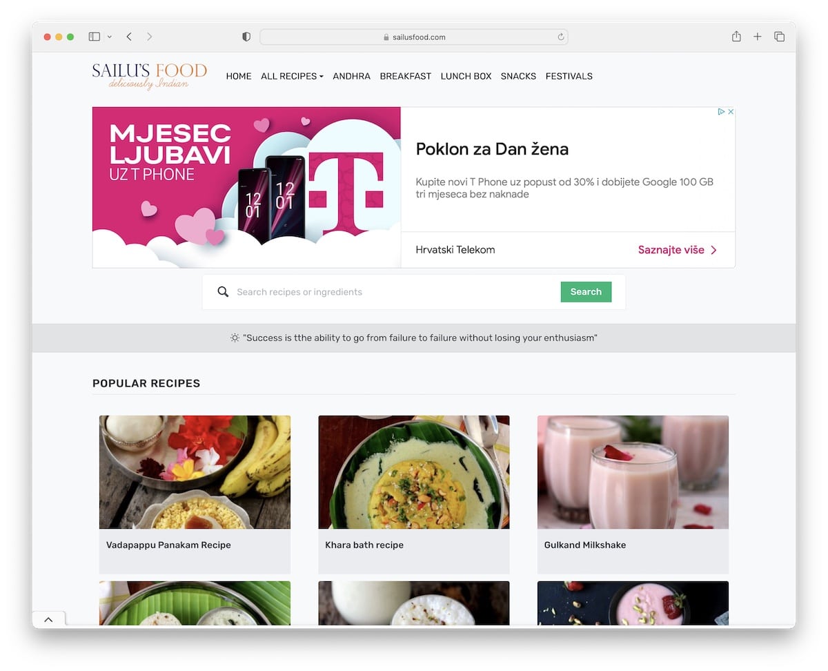
Sailu’s Food is a classic recipe blog with a grid layout home page and posts with a right sidebar.
The blog has plenty of advertisements that help with monetization (but they may be overdoing it).
One handy feature that Sailu’s Food uses is the Pinterest button on each image, so readers can save them and spread the word.
Note: Banner ads are a great way of monetizing your recipe blog, but don’t turn it into “yellow pages.”
9. Vegan Richa
Built with: Foodie Pro Theme
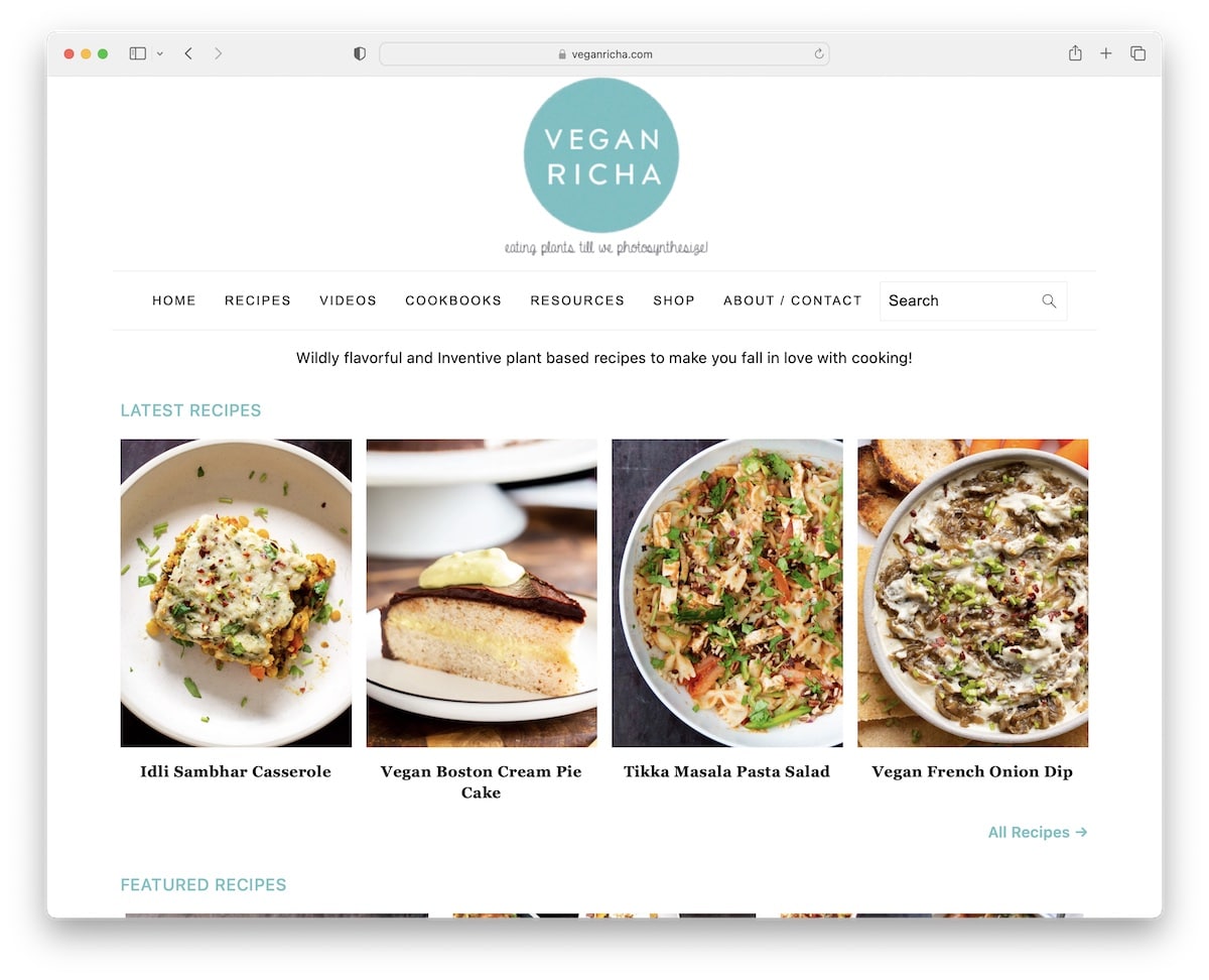
What we like about Vegan Richa is that even though it uses a floating banner ad at the bottom of the screen, you can still close it (so it doesn’t disturb you when reading through recipes).
The home page displays various categories with links to the latest recipes, promotes a newsletter and has a quick “about me” section with links to social media and a more extensive bio.
Note: When using floating ads, let the readers close them if they don’t like them.
10. The Kitchn
Built with: Next.js
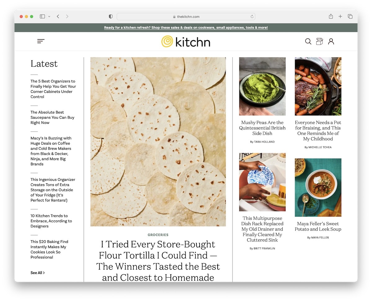
Similar to Martha’s, The Kitchn is also an online recipe magazine website with a pleasant color scheme for a more enjoyable experience.
It features a hero area with the latest posts and a hamburger icon that opens a full-screen overlay with organized navigation and a search bar.
Furthermore, the footer has multiple columns for social icons, a newsletter form and other handy quick links.
Note: Use your footer to display additional links, social media, a newsletter form, etc.
11. Willow Bird Baking
Built with: Bluchic Theme
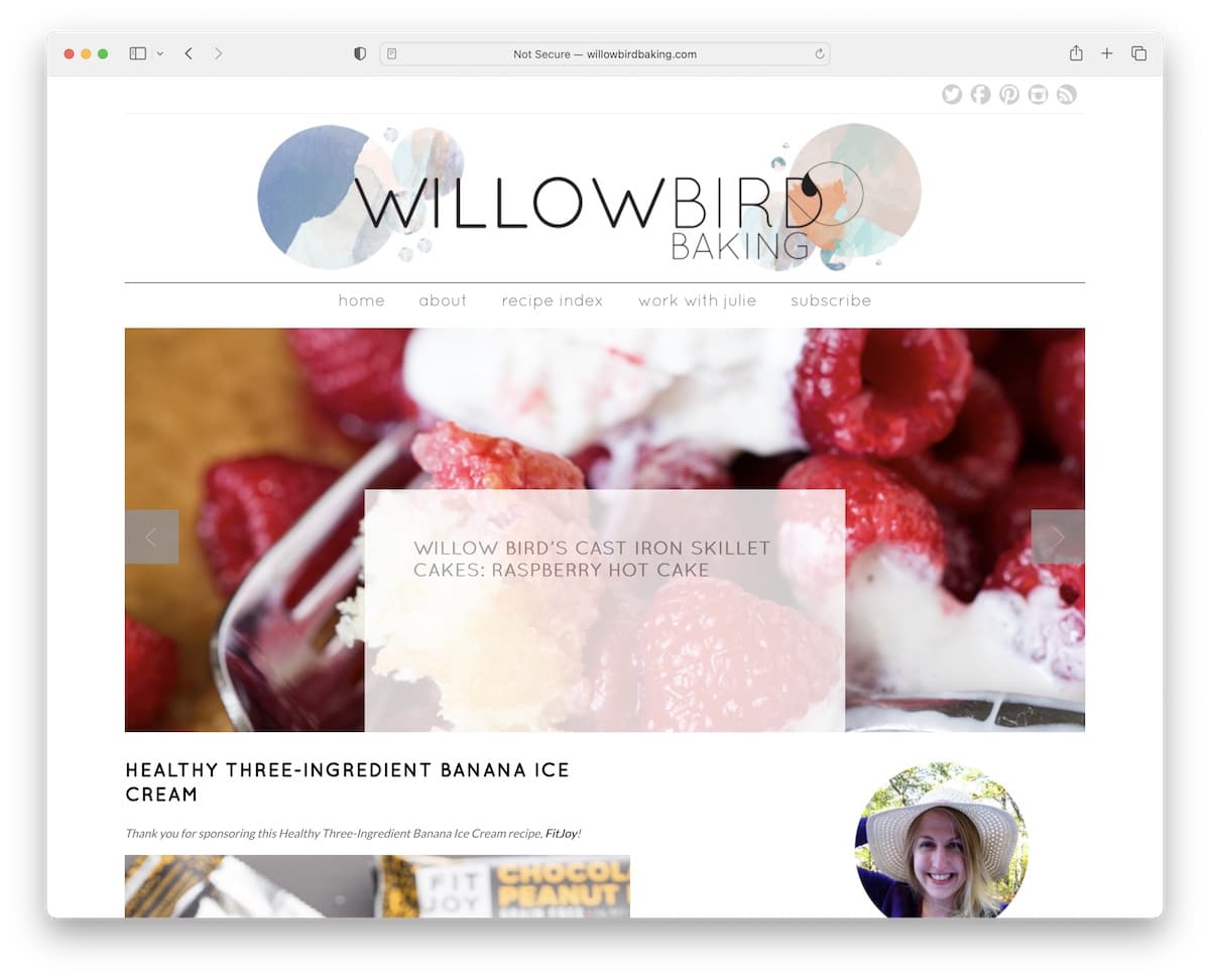
Willow Bird Baking is a simple recipe blog with a slider and a top bar with social media icons. It also has a sidebar with multiple widgets, including banner ads, featured recipes, a subscription form and an IG feed.
The footer sticks to simplicity with recent posts and an auto-refreshing Twitter feed.
Note: Your content matters the most, so keep the blog design clean and simple. Let the content do the talking.
12. Not Without Salt
Built with: Bones Starter Theme
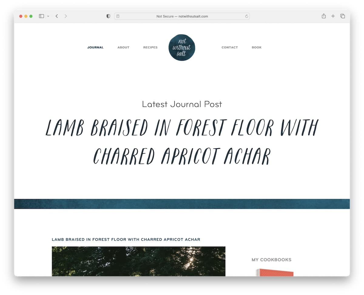
Not Without Salt is about elegance and minimalism, creating a splendid atmosphere that makes reading posts even more likable.
The header/menu section is very plain, followed by a large area that promotes the latest post before the base of the blog begins.
Like the header, the footer is basic with a link to privacy and social media buttons.
Note: Aim for a minimalist blog look if you’re unsure how to approach the design. Why? Because it works. Period.
13. Cookin Canuck
Built with: Genesis Theme
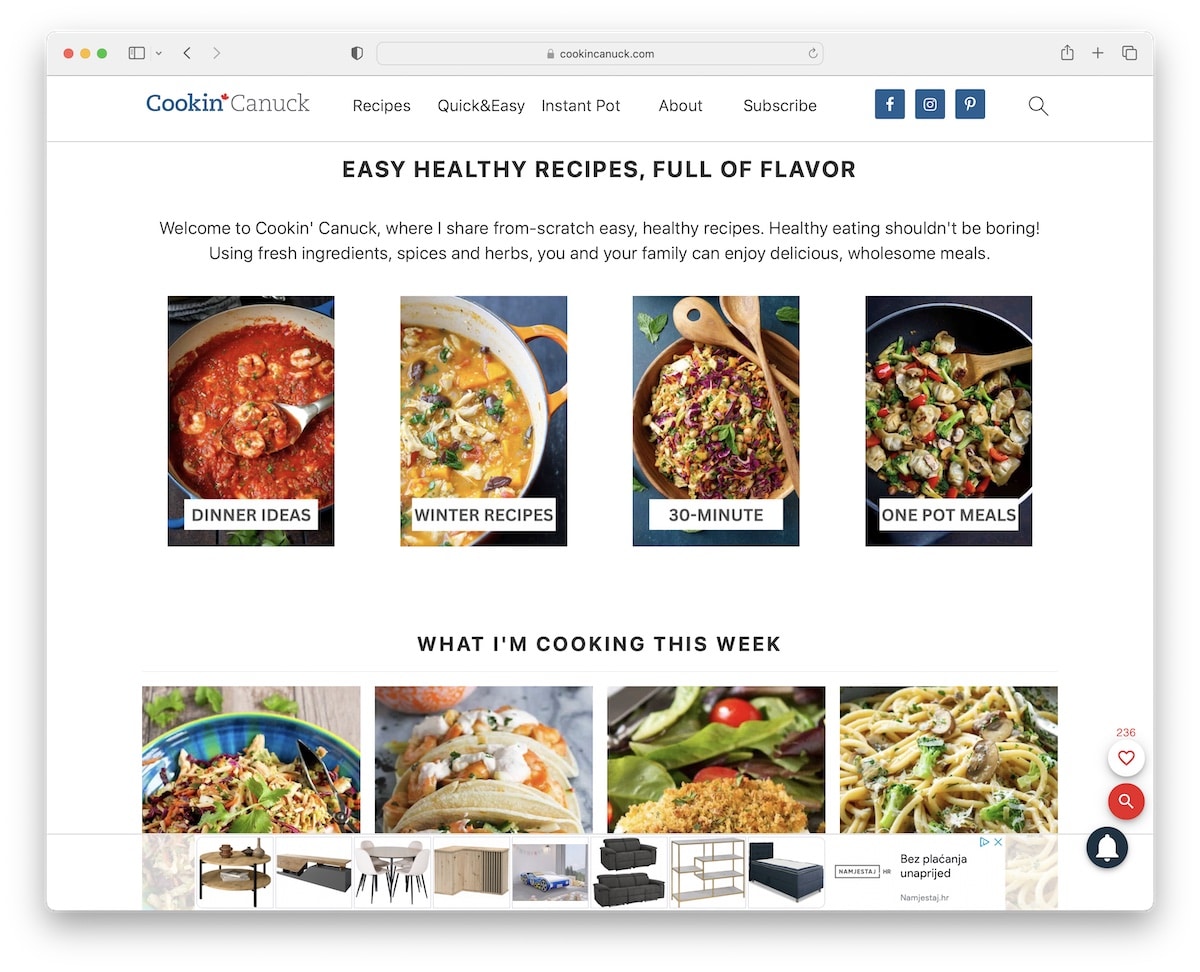
Cookin Canuck has an extensive home page with heaps of content, but white space makes it very easy on the eyes.
Besides the floating navigation bar, Cookin Canuck also features a practical search bar with live results/recommendations for quick finds.
This recipe blog’s home also has an embedded video for more engagement and an interesting recipes banner in the header section when scrolling back to the top.
Note: An Ajax live search function (with recommendations) ensures your readers find the wanted recipes quicker.
14. Picky Palate
Built with: Attorna Theme
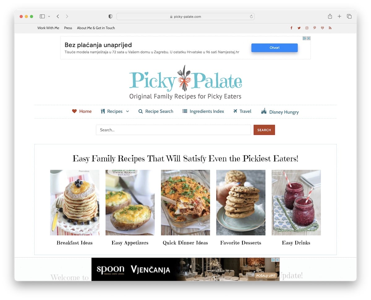
Picky Palate has an organized home page into multiple sections that display the latest recipes and posts and promotes a newsletter subscription form, to name a few.
Between the top bar and the header is a large banner ad and there’s another sticky one at the bottom of the screen. Picky Palate uses more advertisements inside each post and in the sidebar.
We also enjoyed the “about me” page, where Jenny created a compelling and personal bio.
Note: When running a recipe blog, your “about me” page matters. Simple advice: Make it more personal.
15. Kawaling Pinoy
Built with: Genesis Theme
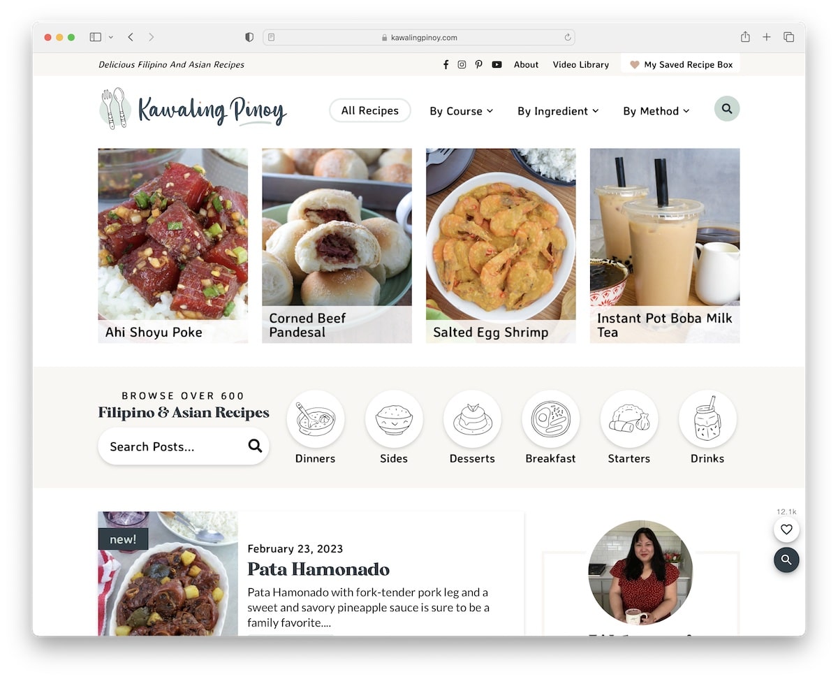
Kawaling Pinoy has an actionable hero section with practical drop-down navigation, popular recipes and custom icons that take you directly to the type of dishes you’re interested in.
This recipe blog also uses a user-friendly live search, so finding your favorite rice dish or tasty drink is effortless.
Lalaine also strategically incorporated the “As featured on” section with logos of many authority sites for social proof.
Note: Are big news sites writing about you? Display logos (and even add links to mentions) on your blog.
16. Nourished Kitchen
Built with: Genesis Theme
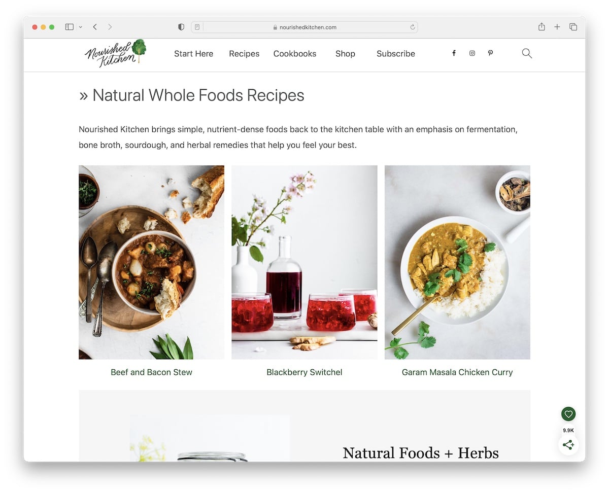
Nourished Kitchen is a gorgeous example of a recipe blog with a light design that loads images on a scroll for a more immersive encounter.
While the header has only essential menu links, the search icon opens a full-screen search experience with predefined recommendations. However, once you type in your query, it’ll display the top results first, followed by the latest and then more specific ones.
What keeps the look of this blog elegant is the same white background across all sections, the header, the footer and the base.
Note: Maintain the same background color throughout your entire blog to achieve a refiner appearance.
17. The Recipe Rebel
Built with: Genesis Theme
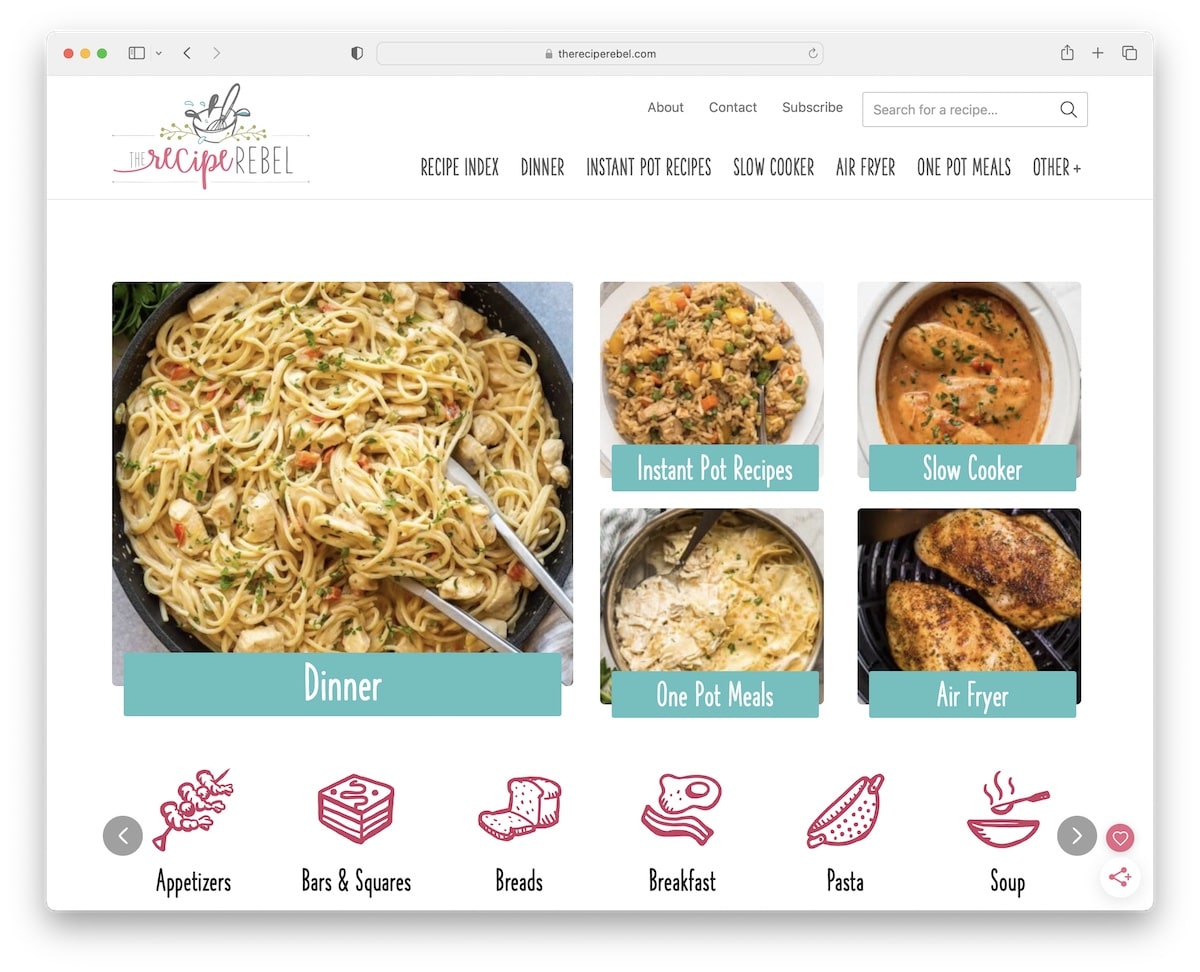
The Recipe Rebel feels very bubbly because of the choice of typography and catchy icons/graphics.
It has a sticky widget for social sharing, search, bookmarks and a sign-in button.
Instead of a floating header, The Recipe Rebel uses a sticky banner to display some of the (most popular?) recipes with slider functionality.
Note: Personalize your recipe blog with original typography and cool graphics and icons.
18. For The Love of Cooking
Built with: Kadence Theme
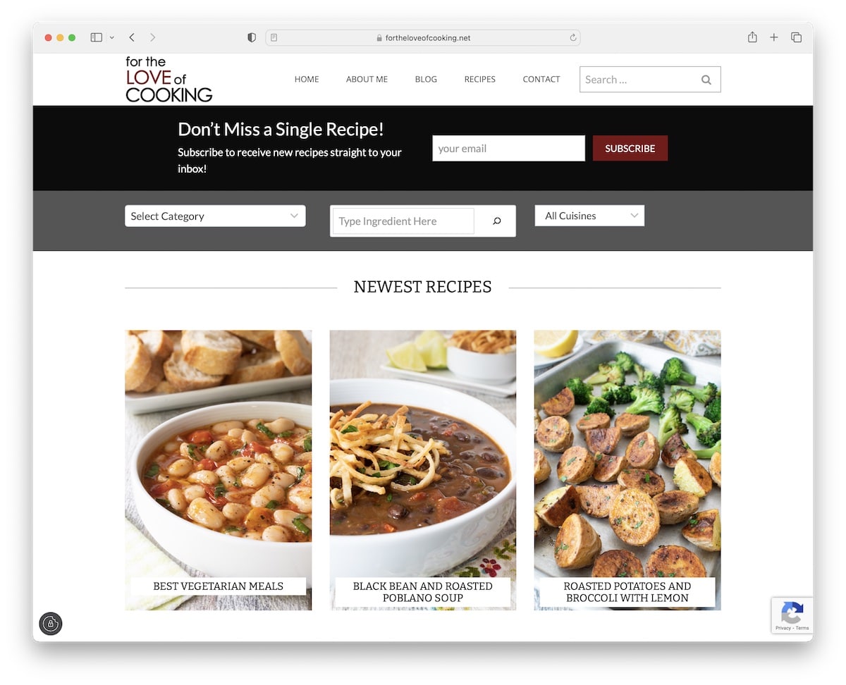
For The Love of Cooking has a multi-part header section with navigation, a search bar, a subscription form and then additional, more advanced search functionality.
Below the header area are the latest recipes, followed by clickable icons for all recipes and other favorite styles.
This recipe blog also uses different sections for finding desired content faster, while the navigation and search bar are always present because they float.
Note: You can grow your business with email marketing, starting by adding a subscription form to your website to collect leads.
19. My Name Is Yeh
Built with: Squarespace
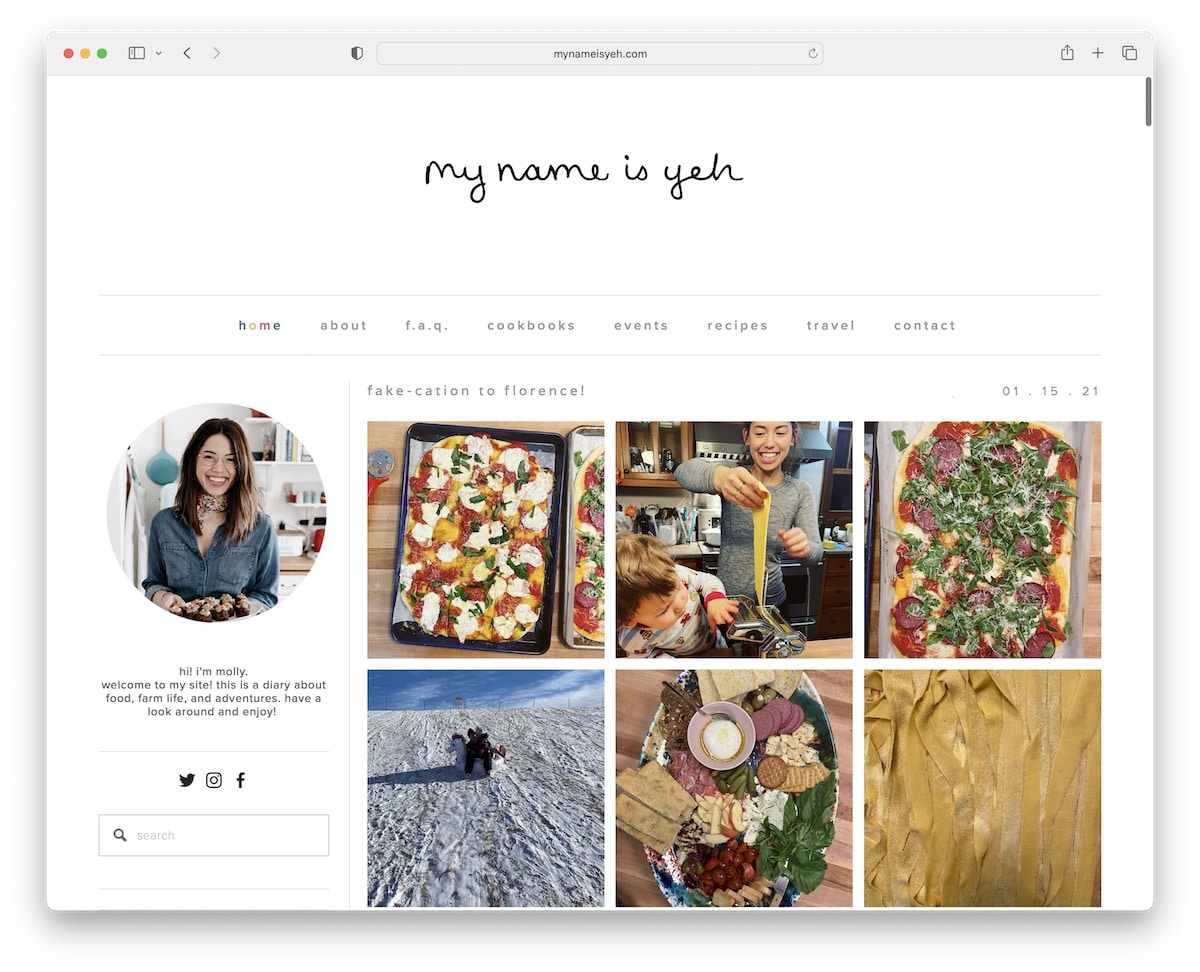
Instead of using a right sidebar (which is more common), My Name Is Yeh created a left version. The whole recipe blog sticks to plain white background, which ensures brilliant content distribution and makes visuals stand out more.
The sidebar has plenty of widgets for “about me,” social icons, search, subscription and recipes.
What’s pretty cool is the header’s hover effect that adds a touch of fun to its minimalism.
Note: If everyone has a right sidebar, why not use a left yourself?
20. Life Made Sweeter
Built with: Genesis Theme
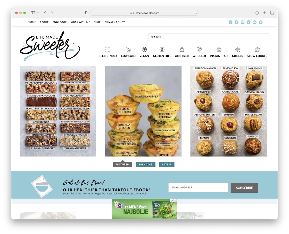
Life Made Sweeter makes its top bar a priority instead of the header by making it stick to the top of the screen. The top bar contains quick links and social media icons, which are always available.
It uses filterable featured, trending and latest recipes in the hero section, but you can also access the recipe index from the navbar.
Then, there’s a back-to-top button, a floating bottom-screen ad and plenty of sections with must-try recipes.
Note: Use filters for your recipe “portfolio” to make it more organized.
21. La Fuji Mama
Built with: Thesis
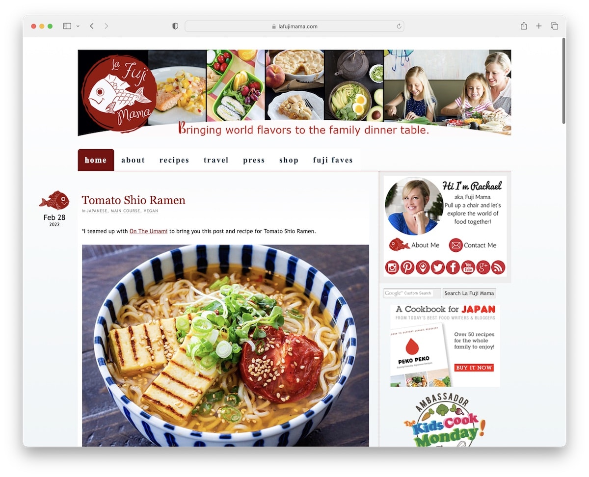
Even though La Fuji Mama uses a more basic blog look, it’s still a great example you can imitate.
This recipe blog has a background image in the header, a drop-down menu, a widget-rich right sidebar, but it doesn’t have a footer.
Note: If you’re hungry to start your recipe blog as quickly as possible, throwing together a classic blog is better than not starting. Yes, it’s cliché, but the content is still king.
22. Food For My Family
Built with: Genesis Theme
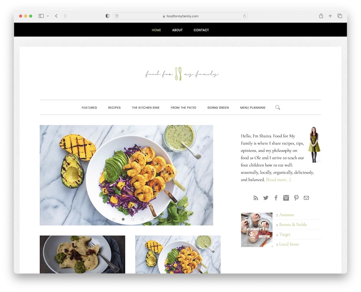
Many blogs have a “bloated” home page, but Food For My Family takes a different approach.
Simplicity is its essential characteristic, using a top bar, a centered logo in the header, a menu with a drop-down, a sidebar and a slider.
Instead of using a footer, Food For My Family has a section of favorite recipes with thumbnails linking to each.
Note: Make your blog more captivating with a slider.
Looking for more inspiration? Here are the best food website examples that are not just blogs but as complex as eCommerce and big corporation websites.
Was this article helpful?
YesNo
