Are you ready to explore the top-class Squarespace restaurant websites, examining how their design captivates and enhances the visitor’s experience?
Creating a tasty restaurant website is crucial for enticing potential diners and showcasing your menu and ambiance.
Squarespace, with its intuitive design tools and stunning templates, has become a go-to platform for restaurants and food businesses looking to establish a strong online presence.
From mouthwatering visuals to seamless navigation, these websites set the standard for a dining establishment’s online footprint.
Each website below serves as a digital appetizer for the delightful dining experiences they represent.
This post covers:
Best Squarespace Restaurant Websites
Feast your eyes on our handpicked selection of Squarespace restaurant sites, where culinary art meets digital design.
Note: You may also be interested in our collection of the most beautiful restaurant website designs.
1. Tacos Poncitlan
Built with: Squarespace
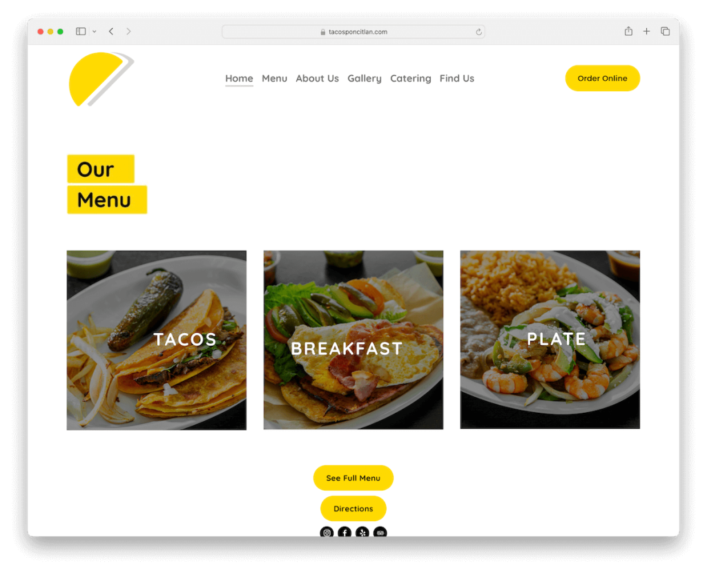
Tacos Poncitlan’s Squarespace website stands out with its light, airy design that leverages plenty of white space to create a welcoming online atmosphere.
The site smartly features an “Order Online” button in the navbar, providing easy access for visitors craving their delectable tacos.
A captivating carousel of food items immediately entices, while a sleek gallery showcases the vibrant dishes.
The integration of Google Maps with a location marker and a dedicated page for their comprehensive food and drink menu enhances the user experience.
Tacos Poncitlan makes it effortless to explore offerings and visit in person.
Note: Use light design to create a distraction-free experience when displaying your tasty dishes.
Why we chose it: For its seamless blend of aesthetic appeal and functionality.
2. The Saucy Cow
Built with: Squarespace
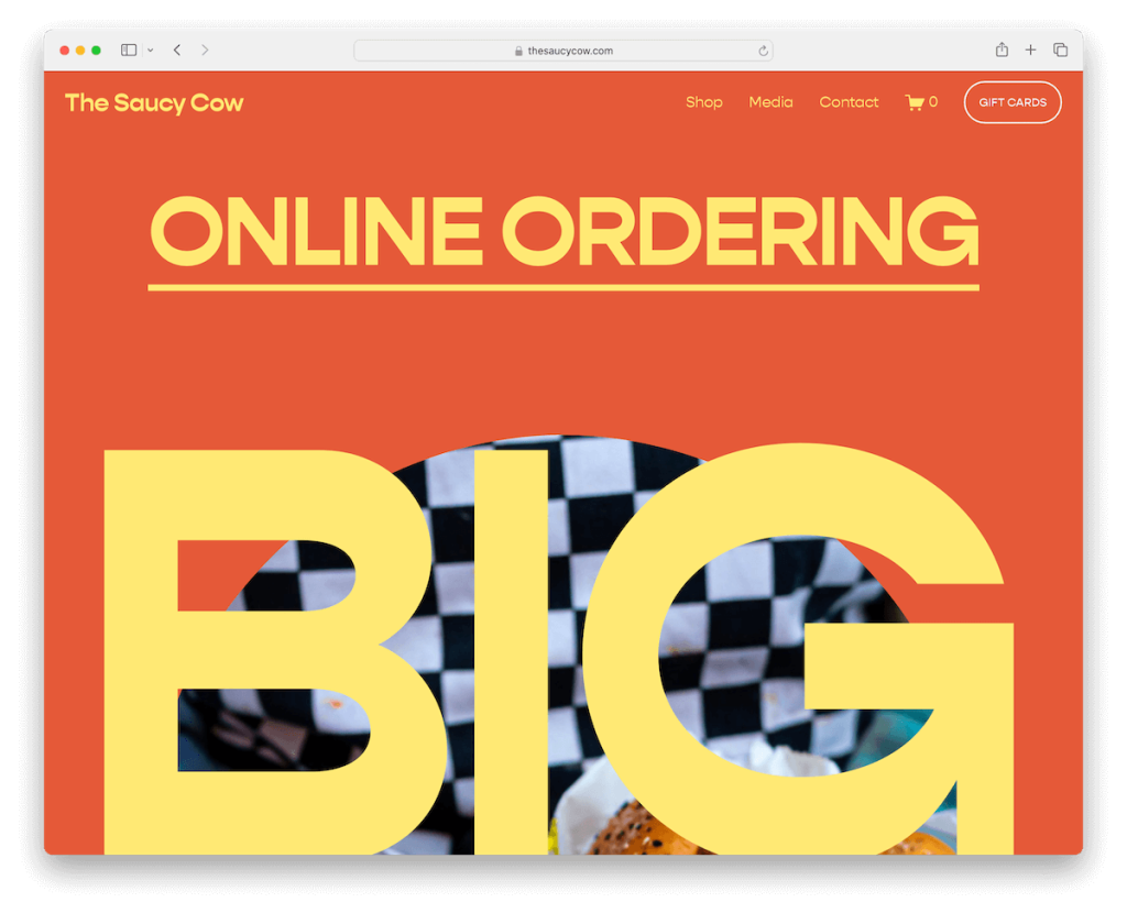
The Saucy Cow’s website captivates with its bold and vivid design, balancing simplicity and visual impact through large, expressive typography.
An integrated eCommerce section allows for effortless browsing and purchasing.
Moreover, an Instagram grid feed showcases their culinary creations while aiming at social connectivity.
The video background hero section immerses visitors in The Saucy Cow experience but only on the Media page.
What you’ll surely find unique is the footer, playfully asking, “Got sauce?” This adds a memorable touch that invites interaction and exploration.
Note: Create a fun and exciting website design that speaks your brand! Hey, why so serious? (You don’t have to be.)
Why we chose it: For its dynamic and immersive user experience, blending visual storytelling and interactivity.
3. Streetbird
Built with: Squarespace
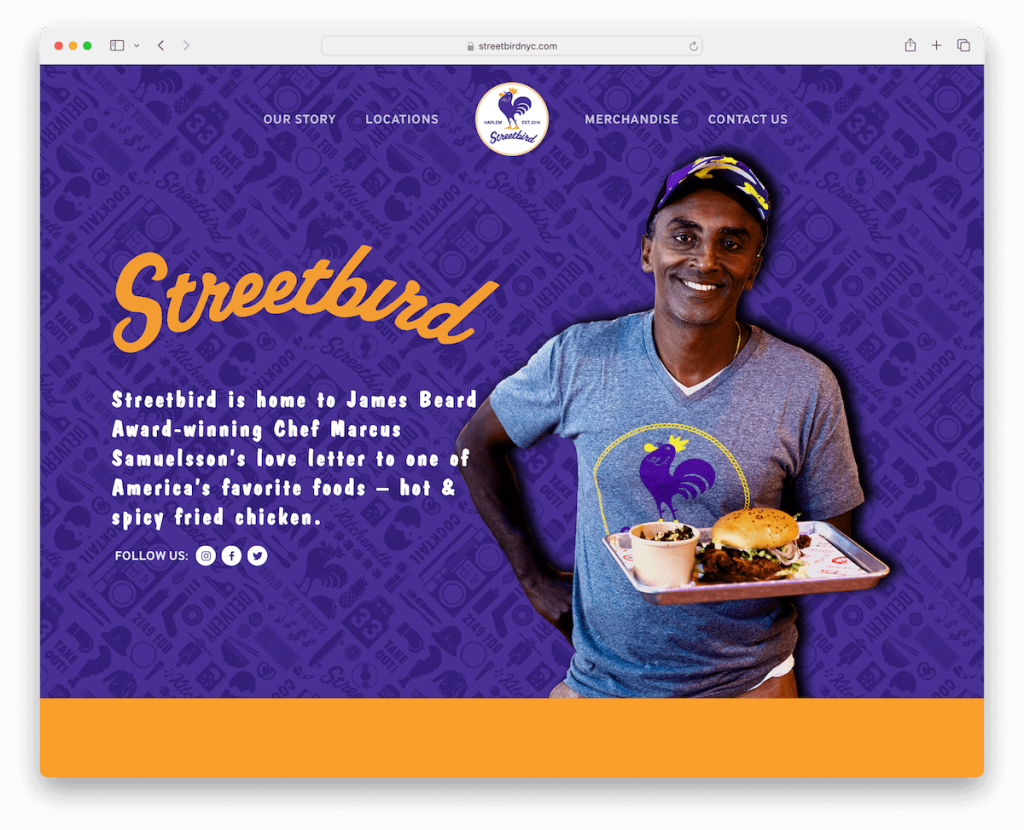
Streetbird shines with its sleek one-page website layout, ensuring all the info is only a few scrolls apart.
The sticky menu at the top of the screen provides effortless navigation, while embedded videos and animations add a dynamic layer to the storytelling.
A conveniently placed contact form at the bottom invites immediate engagement.
And the feature-rich footer provides necessary info, offering links, social media icons, and more, making it functional and informative.
Note: A one-page website layout is a popular choice nowadays, so it’s worth considering it.
Why we chose it: For its efficient one-page design, offering a streamlined and quick browsing experience.
4. Fields Good Chicken
Built with: Squarespace

Fields Good Chicken’s website mesmerizes with an animated full-screen image background above the fold, bringing the site’s culinary ethos to life.
An “Order Now” button in the navbar integrates with a full online ordering system, ensuring a user-friendly experience.
The minimalist approach is complemented by a hamburger menu, simplifying navigation while maintaining style.
The website’s intrigue is heightened by a revealing dark footer effect, which elegantly displays contact details, menu links, and social media icons.
Note: Add a CTA button for orders or bookings in the navigation bar for a conversion boost.
Why we chose it: For catchy design and user-centric features, ensuring a satisfying online ordering experience.
5. Boogie’s Burgers
Built with: Squarespace
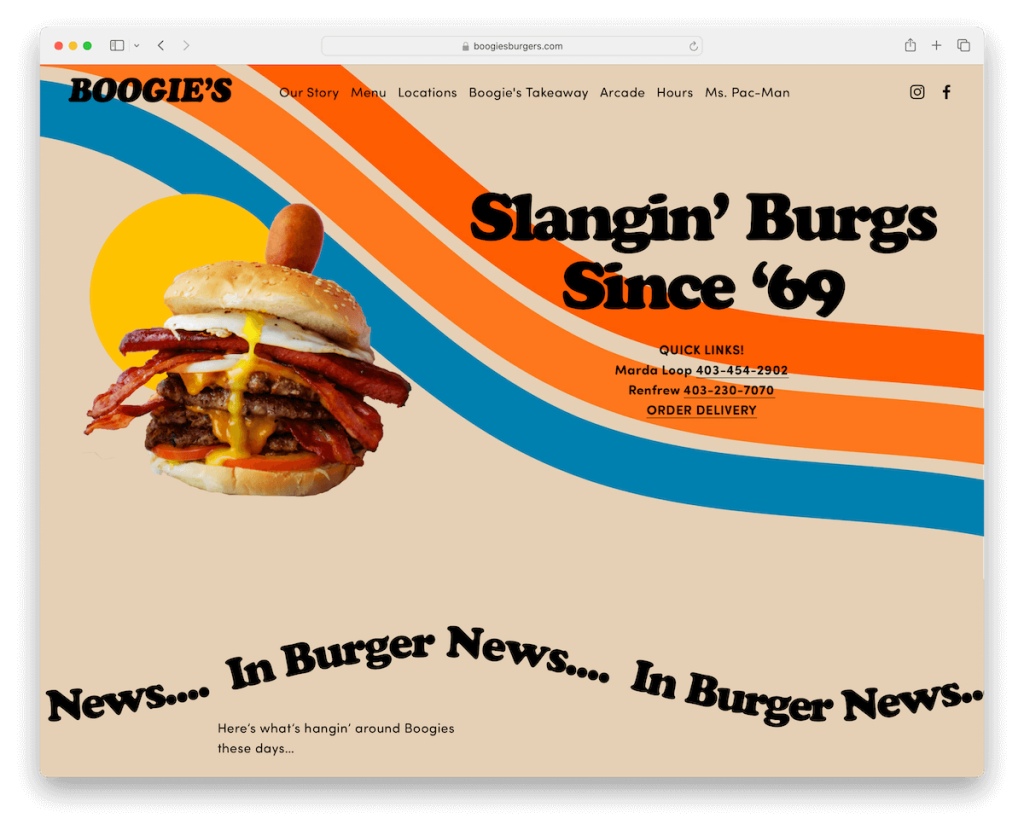
Boogie’s Burgers Squarespace website rocks a transparent header that solidifies upon scrolling and floats.
The sliding text animation injects a playful energy, engaging visitors from the first moment.
Its design is grounded by a contrasting black footer that neatly houses contact details and opening hours, ensuring essential information is always accessible.
The comprehensive food and drink menu, complete with pricing, images, and detailed descriptions, invites exploration and appetite in equal measure.
Note: Let your visitors benefit from the sticky header, contributing to better UX.
Why we chose it: For its dynamic interactivity and sleek design, creating an immersive UX.
6. Aquarius
Built with: Squarespace
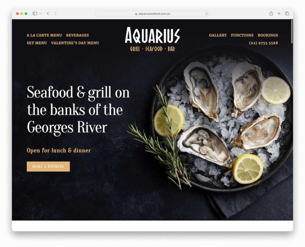
Aquarius Squarespace restaurant website has a striking contrast between dark and light sections. This creates a visually impactful atmosphere that mirrors the restaurant’s elegant ambiance.
An online booking popup offers convenience and efficiency for diners looking to reserve a table.
The website’s footer is packed with features, with all the necessary just a click away.
A beautifully curated food gallery utilizes a lightbox feature for viewing, enhancing the visual appeal.
Moreover, a clickable telephone number in the navbar ensures easy contact, inviting immediate visitor engagement.
Note: Make yourself easily reachable with a clickable telephone number (email or even live chat widget).
Why we chose it: For its stylish use of contrast and seamlessly blending aesthetics with practicality.
7. Vida Cantina
Built with: Squarespace
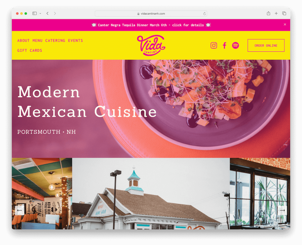
Vida Cantina’s Squarespace website bursts with energy thanks to its vibrant design that captures the spirit of lively Mexican cuisine.
The sticky top bar and menu ensure smooth navigation, making essential information always available.
Visitors are greeted with a newsletter subscription popup, encouraging engagement and connection.
An image gallery showcases the restaurant’s dishes and ambiance, while an integrated Spotify playlist adds a sonic layer to the experience.
Vida Cantina invites visitors to enjoy the vibe even before they step through the door. Yum!
Note: Use your branding throughout your website so visitors feel right at home.
Why we chose it: For its vibrant and delightful design, harmonizing visuals and sound.
8. The Meatball & Wine Bar
Built with: Squarespace
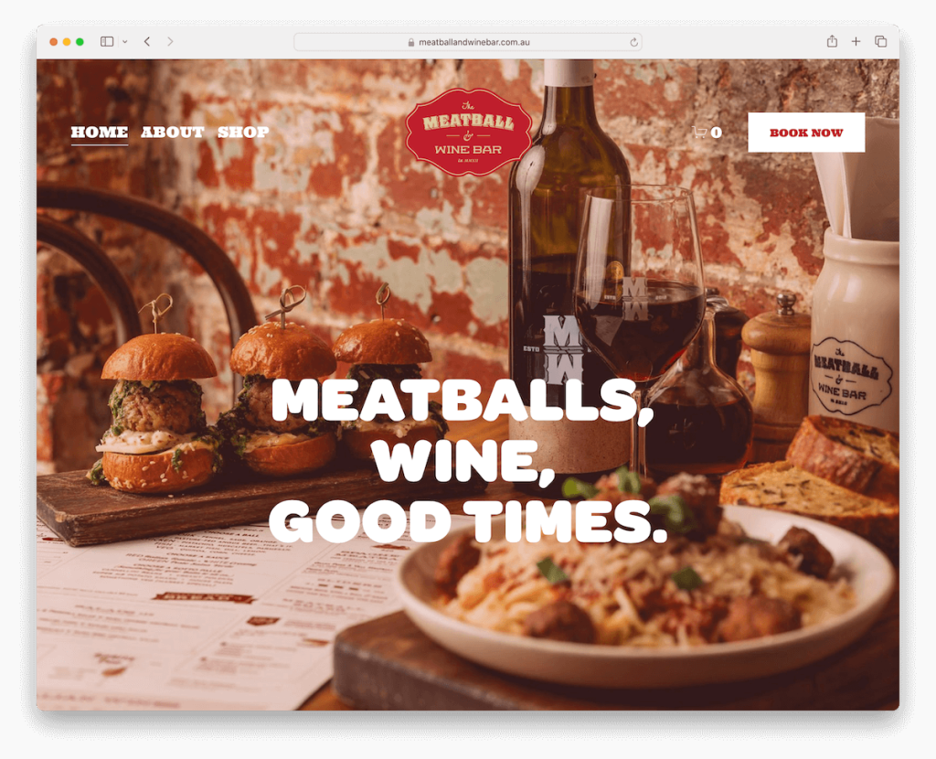
The Meatball & Wine Bar’s website sparks interest with a full-screen image background that sets a tantalizing tone from the outset.
Its transparent header blends seamlessly into the design, with a prominent CTA button in the navigation bar inviting action.
The layout features bold, easy-to-read sections that guide visitors through the site.
A four-column Instagram grid feed injects social vibrancy, leading to a striking subscription section set against an impactful black design.
This transitions into a footer with a bold red background, encapsulating the restaurant’s passionate essence.
Note: Large image background sections can work fantastically well for restaurant websites.
Why we chose it: For its visually stunning design and strategic use of color and imagery.
9. Reelfish
Built with: Squarespace
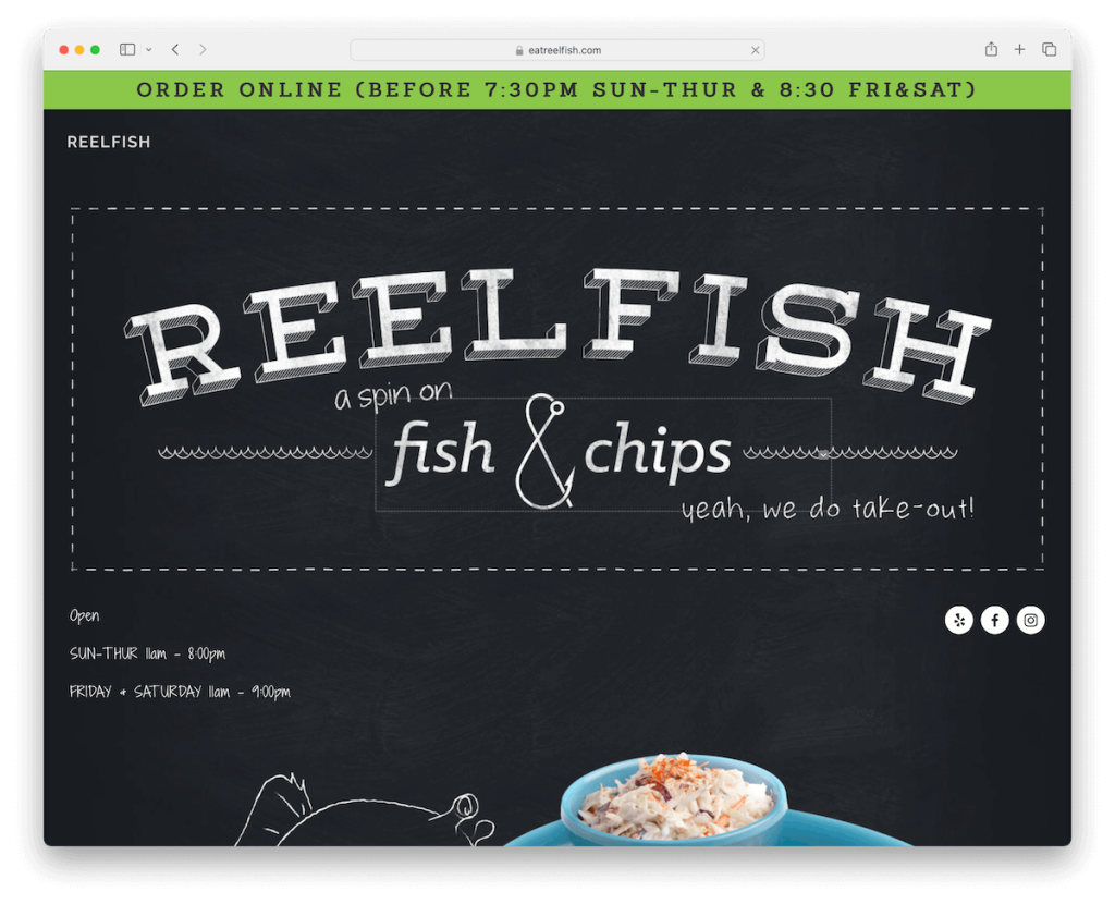
Reelfish’s Squarespace website enchants with a dark design theme, contrasted by a light footer, creating a visually striking experience.
A green top bar sticks to the top, ensuring easy navigation and strong visibility. Furthermore, the site features a dish slider, showcasing their specialties with flair.
Cool detailing and thoughtful typography choices add a unique touch to Reelfish. Also, Google Map integration effortlessly displays the location, which is super handy.
The creative opening hours section is cleverly designed, making it easy for visitors to plan their visit.
Note: Create a strong, memorable first impression with a dark/black website design.
Why we chose it: For its sophisticated design that creates an impactful presentation.
10. Browns Crafthouse
Built with: Squarespace
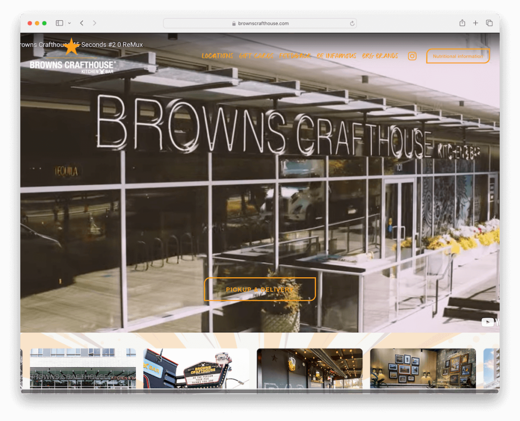
Browns Crafthouse’s restaurant website features a floating header, ensuring simple navigation throughout the site. Additionally, the drop-down menu offers detailed exploration options.
The full-width image/video background above the fold captivates, enhanced by a CTA button with hover effect.
Then, a carousel vividly displays various locations, inviting visitors to explore.
The site also boasts a beautiful image gallery showcasing the ambiance, drinks, and food, painting a tempting picture of what to expect.
This combo creates a welcoming and intuitive online presence.
Note: Use a drop-down or even a mega menu for a more organizer site navigation.
Why we chose it: For its awesome gallery grid and a video background hero section above the fold.
11. Jones Bar-B-Q
Built with: Squarespace
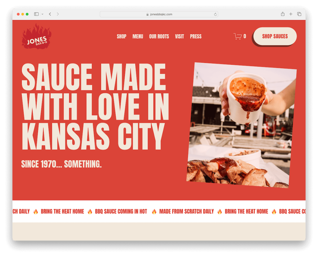
Jones Bar-B-Q Squarespace restaurant website rocks a large, bold photography capturing the nature of their mouthwatering offerings. Meanwhile, a lively red and light color scheme injects warmth and energy.
The cleverly designed header disappears on a down scroll for better viewing and reappears on an up scroll, ensuring navigation is always a breeze.
Content elegantly loads, keeping visitors engaged. Plus, sliding text animations add a dynamic touch.
A subscription form encourages connection, while a multi-column footer efficiently organizes information.
Note: Build an email list and grow your restaurant business with a newsletter subscription form.
Why we chose it: For its dynamic interaction and vibrant design, perfectly reflecting Jones Bar-B-Q’s spirited and flavorful dining experience.
12. Fat Choy
Built with: Squarespace
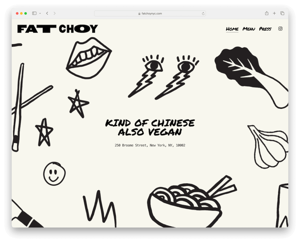
Fat Choy’s Squarespace website embodies light and minimalist design, emphasized with cool graphics that speak to its modern culinary values.
The header cleverly disappears and reappears, facilitating an uncluttered viewing experience.
Google Maps integration ensures easy location finding, while a minimalist dark footer grounds the design.
The menu page presents their offerings with elegant simplicity, so the customer can quickly skim through.
A dedicated press page boasts links to large publication mentions, highlighting the restaurant’s acclaim and buzz in the food community, adding a layer of prestige.
Note: Choosing a minimalist design for a restaurant website will make your delicacies pop more.
Why we chose it: For its clean, minimalist design and intuitive functionality.
13. Bandits
Built with: Squarespace
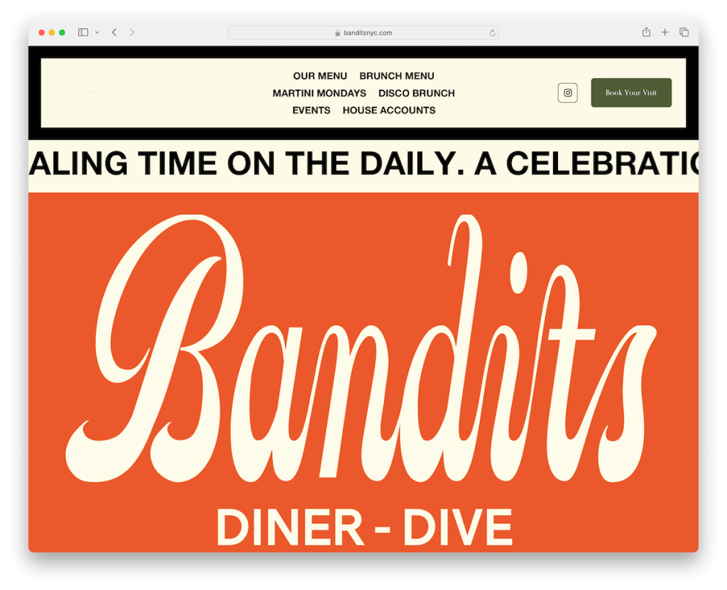
Bandits website greets visitors with a newsletter popup, offering a special deal to incentivize sign-ups.
Its design features large, easy-to-navigate sections that guide the eye through the site’s content.
A framed header includes menu links, an Instagram icon for quick social access, and a booking CTA button, making reservations a click away.
This header also smartly disappears and reappears, optimizing screen space while browsing. It ensures key navigation elements are always within reach.
Note: Take website navigation to the next level with a disappearing/reappearing header for clean yet practical browsing.
Why we chose it: For its strategic engagement elements, enhancing accessibility while promoting a direct connection.
14. Cafecito
Built with: Squarespace
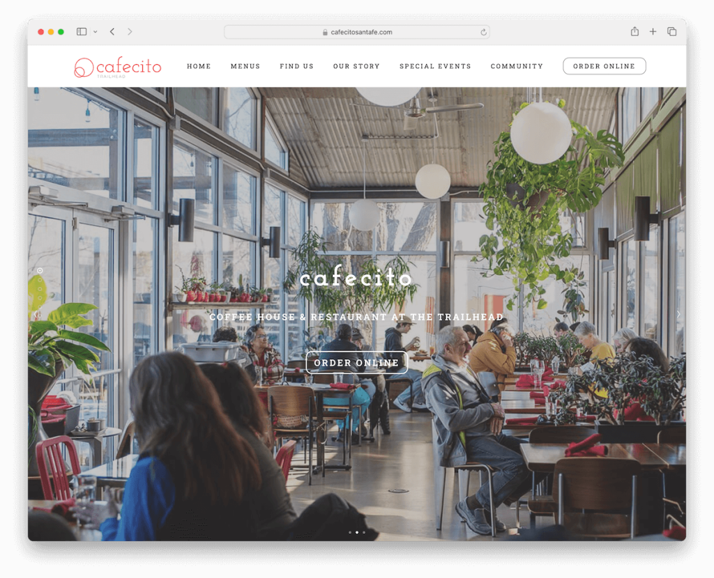
Cafecito’s Squarespace restaurant website captivates with a massive slider, featuring text overlays and CTA buttons.
Its light design aesthetic is clean and inviting, with parallax effects adding depth as you scroll.
A dedicated news section informs patrons of the latest updates, while online ordering simplifies the dining experience.
Google Maps integration ensures easy navigation to their location.
The menus are neatly categorized, making it effortless to check their diverse offerings, enhancing the user journey with functionality and style.
Note: Start a food blog on your restaurant website where you can share recipes, tips, tricks, recommendations, new dishes, etc. (It can also work great from the SEO point of view.)
Why we chose it: For its visuals and practical features, making Cafecito’s online presence as inviting as its physical cafe.
15. Murray’s Cheese Bar
Built with: Squarespace
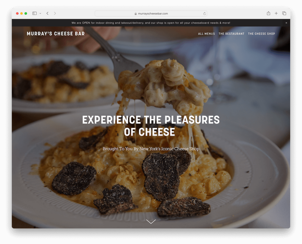
Murray’s Cheese Bar’s website spices things up with a full-screen image background above the fold, enriched by a captivating parallax effect.
A top bar notification provides immediate, important updates, ensuring guests are always in the know.
The website is anchored by a large, dark footer, which presents business details and opening hours.
This design choice creates a classy online presence that mirrors the quality and tradition of Murray’s Cheese Bar.
Note: Add liveliness to your restaurant website with the catchy parallax effect.
Why we chose it: For its immersive experience that reflects Murray’s Cheese Bar’s esteemed heritage and culinary excellence.
16. Landini Brothers
Built with: Squarespace
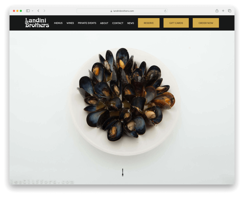
Landini Brothers Squarespace restaurant website boasts a chic black design, creating a refined atmosphere.
The floating header features three CTA buttons, offering clear navigation paths.
A standout element is the massive, image-only slider, delivering a powerful visual impact with each slide. WOW.
The minimalist Instagram grid integrates social proof with style, ensuring clutter-free viewing.
Finally, its four-column footer is a hub of essential information, including links, contact details, opening hours, and CTA buttons, alongside prestigious establishment badges.
Note: Integrate social media feeds (IG is best) for more content and connectivity.
Why we chose it: For its effective showcase of Landini Brothers’ allure and ease of access.
17. Wild Ginger
Built with: Squarespace
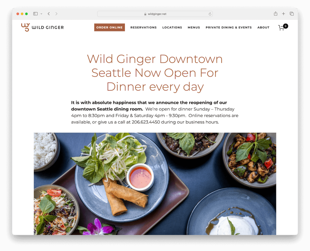
Wild Ginger’s Squarespace website radiates with a light and clean design, embodying the essence of their culinary philosophy.
Parallax image sections and slideshows add depth, inviting users to explore the rich tapestry of flavors.
The inclusion of a newsletter subscription form fosters community and repeat engagement.
A dedicated locations page with Google Maps links aids in planning visits, which is always a plus.
About and Blog pages enrich the narrative, while a filterable menu simplifies the search for delicious dishes.
Note: Save website space with a slider while increasing user engagement at the same time.
Why we chose it: For its interactive features that create a welcoming and informative online gateway.
18. Yang’s Kitchen
Built with: Squarespace
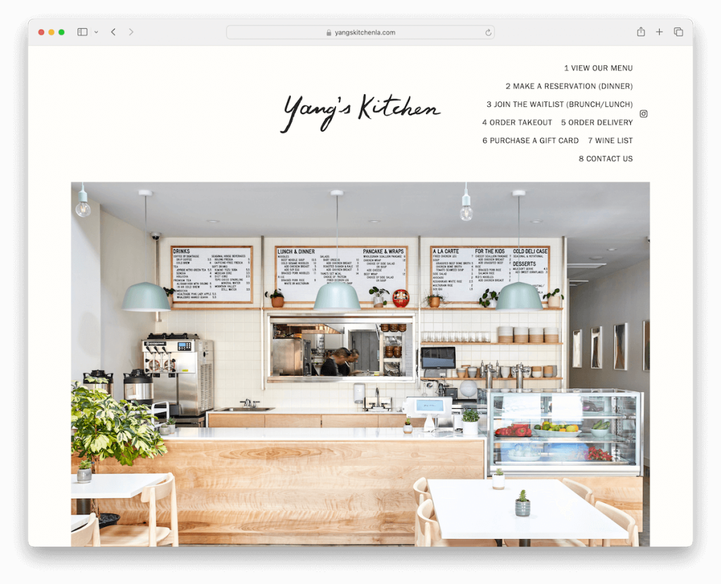
Yang’s Kitchen restaurant website impresses with its modern and minimal design, embracing lots of white space for a clean, orderly look.
The unique header features stackable menu links, offering a fresh navigation experience.
Its boxed layout enhances the focus on content, creating a visually appealing structure. What’s more, an “as seen in” section adds credibility, showcasing their media mentions.
The Instagram feed slider offers a glimpse into their culinary world through vibrant images, perfectly marrying good looks with functionality.
Note: Ensure the necessary white space to make your website more readable.
Why we chose it: For its neat design and strategic elements that effectively blend pleasantness with credibility.
19. The Soup Peddler
Built with: Squarespace
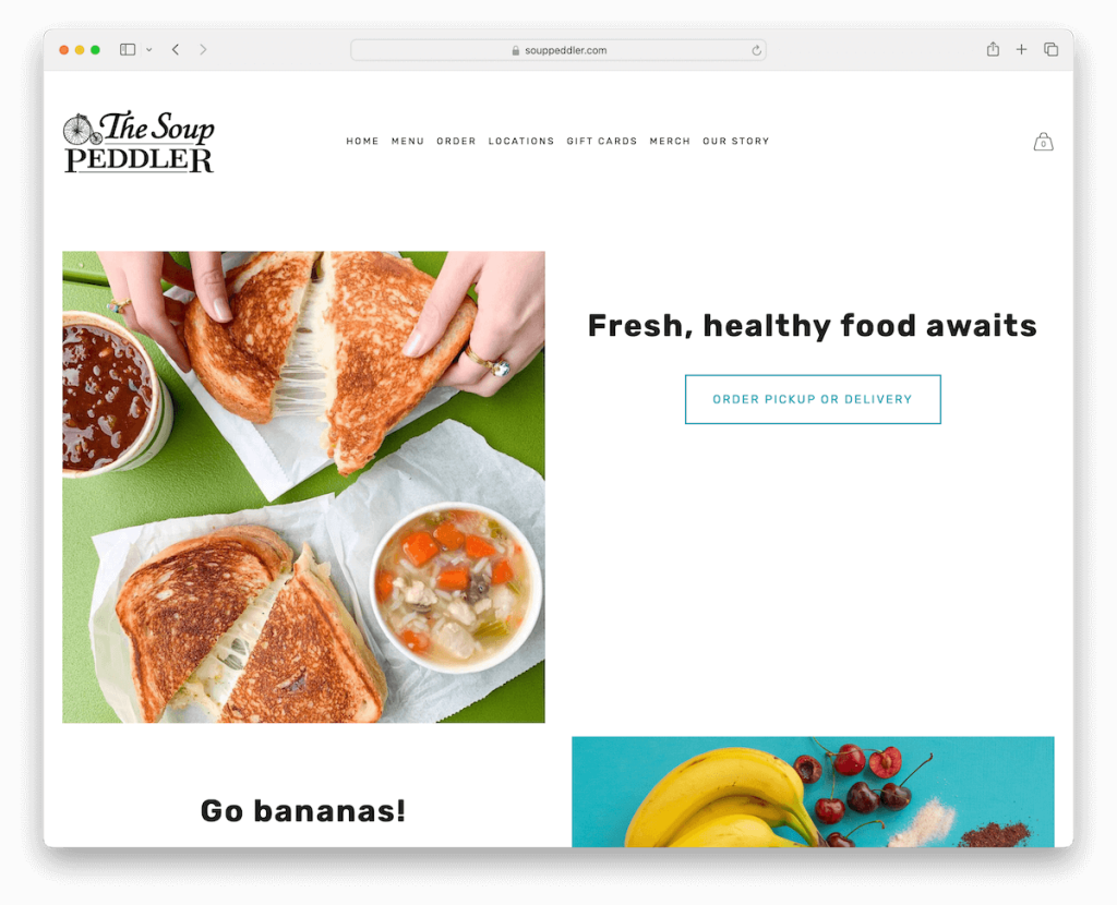
The Soup Peddler website has a light, cohesive design, with a consistent white background from header to footer.
The layout has a trendy interchanging grid with large thumbnails, titles and CTAs. Then, an image slideshow vividly showcases their appetizing offerings, inviting exploration.
Integration with a 3rd-party online ordering system facilitates a convenient dining experience for everyone.
Moreover, an eCommerce section for merchandise extends the brand’s reach, allowing fans to own a piece of their favorite soup haven.
This combination of elements makes the site a menu and a destination.
Note: Use your website to sell merch directly so fans can help spread the word.
Why we chose it: For its clean design and seamless integration of merchandise, offering a holistic brand experience.
20. The Coffee Movement
Built with: Squarespace
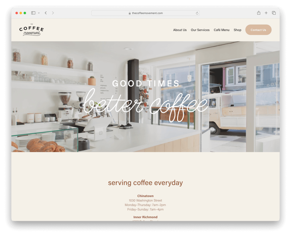
The Coffee Movement’s Squarespace website boasts an elegant and functional clarity, featuring a home page with a minimalist header and footer.
An image banner with a text overlay prominently displays the opening hours for their two locations, ensuring essential information is front and center.
Internal pages dedicated to about, services, and menu offer deeper insights into their offerings.
There’s also an online shop section that adds a convenient layer for purchasing their products.
Note: Display your opening hours on the home page, in the footer or in other dedicated areas.
Why we chose it: For its tidy design and straightforward navigation for effortless interaction with The Coffee Movement’s offerings.
21. Green And The Grain
Built with: Squarespace
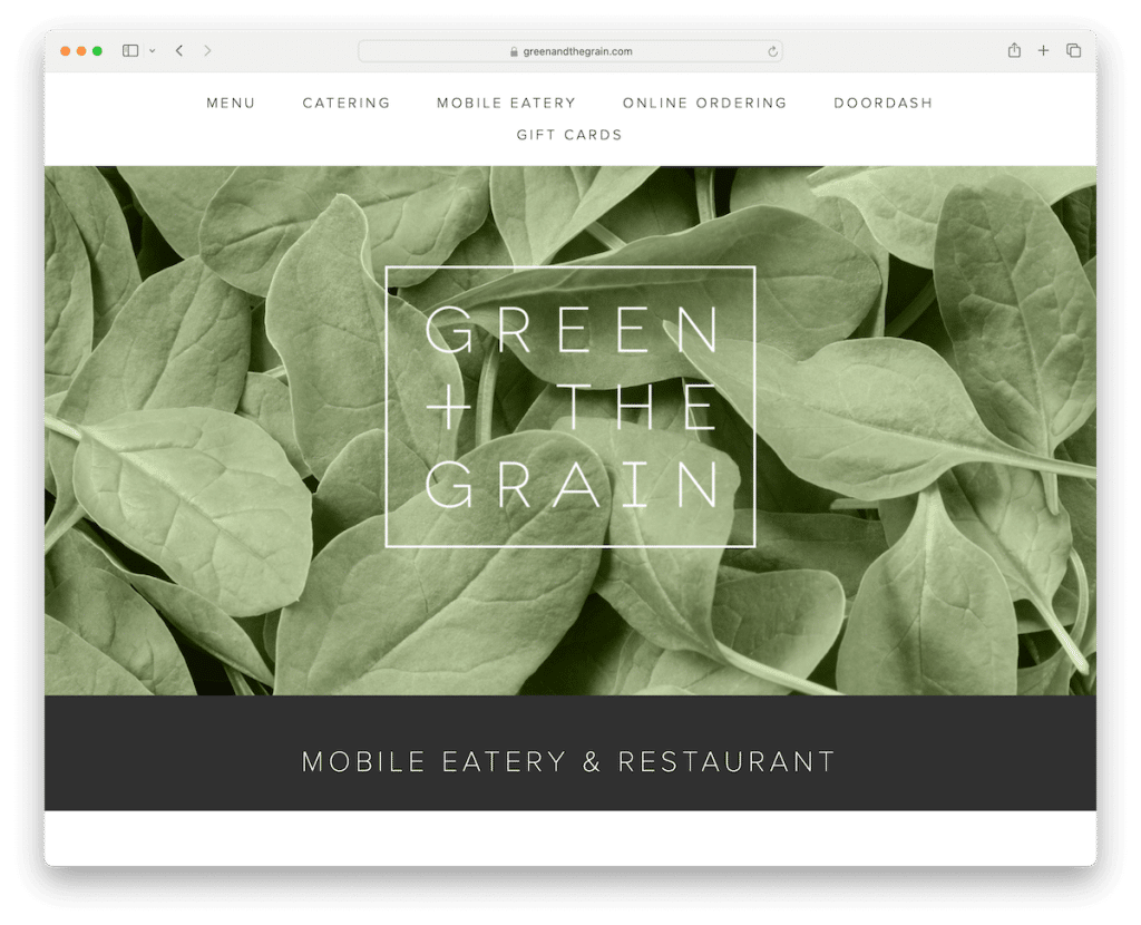
Green And The Grain’s site is an example of a trendy and clean design, embracing minimalism with an unfussy header and footer.
Cool, image-only slideshows hook the essence of their fresh offerings, creating visual appeal without words.
An integrated Instagram feed adds a dynamic, social element, while the sticky header ensures navigation is always a breeze.
An extensive food menu page meticulously categorizes their wholesome selections, allowing visitors to scan and choose easily.
Note: Create a transparent and extensive food menu page – and don’t forget to include prices.
Why we chose it: For its modern, user-friendly format that displays Green And The Grain’s fresh and healthy options.
How To Make A Restaurant Website With Squarespace
First, you don’t need coding and design skills to create a pro-level restaurant website with Squarespace.
All it takes is a simple process that goes like this:
- Sign up and choose your plan: Start by visiting Squarespace.com and creating an account. Choose a plan that fits your business needs, considering Squarespace offers various tiers with different features and pricing.
- Select a template: Squarespace provides a variety of templates designed specifically for restaurants. Browse the options and select one that aligns with your restaurant’s style and ambiance. (Know that you can customize almost every element of the template.)
- Customize your design: With your Squarespace template selected, modify the design to fit your brand. This includes adding your restaurant’s logo, choosing a color scheme, and selecting fonts. Squarespace’s drag-and-drop editor makes it easy to adjust layout elements.
- Add your content: Now, add the essential content for your restaurant. Create pages for your menu, about us section, contact information, and other relevant information like your history or team. (Pro tip: high-quality images of your dishes can make a huge difference.)
- Integrate features: Squarespace offers various features beneficial for restaurants, such as online reservation tools, (food and drink) menus, and the ability to sell gift cards or merchandise.
- Review and publish: Before going live, review your website thoroughly. Once satisfied, publish your site to share your restaurant with the world.
Note: A great website is always evolving.
Regularly update your content, especially your menu and special offers, to keep your site fresh and engaging for visitors.
Fun fact: Have you seen these Squarespace statistics? (Do you know how many websites use Squarespace?)
FAQs About Squarespace Restaurant Websites
Can I integrate a reservation system into my Squarespace restaurant website?
Yes, Squarespace supports integration with popular reservation systems such as OpenTable. You can easily embed a reservation widget into your website by adding a Block and connecting your OpenTable restaurant ID.
Yes. Squarespace allows you to add menu items directly onto your website or through a PDF upload. For ease of updating, using the built-in Menu Block is recommended, as it can be edited without uploading a new PDF each time you make changes.
Can I sell merch or gift cards on my restaurant’s website?
Yes, with Squarespace’s Commerce plans, you can set up an online store to sell merchandise, gift cards, or even takeout orders. The platform provides tools for managing inventory, processing payments, and handling shipping or pickup options.
Can I use my own domain name with a Squarespace restaurant website?
Yes, you can connect your own domain name to your Squarespace website. If you don’t have one, Squarespace offers a free custom domain for the first year with any annual plan, which you can register directly through their platform.
Can I add social media feeds to my Squarespace restaurant website?
Yes, Squarespace makes it easy to integrate social media feeds into your website, such as Instagram, Facebook, and Twitter. This can be done through the Social Links Block or specific integration blocks designed for these platforms.
Was this article helpful?
YesNo
