Are you looking for the most outstanding singer websites?
While many rely only on various 3rd-party platforms, you can take things to the next level with a stand-out online presence.
And it’s way easier to build it than you think.
You have two great and simple options to create a singer website: 1) By using a WordPress theme for musicians and 2) with a musician website builder.
This allows you to promote your latest tunes, albums and music videos. You can also embed a playlist and create an online store to sell merch.
Lastly, you can create a blog and go on a more personal level via compelling posts.
But first, let these excellent examples inspire you.
Best Artists & Singer Websites
1. Steve Benjamins
Built with: Squarespace
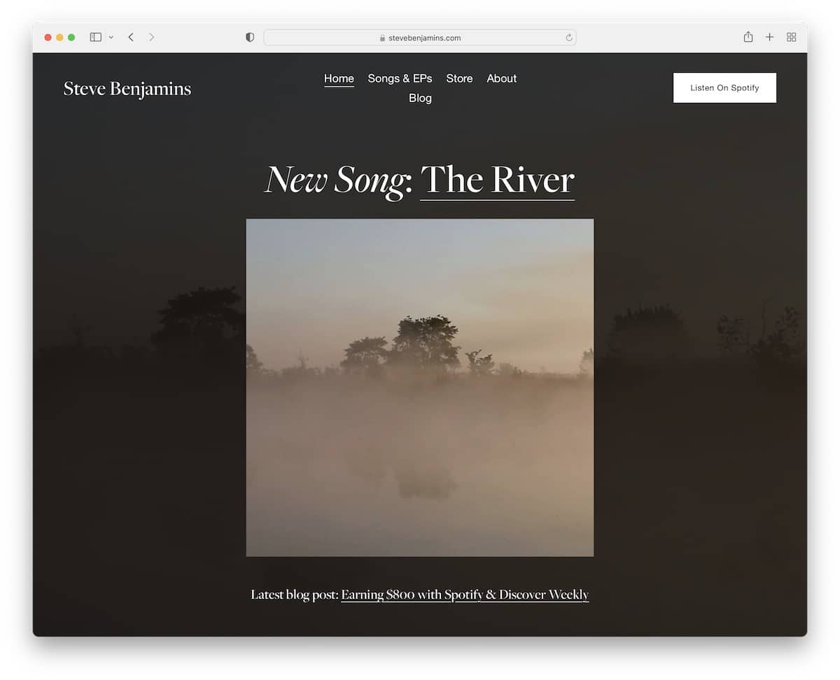
Steve Benjamins has a bold, dark web design, with the hero section promoting the latest song. The header features all the necessary quick menu links and a call-to-action (CTA) button to listen to on Spotify.
Moreover, the footer has three columns, one with a link to a product, one for a newsletter subscription form and one for social media.
Note: Push your latest tunes and album drops in the above-the-fold section.
Don’t miss more fantastic Squarespace website examples we curated for you.
2. Claire Soulier
Built with: Webflow

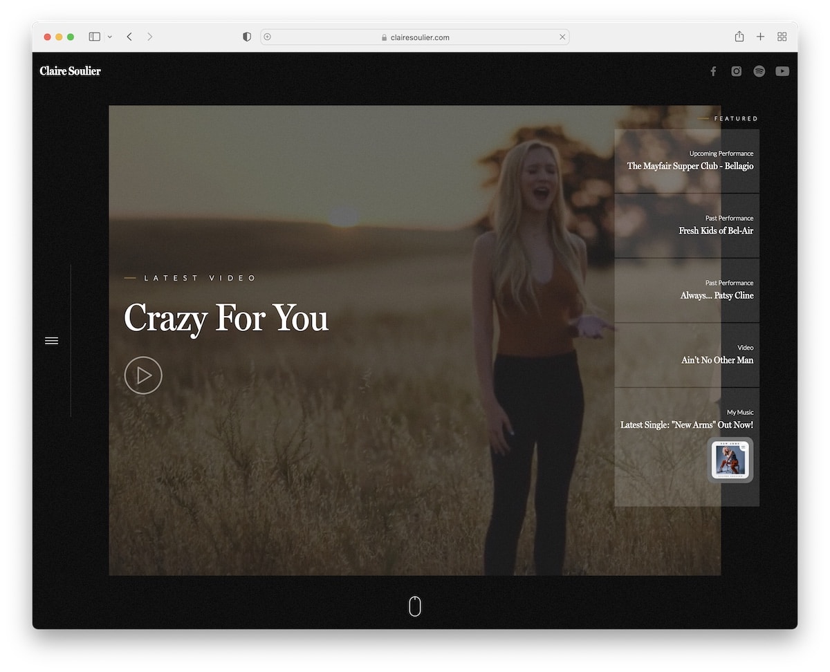
Claire Soulier also has a dark and impactful website design with a video above the fold to immediately trigger every fan’s attention. The video opens in a lightbox by pressing the play button, so you don’t have to leave the home page to watch it.
The rest of this singer’s website’s content loads on scroll to create a more engaging experience. What’s also cool is the sticky sidebar hamburger menu icon that opens full-screen overlay navigation.
Note: Use a dark web design to give your Webflow website a more premium look.
3. Elles Bailey
Built with: Wix

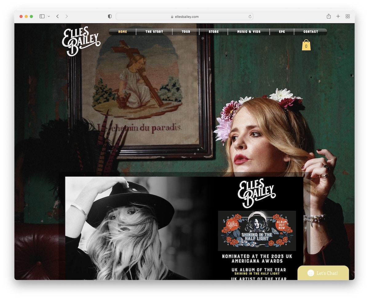
What makes Elles Bailey’s website pop nicely is the parallax background image, making it more likable.
The site’s base has a boxed layout with an embedded video, a list of tour dates and a playlist.
What fans love in particular is the live chat widget that floats in the bottom right corner.
Note: Let fans listen to your music on your website by integrating/embedding an audio playlist.
You may also be interested in checking our collection of the top websites built on the Wix platform.
4. Charley Crockett
Built with: Elementor

Charley Crockett’s home page has a single layout with a transparent header and overlayed social media icons at the bottom of the banner.
This responsive web design has multiple internal pages for tour dates, videos, merchandise, contact, and more.
It’s a simple website with all the necessary easily accessible.
Note: Create a strong and lasting first impression with a single-sectioned home page by using a full-screen background image.
You can easily build a similar website with WordPress. And if you’re still picking the right builder, check our Elementor review and see why it’s THAT good.
5. Andrew Huang
Built with: Squarespace

Andrew Huang is a great singer’s website example with a vibrant color scheme that keeps you focused on the content and info all the time.
What’s handy is the sticky header, so you don’t have to scroll to the top each time you want to access the navbar.
Note: You can improve your page’s user experience by using a sticky/floating header/menu.
6. Jonathan Jackson
Built with: Squarespace

Jonathan Jackson has a full-screen home page with a background image, text and an “enter site” button. Additionally, you’ll also find social media buttons at the bottom of the screen.
Furthermore, this is a clean website with a basic header, with centered logo and a plain footer.
Note: Create a clean and simple website to make your work pop more.
7. Sierra Hull
Built with: Squarespace

Sierra Hull has a semi-single-page layout with a sticky navigation bar that lets you quickly jump (first five links) to the desired section. The other five links open new pages to learn more about Sierra.
The home page has a subscription form and an embedded playlist right before the footer to enjoy Sierra’s tunes on the spot.
Note: Grow your music career by growing your email list – integrate a newsletter subscription form into your website.
8. Garry Tallent

Garry Tallent is a one-page website with tunes, videos and social media feeds available only a few scrolls apart.
While we’re used to primarily seeing Instagram feeds on websites, Garry integrated a Twitter feed (via the handy Juicer tool).
Lastly, you’ll also find a list of all the friends (with links to their websites) and a contact form instead of a traditional footer area.
Note: Improve your web presence’s user experience by creating a single-page site. But we recommend creating a sticky menu or at least adding a back-to-top button in this case.
9. Harpdog Brown
Built with: Squarespace

The number one thing that makes Harpdog Brown’s page stand out from the rest on this list of epic singer website examples is the full-screen background slider on the home page.
There’s also an audio player and various links to watch videos, read the biography and listen to more tunes.
Note: Create a strong first impression with a background image slideshow.
10. Janie Bay
Built with: Carrd

One of the main reasons why we’re adding Janie Bay’s online presence to this collection is because it’s extremely minimalist.
It only has the essentials, no fluff, and that’s what makes it extra special. And the best part? You can effortlessly create a similar Carrd website because of this page builder’s simplicity and beginner-friendliness.
Note: Aim for minimalism when in doubt or not knowing how to approach your website’s design.
Don’t forget to check all these minimalist website examples if cleanness and simplicity are your things.
11. El Vow
Built with: Ruby On Rails

The vivid blue background color makes El Vow’s website pop more and grabs your attention right away.
The header is simple, followed by social media icons and a larger image of El Vow.
Below the main section is a newsletter subscription form, and that’s all the home page features. Simple.
Note: Instead of using traditional light background, go against the grain, like El Vow.
12. Jon Gomm
Built with: Ruby On Rails

Jon Gomm is another terrific singer website example with a dark design. The hero section is a black-and-white image slider with a newsletter subscription window that goes well with the main design.
The drop-down navigation is extra handy because this page doesn’t have a search bar.
There’s another slider/carousel towards the bottom of the website that promotes Jon’s upcoming shows with links to get tickets or share the event.
Note: Use a share button beside your show/tour dates so your fans can promote them for you.
13. Robyn Sherwell
Built with: Wix

Robyn Sherwell is a simple and elegant page with a feminine touch. It has a large banner promoting the latest album with a link below the fold. Friendly tip: Add a link or a CTA button to your product above the fold.
The two-part header has a navigation bar and a row of social media icons above it, but the website doesn’t have a footer.
Note: Use the hero section to advertise your latest tunes and album drops (even merch).
Here are even more beautiful website design examples for musicians.
14. Kirsty Merryn
Built with: Wix

The simplicity of Kirsty Merryn’s page does the trick, especially with its B&W home page, featuring the two main CTAs. But you can also access other sections with menu links or type your query in the search bar.
As for the footer, it only has social media icons, keeping the appearance as minimal as possible.
Note: Use a search bar so fans can find that specific information, tune, etc., easier.
15. Nina Nesbitt
Built with: Divi

Nina Nesbitt’s singer website example triggers your focus with its full-screen above-the-fold section (the background image does most of the work). The hero section promotes the new album with smaller text and a CTA button.
Multiple home page sections come with multiple background images to elevate the overall experience. Plus, the floating navigation bar allows you to find other stuff without the need to scroll to the top first.
Note: Make your Divi website more engaging with various background images (a different one for each section).
16. Harry Harris
Built with: Squarespace

While Harry Harris’ home page is very minimalist, it’s at the same time also very gripping. It has a split-screen design, with a cool image on the right and text, menu links and social icons on the left. No header and no footer.
The horizontal design transforms into a vertical one on mobile, keeping the clean look intact.
Note: Copy Harry’s home page look if you want to do something different.
17. Cardi B
Built with: Drupal

Cardi B takes a different approach to promote her latest drop – with a popup window that shows upon page load.
This songwriter’s website is very vibrant, creating a strong, attention-grabbing effect with the choice of colors and images.
The header is transparent but turns solid and sticks to the top of the screen. Surprisingly, Cardi B has multiple subscription forms scattered across her website, which means email marketing must work for her.
Note: Use a popup window to get more eyeballs on something.
18. Snoop Dogg
Built with: Elementor

Snoop Dogg’s page is dark, clean and fun. It’s one of the rare songwriter’s websites with an accessibility menu icon (in the top right corner), so visitors can customize its appearance.
Also, we like the floating player at the bottom of the screen with a link to his Spotify page.
Note: Two features to copy: First is the sticky audio player and the second is the accessibility configurator.
19. David Cook
Built with: Sonaar Theme

David Cook uses a (image and video) slider above the fold with thumbnail navigation so that you can get to the desired slide with a click.
The hamburger menu icon makes the header look neater, sliding navigation from the right side. This songwriter’s website also has three integrated social feeds, Facebook, Twitter and Instagram.
Note: If you want to add more content to your website, fit in a social feed(s) (which will also help you grow your profile(s)).
20. Soni Withaneye
Built with: Elementor

Soni Withaneye sparks curiosity with the massive slideshow where each slide features text and a CTA button. Part of the slider (on the bottom) is also an audio player to listen to her new release without needing to leave the page and access a 3rd-party platform.
One thing that we haven’t seen on any other singer’s website is the footer reveal that Soni Withaneye uses. It’s a cool detail that enriches the overall user experience. But this page also has other catchy animations to make it more engaging.
Note: Use animations and effects (but don’t overdo it) to raise your site’s engagement level.
Was this article helpful?
YesNo
