Do you want to get inspired and gain new ideas by checking some of the finest illustrator portfolios?
All these websites are modern and beautiful and offer an excellent user experience.
While we recommend you keep the design simple, it’s perfectly OK to introduce a few creative elements here and there.
Simplicity will make your online portfolio pop more, and that’s exactly what you want to achieve with your website.
Additionally, we also ensured to create a collection that consists of both traditional and modern illustrators, so there’s something for EVERYONE.
The best thing is that you can effortlessly build a similar website with 1) an illustrator WordPress theme or 2) a portfolio website builder.
Best Illustrator Portfolios To Inspire You
1. Alex Fisher
Built with: Webflow
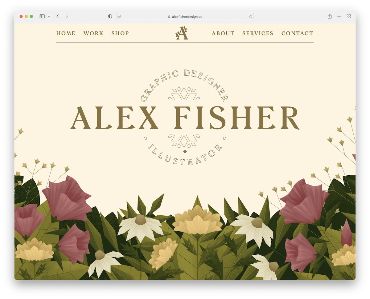
Alex Fisher has a beautiful, creative, modern portfolio website that instantly captures your attention.
The hero section’s excellent parallax-like effect makes the website more engaging – so cool! This page also has sticky navigation, a sliding carousel of works and other catchy effects that make for a superb scrolling experience.
Note: Use a sticky header/navigation, so visitors don’t have to scroll all the way back to the top for better UX.
You may also be interested in these greatest Webflow websites.
2. Lisa Maltby
Built with: Squarespace
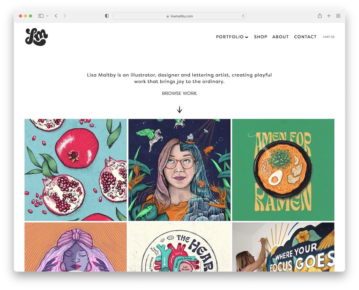
Lisa Maltby’s illustrator portfolio starts with a one-sentence bio and then goes directly into an engaging grid portfolio. You’ll note that some portfolio items are static and some animated, which creates a trendy, dynamic effect.
Moreover, the navigation has a drop-down menu to help you find the illustration style you’re most interested in.
Note: Create a catchier web experience with animated and static elements.
Need more beautiful web designs built with this builder? Then peek at our Squarespace website examples list.
3. Gina Kirlew
Built with: Squarespace
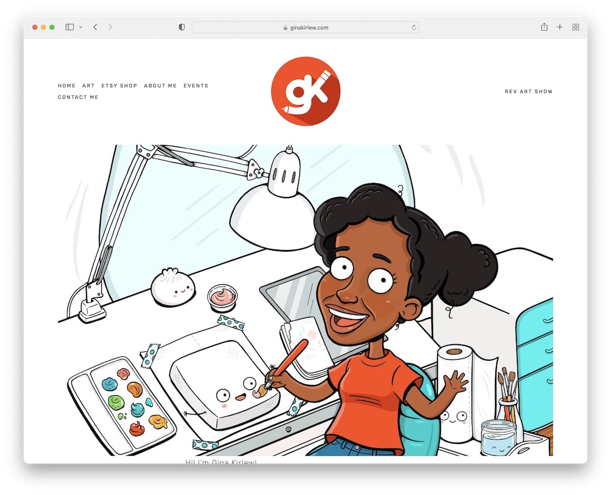
Gina Kirlew knows how to mix simplicity with creativity very well. Her illustrator portfolio website is an excellent example (and proof) that minimalism works!
Her home page is a single section with a basic header and footer with the necessary menu links and social media icons.
What we really like is that the header and footer backgrounds have the same color as the site’s base, which makes it a lot neater.
Note: Build a minimalist website to make your creative work pop more.
4. Susann Hoffmann
Built with: Adobe Portfolio
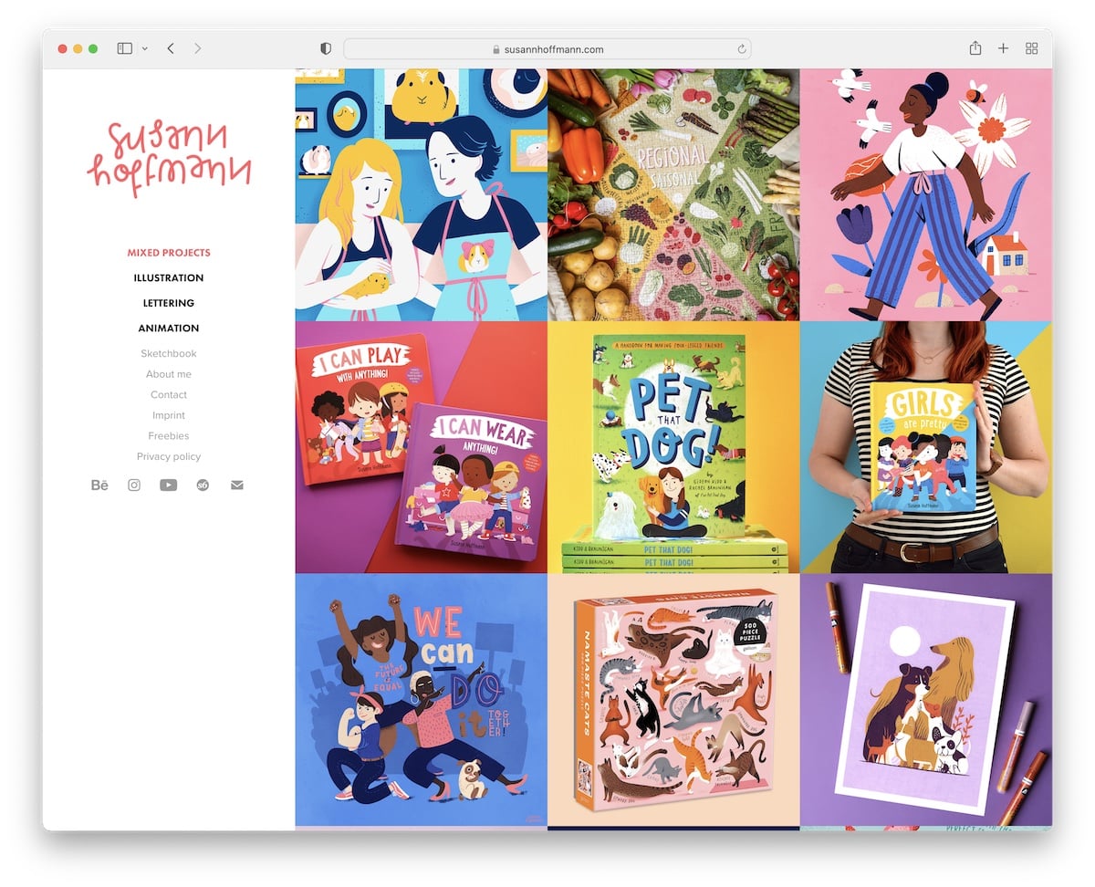
Susann Hoffmann uses a sidebar header/menu, which immediately sets it apart from the rest of these great illustrator portfolios (just like a few others below).
The base of the website is a three-column grid without spacing. Each element has a hover effect, revealing more information about the project. What’s more, Susann breaks down each project even further with extra content on individual pages.
Note: A simple technique not to follow the traditional website look is by putting a header and navigation in the sidebar.
Lastly, we have you covered if you want to see more artist portfolio websites.
5. Essi Kimpimaki
Built with: Cargo
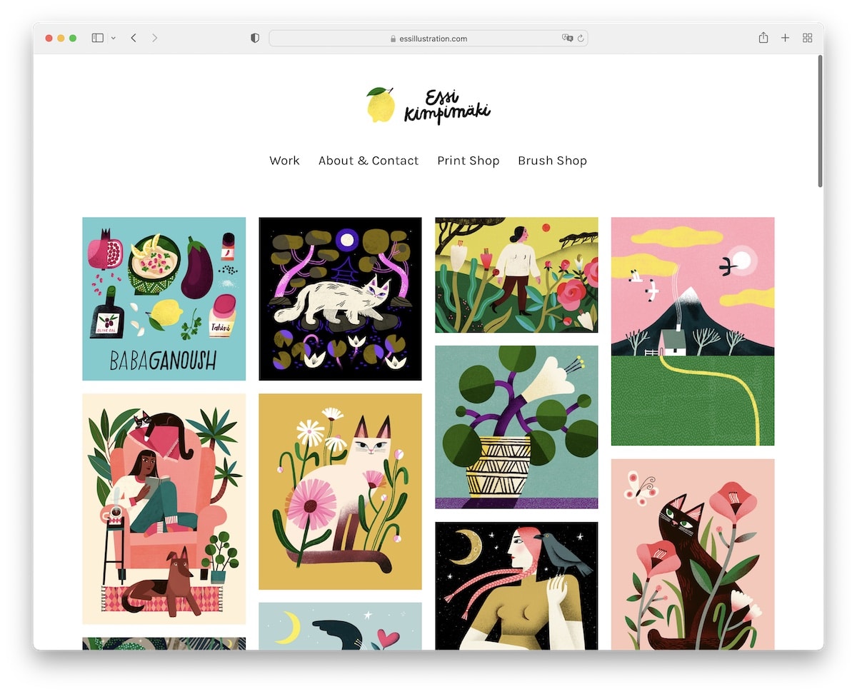
Essi Kimpimaki’s online portfolio is minimalist, with an amazing four-column grid portfolio on the home page. Every project opens on a new page, where you can view a larger image.
The header has a top logo with a plain navigation bar and a bare footer with only social media buttons.
Note: Make your home page one giant portfolio grid so visitors can enjoy your work immediately.
6. Pierrick Calvez
Built with: Webflow
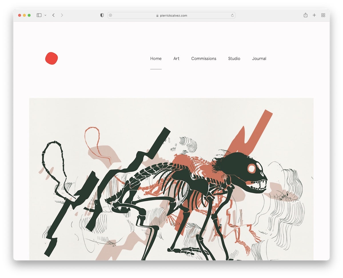
Pierrick Calvez is another great example of an illustrator portfolio that nicely mixes simplicity with a modern look.
The home page is a random collage of works, each opening on a new page. Pierrick’s site has a very plain header and footer (with social media and email links) and a newsletter subscription form.
Note: Grow your email list by integrating a newsletter subscription form.
7. Darren Cranmer
Built with: Pixpa
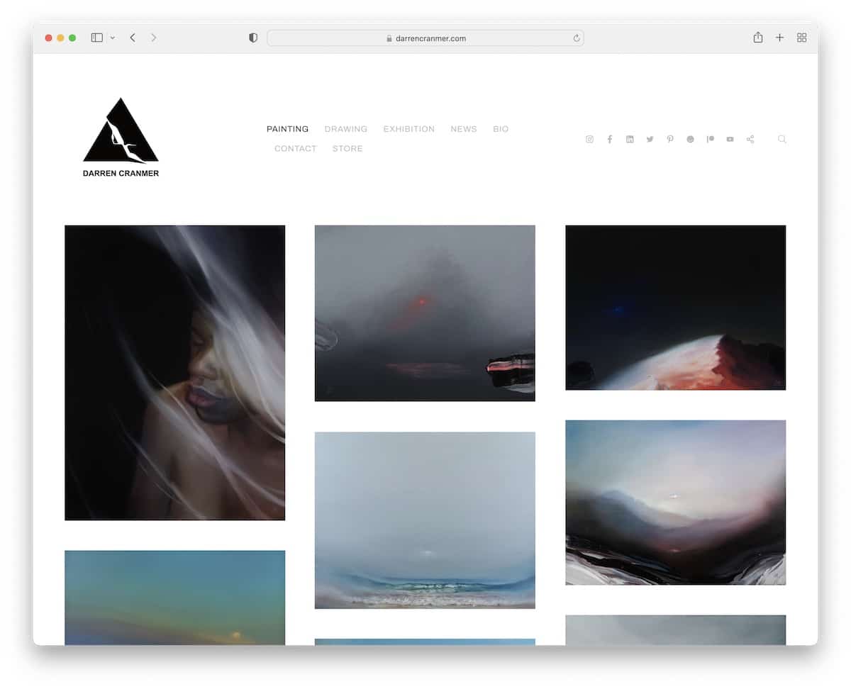
While Darren Cranmer’s home page is a large grid of works, it’s at the same time also an online store. Every grid item links to the product page with additional images and details.
Moreover, the header has a drop-down menu, social media icons and a search icon that opens a full-screen search bar. Plus. there’s a secondary navigation that offers quick links to different categories.
Note: You can strategically mix an online portfolio with an online store, like Darren Cranmer.
8. Michael Molfetas
Built with: Format
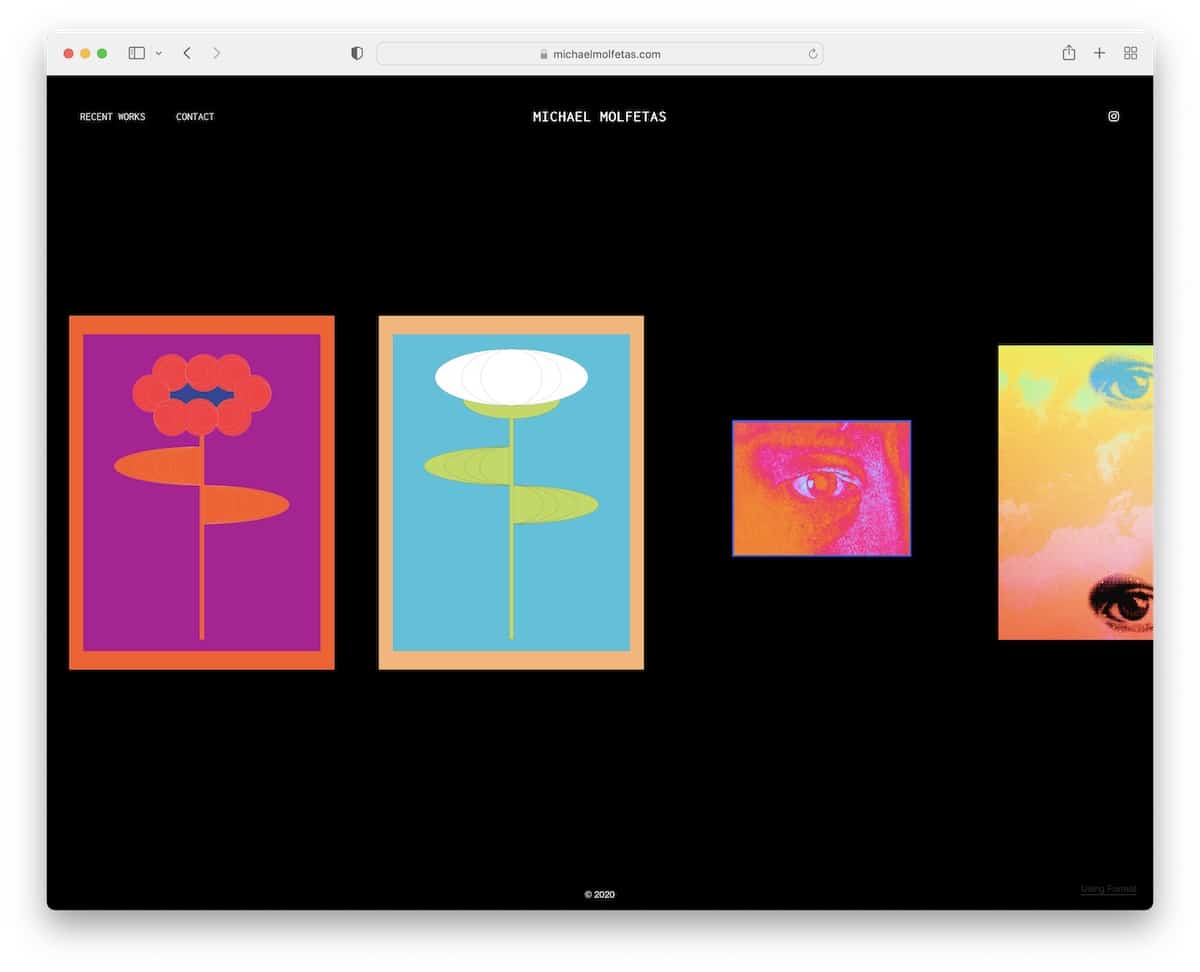
The gorgeous dark design immediately differentiates Michael Molfetas’ site from the rest. But there’s another thing.
Instead of scrolling the works vertically, you scroll them horizontally. Also, this illustrator portfolio has the convenient lightbox effect to enjoy larger images without leaving the current page.
Note: While the light design is most common amongst websites, stand out from the masses with a dark one.
9. Lydia Hill
Built with: Wix
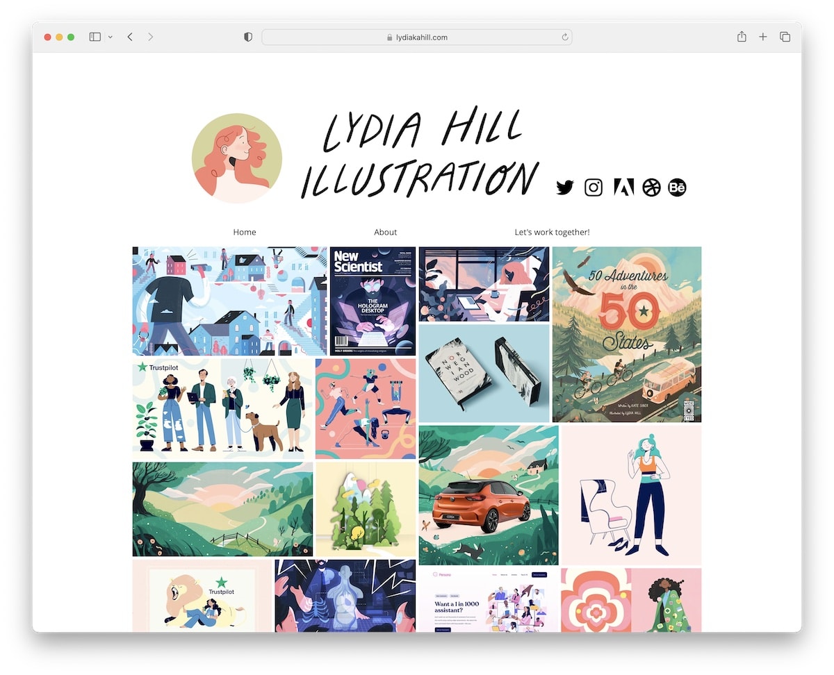
Like Lisa Maltby, Lydia Hill also created an online portfolio with animated and static elements. Additionally, she added the lightbox effect to enjoy each image or animation/GIF in a larger form.
A unique feature that this illustrator portfolio has is the option to download content (in a pretty large format). Who does that?
Note: Let potential clients enjoy your work in more detail by offering to download a higher resolution.
Remember, we also have a list of the best example websites built on the Wix platform.
10. Zach Meyer
Built with: Format
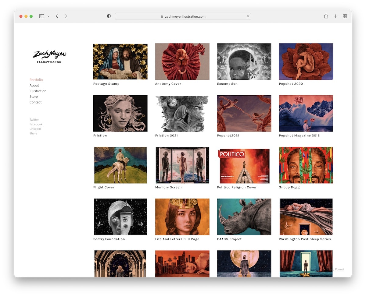
As mentioned earlier, Zach Meyer is another example of an online portfolio with a sidebar menu. The page maintains a sleek look throughout, keeping the same background color across all sections and pages.
The portfolio grid also has enough spacing to showcase the project’s title while all the works open on a new page (sometimes even showcasing an image of the final version).
Note: Use the background of the header, footer and base the same color if you want a more toned-down web appearance.
11. Alice Zhang
Built with: Webflow

Alice Zhang has a catchy grid layout on the home page with a unique hover effect for every element to spice things up.
The header is also pretty original, with a menu button that doesn’t feel like a menu button at all. Plus, there’s a clickable email to get in touch on the spot.
Note: Add funky hover effect(s) to your website to create a more lively experience.
12. Clara De Lorenzi
Built with: Squarespace
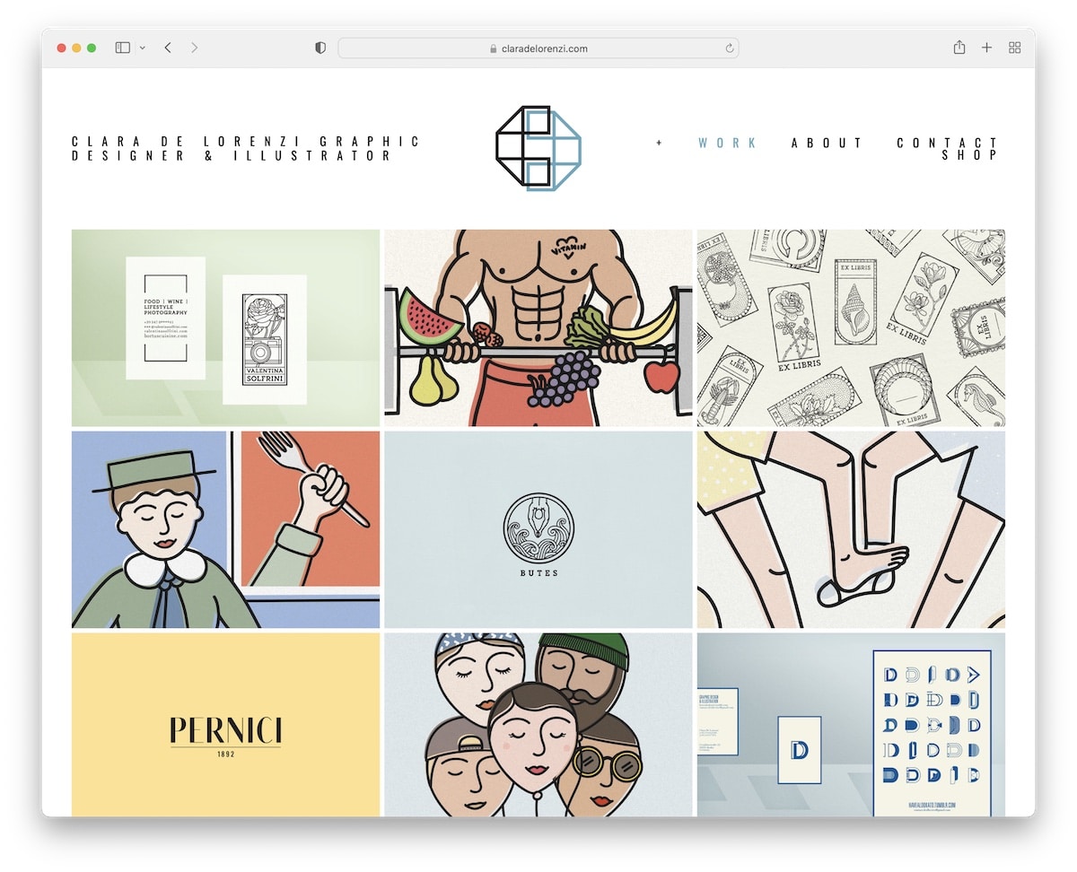
Clara De Lorenzi is a fine illustrator portfolio example with a grid layout on the page, a basic header with drop-down navigation and a plain footer.
The grid opens each project on a new page where you can find more information, including additional images.
Note: Reveal the title or other details on hover to keep the initial presentation cleaner.
You may also want to check our list of clean websites for more excellent demonstrations.
13. That Artista
Built with: Format
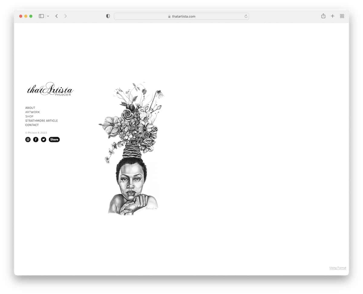
That Artista’s home page is very minimalist, with a graphic and sidebar navigation with social icons (also featuring social sharing).
What’s interesting about this illustrator portfolio site is that some parts scroll vertically (about page) and some horizontally (project pages).
Note: Use horizontal scrolling and mimic swiping on the desktop.
14. Ashley Idell
Built with: Squarespace
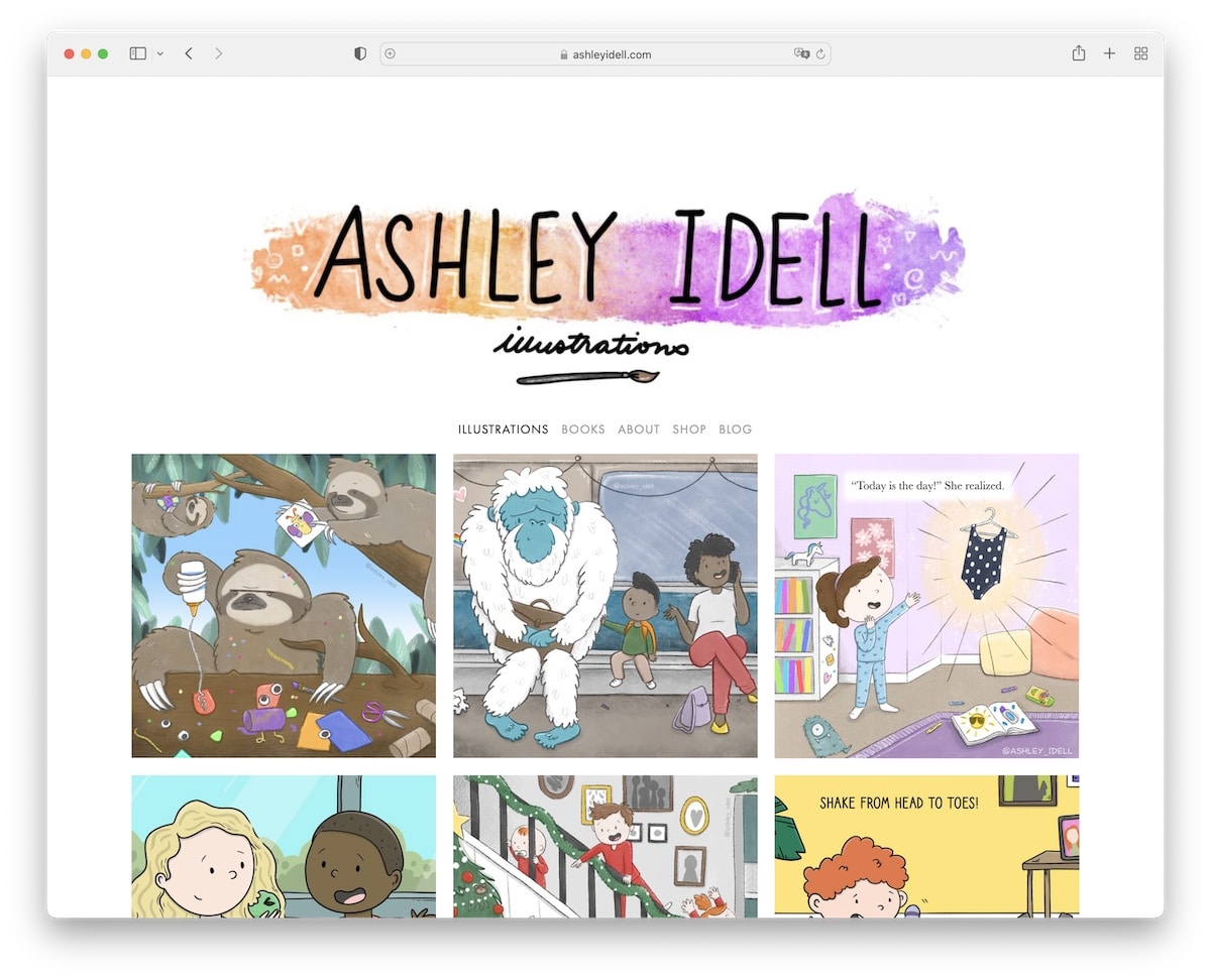
Ashley Idell’s website is very bubbly because of her illustrations, while the overall design is kept very minimal. But that’s great because it makes the images and other content pop more.
Speaking of pop, the portfolio comes with the lightbox function, so you can view larger images and scroll through them without leaving the current page.
Note: Apply the lightbox effect, so the viewer doesn’t have to leave the page to view larger images.
15. Lera Mishurova
Built with: Wix
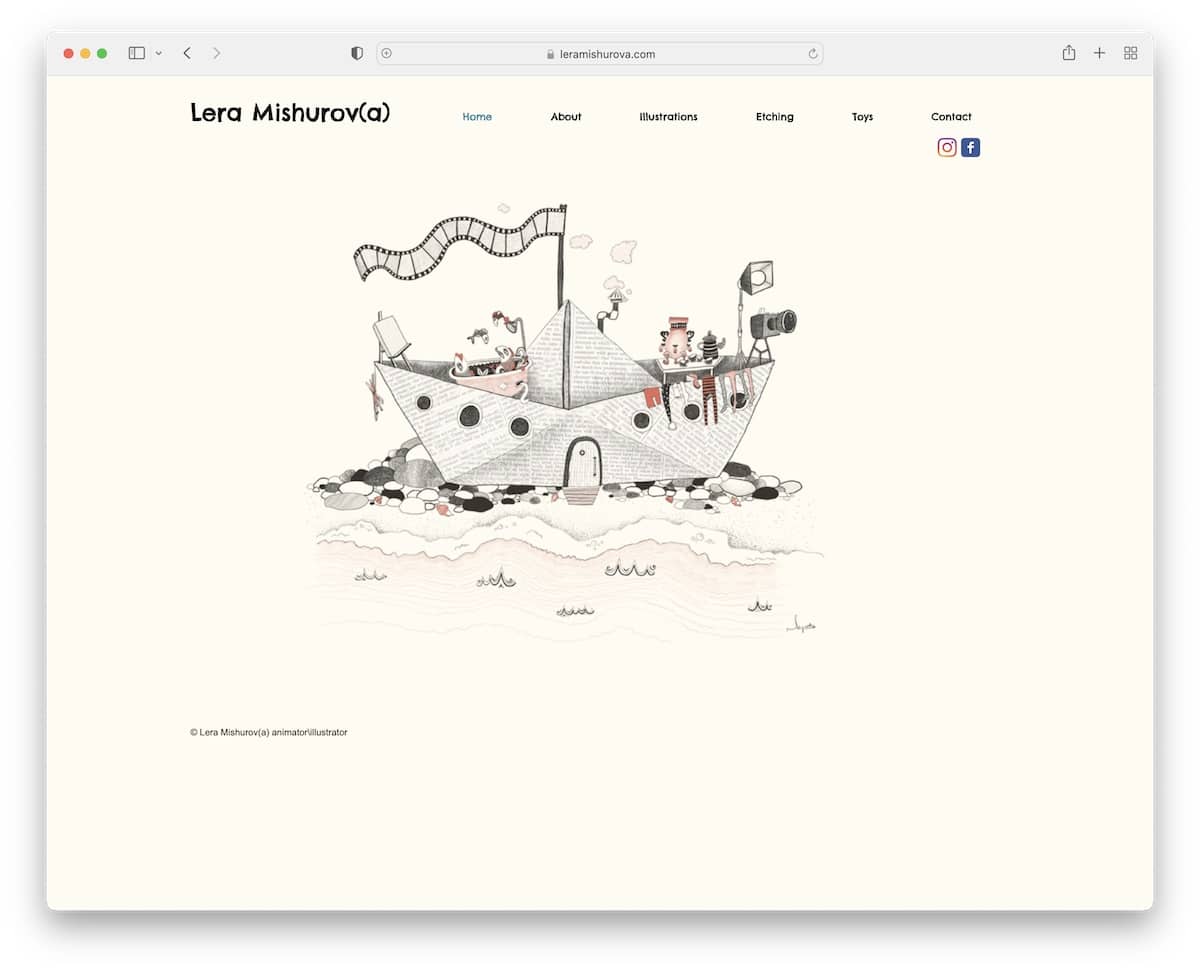
Lera Mishurova’s home page might not reveal that much, but she does one thing very well: Put all the attention on her lovely work (even though it’s just one image).
The header is basic, with the essential navigational links and Facebook and Instagram icons. On the other hand, the footer only has copyright text and a like button, keeping things very modest.
Note: Let your work do most of the talking.
16. Ann Gagliano
Built with: Squarespace
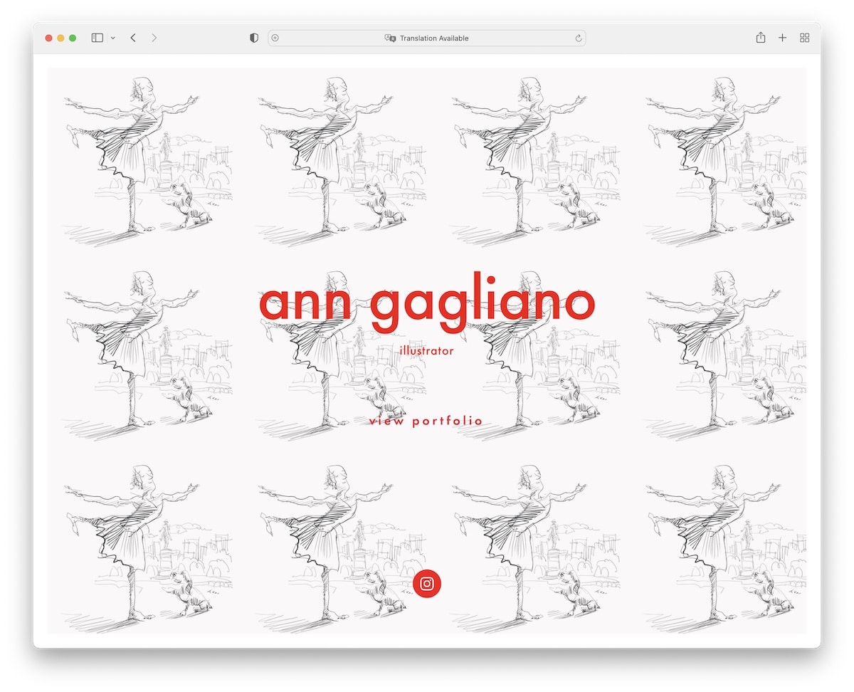
Ann Gagliano has a beautiful framed full-screen home page with a link to view her portfolio and her Instagram profile.
This illustrator’s portfolio is a gallery with bottom thumbnails that you can use to check her work or click on it and it’ll slide to the next one itself.
Note: Create a gallery with thumbnails for your portfolio, like Ann Gagliano.
17. Rachel Sanson
Built with: Squarespace
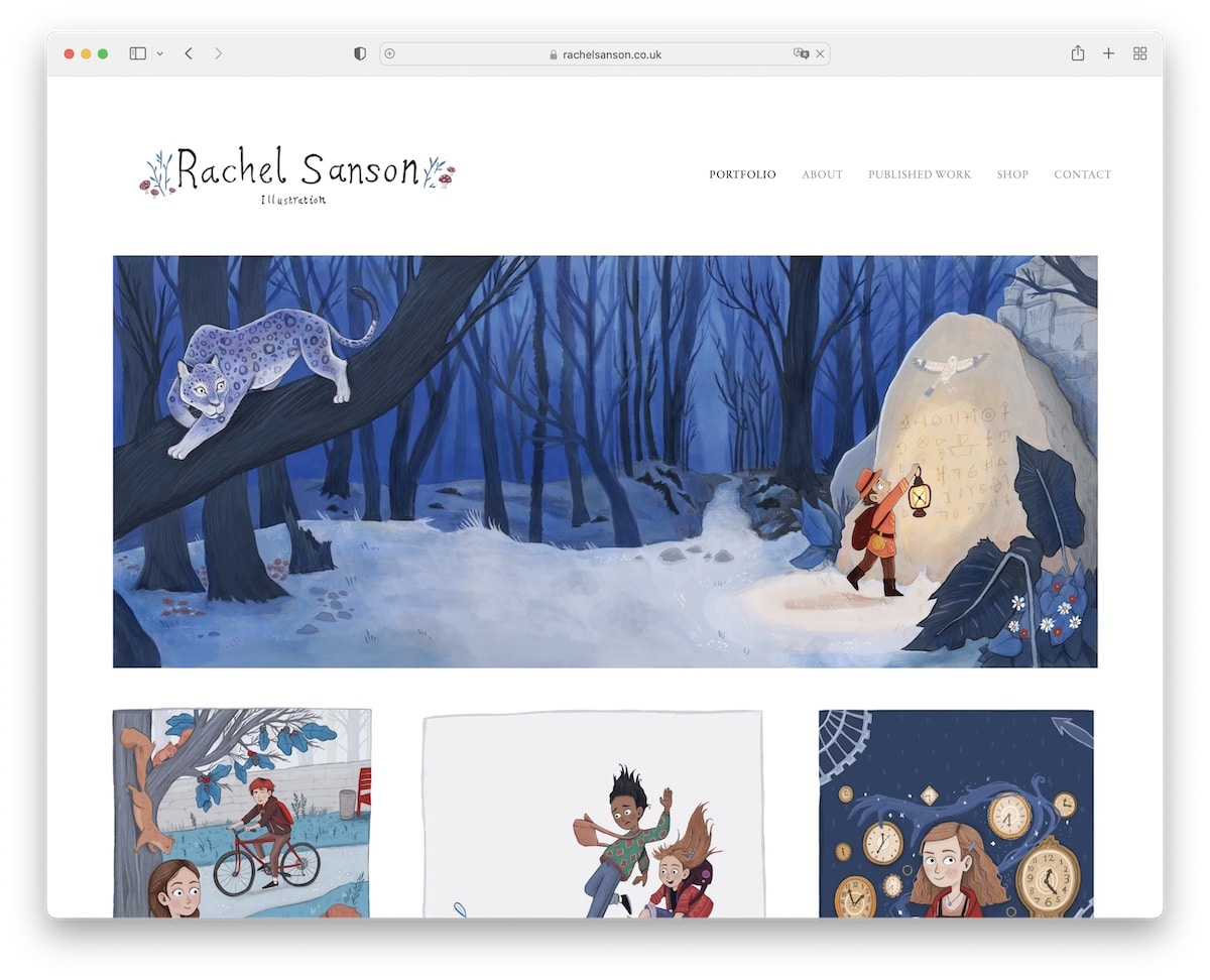
Rachel Sanson has a lovely masonry portfolio grid on the home page with the lightbox functionality to view larger images without needing to open a new page.
The minimalist look is spread throughout the website, including the header and the footer.
Note: You can use different styles of grids to showcase your work if you’re not into the classic one.
18. Beatrice Blue
Built with: Format
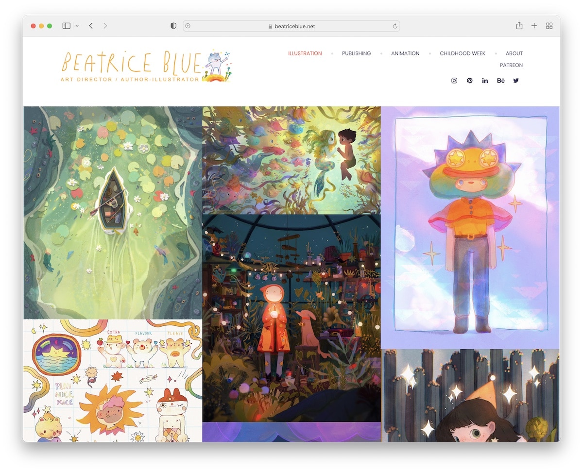
The number one thing that sets Beatrice Blue’s illustrator portfolio website apart from the rest is the infinity scroll she uses for loading her portfolio works. This allows you to keep your visitors around for longer (because they don’t have to click) and it can also improve the website speed.
The page has a sticky header with menu links and social media, which is handy for the infinity scroll function.
Note: Use infinite scroll and improve your website and ensure visitors view more of your content.
19. Luke Adam Hawker
Built with: Squarespace
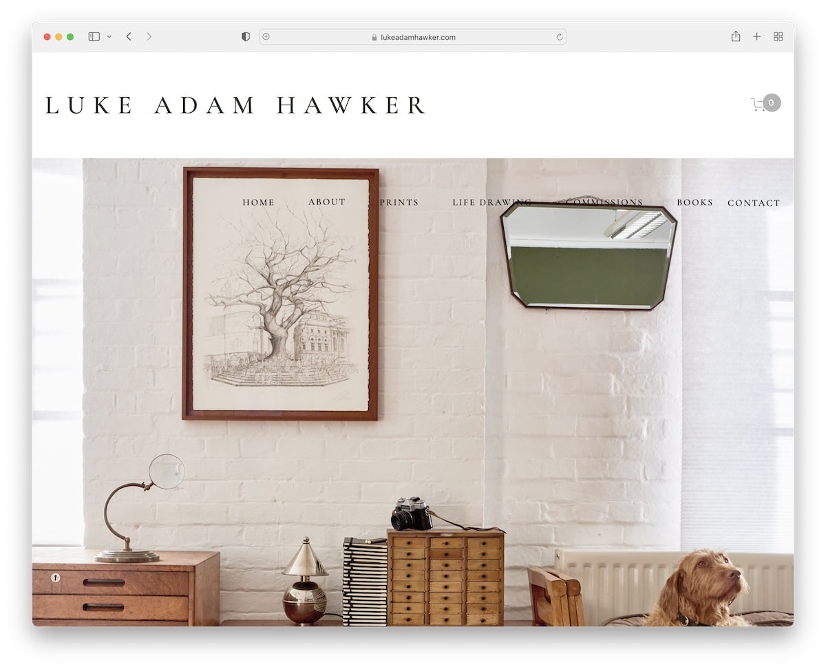
Luke Adam Hawker takes a different approach in presenting his illustration(s) in the hero section – with an actual framed one.
The main header part is the “logo” and shopping cart icons and the second is a transparent navigation bar with a drop-down menu.
The footer has a newsletter subscription form with a few additional links. We’d also like to mention the integration of Google Maps on the contact page, which showcases his business’s exact location.
Note: First, use images of your printed work. And second, use Google Maps if you’d like to display your business location more conveniently.
20. Ive Penkova
Built with: Squarespace
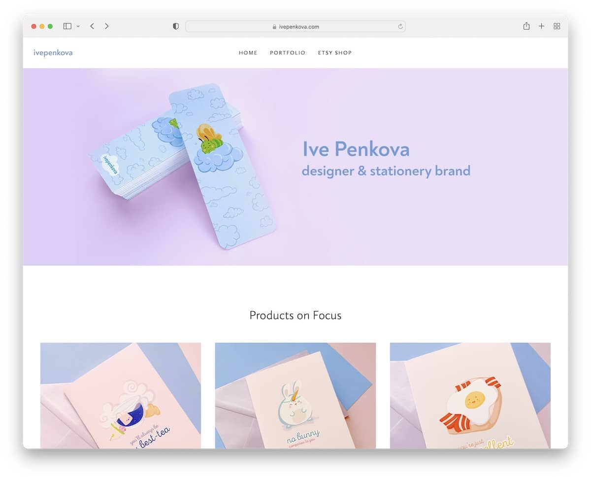
Ive Penkova is an illustrator portfolio example with a full-width banner image, but the rest of the site has a boxed layout.
The header and footer are plain and simple, featuring only the essentials. What we also really enjoyed was the Instagram feed integration that opens posts on new pages (except for the videos, which appear in a popup).
Note: Integrated an IG feed to your website to add more content and to grow your profile.
Was this article helpful?
YesNo
