Do you want to look at the best healthcare website designs before you take the plunge and create your own?
We’ve compiled a list of the greatest twenty that vary in design quite a bit to cover as many tastes as possible.
However, what most have in common are a simpler, cleaner design and a calmer website color scheme.
We also recommend integrating an online appointment system to simplify your workflow and keep your business more organized.
Remember, you can use a health and medical WordPress theme or a medical website builder to achieve the best results – without coding and design skills, of course.
Enjoy.
Best Healthcare Website Designs & Examples
1. Halcyon Health
Built with: Squarespace
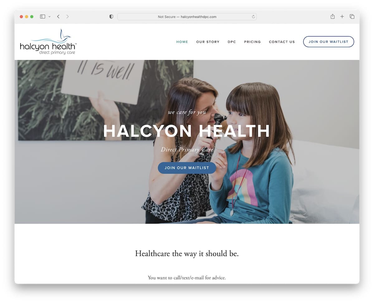
Halcyon Health is a healthcare website example with a minimalist appearance, starting with a large banner with a call-to-action button.
The header has a drop-down menu and a CTA button, while the footer only contains the basics. Halcyon Health also uses hover effects for buttons and links to drive attention.
Note: Your medical website’s design doesn’t have to be complicated. In fact, keeping it minimalist is recommended.
2. Integrative Medicine Of NYC
Built with: Squarespace

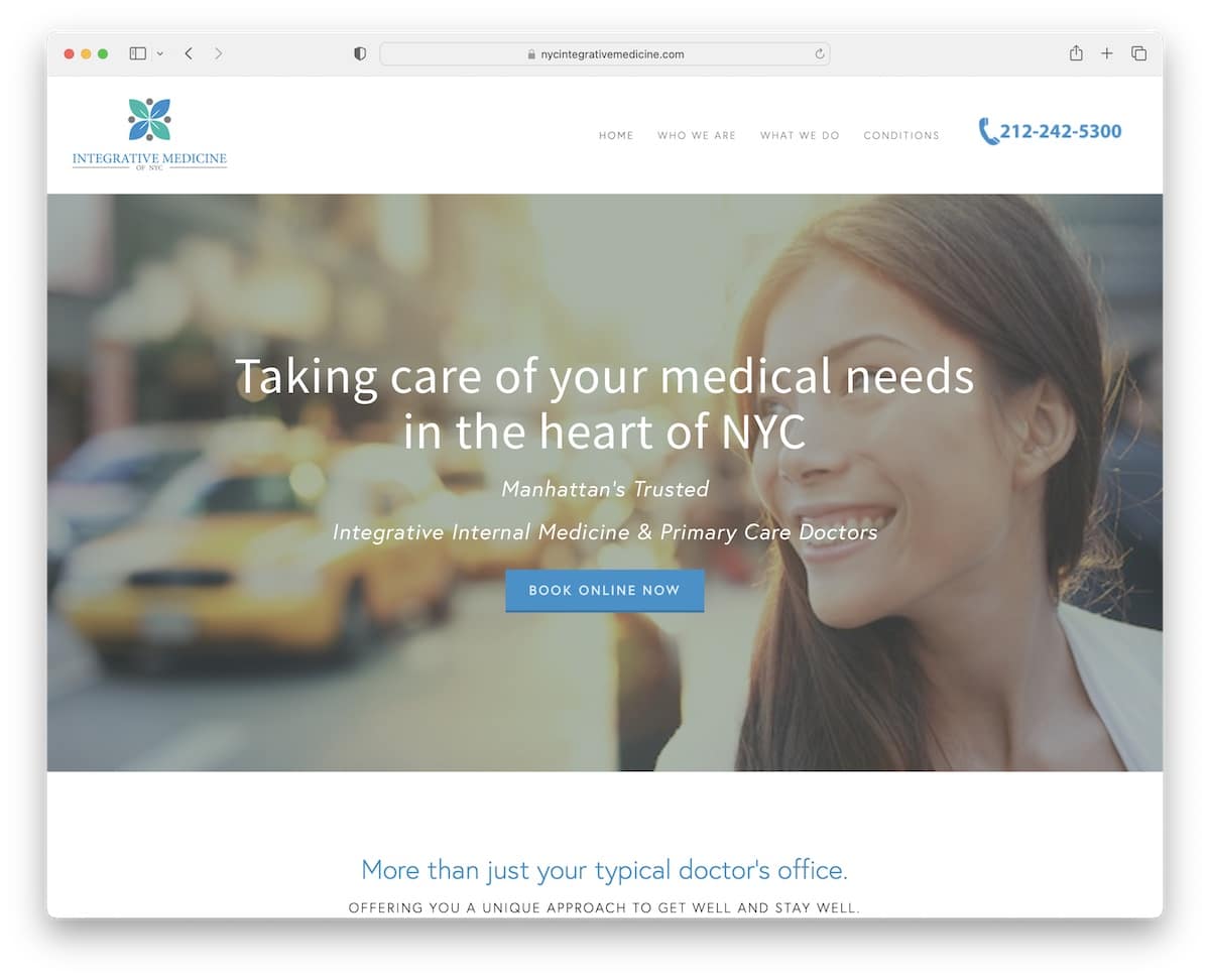
The hero image with a large title, text and a booking CTA button grabs the attention immediately. Moreover, Integrative Medicine Of NYC uses a floating header, so menu links and clickable telephone number are always available.
There’s also a simple testimonials slider to build social proof, a contact form and Google Maps – all on the home page.
Note: Integrate patient testimonials/feedback (on your home page) to build trust/social proof.
3. Just Kids Pediatrics
Built with: Squarespace

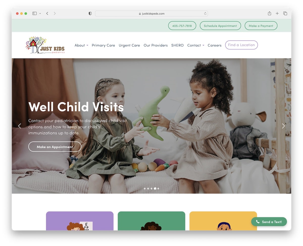
Just Kids Pediatrics quickly showcases multiple options and information with a slider (where each slide features a title, an excerpt and a CTA button).
This healthcare website has a top bar and a header with all the useful links, contacts and CTAs.
What’s also beneficial are the integrated Google Reviews with a “write a review” button. Finally, Just Kids Pediatrics also uses a floating “send a text” widget, so you can click it and get in touch immediately.
Note: Add a slider to showcase your must-see, must-try content and services.
4. Vigor Natural Health Clinic
Built with: Squarespace

Vigor Natural Health Clinic is another wonderful example of a minimalist website with a light design.
What we enjoy about a clean design is using the same background color for the header, the base and the footer – it makes the overall look really neat.
Vigor Natural Health Clinic uses Google Maps on the contact page to showcase their exact clinic location for breezier finds (along with the address).
Note: Make it easier for patients to find you by inserting Google Maps into your page.
5. Flatiron Family Medical
Built with: Squarespace

Flatiron Family Medical is a modern website with multiple parallax sections and interesting sidebar navigation through the home page. You will jump from section to section when clicking the “line pagination.” But scrolling feels equally comfortable.
In between sections is a newsletter subscription form that helps them collect new leads for email marketing campaigns. The header and footer are plainer, with mandatory links, CTAs and social icons.
Note: One of the ways to add “life” to your website is by introducing the parallax effect.
6. Healthway
Built with: Squarespace

Healthway has a modern and creative design with plenty of white space for excellent readability.
It has a simple header with a drop-down and a three-column footer with additional business details and quick links.
Also, the background parallax effect adds more depth to this page, which is a lovely addition to boost the experience.
Note: A clean website look with a few creative elements here and there creates a pleasant atmosphere.
But you can also check more terrific Squarespace website examples that are creative and clean.
7. Crossroads Integrative Medicine
Built with: Divi

Crossroads Integrative Medicine is an elegant healthcare website example with a calming color scheme (thanks, green!).
The page loads content while you scroll to keep you in focus. It improves its user experience with a floating header (top bar, too) and a back-to-top button, eliminating the need for scrolling.
Note: Do you want to enhance your page’s UX? Then create a sticky header or add a back-to-top button or both.
We also have a list of many more fantastic websites using the Divi theme.
8. Felix Medical Group
Built with: Webflow

Felix Medical Group is a two-page healthcare website with one external link to the patient portal.
The layout is organized and sectioned, using a lot of white space and simple typography for easier skimming.
Felix Medical Group has a reviews grid and integrated Google Maps to showcase its location. What’s more, you can call them without needing to dial the phone number when clicking the “schedule an appointment” button.
Note: A clickable telephone number can contribute to a better user experience.
We also have an exclusive collection of the most fantastic Webflow websites ready for your convenience.
9. Maven Clinic
Built with: Webflow

Maven Clinic’s excellent website color scheme creates a comfortable vibe while checking their services.
The page has a floating top bar notification you can close by pressing the “x.” Also, the header (with a mega menu) disappears when you start scrolling down but reappears after returning to the top.
Another feature to point out is the “search” function in the hero area which makes finding out about different topics much faster.
Note: The disappearing/reappearing header/menu makes scrolling more satisfying because of fewer distractions, but, at the same time, it’s handy.
10. One Medical
Built with: Wagtail

One Medical has contrasting CTA buttons with a hover effect to make them more clickable. This healthcare website also has a catchy text effect for services to capture the potential patient’s attention.
Besides the text and images, the embedded video is another way that showcases what One Medical excels at.
We also find the location finder in the footer very handy, but you can also click on the “locations” link in the floating navbar to open the page.
Note: Embed your promotional video into your website for everyone who prefers video over images and text.
11. Mayo Clinic
Built with: SiteCore

As one of the largest healthcare websites in the world, you can learn a lot from Mayo Clinic. The first thing you’ll notice is the clean, almost minimalist design. It’s all about creating the ultimate UX through content, using white space, eye-appealing colors and typography.
What’s interesting is the floating “feedback” button in the bottom right corner that opens a popup where anyone can submit their opinion. This allows them to get more information on the areas where they can improve and better their website and its UX.
Note: Don’t be afraid to ask your visitors directly whether they’re enjoying your site or not.
12. Synergy Private Health
Built with: Squarespace

Synergy Private Health uses a full-screen image slideshow with a transparent header that disappears/reappears depending on the scrolling movement. And the slider they use doesn’t feature any CTA buttons or links; it only highlights how they can benefit you.
Synergy Private Health also achieves a more immersive experience by loading content while scrolling.
Note: Give your potential patients a reason to stay on your website longer, starting with a big slideshow (that doesn’t feel salesy).
13. SimplePractice
Built with: Gatsby

SimplePractice knows how to draw your attention with its actionable above-the-fold section. First, there’s a plain navigation bar with mega menu functionality. And second, comes a banner with an opt-in form to start a free trial.
The hero section also includes certification badges, star ratings and a play button that opens a promotional video in a lightbox.
Note: Take your website navigation to the next level with a mega menu.
14. Northwestern Medicine
Built with: SiteCore

Even though there’s quite a lot going on above the fold, Northwestern Medicine knows how to make everything easy to access without causing distractions. All the links and CTA buttons are clearly visible so the visitors can find what they’re after more quicker.
The top bar and the header both float, so scrolling back to the top to navigate this healthcare website is unnecessary.
Last but not least, the animated statistics add Northwestern Medicine a layer of engagement to avoid monotony.
Note: Simple animations and effects can enliven your website (so it doesn’t feel so “serious”).
15. Virtua Health System
Built with: SiteCore

Virtua Health System has a three-part header; notification bar, top bar and main navigation. And all stick.
Then there’s a slider with CTA buttons and a floating messaging box to get the necessary answers much faster. The chatbox combines a bot and actual navigators (support staff).
Furthermore, you’ll find plenty of additional quick links in the footer, a clickable phone number, social icons, and more.
Note: Create a better customer service experience with a live chat widget.
16. Dr. Rachel Paul
Built with: Squarespace

Besides the websites of clinics and hospitals, we also wanted to add an example of a fantastic doctor’s website.
Dr. Rachel Paul knows how to story tell through the home page to ensure your attention is present and focused.
The page has many CTA buttons, before and after images (that work!), video testimonials and a FAQ section with testimonials.
Note: You’ll achieve even better results with video testimonials and before/after images if you help people transform their bodies.
17. Mass General Brigham
Built with: Adobe Experience Manager

Mass General Brigham makes a strong first impression with the choice of blue, white and teal color scheme.
It features large sections with CTA buttons and easily readable text to make content more digestible. All call-to-action buttons have a hover effect to increase interactivity.
Also, the seemingly basic floating header has mega menu functionality, displaying links in multiple columns.
Note: The choice of color palette can make your website a lot more enjoyable. So choose wisely.
18. Tia
Built with: Gatsby

Tia has a soothing web design with catchy details and on-scroll content loading to make the page more captivating.
It’s a trendy healthcare website example with a floating header, cool testimonial slider, PR mentions and a blog.
While CTA buttons are scattered across the website, one is also in the floating header, so it’s always present.
Note: Give back to the community and express your professionalism with an active blog.
19. Centura Health
Built with: Drupal

Auto-played video in the hero section makes Centura Health instantly more fetching. They also use an overlayed banner with a search bar and multiple other CTAs so everyone can immediately take action.
Besides the disappearing/reappearing header, Centura Health also uses a sticky search function in the bottom right corner.
And to improve the user experience, a language switcher in the top bar translates the entire website with a click.
Note: Offer potential patients to translate your website if you offer services globally.
20. Mercy Health
Built with: SiteCore

With a large slideshow, Mercy Health keeps you posted on the latest and most important. And if you need to search for a doctor, condition or something else, you can do so by typing in your search query using the large green search bar.
Mercy Health also uses its home page for advertising recent news and events and welcomes you to chat with the virtual assistant via the floating widget at the bottom of the screen.
Finally, the entire header, including top bar and notification bar, reappears as soon as you scroll back to the top, so even the donation CTA button is always at hand.
Note: Give your CTA buttons extra exposure by displaying them in the header.
Was this article helpful?
YesNo
