Check out this collection of the best DJ websites and gain new ideas for your online presence.
After reviewing 50+ artist websites, we found that a dark design is pretty popular amongst DJs.
However, many pages use light design, so there’s no rule to follow. You create your own rules.
A DJ site usually comes with links to social media, a biography, tunes and albums, tour dates, and more.
Some even embed official music videos and songs (or playlists) to spice things up. And the others also run an online store.
Remember, you can easily create a powerful website with any of these DJ WordPress themes. (And don’t forget to pick the right hosting for musicians.)
Without further ado, let’s check these beautiful designs now.
Best DJ Websites And Examples
1. Carl Cox
Built with: Salient Theme
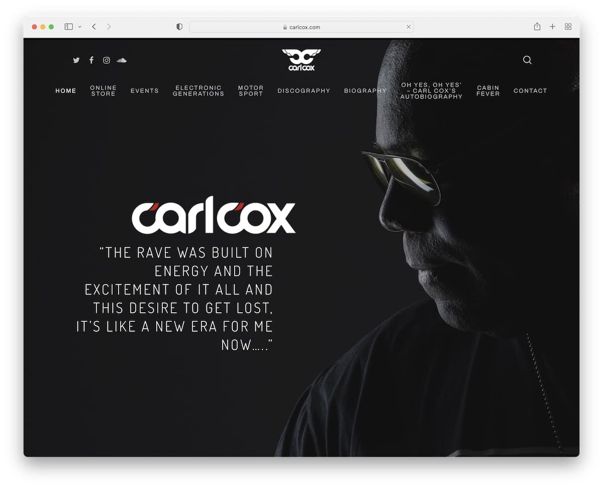
Carl Cox makes a strong and lasting impact on every visitor with the dark and responsive web design. His hero section is a full-screen image of himself with text and a transparent header.
The minimalist footer only includes an archive widget, keeping things clean and simple. Also, the back-to-top button is handy, so you don’t need to manually scroll all the way to the top.
Note: Achieve a more premium and powerful feel with a dark design.
You can also check our list of the best Salient theme examples for more designs.
2. Sharam
Built with: Squarespace

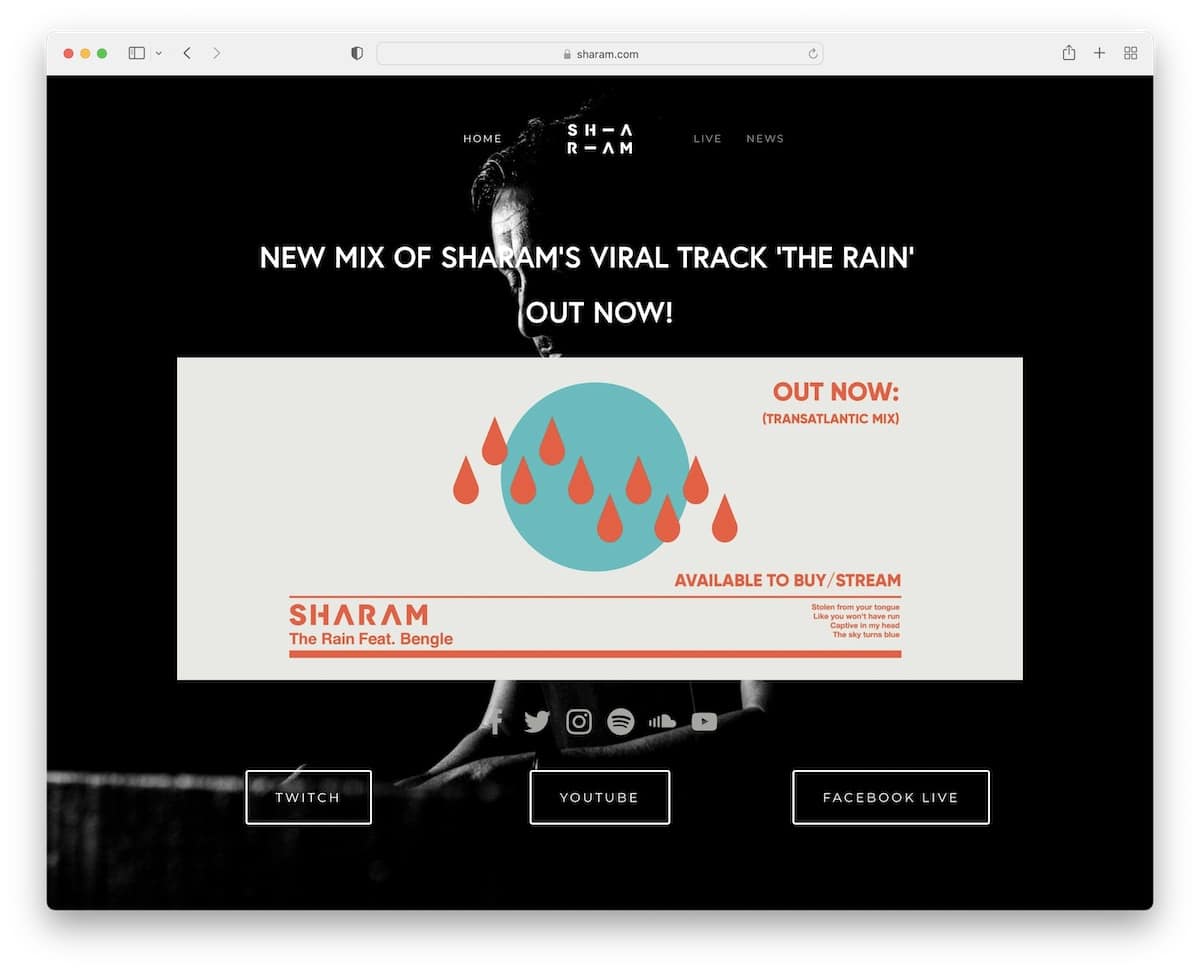
Sharam’s DJ website is a simple but creative landing page example with a dark look like Carl Cox’s.
The page features a minimalist header with links that take you directly to the desired section (without scrolling).
Links and buttons highlight on the hover, so you know you’re clicking the right thing.
Note: A landing or one-page layout is great for boosting user experience.
Do you like Squarespace? Then you must also check these Squarespace website examples.
3. Martin Garrix
Built with: Next.js

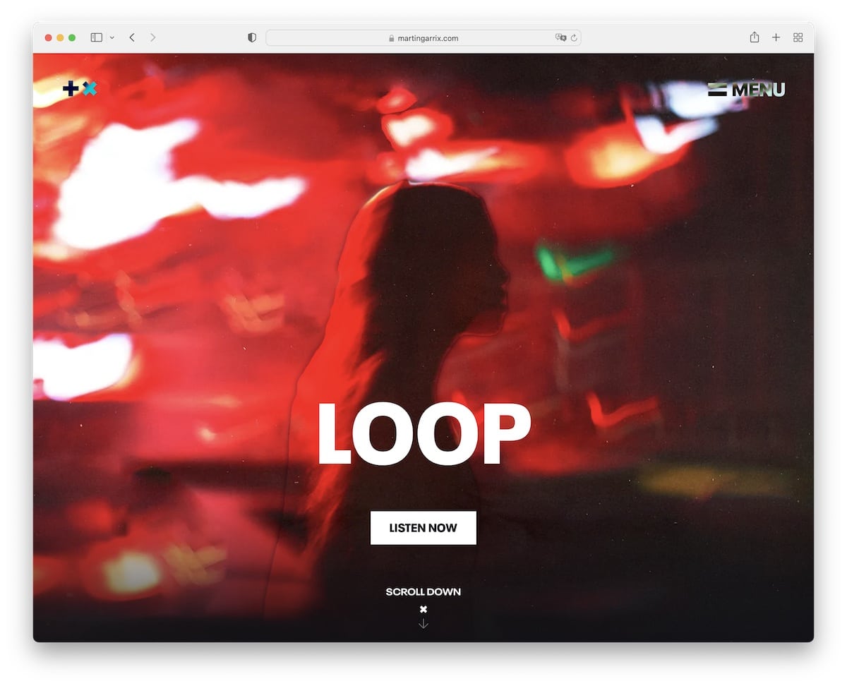
Martin Garrix mixes dark and light backgrounds with many animated elements that keep engagement at an all-time high.
The hero section has a parallax effect to it with a call-to-action (CTA) button to the latest tune. Also, the sticky hamburger menu is always available to jump from page to page without doing any scrolling.
Note: Keep your site more dynamic with dark and light sections.
4. Jauz
Built with: Squarespace

Jauz has a modern one-page DJ website with a simplistic header, using links that take you directly to the section you want to check (0 scrolling).
We really like the parallax background that spices up the overall dark design. However, Jauz uses a white background for the Instagram section, which makes it pop more.
Note: Use a different background color if you want to highlight a particular section.
5. DJ Shai
Built with: Wix

DJ Shai has a refreshing website with a light background and pink detailing. It’s a single-page site where you can quickly learn everything about her.
The embedded Spotify playlists are a very cool addition to keep the fan around for longer.
Note: Let fans play your music on your website.
There are many other excellent websites built on the Wix platform.
6. Aka Aka
Built with: Webflow

Aka Aka’s DJ website has a large hero image with a light parallax effect, promoting the latest single with links to Spotify, Apple Music and Beatport.
The header is dark with catchy animated icons that respond on hover.
We find the tour section very interesting because it’s a somewhat inline frame that you can scroll through without scrolling the main page.
Note: Use the hero section to promote your latest tunes, music videos, tour dates, etc.
Check more Webflow websites for additional ideas and inspirations.
7. Tiesto
Built with: Squarespace

Tiesto is another fan of dark and parallax design, with the above-the-fold section pushing his latest songs.
The rest of the page is a mixture of music videos and song links. Tiesto doesn’t use a footer, but you will find a minimalist header with links to his music, tour, shop, and more.
Note: Dedicate your home page exclusively to your music videos and songs, like Tiesto.
8. Ice One
Built with: Duda

Ice One runs a content-rich home page with a slideshow promoting bookings. The hamburger menu icon opens navigation from the left sidebar, which covers half of the screen.
This DJ website uses a parallax background for a more immersive atmosphere.
Note: Use a hamburger menu icon to simplify the header section.
9. DJ Kara
Built with: Squarespace

DJ Kara’s website is light and minimalist, ensuring a smooth browsing experience. The header includes a drop-down menu, and the footer only social media icons.
Right below the header is her logo, which jumps straight into a testimonial and then a short biography with an image. An interesting approach that’s unlike any other we’ve seen in the DJ space.
Note: Dedicate a special section on your website to reviews and testimonials.
10. From Our Minds
Built with: Shopify

If you don’t have time and want to create a simple but not too simple website, then you need to check From Our Minds.
This clean website features a full-screen image with a CTA button, a tour date list and a newsletter subscription form.
The overlay menu only has two links, and the footer has social media icons.
Note: Keep it simple and minimal if you’re unsure about your DJ’s page design. It always works.
11. James Hype
Built with: Wix

Speaking of simplicity, James Hype’s DJ website is SIMPLE. It features a background image with social icons at the top and various links below the fold. That’s it!
Note: A simple website with curated links to different media is better than no website.
12. Integral DJs
Built with: Stockholm Theme

Integral DJs’ home page has a sticky left sidebar header/menu with a large slideshow that instantly grabs the attention.
The “header” links to other page sections, reviews, social media and contact. The website also has a back-to-top button to avoid scrolling.
Note: Make things differently with a sidebar header, which isn’t something many DJ sites use.
13. Jay Hardway
Built with: Laravel

Jay Hardway does things differently with his semi-membership DJ website. While some of the content is free to everyone, you need to log in for the exclusives.
The home page features a large portfolio of content that you can filter for checking releases, live sets and Inspire radio.
Note: Start building a community with a membership area.
14. Steve Aoki
Built with: Divi Theme

Steve Aoki’s website is a somewhat basic one-page layout with a sticky navigation bar that lets you jump from section to section with a click of a button.
The page also has a back-to-top button, a Twitter feed with a load more button and a newsletter subscription form.
Note: Let your fans subscribe to your email list and stay in touch via email (or SMS).
There are also many other websites using the Divi theme you might want to take a peek at.
15. Oliver Heldens
Built with: Salient Theme

Oliver Heldens’s home page has a full-screen image background, with a cool television animation, sidebar navigation and social media icons in the transparent “footer.”
This DJ website has an off-canvas menu on mobile and a staring Oliver with animated laser eyes.
Note: Transparent header and footer give the website a refined look.
16. Timmy Trumpet
Built with: Squarespace

Timmy Trumpet is a DJ website with a full-screen hero image and a clean and simplistic header. It features a black-and-white design for sections and an animated/video background at the bottom.
Moreover, the footer area only has the copyright text, nothing else.
Note: Full-screen hero image without text and CTA and a simple header can make a strong first impression.
17. Charlotte De Witte
Built with: Craft CMS

Charlotte De Witte’s website has a very cool text revealing animation instead of a header followed by her image.
The last two things are a three-column section for management, bookings and press and social media icons and tour dates link for the footer.
Note: Use a website to showcase only the essential details, tour dates and promote social profiles.
18. Nora En Pure
Built with: Wix

Nora En Pure’s DJ website does things differently than the rest, featuring a biography on the home page.
The page also has an image background, a simple navigation bar and sidebar icons for social media and music.
Note: Let old and new fans learn more about you via an extensive biography.
19. Peggy Gou
Built with: Craft CMS

Peggy Gou’s page will have you glued to the screen, especially when you play a song and let the bottom menu and logo at the top disappear.
It’s a DJ website with a dark, minimal and unique design that unlocks new creative web design ideas.
Note: Use a sticky navbar at the screen’s bottom instead of the top, and your page will look different immediately.
20. Gordo
Built with: Squarespace

Gordo’s dark website is clean and simple, with a bold hero section with text/links that respond once you hover over them (even the background changes).
The home page also has a great scrolling experience with content loading. Plus, the lightbox gallery allows you to view images without leaving the current page.
Note: Add menu links to the hero section, so fans can quickly find what they’re searching for.
Was this article helpful?
YesNo
