Are you searching for the best student portfolios and website examples because you’d like to build your own to stand out from the masses?
Here’s a little secret no one talks about: Just by having an online presence, you show your professionalism and seriousness.
And what’s best, it doesn’t have to be the perfect website!
We’re talking about student portfolios, which are much more basic than the examples we added to our best portfolio websites collection.
But these are the champions in this category (FYI: We needed to go through 95 of them to make a list of the best 20).
Remember, you can create not only a similar BUT A LOT better one with these portfolio WordPress themes for a small investment. Or take things to the next level with a portfolio website builder.
Best Student Portfolios & Ideas
1. Kayla Padilla
Built with: Squarespace

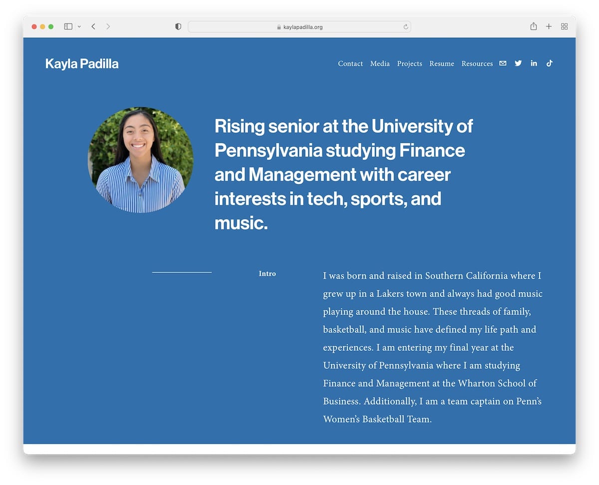
Kayla Padilla’s student portfolio website is minimalist, with lots of white space that ensures a great reading experience. What’s cool is that Kayla has a slider featuring her favorite quotes instead of references and testimonials.
Moreover, the simple navigation bar takes you to the necessary information, social media, and contact.
Note: Keep a minimalist website design to make your content stand out.
These ultimate Squarespace website examples will also offer an excellent creative exercise.
2. Kabel Mishka Ligot
Built with: Squarespace

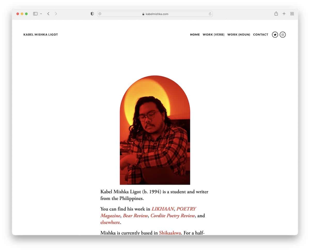
Kabel Mishka Ligot is another excellent example of a simple website with a clean design. The transparent header disappears on scroll but reappears when you scroll back to the top, improving user experience.
Note: Use a disappearing/reappearing header to boost your student website’s UX.
3. Devansh Gandhi
Built with: Squarespace

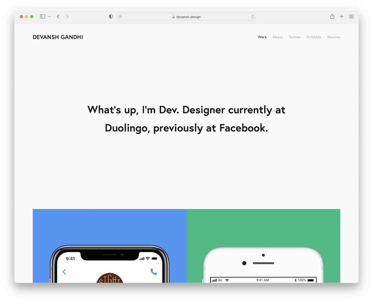
Devansh Gandhi creates an online presence with two pages and links to the resume, Twitter and Dribble.
His home page’s hero section has text on a solid background, followed by a few examples of his works.
Note: Keep your hero area image-free, using only a one-sentence bio (okay, two).
For more alternatives, check out our best resume website collection.
4. Brandon San
Built with: Weebly

Unlike Devansh, Brandon San uses a large hero image with a text overlay and a transparent header. The latter floats on the screen, so you don’t need to scroll back to get to the navigation bar.
Remember, this is a free Weebly website, so it has the floating bottom left corner ad.
Note: Go more personally with your visitors by featuring an image of yourself above the fold.
5. Dalya Green
Built with: Wix

Dalya Green is a student website with an interesting gradient background in the hero area. Besides the text, you can also press the button in the bottom right corner to see fun facts, which appear as stickers (click it, and you’ll see).
Moreover, this Wix website has an awesome split-screen design to present some of the works and a clickable email and WhatsApp. Plus, there’s a back-to-top button to avoid scrolling.
Note: A back-to-top button is a handy detail to improve user experience.
6. Karn Imwattana
Built with: Squarespace

Karn Imwattana’s home page is an about page with an image on top and text at the bottom. His student website features a basic navbar with a Facebook icon and an even more basic footer.
Note: Use your home page to write about yourself, while other internal pages for projects, resume, etc.
7. Mingxi Wu
Built with: Squarespace

Mingxi Wu is a full-screen student portfolio website with an animated background, a text overlay, and links to works. But you can also access the portfolio(s) via the menu. Likewise, you can check Mingxi’s LinkedIn profile through the link in the navigation bar.
Note: Use a single-sectioned home page with a full-screen background image or video (or even a slider).
8. Kayla Valane
Built with: Squarespace

While Kayla Valane’s website feels like it’s just a bunch of text on a black background, things get a lot more exciting once you hover over the text. The hover effect reveals different images relating to the topic.
Besides the home/work page, Kayla only has one more page that shares more about herself.
Note: Instead of using a light design, you can have some fun with a dark one for a more premium feel.
9. Cristina Clerici
Built with: Squarespace

Cristina Clerici has a three-page student portfolio website, sectioned into home, research and contacts.
The home page starts with a short bio and a link to CV, plus an image. This site has a plain floating header but no footer.
Note: Create a page without a footer for a neater appearance.
10. Florence Chen
Built with: Squarespace

Florence Chen has a large hero image with a parallax effect, a title and text. The header is light and simple, while the footer features a back-to-top button and social media links.
The only other thing on the front page is a biography that familiarizes you with Florence on the spot.
Note: Add a parallax effect for a more engaging feel.
11. Ashley Cortez
Built with: WordPress

Ashley Cortez is a free WordPress website with a minimalist vibe with an image, text in the hero image, and extra menu tabs below (in case you don’t access them in the main navigation bar).
The footer is just a simple “Thanks for visiting!” (which no one does!) and social media icons.
Note: You can still create a beautiful student website, even if you use a free platform.
12. Nathan Koch
Built with: Squarespace

What’s unique about Nathan Koch’s site is the very large white space patch above the fold with text at the bottom. It gives a cleaner website look, emphasizing the text more.
The header and the footer maintain the same background color as the base to keep the minimalist design intact.
You’ll also find a timeline with work experience and a “get in touch” that’s impossible to miss.
Note: Plenty of white space, when done right, can work really WELL.
13. Kantwon
Built with: Squarespace

Even though Kantwon’s student website is on the simple side, it has plenty of catchy details and elements that enhance the scrolling adventure. Hint: Kantwon uses a lot of emojis on his one-page website layout.
Note: We’re all used to expressing ourselves with emojis, so why not use them on your website, too?
14. Matti Scherzinger
Built with: Webflow

It’s proven that an introductory text on a plain background in the hero section can capture visitors’ attention.
Matti Scherzinger is aware of that and continues his home page with project examples and a footer with social media and email links.
Note: Use text to trigger visitors’ interest (with bolds and caps).
We also really enjoyed curating the best Webflow websites for your convenience.
15. Onyekachi Nwabueze
Built with: Webflow

Onyekachi Nwabueze has a very interactive website with a cool, welcoming animation above the fold.
This personal website has unique scrolling while maintaining a plain atmosphere (with large(er) images).
Note: If using only text in the hero section sounds boring, spice it up with a catchy animation.
16. Cydney Vicentina
Built with: Webflow

If Nathan Koch uses a lot of white space and little text above the fold, Cydney Vicentina uses a LARGE title and text that fills most of the screen. But the white space is still there to ensure great readability.
Moreover, the home page features multiple full-width sections that showcase works, with links to view projects in great detail.
Note: Use large sections with background images to boldly present your works and projects.
17. David Luong
Built with: Squarespace

David Luong is another great example of a dark website with a bio in the hero area, followed by a grid of past projects and involvements.
The sticky menu allows you to jump from page to page a lot easier, while the footer only has social media icons.
Note: Create a grid with links to more information about your works, projects and experiences.
18. Dalya Baron
Built with: Wix

Dalya Baron has a circular image of herself with a short about me text and circular (menu) button links to other sections.
While the entire website uses the same background, the footer is separated with a line, which is a nice, simplistic detail.
Note: Add your about me text on the home page, so everyone can quickly learn more about you.
19. Isabel Ngan
Built with: Webflow

Isabel Ngan knows how to lean towards minimalism with her responsive web design but also enriches it with creative touches.
Because this student website doesn’t have a floating header, the back-to-top button comes in really handy.
We also like to see that the content loads while you scroll, which gives it a more pleasurable experience.
Note: Blending simplicity with creativity can make browsing your site more exciting.
Was this article helpful?
YesNo