Welcome to our collection of the best Squarespace lawyer websites that blend professionalism and creativity for the ultimate outcomes.
Squarespace has become a popular platform for legal professionals seeking to establish a strong online presence.
Our selection highlights lawyer websites that stand out for their sleek design and user-friendly navigation, making it easier for potential clients to find the information they need.
Whether you’re a lawyer looking for inspiration to create or revamp your website, you’re in for a treat.
Explore these exemplars of digital craftsmanship, each showcasing how lawyers can effectively communicate their expertise and services online.
This post covers:
Best Squarespace Lawyer Websites
Each example below serves as a token of inspiration, demonstrating how legal professionals can elegantly present their practice to the digital world.
1. DKM Law Group
Built with: Squarespace
The DKM Law Group’s website stands out for its clean, minimalist design, which ensures an elegant user experience.
Its contrasting orange CTA buttons grab attention, guiding visitors to key actions.
The consistency in background colors across the header, base, and footer adds to its cohesive aesthetic.
Moreover, the site includes individual attorney pages, an About section, and a Contact page, opting for direct communication via displayed telephone number and clickable email.
Note: Don’t complicate the website design; opt for simplicity and cleanness so the important content and info pop more.
Why we chose it: For its clarity and user-friendly design, prioritizing direct communication and showcasing the firm’s professionalism.
2. Kaufman Law
Built with: Squarespace

Kaufman Law’s Squarespace website captivates visitors with its image background hero section, overlaid by a transparent header that blends style with navigation.
The presence of a CTA button directly in the navbar encourages immediate action, while a drop-down menu simplifies site exploration.
The footer is thoughtfully designed, featuring clickable telephone number and email for easy contact. Plus, it has social icons for broader engagement.
A standout is the contact form modal, which offers potential clients a quick way to contact them without leaving the page.
Note: Ideally, to enhance conversions, add a CTA button (with a contrasting background) in the header.
Why we chose it: For its engaging design, which facilitates easy navigation and immediate contact options.
3. Page Law
Built with: Squarespace
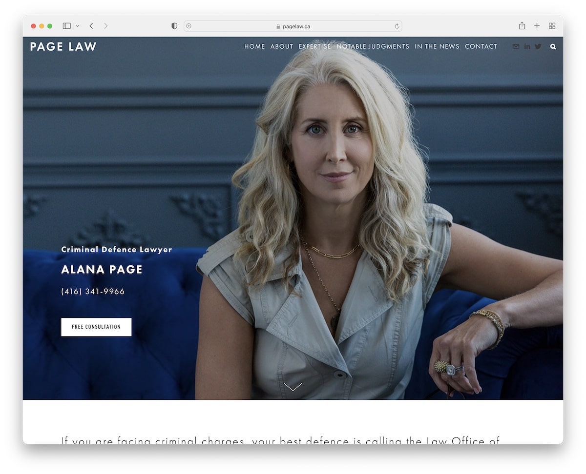
Page Law’s Squarespace website captures attention with a personalized hero section featuring an image of Page, elevated by a dynamic parallax effect.
The site employs a text-heavy design, utilizing large typography for better readability and ease of navigation.
It proudly displays various notable judgments, establishing credibility and expertise.
The contact page is efficiently designed, incorporating a Google Maps location for straightforward directions.
Page Law’s site is user-friendly for clients seeking legal assistance or learning more about the firm’s achievements.
Note: Showcase your location by integrating Google Maps so clients can find you easily.
Why we chose it: For its effective blend of personal branding, clear communication, and practical features.
4. Caryma Sa’d
Built with: Squarespace

Caryma Sa’d’s Squarespace lawyer website has a unique homepage featuring three areas of expertise that react on hover, encouraging interaction and exploration.
The site’s minimalist design is enhanced with creative detailing, blending simplicity with visual interest.
An overlayed full-screen hamburger menu offers a modern navigation solution, keeping the site’s layout clean and focused. (It also floats.)
The absence of a traditional footer underscores the site’s innovative approach, prioritizing a modernized user experience and aesthetic coherence.
Note: Keep your header section clean and simple, with the logo on one end and the hamburger menu icon on the other.
Why we chose it: For its interactive and minimalist approach, offering a unique and engaging UX.
5. Dmitriy Shakhnevich
Built with: Squarespace
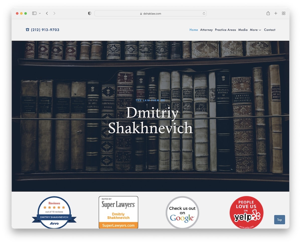
Dmitriy Shakhnevich’s website excels with a content-rich homepage that provides a seamless one-page layout feel, making information easily accessible.
A simple header leads to an immersive experience, while a feature-rich footer offers additional resources and contact information.
A convenient back-to-top button enhances navigation alongside a sidebar section detailing location and contact specifics.
The site also features a video gallery page for visual insights from various news media channels.
In addition, a practice areas page is equipped with accordion elements for detailed yet compact content presentation.
Note: Create an information-rich home page so potential clients can learn all the details in just a few scrolls.
Why we chose it: For its comprehensive and approachable design, combining rich content and easy browsing.
6. Sean O’Brien Law
Built with: Squarespace

Sean O’Brien Law’s website embraces a basic yet effective design, featuring a large header section that introduces visitors to Sean with a personal touch through his hero image.
The homepage thoughtfully includes a contact form at the bottom, encouraging direct engagement.
A standout aspect is the location page, showcasing a custom Google Maps for easy navigation.
Including a phone number in the header adds convenience, though making it clickable would further enhance user accessibility and prompt communication.
Note: Keep it personal with images of yourself or your law firm team.
Why we chose it: For its straightforward design and thoughtful features, such as the contact form and custom Google Maps.
7. Matrona Law
Built with: Squarespace
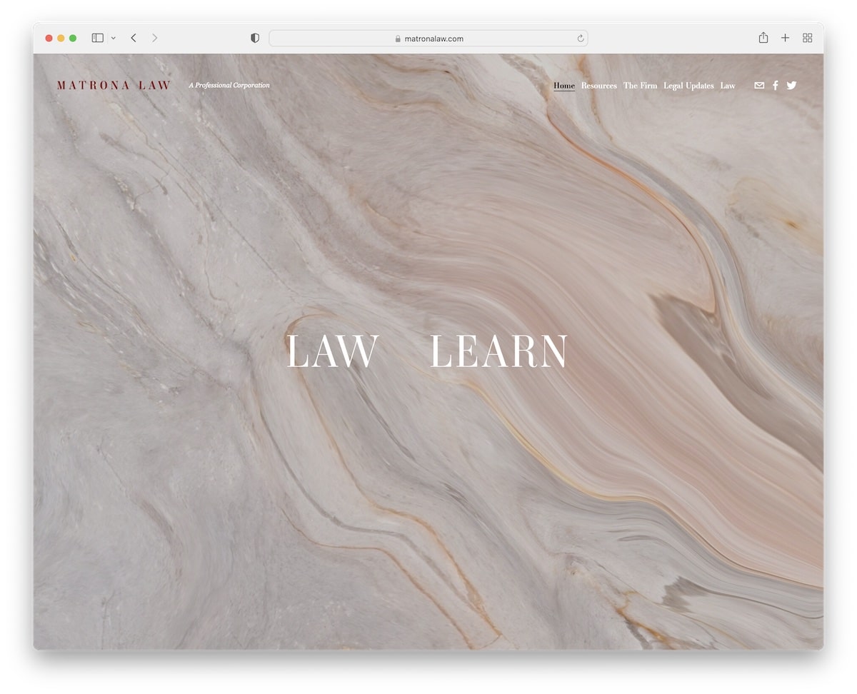
Matrona Law’s Squarespace website captivates immediately with its impressive homepage. The background dynamically changes as you hover over “law” or “learn,” inviting an interactive experience.
Beyond this cool entry point, the site becomes a repository of information, rich with text detailing the firm’s practices, updates, and news, catering to those seeking in-depth insights.
The contact page is comprehensively designed yet simple, including all essential information, a user-friendly contact form, and Google Maps integration for easy connection and location finding.
Note: A blog about law and other updates related to your practices can drive more business (plus, it’s good for SEO).
Why we chose it: For its interesting homepage interaction and the wealth of detailed information it offers.
8. Dana Weber Law
Built with: Squarespace
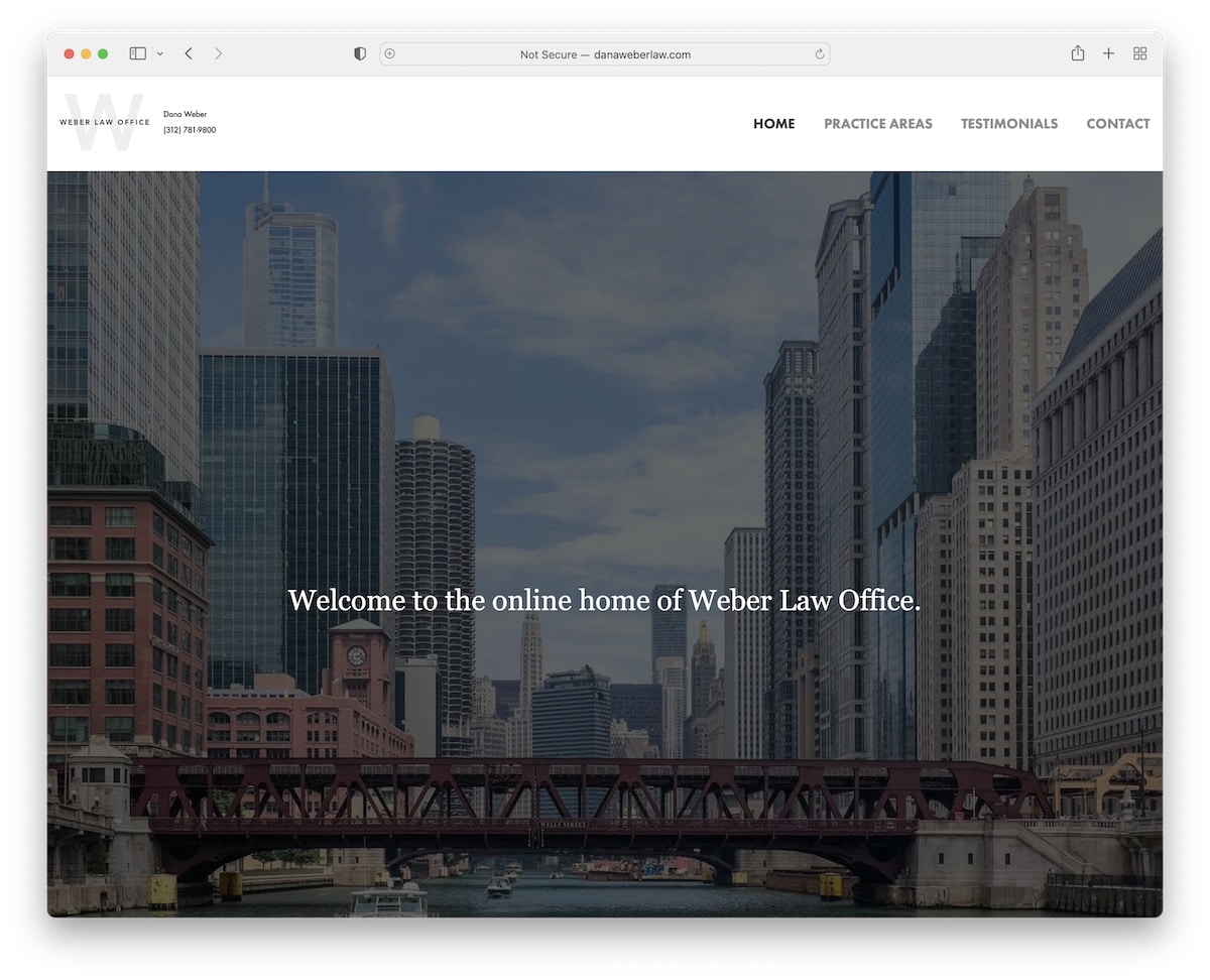
Dana Weber Law’s Squarespace website showcases a minimalist yet solid design.
It’s anchored by a large hero image section featuring welcoming text that immediately greets visitors. And the short bio and promotional video add a nice touch of professionalism.
The contrast between the light header and dark footer, which includes location and contact details alongside a screenshot of the Google Maps location, adds a refined touch.
The site is further enhanced with three internal pages dedicated to Practice Areas, Testimonials and Contact.
It also provides a complete view of the firm’s services, client experiences, and easy ways to connect.
Note: If you have video content – don’t forget to add it to your site.
Why we chose it: For its simpleness and effective organization.
9. Regev Law
Built with: Squarespace
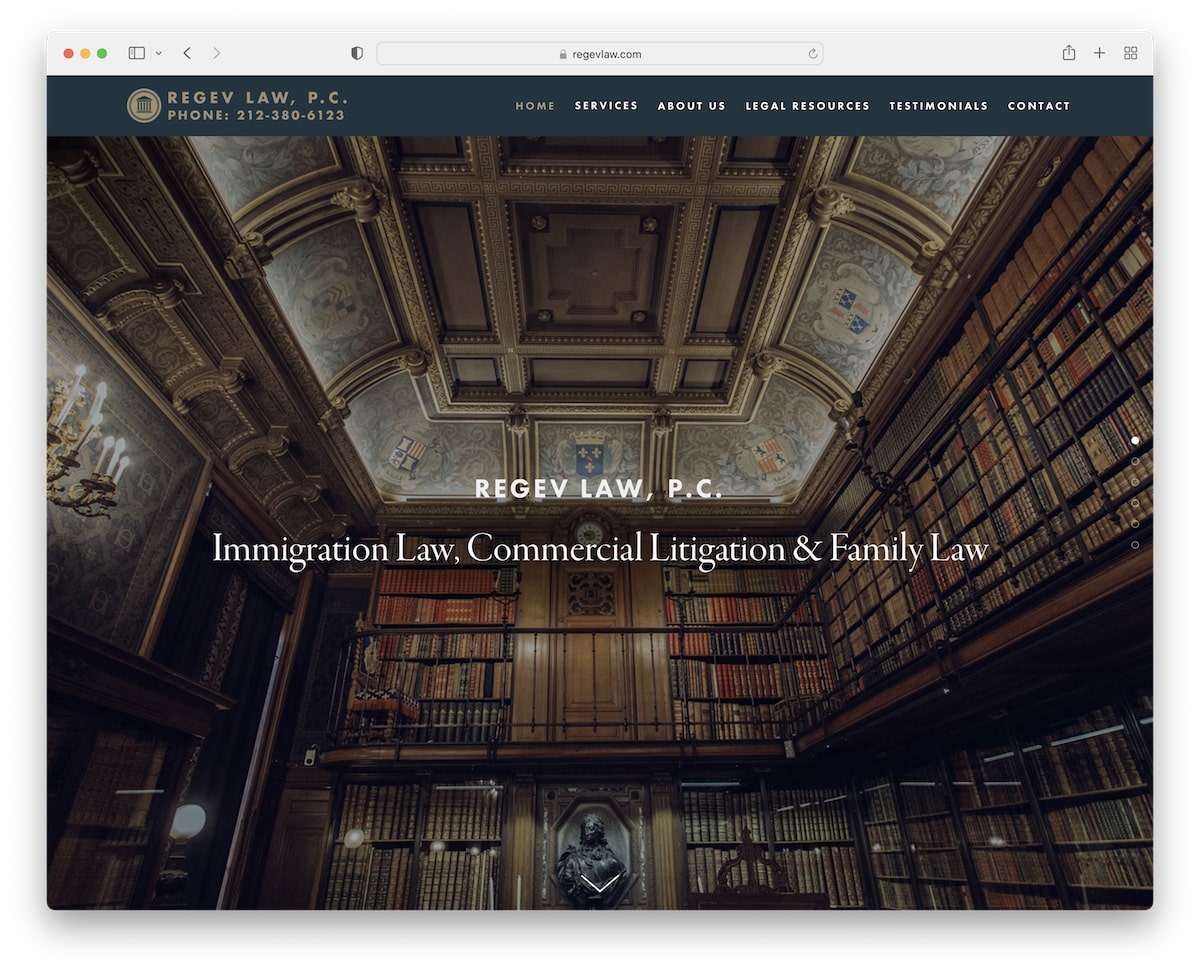
Regev Law’s Squarespace website captures attention with beautiful parallax image sections that bring its services to life, starting from a captivating full-screen hero section.
The overall web design remains elegantly simple, focusing on usability and aesthetic appeal.
A dedicated page brimming with testimonials invites visitors to share their experiences alongside a form to facilitate this interaction.
The website also includes informative contact and about pages, while the footer neatly houses social icons and copyright text, encapsulating functionality and style.
Note: Spice up your online presence with the immersive parallax section.
Why we chose it: For its visually engaging parallax effects and straightforward yet practical design.
10. Brian O’Dwyer
Built with: Squarespace
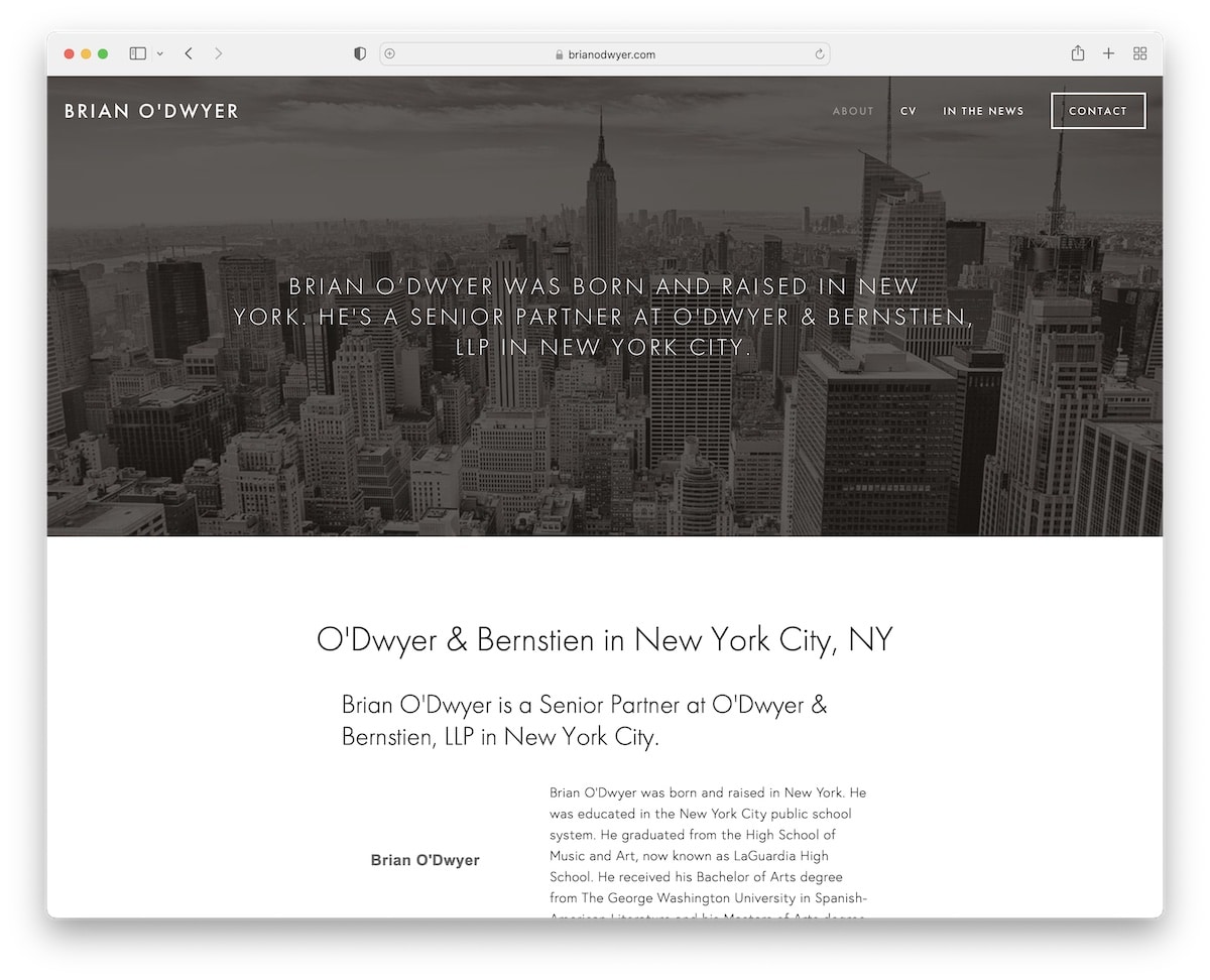
Brian O’Dwyer’s Squarespace lawyer website represents minimalist design with its clean, boxed layout and full-width header and footer.
Unique to the site is a CV page, detailing Brian’s credentials and achievements, and a dedicated page highlighting mentions in the news, showcasing his recognition and authority in the field.
The contact page is thoughtfully designed with a form and Google Maps integration, making it easy for clients to connect and find the location.
Note: Got news talk about you? Be proud of the mentions and showcase them on your lawyer website.
Why we chose it: For its classic design and handy features, showcasing professionalism while ensuring easy navigation and engagement.
11. Nevada Family Law Group
Built with: Squarespace
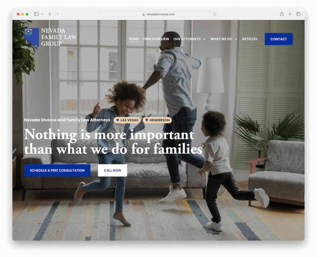
The Nevada Family Law Group website impresses with a full-screen hero section with compelling CTA buttons inviting immediate engagement.
A transparent header, featuring a drop-down menu, ensures seamless navigation while maintaining the site’s visual integrity.
Visitors are greeted with a testimonial slider, adding a personal touch and credibility.
An opt-in form encourages users to subscribe for updates, and an advanced contact form facilitates detailed inquiries.
The feature-rich footer rounds out the site, offering easy access to essential information and resources.
Note: Create a contact form with additional fields and checkboxes to get to know your potential clients better.
Why we chose it: For its professional yet modern layout that fosters trust and communication.
12. John Kail
Built with: Squarespace
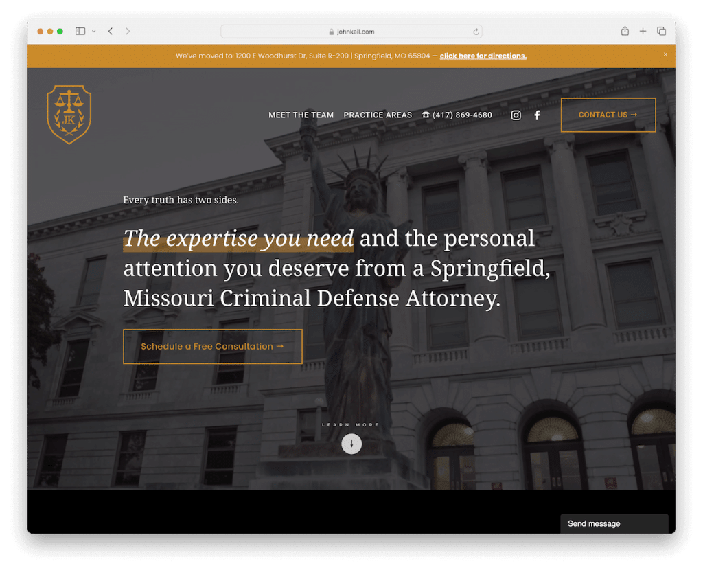
John Kail’s Squarespace lawyer website impacts with its striking dark design, accented by elegant gold detailing that conveys luxury and professionalism.
A contrasting top bar notification immediately catches the eye, providing key messages at a glance.
The innovative header enhances navigation by disappearing and reappearing based on the user’s scrolling, creating a seamless browsing experience.
Content that loads on scroll keeps the site engaging, while the minimalist footer neatly displays essential information like location, opening hours, and contact details.
Note: Create a strong, lasting first impression with a dark/black website design.
Why we chose it: For its bold, dark design and dynamic navigation features.
13. Goldstein Mehta LLC
Built with: Squarespace

Goldstein Mehta LLC site triggers interest with its hero section, prominently featuring a “call now” CTA button for urgent legal assistance.
The basic and text-rich homepage efficiently communicates the firm’s services and ethos.
Notably, the site displays certificates and badges of accreditation, building credibility.
A Google reviews slider introduces prospective clients to positive testimonials and star ratings, enhancing trust.
Additionally, a regularly updated law blog and detailed case studies/results page offer insights into the firm’s expertise and successful outcomes.
Note: Besides testimonials, publish insightful case studies on your website to boost trust.
Why we chose it: For its effective blend of credibility-building elements and direct call-to-action.
14. Moran Law
Built with: Squarespace
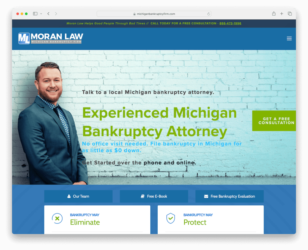
Moran Law’s Squarespace lawyer website is accessible and transparent. It starts with a top bar with a clickable phone number for instant contact.
A simple header with a drop-down menu allows easy navigation, while badges displayed on the site prove credibility and trust.
The website clearly outlines the firm’s process, demystifying legal proceedings for visitors.
A floating live agent widget offers real-time assistance, and a conveniently placed contact form at the bottom of the home page encourages inquiries.
Note: Use a live chat widget (even a bot) for better communication with potential clients.
Why we chose it: For its user-centric design, offering simple navigation and instant support features.
15. Hendley & Goodwyn LLP
Built with: Squarespace
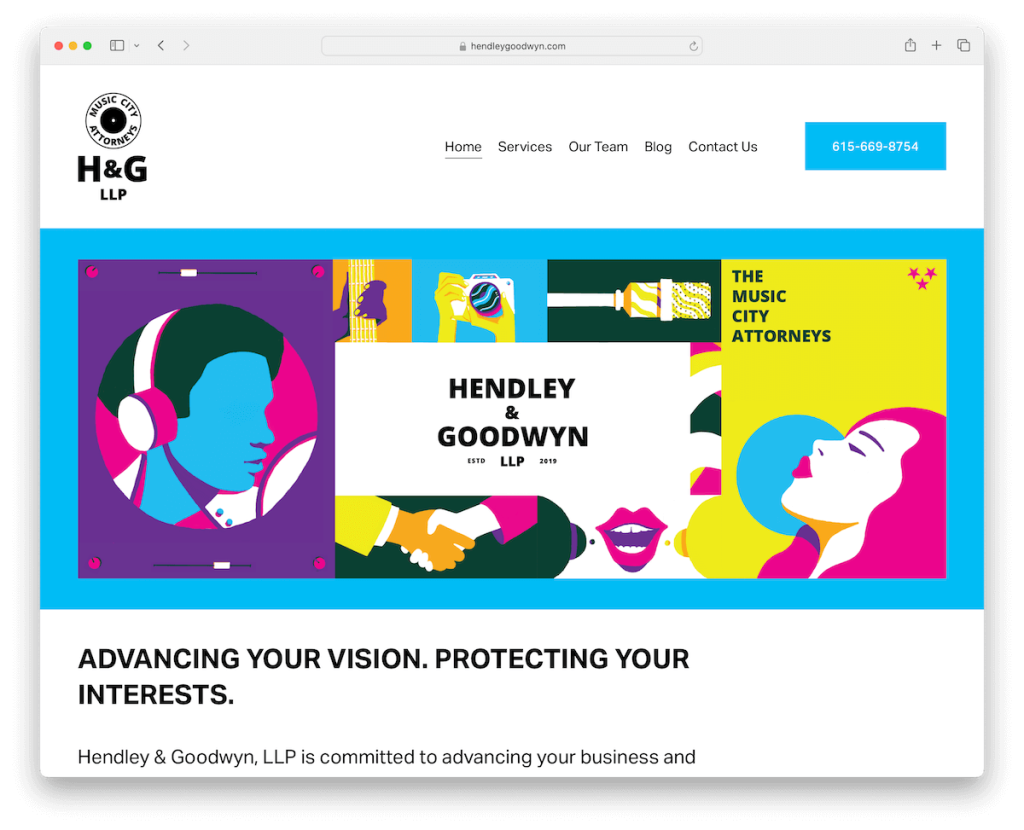
Hendley & Goodwyn LLP’s Squarespace lawyer website marries minimalist design with vibrant graphics, injecting energy and visual appeal into the online experience.
The site employs a two-column grid layout to present its services, making information easy to digest.
The contact page features a form alongside all necessary information, including Google Maps integration, to drive communication and directions. This effectively balances formality with creativity.
Finally, an animated footer adds a dynamic touch, subtly engaging visitors as they explore.
Note: While the law industry is generally “serious,” feel free to go against the grain with energetic and lively web design.
Why we chose it: For its combo of minimalism and engaging visuals, offering a refreshing approach to legal services online.
16. Bison Jacobson Law Office
Built with: Squarespace
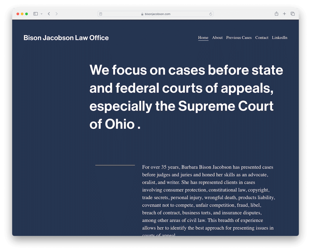
Bison Jacobson Law Office’s site prioritizes simplicity and readability, featuring a design emphasizing text with minimal imagery.
The generous use of white space enhances readability, ensuring that content is easy to digest.
A consistent background color across the header, base, and footer contributes to the site’s cohesive look and feel.
Notably, a dedicated page for client case studies offers insight into the firm’s expertise and successes. It provides prospective clients with tangible examples of their legal prowess.
Note: If you don’t feel like using images on your law site, don’t (just ensure text is large enough to be easy to ride with lots of white space).
Why we chose it: For its clear, focused content presentation and insightful case studies page.
17. Lowenthal APC
Built with: Squarespace
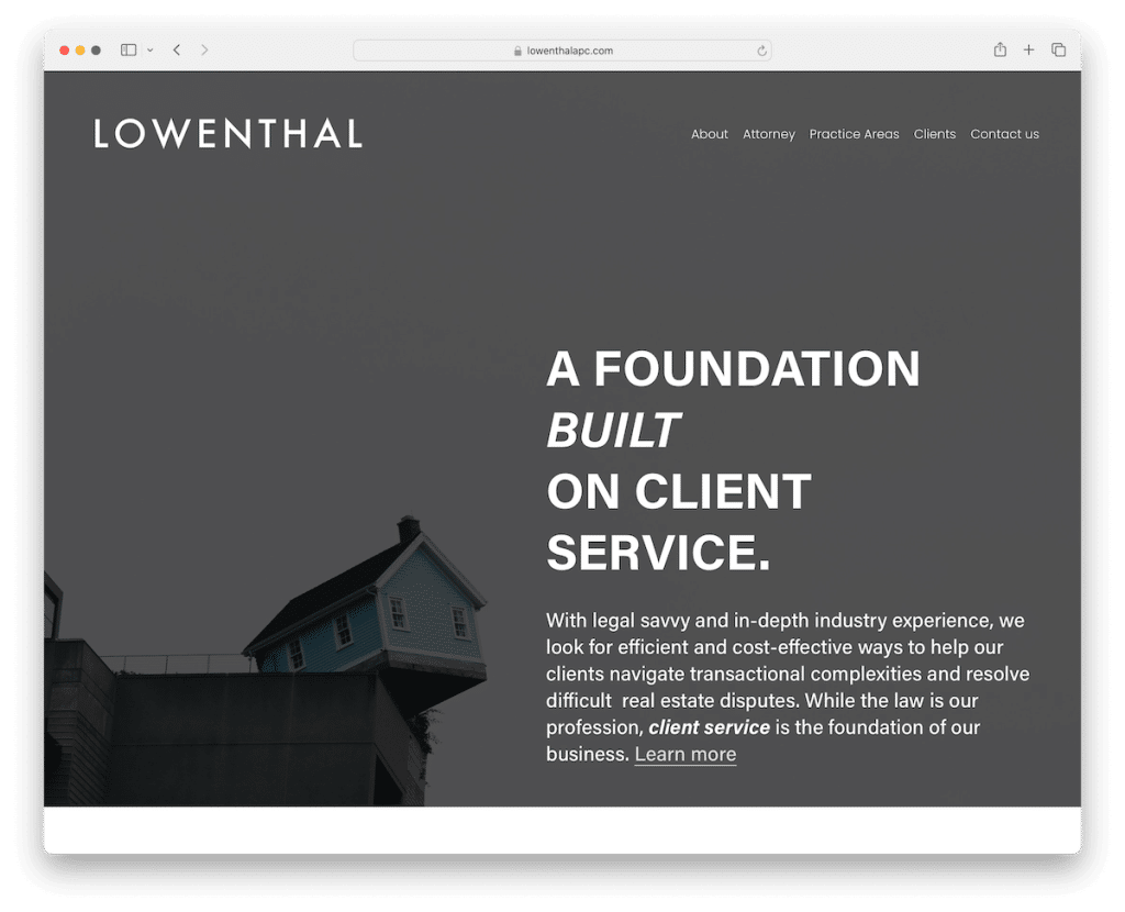
Lowenthal APC’s Squarespace lawyer website features a straightforward homepage that welcomes visitors with a hero background image overlayed with text beneath a transparent header. It creates an immediate sense of professionalism.
The multi-column footer is rich with information, including contact and location details, quick links, and additional business information. It ensures everything a visitor needs is just a click away.
The site also includes dedicated pages for attorneys and practice areas, a contact form and Google Maps integration, making it informative and accessible.
Note: Don’t neglect the footer – use it for quick links, contact details, etc.
Why we chose it: For its structured layout and detailed footer, which provide smooth and informative browsing.
18. Leibowitz Law Firm PLLC
Built with: Squarespace
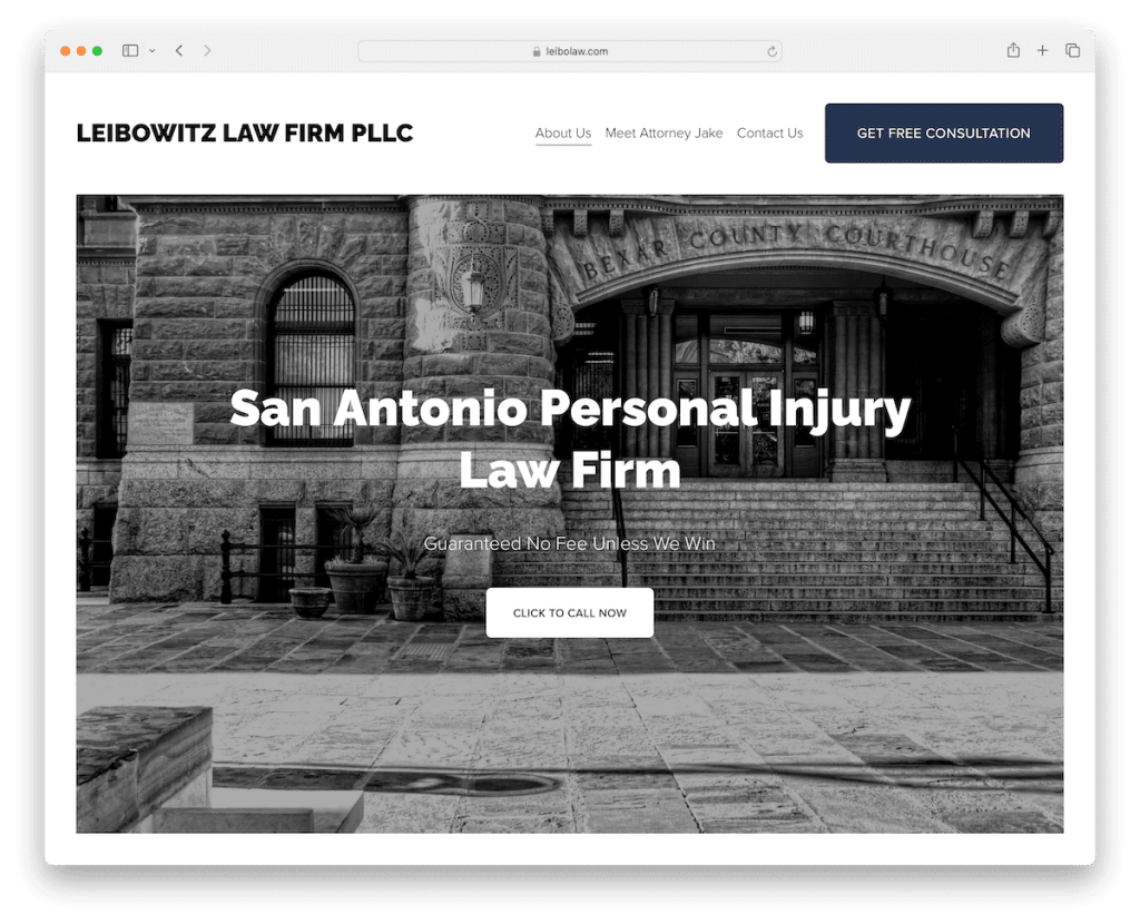
Leibowitz Law Firm PLLC’s website strikes with a light and clean design, embodying clarity and integrity.
A prominently placed CTA button in the navigation bar and more strategically placed across the site ensure that key actions are always within reach.
The footer is simple yet informative, containing all necessary business details.
An “Attorney Jake” page provides a personal touch, while the basic contact page, with a form and Google Maps, streamlines the connection process.
Note: Create personalized attorney pages with bio and images, so potential clients sense your caring nature.
Why we chose it: For its clear, clean design and strategic placement of CTA buttons.
19. Barnes Law
Built with: Squarespace
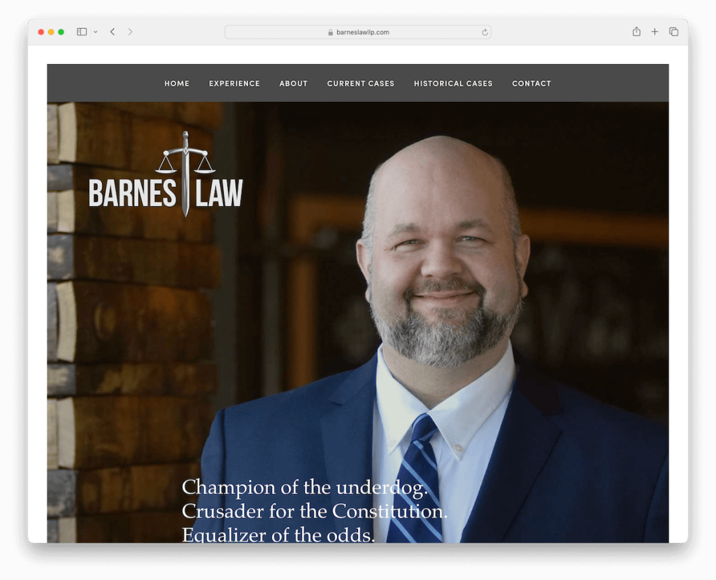
Barnes Law’s Squarespace site has a framed design that gives it a structured, modern look. Engaging parallax effects complement the site’s dynamic scrolling experience.
The drop-down navigation enhances user interaction by highlighting each menu link on hover, guiding visitors through the site’s offerings.
Its massive footer is meticulously organized with CTAs, business details, and more, ensuring essential information is accessible.
Notably, in-depth case studies, including high-profile ones like Wesley Snipes, demonstrate the firm’s expertise.
A traditional contact page rounds off the user experience, providing straightforward communication channels.
Note: You don’t have to use a classic website design – feel free to go against the grain with something unique that will make your site stand out from the crowd.
Why we chose it: For its attractive yet simple design and detailed content, effectively showcasing the firm’s expertise.
How To Make A Lawyer Website With Squarespace
Follow these six simple steps to get your legal practice online fast:
- Sign up for Squarespace: Visit Squarespace.com and sign up for an account. Choose the plan that best fits your needs, with options ranging from basic to advanced features suitable for different scales of legal practices.
- Choose a template: Squarespace offers many templates designed for professional services. Select a template that aligns with the aesthetic and vibe of your legal practice. (Remember, you can customize almost every aspect of the template.)
- Customize your website: Use Squarespace’s intuitive drag-and-drop editor to customize your template. Add your law firm’s logo, change the color scheme to match your branding, and adjust the layout to fit your content.
- Add essential pages: Create the key pages for your site, including an About Us page to introduce your team, a Services page to detail your areas of expertise, and a Contact page with your firm’s location and how to schedule consultations. Consider adding a blog or resources section to share legal insights and updates, which can help with SEO and establish your authority in your field.
- Publish and promote your website: Once satisfied with your site, hit the publish button. Share your new website on your social media profiles and include its URL in your email signature to start directing traffic to your site. Regularly update your site with fresh content and legal insights to keep it relevant and engaging for visitors.
FAQs About Squarespace Lawyer Websites
Can I integrate appointment scheduling into my Squarespace lawyer website?
Yes, Squarespace allows you to integrate appointment scheduling directly into your website using its built-in features or third-party integrations like Acuity Scheduling.
Can I customize my website to reflect my law firm’s branding?
Yes. Squarespace provides extensive customization options, including fonts, color schemes, and layout adjustments. You can also upload your logo and use custom CSS if you need more specific branding elements.
How can I optimize my Squarespace website for SEO?
Squarespace has built-in SEO tools that help you optimize your site. You can add meta titles and descriptions, customize URLs, and use heading structures. Regularly updating your site with high-quality content also improves SEO performance.
Can I add a blog to my Squarespace website to share legal insights?
Yes, Squarespace makes it easy to add a blog to your website. Blogging is a great way to share your expertise, provide valuable information to your clients, and improve your site’s SEO.
Is Squarespace secure enough for a lawyer’s website?
Squarespace sites come with free SSL certificates, ensuring that data between your website and visitors is encrypted. While it’s secure for general use, always consider additional security measures for highly sensitive information.
Was this article helpful?
YesNo
