Today, I’m excited to share with you a curated list of the best Squarespace real estate websites.
If you’re looking to get inspired, you’re in for a treat.
Whether you’re a real estate veteran or just starting out, these sites will blow your mind with sleek layouts, intuitive navigation, and stunning visuals that make listings pop.
We’re talking about websites that do more than just showcase homes; they tell a story, create an experience, and connect buyers with their dream spaces.
These Squarespace sites have set the bar high, combining all the elements needed to make your real estate website not just good but outstanding.
Drop everything and discover how you can elevate your online presence to match the elegance and sophistication of these top-notch real estate websites.
This post covers:
Best Squarespace Real Estate Websites
Here are the top Squarespace real estate websites that stand out for their exceptional design, ease of use, and ability to captivate potential buyers and sellers alike.
1. The Coloradan
Built with: Squarespace
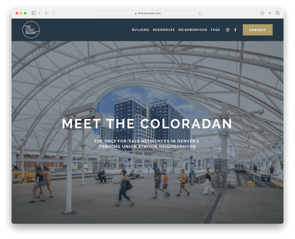
The Coloradan’s Squarespace site is like walking into a modern, airy home.
The full-screen hero image grabs you right away, setting a premium tone. Navigation is a breeze with a clean header, easy-to-find social icons, and a standout contact button.
The light design, big, bold fonts, and plenty of white space make it feel fresh and easy on the eyes.
The footer’s super handy, with everything from a signup form to contact info. Inside, sliders and lightbox galleries showcase properties beautifully.
Note: Keep a clean and minimalist website design to make your properties stand out more.
Why we chose it: For its blend of aesthetic appeal and user-friendly design that’s easy on the eyes.
2. Continuum Development Company
Built with: Squarespace

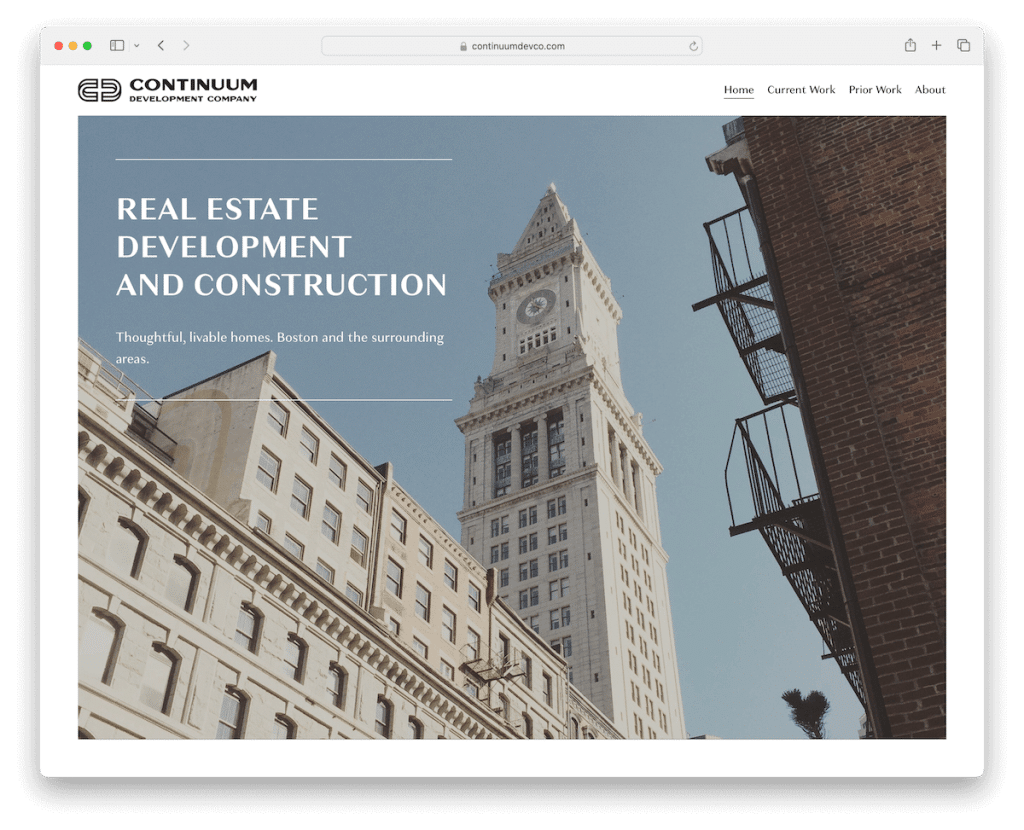
Continuum Development’s Squarespace site nails simplicity with a punch.
The homepage strikes you with its bold image and overlaid text, setting the stage.
It’s all about clarity here – from the neat header to the tidy footer. Their projects shine through stunning presentations, and the Google Maps integration is super handy for pinpointing locations.
The About page impresses with a slider, and getting in touch is straightforward with a simple contact form.
Continuum Development is clean, engaging, and straight to the point.
Note: Integrate Google Maps for a more convenient location display.
Why we chose it: For its simplicity and functionality, offering an engaging and clear journey through their projects and mission.
3. At Home Real Estate
Built with: Squarespace

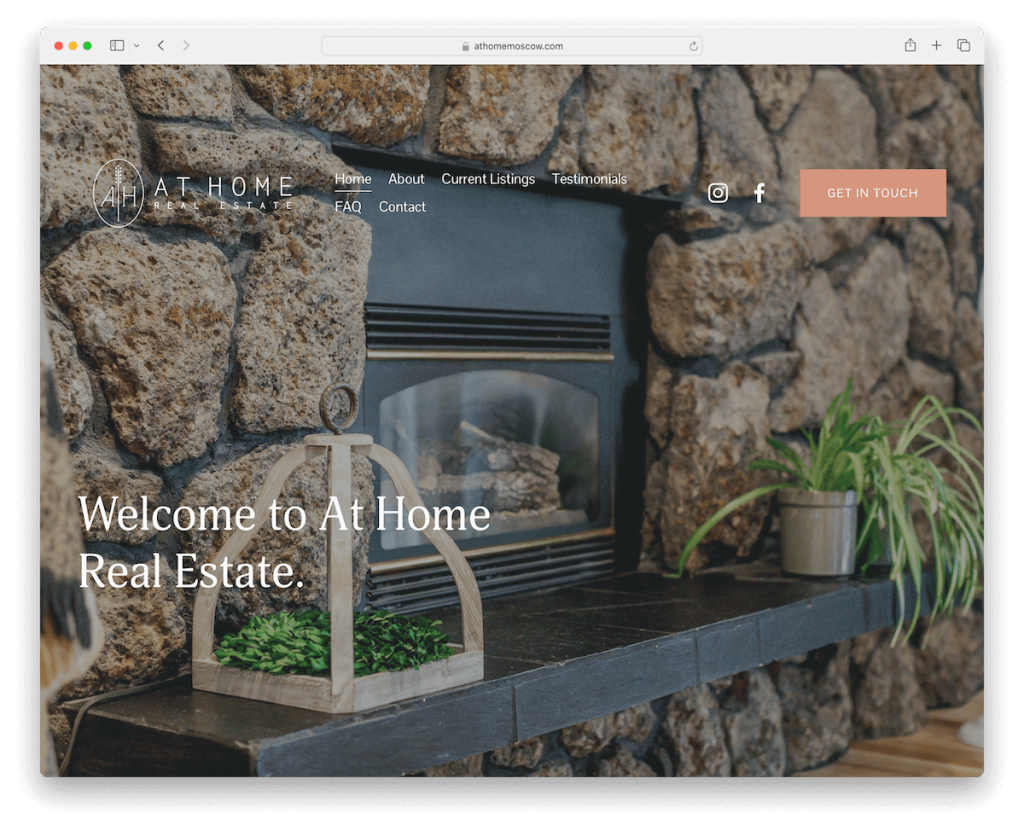
Home Real Estate’s Squarespace site has a full-screen image background above the fold that welcomes you, setting a warm, inviting tone.
The transparent header houses everything you need, blending seamlessly into the design.
Scrolling reveals content that pops up as if by magic, including heartfelt client testimonials. And the use of white space makes everything feel open and uncluttered.
A simple footer offers quick contact options, and their contact page keeps it straightforward – just click to call or email, no forms attached.
Note: Build trust and credibility through reviews and testimonials.
Why we chose it: For its friendly design that guides you through with visual appeal and direct communication options.
4. Alex Miller
Built with: Squarespace

Alex Miller’s Squarespace real estate website is a masterpiece of contrast and clarity.
The light header, base, and footer elegantly frame the site, while a striking blue subscription section grabs your attention.
It’s a visual feast with stunning property images that draw you to explore. Not just a pretty face, it houses a rich real estate blog, detailed about, profile, and review pages, offering depth and insight.
The contact page is easy to use. It features a straightforward form and Google Maps integration, ensuring you’re just a click away from connecting.
Note: Start a real estate blog on your website and take your business to the next level.
Why we chose it: For its balance of visual appeal and comprehensive content.
5. Jenelle Tremblett
Built with: Squarespace

Jenelle Tremblett’s Squarespace site feels like you’re flipping through a personalized real estate album. Pictures of Jenelle throughout add a warm, personal touch.
The floating header makes navigation a breeze and is always there when you need it.
Moreover, the featured listings section showcases prime properties with style. Also, modern touches like integrated TikTok videos and a Google review widget keep it fresh and engaging.
The Instagram feed in the footer adds a colorful, lively vibe, and the online appointment scheduling on the contact page is super convenient, making connecting with Jenelle a snap.
Note: Add more content to your website by integrating social media feeds.
Why we chose it: For its unique blend of personal touch and innovative features.
6. Power Properties
Built with: Squarespace

Power Properties’ Squarespace site is like stepping into a dynamic, moving world of real estate.
The parallax image backgrounds add depth as you scroll, drawing you in. And the content magically appears as you scroll, keeping you engaged.
Furthermore, the navigation bar has a clear call to action (CTA), making it easy to find what you need.
Grab a free guide through the opt-in form, stay updated with the news section, and navigate easily with a four-column footer.
Detailed accordions reveal extra fees, and individual pages for the property management team add a personal touch.
Plus, multiple contact options cater to every inquiry, ensuring you’re never lost for ways to reach out.
Note: Spice up your user experience with parallax scrolling website effects and other animations and effects. (Just don’t overdo it.)
Why we chose it: For its immersive experience and user-centric design, offering depth, resources, and multiple contact avenues.
7. Homes By Lorielle
Built with: Squarespace

Homes By Lorielle’s Squarespace site stands out with its clean, polished look and practical features.
The sticky header keeps navigation and a contrasting call button at your fingertips, making it easy to reach out.
The light gray design feels modern and airy, while the dark footer adds a grounding contrast.
But it’s not just about looks – the impactful mission page, with its striking black design, tells a compelling story.
The success stories page adds a personal touch, showcasing real-life wins and creating a connection with potential clients.
Note: Success stories, like reviews and testimonials, can add plenty of value to your real estate business.
Why we chose it: For its elegant design combined with a strong narrative and client-focused features.
8. PPD Holdings
Built with: Squarespace

PPD Holdings’ Squarespace site embodies sophistication in simplicity.
Its clean and elegant design has a transparent header that seamlessly merges with every page.
The site covers all bases – services, about, news, and investments pages are laid out intuitively, making it easy to navigate and absorb the information.
The contact page is straightforward. It features a form and Google Maps, ensuring you know where they are and how to reach them.
It’s a masterclass in making a professional impression without overcomplicating things.
Note: Improve your website’s browsing experience with a floating header/menu.
Why we chose it: For its simplicity and comprehensive approach, offering a seamless UX.
9. Gary Glass Estates
Built with: Squarespace

Gary Glass Estates’ Squarespace site brings the wow factor with a video background that captures attention immediately.
The header is super user-friendly, offering quick menu links, a clickable phone number, and a neat hamburger menu for navigation ease.
It doesn’t stop at visuals; an accessibility adjustments widget ensures everyone can browse comfortably.
Animated statistics add a dynamic touch, showcasing success in numbers, while an exclusive listings carousel keeps you scrolling.
Plus, a members’ area offers an exclusive touch, making you feel part of an elite club. (See more Squarespace membership site examples.)
Note: Video content works great in real estate, so try including it on your site.
Why we chose it: For its energetic yet clean look, delivering an inclusive browsing experience.
10. Midwest Cash Offer
Built with: Squarespace

Midwest Cash Offer’s real estate site is all about smooth, intuitive navigation.
The header smartly vanishes as you scroll down, but a quick upward flick brings it back. There’s also a handy top bar notification for updates, which you can easily dismiss with a click.
Right off the bat, the actionable section above the fold invites you to connect via a form.
A floating chat widget waits discreetly in the corner, ready for questions.
Plus, accordion-style sections unfold additional information without overwhelming the page, keeping everything neat and accessible.
Note: Use a top bar notification for special deals, announcements, etc.
Why we chose it: For its clever navigation features and easy-to-use design.
11. Champions Mortgage
Built with: Squarespace

Champions Mortgage’s Squarespace site is a visual and navigational treat.
The full-screen image background with the parallax effect sets a dynamic stage, while social icons and a login button in the navigation bar ensure immediate action.
The dark blue design, accented with vibrant orange CTA buttons, makes the text pop, ensuring clarity and appeal. In addition to that, an accessibility configurator makes the site welcoming for all users.
Moreover, showcasing multiple office locations with individual Google Maps enhances the user experience, making it easy to find them in the real world.
Note: Get more visitors to enjoy your website fully with the accessibility configurator/widget.
Why we chose it: For its notable visual design and thoughtful accessibility features.
12. Kathleen Ernst Real Estate
Built with: Squarespace

Kathleen Ernst Real Estate’s Squarespace site has a vibrant yellow header that perfectly complements the blue background.
It greets you with just the right mix of concise text and imagery above the fold, setting a hospitable tone.
The footer is a model of simplicity, offering quick links and social icons for easy navigation. Additionally, a dedicated blog section enriches the site with valuable insights.
While the contact page skips the formality of a form, it thoughtfully includes a telephone number, email, address, and Google Maps, ensuring Kathleen is easy to reach.
Note: Provide your potential clients with different contact options, so they can pick the one that suits them best. (And adding a contact form can be highly rewarding.)
Why we chose it: For its color scheme and straightforward approach.
13. Dwell West Homes
Built with: Squarespace

Dwell West Homes’ Squarespace site is a minimalist dream where less is definitely more.
The light design lets an embedded promotional video shine, drawing you in. Plus, a testimonial slider adds a personal touch, letting happy clients do the talking.
The uniform white background across the header, base, and footer creates a seamless flow that is soothing to the eye.
Project pages are a visual feast, with galleries showcasing their stunning work.
We like the advanced contact form, complete with checkboxes and extra fields, which makes reaching out tailored and straightforward.
Note: To get to know your potential clients better, add additional fields to the contact form (including drop-downs and checkboxes).
Why we chose it: For its clean design and thoughtful user engagement features.
14. Solterra Real Estate Specialist
Built with: Squarespace

Solterra Real Estate Specialist’s Squarespace site is a standout with its bold dark design.
The sticky header ensures navigation is always a click away, while images glide with a cool parallax effect, adding depth as you scroll.
An embedded YouTube video brings the project to life, offering a quick overview of what they do with client testimonials.
A handy back-to-top button zips you back without fuss – but this might not be necessary because of the floating header.
And for those ready to dive deeper, contact and subscription forms are neatly tucked in the footer.
Note: Create a strong, lasting first impression with a bold, dark website design.
Why we chose it: For its exciting dark design and integration of multimedia elements.
15. The Moore Group
Built with: Squarespace

The Moore Group’s Squarespace site hits the sweet spot with a modern, fresh feel.
A notification popup makes getting in touch a no-brainer, while the floating top bar and header mean navigation is always within reach.
As you scroll, content springs to life, keeping engagement high. While animated statistics add a dash of dynamism, visually sharing their success.
The footer is a treasure trove of features, from useful links to social icons. Plus, integrated MLS listings ensure you can easily browse the latest properties.
Note: Squarespace allows you to integrate listings from 3rd-party platforms.
Why we chose it: For its engaging design and functionality, mixing ease of contact with stimulating content.
16. Keller Williams
Built with: Squarespace

Keller Williams’ Squarespace site keeps things sleek and efficient with a one-page-like homepage layout that smoothly guides you through everything.
CTAs appear just where you need them – in the header, floating in the corner, and scattered throughout for easy engagement.
The testimonials slider shines with stars, adding credibility and trust. Its light design is fresh and inviting, grounding with a dark footer.
You dive deeper into Keller’s world with dedicated blog and bio pages. Booking a call? A breeze, thanks to a handy 3rd-party platform.
Note: Increase your conversion rates by placing a CTA button in the header.
Why we chose it: For its strategic placement of CTAs, ensuring an effortless journey from browsing to engaging.
17. Laura Lee Sold
Built with: Squarespace

Laura Lee Sold’s Squarespace site has a transparent header that smartly solidifies and stays put as you scroll, ensuring navigation is always available.
The parallax effect adds a touch of dynamism, making a pleasant scrolling experience. What’s more, full-width sections deliver impactful visuals and information, while heartfelt testimonials lend credibility.
A handy subscription form keeps you in the loop, and while listings tease, they cleverly redirect to a 3rd-party platform for the full scoop.
Note: Start growing your email list as soon as possible so you can grow your business with email marketing.
Why we chose it: For its combination of easy navigation with immersive visuals and integration with an external listing platform.
18. Haistings Real Estate Group
Built with: Squarespace

Haistings Real Estate Group’s Squarespace site is all about intuitive navigation and crisp design. As you hover, menu links light up, guiding your exploration, while a drop-down menu unpacks even more possibilities.
The navbar’s blue CTA button stands out, calling you to action amidst the site’s light atmosphere.
Dark subscription and footer sections offer a stylish contrast with a multi-column (footer) layout that neatly presents social icons, links, and contact details.
Plus, an online home search platform is seamlessly integrated, making your property hunt as smooth as silk.
Note: Integrate a property search into your website with the members’ area.
Why we chose it: For its accessible interface and chic design, with all essential real estate tools.
How To Make A Real Estate Website With Squarespace
Here’s a simple six-step tutorial to get you started in creating your epic real estate site:
- Sign up or log in to Squarespace: Visit the Squarespace website. If you’re new, sign up for an account or log in if you already have one.
- Choose a template: Look for real estate-specific Squarespace templates or choose one that’s visually appealing and matches the vibe you want for your site.
- Customize your template: Once you’ve chosen a template, it’s time to make it yours. Use the Squarespace editor to customize your site’s layout, colors, fonts, and pages. You can add new pages for listings, about us, contact information, and other essential details. Don’t forget to upload high-quality images of your listings for a more engaging user experience.
- Add your listings: For each property listing, create a detailed page that includes high-resolution photos, a description, price, and any other relevant information. Make sure to organize your listings in a way that’s easy for your visitors to navigate. You can use galleries or slideshows to showcase multiple images of each property. (Even videos!)
- Integrate essential features: To add functionality to your site, utilize Squarespace’s built-in features like contact forms, maps, and social media links. These features are crucial for potential buyers to reach out to and promote your listings across various platforms.
- Review and publish: Before publishing your site, review it thoroughly to ensure all information is accurate and that the site is user-friendly. Then hit the publish button to make your real estate website live.
FAQs About Squarespace Real Estate Websites
Can I integrate MLS listings directly into my Squarespace real estate website?
Squarespace doesn’t natively support MLS integration directly into its platform. However, you can use 3rd-party services or embed codes to display MLS listings on your site.
Can I customize my Squarespace site to match my real estate brand?
Yes. Squarespace offers extensive customization options through its Style Editor, allowing you to adjust fonts, colors, page configurations, and more to align with your branding.
How mobile-friendly are Squarespace real estate websites?
Squarespace templates are designed to be fully responsive, meaning your real estate website will automatically adjust to look great on mobile devices and desktops.
Can I add a blog to my real estate website on Squarespace?
Yes, you can easily add a blog section to your Squarespace website. This is a great way to share industry insights, market trends, and property updates, helping to engage visitors and improve SEO.
What are the best practices for showcasing property listings on my Squarespace site?
Use high-quality images (and videos) and consider a gallery or slideshow format to showcase properties. Provide detailed descriptions, include key features, and organize listings for easy navigation. Utilizing tags and categories can also help visitors find relevant listings.
How can I optimize my Squarespace real estate website for search engines?
Utilize Squarespace’s built-in SEO tools to customize page titles, meta descriptions, and URLs for better visibility. Regularly updating your site with fresh content, such as new listings or blog posts, can boost your SEO performance.
Was this article helpful?
YesNo
