You have come to the right place if you need the best Squarespace architect templates to showcase your work.
We’ve compiled a handy list of the best designs that are perfect for architects.
Whether you’re looking to refresh your current site or kickstart a brand new one, these templates will help your projects shine and stand out in the digital crowd.
And when you want to perform customization tweaks and enrich the website with your personalization, you can do it effortlessly. (Hint: you don’t need coding and design skills!)
Each template offers something unique, so you’re sure to find the right fit for your style and needs.
Let’s do this.
This post covers:
Best Squarespace Architect Templates
Below is a curated selection of Squarespace templates tailored for architects. Each is designed to highlight your portfolio and engage visitors and potential clients.
Take a look and discover the perfect backdrop for your architectural projects.
Need inspiration? Then check these fantastic architecture website designs.
1. Palermo
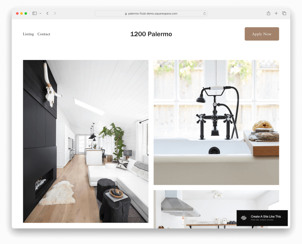
Palermo is a very clean and simple template, presenting your works on the home page in a nice grid.
The header is basic, with the menu on the left and a CTA button on the right.
Palermo can work great for both presenting a property listing or for showcasing your architectural projects.
Moreover, the contact page lacks a contact form but has integrated Google Maps to showcase your location. Still, all the necessary details and a clickable email are there.
2. Selene

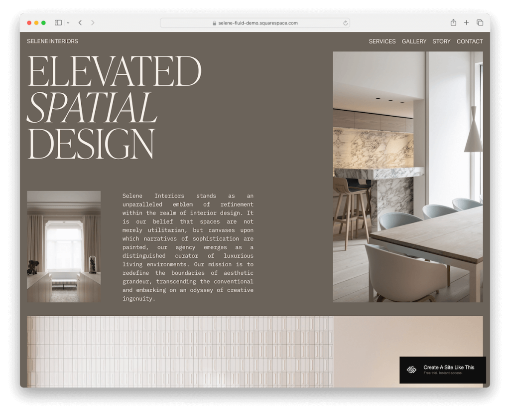
Selene is a Squarespace architect template with an earthy color scheme that immediately catches attention.
Its focus on the images is strong, which, in combination with plenty of white space, makes them pop nicely.
Moreover, Selene has various internal pages, including a gallery/portfolio one, which features a lightbox for a more immersive viewing experience.
Another handy element I like is the header that disappears when scrolling down and immediately reappears when returning back to the top. (Less distraction while scrolling, but still ensures easy access to the navbar.)
3. Bergen

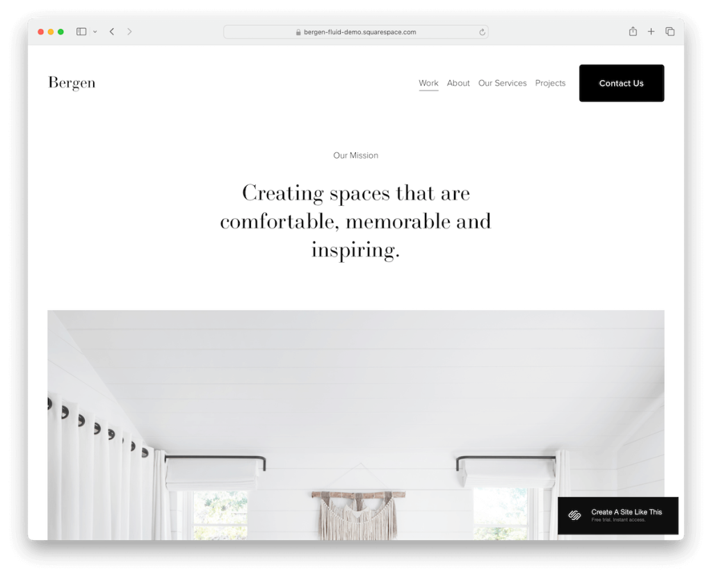
Bergen is minimalist and bold with a massive single-column layout home page to promote your most-proud or recent projects. But single project pages have a grid layout for content presentation with style.
The header sticks to the top of the screen, so navigation and a contact button are always within reach.
Furthermore, Bergen has additional pages for services, about and a contact page with a functional contact form.
At the bottom, the footer houses business details, a quick menu, and project links.
4. Sawyer

Sawyer is a sleek Squarespace template perfect for showing off your architectural work.
It rocks a light gray and burgundy color scheme that really pops yet sticks to simplicity. (But you can modify the default color setting however you want.)
As you scroll, content loads dynamically, keeping the page lively. The homepage has a handy contact form, plus ready-made services and contact pages to help you get started quickly.
The simple footer makes it easy to find your business and contact details, and that’s pretty much it.
Sawyer is streamlined and professional.
5. Condesa

Condesa is a Squarespace template that’s all about vibrant vibes. Its colorful design and rounded edges give it a modern, mobile-like feel, making content viewing much more pleasurable.
What’s interesting about Condesa is that it starts with text above the fold, before the image hits, flipping traditional layouts on their head.
The header keeps it clean and simple, while the large footer packs in a quick menu, social links, and a contact form.
Condesa is fresh, fun, and a standout choice for any daring architect.
6. Sackett

Sackett hits strong with a full-screen image background above the fold section, featuring a transparent header and overlayed text and a CTA button.
There are also multiple impactful image background sections scattered throughout the layout, keeping the engagement high.
One particularly handy feature of Sackett is a full-blown online appointment booking system.
In addition, you also get various predefined internal pages so that you can get your business site online super quickly.
7. Handshake

The Handshake Squarespace architect template is the epitome of minimalist chic. It perfectly mixes light and dark sections, giving your site a balanced, sophisticated look.
The one-page site layout ensures everything is neat and accessible, letting visitors flow smoothly through your content. (It’s becoming increasingly common in modern business sites.)
It’s all topped off with a simple header and footer, keeping the focus on your work. Plus, a handy “back to top” button makes navigation easy.
Handshake is ideal for creating a sleek, professional online presence that handshakes you right into new deals.
8. Kyoto

Kyoto sparks interest with its full-screen image slider above the fold, emphasizing the image rather than the text. What’s more, the header is transparent, so there is little to no distraction.
Moreover, Kyoto has a testimonials slider, parallax scrolling background sections, an online shop section, and a built-in Google Maps and contact form.
In short, Kyoto is packed with goodies to save you plenty of time when creating a solid architectural site.
9. Verano

Verano is a Squarespace template that really pops with its cool header that disappears and reappears as you scroll. And it includes social media icons and a CTA button in the navbar for easy access.
Enjoy the smooth parallax scrolling, which adds depth as you navigate. (See more Squarespace parallax templates.)
Verano is also packed with features like a newsletter subscription form, testimonial slider, Instagram feed, and dedicated pages for about, services, portfolio, and blog.
Verano is dynamic and fully loaded for engagement.
10. Unearth

Unearth is all about modern minimalism with a meticulous eye for detail. This Squarespace architect template spices things up with a parallax scrolling background that adds a touch of drama as you navigate.
The footer contrasts starkly in dark tones and includes a handy search bar.
Need to reach out? The contact form pops up conveniently, which isn’t something you’d see too often.
Plus, you get three different gallery layouts to choose from, letting you display your architectural projects just how you want.
11. Iris

The Iris Squarespace template triggers attention immediately with its unique and catchy above-the-fold section.
Furthermore, it features a transparent header that blends seamlessly with the cool parallax background, giving your site depth and dynamism.
Project pages are neatly designed with a lightbox gallery to showcase your work effectively.
There’s also an Instagram feed, a newsletter subscription form, and a dark footer equipped with quick links, social media icons, and a search bar.
Plus, the practical services page gets straight to the point with all the necessary information and pricing.
12. Arch&Gold

The Arch&Gold template is a stunner. It has twelve ready-made pages, and you can switch between dark and light styles. Additionally, you can make adjustments and edits to your heart’s content.
It includes slick Canva graphics and offers two distinct home page styles to match your vibe.
The contact page contains both a functional form and accordions for FAQs, making it super user-friendly.
Project pages feature a massive, image-only slider that makes a bold statement. Plus, there’s an Instagram-ready feed to keep your site fresh and engaging.
13. Elevate

Elevate welcomes you with a top bar notification, followed by a minimalist header and a slideshow with overlayed text and CTA buttons.
This Squarespace architect template has plenty of awesome detailing, including parallax scrolling, making browsing more dynamic and fun.
Some other goodies you get are a project carousel, testimonial slider, blog section and large, resourceful footer.
Make a strong and lasting first impression on every visitor with Elevate now.
14. Hunter

Hunter makes a bold statement with its sticky red header that really pops against the rest of the site.
You’ll find animated images above the fold and throughout that bring your content to life. As you scroll, more content loads dynamically, keeping things fresh.
Hunter includes carousels to showcase multiple projects, an eCommerce section for merchandise or plans, and testimonials to build trust.
The footer includes an Instagram feed, a subscription form, and business hours, keeping things practical even at the bottom of the site.
15. Exurban

One key feature I really enjoy about Exurban is that it uses the same white background in the header, base, and footer, with a few exceptions.
The header floats at the top of the screen, with menu links, social icons, and a CTA button at your fingertips at all times.
For displaying your works, Exurban takes care of it with project grid layouts – but I’d improve with a lightbox for a better viewing experience.
To take practicality one step further, you won’t need to build a contact form and integrate Google Maps from scratch. Exurban has it all available and ready to use.
16. Harper

Harper’s specialty is the sticky sidebar header/navigation, which is packed with menu links (including a drop-down), social icons, and a CTA button.
The above-the-fold section contains a big image-only slideshow, so everyone can enjoy your work right from the start.
Harper’s overall design is tidy and elegant, ensuring all your content gets all the recognition it deserves.
Finally, Harper equips you with various internal page layouts, so you can mix and match them however you want. And if you want to remove or add something, go for it!
17. Abode

The Abode Squarespace template is a breath of fresh air with its light design and smart dark detailing.
Right under the header with a handy drop-down menu, you’ll find concise text, and a CTA button – all set before a striking large image that draws the eye.
Abode features a convenient back-to-top button, making reaching the navigation seamless as you explore.
The About page is detailed and crafted to engage, and there’s a Blog to keep your audience updated.
18. Design West

Design West uniquely displays a large hero image with the header positioned underneath. Make a smart choice when selecting the image to create a strong first impression.
Another cool thing about Design West is its thin lines that separate sections elegantly.
Moreover, the floating header always showcases the navbar and shopping cart icon. There’s no need to scroll back to the top anymore!
A testimonials slider, subscription form, Instagram feed, online shop and blog pages, and a working contact form are some of the perks that you can use to your full advantage.
Enjoy uniqueness with Design West.
How To Make An Architect Website With Squarespace
Creating an architect’s website with Squarespace is straightforward and rewarding.
- Create an account and choose a plan: Visit the Squarespace website and create an account. Choose a subscription plan that suits your needs, with options ranging from personal to advanced commerce.
- Select a template: Browse the templates available under the “Architecture” category or any preferred style. Pick one that aligns well with your architectural firm’s aesthetic and functional needs. However, we did the necessary testing and reviewing, so the ones above are THE optimal.
- Customize your template: You can customize your chosen template by adding your logo, adjusting color schemes, and selecting fonts that reflect your brand’s identity. You can also use the drag-and-drop editor to rearrange elements such as images, text blocks, and pages according to your preferences.
- Add content: Upload high-quality images of your architectural projects, create descriptive text for your services, and ensure your contact information is easy to find. Organize your content into intuitive sections like Home, About Us, Portfolio, Services, Blog, and Contact.
- Optimize for SEO: Use Squarespace’s built-in SEO tools to help potential clients find your website. Include relevant keywords and meta descriptions and customize your URLs to improve your site’s visibility on search engines.
- Preview and publish: Preview your website to see how it looks on different devices and make any final adjustments. Once satisfied with the design and content, hit “Publish” to make your architect website live.
FAQs About Squarespace Architect Templates
Can I customize the templates to match my brand?
Yes, Squarespace templates are highly customizable. You can change colors, fonts, layouts, and much more to align with your brand identity.
Are Squarespace templates mobile-ready?
Yes. All Squarespace templates are designed to be responsive, ensuring they look great and function well on both desktop and mobile devices.
Do these templates support high-quality images for showcasing architectural work?
Yes, Squarespace templates support high-resolution images, perfect for displaying detailed architectural designs and projects clearly and beautifully.
Can I integrate social media into my Squarespace architect website?
Yes, you can easily link your social media accounts and display social media icons on your site, allowing visitors to connect with you across various platforms.
Is it possible to add a blog to my Squarespace architect website?
Yes, adding a blog is straightforward with Squarespace. You can share news, updates, and educational content directly on your site to engage visitors and showcase your expertise.
How do I optimize my Squarespace site for search engines?
Squarespace provides built-in SEO tools that you can utilize to improve your website’s visibility. This includes adding search keywords, customizing page titles and descriptions, and structuring URLs efficiently.
Was this article helpful?
YesNo
