These are the best minimalist website examples you want to check if you like clean and simple web design.
Don’t we all?
These pages are easy to skim through and don’t cause any distractions that make you want to leave early. And even though some use animations, they work very well in unison with the minimalistic look.
Whether you need inspiration for building a personal, a business or an eCommerce website, here’s an example(s) that will do you well.
Not yet decided which platform to choose? Opt for WordPress and pick the best minimalist WordPress theme!
It’s so effortless to build your dream website.
Best Clean & Minimalist Website Examples
1. Bedow
Built with: Gatsby
Bedow is a beautiful example of minimalist and creative responsive web design that’s also very catchy at the same time. But the latter goes to the clickable hero video and links to their works.
What’s cool about Bedow is that they don’t use the traditional hamburger menu icon but a waving hand that opens an overlayed navigation.
Note: Use a video above the fold to increase users’ interest.
2. ETQ
Built with: Shopify

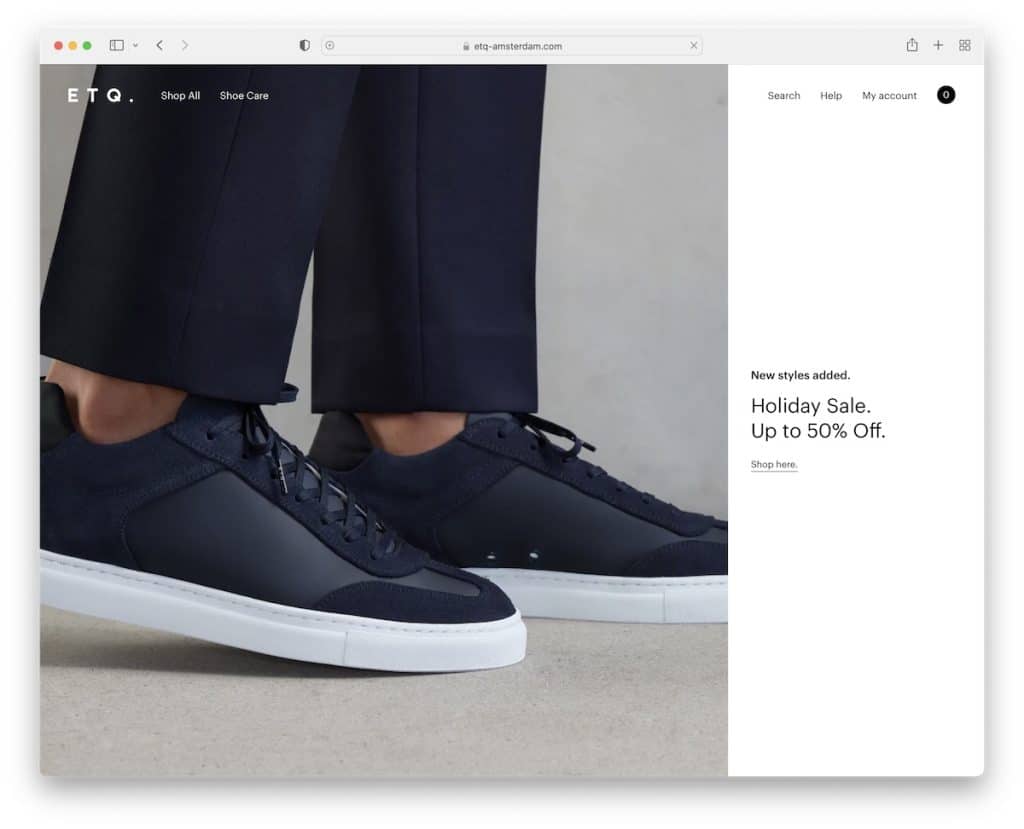
ETQ is a clean website with a full-screen above-the-fold section that’s split into two sections; 2/3 image and 1/3 solid color background with text and link.
They use a transparent header that disappears and reappears depending on the scrolling motion.
While the footer is widget rich, it still has a minimalist flow, with the same light color as the base of the website.
Note: Create a cleaner look with a fully transparent header/menu.
You may also be interested in investigating these great shoe website designs.
3. Lars Tornoe
Built with: Squarespace

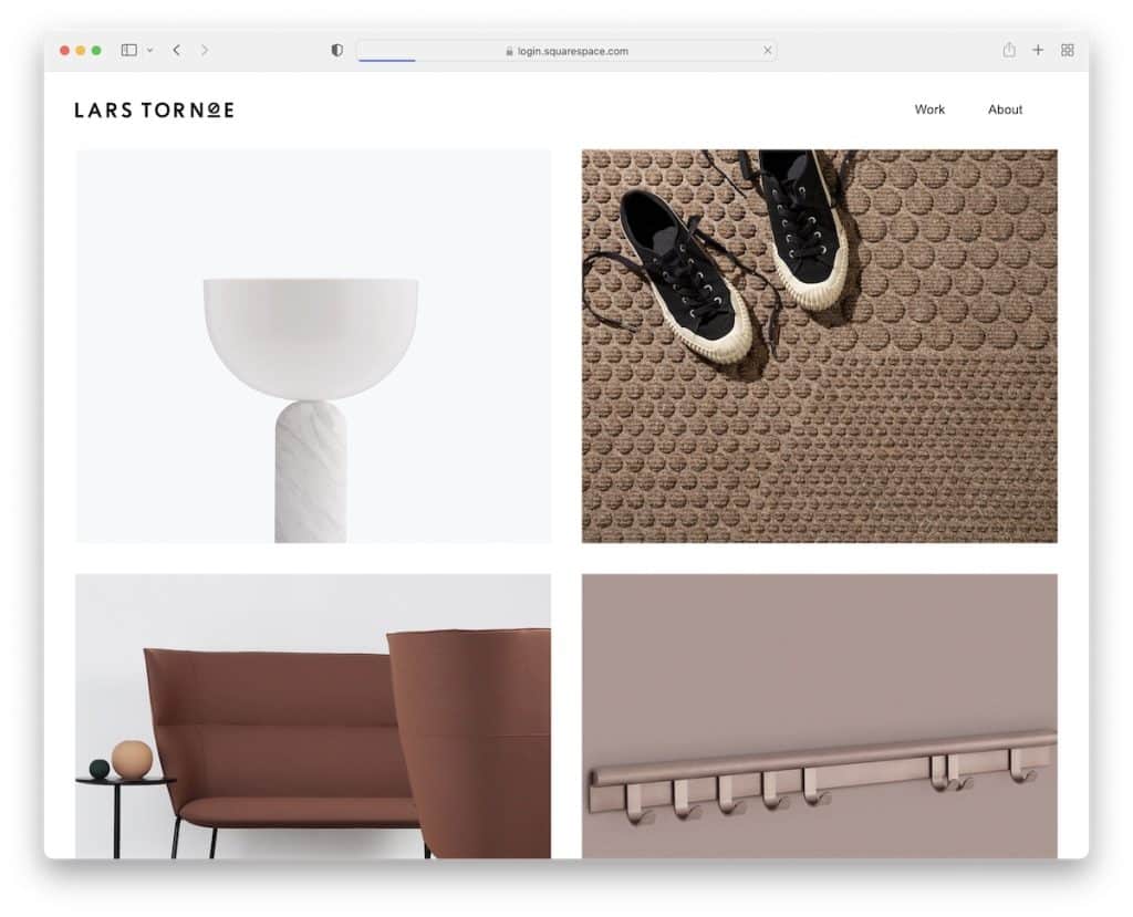
Lars Tornoe’s home page is a neat two-column grid portfolio whose elements have a hover effect. Also, each portfolio item is clickable and links to the project page with additional images and text.
The header only has a logo on the left and two links on the right, but Lars Tornoe doesn’t use a footer. The footer with links to other works only appears on individual pages.
Note: Ditch the footer and make your website look more minimalist.
You’ll also enjoy studying these best Squarespace website examples. But if you need something more specific, view our portfolio website collection.
4. Monograph
Built with: Webflow

Monograph is a text-heavy minimalist website example with a catchy gradient background. The header uses a hamburger menu icon that slides in the navigation from the left.
Moreover, the sticky left sidebar features only one sentence and a newsletter subscription form. Moreover, the two-part footer consists of a large Monograph sign and menu links.
Note: Use larger fonts and more white space if you decide to create an image-free website.
We also have a full collection of Webflow websites if you want to view more alternative designs.
5. Netil Radio
Built with: Gatsby

Netil Radio might have a vivid blue background, but the overall design is clean and simple. The hero section features a play button with text announcing the upcoming show. And when you press the play button, all those outlined dots turn solid.
Netil Radio is also a one-page website, with all the content only a few scrolls apart.
Note: A minimalistic web design and a single-page layout work together well.
6. Field
Built with: Craft CMS

Field has a full-screen image for the home page “preloader” with a menu and an option to skip and go to the website.
The header disappears on the scroll and reappears as soon as you scroll back to the top. Just like the header, the footer also features the same background as the base of the website to achieve a neat look.
Note: Maintain the same background color throughout your entire website, including the header and footer, to achieve a more minimalist appearance.
7. Scott Snyder
Built with: Squarespace

Scott Snyder has randomly scattered portfolio elements on the home page, each linking to the project page, like Lars Tornoe. And some thumbnails are animated to spice up the experience.
Scott also added a section for clients he works with and testimonials to build social proof.
Note: Use testimonials and reviews on your website to build trust.
8. Wendy Ju
Built with: Wix

Wendy Ju made her minimalist website more engaging with the simple but catchy hero text animation. The page has sticky sidebars featuring social and email links on the left and basic navigation on the right.
Furthermore, the eight-part portfolio section has static and animated thumbnails that link to individual project pages with in-depth presentations.
Note: Add animated text in the hero section, even if it’s saying “hello” in different languages.
Plus, don’t miss these websites built on the Wix platform that’ll fill you with even more creative ideas.
9. Casa Mami
Built with: Squarespace

Casa Mami uses a large image slider that creates a warm welcome to the world of simplicity. Also, there’s no text or links/CTAs on the slides, nor are the slides clickable. The slideshow is there for pure enjoyment.
This minimalist website example also has a parallax image with a CTA button that turns solid on hover.
Note: Add more depth to your beautiful website with a parallax background.
10. Anthony Wiktor
Built with: Gatsby

The awesome thing about Anthony Wiktor’s personal site is that it’s light at the beginning but turns dark as soon as you start to scroll.
What we also like about this minimalist website is the portfolio area with a hover effect that changes the thumbnail but also “dims” the whole website with different shades.
Note: You can use dark and light web design, but you can also mix the two.
11. Gary Le Masson
Built with: Drupal

Gary Le Masson’s page is a unique Google lookalike he uses to present his resume, contact details, and more.
It’s a minimalist and one-of-a-kind online presence that expands web design possibilities.
Note: Don’t have an idea for a website? Copy and alter a large website/platform with your creative twist.
12. Mintboxx
Built with: Weebly

Mintboxx website is simple, with a lot of white space and text but few images. Surprisingly, the browsing experience is enjoyable on both desktop and mobile because of the overall cleanliness.
The only moving element is the typewriter effect in the hero section, which adds a cool layer of creativity.
Note: Instead of using just text, add a typewriter (or sliding) effect.
Do you want to check more Weebly websites? We have a whole list of epic designs ready for you.
13. Andrew McCarthy
Built with: GitHub Pages

Andrew McCarthy’s minimalist website is very tricky. Why? Because it features an infinite scrolling loop with changing overlayed objects that may take a while to note, it’s all the same.
Clever.
For this reason, it’s even handier the menu reappears on a back scroll because it could take quite some time to get back to the top otherwise.
Note: Do you want to go against the grain? Do it Andrew McCarthy way!
14. And Then Jupiter
Built with: Craft CMS

And Then Jupiter is another minimalist website example focusing strongly on text. The website also has a cool text effect above-the-fold, like Mintboxx, that acts as an attention-grabbing element.
Large and small text and a lot of white space call for a great reading experience. What’s more, And Then Jupiter has an untraditional menu icon in the floating header that opens a full-screen overlay where most of this page’s animation is.
Note: Use large fonts and make some of the text bold and even use caps to ensure the site is easy to skim through.
Unsure about adding animations? Then get a dose of animated websites first for more epic examples.
15. OrangeYouGlad
Built with: Wix

Even though OrangeYouGlad leans towards minimalist web design, it still features many cool and catchy creative and animated details to make the website more engaging.
But our favorite part is once you hover over the “drop us a line” button and the “howdy” sign starts shaking, word after word.
Note: You don’t have to be too serious with your minimalist page look. Add some animations and special effects and enhance it with the cool factor.
16. Beginner Bank
Built with: Webflow

Beginner Bank keeps things dark (except the last section) and bold, giving the website a more premium feel.
It’s a single-page website with a sticky header, a sticky message in the bottom left corner and a sticky CTA button in the bottom right corner, to name a few. In other words, all the links and buttons are always at your fingertips.
Note: Create a one-page business website and enhance UX.
17. Scope Copenhagen
Built with: Elementor

The Danish style is simple and minimal, exactly what Scope Copenhagen’s website resembles.
Below the header is a simple but powerful message that continues with beautiful images of their works and links to their projects, about page, and more. But you can also access all the information via the floating navbar.
The footer features four columns, displaying menu, social media and project links, plus, a dark and light mode switcher.
Note: Integrate a day/night mode switcher, so visitors can choose how they want to experience your site.
If you like WordPress and want to use a page builder, read our extensive Elementor review first.
18. Maciej Bączkowski
Built with: Kirby

Maciej Bączkowski’s page is another proof that the text-only hero area works. This minimalist website example features a portfolio on the home page with extra spacing between elements and on-scroll content loading.
The header floats, but it features just links without a background to keep the distraction at a minimum.
Another notable mention is the footer reveal function, which isn’t something that we see often.
Note: The footer reveal effect is an excellent detail to an overall minimalist layout.
Was this article helpful?
YesNo
