Take your landscape architect career to the next level with a well-designed website to help you boost your web presence. Here’s a list of websites full of landscaping design ideas to reinforce brands effectively.
Nice outdoor space is relaxing and rejuvenating, whether around commercial businesses, private residences, or government facilities. The natural beauty of green grass, flowers, shrubs, and bushes perfectly trimmed and arrayed beautifully is impressive and refreshing. In like manner, beautifully landscaped lawns can help make a great first impression. Landscaping can enhance the value of one’s property. Hence, the expertise of landscapers is in demand and value in outdoor space development. Typically, landscape designers develop and maintain aesthetic grounds for residential properties, businesses, and parks. They can certainly turn ideas into visuals with extraordinary creativity. And as the landscaping industry service grows rapidly, professionals in this line of business must have the edge over the competition. Today, we’ve collected ample landscaping websites to provide awesome inspiration for landscapers’ career advancement.
How to build a landscaping website?
There are many ways to go about it, but the easiest and most cost-efficient is by using WordPress. Here are the best landscaping WordPress themes that will help you to get your site up and running.
You’ll find different landscaping website design ideas in this list. So, whether you mix and match those features, it’s all up to you. Just jot down the best features you should be utilizing in your project.
Best Landscaping Website Designs
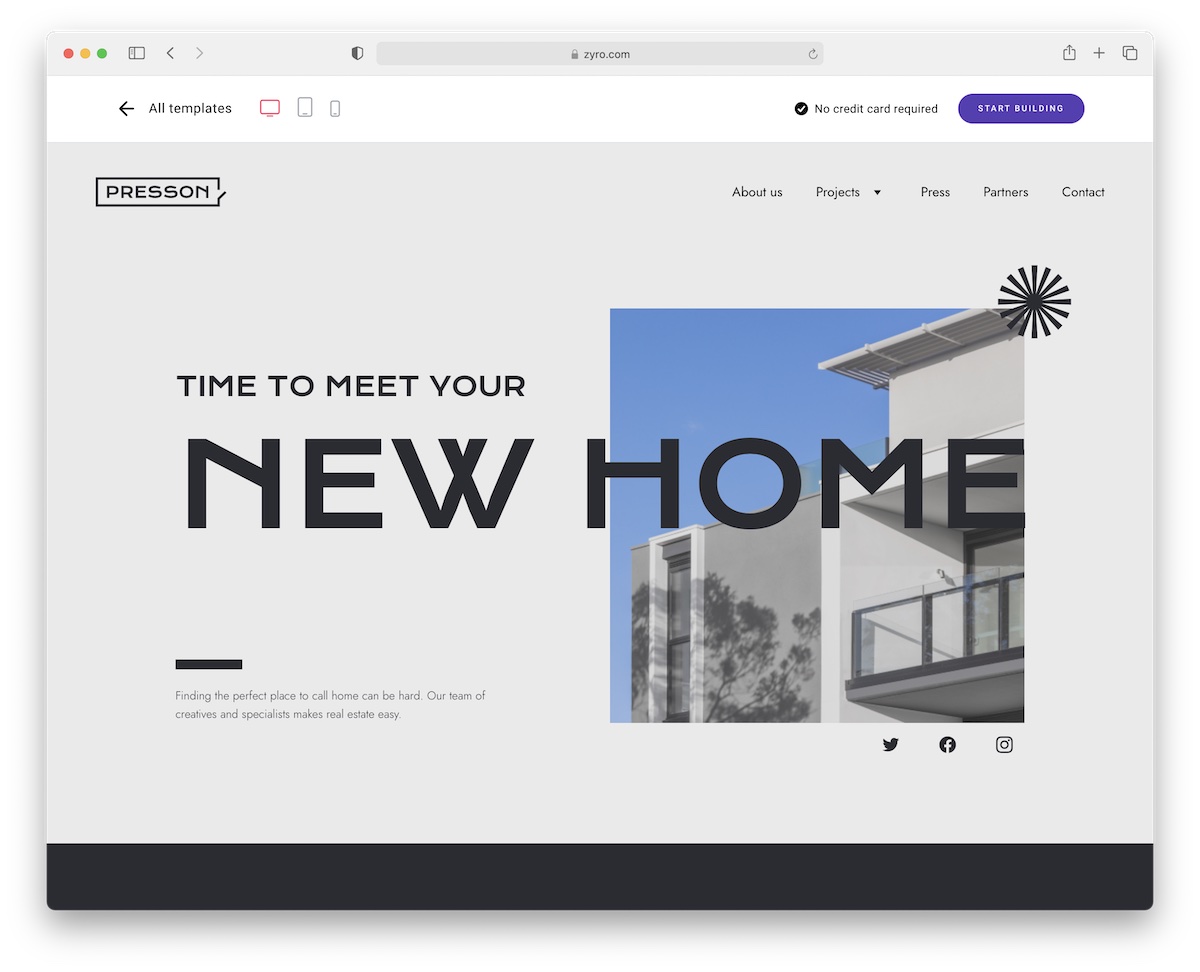
1. Presson

Presson is a flexible landscaping and real estate website design that you can tailor to your needs in a little breeze. You don’t have experience? No problem! You can perform customizations and improvements without coding.
Front and internal pages are ready-to-go, so you only perform refining touches and are ready to rock-n-roll.
Thanks to Presson’s powerful features, present your company online in the best possible light. (Hint: It also sorts you with hosting and a one-year free domain.)
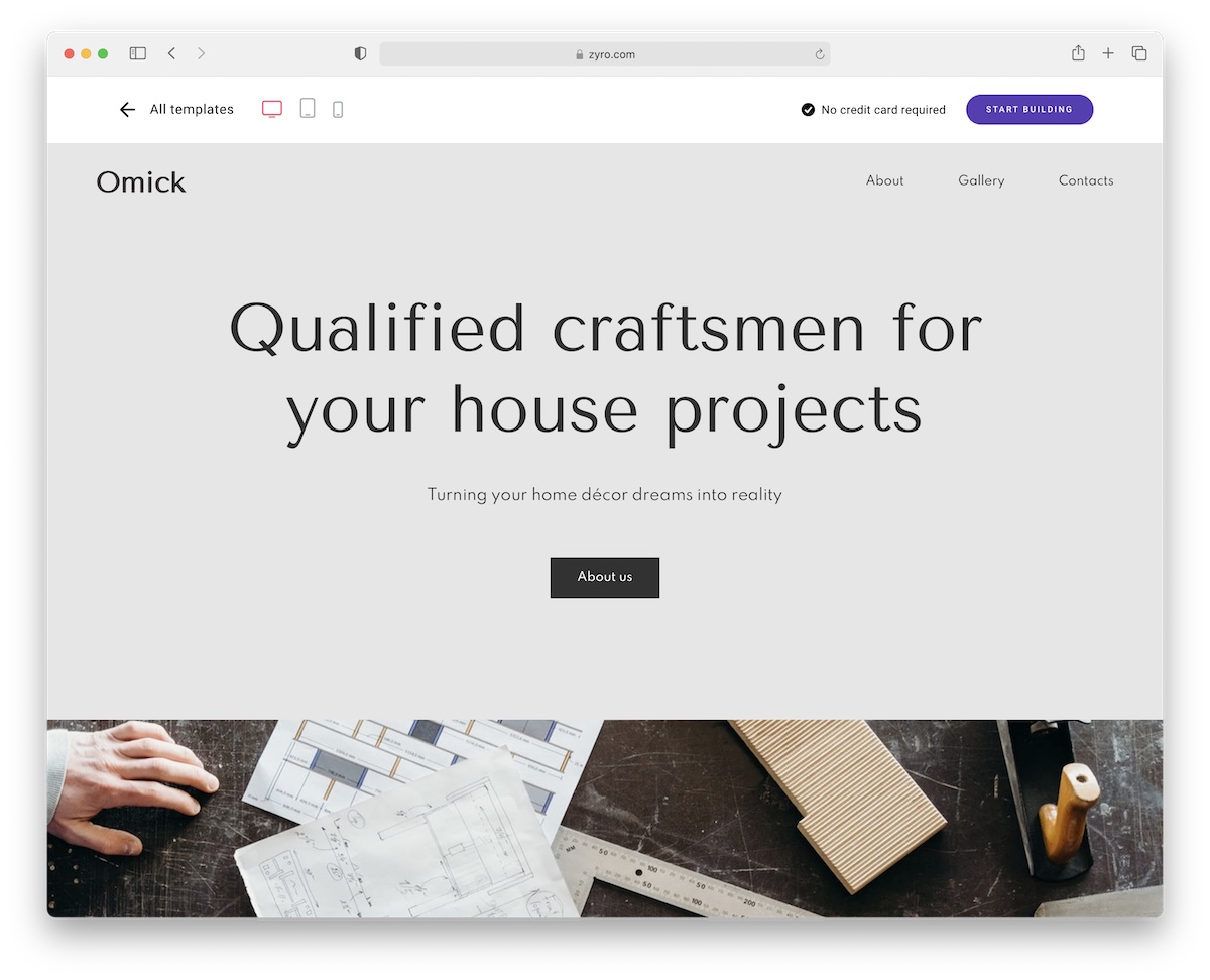
2. Omick

If you’d like to stand out, you better check out Omick. This clean and original template rocks everything for your landscaping company. (Architects and interior designers are welcome to use it, too!)
Share pricing, create a beautiful gallery (lightbox!), add a compelling about page and benefit from the integrated (and working!) contact form.
You can also customize it with the powerful Hostinger builder with hosting. Many landscaping website templates go well with the Hostinger website builder.
3. De Leon Landscapes Co.

Whether you’re adept at landscaping or just a startup business looking to improve your career, this landscaping website design is a good inspiration. De Leon Landscapes Co. is a magnificent, neat, and clean website ready to generate more sales for its brand. It’s a one-page landscaping site with an asymmetrical layout that shines well with white space and the awesome GSAP animation. The hero header has a quality landscaping photo, comprehensible tagline, and clear CTA. It’s loaded with call-to-action buttons to prompt an immediate response from potential clients. This website uses a grid layout with an excellent slider to present the works.
4. Garden Builders

Are you a professional landscaper with amazing experience building an aesthetic outdoor space for homes and businesses? If you are, then a good website is a must! Having a website to spread your services efficiently is essential for your career. Garden Builders promises to yield well-designed and constructed gardens within the client’s schedule and budget. Its website has a simple but comprehensive design that conveys professionalism and creativity. The hero header displays its successful works through a grid layout. Each grid represents a seamless work with a simple description and ample images. In addition, the featured gardens section also looks superb in big squares with a cool hover effect.
5. Green Options

If you’re planning to build a website for your landscaping business, you need to see these remarkable landscaping website designs. Green Options is one you should not miss examining. It’s a landscape management company that offers quality services and efficiency in terms of landscaping. In particular, its website is a great tool to advertise its brand. Since green effectively represents nature and is eco-friendly, this website never misses utilizing green as its primary color. In the hero header, the elements are pretty neat. They are altogether compelling from the highlighted images, CTAs to bold headlines. Moreover, it exhibits its services style by embracing the powerful sliders on each with white space.
6. Vic Turf Landscapes

If you offer amazing landscaping services with quality and professionalism, a well-designed website should be ready to showcase your portfolio worldwide. This landscaping website design is useful if you don’t have a plan yet. Vic Turf Landscapes is a team of highly skilled landscaping professionals who pays great attention to detail and guarantee client satisfaction. Its website is a wonderful presentation of its brand. A comprehensive design of the homepage is crafted to impress potential clients. Specifically, the slider showcases quality images with captivating headlines and CTAs. It also uses the sticky header for improving audience retention. Moreover, some magazines featured this brand which can effectively help improve its credibility, so they are presented with style.
7. Classic Landscape Ltd.

A strong web presence is needed to shine in a highly competitive industry. Integrating digital marketing into your brand promotion is highly effective, whether a company or a professional individual. This inspiration is irresistible if you plan to build your web presence as a landscaper. Classic Landscape Ltd. has a landscaping website design to create a good impression. It comes with a modern design and useful elements. It’s ever-ready to impress potential clients. Specifically, the hero header highlights wonderful landscaping works through a smooth slider. Furthermore, the services section also looks clean and neat, embracing a card design layout and a striking hover effect. Similarly, the portfolio is designed stunningly, too.
8. Masterplan Outdoor Living

Passionate landscapers are indeed valuable in different places. They ought to have a website to spread awareness of their services with their awesome expertise. Here’s Masterplan Outdoor Living that can help you finalize the design of your landscaping website. Specifically, it has a short but adorable homepage design. The hero scene is a compilation of videos that can boost the website’s credibility.
Furthermore, the split-screen design used in the brand introduction is seamless, too. On top of that, the portfolio presentation is even more impressive as it uses a friendly and innovative slider. A short description appears on its bottom by hovering the image, which adds beauty to the overall design.
9. Hess Landscape Architects

A simple but well-designed landscaping website is here to inspire you with your landscaping website design. Hess Landscape Architects has a straightforward design with high-quality images highlighted on the hero scene. Having a short homepage, featured projects, and featured news are the ones that welcome every potential client. Specifically, this website utilizes a clean off-canvas menu with social media icons to easily connect with the brand. In particular, the project page is presented elegantly with a grid layout. Similarly, the firm/team page has a beautiful design too. They’re altogether seamless from a clean introduction to the individual team profiles.
10. Mark Tessier

An online portfolio is one of the most important tools to shine in this modern age. Every brand must have a great portfolio to showcase credibility regardless of profession. If you’re a landscape architect, these landscaping website designs are excellent sources of inspiration. Mark Tessier’s website is exceptionally designed to show off the expertise of this landscape architect. The homepage has a visually appealing design. The hero scene is a great display of outstanding landscape-related images highlighted using a slider.
11. Martin Cuthbert Landscapes

With a passion for combining horticulture with landscape design, Martin Cuthbert Landscapes crafted a well-designed website to show its worldwide reputation. This firm is ready to offer extensive landscape design, construction, and installation. In particular, its website has a creative and modern design. The homepage has a cool and refreshing fixed image background. The portfolio section has a masonry layout where viewers can filter the works such as commercial, maintenance, or residential. While those elements are well organized, the services section has a simple layout with icons and short descriptions. This website also uses a sticky header to make it easier for an audience to navigate to complement such layout.
12. Landzine

Check out these landscaping website designs that provide essential features for your upcoming projects. Landzine is an internationally renowned landscape architecture that showcases different landscape projects worldwide. As the homepage is the first thing a visitor can perceive, it should always look professional and convey the message. Landzine, emphasizes minimalism as it embraces white space. This way, the content will look good and clear. Moreover, other website pages are well-designed too, like the projects, offices, articles, and many others. More interesting features include social media icons, newsletter, advanced search, etc.
13. Manscrapers NY

Don’t miss these outstanding landscape architecture designs we’ve handpicked as part of your awesome inspiration. Manscrapers NY is an exterior design and landscaping firm in Williamsburg, Brooklyn. With the desire to make their client’s outdoor dreams come true, it offers various landscaping services. Its website has a super clean and simple homepage design. It uses a full-screen layout with random images exhibited using a sleek slider. While the images are captivating, the menu on the bottom of the screen never plays its vital role. Particularly, the work, contact, and shop pages are totally impressive. It also embraces the Twitter and Instagram icons for easy brand connection.
14. Candide Contractor

With 28 years of offering environment-friendly, high-end service for residential and commercial landscaping projects, Candide Contractor is all set to inspire fellow landscape architects with its website. Having essential web elements, the homepage appears visually appealing and impressive. The quality images, descriptive CTAs, and good typography are altogether stunning and well-ordered. While the homepage has such features, other pages have ample elements to complement the overall design. Specifically, the portfolio page exhibits the amazing works they’ve successfully built, a services page where details of their renowned services are revealed, a reviews page to improve the credibility of this firm, and more to explore.
15. Landcon

Landcon is one of these landscaping websites that will serve as a wonderful guide in building an online presence. Like most brands, this firm has a great devotion to excellence. With 35 years of expertise in beautifying properties, Landcon prides itself on integrity and satisfaction with its services. Its website comes with an innovative design, ready to reach more clients. Utilizing red as the primary color embraces consistency in the design and visual hierarchy and bold typography. While those elements are apparent, the white space throughout the site makes this website seamless and elegant. That’s not all. The testimonials are highlighted, too, using a slider that is all readable and neat. With the sticky header added, other pages can be accessed without difficulty.
16. Tomlinson Bomberger

More and more brands have discovered the essence of web presence. Hence, every company or professional must have the edge over the competition. Here’s another landscaping website design you can consider a potential inspiration. Tomlinson Bomberger provides landscaping services at their best to meet the demands of every client. Its website is created to promote its services well to reach more clients. Images add life to the design, using more appealing photos on different website sections. Specifically, the hero header has a huge image, while other sections have smaller ones but have similar quality. Apart from that, the sliders also make them look even livelier.
17. Twisted Oak Landscaping

Pick the best design ideas you can from these amazing landscaping websites. Here’s Twisted Oak Landscaping, a landscape firm that promises to make properties look fresh and rejuvenated. They’re a capable, reliable team that exceeds clients’ expectations as they’ve described. Its elegant and sophisticated website design can generate more business leads. In particular, the homepage has a nice design with a dark tone background and white typography. The hero header showcases some striking images with headlines and CTAs as it utilizes the smooth slider. The services section looks simple, too, along with other content. While those elements are attractive, the portfolio also looks fantastic too!
18. Great Canadian Landscaping Company

While most landscaping websites use green as their primary color, it looks vibrant and inviting, with red as the main color. Great Canadian Landscaping Company offers various landscaping services with their skillful and expert team. The hero header showcases the team that works best to yield grandeur landscape architecture. Visitors can easily access the services page to see what they can do. Then, a readable and straightforward introduction of the firm’s capabilities to turn a property into an extraordinary one.
Was this article helpful?
YesNo
