Need inspiration for building a new bakery website? Look no further. Here are some examples of the latest and greatest in bakery website design.
Bakery products are a staple in celebrating happiness and research shows that food appearance greatly impacts appetite. With the rise of the bakery industry and the need to stand out from competitors, having an online presence is crucial.
Regardless of the products and services offered, proper marketing is key. Building a website is a must for any brand and can be done with the help of a talented developer or a user-friendly bakery WordPress theme.
Take a look at these fantastic bakery website designs and get inspired for your website project. Start promoting your business creatively and effectively today.
Best Bakery Website Design Examples
1. Sugaro
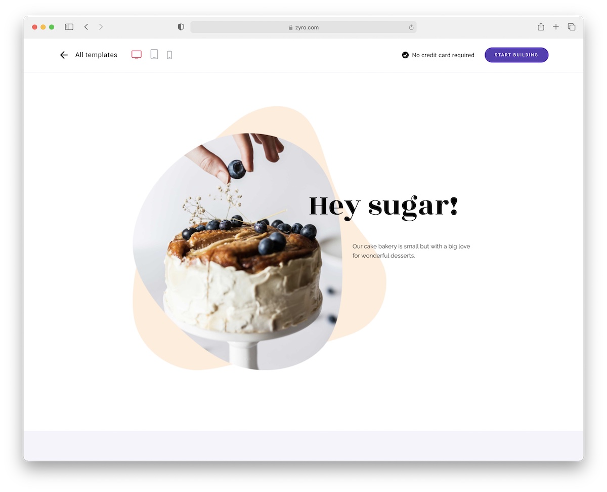
Sugaro is a top-notch bakery website design that makes all your delicious goods appear even tastier. With its clutter-free design, of course!
It’s effortless to use, perfect for beginners and professionals who need a quick but expert page. And the Hostinger page builder ensures you get to brand and personalize it without writing code.
Note: You also get hosting and a domain name when you get Sugaro, which is a BIG plus.
2. Campos
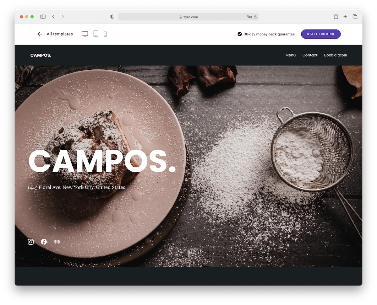
Campos is a gorgeous bakery website design that calls for quick website creation. Your baked goods will look even tastier once you present them online with Campos. And to secure a spot, everyone can easily book a table straight from your website.
But first, let them enjoy a mouthwatering gallery and your delicious menu.
Display your location and opening hours, link Campos to your social accounts and perform any additional branding customization – Campos is here to make an immediate difference.
There are many ready-made bakery website temples available for Hostinger website builder.
Don’t miss it!
3. Nadia
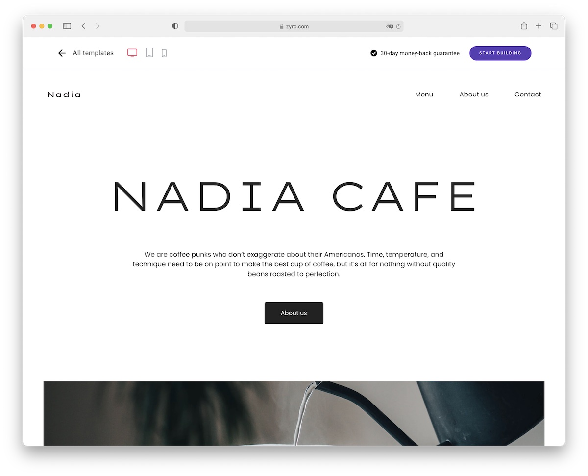
I’m a fan of Nadia because of its amazing (quite minimal!) design that beautifully puts your tasty baked good on display. You will water everyone’s mouth easily. I’m salivating right now just by looking at the live demo!
Include your must-try menu and engage everyone with your jaw-dropping food images. Note: You can create an eCommerce section to sell stuff and let your customers book a table.
A lot is possible with Nadia, so don’t miss it if you want to make a strong and lasting IMPACT.
4. Dubravica
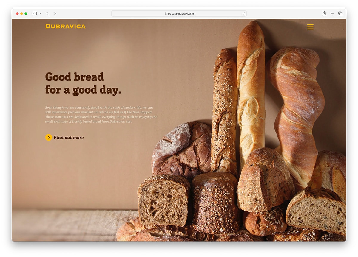
Today, it is essential that your brand promotion schemes should include a powerful online presence. This way, you’ll have a competitive edge over other brands. Dubravica is a website dedicated to the bakery business. It has a simple, clean homepage with a full-width bakery-related image, CTA, captivating tagline, and an off-canvas menu. Dubravica stunningly showcases products. You can find a beautiful display of imagery on the hero header, big and mouth-watering baked goodies in boxes that serve as a menu and has great hover effect. Moreover, this website has a nice and well-designed career page with awesome features contributing to its overall performance.
5. Bavarian Bakery
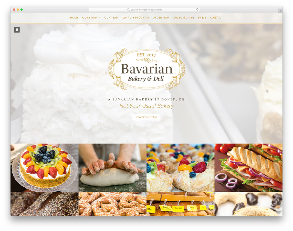
Regarding the bakery business, you must offer customers the best products. Then, look for ways to promote your brand effectively. One way to drive more customers is to embrace digital advertising. Bavarian Bakery is one of the awesome bakery websites design that one should look into. This website comes with exceptional contents – quality images, engaging video, optional music on the homepage, etc. It welcomes visitors with a huge logo on the homepage that works best for branding purposes. Of course, the primary CTA enables customers to order baked goodies in just one click easily. Other features include Lightbox for modal image gallery, sticky menu, parallax effect, etc.
6. Cobs Bread
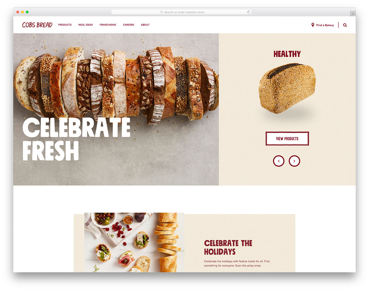
The clean, neat and minimalist design of websites often shines regardless of the products or services. Cobs Bread’s exceptionally designed website surely belongs to this list of outstanding bakery websites. It has a unique homepage design – having a split-screen layout on the hero header, a slider on the right side and a fixed bread image on the left. The overall design, structure and red as the primary color make the website look grandeur. In addition, a slider is also utilized to present various features of Cobs Bread. Other useful features include video background, descriptive CTA, social media integration, accordion, and more.
7. SusieCakes
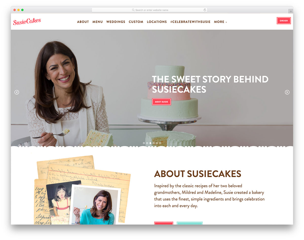
Although minimalist website designs often work, some websites look engaging with vibrant colors. SusieCakes has a great and creative design of the bakery website. It features wonderful imagery on the hero header using a slider, clear CTAs, and compelling taglines. The website utilizes different vibrant colors for every section. Since it is essential for a customer to make an order online easily, SusieCakes ideally provide such a useful feature on its site. Meanwhile, the website also provides career opportunities to bakers in different cities and states. To retain visitors on the website, SusieCakes uses a sticky menu where visitors can access the menu, weddings, locations, etc.
8. Puratos
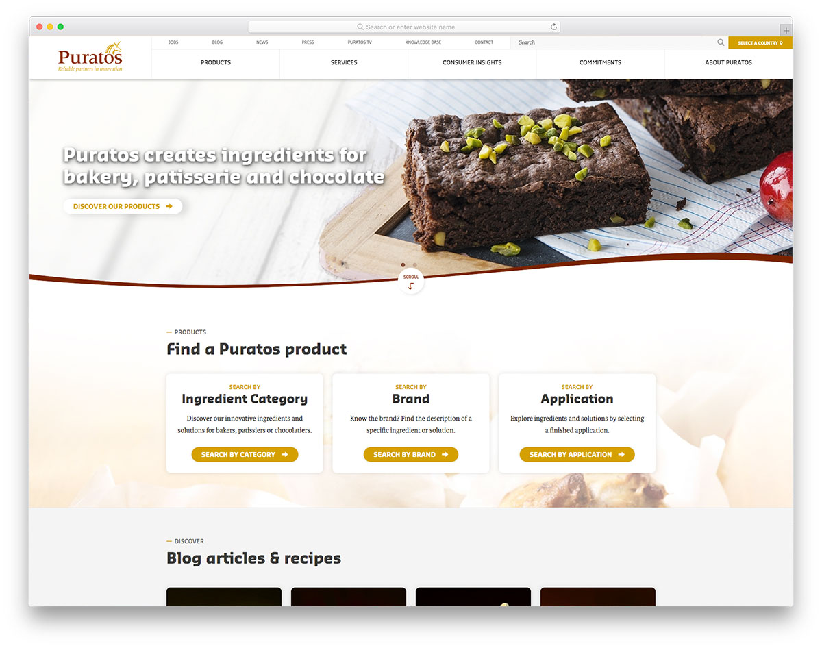
You might consider this collection of bakery website designs if you’re looking for a useful tool for your upcoming bakery website projects. Puratos is an international group offering a full range of innovative products, raw materials and expertise to bakery and patisserie. The website has a classic design with essential elements added to it. It has an attractive image of the hero scene along with a call-to-action. Specifically, visitors can search the content via category, brand, or application. This way, it’s a lot easier for a user to navigate and access the product or service he wishes to avail. It also comes with a stunning structure of blog articles and recipes. The latest videos are also embedded in the website to engage more customers.
9. Hotel Praktik Bakery
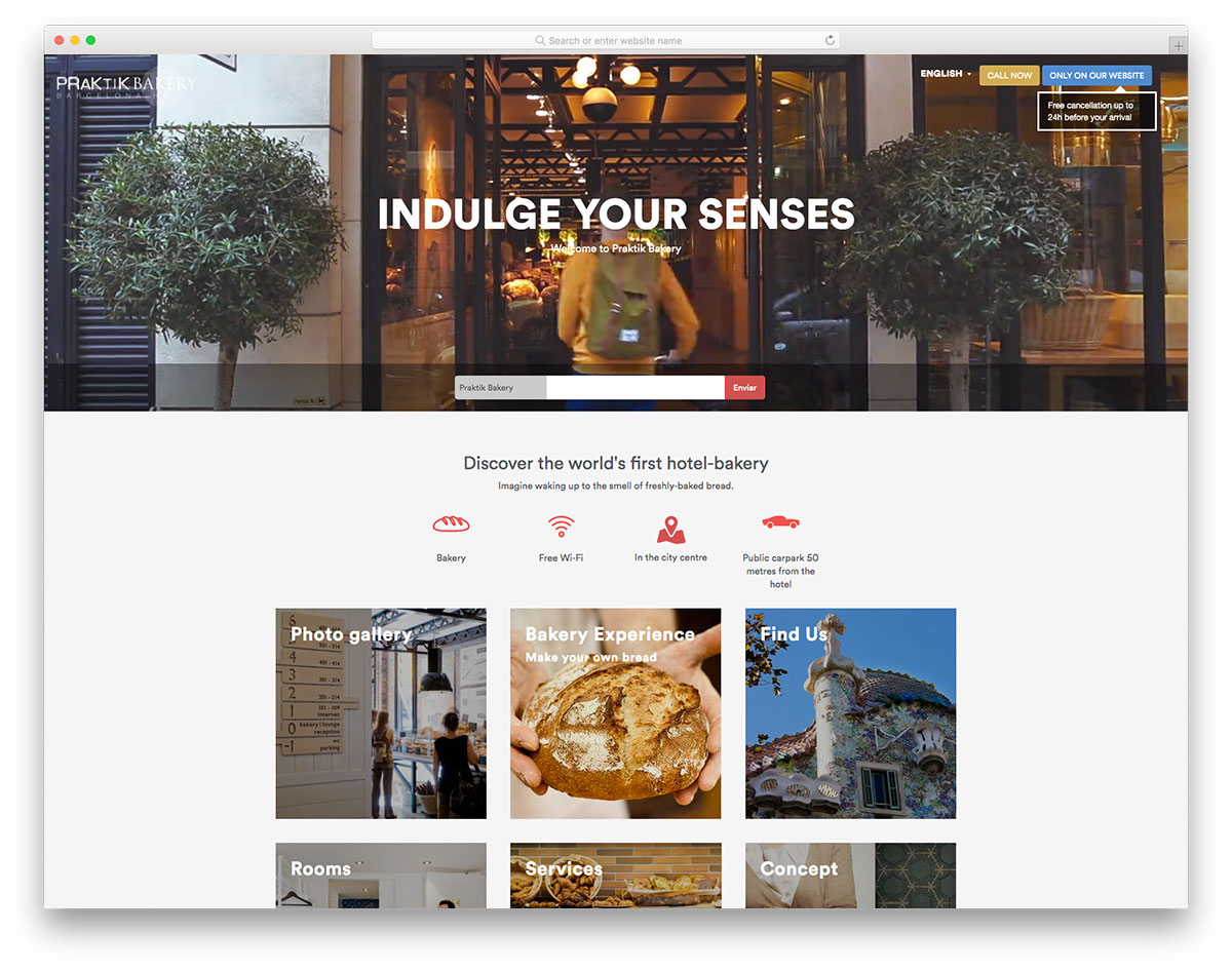
A simple yet worthwhile bakery websites design would help a lot to the success of enthusiasts, bakers, and entrepreneurs. Here’s Hotel Praktik Bakery that you should check out. It has a video background on the hero header, call-to-action, and a logo. Mainly, this website presents contents in a box-style layout where one can access phot0 gallery, bakery experience, rooms, services, and concepts. If a user wishes to search for available hotels with a bakery, this website is easier.
10. Goguettebread
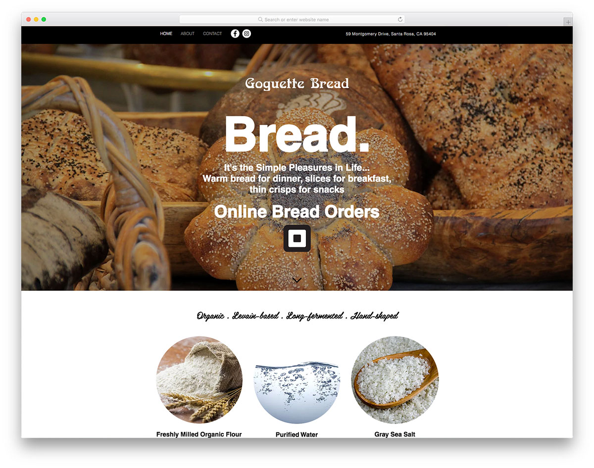
Having bold typography and full-width imagery with the parallax effect, the homepage of Goguettebread surely impresses a visitor. It has minimal content but is ready to provide an awesome web presence. Specifically, this website allows users to access Facebook and Instagram accounts to expand the business network visibly located on the header. As it is essential for a brand to showcase its outstanding features that outshine the rest, Goguettebread reveals reliable and healthy products it uses via images in rounded shapes. Another awesome feature is the cool animation of pouring water in one section.
11. Sidekick Bakery
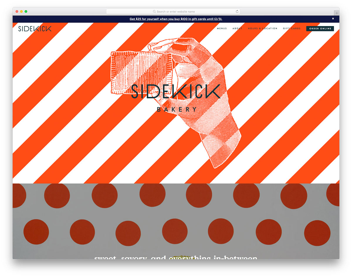
A brand must look for the best strategies to grow its business effectively. Luckily, almost every business can embrace a web presence to improve one’s business. Sidekick Bakery has minimal elements but has an attractive design. The homepage utilizes a colorful image background, parallax effect, CTA, and social media integration. Understanding the essence of sticky menu, Sidekick Bakery ensures that a visitor will have hassle-free navigation on the site. A user can access menus, about page, hours and location the business operates and gift cards. That’s not all, it also comes with a descriptive CTA that allows a potential customer to order bakery goodies online easily.
12. Windy Ridge Bakery
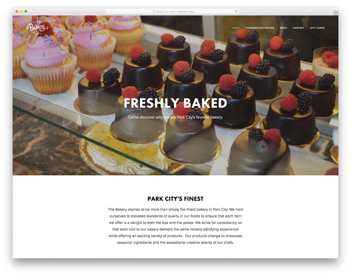
You probably need to make your business available online if you offer freshly baked goodies with delicious taste and excellent quality. This way, you can open greater opportunities for your business efficiently. Windy Ridge Bakery has an amazing design, good layout and visual hierarchy. The homepage has delicious and delightful-looking bakery products in a full-width display. Moreover, it even looks innovative as it implements the parallax effects. Of course, it’s still important that customers can easily read the contents you wish to convey. This website, showcases readable content with white space as its background. Other features are the newsletter, social media integration, and more.
13. Mah Ze Dahr
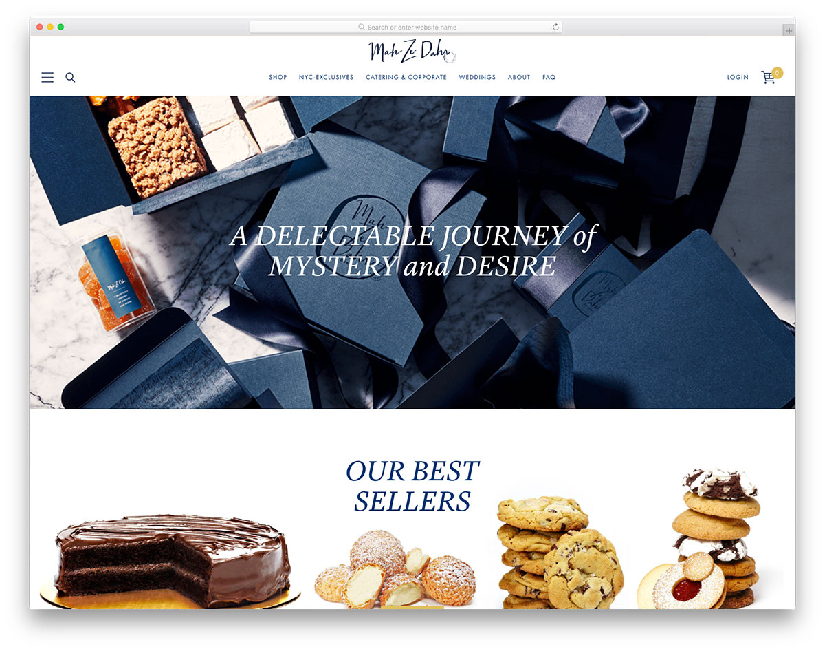
If you produce one of the finest bakery products in your location, you might want to expand your business via an online presence. Mah Ze Dahr is a great website worth including in this list of bakery websites design. It has a stunning, classic homepage design- dark-tone images and light headlines. Particularly, Mah Ze Dahr lets visitors shop online for best-selling products and bakery goodies for different occasions. On the other hand, if a visitor prefers to inquire about catering services, this website allows such services with well-labeled forms. Other notable features include a sticky menu, off-canvas menu, accordion, etc.
14. Boudin
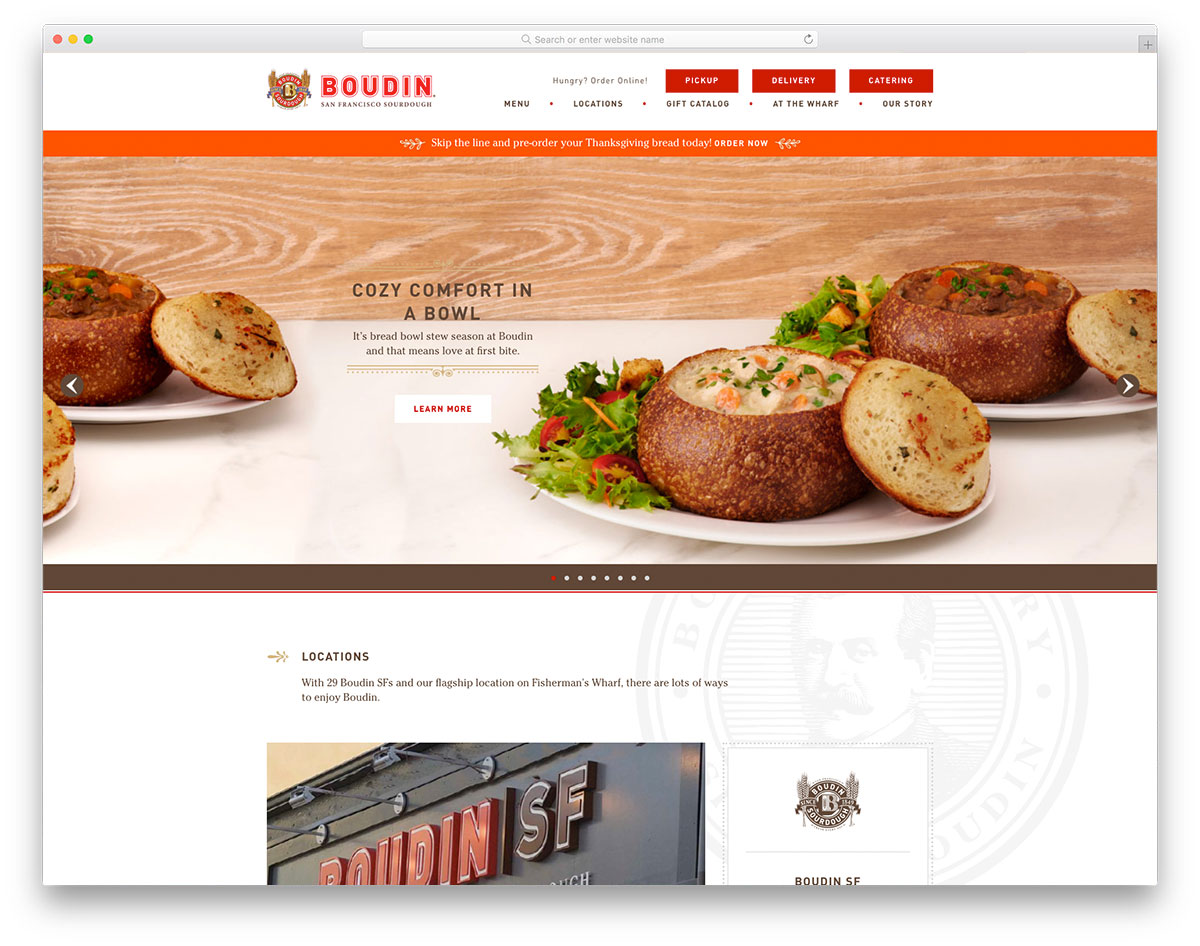
One of the best reasons to build a website is to offer customers a quick and easy way to connect with the business. Boudin always impresses the audience with the perfect and eye-catching CTAs on the header. Notably, the potential customer can choose for pickup, delivery, or catering services Boudin offers. It also has a nice slider on the hero header- ample, attractive, and mouth-watering images. Compelling copy also looks grandeur with awesome borders around it and high-quality images. The website also showcases the featured menu with a simple yet engaging style. Since social media is essential for almost all brands today, this website never ignores its essence. Therefore, it integrates social media on the footer.
15. August First
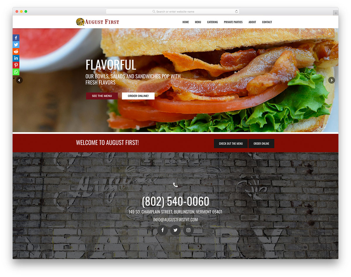
Nowadays, buying and selling stuff online is just at the tip of the finger. Likewise, most customers expect to order food online. August First is an awesome inspiration to look into for bakery websites design. It has an engaging and striking homepage – clear CTA, delicious-looking image, and powerful tagline. The website also implements social media on the homepage and an amazing slider. Since it is necessary to provide a clear view of how to connect with the business, August First added the contact number and social media icons on the parallax section. Moreover, a potential customer can easily check the menu and a captivating button to order easily.
16. Terra Breads
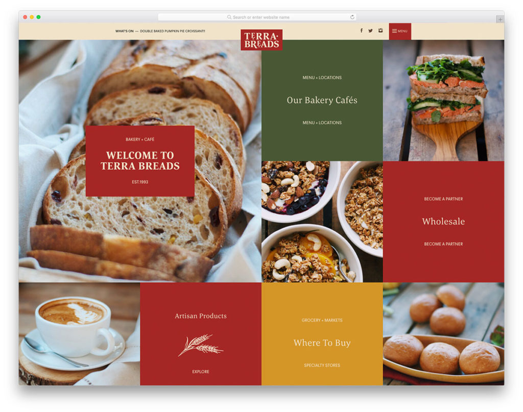
Sometimes, daring structures and designs of websites can easily stun visitors without compromising functionality. Terra Breads makes a stylish arrangement of elements on its webpage. It utilizes a grid layout of images and menu options. It also uses the sticky header where social media accounts and the off-canvas menu is located. Specifically, a visitor can access the menu and locations of the business, how to become a partner with Terra Breads, products and more. In like manner, the Instagram feed is presented creatively too. This way, potential customers can easily check tasty, delicious-looking products and events on Instagram.
17. Tiff’s Treats

Indeed users love stunning imagery. Hence, always pick the best shot in your gallery to introduce your brand well. Tiff’s Treats embraces a lovely display of imagery on the hero header through the slider. It also uses thin yet attractive and readable typography too. This website provides ample ways to navigate through the content. You can access the menu on the sticky header, look into the menu available or slide the images. It also uses ample white space to carry a strong visual force. In addition to that, the website stands out as it utilizes blue as its primary color.
18. The Little Tart
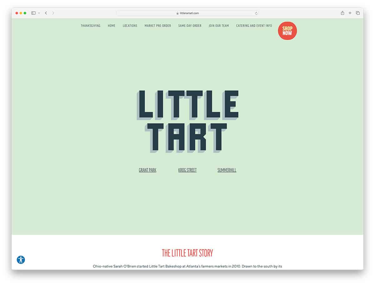
Instagram plays an essential role in marketing your brand. Hence The Little Tart implements a seamless and magnificent display of imagery on the Instagram feed. Images play vital roles in website design. Therefore, images should be of high quality to improve marketing. The Little Tart has a spectacular display of images through a slider on the homepage. The website has an excellent fixed background and a few smaller boxes leading to other pages. In particular, this website also has a sticky footer with the contact page linked with “join our team” and “order an e-gift card”. Check out other features of this bakery website!
What Makes A Great Bakery Website?
- High-Quality Photos: Mouth-watering photos of your baked goods can entice visitors. These photos should be high-quality, well-lit, and professionally taken to showcase your products.
- Easy Navigation: A simple, intuitive site structure makes it easy for visitors to find what they’re looking for, whether it’s your menu, hours, location, or contact information.
- Online Ordering and Delivery Options: Especially in the current climate, having the ability for customers to place orders online for pickup or delivery is a must.
- Menu and Pricing: A clear, easy-to-read menu with pricing is a must. This should be updated regularly to reflect seasonal items or specials.
- Contact Information and Location: Make it easy for customers to find you by prominently displaying your address, phone number, and hours of operation. Incorporating a Google Maps widget can also be helpful.
- About Us Page: Share your bakery’s story. People love to know about the history, the bakers, and the philosophy behind the food they love.
- Customer Reviews and Testimonials: Show off positive reviews and testimonials from happy customers. This can help build trust with potential new customers.
- Social Media Integration: Make it easy for visitors to find and follow you on social media. This can help you build a community around your bakery and keep customers updated on new products, specials, or events.
- Responsive Design: Your website should be mobile-friendly. Many people will look up your bakery on their phone, so it’s important that your site looks good and functions well on smaller screens.
- SEO Optimization: Your website should be optimized for search engines to increase your visibility online and attract more customers.
- Newsletter Signup: You can collect email addresses for updates, promotions, or special offers.
- Blog: A blog can help you share recipes, baking tips, news, and events. This can also help improve your SEO.
Remember, the most important thing is that your website reflects your bakery’s unique brand and makes customers want to visit not just your website but also your bakery.
How to create a bakery website?
Now that you have seen all the best bakery website examples, how about building your own website? Here are the best drag and drop website builders to get you started. They all come with domain name hosting and dozens of bakery starter templates. These tools don’t require any previous knowledge and you will be able to setup a beautiful and professional website within a few hours.
Things You Need To Create a Website For Bakery
- Domain Name: This is your website’s address on the internet. It should ideally include the name of your bakery for easy recognition.
- Web Hosting: This is where your website files are stored. You’ll need to choose a reliable web hosting provider.
- Website Platform: This is the tool you’ll use to build your website. WordPress is a popular choice due to its flexibility and ease of use. Other platforms like Wix, Squarespace, or Shopify are also user-friendly and offer design templates.
- High-Quality Images: You’ll need professional-grade photos of your products and bakery. These images will be used throughout your site to showcase your offerings and entice customers.
- Content: This includes all the written information on your site, from product descriptions to your bakery’s history. This content should be engaging and well-written.
- Logo and Branding: Your bakery’s logo and overall branding should be consistent throughout the website.
FAQ: Bakery Website Design
A successful bakery website design should include high-quality images of the products, an easy-to-navigate layout, clear branding, contact information, a menu or product list with prices, customer testimonials, and an online ordering or reservation system, if applicable.
An online presence is crucial for a bakery as it allows potential customers to discover the bakery, explore its offerings, and engage with the brand from anywhere at any time. It can also facilitate online orders and increase overall sales.
To make your bakery website stand out, focus on unique branding, incorporate custom photography, offer an exceptional user experience, and add personal touches such as the bakery’s story or a blog with baking tips and recipes.
Yes, a bakery website should be optimized for mobile devices since many users will visit the site from their smartphones or tablets. A mobile-responsive design ensures the website is accessible and user-friendly across all devices.
Absolutely! Integrating social media on your bakery website is a great way to connect with customers and showcase your products. Include links to your social media profiles and consider displaying a live feed of your latest posts.
Regular updates are important to keep your bakery website fresh and relevant. Update product offerings, prices, hours of operation, and news or events regularly. Additionally, posting new content such as blog posts or seasonal promotions can help attract repeat visitors.
Professional photos can make a significant difference in the appeal of your bakery website. High-quality images of your baked goods can entice customers and give them a better sense of what to expect. Consider hiring a professional photographer to capture your products in the best light.
To improve the user experience, ensure your website loads quickly, has a clear and intuitive navigation structure, features readable text, and straightforwardly provides all the necessary information. Also, consider adding features like online ordering to enhance convenience.
Yes, an ‘About Us’ page is important as it helps customers connect with your bakery on a personal level. Share your story, mission, and the passion behind your baking to create a more engaging experience for visitors.
Your contact information should include the bakery’s physical address, phone number, email address, and hours of operation. Additionally, you can include a contact form for customer inquiries and a map to help customers find your location easily.
Was this article helpful?
YesNo
