Here are some of the best examples of architect website designs to inspire your own online presence.
What makes your architectural services stand out from the rest? If your expertise in architecture exceeds the client’s expectations, you can’t miss the great opportunities digital marketing offers your business. Feast your eyes with these super creative websites and discover the most innovative architectural website design you could ever behold.
Typically, architects offer professional services to design public and private building structures. However, their profession is not merely set in that goal. Aside from the overall aesthetic look of the buildings, they must also ensure the public’s functionality, safety, and welfare. That’s how deep the essence of architecture is. Hence, architects deserve the best website to advertise their expertise and experience in the architecture industry. Indeed, hiring web designers to create the best website is an excellent choice for architects. But with the numerous premade themes available on the market, it’s easier to pick the one that suits your taste. While that choice is excellent, having many architectural website designs for inspiration is undoubtedly valuable. You’ve just come to the right place if you need such inspiration!
In this set, you can find extraordinary and innovative architecture websites to showcase their creative works and promote their brands. So, don’t miss this list and pick the features you must incorporate into your architecture website design project.
Best Architecture Website Design Examples
1. Patchwork Architecture
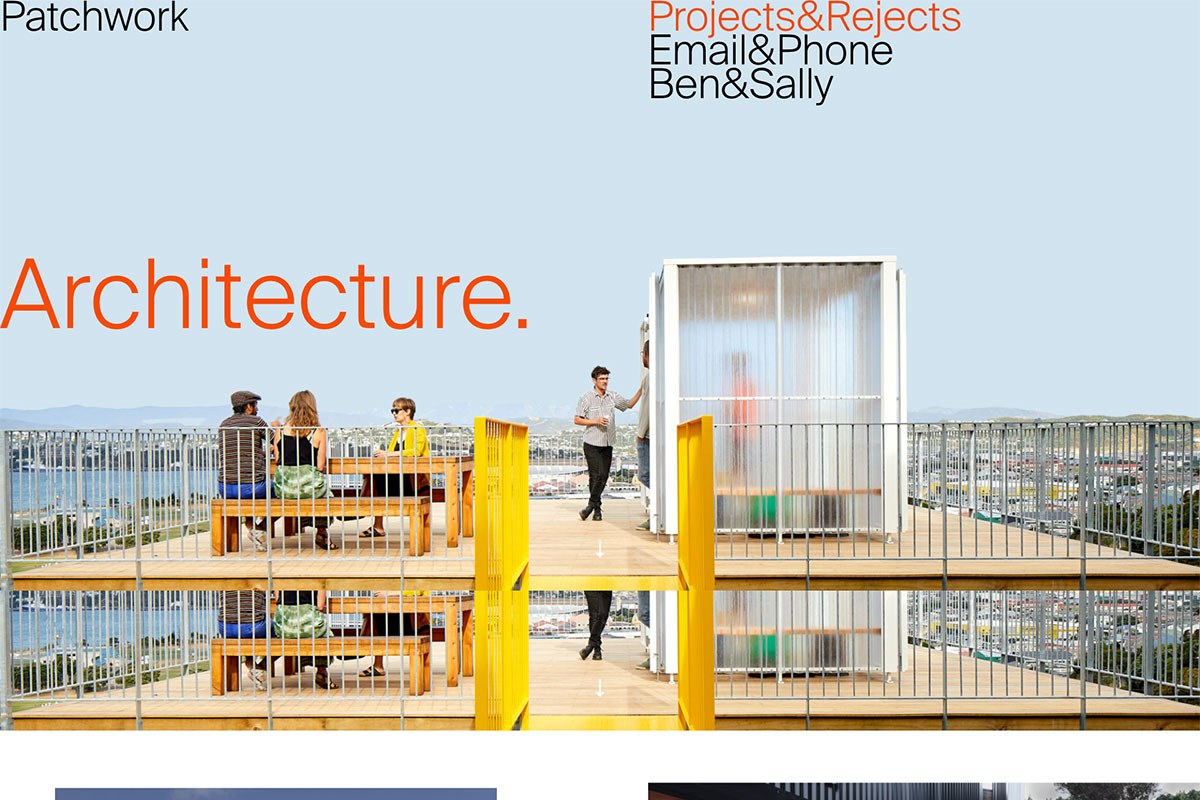
Almost all industries embrace the power of digital marketing. So, if you’re an architect who doesn’t have a portfolio yet, you might have missed greater opportunities for your career. Patchwork Architecture has a wide range of experience, on jobs large and small, residential and commercial. It exists to help clients create beautiful, efficient, and economic spaces to suit purpose and location. It has an out-of-the-box design layout but is truly understandable. The extraordinary works of the firm are presented in an asymmetrical layout coupled with white space and an amazing hover effect. Similarly, the website’s inner pages also have stunning designs with cool and subtle animation upon scrolling.
2. Measured
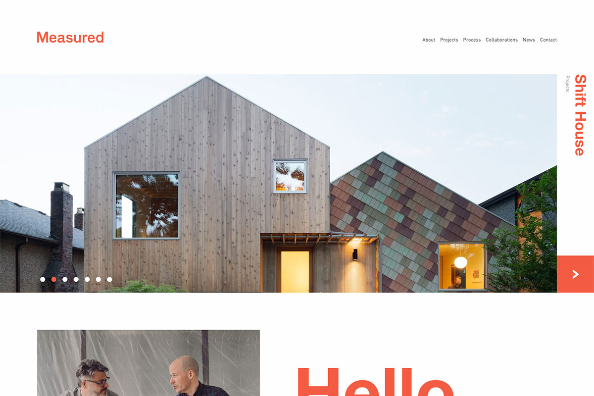
A good dose of simplicity plus amazing visual impact greatly describes Measured. It’s a Vancouver architecture agency focusing on modern design, interiors, and landscapes. They are adept in delivering exceptional public and private environments. With a fully functional and creative website, it’s ready to spread its brand awareness. The homepage manifests a beautiful, asymmetrical layout with high-quality images that adds aesthetic features. The sleek slider highlights the previous projects of Measured with an attractive CTA, names on the sidebar, and a sticky menu in the header. Moreover, the news section also looks gorgeous and the newsletter subscription.
3. ABCD Architect
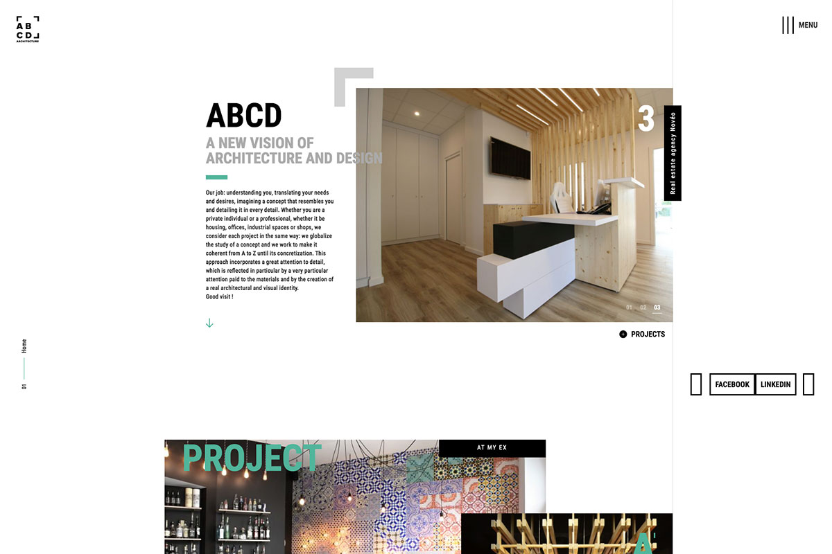
It is never a waste of time and resources with a strong web presence as brands opt for digital marketing. Of course, the website must represent the quality of services and products the brand offers. ABCD Architect has a great architecture website design led by a team of passionate, experienced architects and graphic designers adept in sketches, 3D modeling, videos, and virtual reality. In particular, the design of the homepage is quite impressive and out-of-the-box. From smooth sliders, awesome hover effect, animation upon scrolling to white space and off-canvas menu, they’re excellent and add elegance to the overall design. That’s not all, other pages are as impressive as the homepage, too so it’s not just a mere architecture portfolio.
4. Humbert & Poyet
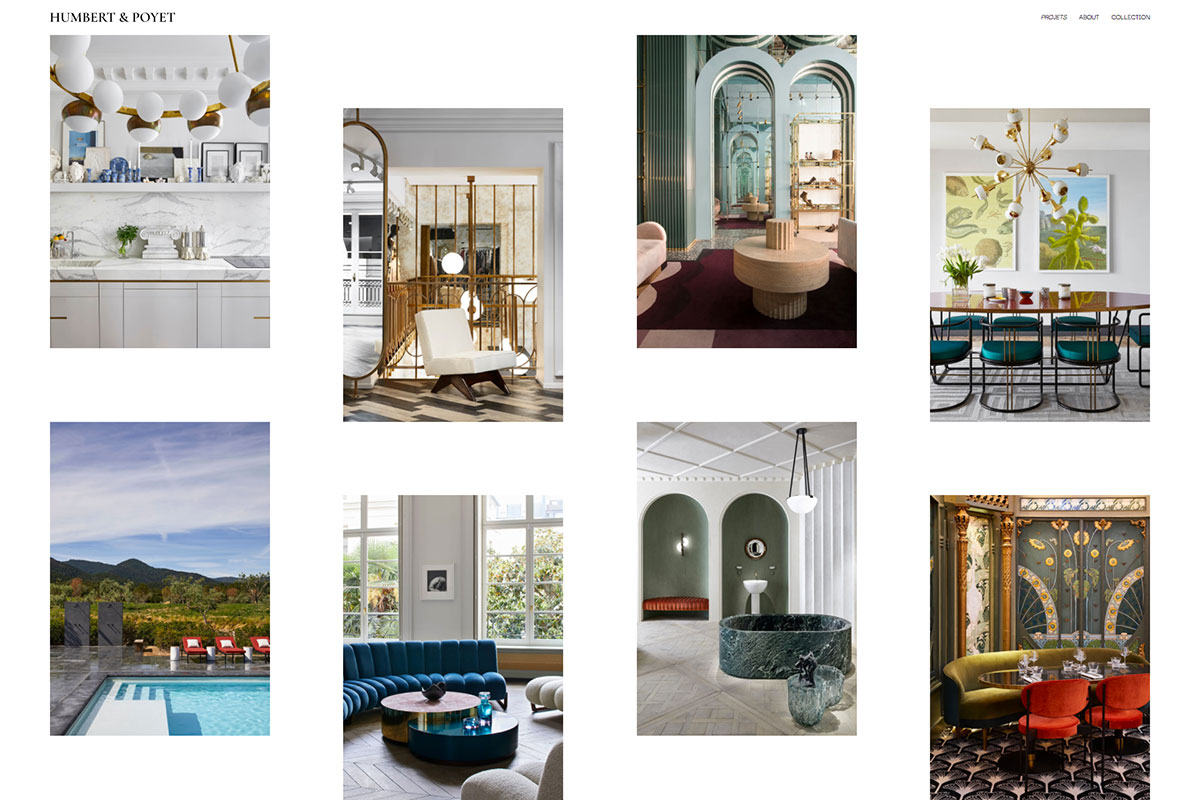
An architect’s works are beyond the looks of the buildings they design. It’s their primary goal to keep buildings safe and functional. Humbert & Poyet has an excellent website design that can inspire other architects. They’re both experienced architects who create the finest restaurants, offices, villas, apartments, hotels, etc. in different places. Particularly, the design of the homepage is unique. With the desire to showcase well their awesome projects, the audience can see nothing but all their successful architecture projects. Similarly, the inner pages are seamless, with a simple menu and a cool slider that showcases various images.
5. Ark-Shelter
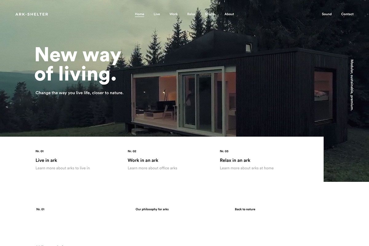
Architects who work diligently to create a design concept that meets the client’s requirements should have a website to exhibit awesome works. Ark-Shelter is crafted with outstanding architecture website design. With its amazing goals – “to give you an escape and a shelter to protect you” the firm stands out and complements its website. As exceptional as its vision, Ark-Shelter’s website is visually appealing and more creative. The hero scene welcomes with a video background, simple menu, brand name, and a headline. It also has a clean and minimalist introduction with visual hierarchy integration. Moreover, the nice and smooth slider used in highlighting their wonderful and creative architecture adds extra creativity to the overall design.
6. Amanda Martocchio
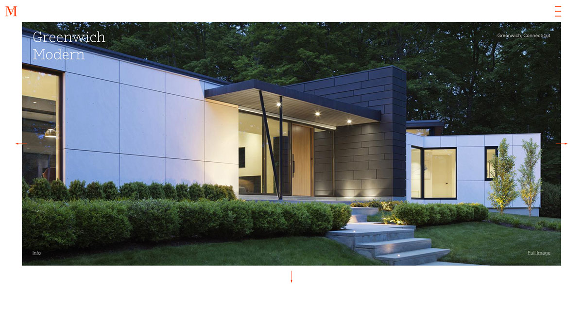
Generate more leads to your architecture business with a wonderful website to promote your brand worldwide. Amanda Martocchio exhibits her expertise through her splendid architecture website design. She’s a skilled architect working on large-scale cultural and commercial buildings and later design projects at a closer range to impact more lives. Her website displays a fullwidth image at first but automatically adjusts as it is scrolled. Images are more captivating than text, so the homepage has large images representing projects arrayed one after the other. Each of the projects has a slider that highlights important details. It also utilizes an off-canvas menu for a clean display of navigation.
7. Archi Site Mobius
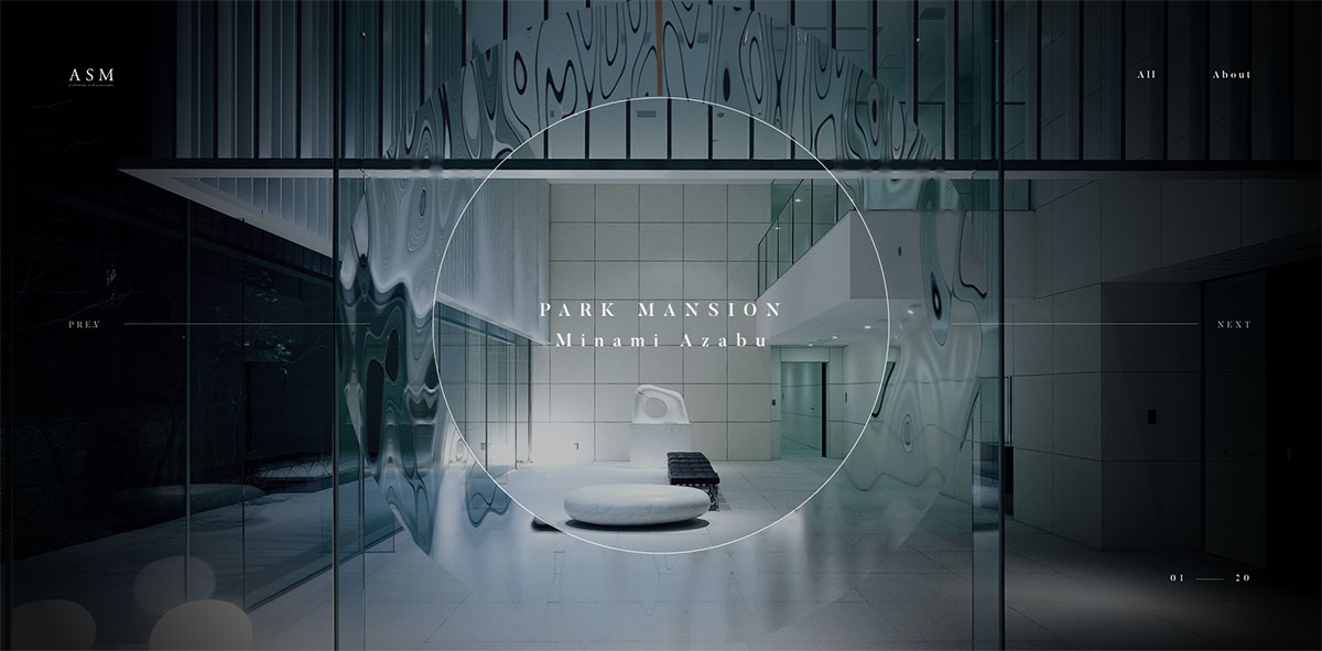
Unlock more opportunities and shine in the highly competitive market with a great architecture website design. Archi Site Mobius is a potential inspiration for fellow architects to examine. It seeks to create spaces with serenity and is excited to share its expertise through its website. Like most innovative websites today, ASM utilizes the popular GSAP animation in the project exhibition. Particularly, the transition effect from one project to another is impressive and clever. The homepage comes with the brand’s name, about page, all project presentations, next and previous buttons. More and more images are displayed on the inner pages to introduce a specific project.
8. Maman-Corp
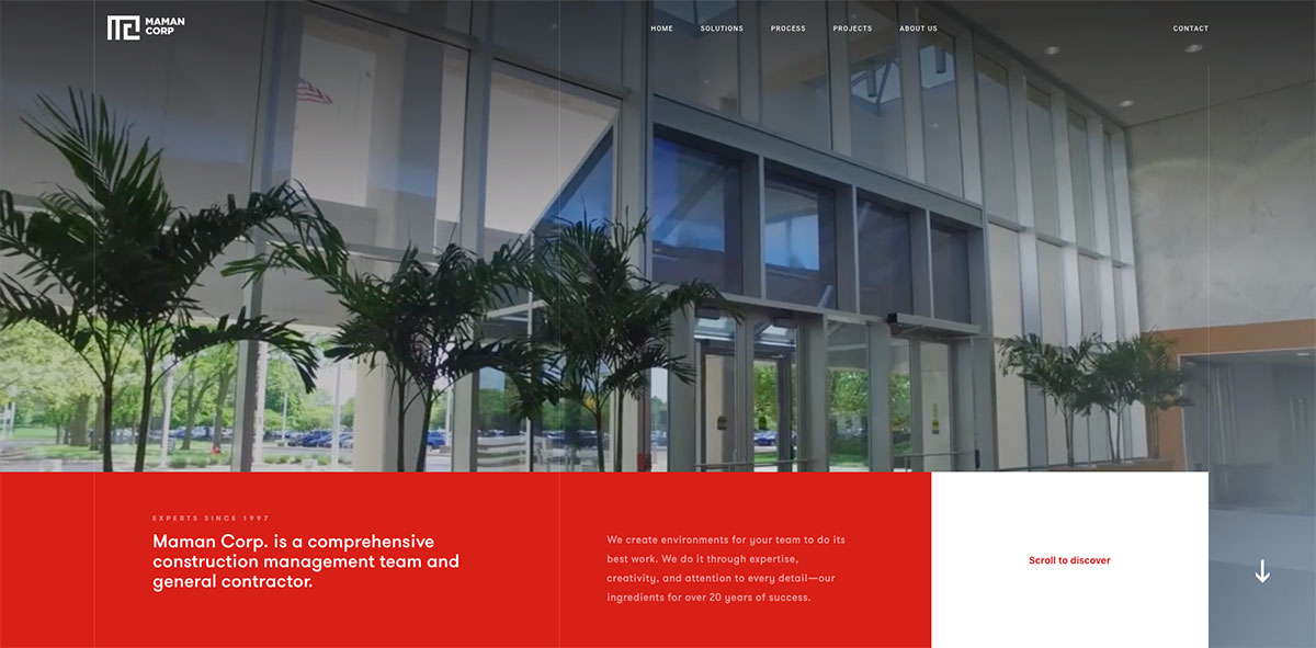
From planning, designing, and constructing buildings, architects have the skills to make such projects safe and aesthetically appealing. Maman-Corp exists to build spaces and create environments where teams can grow, thrive and innovate. In like manner, this architecture firm has customized solutions for new construction, additions, and renovations. One of the most creative architecture website designs never impresses potential clients. Thanks to the power of GSAP animation, implementing such animations is possible. The homepage has essential elements such as awesome transition effect, video integration, etc. It also embraces the power of white space in the success of every website. Check out other amazing features this brand has for fellow architects.
9. Zikzak
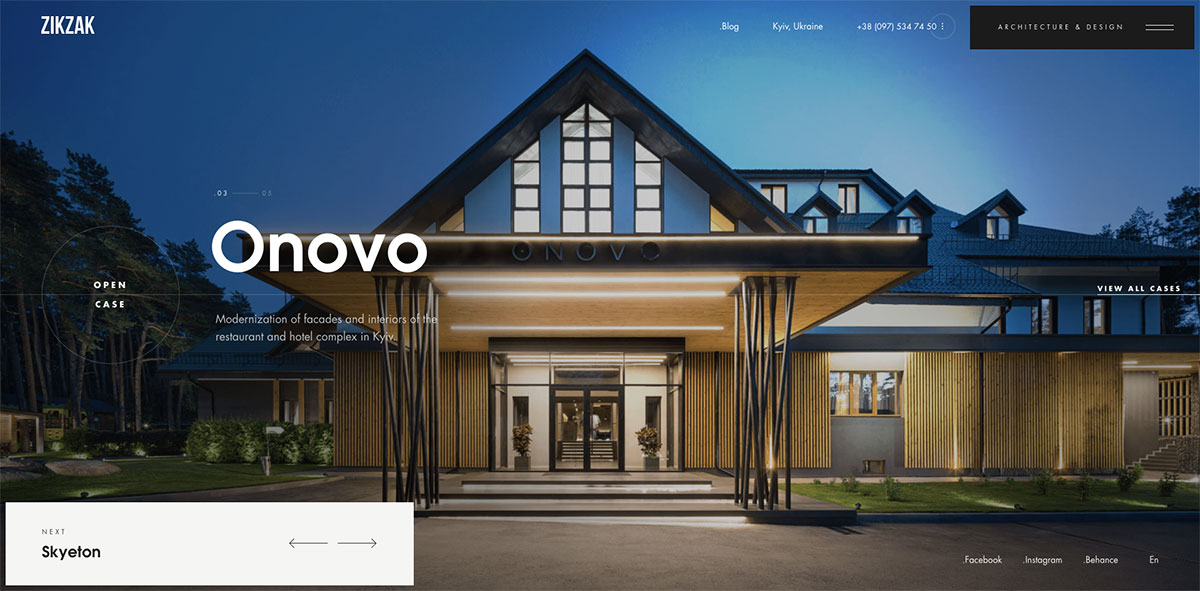
Promoting your brand worldwide is now possible with a website that effectively markets your products and services. Here’s another remarkable architecture website design that’s worth checking. Zikzak is hooked with its goal – to create designs with perfect quality and creativity. A result-oriented team has yielded visually excellent designs and is fully functional. The website reveals the capabilities of this firm when it comes to architectural design. The homepage highlights the amazing projects by using a nice slider but retains the menu, logo, social network links, and contact number. Furthermore, the project page is extremely impressive as it utilizes the masonry layout to present the images of their works.
10. Archi-Graphi
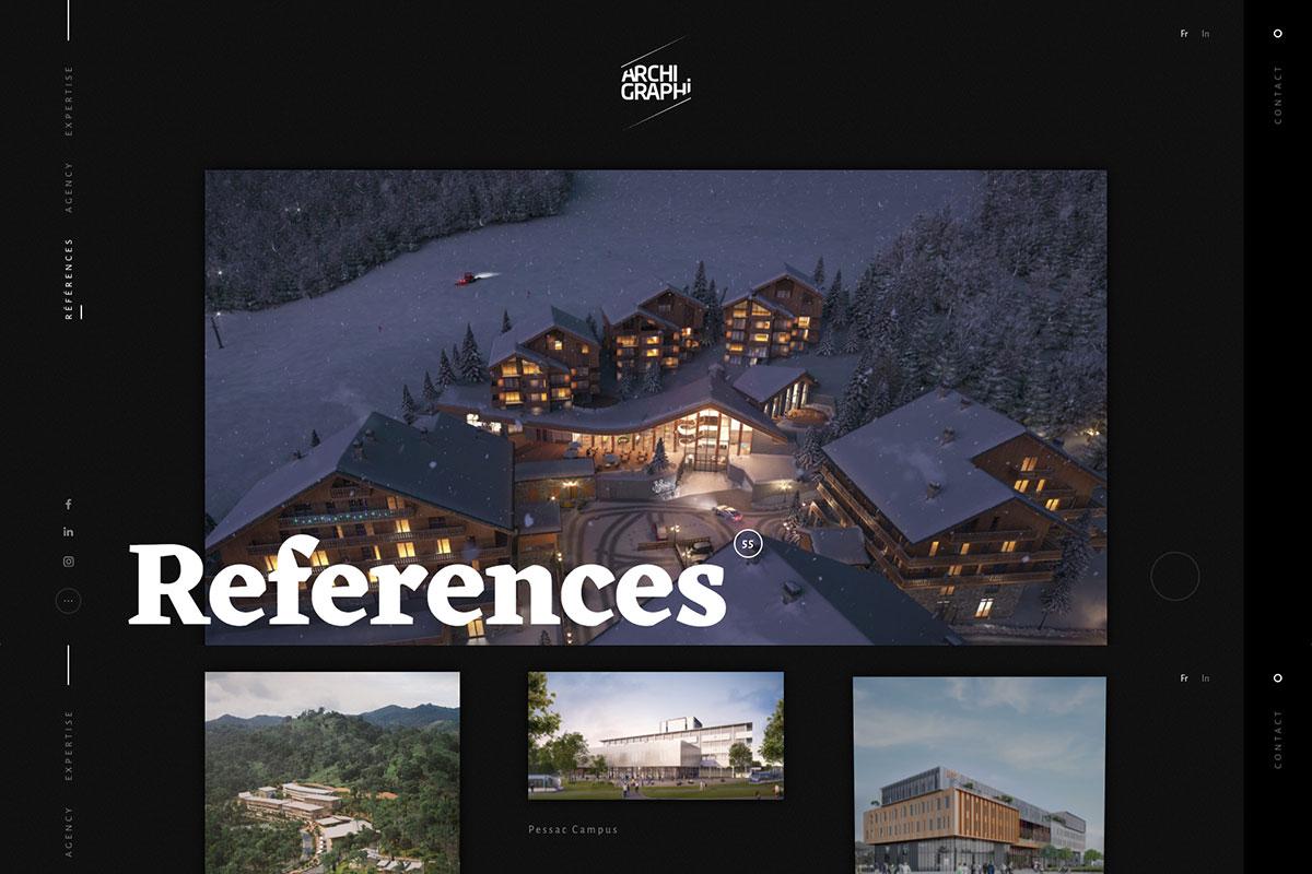
Establish and grow your business with an intuitive website with advanced features. If you’re an architect looking for inspiration, you’ve just landed in the right place! Archi-Graphi is a great architecture website design that can kindle the interest of fellow architects. Specifically, the website has features that can make the brand shine. It has a beautiful presentation of works on the homepage where the potential client has different options for viewing the projects, such as perspective, interactivity, identity, or movie. All of those projects are arranged through the use of a masonry layout. It also has a unique display menu where clients can check the firm’s expertise, references, and the agency that makes the projects possible.
11. Pelizzari
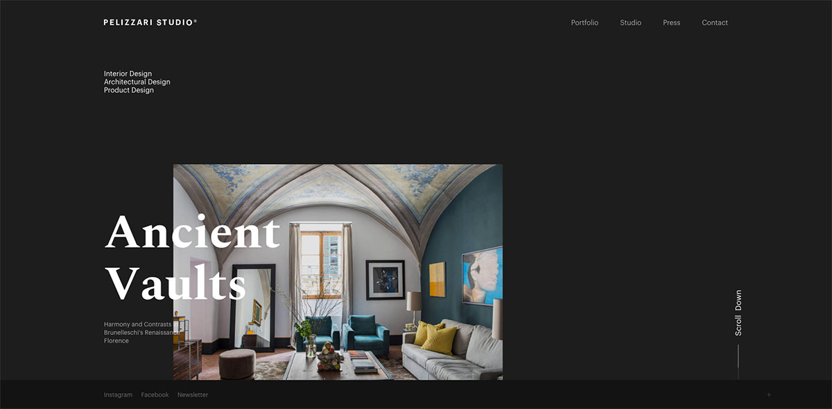
Feast your eyes with these super creative architecture website designs that have the power to kindle the interest of every skilled architect. Pelizzari is one of the amazing websites you shouldn’t miss checking. This firm appears ready to shine in the architecture industry with greater emphasis on professionalism, accuracy, punctuality, and privacy. Its website has a simple homepage design but says a lot about its expertise. The design is simple but comprehensive and innovative with the integration of GSAP animation. Similarly, the inner pages also look stunning with quality images added to it and the visual hierarchy and white space. Altogether, the elements in this website are pretty cool and useful.
12. Mafco House
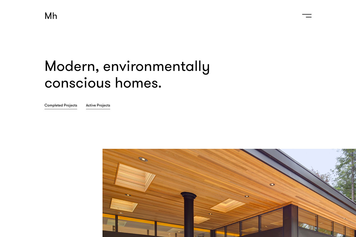
Mafco House loves to build modernist homes in Canada. Specifically, it has built over 40 homes with timeless design and functionality. Like other architecture firms, it has a great website to entertain potential clients wherever they are 24/7. Embracing the excellence of white space in the design, its website implies sophistication and makes it look attractive. While that feature is irresistible, the visual hierarchy plays a greater role in presenting the content. Well, with this website, the content is truly compelling and understandable. From large, quality images to beautiful typography plus a smooth slider, such features are perfect! See which features you should be acquiring soon from this inspiration!
13. Mareines Arquitetura
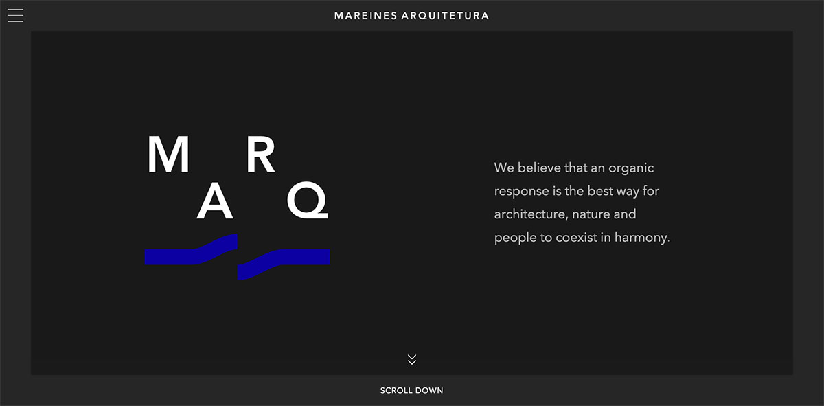
Building a website is not about visually appealing designs but functionality. However, as most people look at appearance, it would be best to have a well-designed website for brand promotion. Mareines Arquitetura is a studio that seeks innovative solutions to different businesses needs. Its website has creative elements combined to showcase its expertise in architecture. The homepage appears magnificent with the simple and subtle animation using the GSAP animation. The visitor can easily scroll down the page, and each section is revealed smoothly via the slider with CTAs for viewing the project and quality images. While the scrolling is innovative, visitors can use the off-canvas menu to access other necessary pages. The inside pages also have ample images to showcase with awesome white space.
14. Canatal
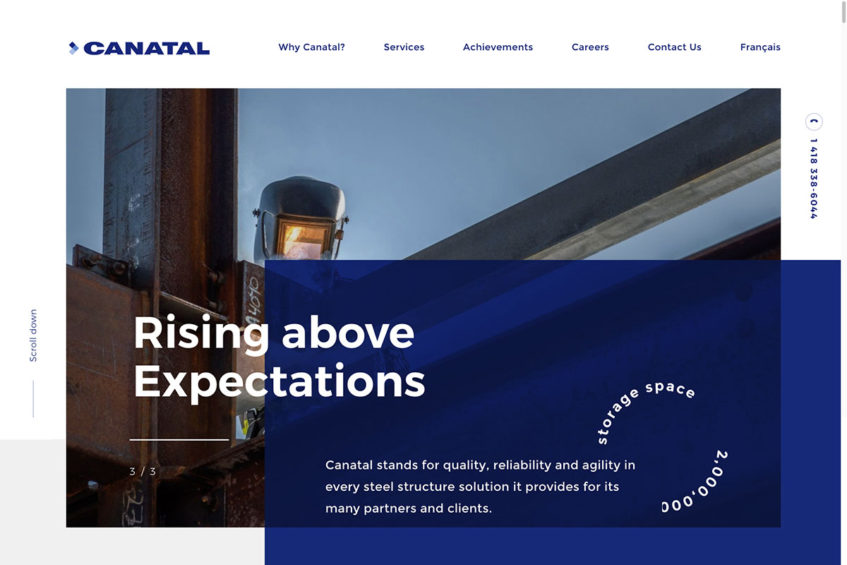
Need inspiration for redesigning your website? Brace yourself with these fantastic architecture website designs that inspire you on your next project. Canatal is a company that fabricates and installs steel structures with solution-oriented thinking, proactivity, and agility. The website reveals excellent designs ideal for inspiration. The homepage’s design utilizes remarkable animations and looks captivating with an asymmetrical layout. From animation upon scrolling, white space, visual hierarchy, and good typography, such features make the website striking and breathtaking. Other notable features this website exhibits are video integration, a super cool slider, excellent hover effect, quality images, and so much more!
15. Henning Larsen
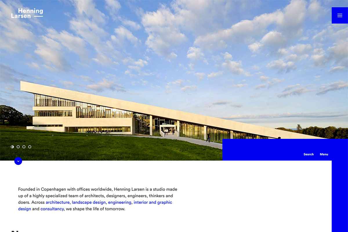
Whether it’s building or renovating a home or office, the role of architects is not to be ignored. They exist to keep buildings aesthetically pleasing for safety and welfare. Henning Larsen is one of the most progressive and professional architecture practices worldwide. Its website is crafted with innovation and excellence as awesome as its services. Quality images are highlighted using a smooth slider to present the works. It’s even more interesting with the integration of GSAP animation. As blogs help build credibility and search engine optimization, this website never ignores its importance. Moreover, the featured projects look seamless, with huge images and awesome typography.
16. Henry J Lyons
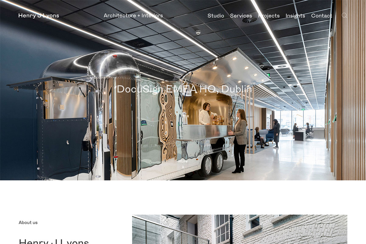
With expertise in architecture, interior design, master planning, and heritage projects, Henry J Lyons is ready to impress every visitor with a breathtaking website design. The hero header is a wonderful display of imagery using a nice slider. While the images add elegance to the invention, the white space makes it look sophisticated and comprehensible. Moreover, GSAP animation also makes the overall design captivating. Furthermore, the project page also looks cool and seamless, with clear images and white space between them. Meanwhile, the website also has a nice and simple menu, making it easier for a potential client to explore the studio, services, projects, and insights. Check out other useful features you can acquire with this inspiration.
17. Maadi Group
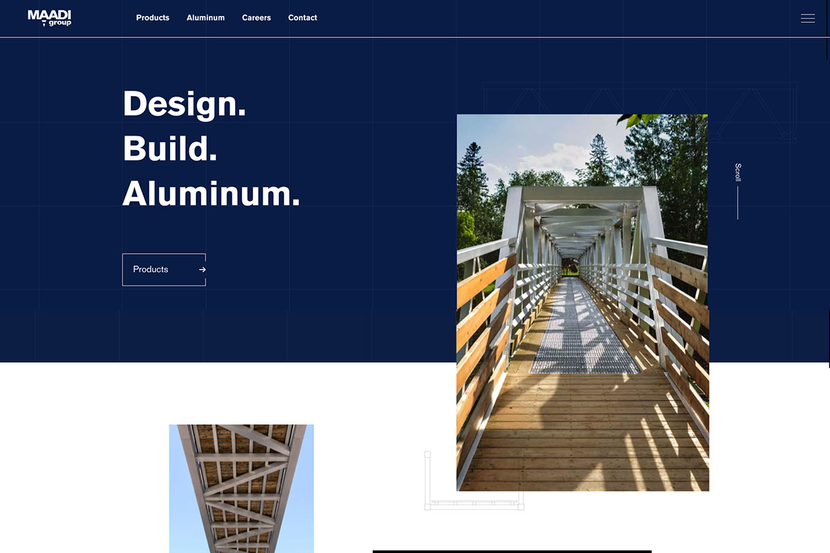
Don’t miss these architecture website designs that can inspire fellow architects worldwide. So, better jot down the features you’d love to implement on your upcoming website project. Maadi Group has an extremely impressive design that embraces the awesomeness of GSAP animation. It exists to provide the most advanced structural designs and building solutions to clients. Hence, its website is crafted to improve its brand across the web. The homepage is loaded with amazing features to wow clients. The hero header has a nice design with CTAs, images, and sliders to improve the look and feel of the site. Moreover, the animation upon scrolling adds sophistication to the overall design.
18. Mason Group
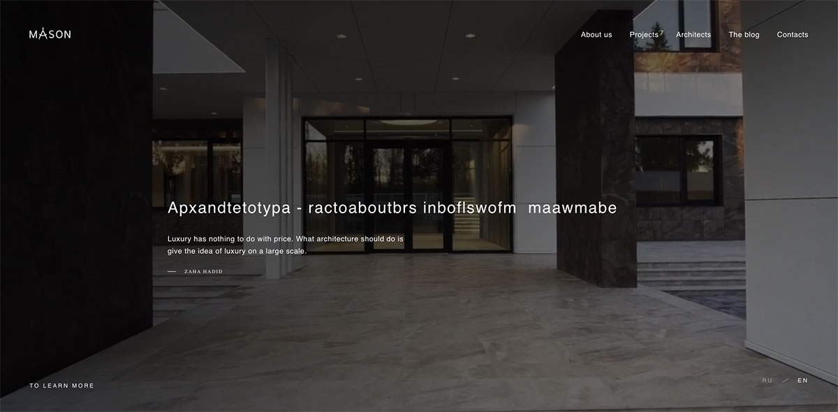
Promote your architectural services and unlock more opportunities for your brand to excel in the industry with a great website. Here’s Mason Group, an architectural and construction company specializing in designing and constructing premium-level facilities. It has a striking architecture website design that can enhance the firm’s credibility and arouse the interest of other architects. The homepage showcases big projects through the use of a smooth slider. While those projects look superb, the menu on the header is ready to provide quick and easy navigation to other necessary pages. Typically, the project presentation should be outstanding to impress clients with this website, projects are truly adorable with the GSAP animation. Explore this website today and pick the irresistible features.
Was this article helpful?
YesNo
