Are you on the lookout for the perfect Squarespace podcast templates to showcase your work?
Well, you’re in luck!
In this article, we’re diving into the world of Squarespace to bring you a curated list of the best podcast templates designed to elevate your show’s online presence.
It doesn’t matter if you’re just starting or want to freshen up your current site; we have something for everyone.
Take your professionalism to the next level by creating an actual website, so you don’t 100% rely on 3rd-party platforms.
Hint: You can also use your website for blogging and promoting your social media to expand your reach over and beyond.
Are you ready?
This post covers:
Best Squarespace Podcast Templates
Before you make the pick, let’s set the stage for what makes these tools stand out.
Each one is hand-collected for its unique features, ease of use, and ability to engage your audience, ensuring your podcast sounds great and looks amazing online.
Do you need inspiration? Check these top-notch Squarespace website examples.
1. Sundew
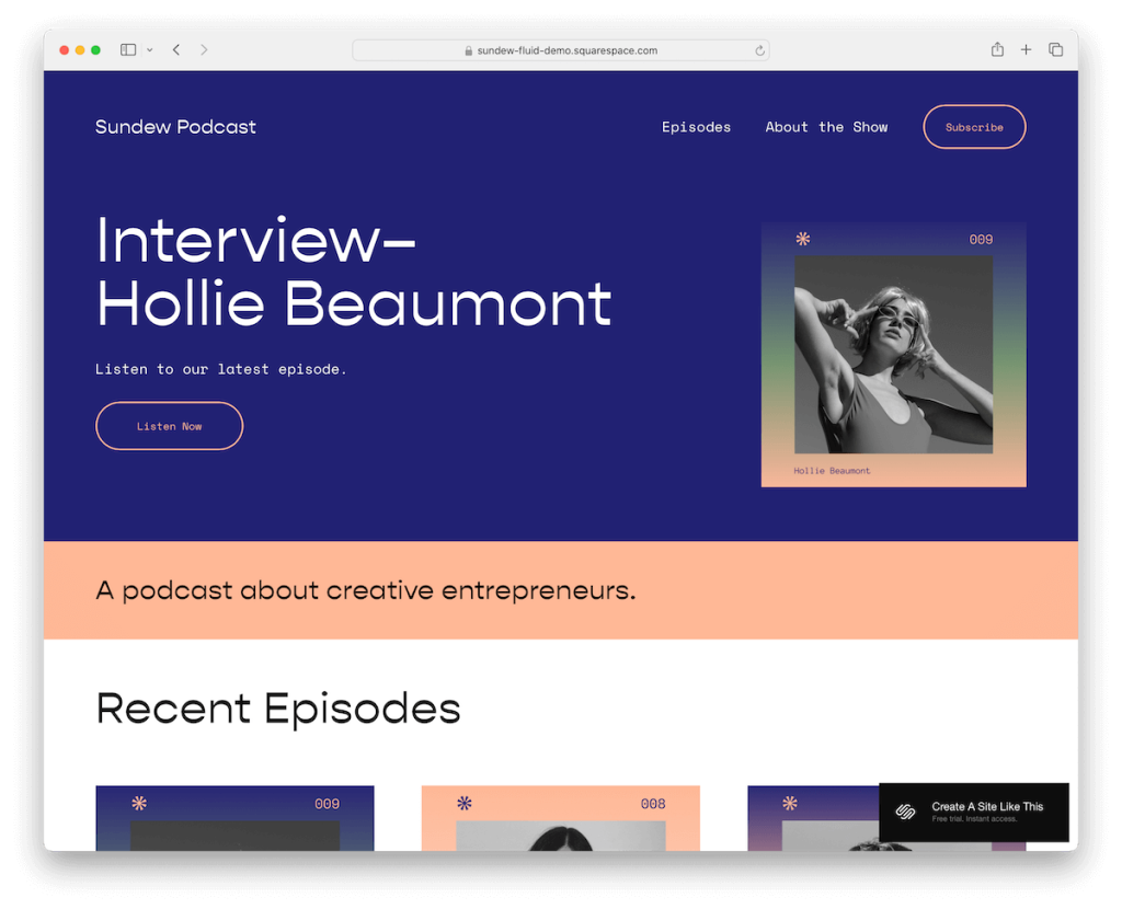
Sundew Squarespace template captivates with its elegant, transparent header that vanishes as you scroll, only reappearing when you navigate back to the top, ensuring a seamless user experience.
A prominent “subscribe” button in the navigation bar invites listeners to connect, while the dynamic content loading keeps the audience engaged.
Each podcast episode page is thoughtfully designed with next/previous buttons, enhancing discoverability.
The footer rounds off the experience, offering handy links to social media and various podcasting platforms.
2. Paloma

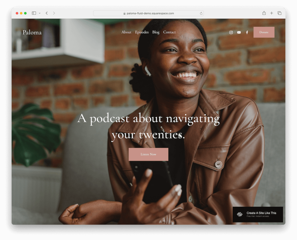
Paloma podcasting template stands out with its full-screen image background above the fold, seamlessly complemented by a clean, transparent header.
This minimalist masterpiece elegantly houses menu links, social icons, and a “donate” button within its header, striking the perfect balance between aesthetics and functionality. (See more minimalist website examples.)
The template’s simple footer and episode grid layout ensure a smooth browsing experience.
What we like are the neat episode pages that keep listeners focused on content.
3. Transmission

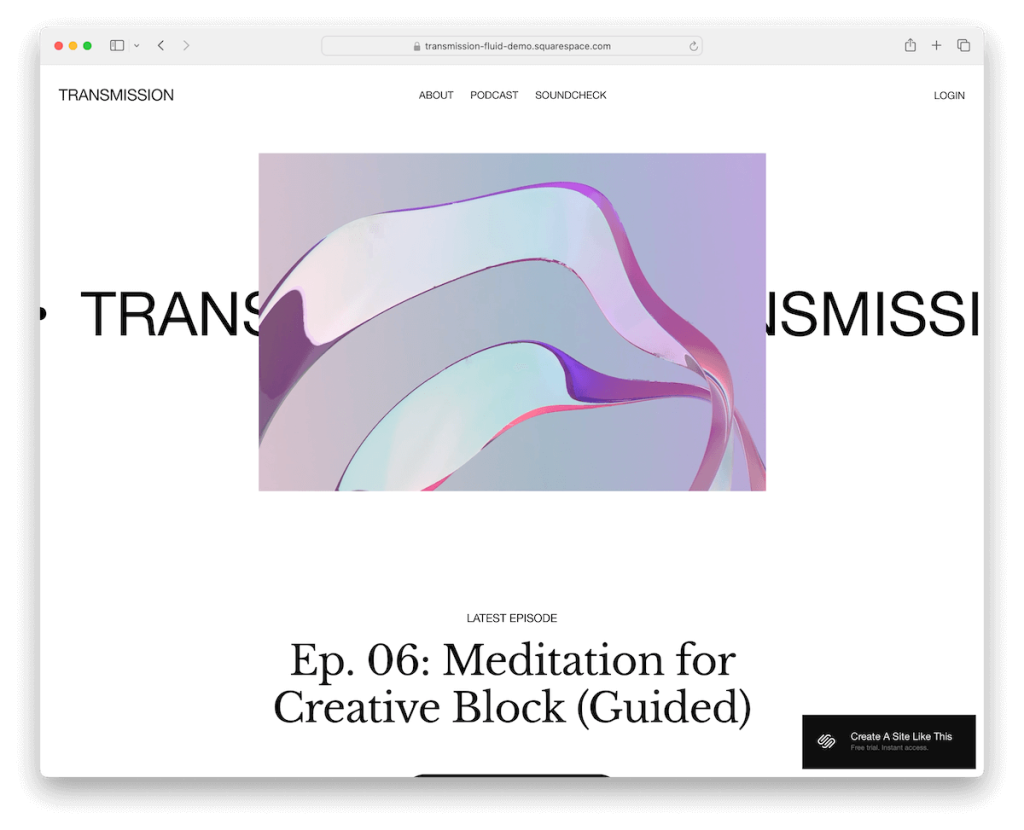
Transmission dazzles with its animated above-the-fold section, instantly capturing attention and setting a dynamic tone for the entire site.
Its minimalist and light aesthetic is maintained throughout, with a consistent white background for the header, base, and footer, ensuring a cohesive and clean look.
The cleverly designed header discreetly disappears as you scroll down, reappearing when you return to the top, offering easy navigation.
The dedicated podcast and episode pages make content organization a breeze, establishing Transmission as a top pick for podcasters seeking a blend of animation and simplicity.
4. Nova

Nova is a Squarespace podcast template with customizable graphics and a sleek, modern design. It perfectly blends form and function for a standout online presence.
Content elegantly loads as you scroll, keeping audiences engaged and immersed in your podcast narrative.
Strategically placed CTA buttons in the header and throughout the page prompt action, while a testimonial slider and Instagram feed add a personal touch and social proof.
The contrasting dark footer (don’t miss these great footer examples) anchors the design, offering a visually striking conclusion to the user’s journey.
5. Montreal

Montreal mesmerizes with its parallax scrolling site effect, adding depth and dynamism to your podcast’s online home.
Its unique design is highlighted by cool menu links that illuminate upon hover, offering an interactive user experience.
The template boasts a feature-rich footer with menu links for easy navigation, social media buttons for increased connectivity, and an Instagram-ready feed to showcase your visual content.
Montreal’s distinctive aesthetic and functional features make it an exceptional choice for podcasters who want to captivate and engage their audience with style.
6. Seoul

Seoul amazes with its impactful color scheme, featuring bold dark sections that command attention and convey sophistication.
The template’s use of the parallax effect adds a layer of depth and engagement, drawing listeners deeper into your content. The setup process is streamlined with predefined internal pages, so you can get your podcast website up and running in no time.
Furthermore, a podcast subscription form is prominently placed, encouraging audience growth. At the same time, the large and practical footer provides ample space for essential information and links, making Seoul a standout choice.
7. Perfectionist

Perfectionist bursts with vibrancy and energy, designed to charm and engage.
This Squarespace podcast template comes fully equipped with ten pre-made pages, including About, Podcast, Speaking, Blog, and Services, saving you plenty of time.
Included Canva graphics add a professional touch to the visual appeal, while custom layouts are tailor-made for coaches, experts, and speakers, emphasizing their expertise.
The template’s design elements are effortlessly customizable, ensuring your site can evolve with your podcast.
Perfectionist is an excellent choice if you’re looking to establish a dynamic and inspirational online presence.
8. Tryp

Tryp represents sleekness, offering special pages designed for easy and rapid podcaster website creation. Who doesn’t want to build a site fast? Yeah, I thought so.
Its video background and subtle animations add a layer of sophistication and dynamism, captivating visitors upon arrival.
Accordions unfold for additional information without cluttering the space, maintaining a clean atmosphere.
The testimonial slider builds credibility, while strategically placed CTA buttons invite listeners to tune in.
A seamlessly integrated subscription form encourages audience engagement and growth. All this makes Tryp a compelling choice for a polished and interactive podcast page.
9. Primrose

Primrose makes a striking statement with its daring black and pink contrast, setting a vibrant and energetic expression for podcast websites.
Customizable doodles add a personal and creative flair, allowing podcasters to infuse their unique brand personality.
The floating header, with menu links, social icons, and a call-to-action button, ensures vital navigation tools are always within reach.
A dedicated podcast page features links to 3rd-party platforms, facilitating easy access for listeners.
Primrose’s full-width design maximizes screen space, delivering an immersive and visually impressive user experience.
10. Influence

Influence is the model of modern minimalism, featuring a sleek one-page website design that encapsulates all essential elements in a single, fluid scroll.
(Keeping everything only a few scrolls apart can significantly boost your site’s user experience.)
Its hip aesthetic is complemented by a sticky navigation bar with jump links, ensuring a smooth and intuitive user journey.
The template includes a neatly integrated contact form, a dedicated section for showcasing an Instagram feed, and a subscription form to build your listener base.
Influence’s tasteful approach combines style and functionality for podcasters searching for a compact yet impactful Squarespace template.
11. Lemongrass

Lemongrass offers a refreshing take on website design with its six long-form scrolling pages, facilitating a narrative journey through your podcast’s story and content.
Its unique customizations and minimal yet highly adaptable design allow for a tailored look that can evolve with your brand.
The inclusion of a drop-down menu enhances navigability, while a testimonial slider adds credibility.
A light header contrasts beautifully with a vibrant footer, creating a visually appealing balance that engages visitors.
Are you looking for depth and flexibility in design? Then go for Lemongrass.
12. Identity

Identity is a masterpiece of contemporary minimalism, tailored for podcasters in the market for a trendy edge.
This Squarespace template comes packed with nine ready-to-use demo pages, simplifying the setup process. Plus, it ensures a cohesive look across your site. (No need to build anything from scratch.)
Including stylish Canva graphics elevates the visual appeal, while a carousel for popular articles keeps your audience engaged with your best content.
The template features a prominent CTA button in the navbar, a dedicated section for newsletter subscriptions, and a striking black footer.
Identity is not just a template but a statement.
13. Rose

Rose blooms with a dynamic look, combining a vibrant yet light color scheme that infuses your podcast website with energy and warmth.
The immersive video background and subtle animations bring your content to life, winning visitors from the first click.
Handy accordions expand to reveal additional information without overwhelming the layout, and the testimonial section adds a layer of trust and community feedback.
Rose is ideal for podcasters who desire a visually engaging, interactive site that mirrors the liveliness of their audio content.
14. Quinn

Quinn exudes sophistication with its high-end, refined editorial design, perfect for podcasters aiming to make a statement.
The attention-grabbing slider above the fold sets a dynamic tone, while the testimonial slider builds credibility through listener feedback.
Content gracefully appears as you scroll, creating an interactive run-down that keeps you glued to the screen.
The brand collaboration logo section enhances professional appeal, and an Instagram reel feed integrates social dynamics.
A dark footer houses a subscription form, menu links, and social icons, rounding off this elegant template with functionality and style.
15. Penny

Penny is a gem for podcasters seeking simplicity with a punch.
Its single-page structure ensures a smooth, uninterrupted user journey, where every detail is just a scroll away.
The clever use of accordions tidily packs extra information, keeping the layout clean and focused. An episodes section showcases your latest work, while the “About me” area adds a personal touch.
The animated text brings vibrancy to the story, and a contact form invites engagement, making Penny a comprehensive platform for podcasters and listeners to connect.
16. Podcast Page

Podcast Page redefines uncluttered elegance with its one-page format, avoiding a traditional header for a cleaner, more immersive UX.
Its thoughtful blend of light and dark background sections, enhanced by the subtle parallax effect, adds depth while ensuring the content stands out.
Generous white space is masterfully employed, promoting readability and allowing each element to breathe.
The footer, featuring a subscription/download opt-in form, strategically encourages listener engagement and growth.
Podcast Page is ideal for podcasters prioritizing clarity, simplicity, and listener interaction.
How To Make A Podcast Website With Squarespace
Creating a podcast website with Squarespace is a straightforward process that can help you showcase your episodes and engage with your audience.
Here’s a how:
- Sign up or log in: Visit the Squarespace website and sign up for a new account or log in if you already have one. (Choose the plan that best fits your needs.)
- Choose a template: Browse through the tested and proven Squarespace templates above and select the one that suits the style and needs of your podcast.
- Customize your template: After selecting your template, use the Squarespace editor to customize it. You can change the layout, colors, fonts, and more to match your podcast’s branding. Don’t forget to add essential pages/sections such as About, Episodes, Contact, and any other relevant sections for your listeners.
- Add your podcast episodes: Squarespace allows you to upload audio files directly or embed them from popular podcast hosting platforms. Create a new post for each episode in the Blog or Podcast section, add a title, description, and the audio file or embed code.
- Integrate social media and podcast platforms: Link your profiles and podcast platforms (like Apple Podcasts, Spotify, etc.) to your Squarespace site. This can help you grow your audience by making it easier for listeners to follow, share, and subscribe to your podcast across different platforms.
- Preview and publish: Before going live, preview your website to ensure everything looks and works as expected. Once you’re satisfied, publish your website.
FAQs About Squarespace Podcast Templates
Can I upload my podcast episodes directly to Squarespace?
Yes, Squarespace allows you to upload audio files directly to your website. You can add episodes by creating audio blocks or blog posts with audio files.
Yes, Squarespace automatically generates an RSS feed for your podcast when you use the Blog Page to publish your episodes. This RSS feed can be submitted to podcast directories like Apple Podcasts and Spotify.
Can I integrate 3rd-party podcast hosting services with my Squarespace website?
Yes. While Squarespace allows direct uploads, you can also embed episodes from 3rd-party podcast hosting platforms like Anchor, Libsyn, or SoundCloud using embed codes or widgets.
Are Squarespace podcast templates mobile-friendly?
Yes, all Squarespace templates are designed to be responsive, ensuring your podcast website will look great and function smoothly on devices of all sizes.
Can I customize my podcast website’s design on Squarespace?
Yes, Squarespace offers extensive customization options to adjust the design, layout, colors, fonts, and more to match your podcast’s branding and aesthetic preferences.
How can I track the performance of my podcast on Squarespace?
Squarespace provides built-in analytics tools that give insights into your website’s traffic, listener engagement, and other key metrics. For more detailed podcast analytics, you may want to use the analytics provided by your podcast hosting service or integrate 3rd-party tools.
Was this article helpful?
YesNo
