Are you ready to feast on the best Squarespace dental websites?
Squarespace is a popular choice among dentists who want to create a professional and welcoming online space for their patients.
And the best part?
You don’t have to be a coding genius to create a top-notch website. In fact, no coding knowledge is necessary to work with Squarespace.
In this article, we’ll take you on a tour of the most impressive dentist websites powered by Squarespace.
From minimalist designs that prioritize ease of use to more dynamic sites packed with interactive elements, we have something for everyone.
These websites not only represent the best of dental web design but also serve as inspiration for anyone looking to create or revamp their online presence.
Let’s go.
This post covers:
Best Squarespace Dental Websites
Each site below showcases exceptional design, functionality, and creativity, setting the standard for what a dental website can achieve.
1. Seattle Dental Co
Built with: Squarespace
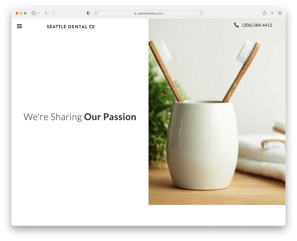
Seattle Dental Co’s Squarespace site’s sleek, modern design stands out nicely.
Upon landing, visitors are greeted with a dynamic split-screen design: engaging text on the left and a captivating image slider on the right.
A floating header offers easy navigation, featuring a drop-down menu and a clickable phone number for instant calls.
The site boasts a testimonial slider, clear opening hours, an integrated Google Map for directions, and a convenient online appointment form via Google Forms, enhancing user experience.
Note: Integrate an online appointment form into your dental website and keep your business more organized.
Why we chose it: For its innovative use of split-screen design and user-friendly features, offering a blend of aesthetics and functionality.
2. Dental Care Seattle
Built with: Squarespace
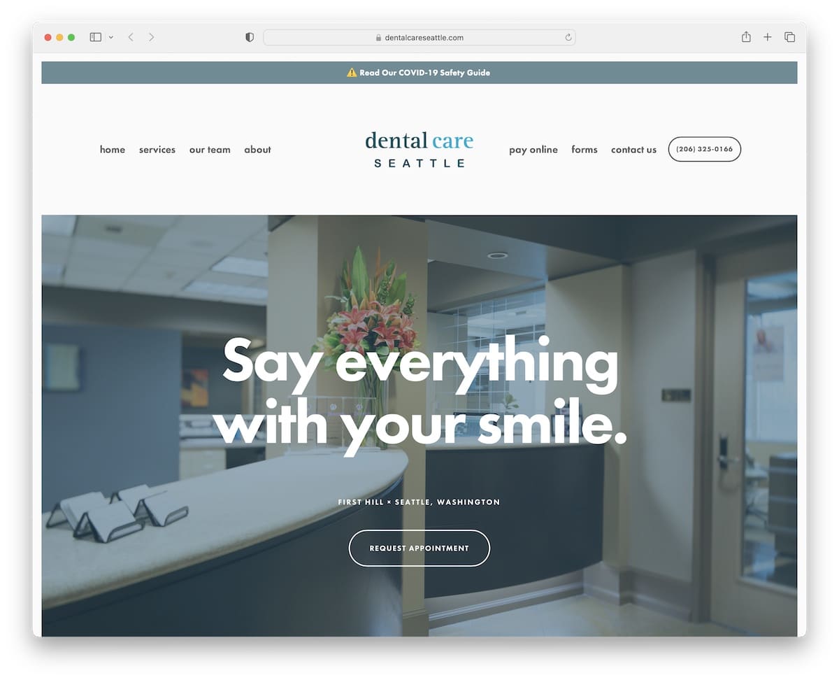
Dental Care Seattle’s Squarespace site captivates with its clean, minimalist design.
A top bar notification greets visitors, offering updates that are hard to miss.
The neat header simplifies navigation, while parallax background images add depth and motion, enriching the browsing experience.
The footer is thoughtfully organized into four columns. It includes additional information, quick links, contact details, and an embedded Google Map, ensuring everything a visitor might need is just a click away.
This website perfectly balances simplicity with comprehensive functionality.
Note: When building a dental site, aim for simplicity and cleanness in web design so your services, images, and other content pop more.
Why we chose it: For its minimalist design paired with engaging parallax effects and a well-organized footer and header.
3. North Beach Dental Care
Built with: Squarespace
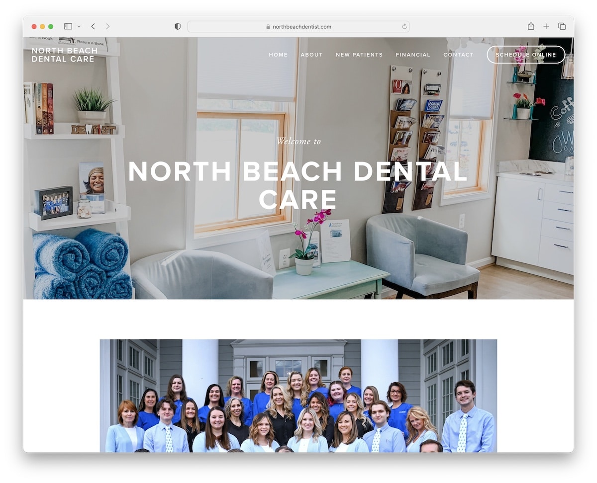
North Beach Dental Care’s Squarespace website grabs attention with its striking top bar notification banner, set against a transparent header for a sleek look.
An embedded video engages visitors, showcasing the clinic’s services and atmosphere.
The mobile version features an off-canvas hamburger menu, ensuring easy navigation on smaller screens.
Booking is streamlined through a third-party solution, enhancing user convenience.
The contact page includes a form and Google Maps, while accordions neatly organize additional information, making the site informative and easy to use.
Note: Showcase your dental clinic’s location with the convenience of Google Maps.
Why we chose it: For its engaging blend of visual contrasts, interactive elements (video) and seamless integration of a 3rd-party booking solution.
4. Winter Park
Built with: Squarespace
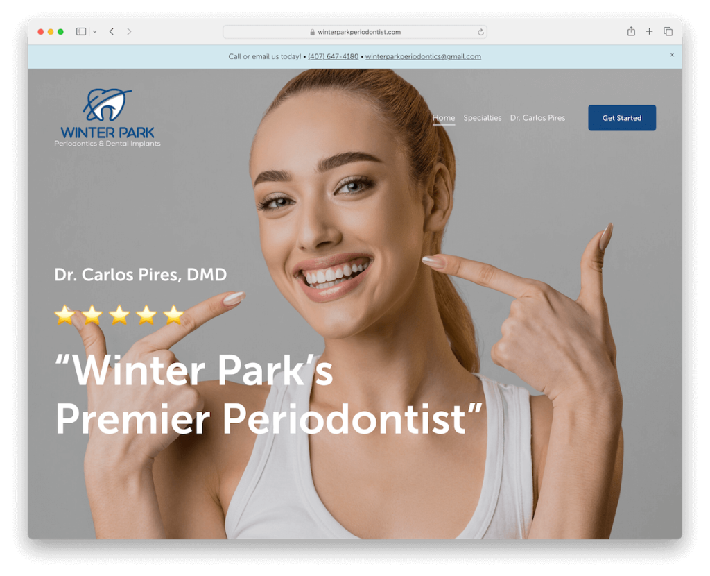
Winter Park’s Squarespace dental website impresses with a full-screen image background that immediately captures the viewer’s attention.
Its transparent header, which cleverly disappears and reappears based on scrolling direction, adds a touch of sophistication.
The site’s clean design emphasizes content, while testimonials with star ratings boost credibility.
To keep the experience fresh, the site uses dynamic on-scroll content loading.
Moreover, a contact form with checkboxes in the footer makes reaching out or providing feedback easy.
Note: Make yourself easily reachable with a clickable telephone number in the header and a contact form in the footer.
Why we chose it: For its full-screen imagery and intuitive navigation features, coupled with a clean design.
5. Remington Family Dentistry
Built with: Squarespace
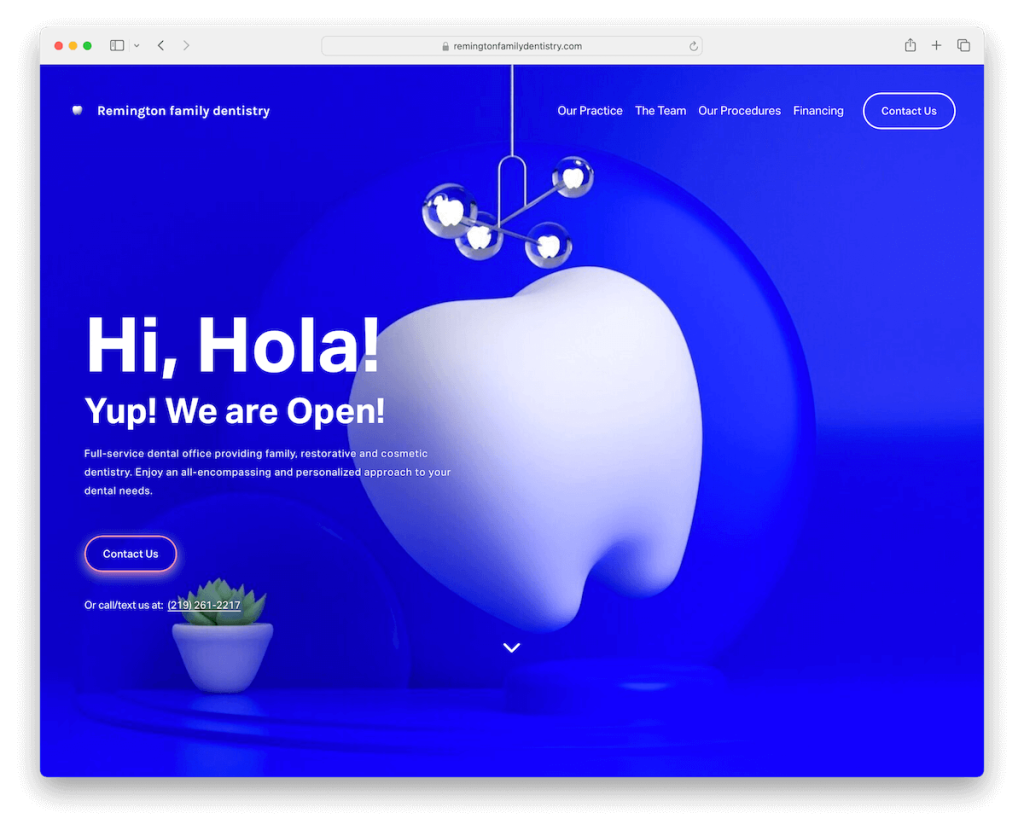
Remington Family Dentistry’s Squarespace website dazzles with its vibrant design and catchy color scheme.
A scroll-down button invites further exploration into the layout with ample white space, ensuring content is easily read and visually appealing.
Unique doctor blocks feature a “+” sign, revealing more information in an interactive manner.
An Instagram feed adds a personal touch, while animated “Ready for an appointment?” text, followed by a prominent Contact Us button, seamlessly guides users towards the next step.
Note: Implement branding colors into your website, so potential patients can relate.
Why we chose it: For its modern design elements, such as the expandable doctor blocks and animated call-to-action.
6. Cahaba Dental
Built with: Squarespace
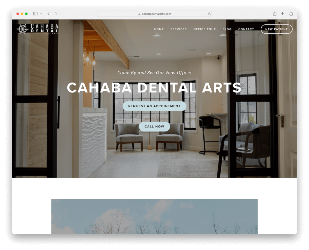
Cahaba Dental’s Squarespace dental site features stunning full-width hero and footer areas that sit elegantly on a boxed base layout.
A prominent call-to-action (CTA) button in the navigation bar ensures appointments are just a click away.
Pricing for new patients is transparently displayed, fostering trust right from the start. (Big plus!)
Testimonials, a feature-rich footer, an office gallery with a lightbox feature, and a (i)regularly updated blog section all combine to provide a comprehensive user experience.
Note: A dental blog can attract many new patients when you execute it strategically – but even more importantly, update it regularly.
Why we chose it: For its combo of pleasant atmosphere and practical features, such as transparent pricing.
7. Round Barn Dental
Built with: Squarespace
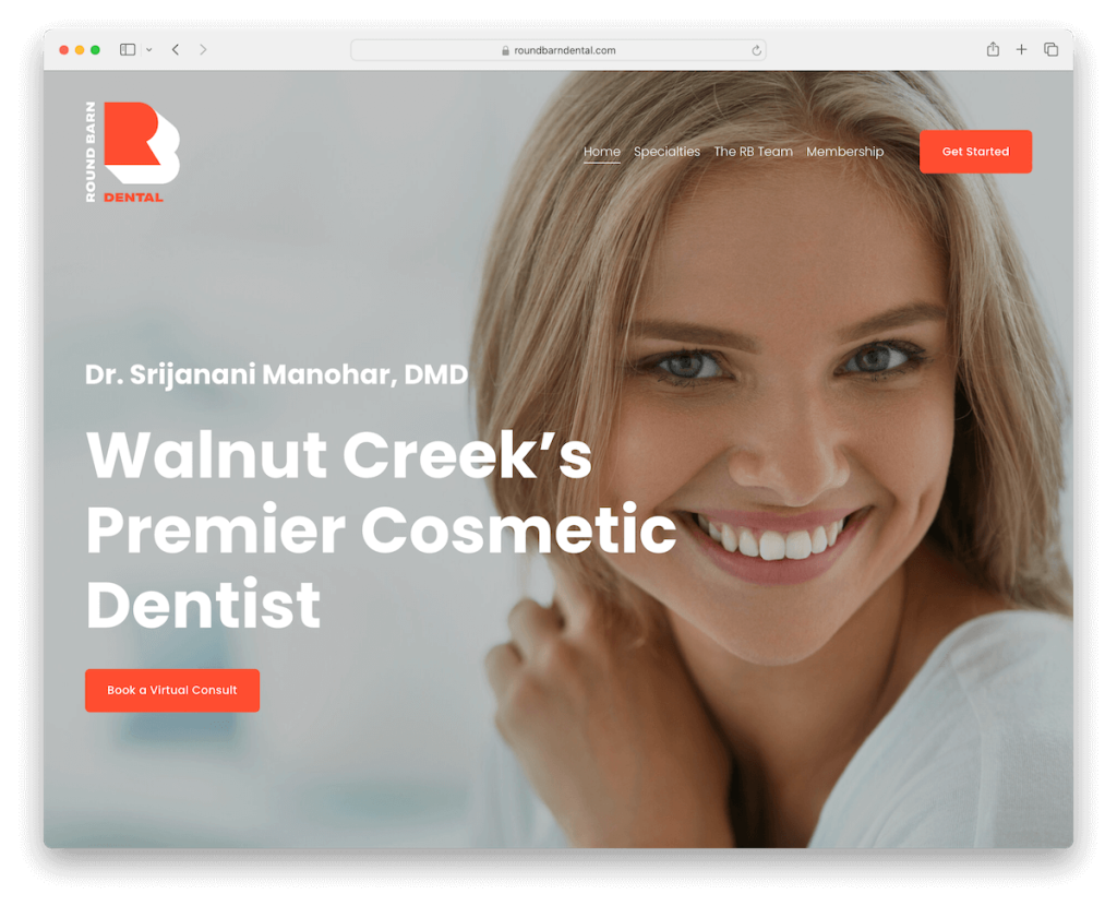
Round Barn Dental’s site makes a bold first impression with its impactful full-screen hero section. It contains an overlayed header, concise text, and a prominent booking CTA button.
The clever header design disappears when scrolling down for an uncluttered view but reappears when scrolling up, ensuring easy navigation.
A floating Facebook Messenger chat widget in the bottom right corner adds a modern touch, facilitating instant communication.
The footer is packed with useful information, including social media icons, a contact form, Google Maps, and opening hours, making it a handy resource for visitors.
Note: Integrating a live chat widget will take your visitor interaction to the next level. (You can calmly use a bot for more basic questions.)
Why we chose it: For its visual impact and user convenience, highlighted by the dynamic header and accessible communication tools.
8. Sleep Dentistry Of Spokane
Built with: Squarespace
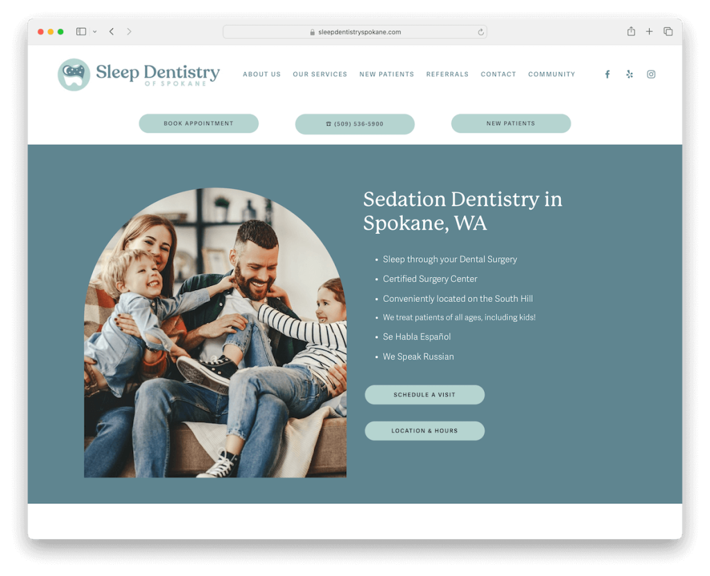
Sleep Dentistry Of Spokane’s website radiates a light and calming design, inviting users into a serene online space.
Content loads as you scroll, ensuring a smooth and uninterrupted browsing experience with sufficient white space.
The header is efficiently organized, featuring menu links, social icons, and three CTA buttons for making appointments, calling the office, and welcoming new patients.
A cool “meet the team” section adds a personal touch, while Google Map integration offers convenient directions, making visits just a click away.
Note: CTA button(s) in the header/navigation bar can significantly boost conversions.
Why we chose it: For its soothing design and user-centric features, such as the intuitive navigation and the “meet the team” section.
9. Agile Dentistry
Built with: Squarespace
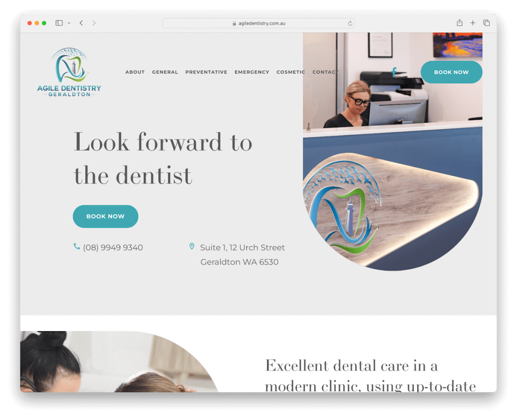
Agile Dentistry’s Squarespace website is designed for action. It features an above-the-fold section that immediately presents visitors with clear CTAs, contact details, and location information.
The transparent header adds to the site’s modern aesthetic, while a compelling before/after image gallery showcases their work’s transformative power. (Sadly, it’s a stock image.)
Internal pages are filled with useful information, providing depth and resources for visitors.
Online appointments are seamlessly integrated via a 3rd-party platform, simplifying the booking process.
Note: Before and after images can work wonders, but ensure the images are yours and not stock.
Why we chose it: For its clear, actionable layout and resourceful internal pages.
10. Pitt On Penn
Built with: Squarespace
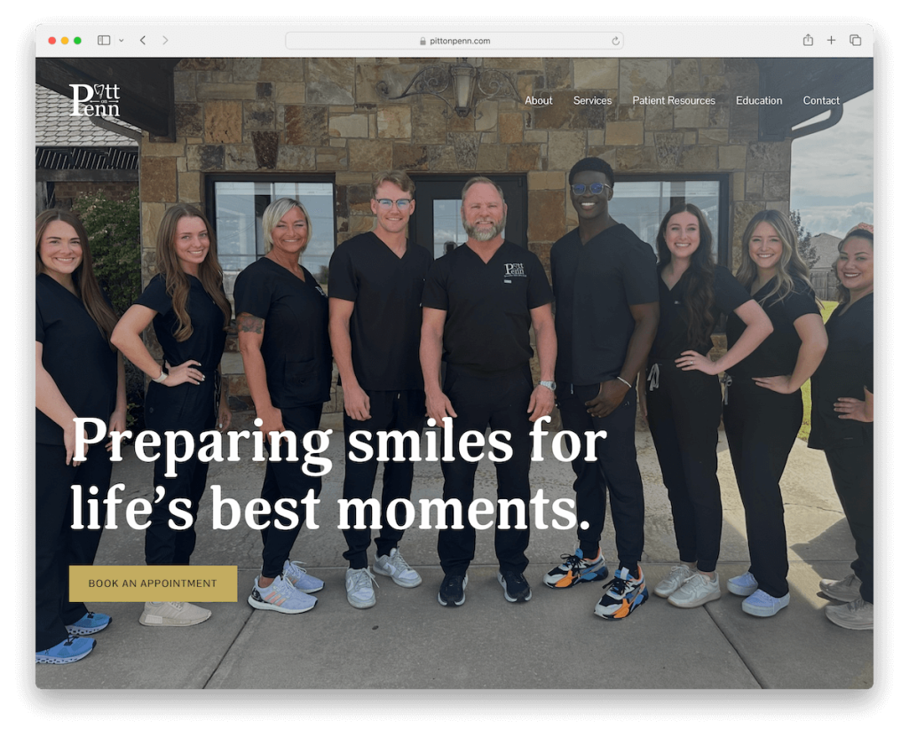
Pitt On Penn’s dental website sparks interest with its contrasting design, setting a notable tone from the start.
The full-screen image background in the above-the-fold section, complemented by a direct booking CTA, invites immediate interaction.
We really like the image gallery showcasing actual patient results, adding authenticity and trust.
The dark footer sharply contradicts the rest of the site, which neatly presents contact information, location details, and opening hours.
Also, the newsletter subscription form at the bottom encourages ongoing connection (read: email marketing).
Note: One great way to build your dental business is by collecting (potential) patient emails and applying strategic email marketing.
Why we chose it: For its bold design and effective use of real patient images, creating a compelling and trustworthy online presence.
11. Cameron & Co
Built with: Squarespace

Cameron & Co’s Squarespace dental website shines with its dynamic disappearing/reappearing top bar and header, ensuring seamless browsing.
Large, impactful full-screen image background sections draw visitors in, complemented by energetic detailing that adds vibrancy to the site.
Furthermore, the bold black footer, organized into five columns, offers a wealth of handy links and contact details.
Additionally, patient success stories are prominently featured in the news section, providing tangible evidence of the practice’s quality and impact.
Note: Include testimonials, before/after images, and patients’ success stories on your dental site.
Why we chose it: For its lively features, packed footer and client success stories.
12. Burkett Family Dentistry
Built with: Squarespace
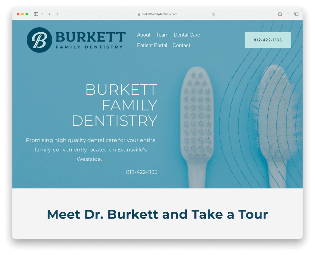
Burkett Family Dentistry’s site prioritizes simplicity and accessibility, featuring a clickable phone number in the header for instant contact.
Its design leverages white space and large typography, creating a clean, user-friendly interface that emphasizes readability and ease of navigation.
Uniquely, the site opts for direct telephonic communication, eschewing email contacts or contact forms in favor of a more personal touch.
A Google Maps integration ensures easy location finding, while an FAQ section addresses common queries, streamlining the visitor’s experience.
Note: Ensure you provide as much information for patients on your website as possible, and a FAQ section can be very useful.
Why we chose it: For its clear focus on simplicity and direct communication.
13. Forest Ridge Family Dentistry
Built with: Squarespace
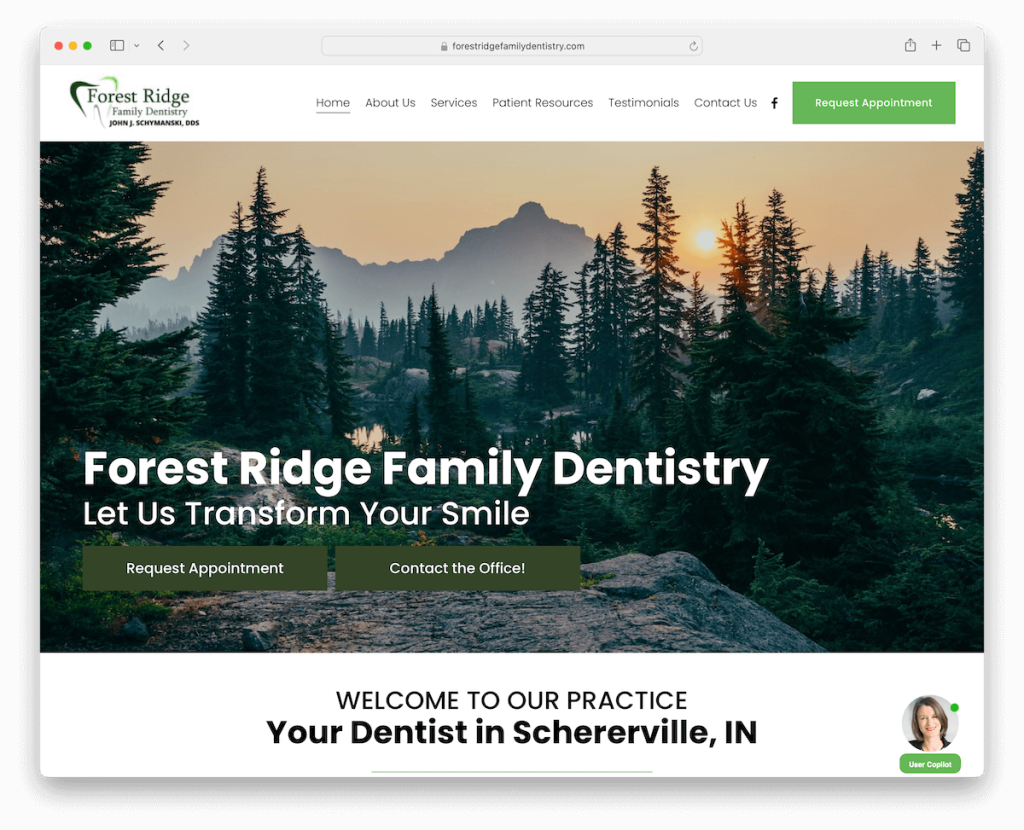
Forest Ridge Family Dentistry’s website has practical design features, including a floating header that ensures key navigation elements are always accessible.
What’s more, a distinctive floating assistant widget in the bottom right corner provides immediate assistance, enhancing user engagement.
The appointment button in the navbar seamlessly directs users to a 3rd-party platform for efficient booking.
Additionally, a dedicated testimonials page showcases Google reviews, offering authentic patient feedback and building trust among prospective patients with real-world endorsements.
Note: Feel free to use 3rd-party platforms for reviews. (Google reviews are a great solution to boost your dentistry’s trustworthiness.)
Why we chose it: For its accessible communication tools and the dedicated testimonials page.
14. Maccaro Smiles
Built with: Squarespace
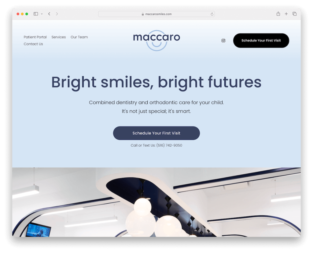
Maccaro Smiles’ Squarespace website attracts with a large, image-only slider that showcases the practice’s atmosphere and services.
A carousel beneath the slider provides extra, easily digestible information, enhancing visitor engagement.
The site features a compelling before-and-after image gallery, demonstrating tangible results and expertise.
Additionally, authentic Google reviews are prominently displayed on the home page, adding credibility.
An in-depth About Us page offers comprehensive insights into the team members, while a patient members area, hosted on a third-party platform, ensures secure and personalized patient access.
Note: A slider is a great way to showcase your office, services, etc., without sacrificing too much website space.
Why we chose it: For its visual elements and thorough content, including before-and-after galleries and Google reviews.
15. Beam Pediatric Dental Studio
Built with: Squarespace
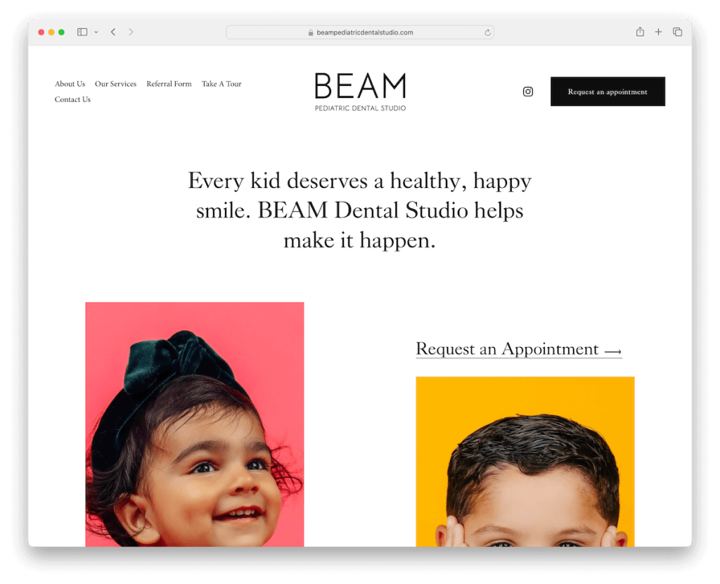
Beam Pediatric Dental Studio’s site pops with its catchy design, emphasizing lots of white space, vivid images, and large typography.
The convenient header smartly disappears to maximize screen space while scrolling down but reappears with a simple scroll up.
A light yet feature-packed footer offers essential information without overwhelming the page.
Moreover, an embedded promotional video provides a dynamic introduction to their services.
You’ll also find an advanced appointment form that streamlines the booking process, making it easy for parents to secure visits for their children.
Note: Make site navigability more convenient with a disappearing/reappearing header.
Why we chose it: For its blend of clean design and functionality, highlighted by intuitive navigation and a time-saving booking process.
16. Campi Family Dentistry
Built with: Squarespace
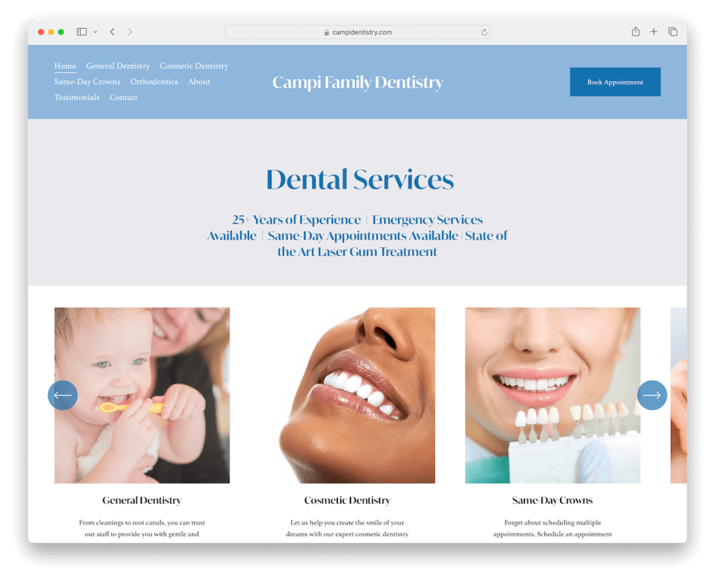
Campi Family Dentistry’s Squarespace website is a model of simplicity and convenience.
Its straightforward design features a header with menu links and a prominent appointment CTA button.
A carousel elegantly displays their range of services and certificates and badges that underscore the clinic’s expertise and trustworthiness.
Accordions are cleverly used to reveal more detailed information about Campi Family Dentistry, allowing visitors to expand their knowledge without cluttering the page.
Finally, the contact page doesn’t have a form or email, but you get Google Maps and a telephone number with the location and opening hours.
Note: If you have certificates, badges, diplomas, or whatever, don’t hesitate to display them on your site.
Why we chose it: For its clarity and ease of use, with features like the service carousel and informative accordions.
How To Make A Dental Website With Squarespace
Here’s a simple six-step tutorial to start working on your dental site:
- Sign up for Squarespace: Visit the Squarespace website and create an account. Choose the plan that best suits your needs, taking advantage of the free trial.
- Choose a template: Browse through Squarespace’s collection of templates. Look for designs tailored to health professionals or businesses, as these will likely offer the layout and features that best fit a dental website.
- Customize your template: Use Squarespace’s drag-and-drop editor to customize your template. Add your practice’s logo, choose your color scheme, and select fonts that reflect your brand.
- Add content: Create pages for your website, such as Home, About Us, Services, Testimonials, and Contact Information. Fill these pages with relevant content, including descriptions of your services, your professional background, and how patients can get in touch.
- Publish and promote your website: Once satisfied with your website, hit the publish button. Share your new site on social media, email newsletters, and other marketing channels to attract visitors.
FAQs About Squarespace Dental Websites
Can I integrate appointment booking functionality on my Squarespace dental website?
Yes, Squarespace allows the integration of appointment booking functionalities through its built-in features or embedding 3rd-party services. This can be easily set up through the Squarespace editor, enabling patients to book appointments directly from your website.
Is it possible to display before-and-after images of dental work?
Yes. Squarespace provides various gallery options that you can use to showcase before-and-after images of dental work. You can choose sliders, grids, or carousel formats to display these images.
How customizable are Squarespace templates for dental websites?
Highly customizable. Squarespace templates offer various customization options, from color schemes and fonts to page layouts and features. This flexibility ensures that you can precisely tailor your website to match your dental practice’s branding and unique needs.
Can I add patient testimonials to my Squarespace dental website?
Yes, you can add patient testimonials to your website. Squarespace allows you to create dedicated sections or pages for testimonials, where you can share positive feedback from your patients. This is a great way to build trust and credibility with prospective patients.
How can I ensure my Squarespace dental website is mobile-friendly?
Automatically. Squarespace templates are designed to be responsive, meaning they automatically adjust to fit any device’s screen size, including smartphones and tablets.
Was this article helpful?
YesNo
