Comprehensive list of the best barbershop websites for your inspiration. All the best website examples in one place.
The physical appearance of a person affects the overall personality. Typically, good looks can boost self-confidence and self-esteem for both men and women. Particularly, men don’t wear makeup but can enjoy grooming services that barbershops offer. Accordingly, barbering has become the fastest-growing profession in the US since 2013, and the male grooming industry is expected to be worth more than $40B by 2025. With that fact, barbers need to look for schemes to market their expertise by all means. Fortunately, barbers can establish brands through a web presence. With user-friendly, comprehensive, and innovative barbershop websites coupled with a great social media presence, a barbershop business can stand out in the competition. A barber’s expertise can reach more potential customers when websites are accessible on diverse devices. Here’s a list of barbershop websites that will inspire you to build your online presence effectively.
The barbershop industry embraces influential and mighty digital marketing. Hence, massive opportunities await every brand that opts for an online presence. When planning your barbershop website, you must look for the best elements to include, choose the best tools to help you complete the functionality, and ensure the design is user-friendly. In addition, acquiring the best barbershop websites will inspire you to unleash your creativity.
Check out this awesome collection and take your barbershop website designs to the next level.
1. Barber Blades

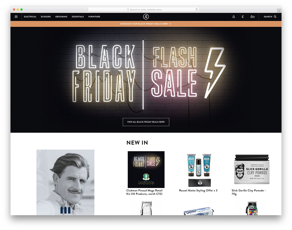
The website represents the business across the web. Therefore, as much as possible, it should make a great first impression through an exceptional and innovative website design. Barber Blades is here to inspire you if you need inspiration in crafting your barbershop website. It is a one-stop-shop for the barbering world, providing the necessary tools to work efficiently. It embraces the elegance and sophistication of black color on the header and footer. The website applies consistency on the colors, fonts, navigation, and other web elements to ensure a consistent user experience. Utilizing the sticky menu, visitors can access different tools used in barbershops. Specifically, this website integrates social media, a newsletter for subscription, live chat and more.
2. Tweed Barbers

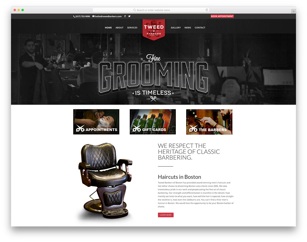
Visual consistency on a website is important. It will help a brand highlight the most important elements in your website. Tweed Barbers comes with such interesting features in this list of barbershop websites. Particularly, it implements consistency in the colors, animation upon scrolling, logo, and other elements. The grayscale background images look elegant and add a touch of sophistication to the overall design. The homepage of Tweed Barbers has little and simple elements but can speak well of what the brand offers. Following the grayscaled image on the hero, header are the most important menus that link to other pages – appointments, gift cards, and the barbers. Moreover, the website adds a cool hover effect on some elements.
3. Natural Barber

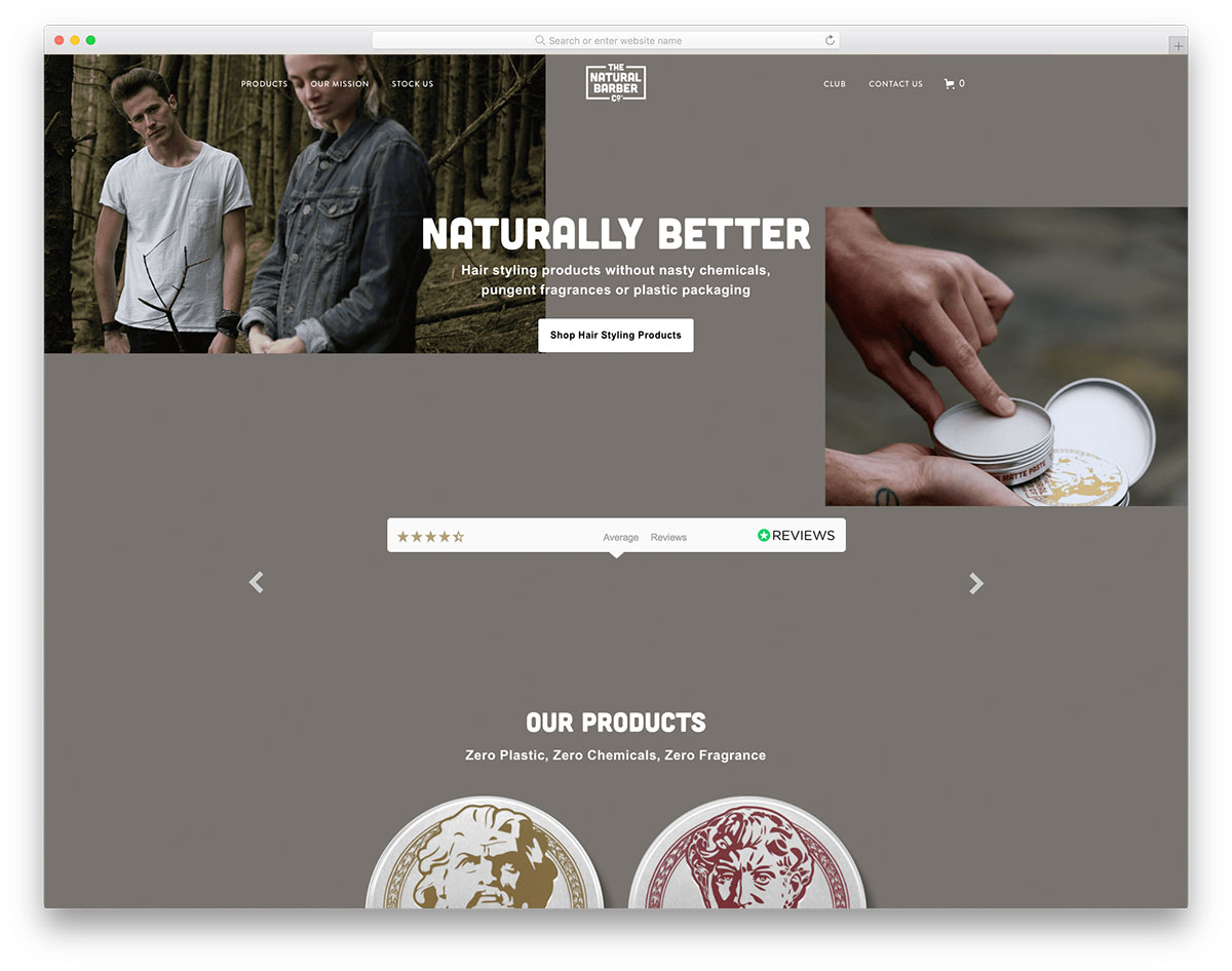
While you offer sophisticated haircuts in your barbershop, you must anticipate the effects of the products you use. In that case, you can check out Natural Barber, which significantly uses natural and eco-friendly products in barbering. It is an excellent eCommerce website that sells eco-friendly products worldwide to barbershops. The website has a unique homepage design with images in an asymmetric layout. As testimonials are essential in improving a brand’s credibility, this website places the reviews section just below the hero header through a slider. Of course, the hero header has stunning typography, CTA, and clear and high-quality images.
4. Forth Worth Barber Shop

If you offer the best barbershop industry haircuts, you may reach massive potential customers when you opt for an outstanding barbershop website. You might check Forth Worth Barber Shop for inspiration in planning and implementing your website. It has an out-of-the-box design that will serve as an inspiration to fellow barbers. The website welcomes visitors with a simple, grayscale image along with a center-structured headline. Since the website uses a sticky menu, it is easier for visitors to examine the other pages closely. Having a unique menu presentation undeniably adds beauty to the overall design. A nice gallery is also ready to entertain visitors and other amazing features.
5. Boardroom Salon

Building a website is one of the effective marketing strategies that work best. With such a strategy, you can promote your brand across the web 24/7. Thus, improves your reach and enhances business growth. Here’s a barbershop website that will serve as a wonderful inspiration for your upcoming project. Boardroom Salon is one of the leaders in quality men’s grooming. The website has a simple yet attractive design of the hero header. Boardroom Salon beautifully introduces its business and a CTA with an asymmetrical image and a bold headline. Since it is essential for a website to provide user-friendly navigation, it implements the sticky menu. Having light brown as its primary color, the website truly emphasizes consistency. Check out how useful this website can be to your next barbershop web design projects.
6. Capellis

One way to build a man’s confidence is to have outstanding personal grooming. That’s where barber’s expertise is a demand. Capellis is an excellent website that barbers can look into for inspiration. It has a stunning display of images in the hero header using a smooth slider. The clear and descriptive CTAs play an important role in growing your audience and increasing sales, and this website never disregards its significance.
Additionally, Capelli’s presentation of testimonials is a great element that can help establish credibility and trust. Moreover, the website also implements the off-canvas menu for stylish and enhanced navigation. It also embraces the power of social media, including the social media icons linked to such platforms. Having various branches, this website enables customers to book an appointment on their preferred location.
7. Gentlemen Barberclubs

To maximize your web presence as part of your marketing strategies, always ensure that the website you build is striking and innovative. Gentlemen Barberclubs is an excellent design of the barbershop website. It has an aesthetic appeal as it implements the parallax effect on the hero header. A perfect combination of barbershop essentials, good typography, and visual hierarchy, this website effectively provides an inspiring and creative design for barbers. The brushstroke effect on the website elements makes a strong impression and consistency in the overall design. Having a dark tone background in displaying the gallery, images are more interesting and elegant to look at. It also integrates a video to introduce its brand across the web further.
8. Scissors Scotch

One of the best ways to improve barbershop business is to have a solid online presence. However, you may need to put great effort into building credibility online. Scissors Scotch is a superb example if you need inspiration in crafting it. Accordingly, videos can quickly deliver messages and drive more traffic than text. Hence, this website applies a video background with CTA and brand name. That’s not all, it also integrates video to engage visitors and kindles their interest. Moreover, the customers’ testimonials are one of the most powerful tools to convert visitors to customers, so Scissors Scotch never ignored such a useful tool. Visitors can also access the social media accounts of this barbershop in no time!
9. Abels On Queen

Create a website with magnificent design and cutting-edge tools. In this way, you have greater chances of success in the competition. Abels on Queen is a creative barbershop website that can shine in the industry. Utilizing a dark-tone background, this website conveys its message clearly and elegantly. The header is one of the most important sections of your website; hence, it should be seamless and simple. Abels on Queen implements a sticky header to represent the menu and the logo for branding. It also comes with a unique presentation of imagery. For presenting the services, the content stands out with a dark tone background and white fonts.
10. Bruno’s Barbers

The perfect combination of white and black color scheme yields extremely impressive results. Bruno’s Barbers is one of these Barbershop websites that can motivate fellow barbers worldwide. With an exceptional layout of Bruno’s Barbers, introducing the services and products are truly interesting. Meanwhile, other website contents are arrayed in grids with titles and a brief description. Specifically, these contents can be shared easily on Facebook. What’s more? The Instagram feed is also added to the website where visitors can easily connect with what Bruno’s Barbers care about.
11. Tucson Barber

Dare to be different and get ready to shine! This could be the goal of Tucson Barber when it builds its barbershop website. The website welcomes visitors with a full-width image having a smooth parallax effect. Adding a smooth animation to the image in its brand introduction improves its visual appeal. Furthermore, the team section also looks grandeur with its cool hover effects. Meanwhile, the perpetual display of haircuts images using a slider conveys ample haircuts that stand out.
12. Shed Barber

Improve your barbershop website design with these inspiring and creative barbershop websites we’ve handpicked for you. Shed Barber is a remarkable website example with useful elements to boost web presence. The hero header has a simple, split-screen layout with an image and a huge brand name. The screens slide opposite as a user clicks on the slider. With such animation, it can greatly impress potential customers. The brand’s introduction and services are simple yet convey the contents well. Moreover, the website enables a customer to shop items online. What’s more? The hover effect added to the images is even more striking and enticing.
13. New York Barbershop

The great design of websites has a higher chance of getting recognized. Of course, the website must have the essential elements needed to improve its look and feel. New York Barbershop is a one-page website with cool and simple design elements. The hero header highlights different images using the slider, while services are simple and minimalist. On the other hand, this website offers different courses to other individuals who wish to learn the skills in barbering. Each of the courses is exhibited with a simple box layout. A grid layout is utilized for the gallery to showcase different haircuts that customers can choose for their next visit.
14. Balls Barbershop

Barbers can be like heroes to boost men’s confidence and improve self-esteem. Balls Barbershop is one of the awesome barbershop websites that can inspire entrepreneurs and barbers alike. Specifically, this website welcomes visitors with monochrome imagery on the hero header through a slider. This website’s contents are in the center, seamlessly presenting the elements. Specifically, a user can access the services, products, barbers, etc. In addition, the website also integrates a short video of the brand as part of its introduction. What’s more? Customers can easily book an appointment for a certain barber and scan through the list via another cool slider.
15. Crowsnest

Marketing your brand is not just a walk in the park. You need thorough research on how you can make your brand stand out. Having a well-designed website is a demand when it comes to the barbershop business. Offering gorgeous personal grooming services to men with passion is truly remarkable. Crowsnest comes with an outstanding website to impress potential customers. It enables users to book an appointment with their barbershops in different branches and at the same time sell products too.
Furthermore, it utilizes a stunning parallax effect on some sections to look creative. It also integrates a short but comprehensive video introducing Crowsnest’s passion for men’s grooming. Additionally, this website offers a wonderful page for the career opportunities of fellow barbers.
16. Maverick Studio For Men

If you’re looking for a creative and out-of-the-box design of the barbershop website, you probably need this Maverick Studio For Men. Its website has an exceptional design as it embraces the awesome split-screen layout in every website section. Additionally, it looks breathtaking as the left and right screens move in the opposite direction. It also utilizes the off-canvas menu for users to navigate the website. Specifically, a user can easily book an appointment with the different branches of Maverick. The product page of this website enables a user to easily connect with other brands that sell products online. That’s not all, like other websites, Maverick allows other barbers to join the team as it integrates the career page to its website.
Was this article helpful?
YesNo