21 Best Copywriter Websites (Examples) 2024
Enjoy a massive dose of creative ideas by checking these striking copywriter websites.
Build an online presence where you can showcase your amazing portfolio, promote your services and write compelling about-me text.
Not just that, but you can build trust and social proof by including client testimonials, which can raise your potential.
And if you’d really like to take it to the next level – start a blog. Share how copywriting is done with the world and help others become PROS like yourself.
We recommend using WordPress to build and design your website. For this reason, we created a list of the best WordPress themes for copywriters that’ll save you a lot of time.
Best Inspiring Examples Of Copywriter Websites
1. Kelsey O’Halloran
Built with: Squarespace
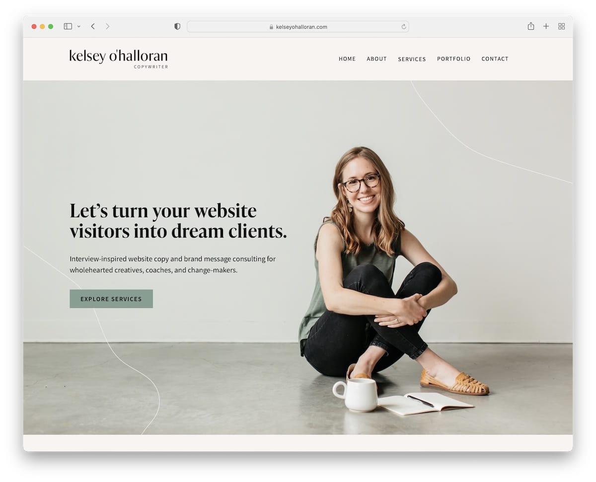
Kelsey O’Halloran’s personal website has a very one-on-one experience with images of herself and great copy.
The header is basic, but the footer provides heaps of information and takes a substantial part of the web real estate. It features CTA buttons, menu links, social media icons and an Instagram feed.
Note: Make your Squarespace website more personal by including images of yourself.
2. Shanley Cox
Built with: Squarespace
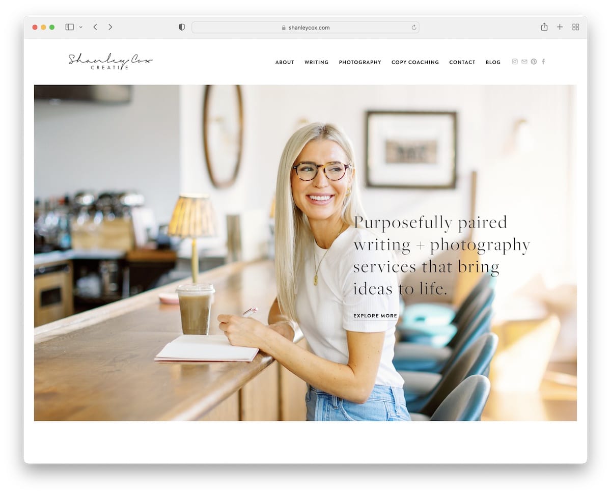
Like Kelsey, Shanley Cox also has an excellent copywriter website with a minimal and feminine design sprinkled with creativity.
The navigation bar has a hover effect, highlighting the link you put your mouse cursor on. Also in the navbar are social media icons to easily connect with Shanley.
Moreover, you’ll find a clean client testimonial slider, a featured work portfolio and a contact form, all on the home page.
Note: Build social proof by adding client testimonials to your page (preferably the home page).
3. Brooks Lockett
Built with: Squarespace
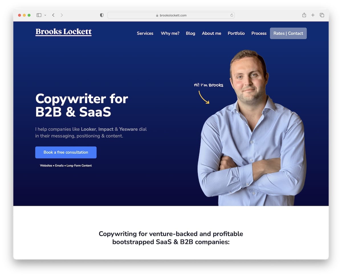
Brooks Lockett has an actionable hero section with text and a call-to-action (CTA) button. There’s also another CTA button in the header, which can boost click-through rates.
The extensive client testimonials instantly build an additional layer of trust in Brooks’ services. Plus, we really like the presentation of his process, so everyone gets familiar with what working with Brooks looks like.
Note: Place CTA buttons across your website strategically.
4. Lemon Tree Editorial
Built with: Squarespace
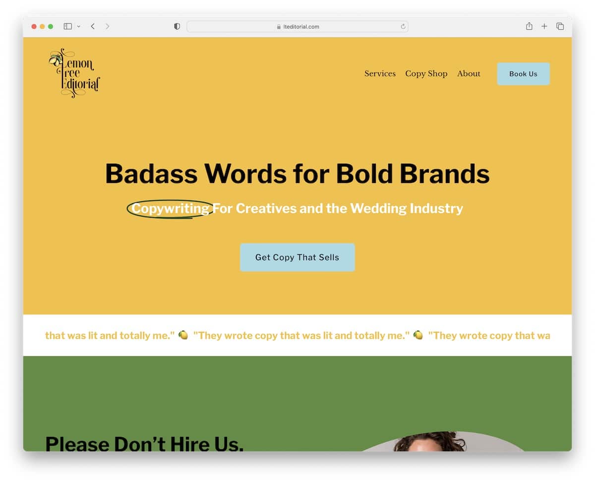
Lemon Tree Editorial has a catchy color scheme that makes browsing the website a lot more enjoyable.
The hero section is a bold statement with a CTA button on a yellow background to make it pop more. The header is also transparent for a more pristine appearance.
Moreover, the sliding text animation is a nice attention to detail that makes the page livelier.
Note: Don’t be afraid to create a text-only above-the-fold section (but try using larger, bolder fonts for a bigger impact).
5. EST Creative
Built with: Squarespace
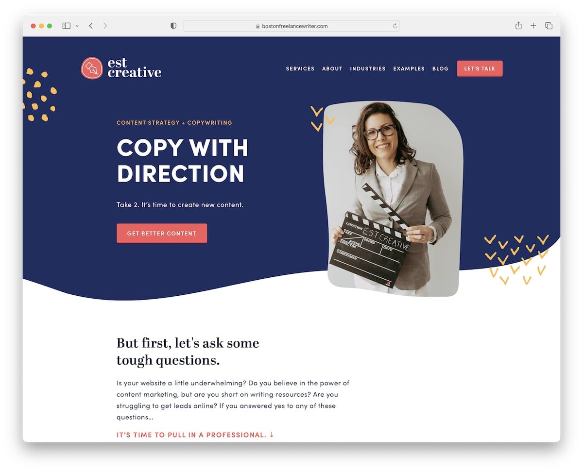
EST Creative is a professional and modern business website with a clean and catchy hero area. The combination of the image, title, text and CTA button on a “wavy” background work so well together.
Furthermore, this copywriter website has a grid layout for testimonials, a section that displays client logos and a newsletter subscription form in the footer.
Note: Grow your clientele and business by collecting emails through a subscription form on your site.
6. Kristin Macintyre
Built with: Squarespace
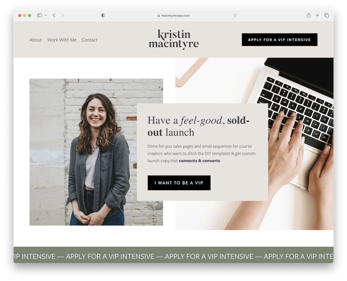
Kristin Macintyre has a beautiful responsive web design with content loading while you scroll for a tad more engagement.
The minimalist header with a menu and a CTA button disappears on scroll but reappears as soon as you start scrolling back to the top.
It’s a great detail for a more distraction-free scrolling but also super handy because you don’t have to scroll to the top every time to access the navbar.
Note: Create a sticky/floating header/menu and improve your website’s user experience.
This website is made using a Squarespace website template for writers, which we have mentioned here.
7. Meg Peery
Built with: Squarespace
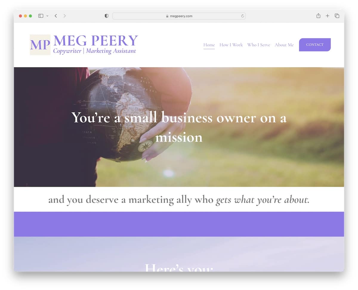
Meg Peery creates a strong first impression with a website with a full-width design, large images, text and plenty of white space (for enhanced readability).
Like Kristin, the header disappears/reappears depending on the scrolling movement, while the footer is basic with additional quick links.
Note: The usage of white space is essential in creating a more pleasant atmosphere (especially if you use a lot of text).
8. Katie Lemon
Built with: Squarespace
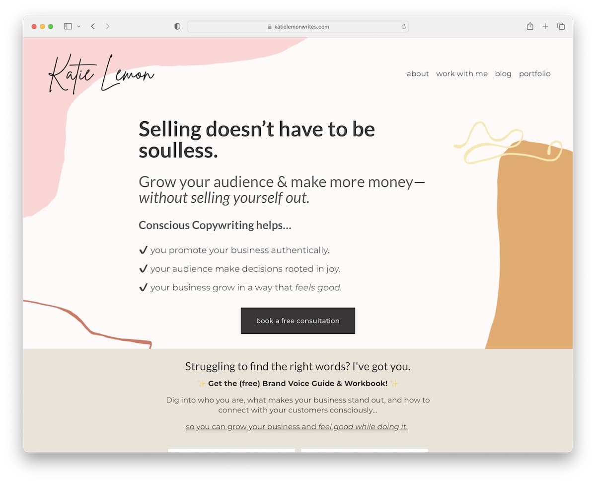
While Katie Lemon’s copywriter website is text-heavy, the choice of colors and unique backgrounds make it very likable.
The hero section features a compelling title, text, and a CTA button for bookings. What’s also unique about this page is the promotion of a free guide and workbook in exchange for an email, which is a strategic way of building an email list.
Note: Built an email list by offering a free product.
9. Sarah Breeze
Built with: Squarespace
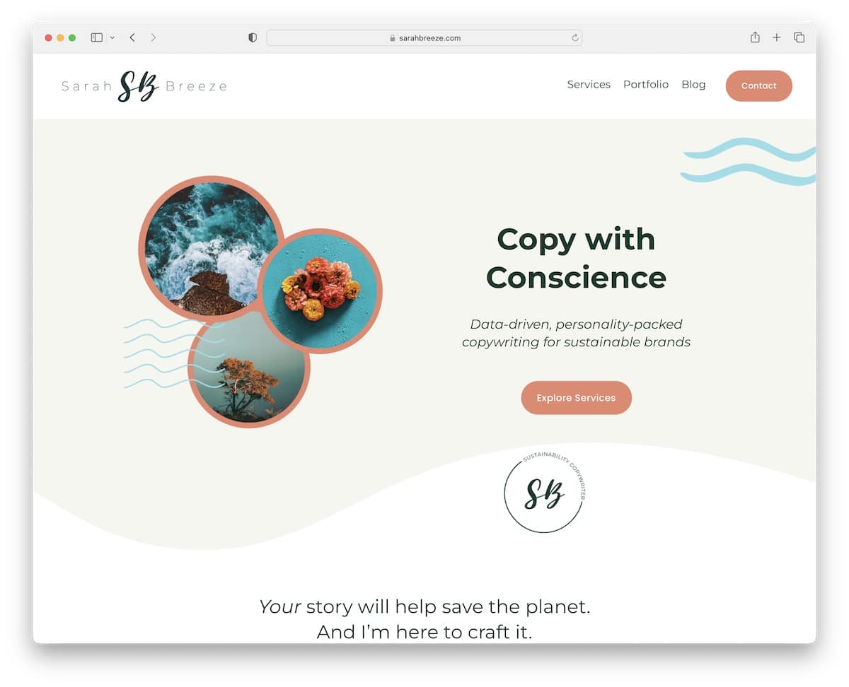
Sarah Breeze is a minimalist one-page website (except for the blog) where you can learn about the services, the portfolio and more quickly.
The branding is done with great care and attention to detail while maintaining simplicity. The same goes for the footer and the header, which are plain and feature only vital quick links.
Note: A single-page website can create a better user experience (but try using either a sticky header, a back-to-top button, or both).
10. Gio Marcus
Built with: Squarespace
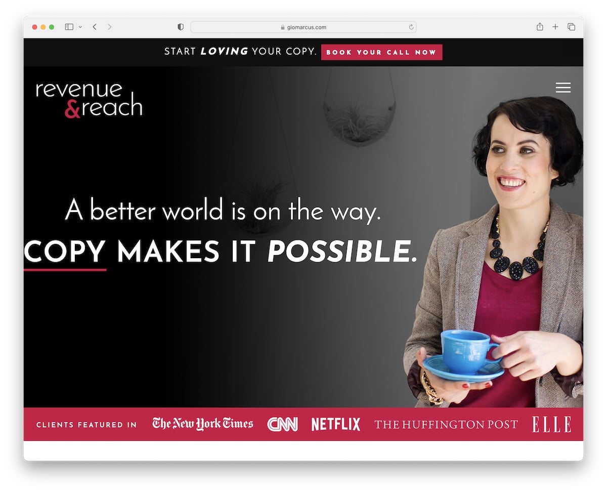
Gio Marcus does a fine job at grabbing your attention with a striking above-the-fold section. It has a top bar notification, a hamburger menu icon (opens an overlayed navigation), the main banner and a bottom bar with client logos for proof.
Like Katie, Gio also offers a free product for an email (it also uses a popup to capture emails) that helps her grow her list (of potential clients).
The use of larger typography makes skimming the website a breeze, while the embedded video is a great example of what working with Gio looks like.
Note: Show yourself in action via a (promotional) video.
11. Brandon Van Buskirk
Built with: Squarespace
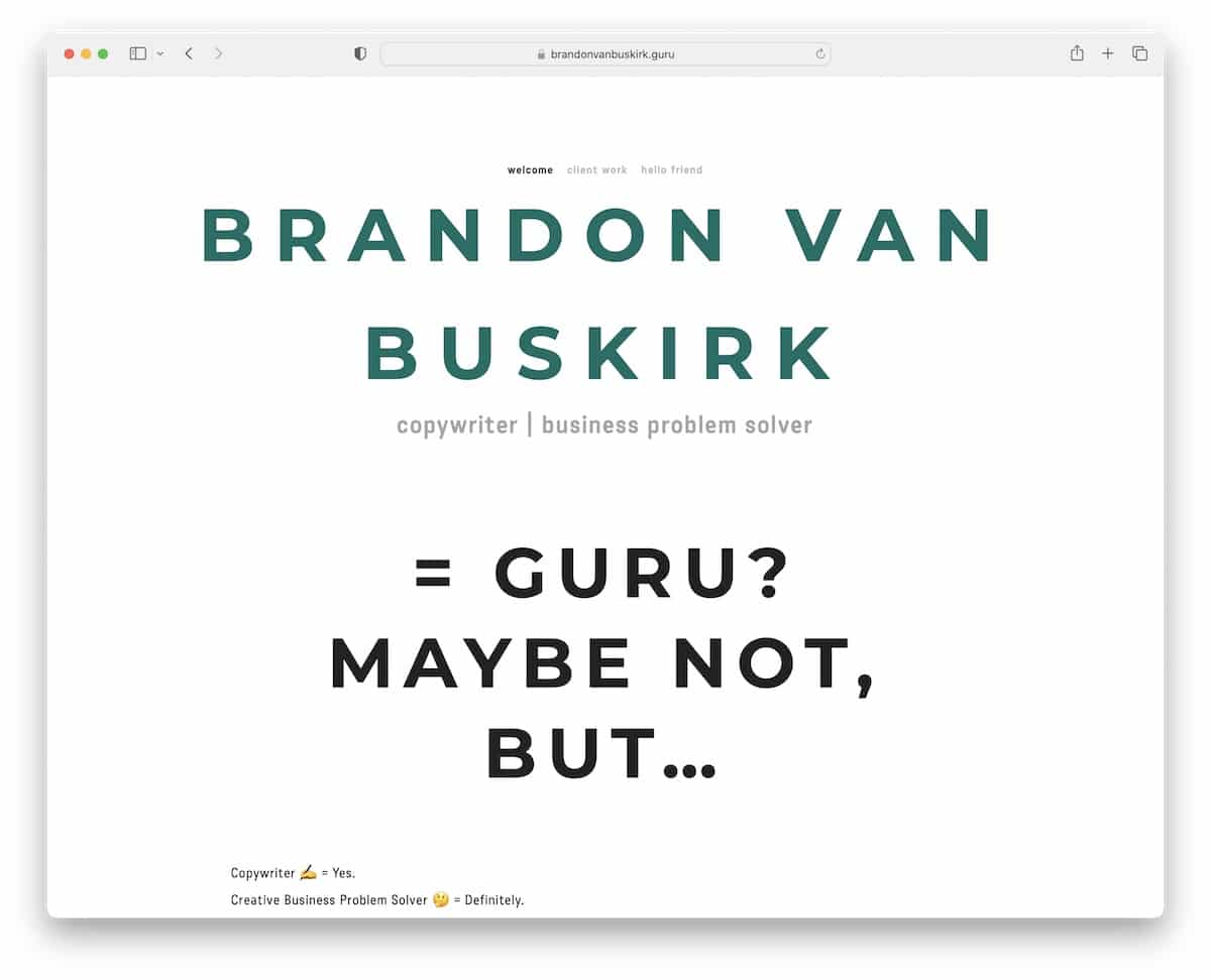
While Brandon Van Buskirk’s home page is clean and simple, it’s also very catchy, thanks to the (strategic) use of emojis.
The header and the footer have the same background color as the base to give it a more shipshape look.
But when things get pretty next level is the work page with LOTS of in-depth examples.
Note: Copywriting and emojis? WHY NOT!
Do you like simplicity? Then check all these clean websites because they are too good to miss.
12. From Scratch
Built with: Divi
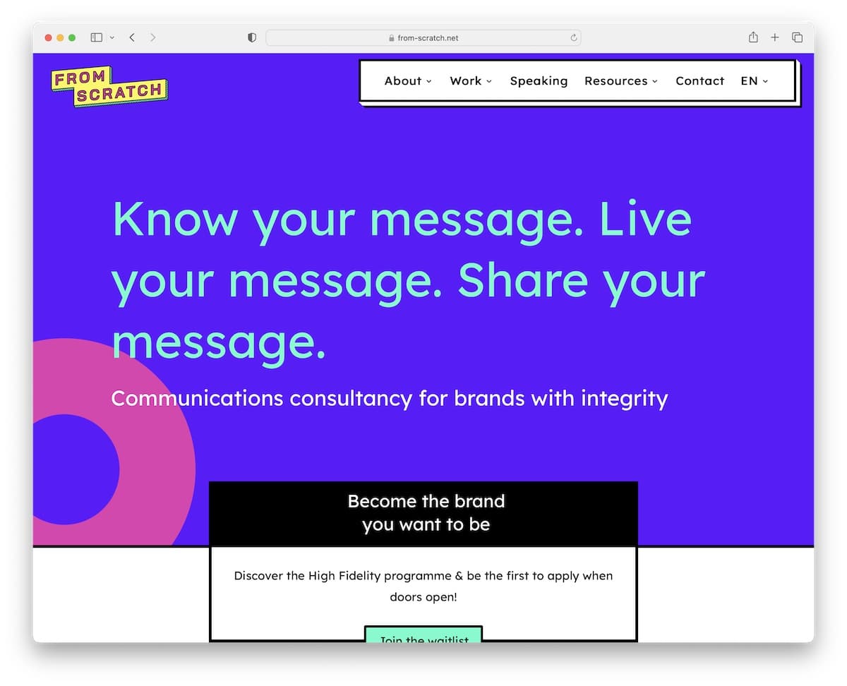
A strong message in the hero section can grab every visitors’ attention, and From Scratch is well aware of that.
It’s an awesome copywriter website example with a unique yet minimalist design (cool details!) that ensures all your focus is on the content.
The home page has many testimonials for different categories and even a large clients list for everyone to get a big dose of social proof.
Note: Blend simplicity with unique details for an original online presence.
We also have a comprehensive list of the ultimate websites using the Divi theme.
13. Content Bistro
Built with: Divi
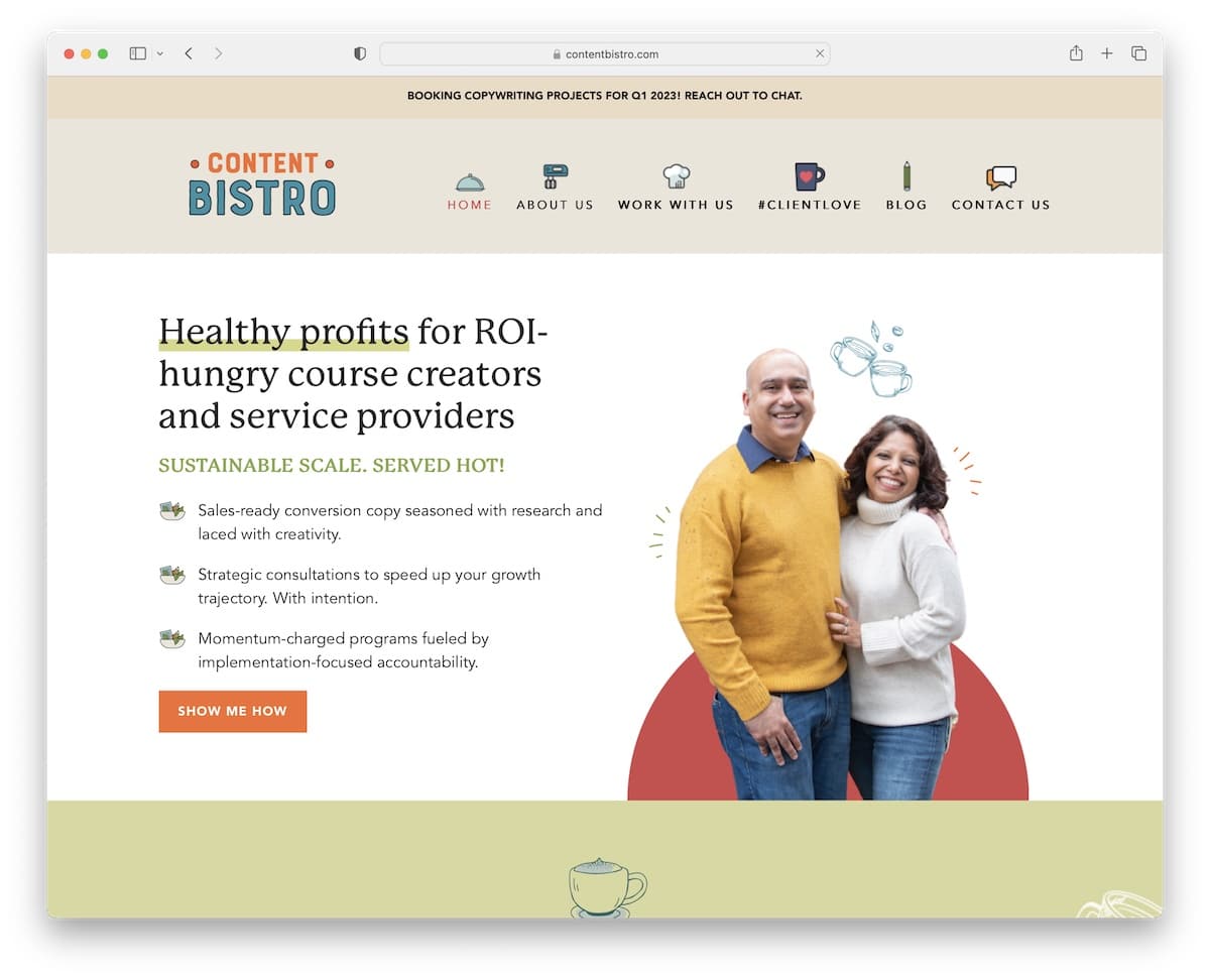
Content Bistro’s website gives you a very personal feel, thanks to the images and cool (custom) icons.
Even though this copywriter’s website is built with cleanness in mind, the details enrich the experience nicely.
Also, using the live chat/contact form widget in the bottom right corner greatly improves customer service.
Note: Let potential clients reach out via the live chat widget (you can even use a chatbot).
14. Grace Ventura
Built with: Squarespace
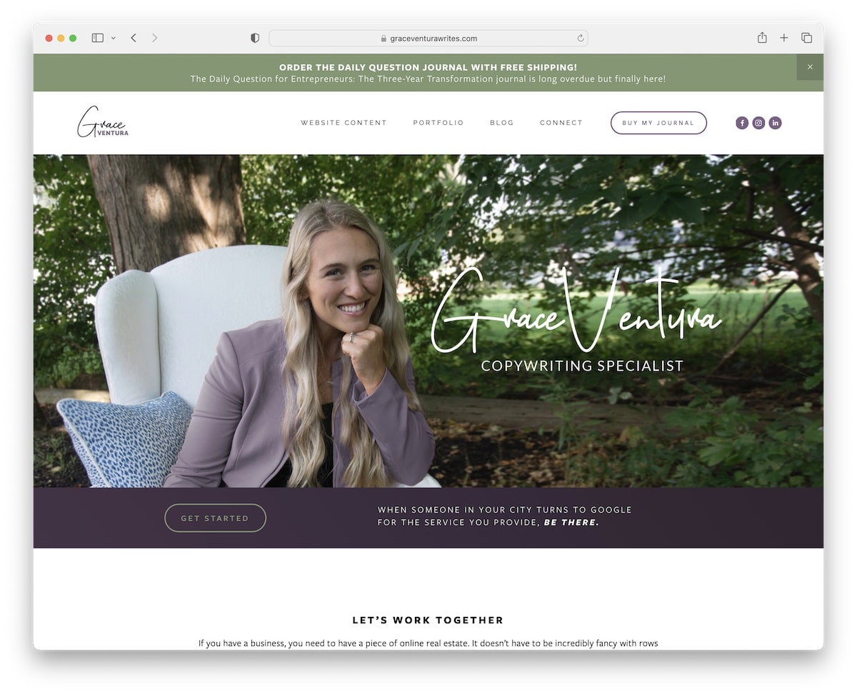
Grace Ventura knows how to trigger visitors’ interest through her copywriting and storytelling skills mixed with visual content.
The page uses a top bar notification (which you can close) and a navigation bar with a CTA button and social media icons.
Interestingly, the footer is just the copyright and “designed by” text, keeping things plain.
Note: Use a top bar to put an extra shine on something.
15. Suzie Bakos
Built with: Wix
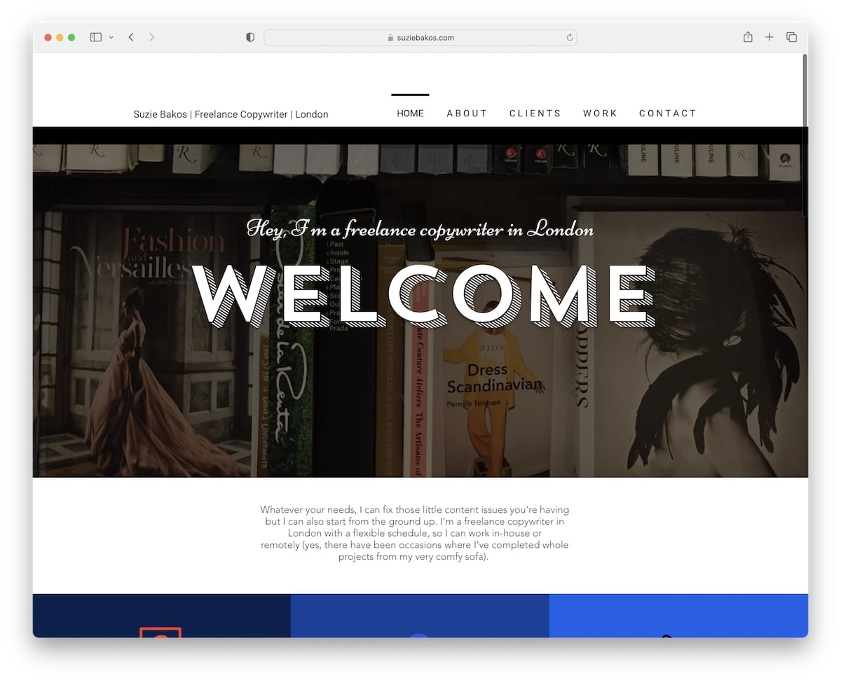
A hero banner with welcoming text is what this copywriter website uses to trigger your interest. You can then use the basic navbar to visit different internal pages or glimpse at everything by scrolling the home page.
Moreover, the footer has a cool “about me” button with a hover effect that feels like pressing it.
Note: Even though your Wix website might be full of “serious” content, you can complement it with catchy hover effects.
16. Alejandro Castro
Built with: Squarespace
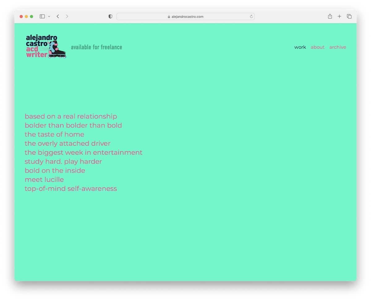
Alejandro Castro’s home page is unlike any other we stumbled across while searching for the best copywriter websites.
It feels like it’s only a bunch of text, but it’s not quite like so when you hover over it. Also, the use of the vibrant background color is very grippy and “in your face.”
Note: Surprise your visitors with special effects they weren’t expecting.
17. Gari Cruze
Built with: Squarespace
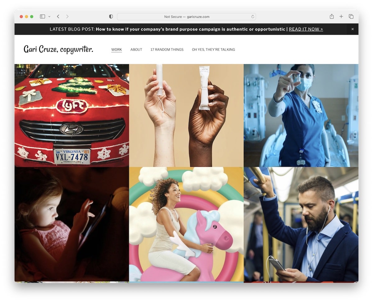
Gari Cruze is an inspiring portfolio website with a grid layout (without spacing). Each grid element reveals the title on hover and more about the project when you click on it.
Furthermore, the simple header sticks to the top so you can always access different page sections, including the top bar notification.
Note: Make your home page a portfolio of your most-proud works.
18. Jennifer Locke
Built with: Divi
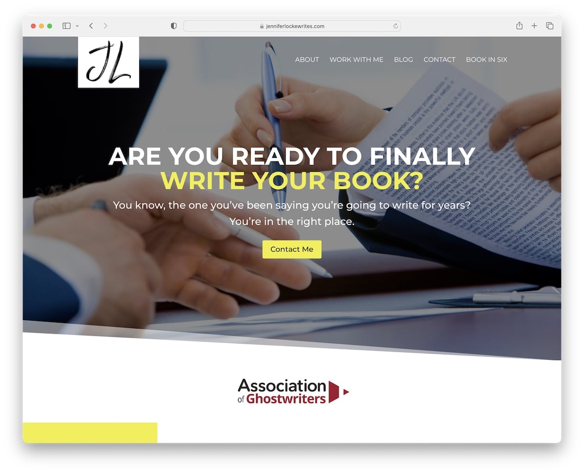
What Jennifer Locke does really well is using a question in the hero section and then a CTA button for immediate action.
This copywriter website uses a transparent sticky header and a footer with a contact form and two CTA buttons.
Remember, the website features a single-page layout, making everything easily accessible.
Note: Use multiple CTA buttons on your home page, so they’re always at your visitors’ fingertips.
19. Copy Blogger
Built with: Genesis
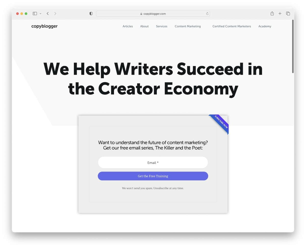
Copy Blogger has a minimalist site design with a text-rich hero section and a single opt-in form to get to the free training.
The header and the footer rock a clean look that goes well with the base, which is a post grid layout with pagination.
Before the footer is another opt-in form in case you didn’t take action on the first one.
Note: Instead of using a traditional subscription form, offer a free product, and you’ll likely get way more subscribers.
Enjoy a speedier business website creation by picking any of these Genesis child themes that we thoroughly tested and reviewed.
20. Emma Gannon
Built with: Squarespace
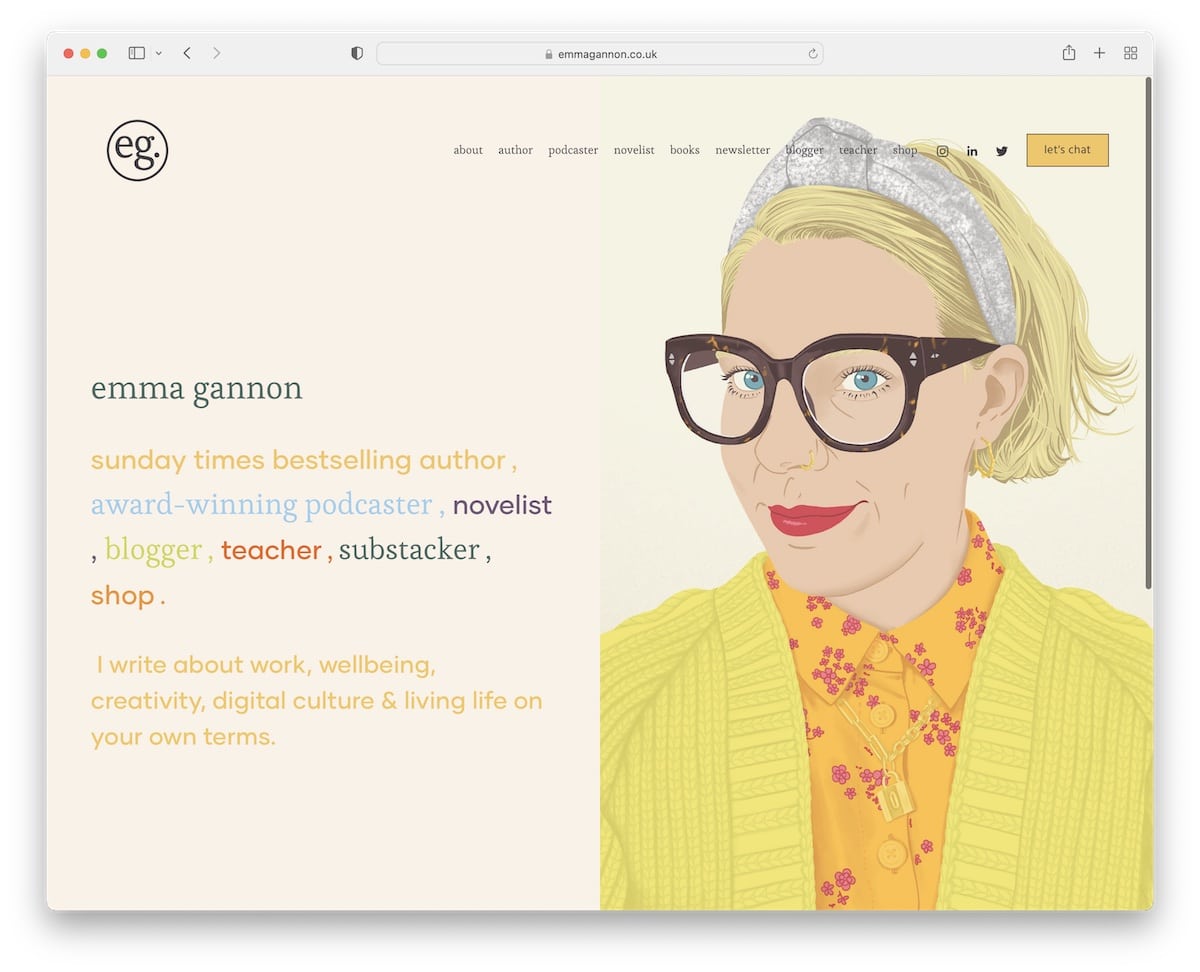
Emma Gannon’s website is very cartoonish, making it stand out from the other examples. It also uses vibrant (but soothing?) colors with much white space and large text that improves readability.
It’s a copywriter website that makes you want to check all its content because it’s cool but, at the same time, professional.
Note: Create a website with cartoon-like graphics and designs to make it bubblier.
21. Chris Harrison
Built with: Squarespace
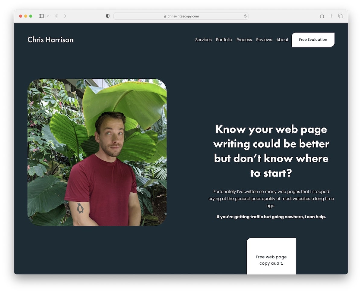
Chris Harrison’s site adheres to cleanliness, but some sections have a pause and play button in the bottom right corner to activate the animated background. This is interesting.
The navigation bar is basic, with a CTA button, while there’s no traditional footer. Every page has a larger “free evaluation” section that works as a footer, which takes you to the free consultation form, just like the header CTA.
Note: You may leave the traditional footer out if you don’t have many pages and categories on your website.
Was this article helpful?
YesNo