Welcome to our comprehensive guide, where we explore some of the best wellness websites out there.
We’ll explore how each website’s design contributes to a more engaging and intuitive user experience, making the journey towards wellness informative and visually captivating.
From the clever use of colors and imagery that evoke tranquility and balance to the innovative layouts that make navigation a breeze, these sites stand out for a reason.
Moreover, we’ll examine how these wellness websites use interactive elements and responsive design to connect with their audience, offering a seamless experience across various devices.
These sites go the extra mile to ensure your digital wellness journey is enriching and accessible.
This post covers:
Best Wellness Websites
Each website you’re about to see offers a unique blend of design and functionality.
Use these as a source of inspiration when creating your amazing and thriving wellness site.
1. Yoga Journal
Built with: WordPress
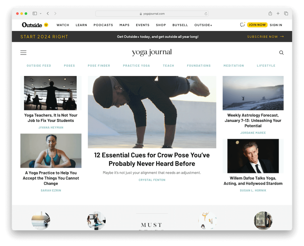
Yoga Journal is a premier wellness website with a light magazine-style design that embodies tranquility and mindfulness.
The site features a floating header with an intuitive hamburger menu, simplifying navigation while maintaining a minimalist aesthetic.
Ample white space enhances readability, creating a serene, uncluttered user experience. Its contrasting dark footer anchors the design, providing a visually striking balance.
Additionally, the website cleverly incorporates floating bottom-screen advertising, ensuring visibility without disrupting the user’s journey through its enriching content.
Note: Create a light and minimalist website design so your content will pop more.
Why we chose it: Yoga Journal stands out for its comprehensive yoga and wellness content, presented in a serene, user-friendly design.
See how to make a website with WordPress using a wellness WP theme that simplifies that process.
2. Avocadu
Built with: WordPress
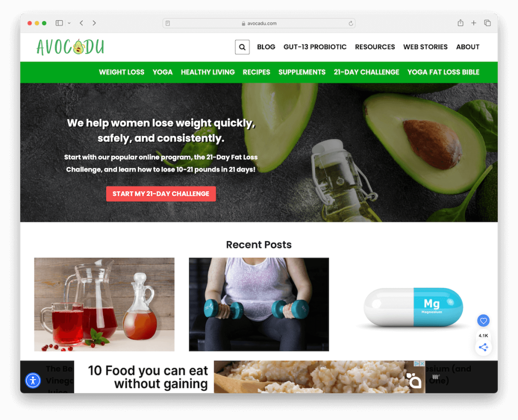
Avocadu’s wellness website is notable for its practical and engaging design. It features a two-part header that neatly organizes menu links for easy navigation.
The handy three-column grid layout efficiently displays information without overwhelming the user.
Avocadu enhances user engagement with a popup offering a free gift in exchange for an email, cleverly building its community.
Additionally, the site includes an accessibility configurator, making it inclusive and user-friendly for visitors with different needs and preferences.
Note: Build an accessibility configurator/menu into your website so more visitors can enjoy your site.
Why we chose it: Avocadu is a balanced blend of accessible wellness content, user-friendly design, and engaging, community-building features.
3. The Art Of Healthy Living
Built with: WordPress
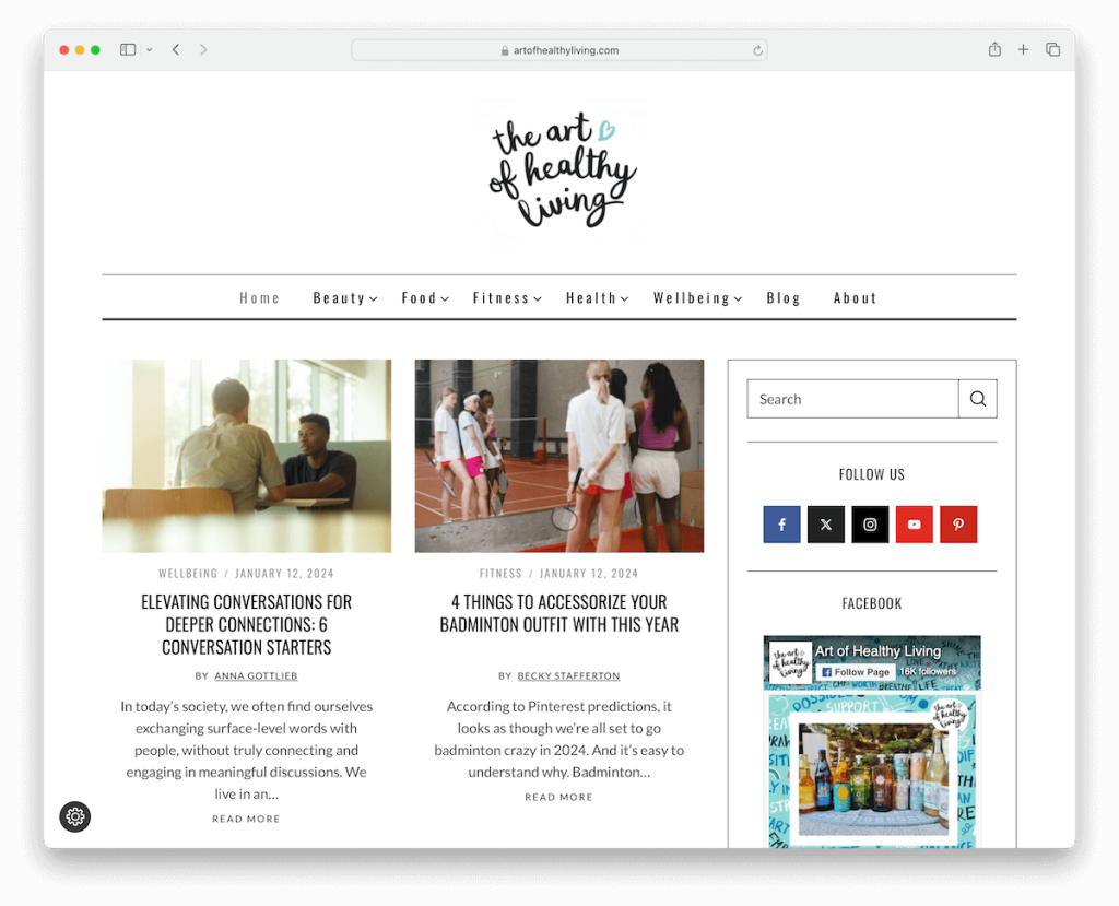
The Art Of Healthy Living wellness website has a minimalist header that exudes simplicity and elegance. It is complemented by a mega menu for extensive yet organized navigation options.
The layout features a right sidebar for additional content and a two-column post layout that improves readability and user engagement.
The website creatively integrates an Instagram feed into its footer, showcasing a vibrant community and real-time updates. A subscription form in the footer also invites users to stay connected, fostering a growing wellness community.
Note: Utilize the power of the mega menu if you have lots of content for a more convenient browsing experience.
Why we chose it: The Art Of Healthy Living combines sleek design, user-friendly navigation, and social integration, offering an immersive and connected wellness experience.
4. Eating Bird Food
Built with: WordPress
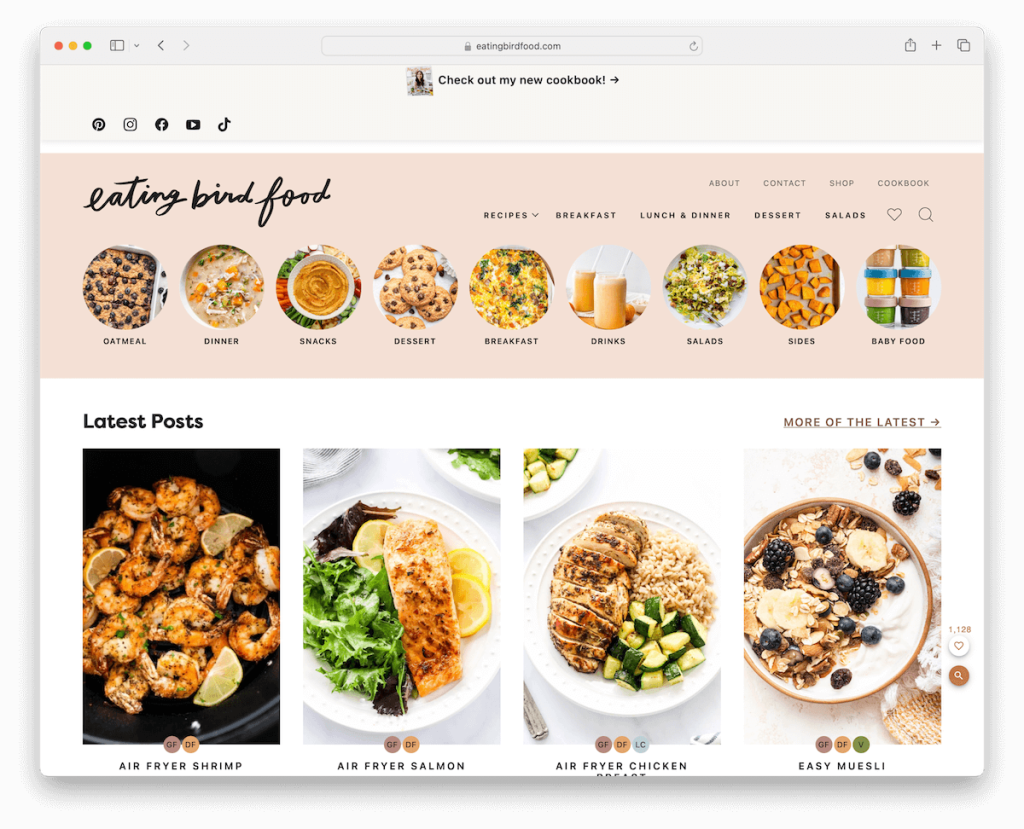
Eating Bird Food stands out with its boxed layout, providing a clean and organized user experience.
The large top bar effectively promotes a cookbook and offers quick access to social media icons. Its beautiful header showcases unique navigation with images, enhancing visual appeal and usability.
The site includes a search function with live results and embedded videos for interactive content exploration.
A popup featuring a special offer strategically engages visitors, while the simple footer with links and social media icons neatly encapsulates the site’s resources.
Note: Use a top bar thoughtfully for promotions, special offers, etc.
Why we chose it: Eating Bird Food blends aesthetic appeal with functional design, offering rich content and interactive features.
5. Muscle & Fitness
Built with: WordPress
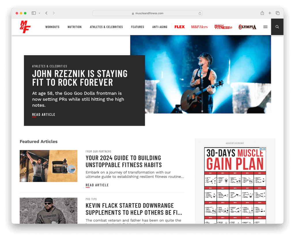
Muscle & Fitness’s wellness website excels with a feature-rich design. Its mega and hamburger menus ensure effortless navigation, while the floating header keeps essential options always available.
The homepage is strategically sectioned, offering users easy access to many fitness resources. Moreover, the neatly organized exercise browser simplifies workout selection.
A footer with multiple columns neatly presents links, social media connections, and newsletter signup, ensuring visitors can access valuable content and stay engaged with the community.
Note: Make a floating header and boost your site’s user experience.
Why we chose it: Muscle & Fitness has user-friendly navigation and strategic content organization.
6. Wellness Mama
Built with: WordPress
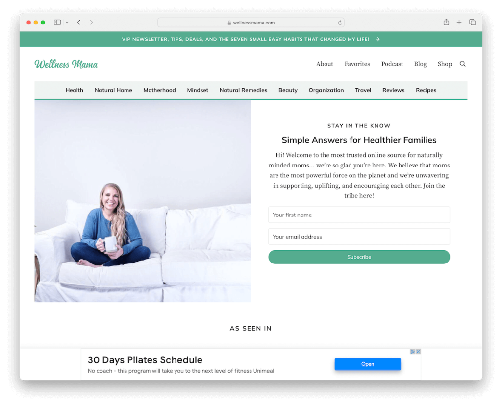
Wellness Mama’s wellness website offers a unique experience with its thoughtful design. A top bar notification keeps visitors informed, while a subscription form placed prominently above the fold helps build an email list.
Below the fold, an exposed search section simplifies content discovery, which isn’t something you’d normally see on a blog/magazine site.
Trending and recent articles provide up-to-date information, while promotions for books and products cater to diverse wellness interests.
This holistic approach makes Wellness Mama a one-stop destination for those seeking comprehensive wellness insights and resources.
Note: Ensure your website’s search bar is clearly visible so visitors can easily and quickly find what they want.
Why we chose it: Wellness Mama has a user-focused design, offering valuable content, community interaction, and resource accessibility.
7. Nutrition Stripped
Built with: WordPress
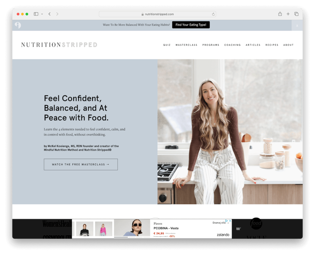
Nutrition Stripped’s wellness website captivates visitors with its stunning features. A prominent popup quiz engages users, while a floating top bar notification keeps them informed.
The split hero section balances compelling text and a call-to-action with eye-catching visuals. Below the fold, logos of leading publications build credibility, and a testimonials slider reinforces trust.
Sections for recipes, articles, and products cater to diverse wellness needs, while an Instagram feed adds an interactive element.
Note: Integrate social media feeds into your website for additional content display and social interactivity.
Why we chose it: Nutrition Stripped rocks engaging design, expert-backed content and interactive features, making it a top choice for wellness enthusiasts.
8. Mindbodygreen
Built with: WordPress
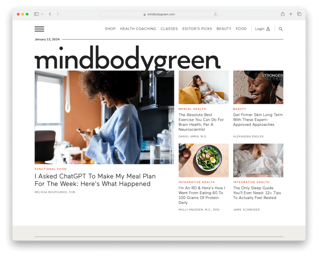
Mindbodygreen’s wellness website boasts a modern, minimalist design embodying simplicity and elegance.
Its main menu links, complemented by a hamburger menu, ensure easy navigation, while a prominent login icon enhances user accessibility. It also has a sticky header for convenience.
The text-only latest article carousel prioritizes content, and the use of light and vivid background colors makes sections visually striking.
A resourceful footer offers additional links and social icons, providing visitors with a comprehensive and engaging wellness experience.
Note: Adopt minimalism when in doubt regarding what website design approach to pursue.
Why we chose it: Mindbodygreen excels with its modern design, user-friendly interface, and valuable content.
9. The Real Food Dietitians
Built with: WordPress
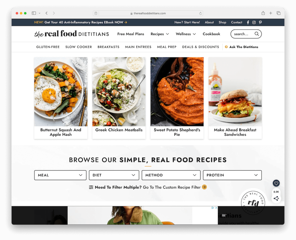
The Real Food Dietitians’ wellness website impresses with its thoughtful features for a boost in UX.
A multi-level drop-down menu enhances navigation, simplifying access to a wealth of content. The advanced recipe search function makes finding nutritious meals a breeze.
Multiple grid sections elegantly display diverse food resources, while embedded videos add an interactive element.
Various forms scattered throughout the website aim to collect emails for future marketing campaigns.
Finally, a convenient back-to-top button ensures effortless browsing. Also, when you start to scroll, The Real Food Dietitians site has a sticky section for recipes with horizontal browsing instead of a traditional floating header.
Note: Allow users a more refined searching experience with an advanced search.
Why we chose it: The Real Food Dietitians’ user-friendly design and practical resources make it a top choice.
10. Everyday Health
Built with: Sitefinity
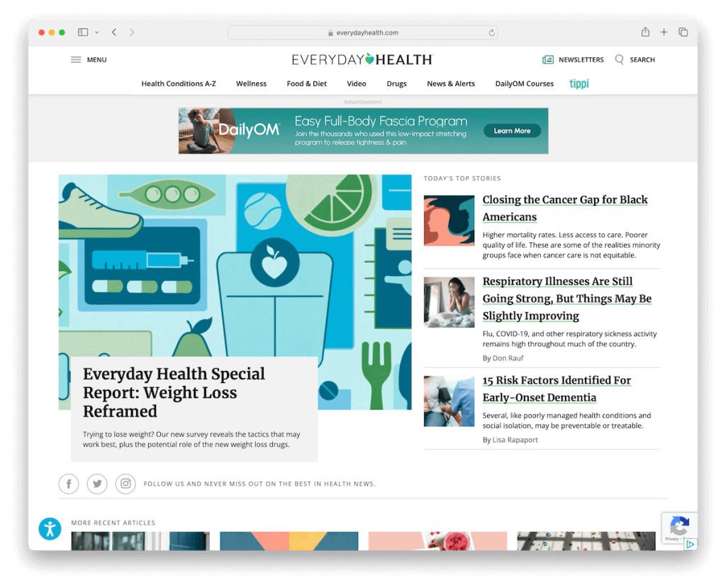
Everyday Health’s wellness website offers a modern and dynamic magazine-style design.
Its floating header with a hamburger menu ensures easy navigation, while a newsletter subscription option in the navigation bar encourages user engagement.
An accessibility menu enhances inclusivity so more visitors can enjoy the site’s content.
Furthermore, carousels and videos provide interactive content, while a feature-rich footer offers valuable resources.
With its comprehensive approach to wellness and user-friendly design, Everyday Health is a go-to destination for health-conscious.
Note: A hamburger menu is a handy alternative to creating a minimalist header with full navigation functionality.
Why we chose it: Everyday Health’s modern design, user-friendly features, and extensive wellness resources make it top-notch.
11. YouAligned
Built with: WordPress
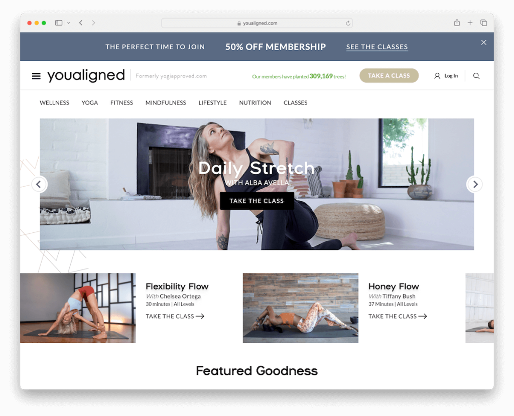
YouAligned’s wellness website pops with a bold and inviting top bar promoting its membership program.
The convenient search overlay provides quick access to popular classes and recommended articles. What’s also cool is that it allows users to search for articles or classes specifically.
A dynamic slider featuring compelling text and CTA buttons engages visitors effectively.
The boxed layout ensures content organization, while carousels and video backgrounds enhance visual appeal.
And a large Instagram feed fosters community engagement and inspiration.
Note: A slider works great in saving space and ensuring the attention-grabbing effect.
Why we chose it: YouAligned’s approach offers a captivating and connected wellness experience.
12. Mantra Wellness
Built with: Wix
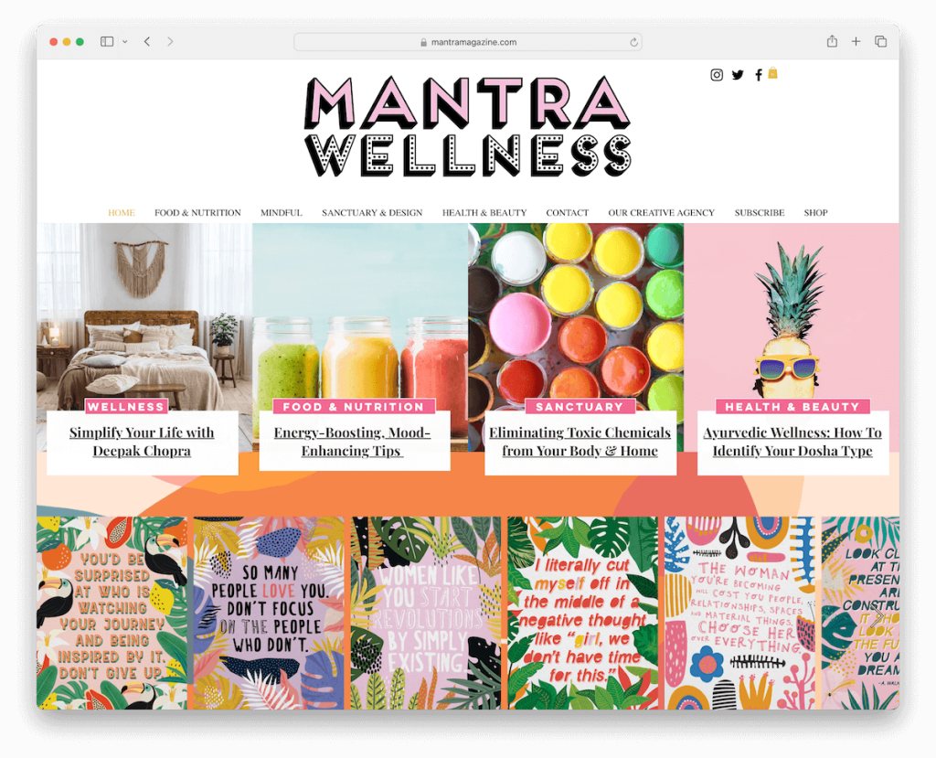
Mantra Wellness website stands out with its serene and minimalist – yet vibrant – design.
A discreet popup subscription encourages visitor engagement right from the get-go. Then, the custom background pattern adds visual interest, and the full-width website grid structure offers an uncluttered user experience.
The clean header features a large centered logo, with social icons above and menu links below, ensuring easy navigation. And a simple footer neatly summarizes essential information.
Note: Spice things up with a custom background that reflects your business and branding.
Why we chose it: Mantra Wellness embodies simplicity and user-friendliness, providing a tranquil online space for wellness seekers.
Don’t forget to check more fantastic websites built on the Wix platform.
13. Thrive Magazine
Built with: Wix
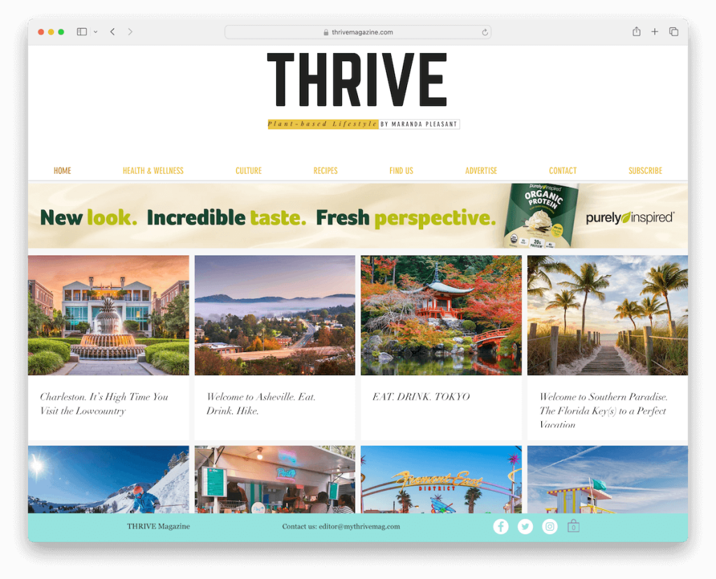
Thrive Magazine’s wellness website embraces a minimalist approach to design, allowing its content to take center stage.
Upon arrival, a discreet popup offers options for store location and magazine subscription, simplifying user choices.
The website features a clean and unobtrusive header and footer, with a newsletter subscription form as the sole element in the footer.
A floating bottom bar offers convenient access to contact information, social icons, and a shopping cart. While lacking a search bar, Thrive Magazine’s simplicity and streamlined design provide a distraction-free experience.
Note: Make social icons accessible so visitors can connect more easily.
Why we chose it: Thrive Magazine’s minimalist and distraction-free design and easy access to essential features create a serene wellness environment.
14. ISA
Built with: Squarespace
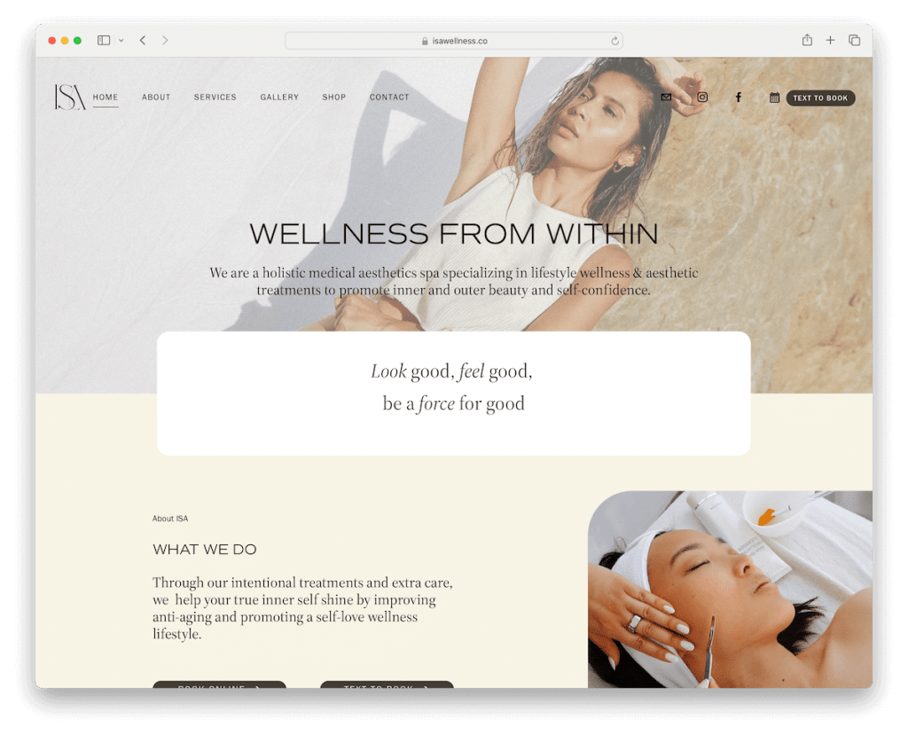
ISA’s wellness website offers a sleek, modern design that seamlessly adapts to user interaction. The transparent header transitions to a solid, sticky navigation bar as you scroll, ensuring easy access to key features.
Call-to-action buttons in the navbar guide users effectively to the calendar or text-to-book feature.
An Instagram grid feed with a lightbox feature adds visual appeal and interactivity, while the footer provides valuable information, including additional links, working hours, and contact details.
Note: Add action-first links and buttons (CTAs) in the navigation bar so users can easily navigate them.
Why we chose it: ISA’s user-centric design makes it a user-friendly and engaging Squarespace website for wellness exploration.
15. Sblended
Built with: Wix
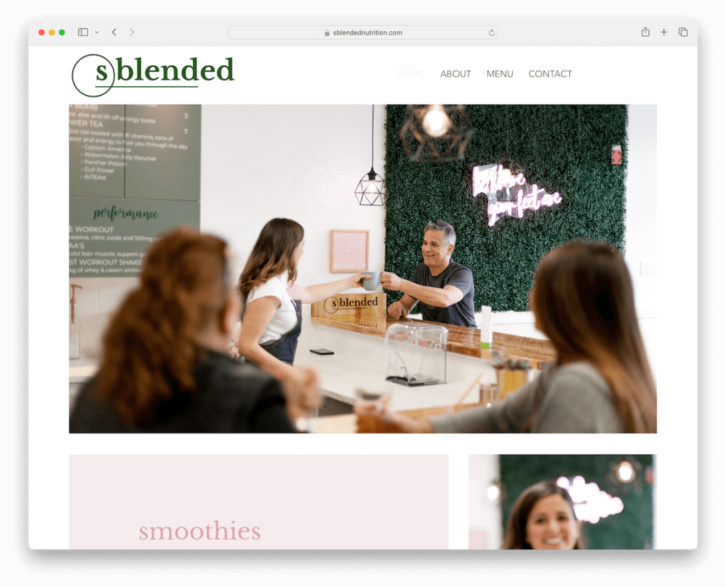
Sblended’s wellness website sets itself apart with its clean and minimalist look. The transparent header and menu exude simplicity, ensuring an uncluttered user experience.
Above the fold, a large banner with no text or CTA captivates visitors with its modern and sleek aesthetic. It continues into a few more sections, focusing on imagery to boost engagement.
Note: Create a neater atmosphere with a transparent header (but it might not work the best if sticky – still, it depends on the overall website design.)
Why we chose it: Sblended’s commitment to simplicity and elegance creates a serene online environment, making it an inviting platform for wellness exploration.
16. LOFF
Built with: WordPress
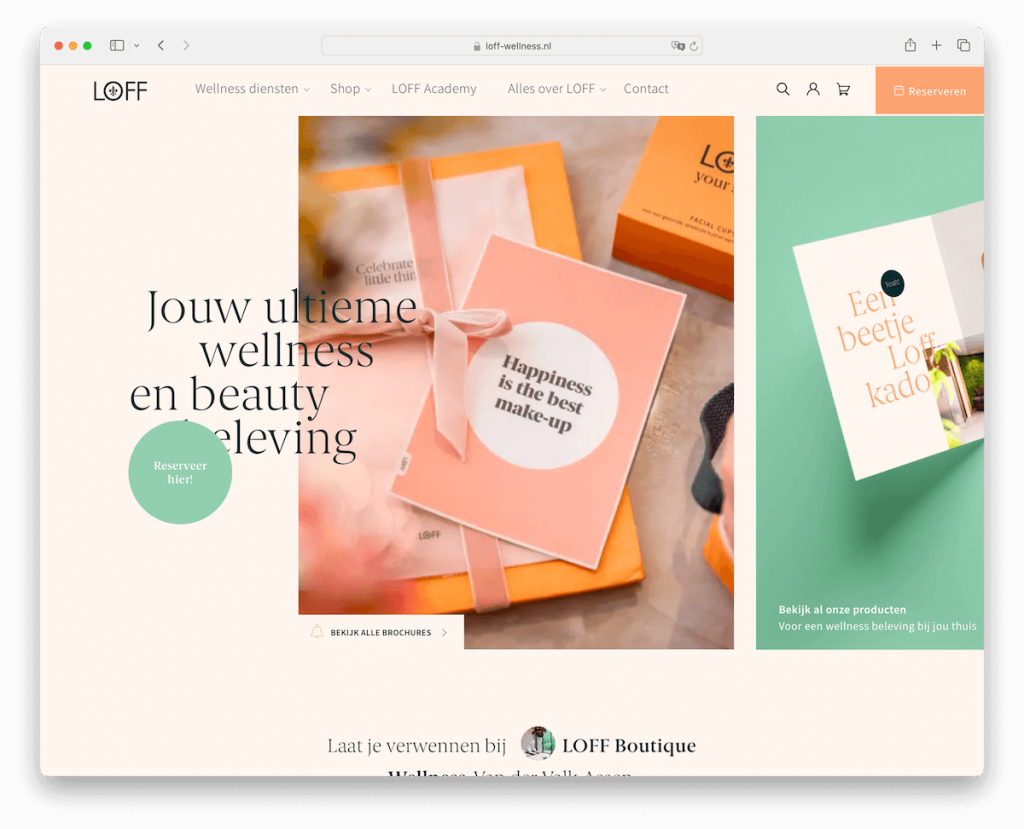
LOFF’s wellness website boasts a modern and interactive design that sparks interest immediately.
The floating header with profile, shopping cart icons, and a reservation button ensures seamless navigation. In addition to that, the site also has a mega menu to provide a better navigation experience.
A captivating watery hover effect adds visual intrigue above the fold.
Moreover, content loads dynamically as you scroll, enhancing user engagement. The addition of a WhatsApp widget in the bottom right corner offers instant communication convenience for all visitors.
Note: Implement hover effects strategically to provide more engagement and interactivity.
Why we chose it: LOFF’s blend of connectivity and aesthetics creates a user-friendly and visually appealing wellness destination.
17. Roczen
Built with: Webflow
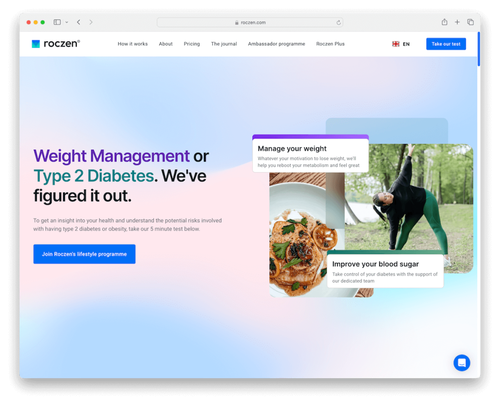
The Roczen website exemplifies modern design in the wellness industry with its mobile app-like interface and global accessibility via a language selector.
It features a testimonial grid, a thumbnail gallery, and an embedded promotional video, enhancing user connection.
Additionally, this Webflow website includes user-friendly accordions for FAQs and a comprehensive multi-column footer with extra links and information, showcasing a commitment to accessibility.
We also really like the soothing background sections that complement their business model nicely.
Note: Use branding colors strategically across your website so visitors feel right at home.
Why we chose it: Roczen is the top wellness website for its modern design, diverse features, and engaging, informative content.
18. Nu Performance
Built with: WordPress

The Nu Performance wellness website sets itself apart with a unique scrolling experience, making navigation both engaging and informative.
Its design, characterized by rounded edges, mimics a mobile app, enhancing user interaction. The website’s aesthetic is light and clean, promoting a sense of calm and clarity.
Client testimonials are prominently featured, providing real-life insights into the effectiveness of their services.
A standout feature is the cool counter at the bottom of the page that displays the distance scrolled in kilometers, adding a direct and fun element to the user experience.
Note: Introduce cool animations, effects and fun elements and add life to your website.
Why we chose it: The blend of innovative design and interactive features makes Nu Performance a noteworthy example in wellness web design.
19. Mommypotamus
Built with: WordPress
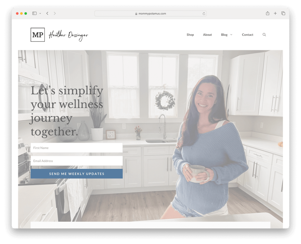
Mommypotamus’s wellness website stands out with its light and inviting design, fostering a calm and informative atmosphere.
At the forefront is a large banner above the fold, effectively promoting newsletter subscription, enhancing user involvement.
The site features a multi-level drop-down menu, simplifying navigation across various topics.
Furthermore, the “As Featured In” section adds credibility, showcasing endorsements from reputable sources.
The latest articles are neatly displayed in a grid, providing easy access to fresh content. Lastly, the clean footer includes social icons, essential links, and business details.
Note: Use testimonials, reviews and other trust factors on your website to boost credibility.
Why we chose it: Mommypotamus shines with its inviting design, engaging newsletter promotion, and credible “As Featured In” section.
20. Born Fitness
Built with: WordPress
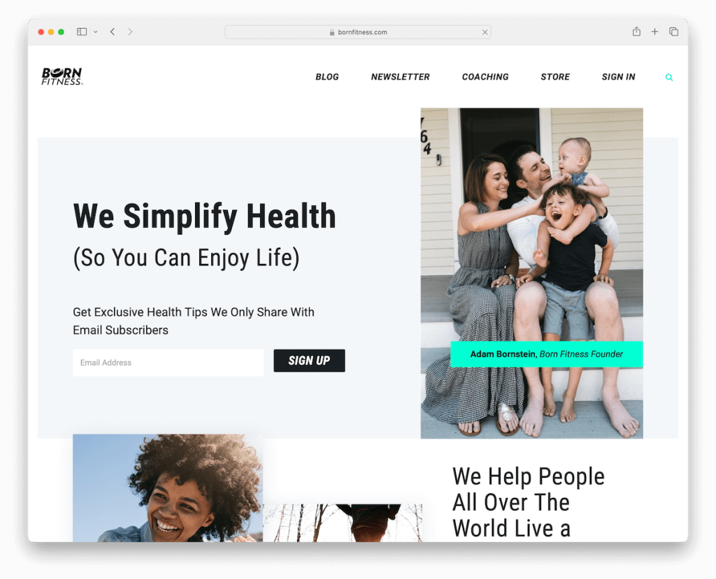
Born Fitness wellness website distinguishes itself with a top bar that effectively promotes newsletter subscription, instantly engaging visitors.
The search bar is not just functional but also offers recommendations, enhancing user experience.
Testimonials from both clients and notable personalities add a layer of trust and credibility.
Its modern and minimal design ensures a clutter-free and focused browsing experience. This aesthetic extends to both the header and footer, which are clean and streamlined, providing essential information without overwhelming the user.
Note: Simplify visitors’ search experience with live recommendations.
Why we chose it: Born Fitness uniquely combines an engaging newsletter top bar, insightful search recommendations, high-profile testimonials, and a minimalist, modern aesthetic.
21. 12 Minute Athlete
Built with: WordPress
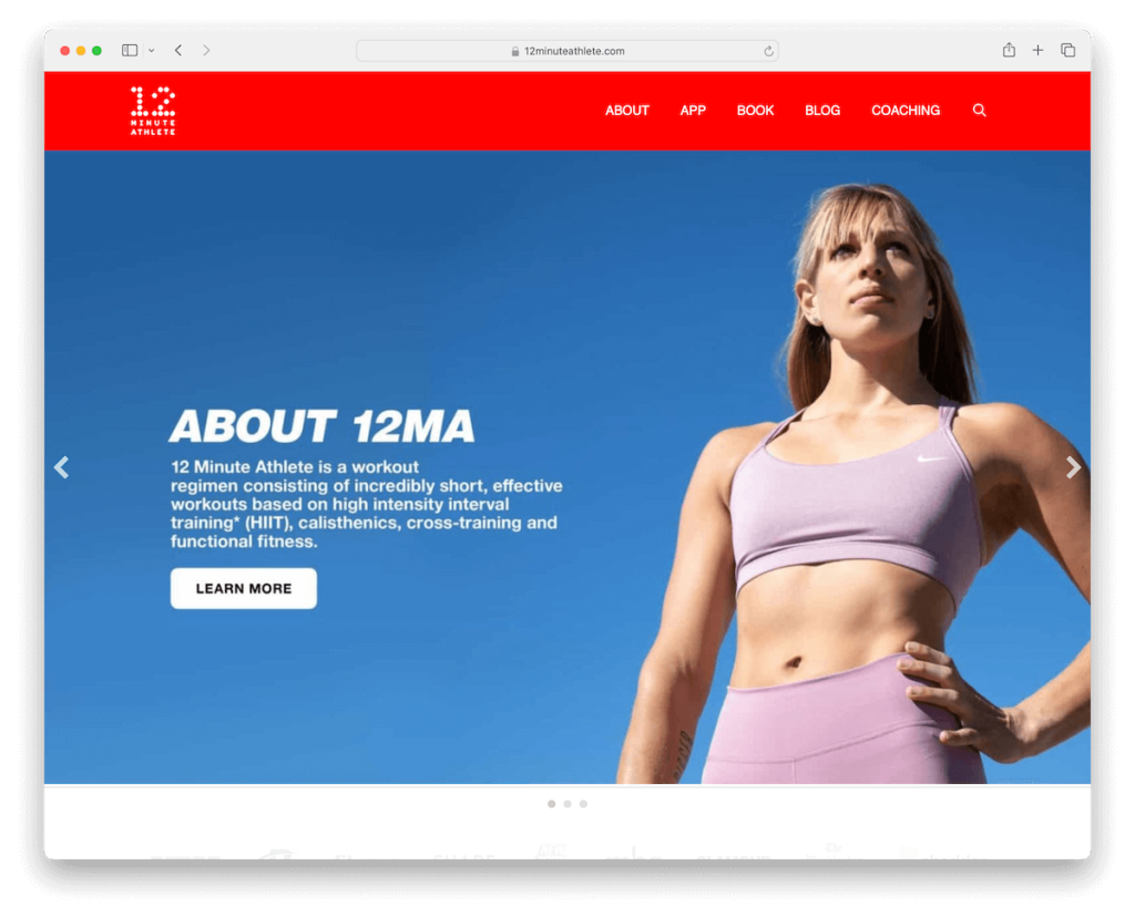
The 12 Minute Athlete wellness website captivates with its striking red detailing, creating a dynamic and energetic vibe.
A large slider above the fold immediately grabs attention, showcasing key content and offerings.
The website effectively promotes its diverse products, including a book, an app, and various programs, ensuring users are well informed. Additionally, it highlights the founder, Krista, adding a personal touch and credibility.
The inclusion of a newsletter subscription form further engages visitors, keeping them connected and updated.
Note: Create detailing across your website with your main color and spark vibrance.
Why we chose it: The blend of vibrant design and comprehensive content makes the 12 Minute Athlete website a noteworthy example.
22. The Chalkboard Mag
Built with: WordPress
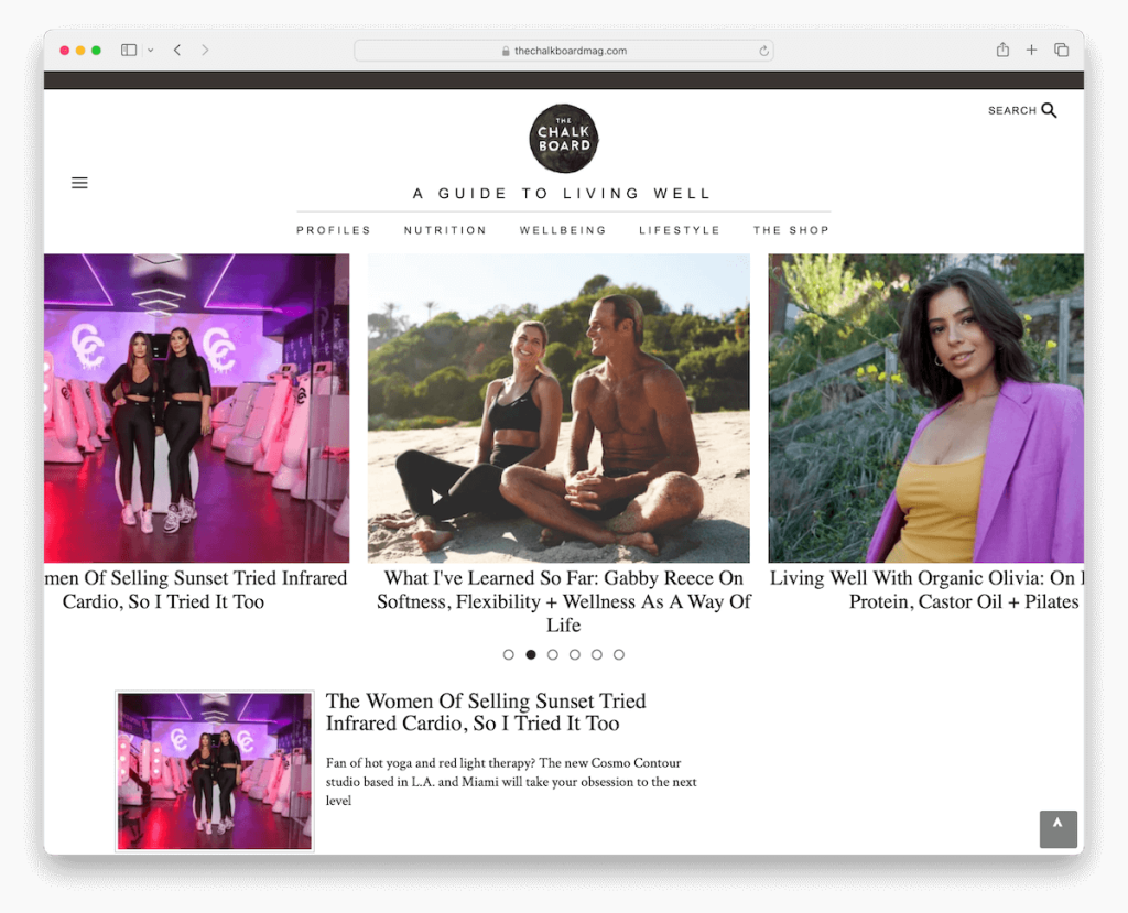
The Chalkboard Mag wellness website is a standout with its engaging newsletter popup, ensuring visitors are immediately invited to connect.
The site cleverly combines a hamburger menu with main navigation links, offering simplicity and depth in navigation. Additionally, the search bar provides live results, enhancing UX.
A dynamic post carousel above the fold showcases the latest and most popular content before you dive deeper into the content.
The main blog post layout features a right sidebar for additional content and advertisements, while a back-to-top button eliminates scrolling.
A simplified footer rounds out the design, making information easily accessible yet unobtrusive.
Note: Benefit from the right sidebar to include additional info, content and advertisements.
Why we chose it: The Chalkboard Mag mixes interactive features, intuitive navigation and streamlined design.
What Makes A Great Wellness Website
These features enhance the UX and ensure that each website visit contributes positively to the user’s better health and well-being journey.
- User-friendly interface: A great wellness website should have an intuitive, easy-to-navigate layout that makes finding information straightforward for users of all ages and technical abilities.
- Quality content: The content should be authoritative, well-researched, and regularly updated, covering a wide range of wellness topics such as nutrition, exercise, mental health, and holistic practices.
- Interactive tools: Features like personalized wellness plans, interactive quizzes, and health trackers can engage users more deeply, making the website not just informative but also a practical tool in their wellness journey.
- Responsive design: The website should be functionally consistent across various devices, including smartphones, tablets, and desktop computers, ensuring a seamless experience for users on the go.
- Community engagement: Forums, comment sections, or social media integration allow users to interact, share experiences, and offer support, fostering community and belonging.
- Visual appeal: An aesthetically pleasing design with calming colors, high-quality images, and a clean layout can enhance the user’s experience. (Make the website more inviting and enjoyable to use.)
- Accessibility features: Incorporating features for accessibility, such as text-to-speech options, alternative text for images, and easy-to-read fonts, ensures the website is inclusive and usable for individuals with different abilities.
FAQs About Wellness Websites
What design elements make a wellness website visually appealing?
Key design elements include a clean and uncluttered layout, soothing color schemes, high-quality images, and easy-to-read fonts. These elements create a calming and welcoming atmosphere that resonates with the wellness theme.
How important is mobile responsiveness for a wellness website?
Extremely important. With the increasing use of smartphones, a wellness website must be responsive to various screen sizes to ensure a seamless user experience across all devices.
What features enhance user engagement on a wellness website?
Interactive features like health quizzes, wellness trackers, and interactive infographics can significantly enhance user engagement. Additionally, easy navigation and fast load times keep users interested and reduce bounce rates.
How can a wellness website ensure it’s accessible to all users?
Implementing accessibility features such as keyboard navigation, screen reader compatibility, and alternative text for images helps make the website usable for people with disabilities, ensuring inclusivity. Another great solution is to implement an accessibility configurator so visitors can adjust the site according to their needs.
What role does content layout play in a wellness website’s design?
A well-organized content layout helps users quickly find the information they want. Headings, bullet points, and short paragraphs improve readability, while strategic call-to-action placement can guide users through the site.
Was this article helpful?
YesNo
