First, review these amazing podcast websites, and second, build a professional online presence for your business.
You’ll be full of new ideas!
For example, did you know you can embed your full episode playlist on your site or just the latest one? Or collect emails to grow your list and build your business through email marketing?
You can also sell merch on your page, start a blog and accept donations.
So. Many. Options.
Finally, a WordPress podcasting theme is one of the best ways to create a great online presence.
Enjoy!
Best Podcast Websites For Your Inspiration
1. Duncan Trussell
Built with: Squarespace
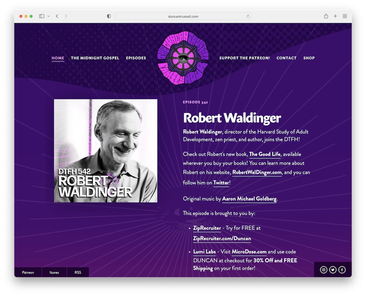
The purple color definitely makes Duncan Trussell pop nicely. This site has pretty extensive excerpts about each podcast episode with extra useful links.
The header is simple and transparent, which blends well with the design. Moreover, there are multiple sticky buttons, so searching for social media, iTunes, etc., is unnecessary. Additionally, Duncan Trussell uses a search bar in the footer section, which isn’t too common.
Note: Use sticky buttons/elements if you want to keep reminding the user of something.
Do you need more design ideas? Then check out this Squarespace website examples list.
2. The Friday Habit
Built with: Squarespace

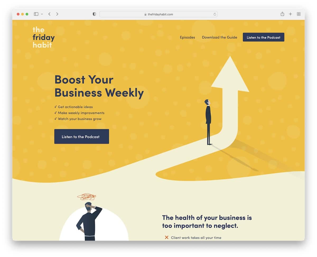
The Friday Habit is a podcast website with a catchy but simple responsive web design that ensures a great user experience.
The hero section features a title, text and a call-to-action (CTA) button for the podcast. There’s an additional CTA in the navigation bar and multiple more scattered across the website.
Plus, The Friday Habit uses an opt-in form for a free guide/workbook, which helps them grow their email list.
Note: Make sure your podcast CTAs are clearly visible.
3. Twenty Thousand Hertz
Built with: Squarespace

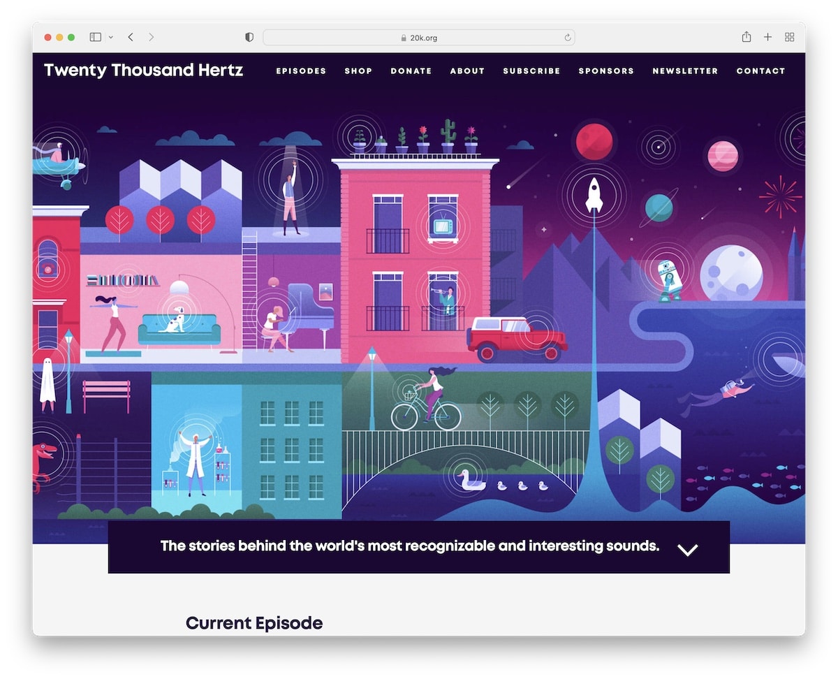
Twenty Thousand Hertz has an attention-grabbing above-the-fold section with a banner at the bottom explaining what the podcast is all about. Moreover, the animated down-pointing arrow encourages the user to scroll for more.
There’s also a press section with logos and links to mentions. The home page has a contact form with social media buttons on a cool animated gradient background.
Note: Add a press section with logos and links to articles to build social proof.
4. The Collective Podcast
Built with: Squarespace

The Collective Podcast website example has a minimalist grid layout with podcast thumbnails, titles and excerpts.
The header and the footer stick to the same light background, which keeps the simplicity at the highest degree.
What’s more, The Collective Podcast has social media, email and podcast links in the navbar, plus a search bar and shopping cart.
Note: Maintain a clean website design to emphasize your episodes and content more.
5. The Newsworthy
Built with: Squarespace

The Newsworthy is a podcast website example with a hero area dedicated to the latest episode with a direct link.
The simple website layout and plenty of white space call for a great readability experience both on mobile and desktop.
There’s also a section featuring listener reviews to build trust and ensure more folks decide to listen to the episodes.
Note: Introduce reviews to your website to increase your listener base.
6. Congratulations With Chris D’Elia
Built with: Squarespace

What we find really awesome about Congratulations With Chris D’Elia’s page is the embedded playlist above-the-fold. And while you can listen to episodes via the website, Chris also added a CTA button to Apple Podcasts.
Furthermore, the top bar notification (on a yellow background) invites everyone to join his Patreon. But there’s another call to action bellow-the-fold.
Note: Use a top bar notification on a contrasting background to grab more eyeballs.
7. Niche POD
Built with: Squarespace

If you like The Collective Podcast’s site but want to make it more minimalist, then Niche POD is an excellent example.
The website also has a grid layout on the home page, which features episode thumbnails, dates and titles (without the excerpt).
Niche POD has a transparent sticky header with a hamburger menu and a minimalist footer with social icons and links to Apple Podcasts and home.
Note: A grid layout with extra spacing can create a cleaner look so the potential listener can focus on each element more easily.
8. Unladylike
Built with: Squarespace

Unladylike’s unique background creates a strong attention-grabbing effect with menu links in the center of the hero section instead of the header area. Speaking of the header, it disappears when you scroll down but reappears when you scroll back to the top.
Unladylike also has an entire playlist on the home page, so you can listen to the episodes without leaving the website.
Note: Use a disappearing/reappearing header to boost user experience.
9. Stassi Schroeder Clark
Built with: The Voux Theme

Stassi Schroeder Clark’s podcast page section has a large image banner of herself above the fold, with a notification at the bottom.
The header is transparent but turns solid and floats on the scroll.
This podcast website also has a back-to-top button to avoid scrolling. And there are multiple CTA buttons linking to different platforms where you can listen to the podcast.
Note: Like the sticky header, the back-to-top button also contributes to better UX.
10. ALL IN By Teddi
Built with: Elementor

ALL IN By Teddi gives you a quick introduction in the hero area with an image and text, plus links to three different podcast destinations.
The website also has two forms, one for newsletter subscription and the other for accountability coaching registration.
Note: A podcast is a great addition to growing an established business over and beyond.
Get all the ins and outs of this extraordinary WordPress page builder by reading our in-depth Elementor review.
11. Laura Dawn
Built with: Elementor

Laura Dawn has an animated website with a strong engagement factor that’ll keep you scrolling and enjoying the content a whole bunch.
But our favorite feature of this podcast website is the sticky episode player on the bottom of the screen that you can share on social media.
Note: Use animations on your website to raise the engagement bar.
12. Song Exploder
Built with: Underscores

Song Exploder is a podcast website example with a blog-like layout without sidebars. The page uses a single column where all episodes have an embedded player to listen to the podcast directly.
Note: A blog can work really well for a podcast. (Tim Ferriss has one of the largest podcast blogs in the world.)
13. Office Ladies
Built with: Squarespace

Office Ladies know how to trigger visitors’ attention with a large and bubbly hero image (without any text and CTA). The page design leans towards simplicity with a clean header and footer with the same background color as the base.
Office Ladies use a quick introduction below the fold that goes straight into promoting their latest episode.
Note: Use (only) an image with an engaging image above the fold to spark interest.
14. Being Boss
Built with: Underscores

Instead of using a link or CTA to podcast episodes, Being Boss uses a newsletter subscription form above the fold. What’s unique is the subscriber feedback that works great for social proof. But there’s also another review that’s about the podcast itself.
Being Boss’s header is sticky that has navigation with a hover effect. Moreover, the dark footer has a nice dynamic feel with multiple widgets for links, social icons, podcast icons and (another) subscription form.
Note: If your podcast heavily relies on email subscribers, use a form above the fold.
15. Joe Rogan
Built with: Squarespace

Joe Rogan’s website instantly stands out from the rest with its dark design. This podcast has a semi-single-page layout with additional internal pages for shop, blog and contact.
While the header floats on top of the screen for easy site navigation, there’s no footer, just the “Powered by Squarespace” text.
Note: It’s easy to stand out from the world of light web design – create a dark one!
16. Emma Gannon
Built with: Squarespace

Emma Gannon has a chic split-screen design, with text on the left and an animated image of herself on the right. Catchy!
The floating header features a navigation bar, plus social media icons and a CTA button that takes you to contact details.
Like the header, the footer is very uncomplicated, with additional menu links and a search bar.
Note: A search bar can also be in the footer (better there than no search bar in terms of UX).
17. How Did This Get Made
Built with: Squarespace

How Did This Get Made enhances user engagement with a parallax hero image and multiple sections with multiple background colors to make browsing more dynamic.
The transparent menu makes the first-time impression less distracting, which is always a big plus. But even the footer maintains simplicity with additional business details and social and podcast icons.
Additionally, you can also listen to the podcast via the integrated player.
Note: Integrate your podcast episodes directly into your website.
18. SERP’s Up
Built with: Wix

SERP’s Up is Wix’s podcast with a minimalist web design that promotes the latest episode above the fold. You can listen to it on the spot!
Additionally, SERP’s Up has a two-column grid-style blog where you can find other podcasts and a “load more” button.
They also have a section where you can enter your email, so new episodes land directly in your inbox.
Note: Instead of loading all the posts right away, use a “load more” button, which will also contribute to your website’s loading speed.
Gain more design ideas by reviewing these best websites built on the Wix platform.
19. Nikki Spo
Built with: Wix

Besides the header, Nikki Spo has a top bar where you can find the search bar and social icons.
This podcast website has two sticky elements at the bottom of the screen; one is a chat box and the other is a newsletter subscription popup.
Note: A top bar can be a fantastic location for a search bar and adding additional links, notifications, etc.
20. Artpop Talk
Built with: Wix

Artpop Talk has a large newsletter form that opens on page load, which you can close by pressing “x.”
The plain but bold header sticks to the top to ensure surfing through the page doesn’t require scrolling back to the top. It’s also a semi one-page website, like Joe’s, but a lot more vibrant!
Note: Let your sparkling personality shine through your podcast website’s design.
Was this article helpful?
YesNo
