Looking for inspiration for your makeup website? Here you will find examples of the best makeup artist websites and some tools to build a similar website.
Women always want to look their best, especially on special occasions. That is where makeup comes like a superhero. Accordingly, the global beauty industry is worth over $600 billion and is estimated to increase with a market value of almost $900 billion by 2024. With such statistics, it’s clear that the demand for makeup is high, and the beauty industry is growing fast. With makeup’s confidence and competency to women, who could have resisted its essence? Since every makeup brand needs to impress potential customers, you must closely examine which elements you should add to your website. If you’re one of the makeup brands that wish to build a web presence, you can look into this list of makeup websites that will help you achieve your goal. We’ve handpicked these websites to provide striking and outstanding inspiration.
Best Makeup Artist Website Design Examples
While you can find genius developers to create your website or acquire extraordinary themes, you must always find the ideal websites for motivation. In this collection, you can find modern and jaw-dropping website design for makeup business and makeup artists. Each component has outstanding, user-friendly designs you can replicate for your project. Check out these makeup websites and jot down the features you wish to implement.
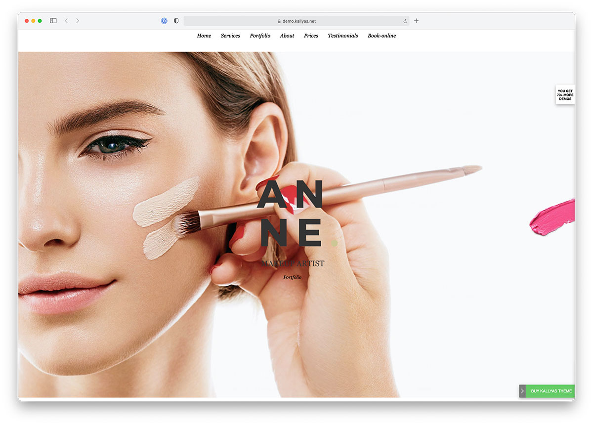
1. Kallyas
Kallyas is a flexible WordPress theme built for makeup artists to simplify website design.
2. Bridge
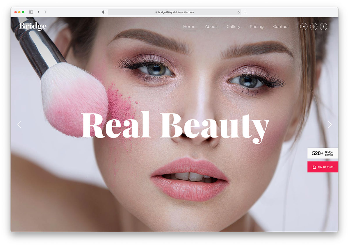
Bridge is a multipurpose WordPress theme for beauty salon and makeup artist websites. Building your websites has never been easier thanks to WordPress and this amazing theme.
3. Evagher
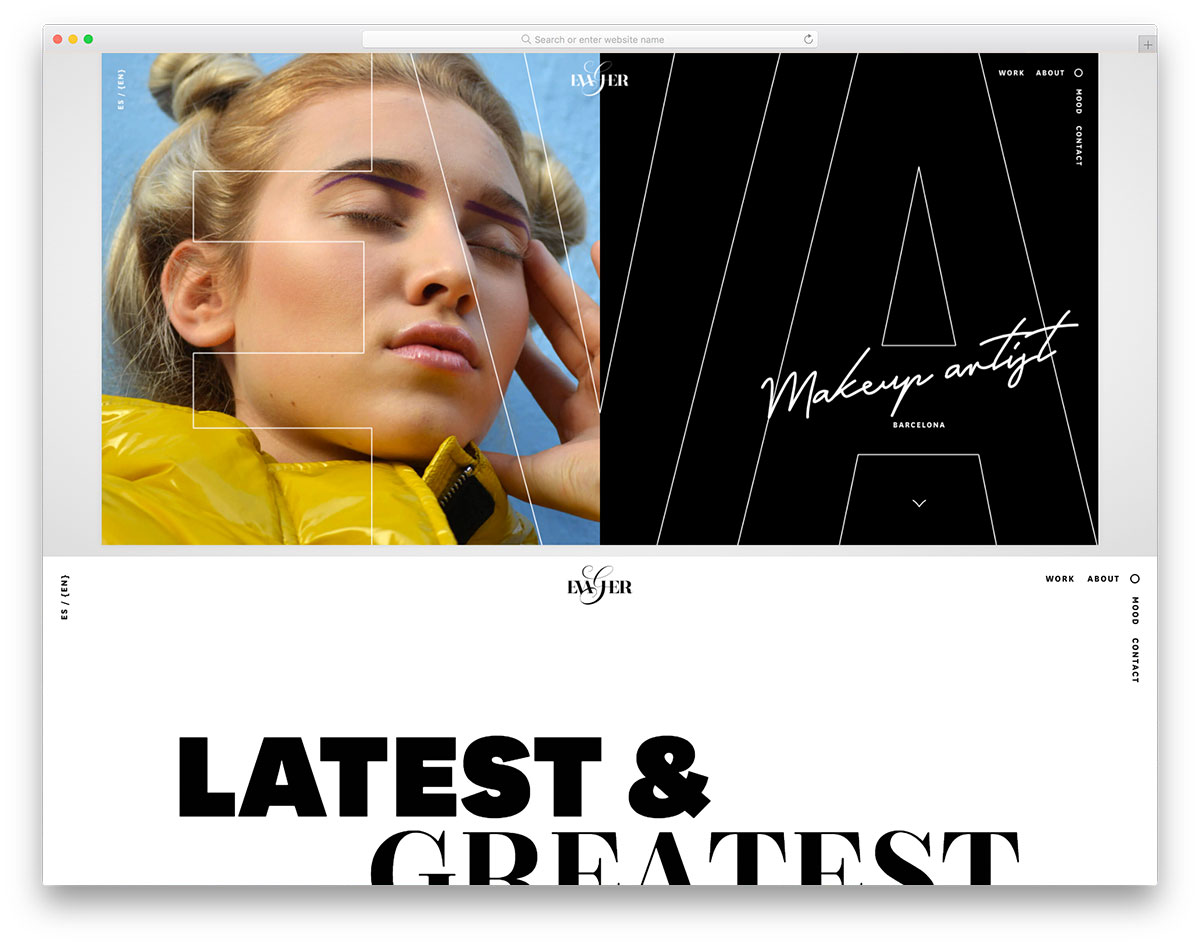
Different makeup brands reveal their identities as a businesses through the impressive website. Evagher is one of the visually appealing makeup websites that implements creativity, sophistication and usability. This breathtaking website welcomes visitors with a beautiful split-screen layout on the hero header. Clear and high-quality images look entertaining as they’re randomly displayed on one side while a creative white text looks superb on plain black. Moreover, its menu is unique and awesome too.
What’s more? Check out how inspiring this website is for makeup artists and entrepreneurs. The website also embraces the power of white space, striking images, and a brief description.
4. Sylvia Spitzbart
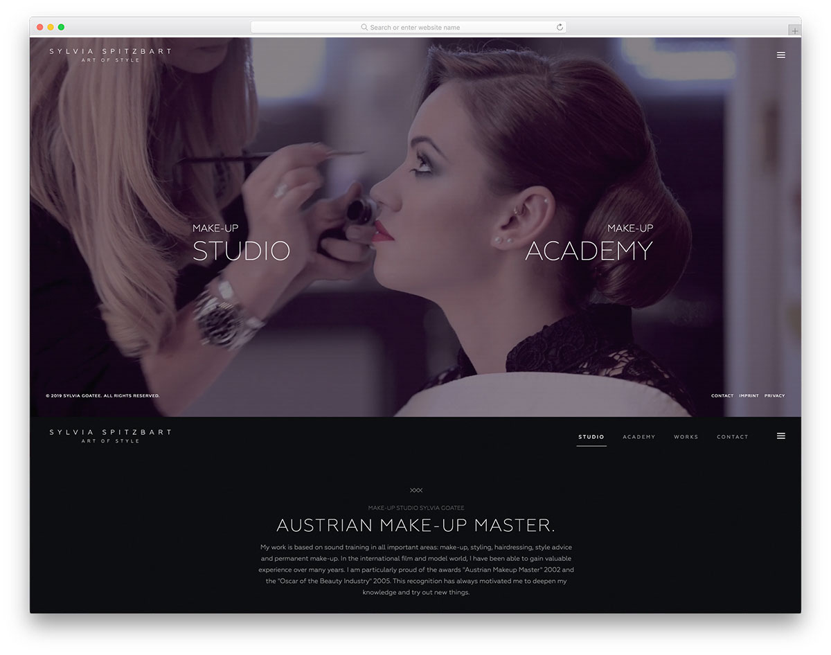
More and more brands consider the essence of having a video background for their business. Thus creates an entertaining and engaging atmosphere for potential customers. Sylvia Spitzbart implements this kind of creativity on its website’s homepage. It provides an option to browse its makeup studio or makeup academy. Having a unique and excellent layout, this website truly stuns a visitor and is worth being in this list of amazing makeup websites. Organizing contents in an asymmetrical layout, Sylvia Splitzbart makes an elegant presentation of images and its good copy. Furthermore, it also utilizes the sticky menu for easy and quick navigation. Other website features include a smooth slider, video integration, an off-canvas menu, and more.
5. Sara Pascolini
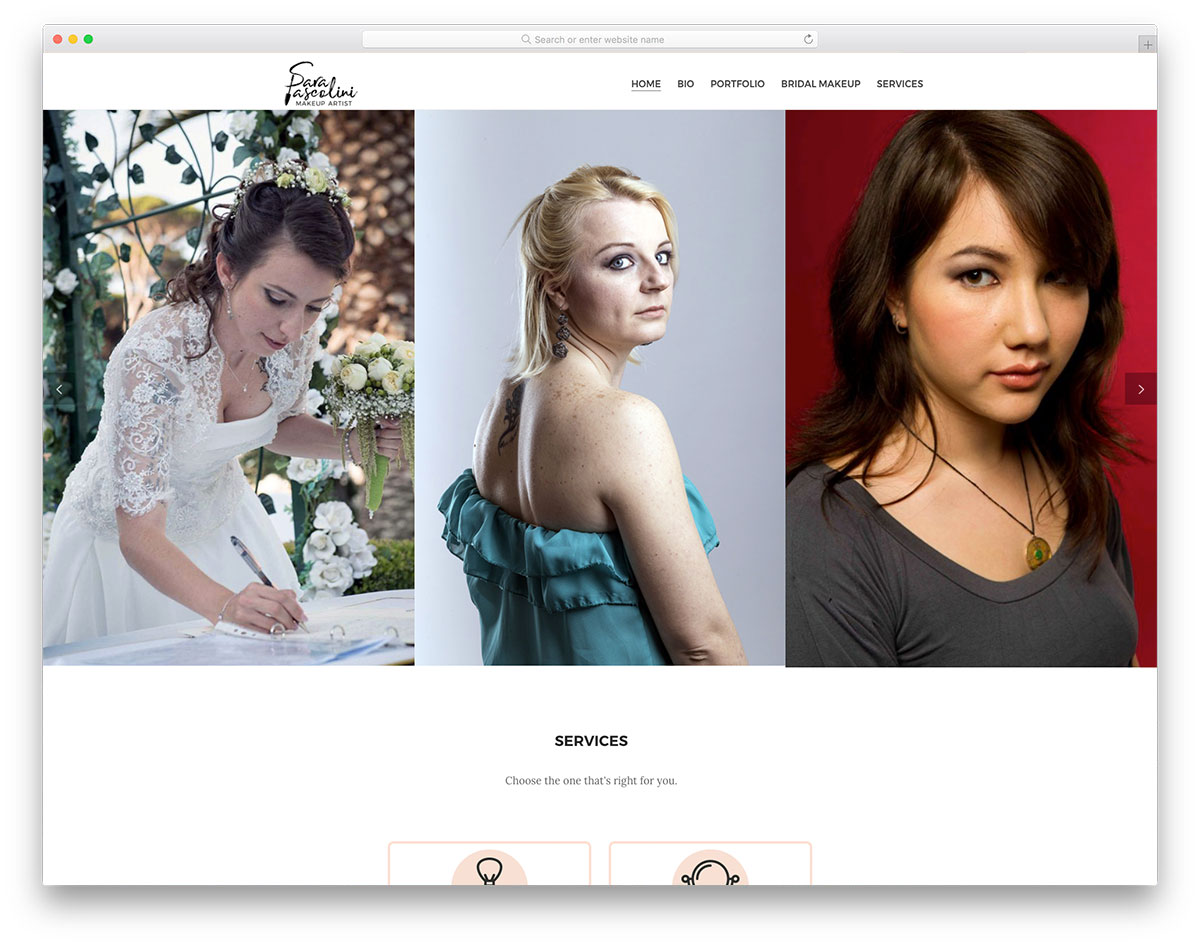
Professional makeup artists are a demand these days. As more cosmetic brands are available on the market, there is also a great demand for makeup artists to do wonders. Hence, an effective marketing tool is needed to improve one’s profession. Sara Pascolini adopts the power of web presence in improving career. The homepage looks exceptional with a wonderful cool and smooth slider images display.
Additionally, presenting services in an attractive course makes it easier to convey messages to customers. Other website pages are the bio for displaying credibility, portfolio for presenting works; bridal makeup page and services display. It also provides the contact number and email address for easy connection with interested clients.
6. Michael Vincent Academy (MVA)
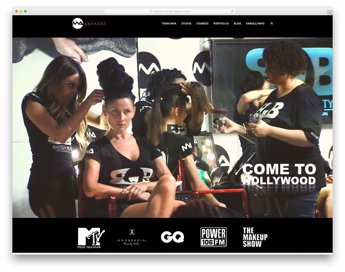
Indeed makeup can transform the looks of women. With the different makeup products available in the market, it may be hard to pick one that suits you. That’s where the expertise of makeup artists and makeup classes are in demand. Michael Vincent Academy offers makeup classes that are world-class in LA. However, its glamourous website is ever ready to promote its brand across the web 24/7. Its website has a nice introduction with video integration.
Furthermore, it also increases its credibility by revealing the list of firms and establishments that trusts MVA compiled using a slider. It also presents its services is a stylish way via square boxes. That’s not all, it also showcases essential statistics that can improve the authenticity of this brand.
7. Steeledezign
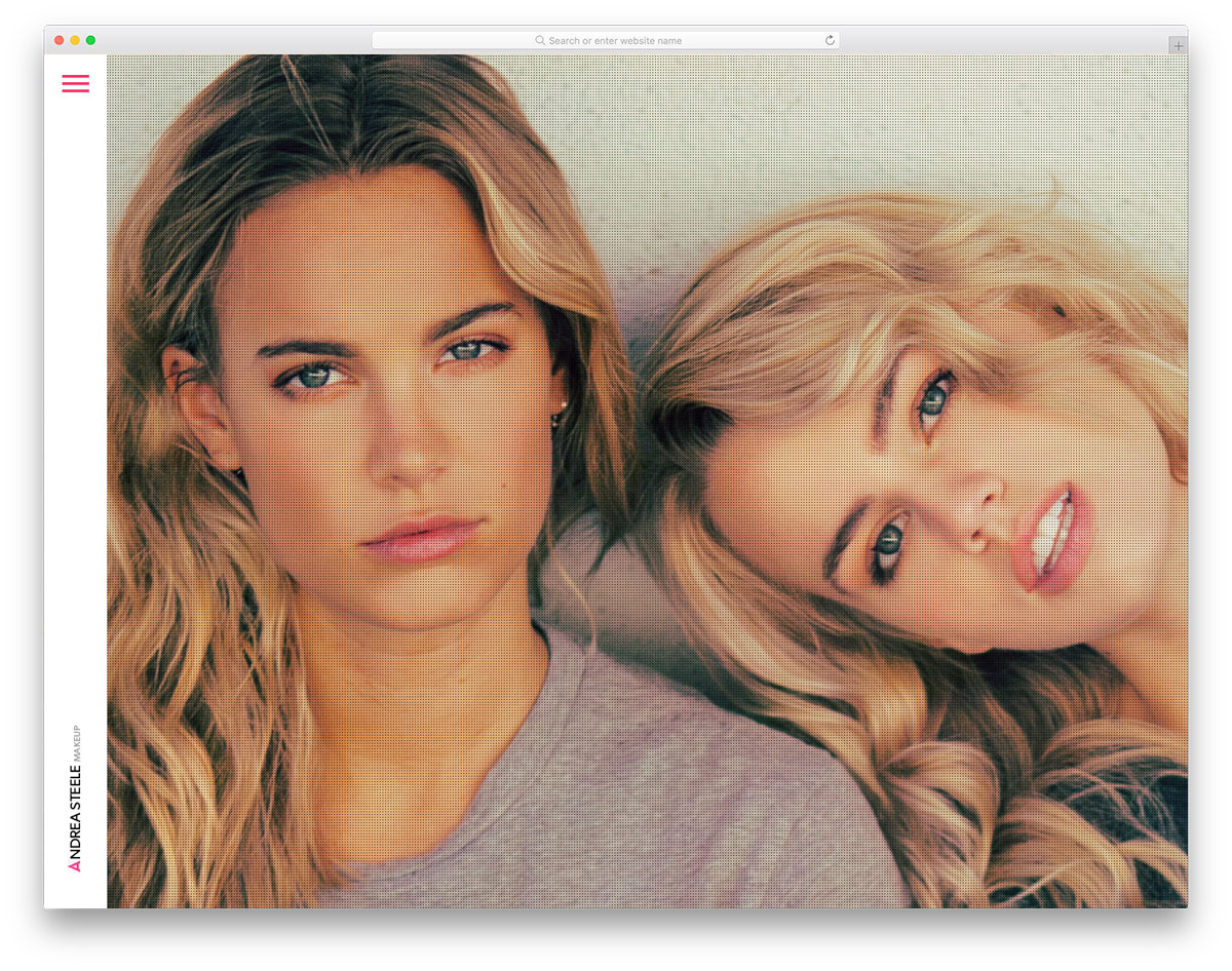
Surely, the appearance of a person greatly affects self-confidence. That’s why numerous brands of makeup and makeup artists are emerging to meet women’s needs worldwide. Steeledezign is a gorgeous makeup artist website that will be a great inspiration. Its homepage has a random display of compiled images of its authenticity along with the off-canvas menu. This website impresses potential clients with image galleries of the artist’s works. The gallery is presented using a smooth slider and in a masonry layout. While it provides a gorgeous image gallery and exhibits dramatic makeup works in a masonry layout.
8. Milk Makeup
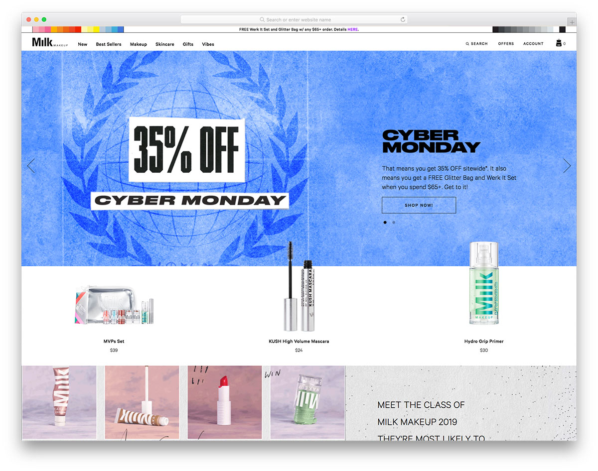
With the charm and wonders, makeup can do to women, there’s no need to doubt why the cosmetics industry grows enormously. Milk Makeup is an exceptional design of makeup website that stands out online. It has a great display of products and promos in the hero header through a smooth slider. The descriptive CTA and clear headline are also ready to impress possible customers. Specifically, this website showcases the best seller products in an attractive approach. While it is ready to provide a smooth shopping experience online, Milk Makeup didn’t ignore the essence of blog pages. Hence, website users can easily visit the blog page via thumbnails in square boxes. It also implements the sticky header for easy navigation.
9. Eudora
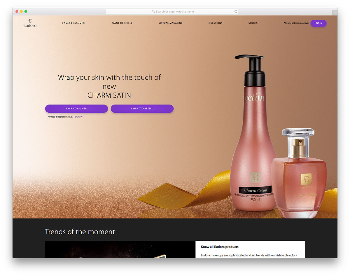
Makeups typically boost the confidence of women. Women are hooked to this beauty enhancer as it can add a brighter look and a good style. Hence, more makeup brands are joining this industry, and each brand must have a good website to showcase products well. Eudora has a stunning makeup website design packed with amazing features. Its hero header looks cool with its fullwidth image, captivating CTAs, and charming headline. Offering sophisticated and trendy makeups, its website showcases such products in square boxes. Utilizing purple as its primary color, this website emphasizes design consistency. Other features include an accordion for displaying the FAQs and stunning shop page. It also comes with video integration, Facebook, Instagram and YouTube.
10. Bobbi Brown
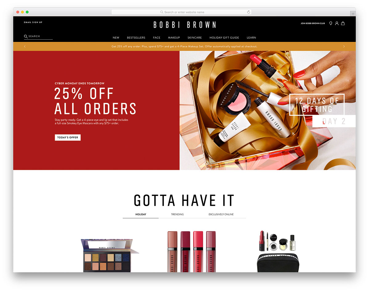
To grow your business, you need effective marketing strategies to help you reach your goals. Luckily, digital marketing makes brand promotion quick and easy. Bobbi Brown is a magnificent example if you’re seeking inspiration to craft a good makeup website. Its hero header has a striking split-screen layout – cool combination of an image and headline. It also reveals special offers or promos on the header via a slider. This eCommerce site enables customers to purchase makeup online with ease. Specifically, a user can shop trending, holiday, exclusive, etc. Furthermore, it also introduces its brand through fullwidth video integration. Other pages of the website are linked using visually appealing square boxes.
11. Stila
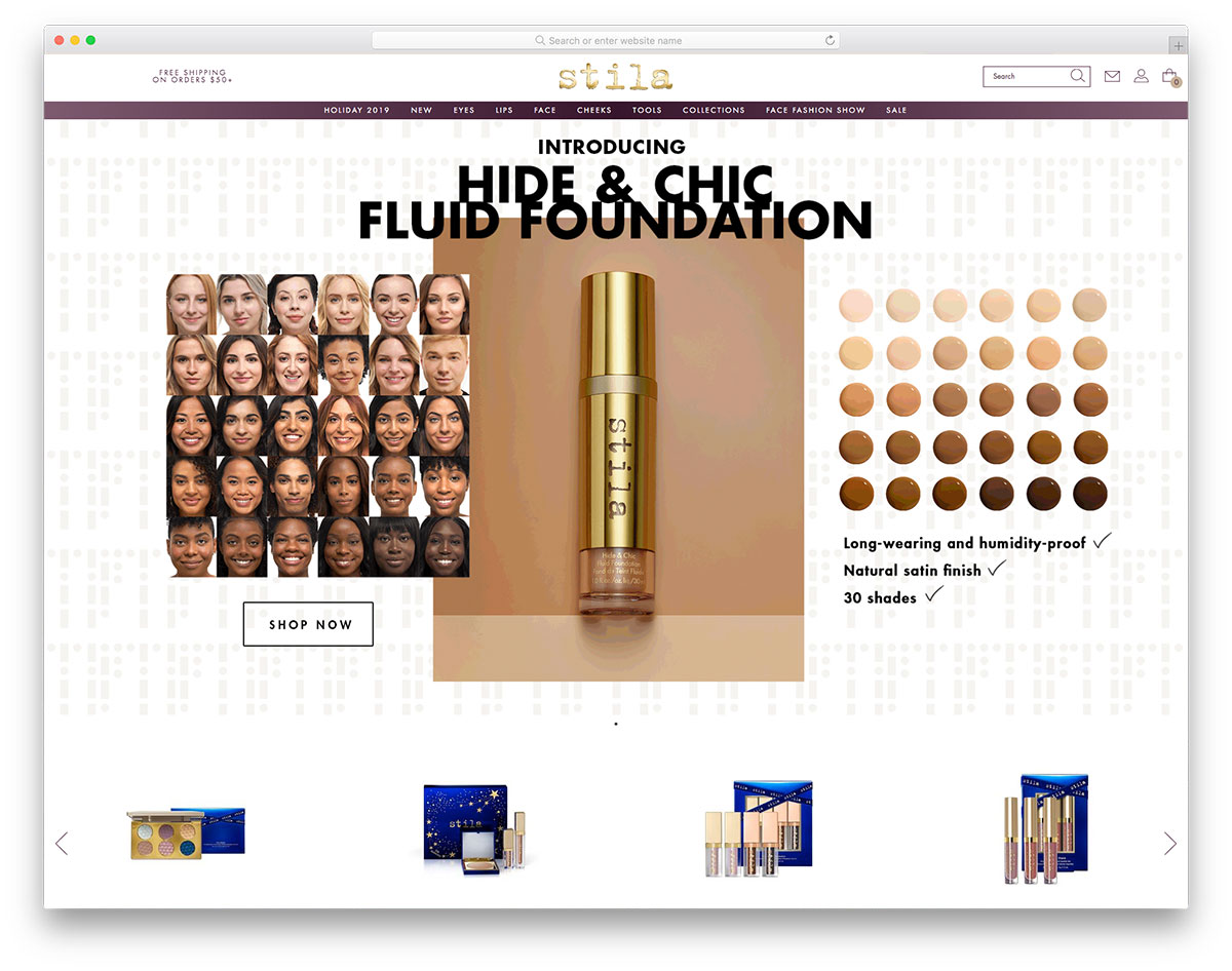
The makeup’s ability to conceal wrinkles, fine lines, or aging spots has become necessary for almost all women. Hence, makeup brands should emphasize their marketing strategies to stand out. Stila’s grandeur website design is ready to inspire cosmetic brands worldwide. The website showcases fullwidth images using slider along with a product promotion. For quick and easy access in the shop, Stila also highlights products with a smooth slider where customers can quickly shop for certain products. It also makes a captivating display of new product arrivals with simple animation. Other website sections also exhibit makeup products that enable customers to acquire them easily. Stila also integrates Instagram feeds, newsletter, and social media integration.
12. Glossier
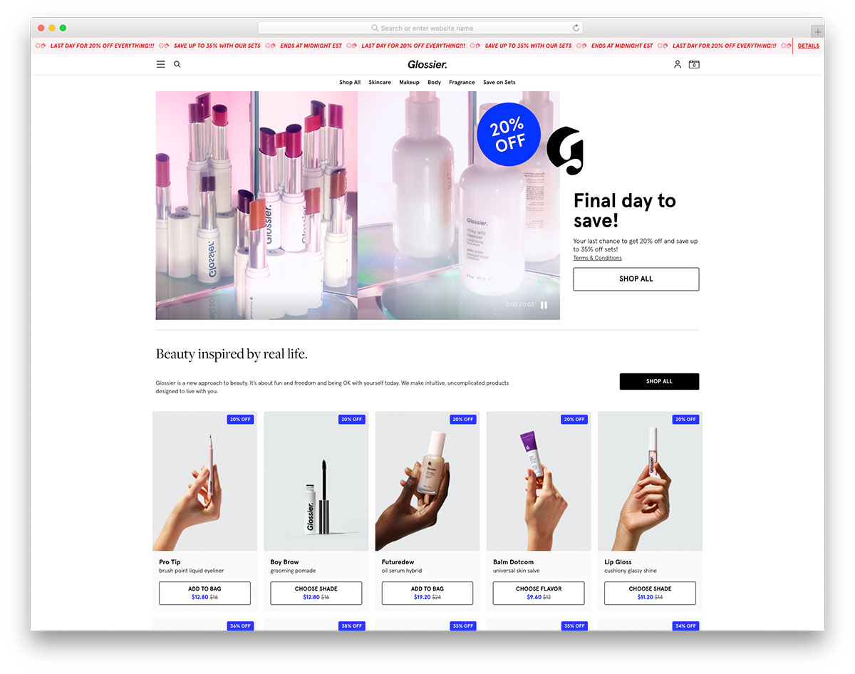
If you want to improve your makeup website design, you may check out these websites we’ve handpicked. Glossier has a clean, minimalist, yet modern design that provides essential elements for a makeup website. It simply uses a straightforward design on the homepage where users won’t have a headache navigating the site. Glossier adds a video integration on the hero header with CTA and special promos. This eCommerce website offers customers a quick and great shopping experience worldwide. Specifically, products are displayed on the homepage in grids with cool hover effects. It also showcases the magazines that feature Glossier. Other notable features include mega menu, accordion, Instagram feed, sticky menu and more.
13. NYX Professional Makeup

Professional makeup artists need genuine makeup products to unleash creativity and enhance skills. For makeup brands to spread awareness, a good website is a must! NYX Professional Makeup is a nice and elegant website. The hero header exhibits two different promos with CTAs, images and headlines. Most makeup brands promote hot or trendy products next to hero headers. NYX sets of hot products are displayed using a slider which a customer can easily add to its cart.
On the other hand, makeup categories are also exhibited in boxes styles. A single row of images is utilized for the Instagram feed presentation. If a customer wishes to search for certain makeup products, it’s also possible with NYX.
14. Elf Cosmetics
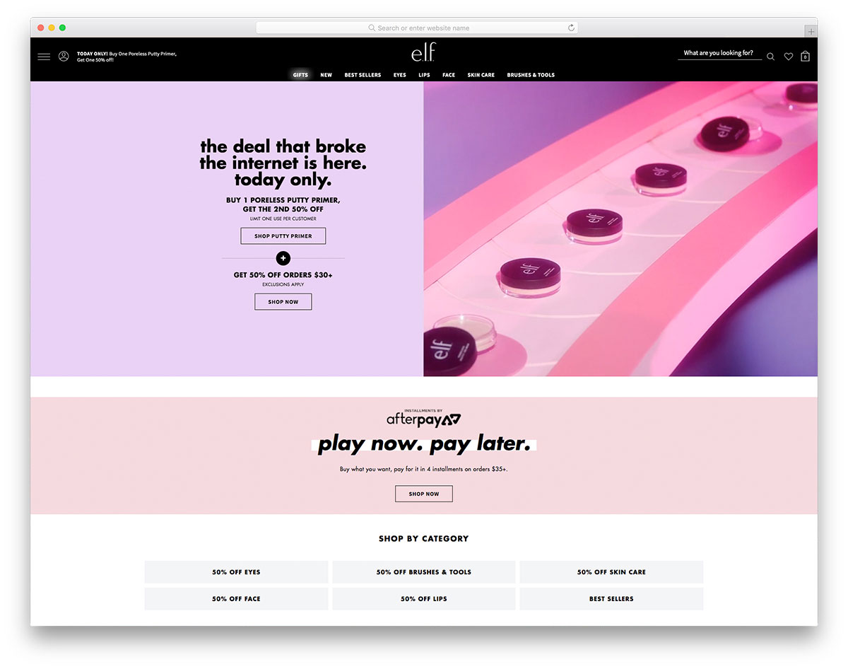
The cosmetics industry is rapidly growing. Undeniably, numerous makeup brands appear in the industry to offer organic and hypoallergenic products. Elf is one of these glamorous makeup websites that can inspire other brands. Specifically, the website has a split-screen hero header – a cool combination of a gif image and a stunning headline. Additionally, the header is one of the vital parts of the website, hence Elf added a ticker to highlight promos and specials offers.
What’s more? It also offers search functionality for customers to easily locate the item they want. While those features are interesting, this website also allows shopping by category such as bestsellers, products for eyes, face, skincare, lips and even brushes and tools with specific discounts. A masonry layout adds a gallery of different works to the homepage.
15. Makeup Forever
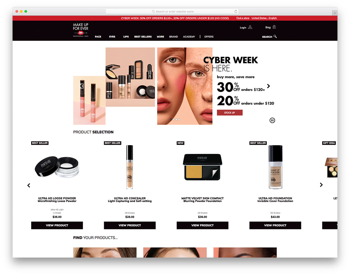
One of the best reasons a brand must have a web presence is to easily and quickly promote products and services 24/7. Makeup Forever is one of the excellent makeup websites with a clean and sophisticated design. The homepage features some essential web elements that can boost the brand. Notably, the website has a simple hero header with images highlighted using slider, CTA and tagline. Of course, the header is packed with powerful elements too like special promos, logo, menu, search, etc.
Meanwhile, another slider is used in exhibiting the best seller products. A customer can easily view the product details and add such items to its cart with such presentation. It also comes with product categories for the face, eyes, lips, best sellers, etc.
16. Becca Cosmetics
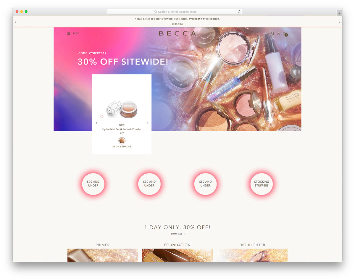
Aging is part of men’s and women’s life. But for women, makeup can do magic to look younger and beautiful regardless of age. Many cosmetic manufacturers always find ways to meet the market’s demands. Becca Cosmetics is a clean, minimal, and remarkable makeup website. It uses ample white space, making the overall design look grand. Few elements are added but have essential features enough to amaze visitors. This website uses a slider to showcase the images and square boxes for the product categories. It also displays the best-selling products for customers to pick the popular ones easily.
17. Adore Beauty
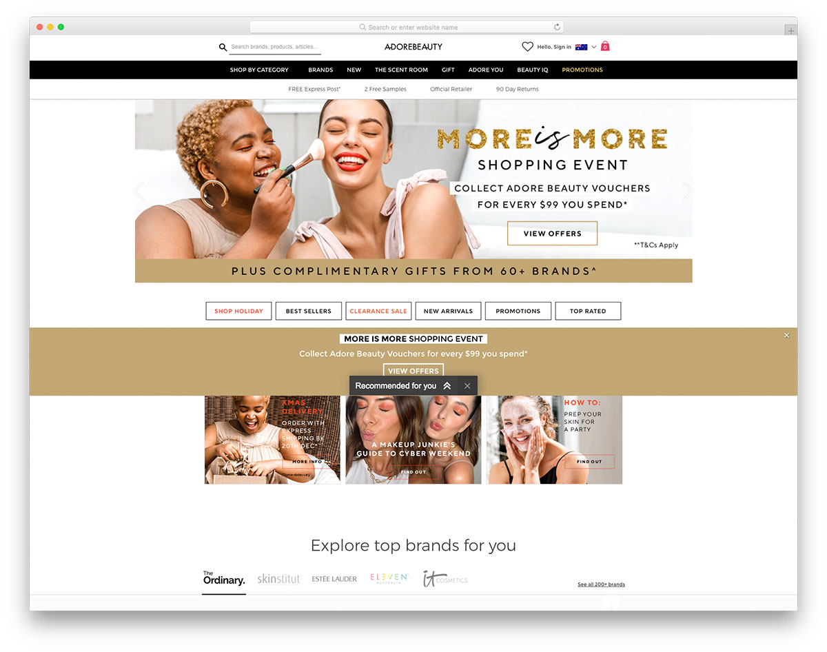
Clean and minimalist layout often stands out regardless of the website’s products or services. Adore Beauty is a great makeup website that can motivate fellow entrepreneurs in this line of business. It has a cool content display on the hero header through a slider. Of course, it never fails to impress potential customers as it includes clear CTAs and captivating headlines. Specifically, the website features different categories (holiday shop, best sellers, clearance sale, new arrivals, promotions and top-rated) where customers can easily visualize the website’s content. Since most women trust brands, Adore Beauty has a section to display popular brands and customers can shop right then and there.
18. Cosmetic Capital
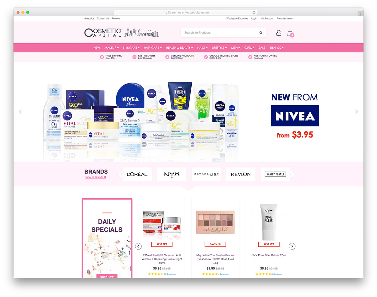
You might want to check these magnificent makeup websites if you plan to sell cosmetics or beauty products online. Cosmetic Capital has a great and comprehensive design. It utilizes a nice hero header with essential elements added to it. Cosmetic Capital ensures that customers can easily locate the brands they prefer for product presentation, so it uses another slider for brand presentation. On the other hand, customers can also check the daily specials, newly arrived products and hot products. With rectangular boxes, locating such categories and purchasing without hassle is much easier. It also features newsletter, Instagram feed, and blog page to share makeup tips, advice, alternatives, etc.
19. Mecca
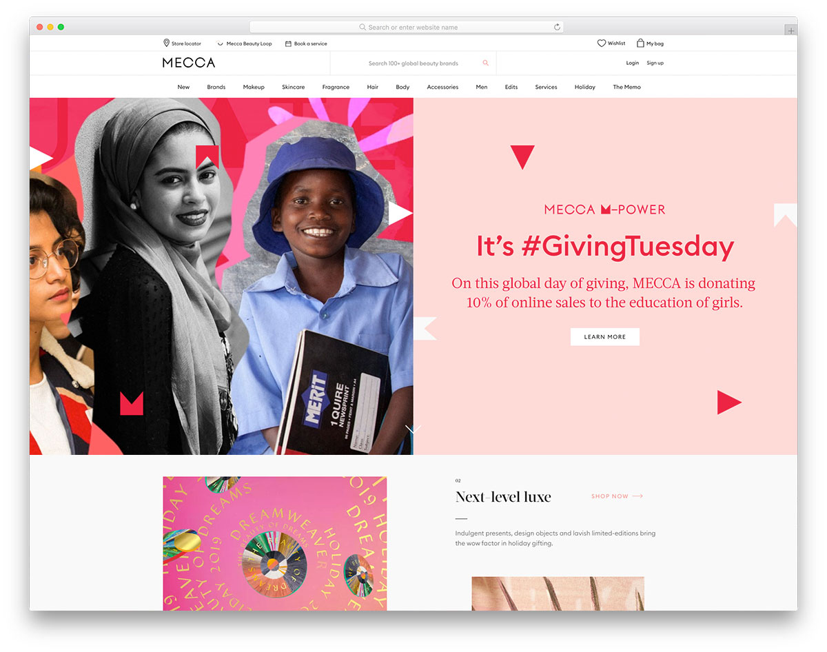
Utilizing vibrant colors on the hero header makes this makeup website a delightful and innovative tool for makeup brands. Mecca comes with an exceptional design of a website to showcase makeup products. It displays content through an asymmetrical layout, which shines as the images are added with cool hover effects. Having ample white space, Mecca looks clean, and well organized elements. The best-selling products are featured and highlighted using a sleek slider. That’s not all, the blog section also looks visually appealing as it implements visual hierarchy. Notable features include social media integration, newsletter, mega menu, search, and more.
Was this article helpful?
YesNo
