Are you looking for the best about me pages to gain inspiration and create the ultimate for your business?
An “about me” or “about us” page is part of almost every website.
It doesn’t matter if you run a personal site, a corporate page, an online store, etc.; it’s a section on your site where you get to introduce yourself, your business, and your team compellingly.
Use the “about me” page to sell yourself and promote your services and business.
However, if you’re unsure how to approach it, you can check these modern and creative designs.
This post covers:
Best About Me & About Us Pages
1. Marcia Cocco
Built with: Hostinger
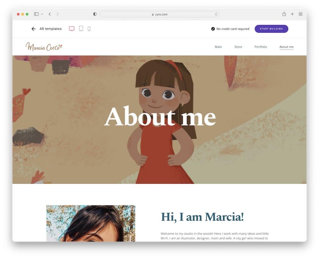
Marcia Cocco is a catchy example that starts with a full-width banner, followed by multiple sections that break things down nicely.
From daily life and partners to links to portfolio, store and FAQ, it’s all on one page, plus a contact form.
Note: Use your about me page to share your personal and professional life.
2. Nqvist
Built with: Hostinger
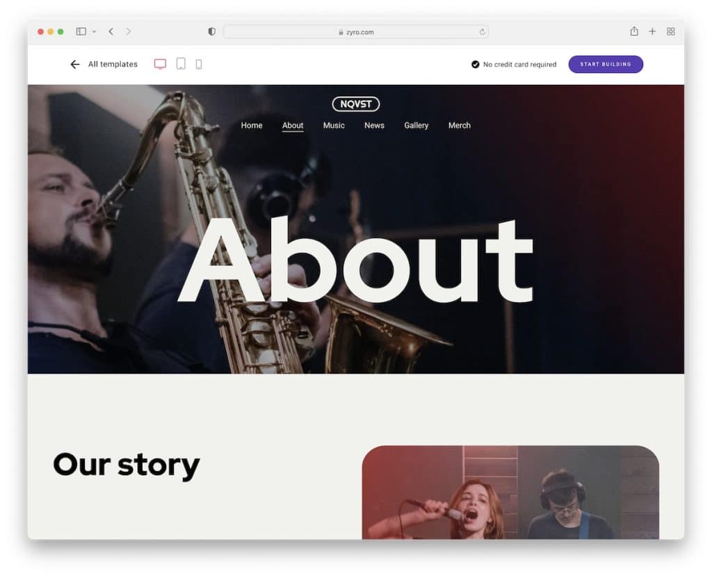
Nqvist’s hero section features an image with a transparent header for a clean website look. It has a section for the band members with roles and social media links.
Moreover, Nqvist uses another large image background section to promote tickets and a cool paginated recent news page element, which is always a plus.
Also, the header floats on top of the screen so you can access other pages anytime.
Note: Present all members with social links as a band on your about page.
3. Linas Thoemke
Built with: Hostinger
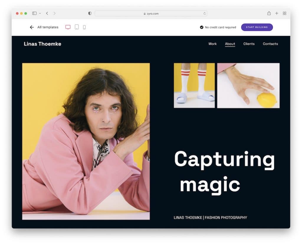
Linas Thoemke’s large images, white space and dark and light backgrounds create an engaging experience.
Besides a short biography and exhibition announcements, this about me page also links to other pages to learn more about the clients and to get in touch via the contact form.
Note: Instead of listing it all on one page, use internal linking so that visitors can get all the information they need.
4. Ginza
Built with: Hostinger
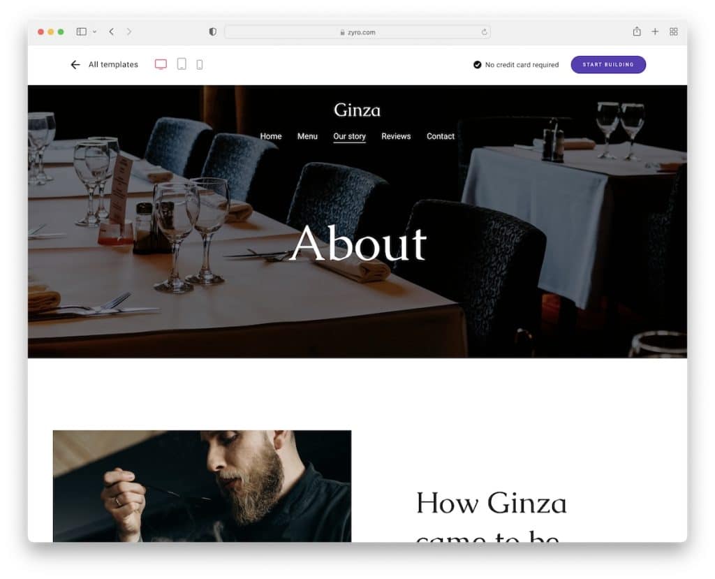
Ginza is a modern and minimalist about-page example of a restaurant. Two images showcase the location and one features the master chef in action.
Also, the title font is large, but the paragraph font is small. Still, the use of white space makes it pleasant to skim through.
You’ll also find a call-to-action (CTA) button for table reservations that opens on a new page.
Note: Don’t forget to add CTA buttons on every page to increase your potential of scoring more conversions.
5. Dovile
Built with: Hostinger
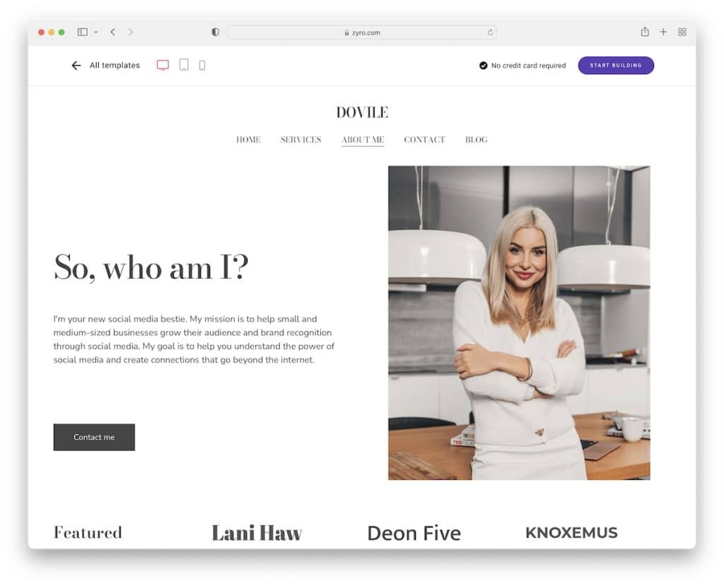
Dovile is an excellent example of an about me page with a feminine touch. This responsive web design is very clean, focusing on text, client logos and images.
The simple floating header is always available to visit other pages, while the footer only includes social icons and links to Terms of service.
Note: Let your page design express your personality.
We also have a full list of service websites if you’re in the process of building an entire page.
6. Presson
Built with: Hostinger
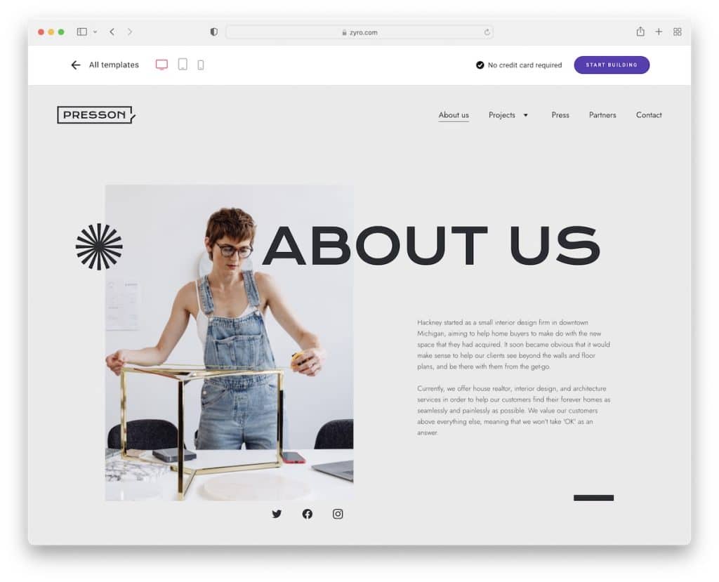
Presson’s about us page example is creative but minimal, ensuring everything pops out nicely even though some text might be a little small to read on a desktop.
Besides the about text, there are also sections for “our mission,” “our vision,” team and contact form. Also, we like the use of social media icons in the above-the-fold section.
Note: Using a minimalist layout with creative elements creates a great browsing experience.
7. Julian Mack
Built with: Hostinger
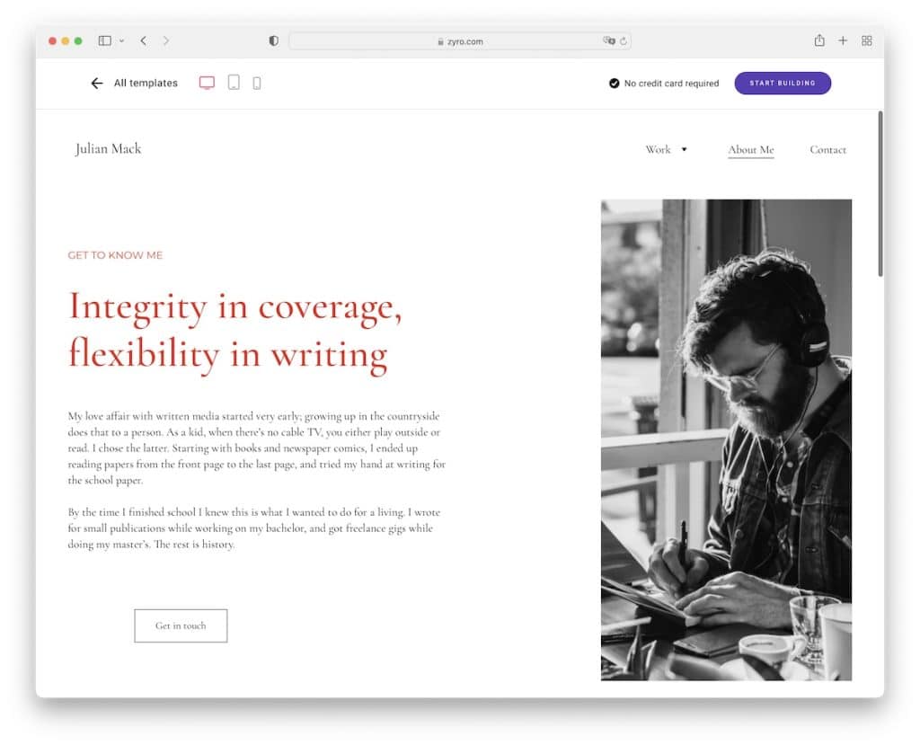
Julian Mack is a nice and simple example of an about me page that has a hero section that’s broken down into 2/3 text and a CTA button and 1/3 image.
The rest of the page shows a popular quote, some of the works and a contact form. The footer only features social buttons but has a red (like title text) background that makes it stand out nicely.
Note: Let your branding show across your entire website by focusing on details (like the choice of color in the case of Julian Mack.)
8. Kristine
Built with: Hostinger
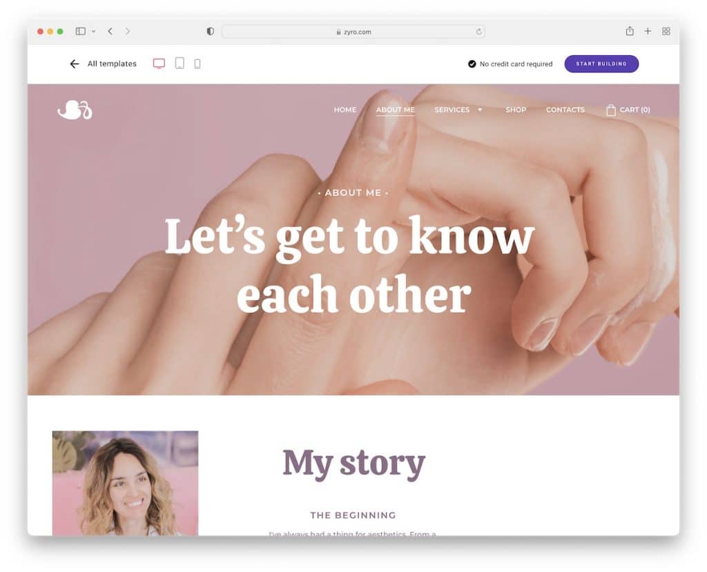
Kristine’s about me section almost feels like you’d be viewing a landing page with story section, testimonials, contact form and IG posts with links.
The header is sticky with a drop-down menu and the footer features a newsletter subscription form.
Note: Build social proof by integrating testimonials into your page.
9. Enson
Built with: Hostinger
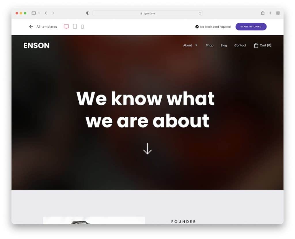
Enson’s hero section features a gradient background with text and a downward-pointing arrow. The design has a nice color scheme, an image background section with text and a CTA just before the footer.
Speaking of the footer, it has business details/contacts, a menu and a subscription widget.
Note: Instead of using an image or a video for the hero section, make it text-only.
10. Poveda
Built with: Hostinger
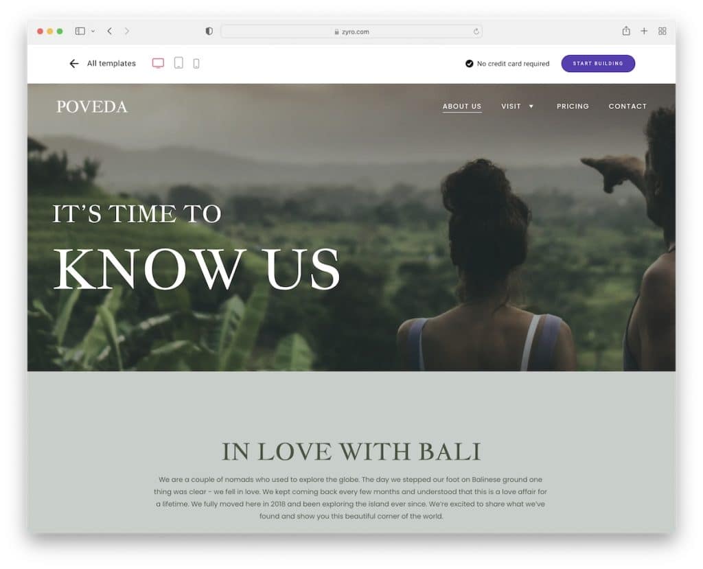
Beautiful background colors, images and a transparent floating header make Poveda very enjoyable to scroll.
While many use multiple client testimonials on their sites, Poveda has only one. There’s also a section for an Instagram feed and a contact form accompanied by some text.
Note: An IG feed is a great way of adding more content to your page, even in the about me section.
11. Millaw
Built with: Hostinger
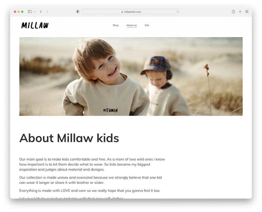
Millaw keeps things image-heavy on their about us page with just enough text to explain what they’re all about.
They also feature an Instagram grid feed, social icons and a catchy solid color background section with a slogan.
Note: Don’t feel like writing a ton of compelling text? Use images instead!
12. Shleps
Built with: Hostinger
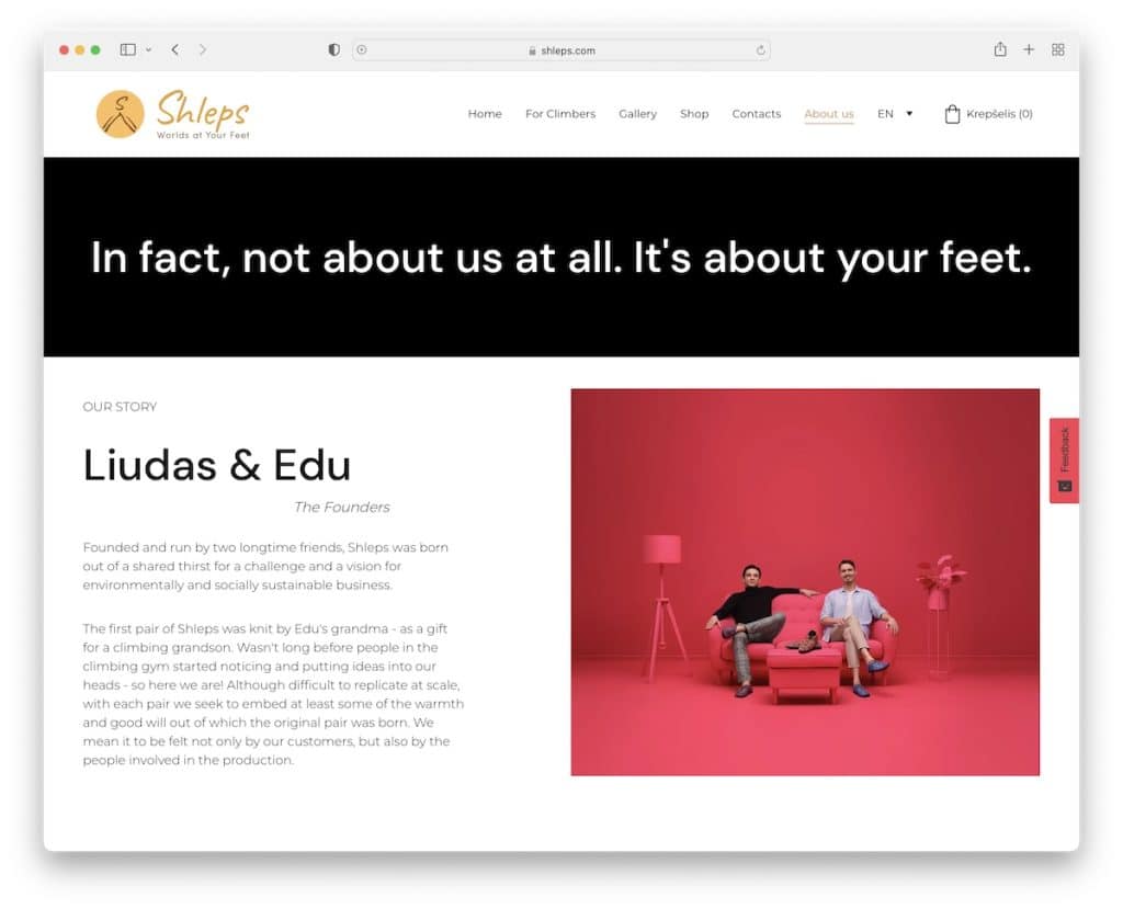
Shleps is the complete opposite of Millaw, using a lot of text and little images.
If there’s a lot of useful information you’d like to share about your brand, your vision and your products, an about us page is the perfect place to publish it.
The sticky right sidebar button asking you to rate your experience with emojis and text is a cool addition.
Note: If you have a way with words, by all means, don’t be afraid to add extra text – just make it readable.
13. Yellow Leaf
Built with: Shopify
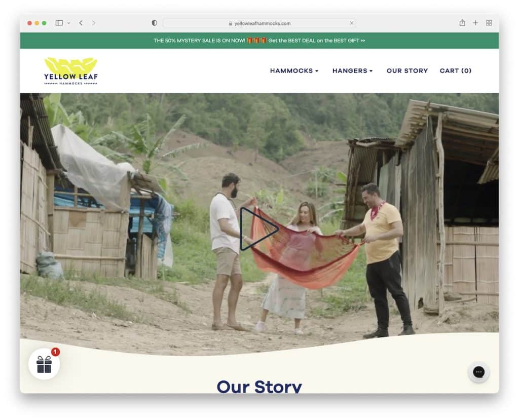
Yellow Leaf starts its about us page with a presentational video that you can pause and play by clicking on it.
Their story section is a mixture of images and text that are easy to skim through. They also added links to more information, a CTA to the shop and a carousel that showcases the workers with an avatar and a short bio.
Interestingly, they also use a section to promote three of their items with buttons linking to product pages.
Note: Use a promotional video in the hero section instead of an image or slider or just text to make it more engaging.
14. William Joseph
Built with: Craft CMS
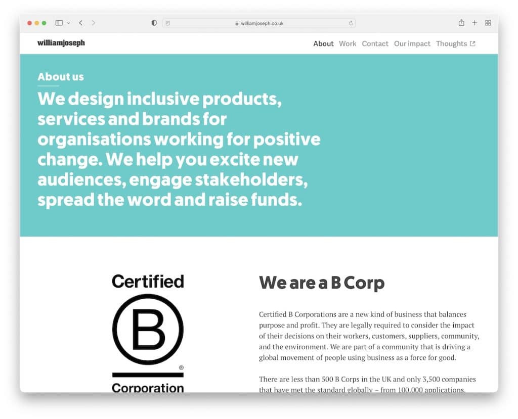
Even though using only text in the hero section is rare, it can work really well. William Joseph’s about us page is a great example of minimalism with really cool animations that spice up the overall clean appearance.
There’s also an extensive section dedicated to the team with headshots, roles and biographies. And the “we work with” section consists of client logos and a drop-down icon that reveals the full list.
Note: If you’ve worked with many clients or even some large companies and organizations, be proud of them and showcase them on your website.
15. Anthony Wiktor
Built with: Gatsby
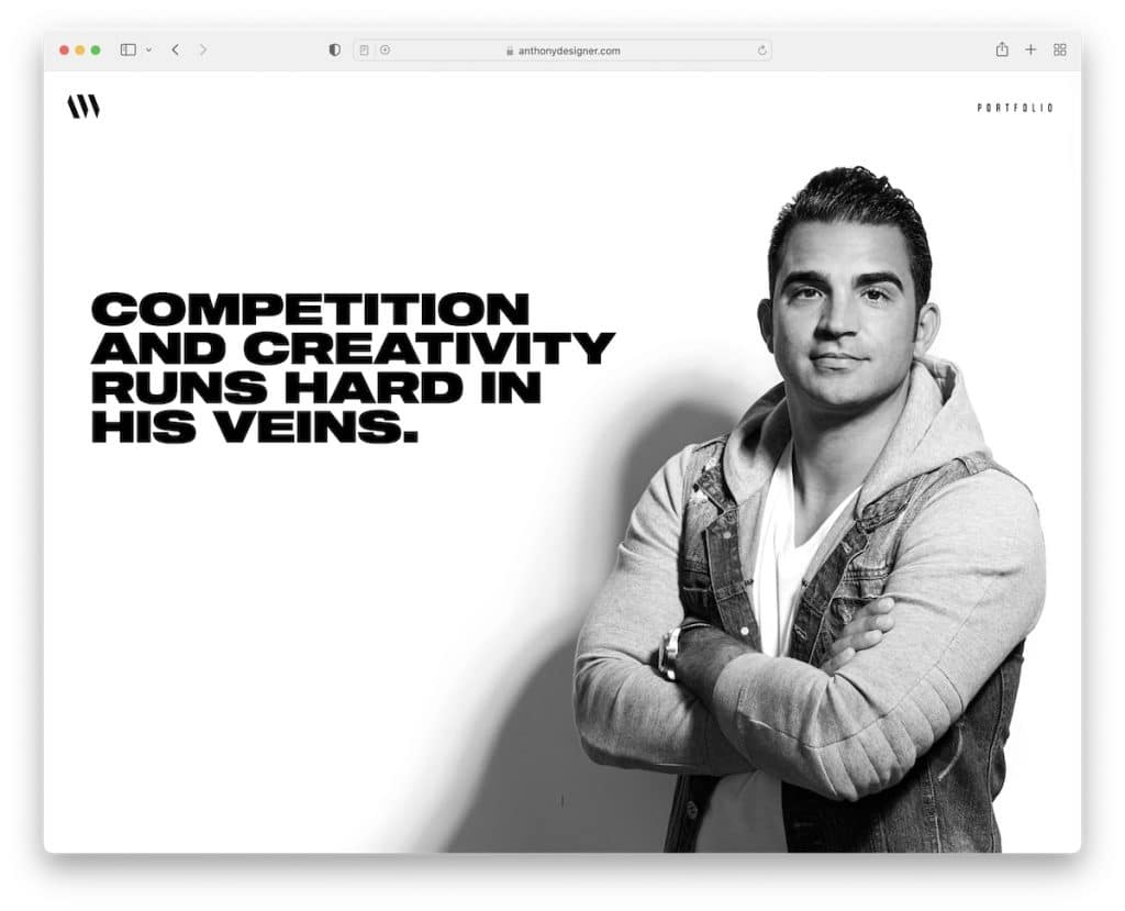
Anthony Wiktor has a unique about me page that switches between light and dark backgrounds overlaying his background image.
The choice of regular and bold typography makes skimming text much faster and the clients’ list is extensive, letting you know that Anthony’s work is high-quality.
The footer is non-traditional, with creative social links, a contact link and a back-to-top button.
Note: Make your about section put an extra shine on everything you do – make it promote you!
16. Sean Halpin
Built with: GitHub Pages
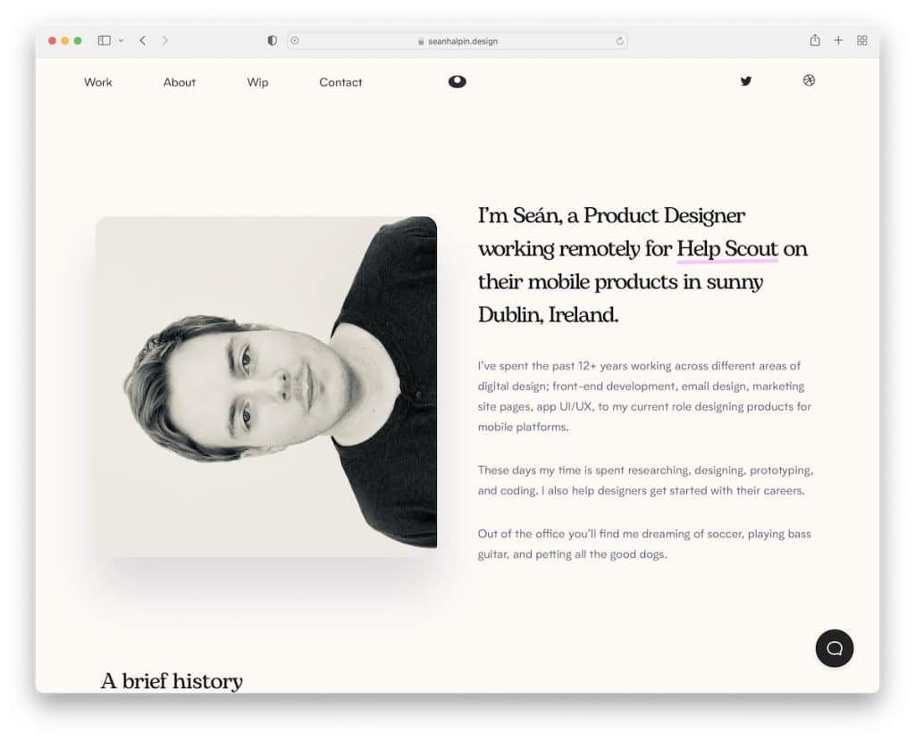
Sean Halpin has an attention-grabbing hero section with a split layout, featuring an image on the left and a short bio on the right.
He also created a cool timeline that showcases his work experience and a section that displays three books he’s currently reading.
And the chatbot is a smart way of getting people to learn more about Sean or hiring him for work.
Note: There’s always a way of doing things differently, even if that means rotating your headshot to the left.
Do you want to see more personal and resume websites? Don’t miss our collection!
17. RyuCreative
Built with: Squarespace
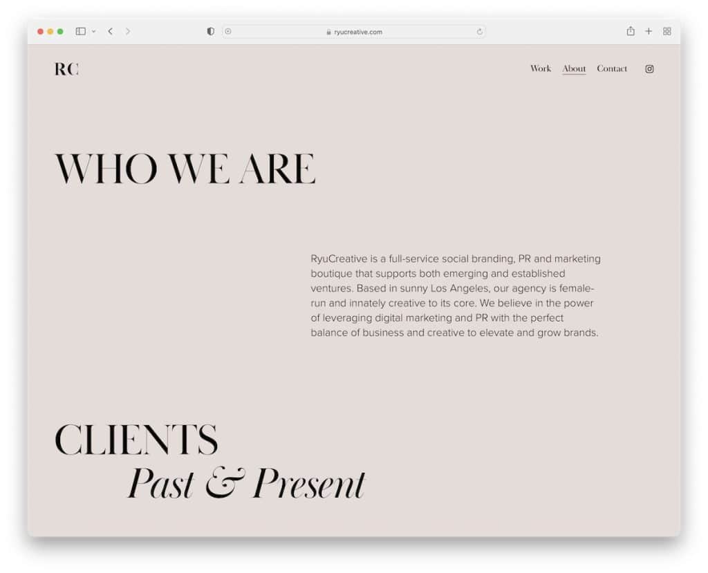
RyuCreative starts with a large title and text explaining what they do, continuing with client logos and a team section with images and bios.
This about me page doesn’t use a footer, just a basic header with three links and an IG icon.
Note: Let potential clients get familiar with who’s behind the brand by adding a comprehensive team section.
You shouldn’t miss these gorgeous Squarespace website examples to see how versatile this site builder software is.
18. Shanley Cox
Built with: Squarespace
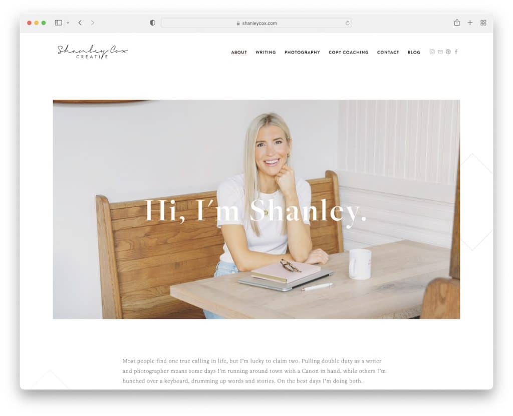
Shanley Cox features an image of herself and a simple introduction text above the fold, which couldn’t be done any better. No need to complicate things.
But Shanley also doesn’t complicate the rest of the about her page, using text, a contact form, an Instagram feed and a three-column footer section.
That’s it.
Note: If you don’t know which image to add, use an image of yourself.
How To Create The Ideal “About Me” Page
Creating or updating your about me page is way easier than you think.
You don’t need any experience to make it happen, but you do want to consider our tips to make it the ultimate.
After all, you do want more clients, don’t you?
And that’s when an epic about me section comes into play.
1. Pick A Template
Instead of building it from scratch and wasting a lot of time, you can choose a template and start immediately.
This also means you can be a complete beginner but still have a chance to build a professional outcome.
Ensure you pick the template that flows with your website, work, and personality.
However, you can edit and customize any template, enriching it with your creative touches.
Tip: Aim for a simple website look.
2. Choose Title & Opening Line/Text
You can keep the title simple and use your or your business name. You can even opt for adding a logo.
But try to come up with a bold, one- or two-sentence opening line to compel the visitor and get them interested in discovering more about you and your works.
Remember, while some only add what they do, others include a biography. Luckily, both approaches can work well, so it’s up to you to decide what feels right – or, should we say, feels you!
3. Add Images
While some daring ones only use text on their about pages, we encourage you to use images and videos to make it more engaging. (The former option can work great if you’re a writer/copywriter.)
You can also use sliders and portfolios with a lightbox effect.
Use visual content to show yourself, your work, the process and anything else you think is worthy of inclusion.
4. Tell About Your Valuable Skills & Experience
Of course, don’t forget to tell more about yourself, your work, your skills, your experience, your education and past and current clients.
You can also dedicate a whole section to your services with CTA buttons to your contact/get a quote form.
5. Use Links & Call To Actions
As we mentioned above, include CTA buttons, so those interested in working with you can take immediate action.
But you can also add links to your social media and other parts of your websites, like portfolio, blog, etc.
It takes time to master a web design especially when creating important pages like About Me. However, now there is a solution to automate any web design building and design – AI-powered website builders. We made a roundup of the best AI tools you can use today.
Conclusion
With all the above examples and our tips and recommendations, you now have everything you need to create a powerful about me page that will raise your potential sky-high.
Let your about page share more about who you are, your business, your team, your vision and your process.
Make it exciting and interesting so that everyone reads through it with joy.
It’s your turn now.
Good luck!
Was this article helpful?
YesNo