Are you interested in building a great page fast and want to check the best Hostinger websites to get some ideas?
Today, we’d like to share our collection of great and responsive web designs that use this cool, versatile and simple-to-use website builder.
Hostinger is great because you can use it for any industry and niche, but we prefer it for small businesses the most (even freelancers and agencies).
Moreover, you can work on a creative and feature-rich page or stick to simplicity and minimalism – the choice is yours!
These awesome website examples show that Hostinger can do many things, including eCommerce.
Best Hostinger Website Examples

Millaw has a full-width image with text that creates a strong first impression on the visitor.
Right after the hero section starts a collection of the products – the online store. The customer can then click the item to find out more details and purchase it.
Millaw is a very untraditional eCommerce website that stands out.
Note: Use an image of a “staring” person above the fold to capture the visitor’s attention.

Forrest’s home page is modern and interesting, showcasing the three main product categories and an Instagram feed.
The header section has a transparent background with a logo on the left and a menu on the right.
Lastly, the Messenger chat box is always available to get in touch.
Note: Offering a live chat can greatly increase your conversions if you sell products.

Let’s Hair lets you know that they’re all about hair. Instead of using an image with text overlay and call-to-action (CTA) buttons first, it comes second. But the rest is still first, on a white background for more pop.
What’s awesome is that they use a large and beautiful client image with a testimonial, which makes it special.
Note: Use client images and testimonials to build company trust.
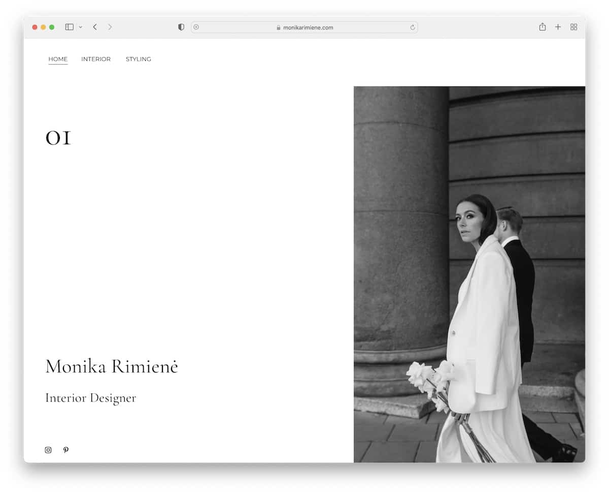
You can create an online portfolio website that’s clean and simple and AWESOME, just like Monika Rimiene’s.
The minimalist look makes you want to learn more about her work. We also like the light floating navigation that keeps you moving through the page smoothly.
Note: Don’t be afraid to keep things minimal when building an online portfolio – let your work be the focus!
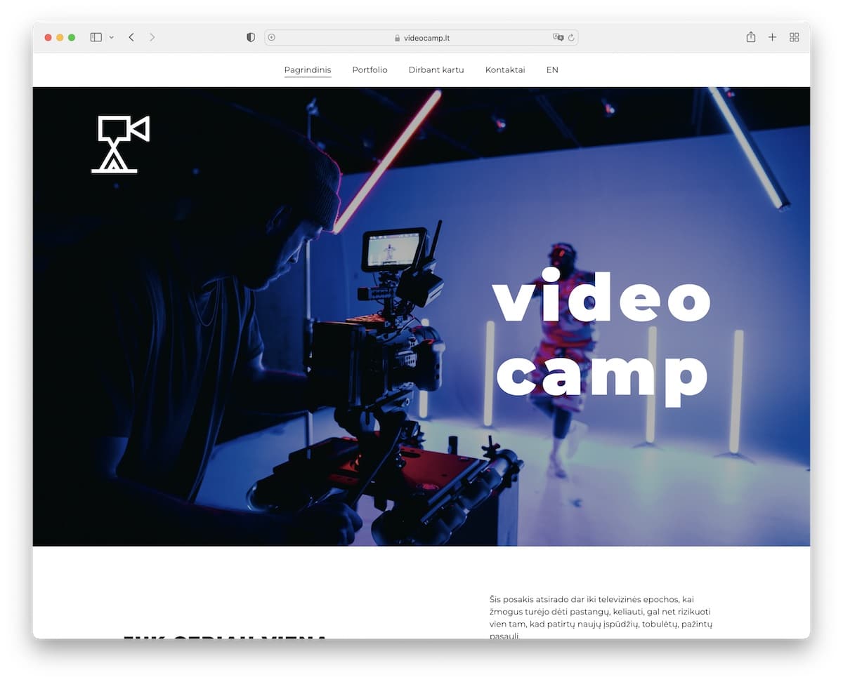
If your business has anything to do with videos, then make sure you give a taste of what you’re all about on your website.
Videocamp does that well by embedding a video from YouTube. There’s also a Facebook Messanger button that lets anyone get in touch directly.
Note: Your work speaks over a thousand words, so ensure you include it on your website.
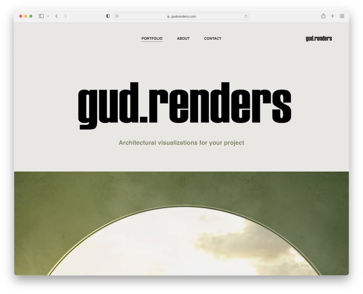
Gud Renders’ portfolio website is bold but clean. Each section has a full-width image with a title and a call-to-action button leading to the project page.
This cleverly executed distribution of images gives you an instant idea of how good the work is.
Note: High-quality images that take complete website real estate can work well. (By the way, the simple IG icon in the footer area is so cool.)
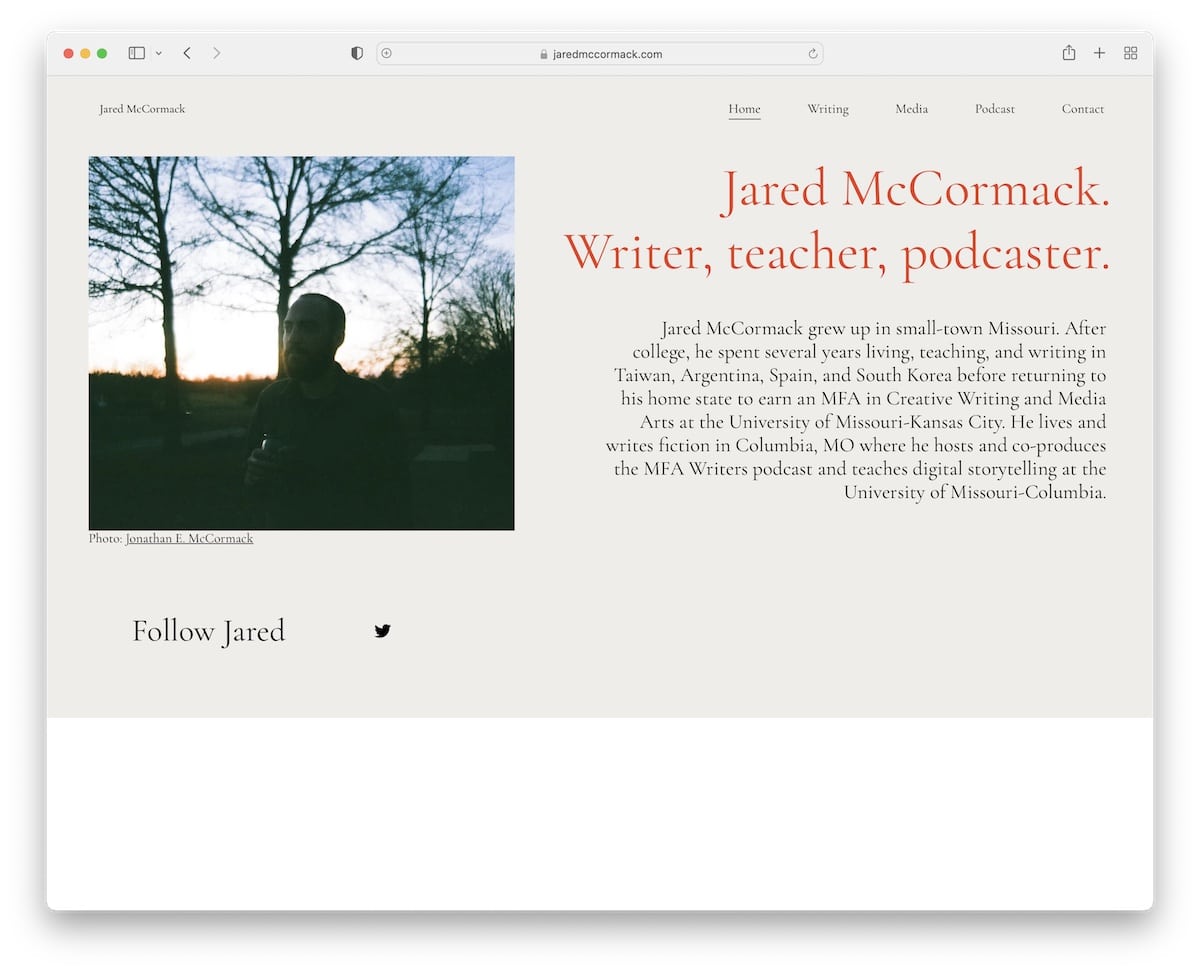
Jared McCormack runs a personal website that’s almost too simple for some. But that’s exactly why we’re adding it to the list of these best Hostinger websites.
Note: Use your personal website’s home page to share your story with an image and link(s) to social media.
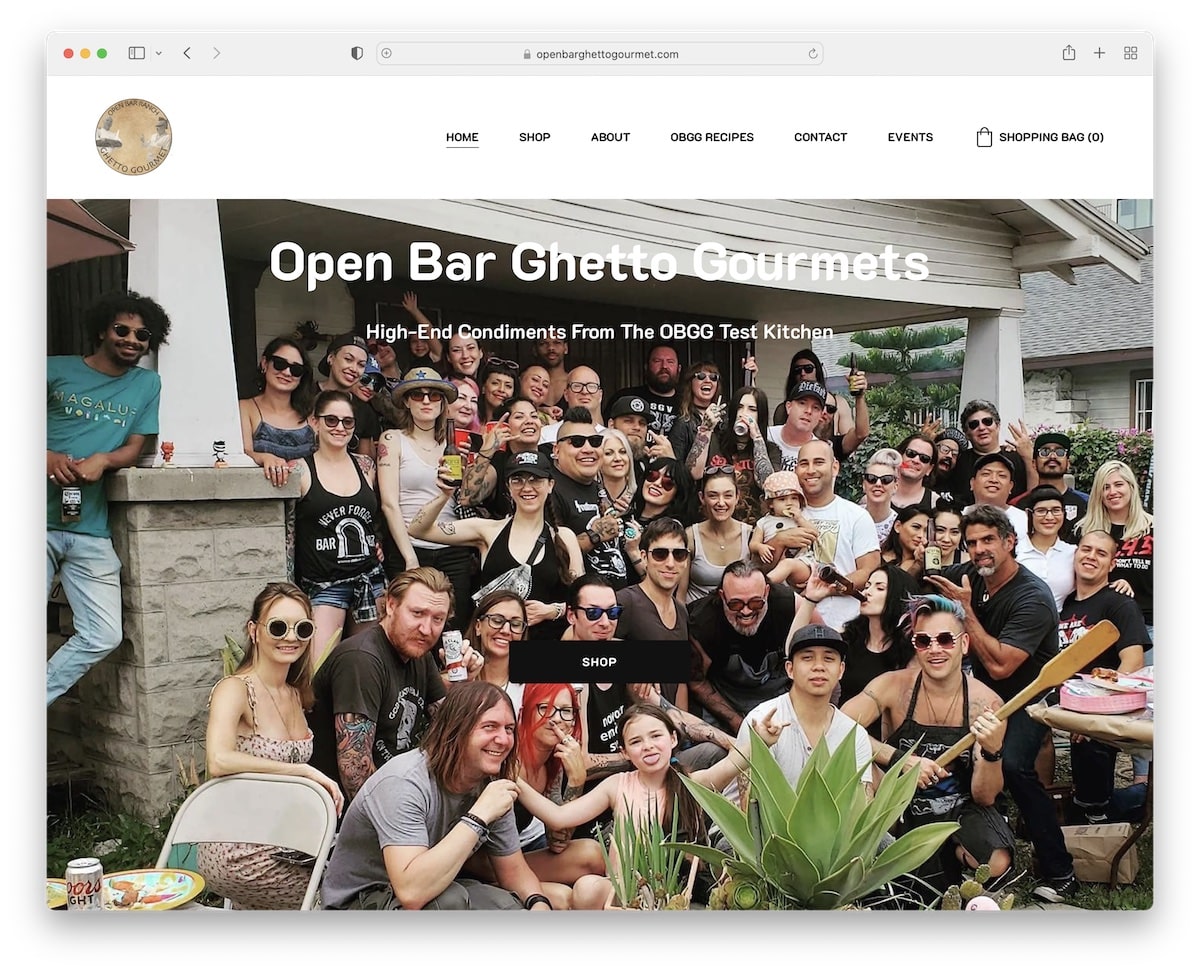
Open Bar Ghetto Gourmet rocks a responsive web design with enough white space to beautifully separate image and text content.
The floating header features a logo on one side, the menu and a shopping bag. You can always check what’s in your bag or visit other page sections.
Note: Your home page is the base of your online presence, so use it to show what your business is all about. Adding reviews and testimonials can work extremely well.
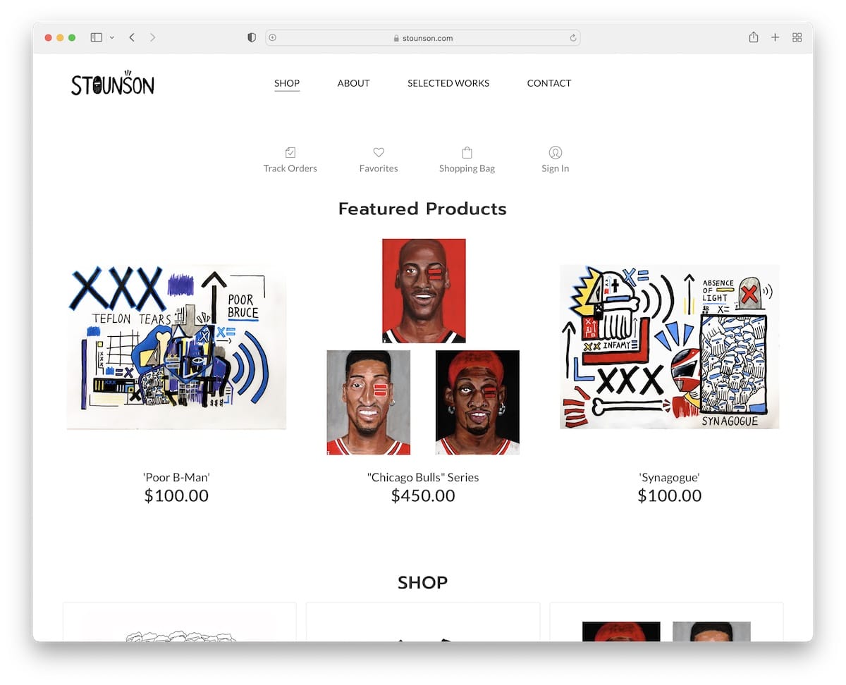
Stounson’s home page is a shop with a simplistic look that places all the items front and center.
But everyone interested in learning more about Steven can click on the About page, check selected works or get in touch by visiting the contact section.
Note: Don’t be afraid to sell items on your front page if you run a more boutique online store. (Just don’t add too many items.)

How beautiful can a wedding website be? Piktas Keksas. That’s all we can say.
The wedding event organizer, Justina did an excellent job using the Hostinger website builder to create a unique online promotion of what she does best.
Note: Use your website to create an in-depth presentation of your services, tell your story, share images, testimonials, social links – everything!
Remember, you can also use any of these wedding website builders if you’re searching for Hostinger alternatives.
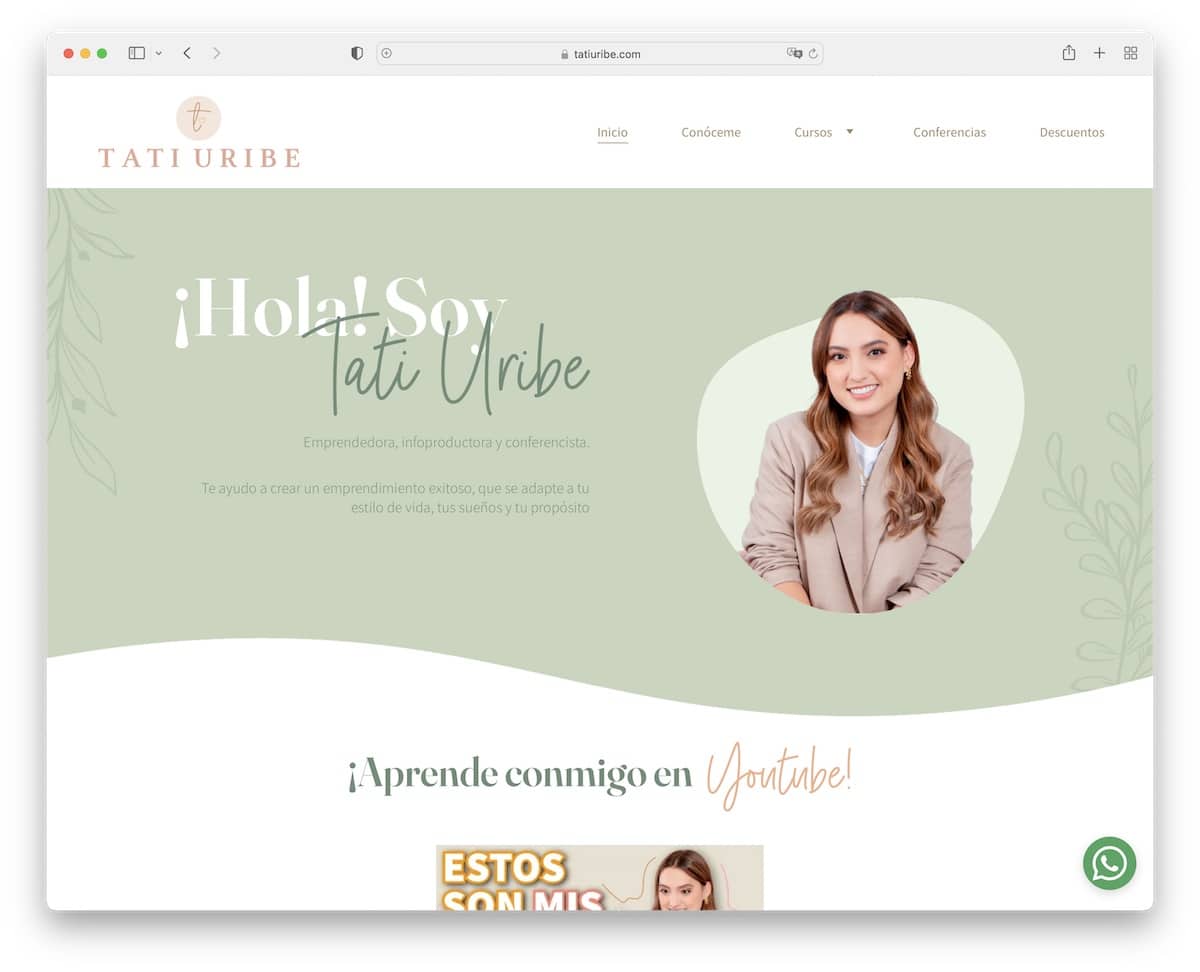
Hostinger is a fantastic personal website builder, and Tati Uribe’s page is another superb example.
This one has a lot more feminine touch than the previous one. You get the feel of Tati and what she does just by scrolling the home page.
She also created a “bubbly” section to promote her services. Lastly, the floating header with a drop-down navbar will take you anywhere you want.
Note: Use your website to express yourself with creative and unique touches.
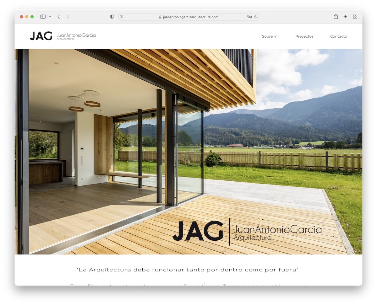
JAG Arquitectura’s website has a simple, no-scroll home page, about section, projects and a contact form.
And you can use the hero section of your front page to display your best or most recent project.
Note: You don’t need to complicate web design to make it work in your favor. Juan knows that very well.
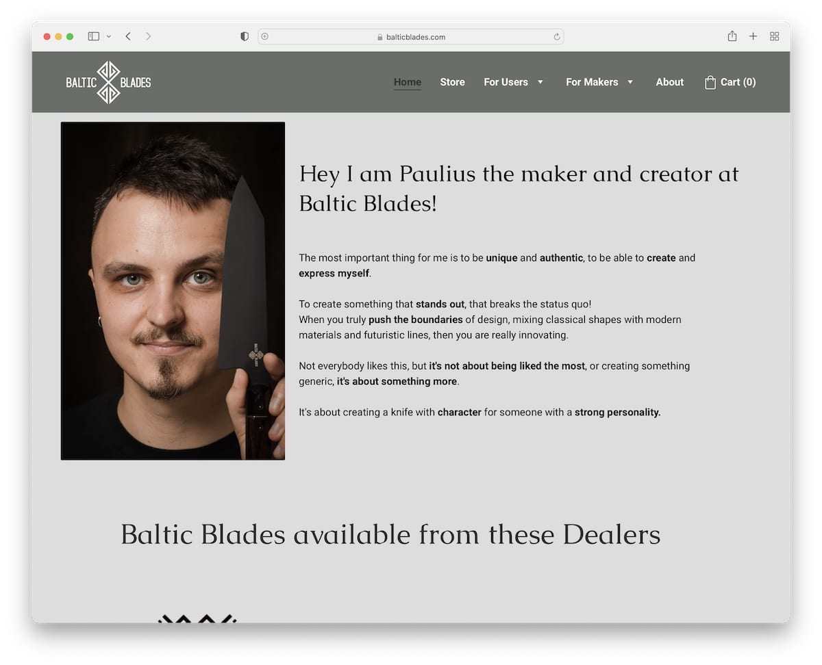
You only check the image on Baltic Blades and immediately know what Paulius is passionate about. And it could be something as simple as holding the product(s) you create.
Paulius also has a contact form for custom orders on the home page, so everyone interested can get in touch immediately.
Note: Use images and text to ensure everyone gets to know you and what you do as quickly as possible. And then add a contact form for business.
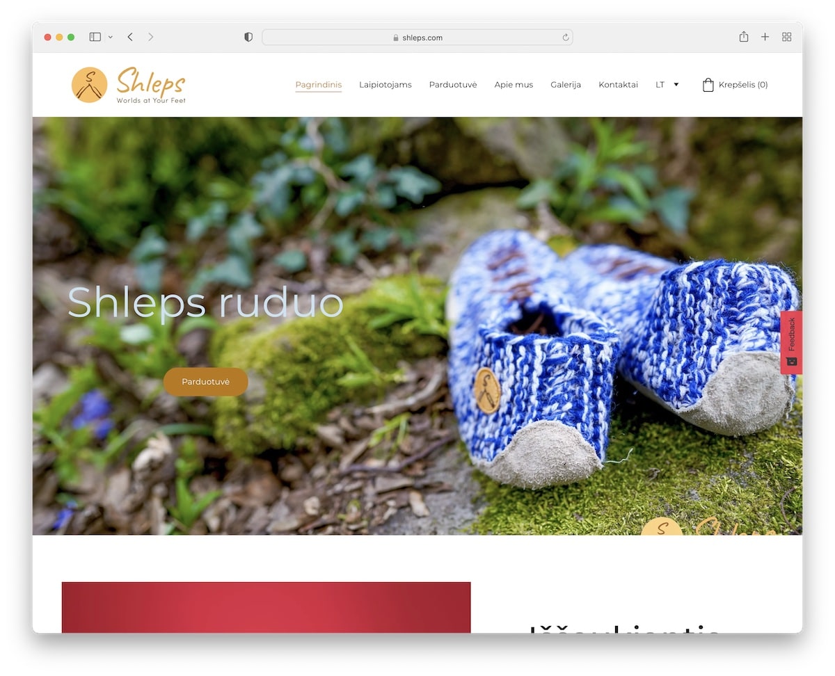
The benefits of the product(s) you offer deserve a special spot – and the website’s home page is the ideal location.
Shleps do a great job using images, text, and call-to-actions that display all the specialties that make their shoes so unique.
Note: Displaying images and text interchangeably works great for storytelling.
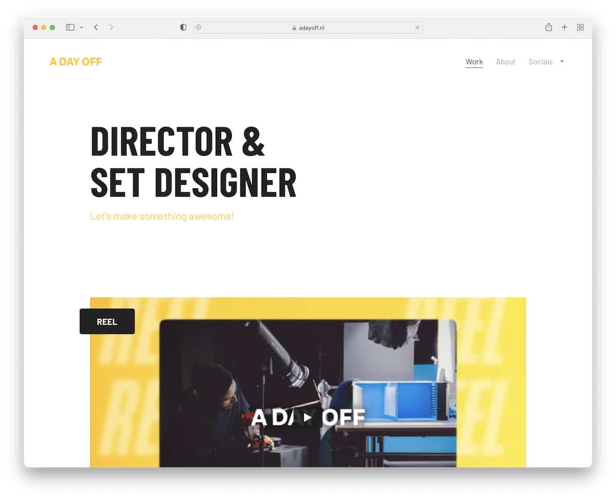
Promotional video works well because we’re most used to watching video content lately.
And that’s why A Day Off cleverly introduces it on its website just after explaining what A Day Off is in bold text.
But there’s also an AWESOME animated portfolio just below that, which makes you take a moment to stare at it.
Note: Create a “moving” portfolio to spice up your project presentation – see A Day Off’s home page.
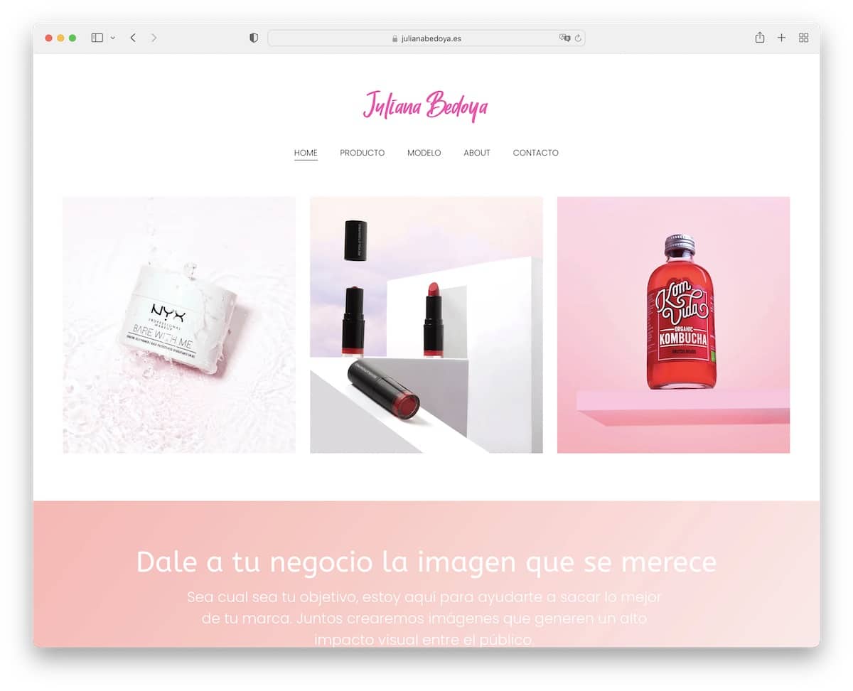
We like the idea of showcasing your works and projects before explaining what you do.
Juliana Bedoya is a terrific Hostinger website example of an online portfolio that does things correctly.
It’s simple but shares just the right amount of information that sparks interest in a collaboration.
Note: Ensure your work is visible to all potential clients – preferably first thing.
Was this article helpful?
YesNo