What’s the Best Color for Websites?
Color is one of the most important visual components of website design. It can affect everything from your conversion rate to how visitors perceive your brand.
It goes without saying, then, that you’ve got to get your website color scheme right. But which colors should you use? And how can you use them effectively?
In this roundup of website color statistics, we’ll share some eye-opening data that can help answer those questions.
The stats below will highlight how important color is, reveal how different consumer segments respond to different website colors, and more.
Ready? Let’s get started!
Website color statistics (top picks):
- Blue is the preferred website color for 46% of consumers…
- … It’s also 42% of people’s favorite color, making it the most popular color in the world.
- Green was the second most popular website color (30%) and the world’s second favorite color overall (14%)
- Yellow is the worst website color, according to 23% of consumers
- 26% of people prefer websites that use primary color schemes
- Red website buttons outperformed green website buttons by 21% in one study (but this isn’t necessarily always the case)
- 39% of people say color is the most important visual element on websites
- Color can boost brand recognition by up to 80%
- Black is the most commonly used logo color by the world’s leading brands
- The human eye can perceive 10 million colors
What is the best color for a website?
There’s no objective consensus on the best color for a website as it all depends on the nature of your brand and target market. However, blue and green are safe choices as they’re the colors most customers prefer to see on websites.
In general, consumers also seem to prefer cooler colors over warmer colors.
What colors do website visitors prefer?
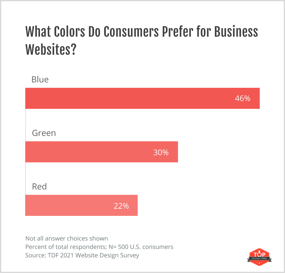
46% of consumers prefer when businesses use blue on their websites, making it the top color preference amongst website visitors.
As we’ll see later, this preference tallies with general color preferences worldwide.
It’s probably something to do with how we perceive the color blue. It’s often seen as a nonthreatening color that’s calming, secure, and professional—three traits that brand websites often strive to be. But we’ll talk more about these color associations later.
Green was the second most preferred website color, with 30% of the vote, and red came third at 22%.
Interesting website color statistics:
- 22% of consumers who visit a website for the first time will look for eye-catching colors
- But 21% of consumers will leave websites that have outlandish colors
- 19% of people associate cool colors with positive emotional responses, compared to just 14% for warm colors.
What is the worst website color?
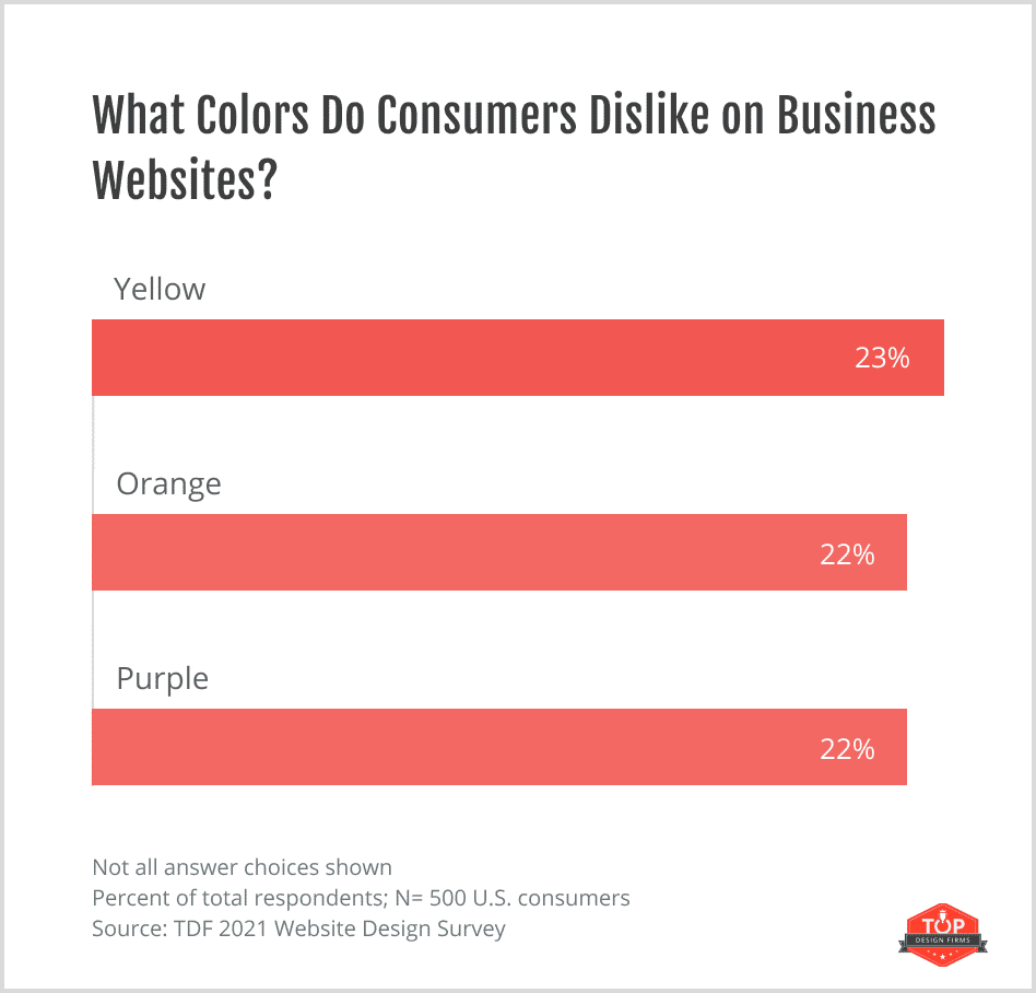
Yellow is the color consumers dislike most on websites, with 23% of those surveyed thinking businesses shouldn’t use it in their website design. Orange and Purple were close seconds with 22% saying it’s their least favorite website color.
That said, there is no objectively ‘worst website color’. The website color statistics above tell us which website colors consumers think they don’t like, but that doesn’t mean they’re not the right choice for you. It all depends on factors like your brand personality and target audience.
Website color preferences by demographic
Website color preferences vary depending on gender. Both men and women seem to have a soft spot for blue and green, but women are particularly fond of them:
- 50% of women prefer to see blue on websites, compared to 45% of men
- 34% of women prefer to see green on websites, compared to 30% of men
Likewise, the color people dislike most in websites also seems to vary by gender. Women dislike yellow more, while men dislike orange more.
- 26% of women think businesses shouldn’t use yellow on their websites
- 23% of men think businesses shouldn’t use orange on their websites
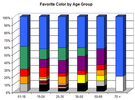
Color preferences also seem to vary by age:
- 43% of those aged 18 to 24 are fond of purple in websites, but only 17% of those 44-54 feel the same way
What color scheme is best for a website?
Most websites don’t just feature one color—they use several. The combination of colors you use together on your website is your color scheme, and it’s super important to get it right.
According to the data, here’s what color schemes most consumers think are the best choices for websites:
- 26% of consumers prefer primary color schemes. Primary color schemes utilize primary colors: red, yellow, and blue.
- 21% of consumers prefer complementary color schemes. Complementary color schemes use two colors that are found opposite each other on the color wheel, like blue and orange, or red and green. One is the dominant color while the other is the accent color.
- 20% of consumers prefer analogous color schemes. Analogous color schemes use colors that are positioned next to each other on the color wheel, like red with violet and red-violet, or yellow with green and yellow-green.
How important is white space?
Only 8% of consumers notice white space when viewing websites for the first time, which is why white space is so important in web design.
It helps to create space between elements so that you can direct the visitors’ attention to what matters most, like your CTAs and buy buttons. And it helps prevent the website page from looking messy and cluttered.
Sources: Colorlib1, Top Design Firms2
Color popularity statistics
We’ve looked at consumers’ favorite website colors—but what about their favorite colors in general? Let’s find out.
What is the world’s favorite color?
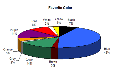
A study by Joe Hallock found that in addition to being the top choice for website colors, blue and green are also the world’s favorite colors across the board.
42% of people surveyed said blue was their favorite color, making it the top pick. Green and purple were the world’s second-favorite colors with 14% of the vote each.
This statistic is backed up by data from Colorcom’s Global Color Survey. The survey results of over 300,000 people also found that participants most commonly chose blue as their favorite color.
What is the world’s least favorite color?
According to the same survey by Joe Hallock, Orange is most people’s least favorite color across all ages and genders.
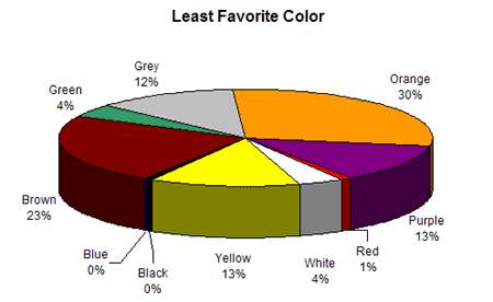
30% of people said they disliked orange the most, while 23% said brown (the world’s second least favorite color) and 13% said purple (the world’s third least favorite color).
However, Colorcom’s global survey generated slightly different results. According to their data, yellow is the most common least favorite color.
Most popular colors by gender
As with website colors, people’s favorite colors in general vary based on gender and age.
Below, you’ll find a breakdown of the percentage of people of either sex who said a particular color was their favorite, according to our best data.
Top 10 favorite colors (women):
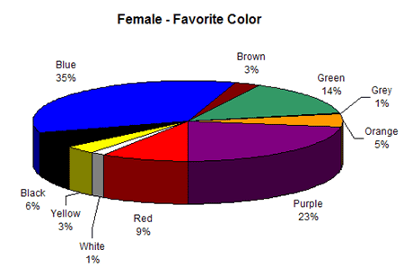
- Blue – 35%
- Purple – 23%
- Green – 14%
- Red – 9%
- Black – 6%
- Orange – 5%
- Yellow – 3%
- Brown – 3%
- White – 1%
- Grey – 1%
Top 10 favorite colors (men):
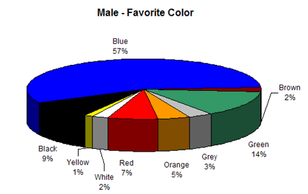
- Blue – 57%
- Green – 14%
- Black – 9%
- Red – 7%
- Orange – 5%
- Grey – 3%
- White – 2%
- Brown – 2%
- Yellow – 1%
- Purple – 0%
Interestingly, while both genders like blue and green, there’s a stark difference in fondness for purple. Among women, it’s the second most popular color, but among men, it’s the least.
Least favorite colors by gender
Next, let’s look at a breakdown of the percentage of respondents of either gender that said a particular color was their least favorite according to the same study:
Most common least favorite colors (women):
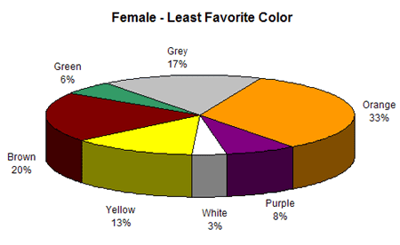
- Orange – 33%
- Brown – 20%
- Grey – 17%
- Yellow – 13%
- Purple – 8%
- Green – 6%
- White – 3%
Most common least favorite colors (men):
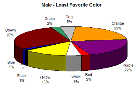
- Brown – 27%
- Purple – 22%
- Orange – 22%
- Yellow – 13%
- White – 5%
- Grey – 5%
- Green – 2%
- Red – 2%
- Black – 1%
- Blue – 1%
Again, there are some interesting similarities and differences here. Both sexes seem to somewhat dislike the color brown and orange, but men are much more likely to say their least favorite color is purple.
Sources: Colorcom1, Joe Hallock1
Do color preferences depend on age?
Yes, color preferences seem to depend on age. Blue is the world’s favorite color across generations, but interestingly, statistics show that the younger the age group, the higher the preference for green, and the older the age group, the lower the preference for green.
The reverse is true for purple: younger people like it less and older people like it more.
Similarly, orange and yellow seem to be less popular amongst older consumers. These colors are more frequently named as the least favorite color by respondents in older age groups.
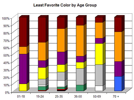
Younger age groups frequently named Brown as the least favorite color.
What’s the best color for call-to-action buttons?
Your call-to-action (CTA) buttons are probably the most important element on your website. You want your customers to notice and click on them.
As such, many studies and tests have been done to figure out the best color for call-to-actions. Here’s what the statistics show:
- In a split test by Hubspot on Performable’s website, red buttons outperformed green buttons substantially and generated 21% more clicks.
- Other tests have shown similar results. For example, Dmix found that switching to a red button boosted their conversion rates by 34%.
- While most studies focus on red and green buttons (as these are the most popular), some have compared other colors. One such study compared blue vs orange buttons and found that blue outperformed orange by 9%.
The easy takeaway is that red is best—but that would be an oversimplification.
The truth is that there is no best color for a call-to-action button. It varies from case to case, and there’s no one-size-fits-all approach.
The most important factor seems to be that your buttons stand out from the other colors on your webpage. If your website’s primary color is green, green buttons probably won’t catch the user’s attention as much as red. But if your website’s primary color is red, green buttons might work well.
Why is website color important?
Next, let’s look at some website statistics that tell us more about the importance of color in web design.
Does website color matter?
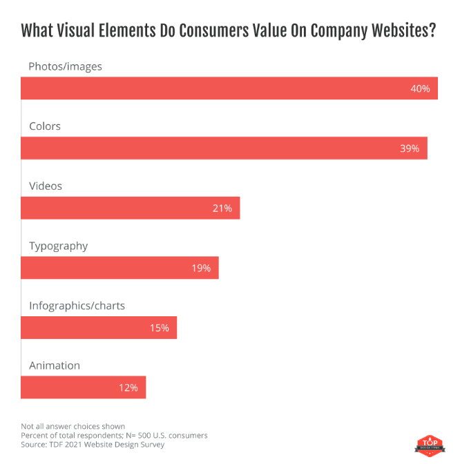
39% of surveyed consumers said color is the visual element they value most on company websites. This makes it the second top visual element consumers appreciate, just behind photos/images (40%).
42% of shoppers base their opinion of a website on design alone (including color).
Among shoppers who don’t return to a website, 52% of the time, it’s down to aesthetic elements (including color).
Other statistics about the importance of color
Colors aren’t only important in your website—it’s important across all your branding materials, from your product design to your brand logo and beyond. Here’s why:
- About 62-90% of a consumer’s initial assessment of products is based on color alone.
- Color can increase brand recognition by up to 80%
- 90% of people believe colors can help attract new customers
- 83% believe color makes them seem more successful
- 81% think color gives them an edge over their competitors
- 90% believe consumers remember presentations better when color is used
- Readers notice full-color ads 26% more often than black-and-white ads. The study that found this specifically looked at magazine ads, but the same principle could hold true for website ads.
Sources: Colorcom2, Top Design Firms1, ResearchGate, Neil Patel, Kissmetrics
Color associations
Studies show that humans seem to hold specific associations with certain colors. Some seem to be innate, biologically-wired associations while others are culturally driven.
It’s important to be aware of common color associations when designing your website, as this will impact how visitors perceive your brand. You should try to choose colors that represent your brand personality and evoke the passionate responses you aim for.
With that in mind, here are some website color statistics that show what each color is most commonly associated with, per a study by Joe Hallock.
Trust
Blue is the website color most commonly associated with trust. 34% of surveyed respondents said they think of trust, they think of blue. This is likely a big part of why blue is such a popular website color.
21% of respondents associated trust with the color white, making it the second top pick. This is likely because (or perhaps why) white is used in settings like hospitals and in doctor’s lab coats.
Orange was the least trustworthy color identified in the study. Only 1% of respondents associated it with trust.
Security
Blue is also the website color that’s most commonly associated with security, with 28% of the vote. This is fairly unsurprising given security and trust are semantically closely linked. Black was also frequently associated with security at 16%. And orange was once again at the bottom of the list with 2% of the vote.
Speed
Red is the color most commonly associated with speed at 76%. This is likely due to Red’s underlying energizing effect and its associations with intensity, rage, and fierceness. Yellow was a distant second at 7%.
This might make red a good choice for creating a sense of urgency in your website. For example, you might use it to highlight time-sensitive offers.
Cheap/inexpensive
26% of participants associated orange with the words cheap/inexpensive. Yellow came second with 22% of the vote, and brown was third with 13%.
Blue was the least likely color associated with cheapness, with only 1% of respondents picking it.
What’s interesting about this is that association with cheapness seems to correlate closely to color preferences. Brown, yellow, and orange are both consumers’ least favorite colors and those most likely to be associated with the word cheap.
High quality
43% of surveyed people associated black with high quality. You can leverage this association with quality using black color schemes in your website.
Blue was associated with high quality the second most often with 20% of respondents picking it. Orange was the least likely associated with high quality, receiving 0% of the vote.
High technology
Black (26%) and blue (23%) were the colors most commonly associated with high technology. Grey was a joint second, chosen by 23% of respondents.
Fear
41% of participants associated red with fear or terror. Black was a close second at 38%. If you’re working on a horror-themed website, black and red are the obvious choices.
Interestingly, none of the respondents associated blue with fear, again showing how trustworthy and calming the color is perceived as.
Fun
28% of people said orange was the color they associate most with fun. Yellow was a close second at 26%. Purple (17%) and red (16%) were popular choices.
This shows that despite being some of the least favorite website colors, orange and yellow do have their place in website design. They may be effective choices if you’re trying to position your brand or product as fun.
Bravery
29% of respondents said they associated purple with courage and bravery. Red was a close second at 28%, and blue came third at 22%.
This is interesting as courage and bravery are commonly thought of as more masculine values, but as we saw earlier, few men like the color purple despite its associations with these traits.
Website color associations according to Joe Hallock
Here’s a recap of the top color associations according to the study by Joe Hallock:
- Blue – trust, security
- Red – speed, fear
- Orange – cheap, fun
- Black – high quality, high technology
- Purple – bravery
Website color associations according to Colorcom
Colorcom’s Global Color Survey also asked respondents about color associations. Here are the most common associations for each color according to their data:
- Yellow – happiness
- White – purity
- Green – luck
- Red – tasty
- Dark blue – dignity
- Silver – high technology
- Red – sexiness
- Black – mourning
- Gold – expensive
- Brown – inexpensive
- Red – powerful
- Blue – dependable
- Gold – high quality
- Muted yellow – nausea
- White – deity
- Black – bad luck
Sources: Colorcom1, Joe Hallock2
Website logo color statistics
Your logo is another key visual element featured on your website. Here are some website color statistics that relate specifically to logos.
The importance of color in website logos
In a test by Reboot Online, 78% of customers could recall the primary color of logos they’d been briefly shown, but only 43% could remember the name.
The upshot: the colors you use in your brand assets (like your website) are more memorable and arguably more important than your brand name.
Most common website logo colors
Black is the most popular branding color amongst the top brands. It’s used in the logos of 34% of the top 100 global brands.
The percentage of brands that use each color in their logo:
- 34% use black
- 30% use blue
- 30% use red
- 9% use yellow
- 7% use green
- 6% use silver/green
- 5% use orange
- 2% use brown
Source: Reboot Online
How many colors are there?
Nobody can agree on exactly how many colors there are, but the best answer we can give is 10 million.
That’s the maximum number of colors the human eye can see, but there are infinitely more colors we can’t perceive.
If you’re curious how we arrived at the 10 million figure, it’s basic math. The human eye can see 1,000 shades of light. And within those light shades, we can detect 100 different red-green shade levels and 100 different yellow-blue shade levels.
Multiply that all together (1,000 x 100 x 100) and you get 10 million.
Of course, it’s a bit more complicated than that—this is just a brief, oversimplified explanation
Final thoughts
That concludes our roundup of website color statistics.
Hopefully, you were able to extract some useful insights to inform your website design strategy from these facts and figures.
The key takeaway is that while color is important, there’s no right or wrong way to use it on your websites. The right color choices depend on your brand personality, positioning, and target market.
If you want to learn more about what good web design looks like, see our recent roundup of website design statistics.
To learn more about graphic design, check out these mind-blowing graphic design statistics.
Good luck!
Was this article helpful?
YesNo